pro
Eric Trovò
Brand identity for founders who need to look credible, fast.
- 4
- Followers




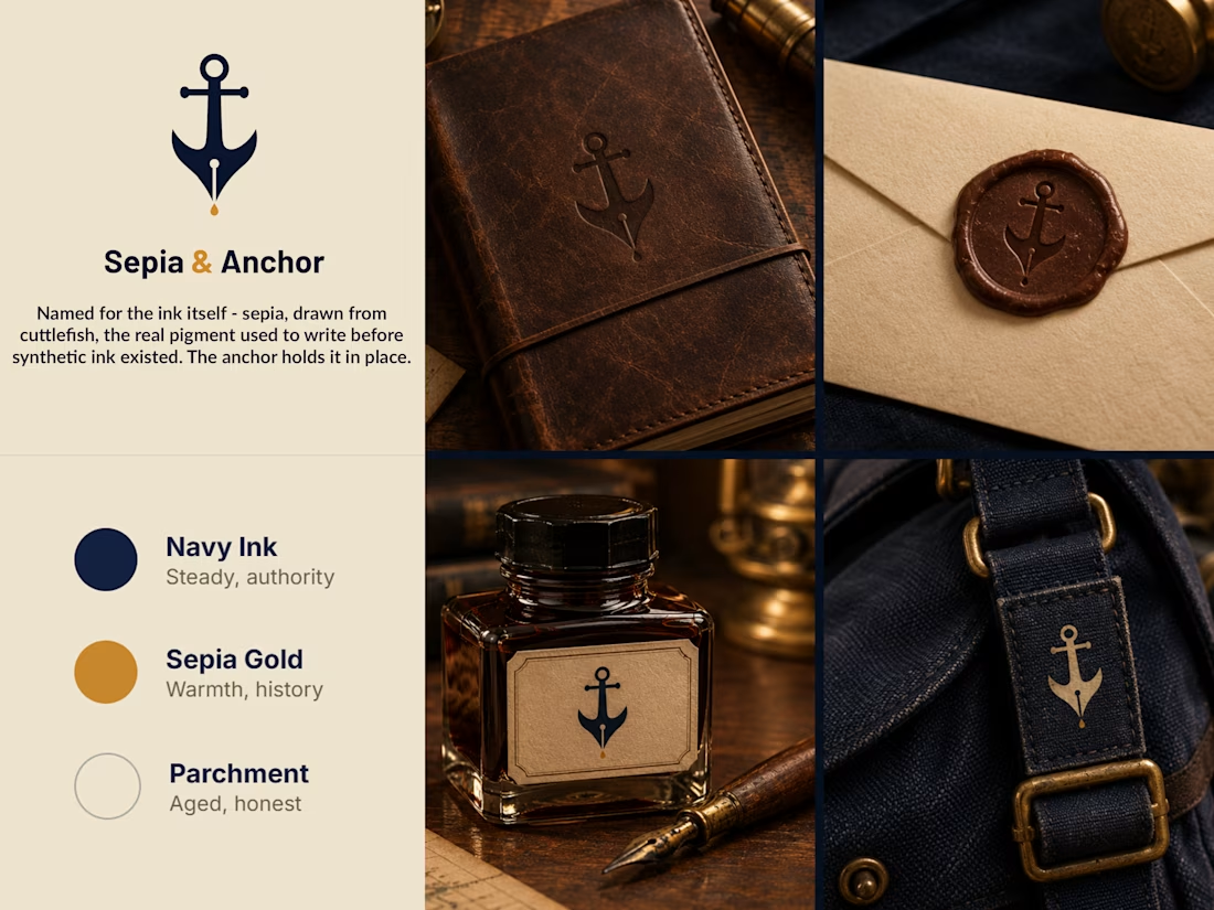
Sepia & Anchor - Brand Identity for a Stationery & Correspondence Co.
Introducing the brand identity for Sepia & Anchor, a stationery and correspondence brand built around a single historical fact: sepia ink was once drawn from real cuttlefish, long before synthetic ink...


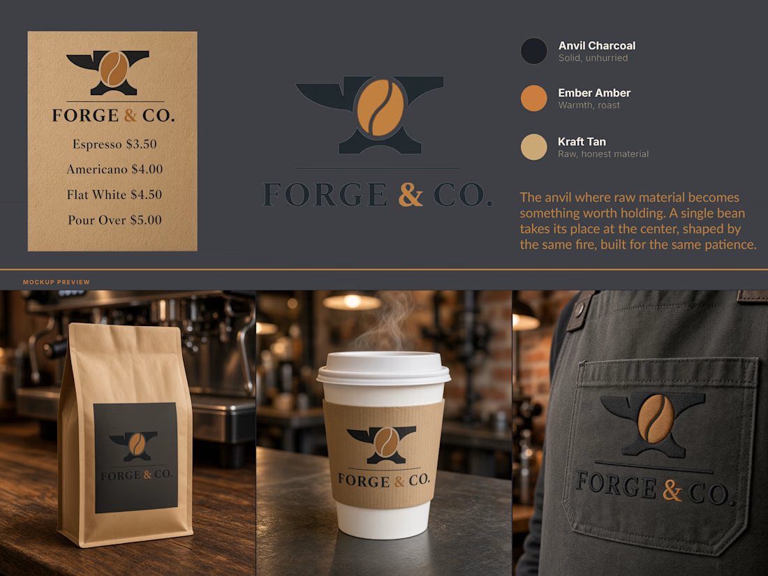
Forge & Co - Brand Identity
A coffee roastery identity built on a single idea: the fire that shapes metal is the same fire that roasts a bean.
Forge & Co needed a mark that earned its name instead of just wearing it. The brief was a brand for a small-batch coffee roaster with a...
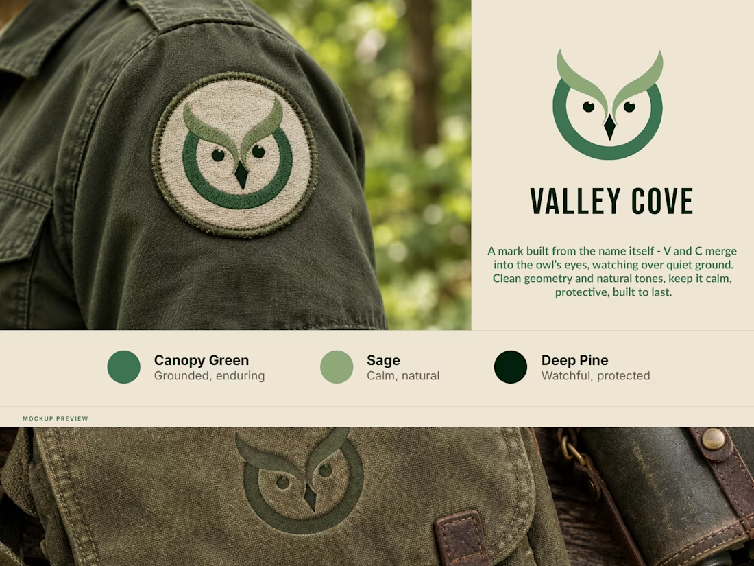
New brand mark - Valley Cove.
Built it straight from the name: the V and C merge into the owl’s eyes. Canopy Green, Sage, Deep Pine. Feels grounded, calm and solid.
Works stitched as a patch, works debossed into leather. Had to hold up both ways, so I designed it to.
Opinions?