The network for creativity
Join 1.25M professional creatives like you
Connect with clients, get discovered, and run your business 100% commission-free
Creatives on Contra have earned over $150M and we are just getting started
Back to feedPost
Taste Test

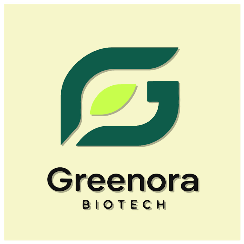
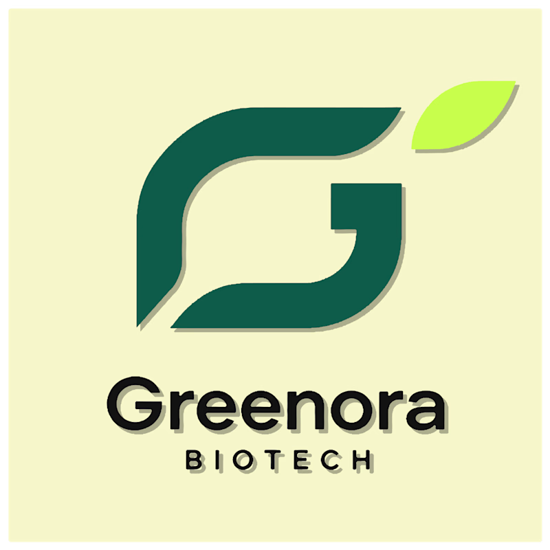
Two directions for a biotech logo. Same mark, one small addition.
- Option A folds the leaf directly into the G’s lower curve, so the two shapes share a single stroke instead of sitting side by side.
- Option B tucks a leaf into the negative space above the G, nodding to the “green” in biotech without adding a separate icon.
Which reads stronger to you?
2 votes
Ends in 1d


The network for creativity
Join 1.25M professional creatives like you
Connect with clients, get discovered, and run your business 100% commission-free
Creatives on Contra have earned over $150M and we are just getting started



Related posts

Codix - Which Visual Direction Works Better? 👀
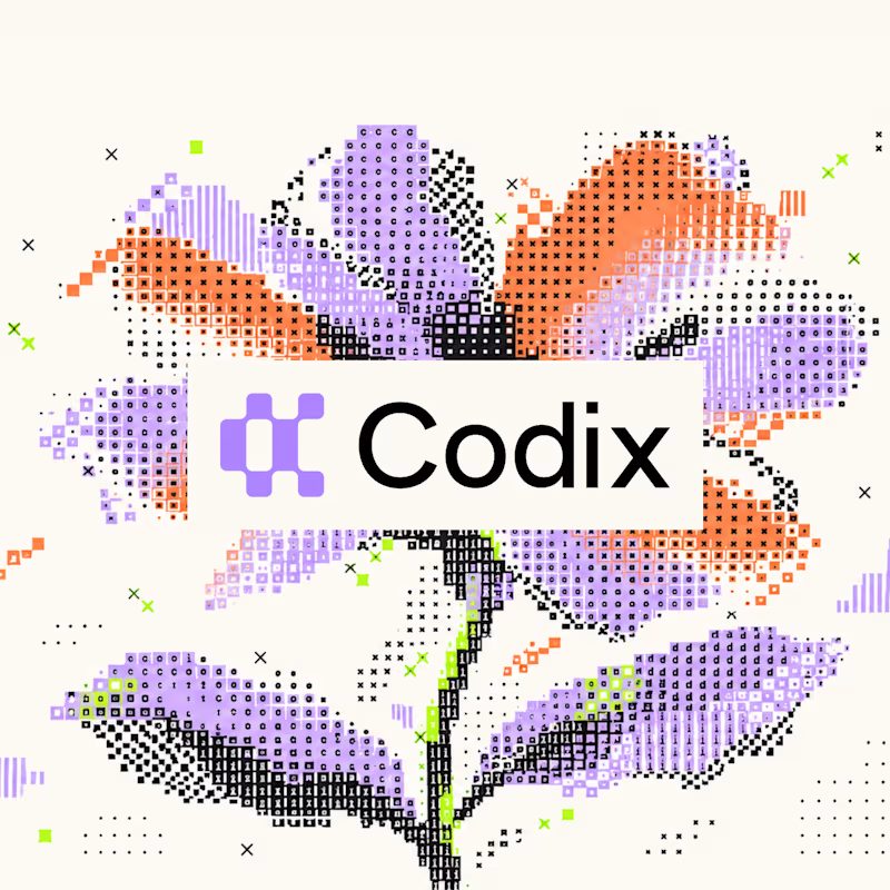
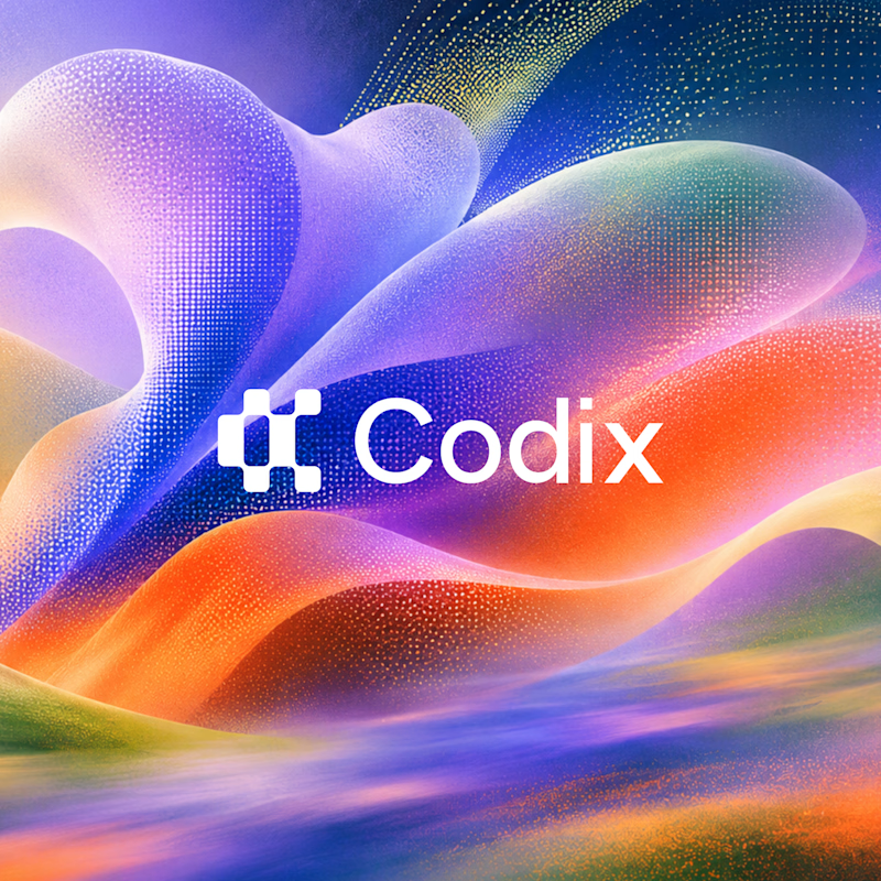
Exploring two different visual styles for Codix, an experimental tech brand identity.
Option 1
Bold, geometric, and pixel-inspired. A playful mix of digital patterns, modular shapes, and vibrant colors.
Option 2
Abstract, expressive, and futuristic. A dynamic blend of flowing forms, gradients, and digital textures.
Same Brand. Two different creative directions.
Which one would you choose - 01 or 02?
5 voted
24%
16 voted
76%
21 votes
Closed

Option 2 was stunning🔥🔥

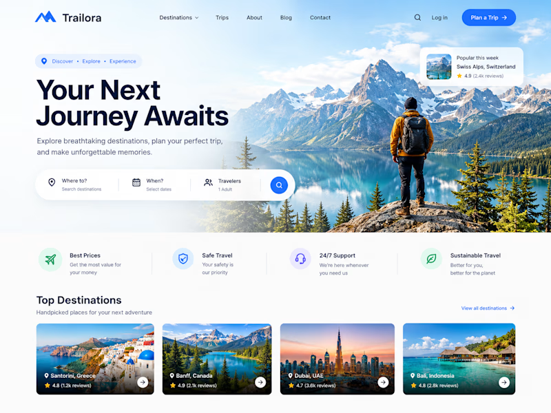
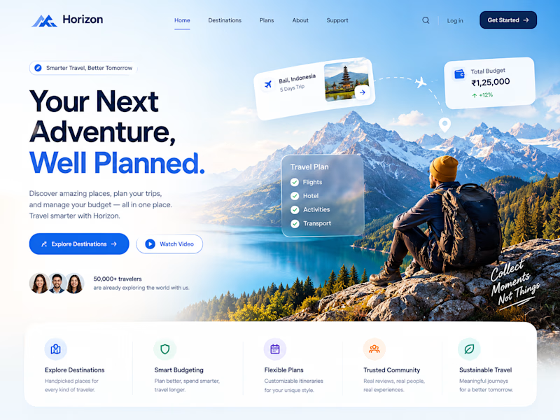
Two designs. One idea. Two different ways to experience travel. ✈️
What if planning your next trip felt less like managing a checklist and more like discovering a story waiting to unfold?
Trailora makes discovery feel effortless, while Horizon turns travel planning into a smarter, more structured experience.
Same industry. Different design directions.
Which direction would you choose: the freedom to explore or the confidence of a well-planned journey?
25 voted
71%
10 voted
29%
35 votes
Closed

Both are lovely! The second one feels more like an adventure, which fits travel well.

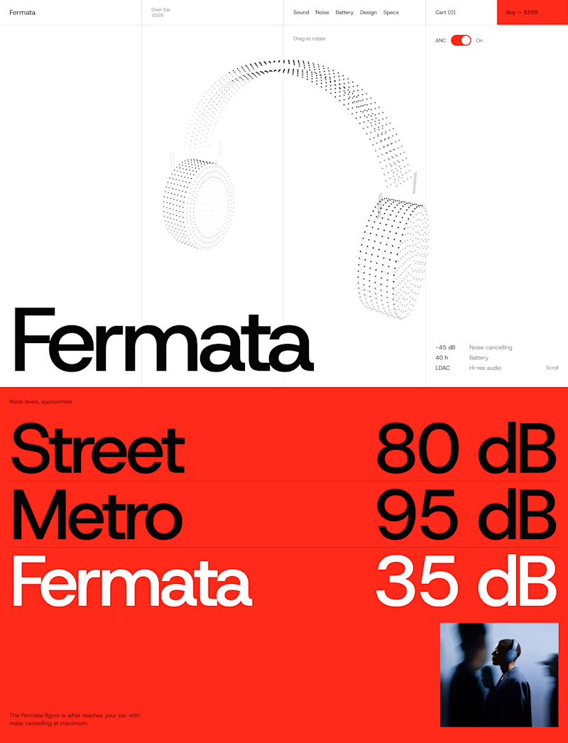
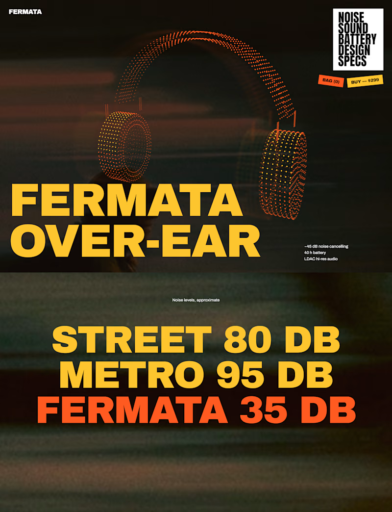
🎧 FERMATA — new over-ear headphones, coming soon.
A — Swiss poster: red, light blue, white and black. Clean grid, one grotesk typeface, product as a stipple 3D model.
B — Night edition: black, yellow and orange. Heavy condensed type, motion-blurred city photography, sticker details.
Both will have a scroll-driven 3D headphone (particles) as the hero.


56 voted
79%
15 voted
21%
71 votes
Closed


The Red Color Scheme looks nice