The network for creativity
Join 1.25M professional creatives like you
Connect with clients, get discovered, and run your business 100% commission-free
Creatives on Contra have earned over $150M and we are just getting started
Back to feedPost

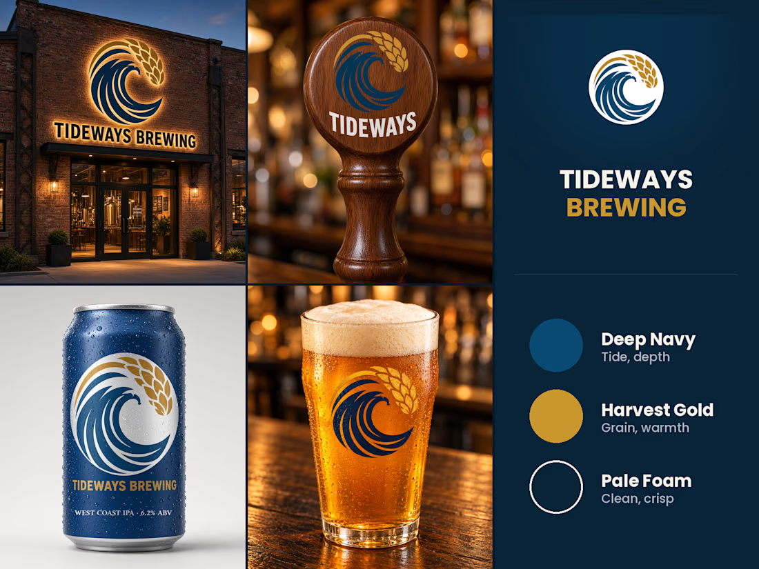
Built this for Tideways Brewing - a wave and a stalk of wheat folding into one mark, a full West Coast IPA brand built around it.
Took it past the logo: signage on the building, a tap handle, the can, the pour. Same mark holds up lit up at night, carved into wood, wrapped around a can, printed on glass.
The network for creativity
Join 1.25M professional creatives like you
Connect with clients, get discovered, and run your business 100% commission-free
Creatives on Contra have earned over $150M and we are just getting started





Related posts

Had some fun with this one.
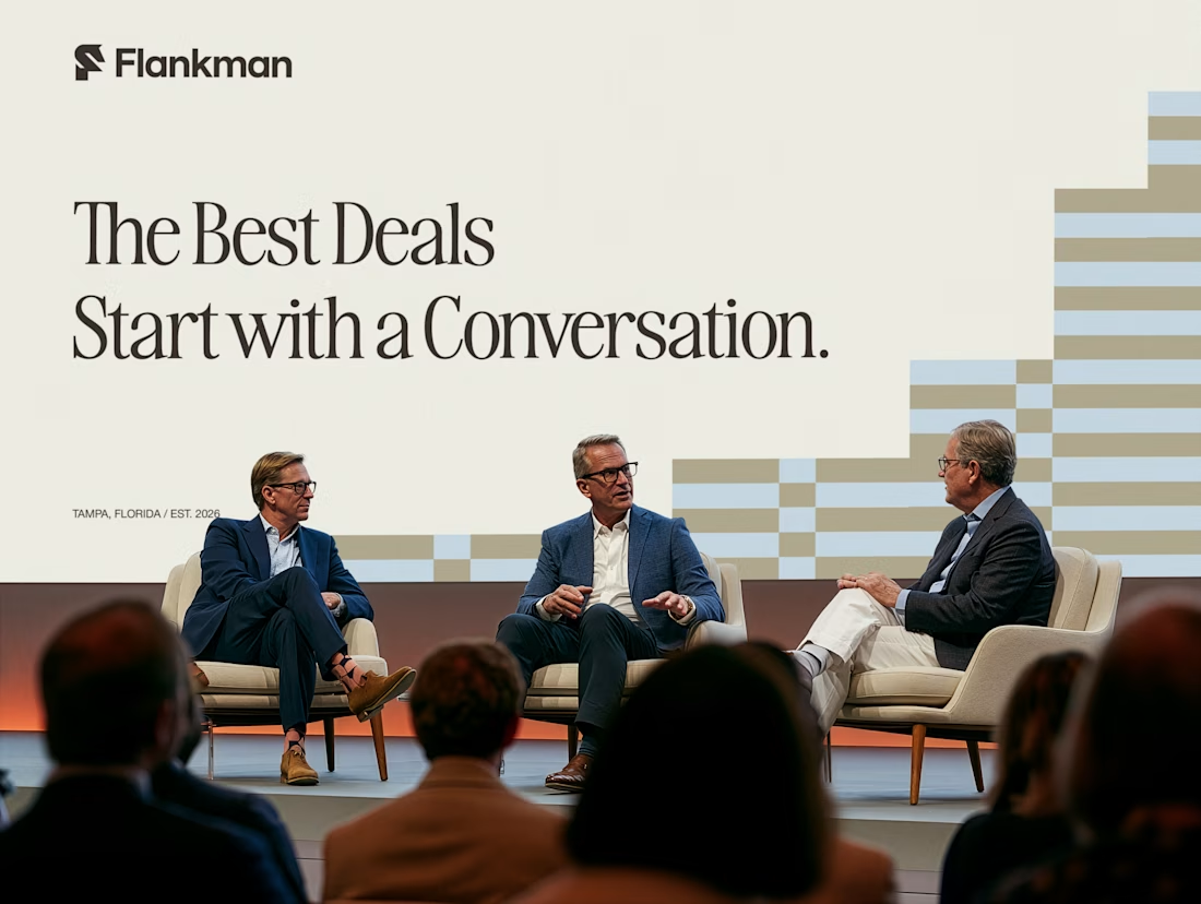
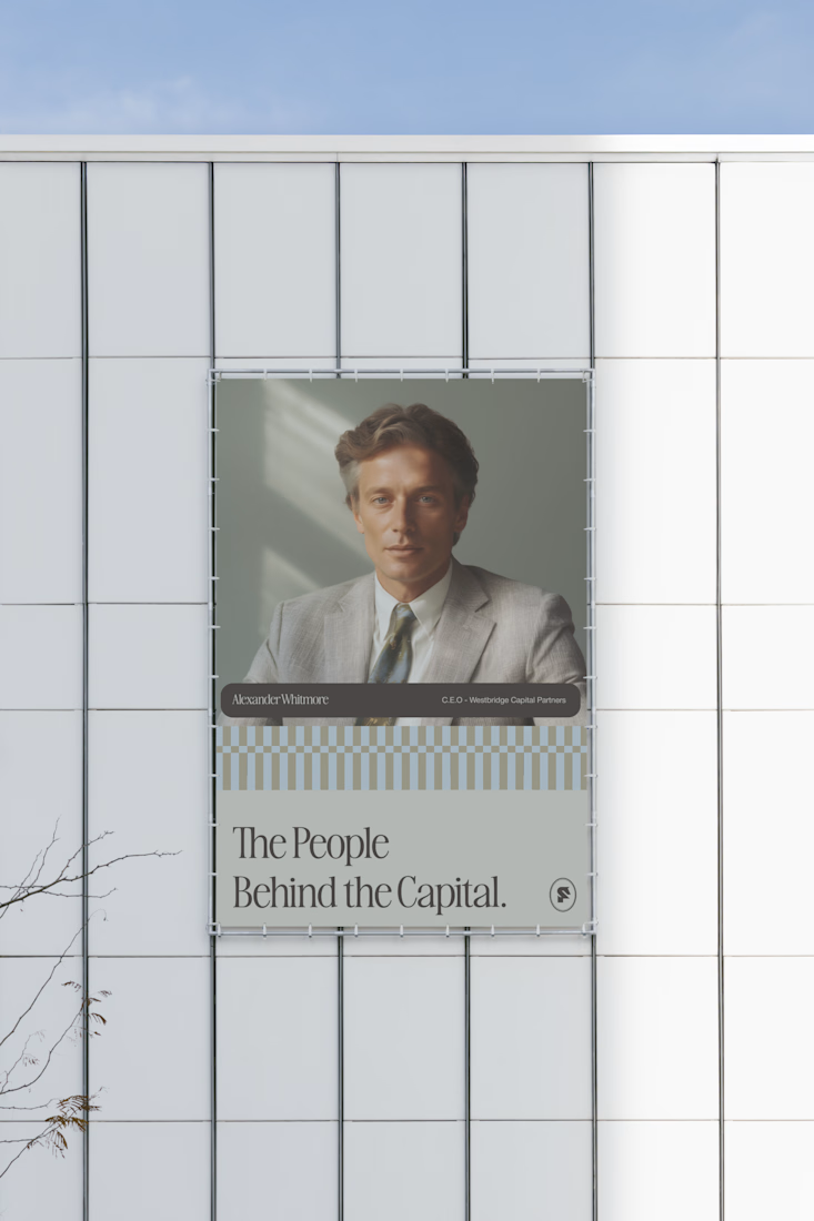
Exploring how typography, colour, and a few unexpected details can give a brand its own personality.
Meet Flankman. Full case study is live! ↓





clean

two brands, one tiny taste test.
would you rather look through an Oriel or answer a Calling?
winner gets the full brand. reply with your pick.
35 voted
85%
6 voted
15%
41 votes
Closed

The biggest misconception about branding is thinking it's just a logo. What actually saves founders time and money later is a compact system a focused 2–3 color palette and clear sub-brand rules so every new deck, social post, or product launch looks cohesive without starting from scratch.

My latest branding project for the Atlanta Museum of Paleontology.
Check out the full project at maximjungle.com


A T-rex drawn in one thin outline is such a good mark 🦖 I'd happily visit that museum.