
Kajabi Expert | Course Creation, Funnels, Marketing Strategy


Kajabi Expert | Course Creation, Funnels, Marketing Strategy


UX | Web Design | Brand Strategy | Accessibility

UX | Web Design | Brand Strategy | Accessibility

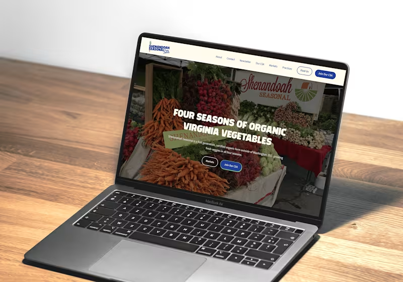
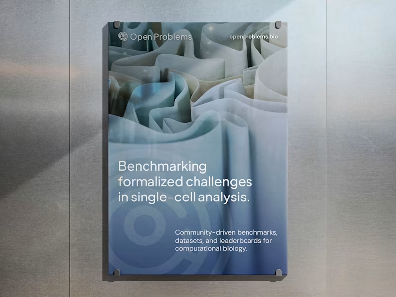


Web Solutions. AI Applications. Proven Marketing Strategy

Web Solutions. AI Applications. Proven Marketing Strategy


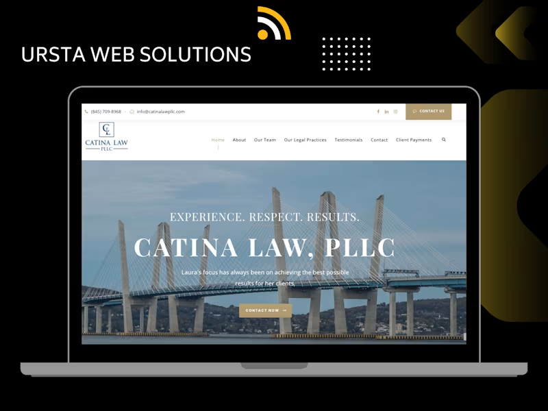


web designer. creative brain.
web designer. creative brain.
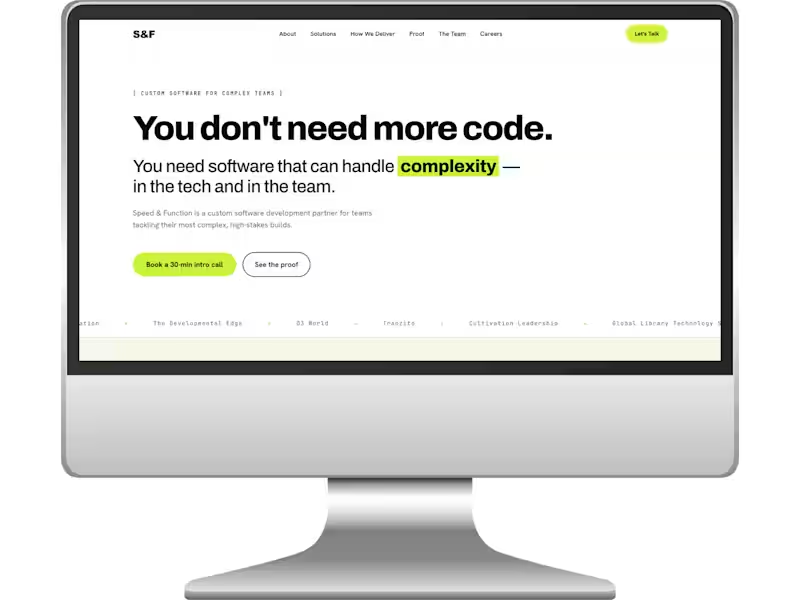
Speed & Function — Concept Redesign / Spec
Speed & Function is a software development company, and I wanted to explore what their website could feel like with a clearer, more contemporary visual system and a stronger sense of personality.
I redesigned the site as a self-initiated concept project, rethinking the hierarchy, pacing, typography, layout, and overall visual direction while working with the company’s existing positioning and the website copy I had previously written for the brand.
The result is a cleaner, sharper B2B tech site that makes complex software services feel easier to understand — and proves that “professional” doesn’t have to mean visually anonymous.
1
54
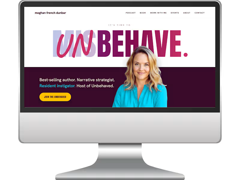
Meghan French Dunbar
Meghan French Dunbar is an author, speaker, founder, and host of the Unbehaved podcast, where she explores what happens when we stop blindly following the rules of work, business, and success.
I wrote and designed her full website around that central idea of being unbehaved — turning the podcast’s voice and philosophy into the creative thread connecting her book, speaking, writing, events, and broader body of work. The goal was to make the site feel intelligent and credible without becoming polished into corporate sameness: thoughtful, a little rebellious, and unmistakably Meghan.
The result is a copy-led personal brand site where the words and visual world work together, giving each part of her work its own space while making everything feel like it belongs to the same bigger idea.
1
101
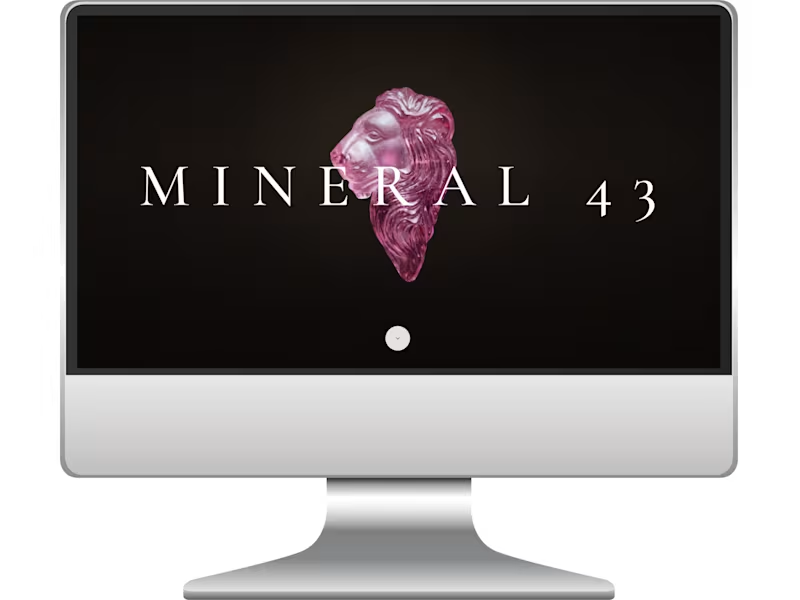
Mineral 43
Mineral 43 is a luxury jewelry boutique built around rare collector minerals, sculptural objects, and one-of-a-kind pieces, so the website needed to feel less like traditional ecommerce and more like stepping into a beautifully curated gallery.
I designed the Home and Atelier pages, focusing on atmosphere, pacing, typography, image treatment, and a sense of discovery that lets the objects do most of the talking.
The result is an editorial, high-end digital experience that feels distinctive and artful without competing with the work itself.
1
116
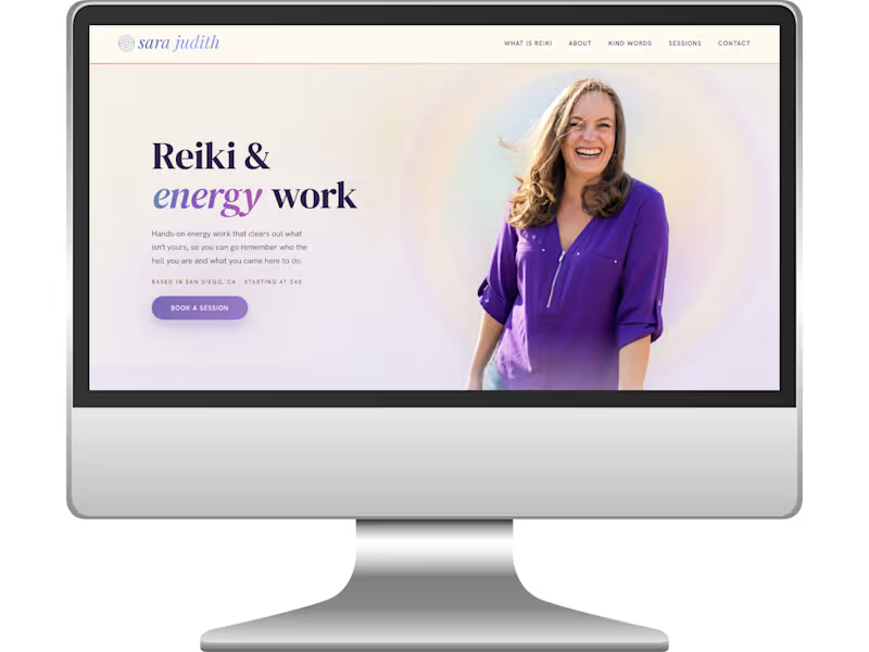
Sara Judith Gustafson
Sara Judith was launching her first solo Reiki practice and needed a site that felt credible and grounded without becoming clinical, and spiritual without disappearing into a cloud of beige woo.
I designed and wrote a one-page site around her own description of the brand: “equal parts Southern California woo and New England straightforwardness.”
The result is warm, luminous, a little magical, and still extremely easy to understand and use — with clear pricing, session guidance, booking paths, and everything a first-time Reiki client needs to feel comfortable taking the next step.
1
129

Bold copy focusing in bringing life to your ideas.
Bold copy focusing in bringing life to your ideas.



Digital Marketer | SEO & Ads Expert | 10+ Yrs Exp
Digital Marketer | SEO & Ads Expert | 10+ Yrs Exp


Transformation Designer | Design, Space & Client Experience
New to Contra
Transformation Designer | Design, Space & Client Experience
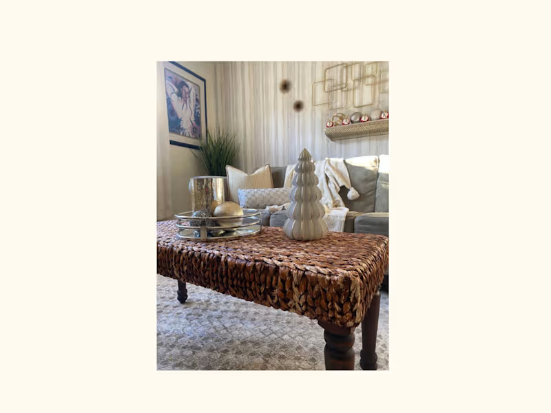
“I layered holiday pillows and seasonal accents to create a warm, cohesive setting, bringing the tree, coffee table, and surrounding details together from a fresh perspective.”
0
30
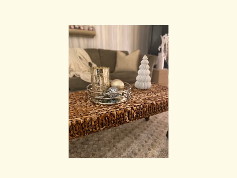
“I transformed the coffee table into part of the holiday experience, layering texture, metallic accents, and sculptural elements to create a warm, cohesive moment that connected the room.”
0
44
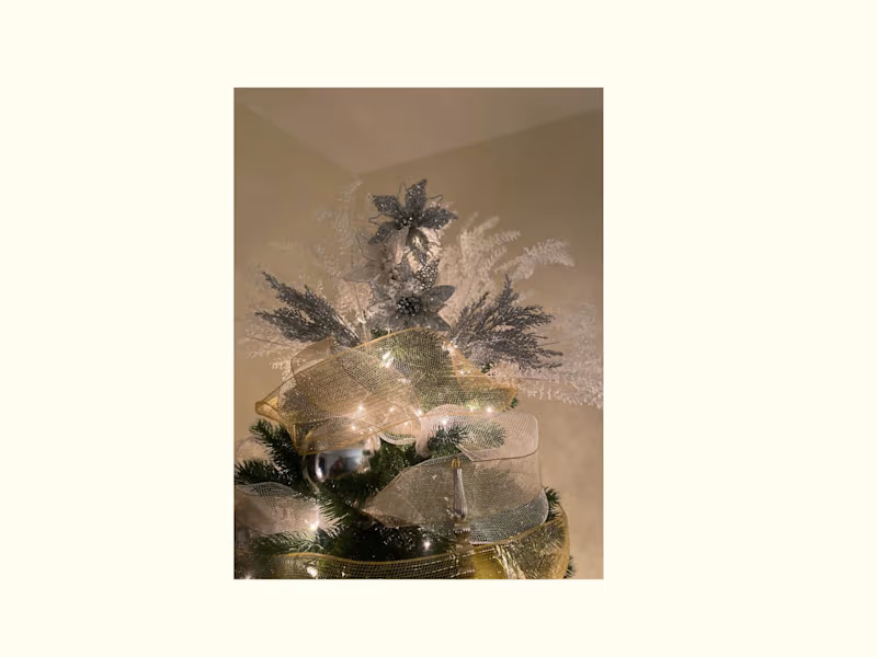
Custom Tree Topper/It's The Crown
“I reimagined the tree topper as a design statement, layering ribbon, florals, texture, and light to create a custom focal point that brought the entire holiday design together.”
0
45
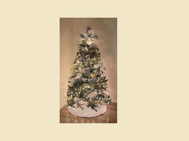
Holiday Living | Designed to Feel Like Home
I reimagined this living space for the holiday season, creating a warm, layered experience through styling, texture, lighting, and intentional details. From the custom tree topper and layered ribbon treatment to the curated tabletop accents, every element was selected to complement the existing space rather than overwhelm it.
The result was a holiday environment that felt elevated, inviting, and personal—proof that transformation isn't always about changing the space. Sometimes, it's about seeing what's already there differently.
0
42

I build brand identities that help businesses sell
I build brand identities that help businesses sell
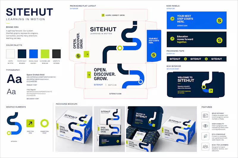
SiteHut’s packaging redesign is built around the idea of Learning in Motion. Rather than relying on traditional academic symbols, the identity uses a custom geometric pathway system to represent progress, connection, and the different directions learning can take.
White creates the clean foundation requested in the brief, while Pacific navy provides credibility, signal blue adds energy, and learning lime creates a distinctive point of recognition. The graphic system extends across multiple package surfaces so the shipment feels like one continuous branded experience rather than separate decorated panels.
The result gives SiteHut a contemporary educational identity that feels energetic and approachable while remaining structured enough to communicate trust and professionalism.
1
113

AI isn’t replacing creativity—it’s exposing the difference between using a tool and having real vision.
A designer brings strategy, taste, experience, storytelling, and human judgment. AI can speed up the process, but it still needs someone who knows what to create, why it matters, and how to make it connect.
Use AI as the assistant. Keep your creativity in control.
Level up. Stay irreplaceable.
2
139

