Brand Identity for Biotech Nonprofit
Molly Brooks
Brand Identity for Biotech Nonprofit
Overview
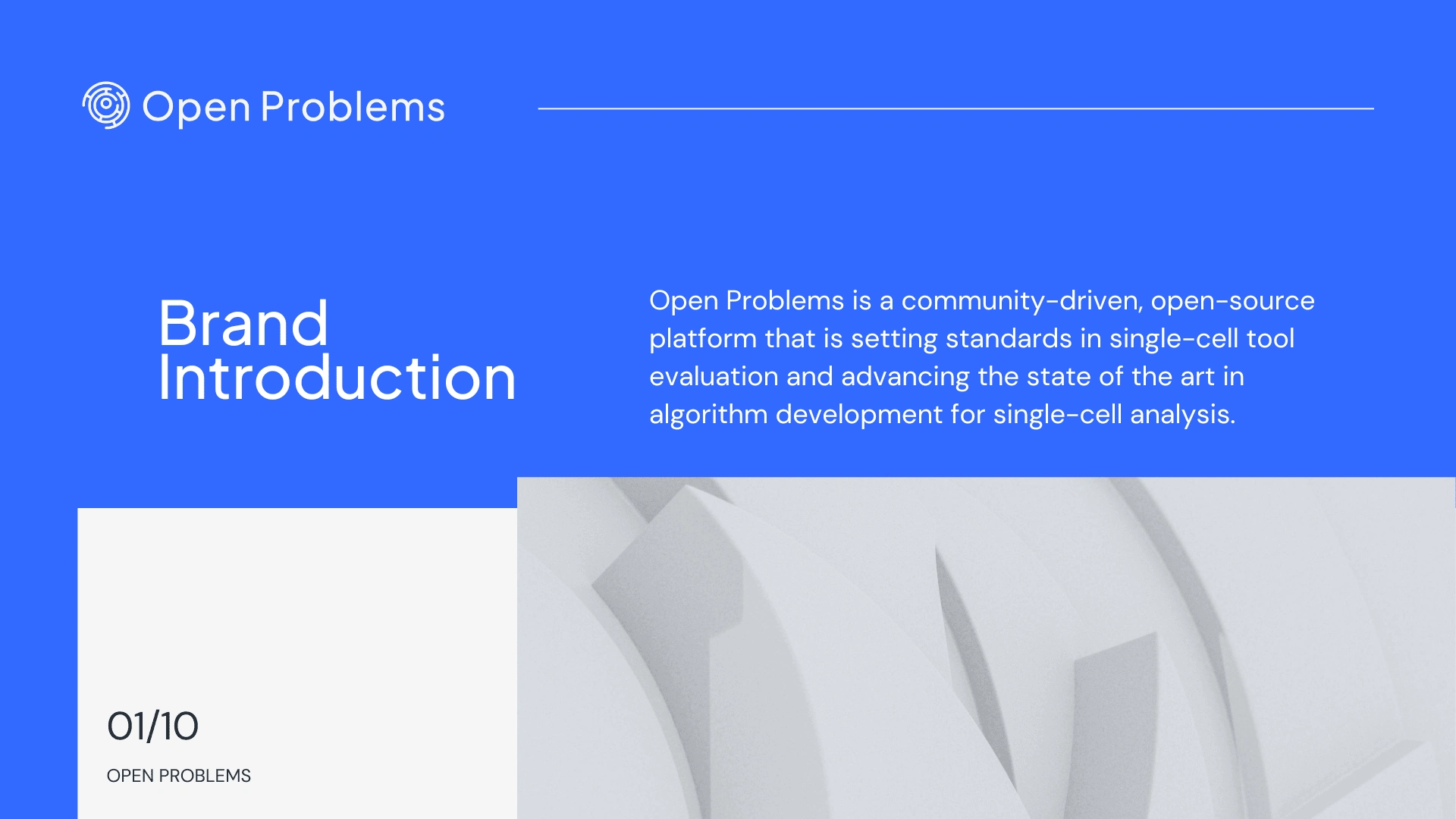
Open Problems, a biotech nonprofit, provides critical tools and resources for researchers in computational biology. Their mission is to drive innovation in algorithm development, set evaluation standards, and guide users in selecting the best tools.
While their platform is community-driven, high-quality, and trustworthy, their original brand identity lacked clarity and visual appeal, falling short of representing their values and mission.
The Starting Point
The Challenge
Open Problems needed a brand redesign that:
Captured the essence of their community-driven and trustworthy nature.
Differentiated them from competitors such as Kaggle and Polarishub.
Communicated effectively to three distinct audiences: algorithm developers, users, and benchmarking scientists.
Reflected their role as an authoritative and innovative platform in single-cell analysis.
The Process
Discovery and Strategy
We began by identifying the core values that underpin Open Problems: community-driven collaboration, rigorous quality, and trust. Drawing insights from their audience’s challenges, we identified a need for a clear, approachable, and professional visual language to appeal to academic and industry scientists alike.
Visual Identity Development
Key steps included:
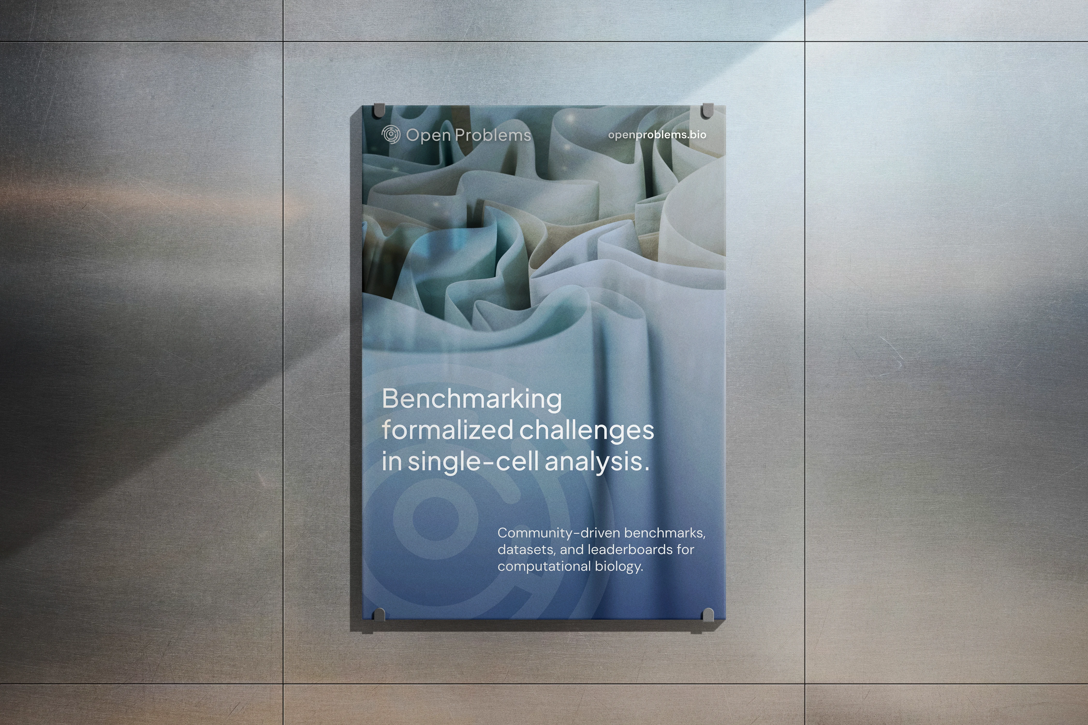
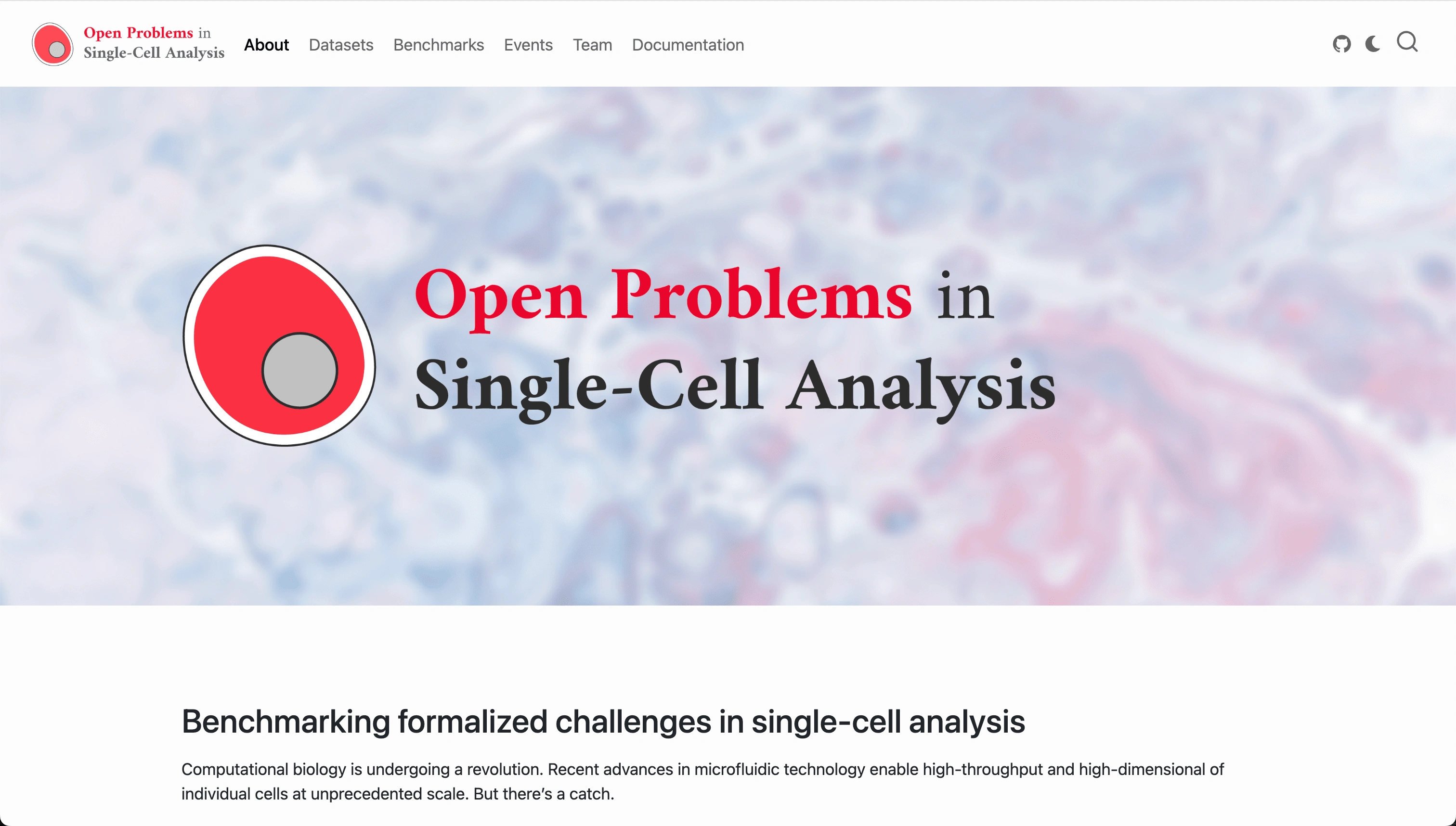
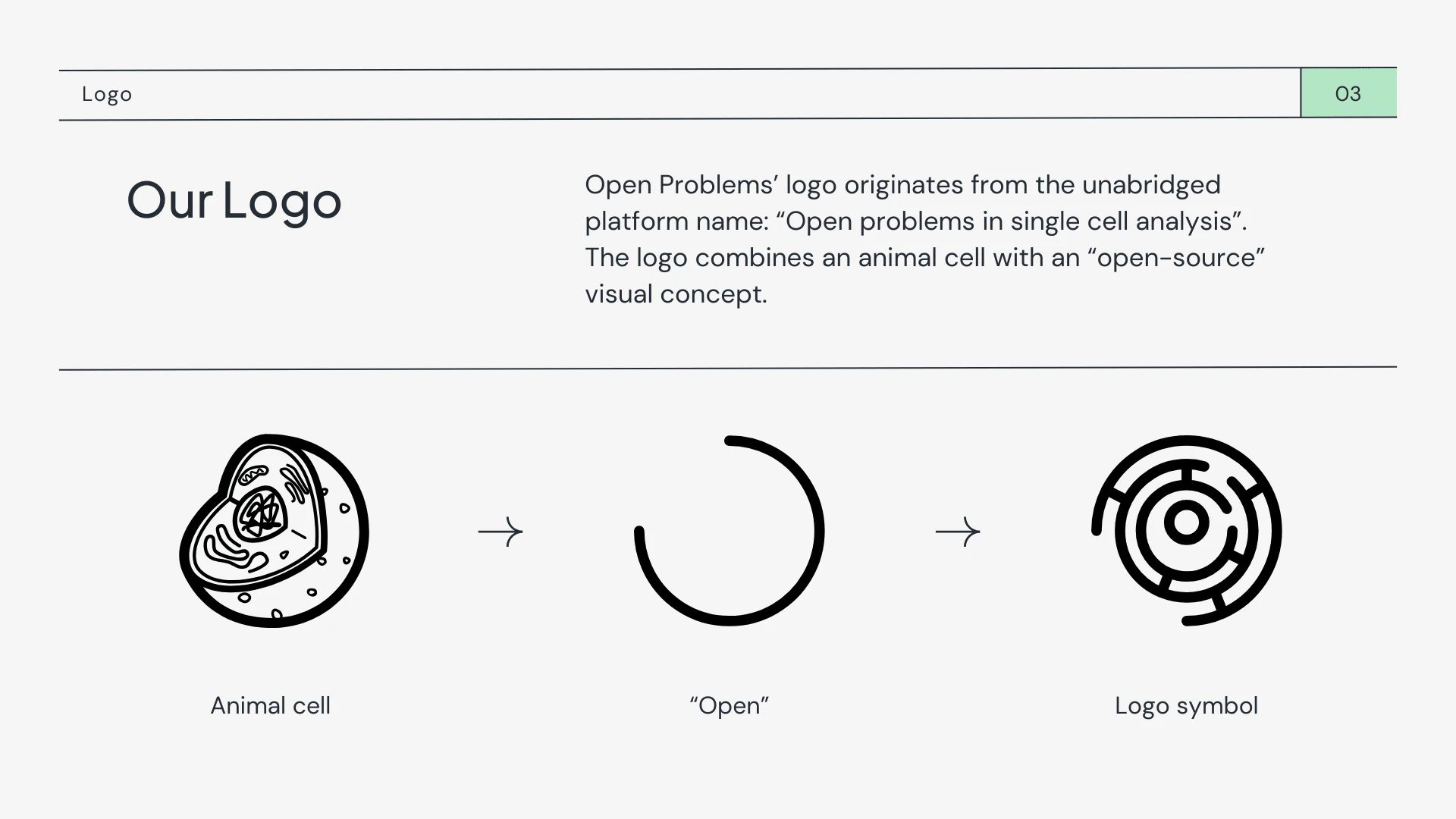
Logo Design: Inspired by cell structure and the open-source nature of this initiative, the new logo features a scalable design originating from the unabridged platform name: “Open problems in single cell analysis”. The logo combines an animal cell with an “open-source” visual concept.
Color Palette: A balance of bright, modern hues (symbolizing innovation) and muted tones (conveying trustworthiness).
Typography: A clean, sans-serif font system was chosen for clarity and professionalism.
Iconography: Custom icons were developed to represent algorithms, benchmarks, and tools.
Brand Voice and Guidelines
We defined Open Problems’ voice as informative, approachable, and authoritative. The brand guide outlines consistent usage for logos, colors, and typography, ensuring cohesive communication across all touchpoints.
The Result
The redesigned brand identity positions Open Problems as a modern, authoritative, and approachable nonprofit. It communicates their mission to drive innovation, foster collaboration, and set standards in computational biology research.
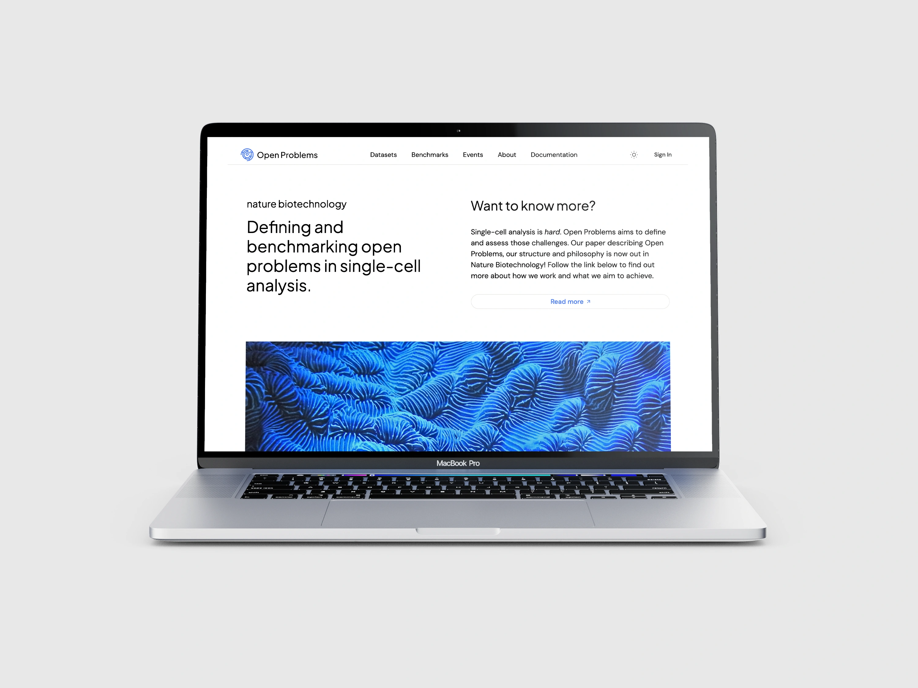
Open Problems brand implemented in their new website
Brand Kit cover
Brand overview
Logo design
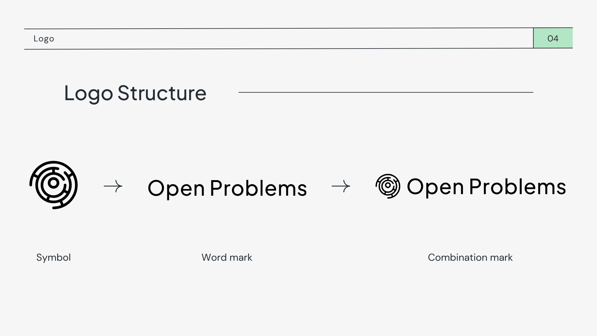
Various logo structures
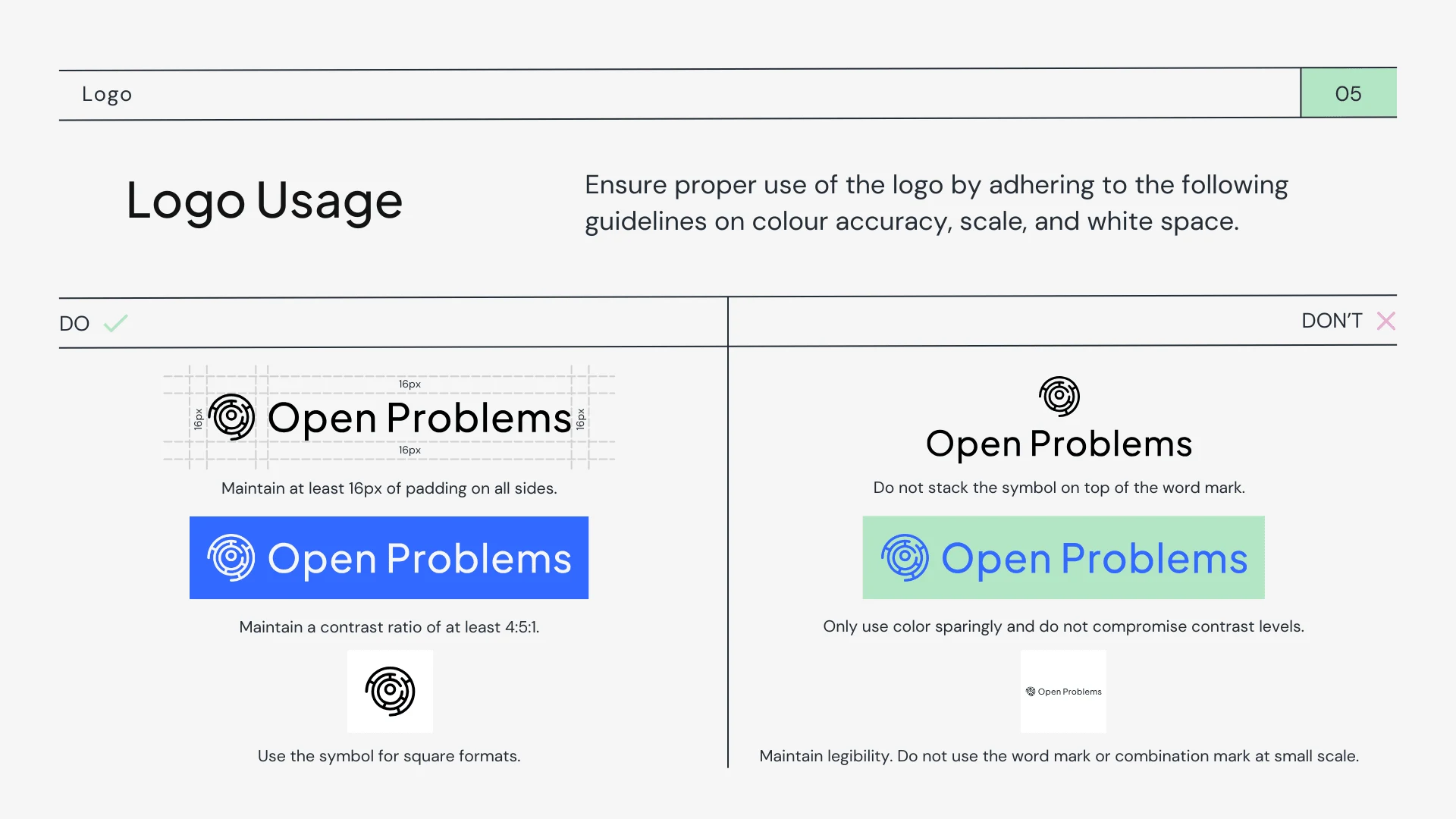
Logo usage guidelines
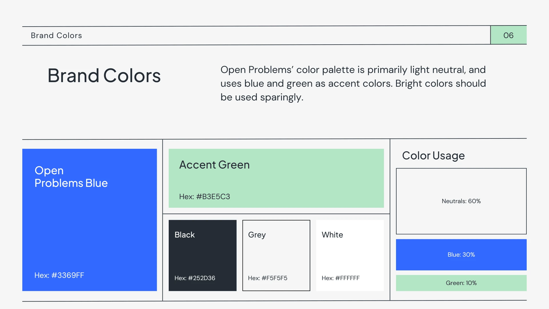
Brand colors, usage, and distribution guidelines
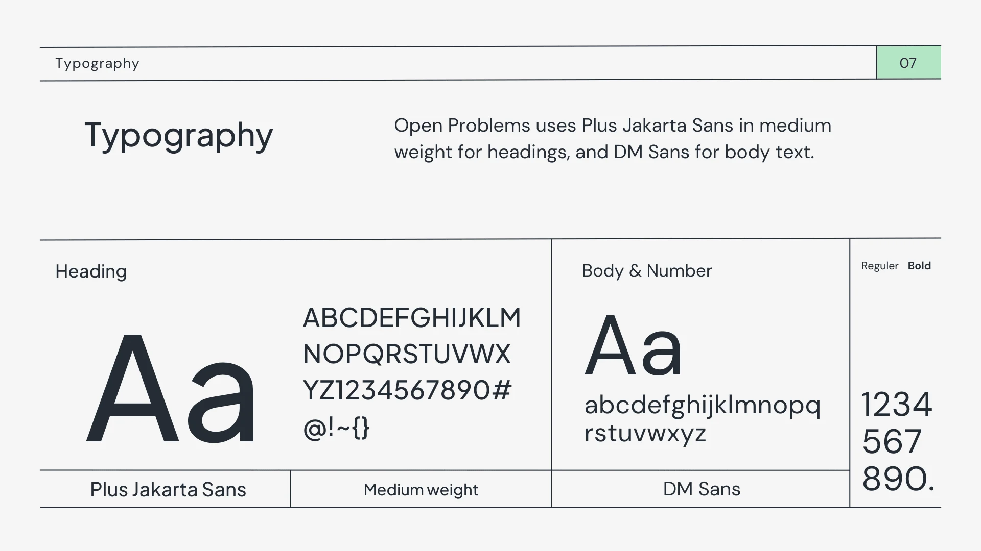
Typography usage
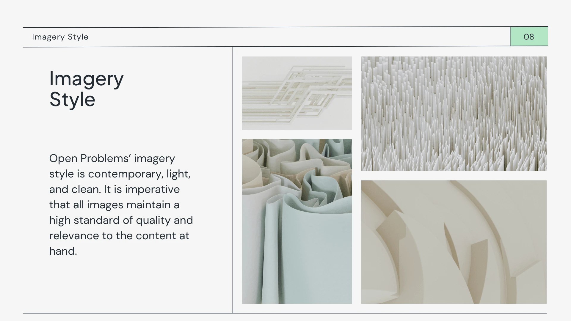
Imagery style and guidelines
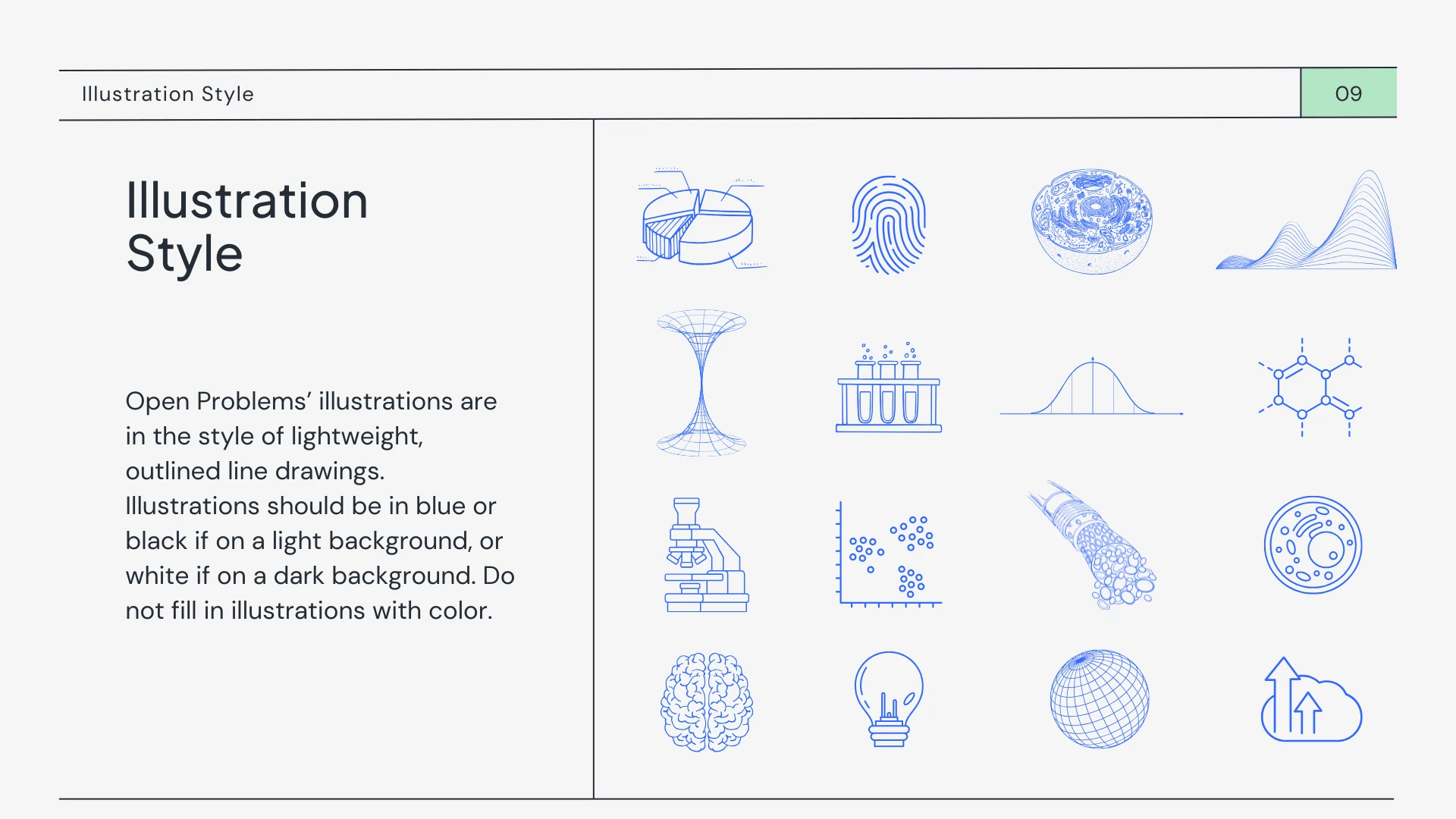
Illustration style guidelines and custom branded illustrations
Like this project
Posted Jan 2, 2025
A redesign of Open Problems' brand to highlight their mission, innovation, and trust, creating a cohesive identity that engages their scientific community.
Likes
4
Views
106
Clients
Cellarity