Freelance Responsive Designs in London
Sign Up
Post a job
Sign Up
Log In
Filters
2
Projects
People
George Weatherhead
max
London, UK
I animate interactive, gamified worlds 🚀
$50k+
Earned
11x
Hired
5.0
Rating
261
Followers
expert
Club
Follow
Message
I animate interactive, gamified worlds 🚀
14
Micro-Interactions, Rive
14
336
7
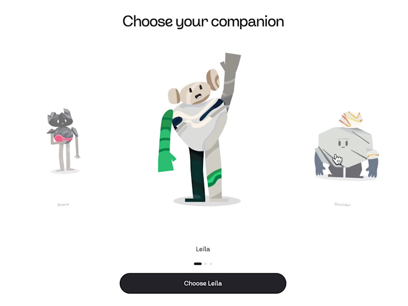
Learning Companions - Pebble
7
282
4
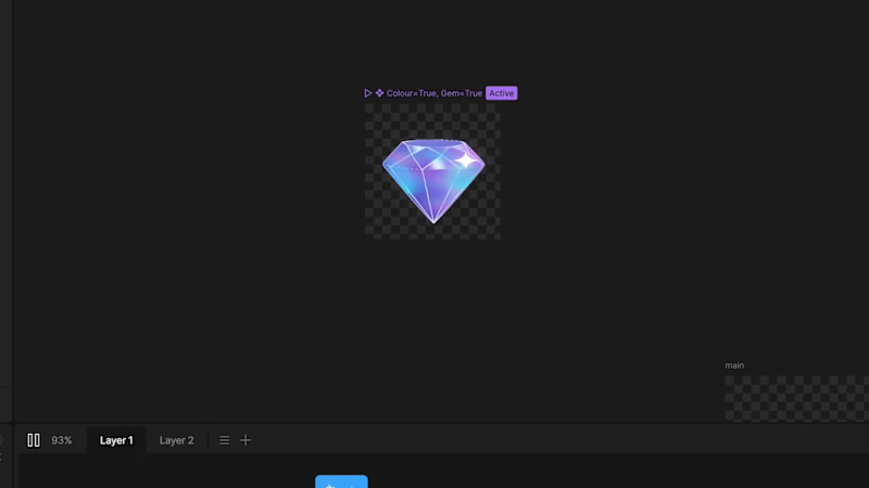
Gems & Stars - Immutable 💎
4
188
4
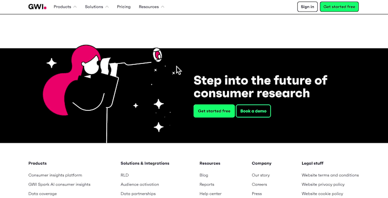
Interactive Headers for GWI's Website
4
94
Responsive Design
(1)
Follow
Message
Anna-Louise Chouay
pro
London, UK
Hello! I’m a freelance UX and UI designer
$1k+
Earned
1x
Hired
5.0
Rating
12
Followers
Follow
Message
Hello! I’m a freelance UX and UI designer
0
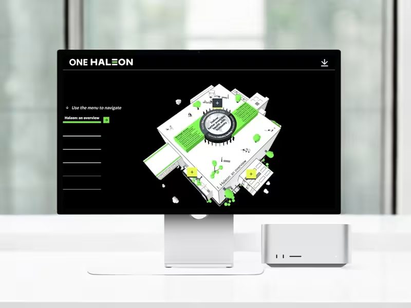
3D Interactive Learning Platform for Haleon
0
14
1
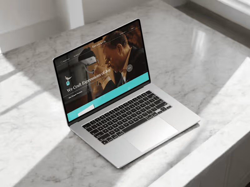
Tiffany - Responsive Microsite Design for Feature Films
1
16
1
Specsavers Scrolly-Telling Learning Module
1
13
0
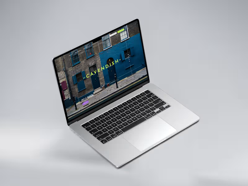
Cavendish Legal Group Website Redesign
0
9
Responsive Design
(3)
Follow
Message
doris james
London, UK
WordPress & WooCommerce Website Developer
11
Followers
Follow
Message
WordPress & WooCommerce Website Developer
2
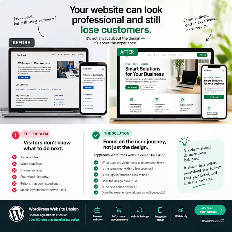
Your website can look professional and still lose customers. One of the biggest problems I see with business websites isn’t that they look bad. It’s that visitors don’t know what to do next. Too much text. Weak headlines. Unclear services. Poor visual hierarchy. Buttons that don’t stand out. And mobile layouts that make the experience frustrating. The solution isn’t always a complete redesign. Sometimes, the biggest improvement comes from fixing the user journey. I approach WordPress website design by asking: → What does the visitor need to understand first? → Is the value clear within a few seconds? → Is the right information easy to find? → Does the design build trust? → Is the next action obvious? → Does the experience work just as well on mobile? A website should do more than look good. It should help visitors understand your business, trust your brand, and take the next step. That’s the kind of WordPress website experience I enjoy building. Good design attracts attention. Good UX turns that attention into action. #WordPress #WebDesign #WebsiteRedesign #UXDesign #WooCommerce #WebDevelopment #DorisWPStudio
2
160
2
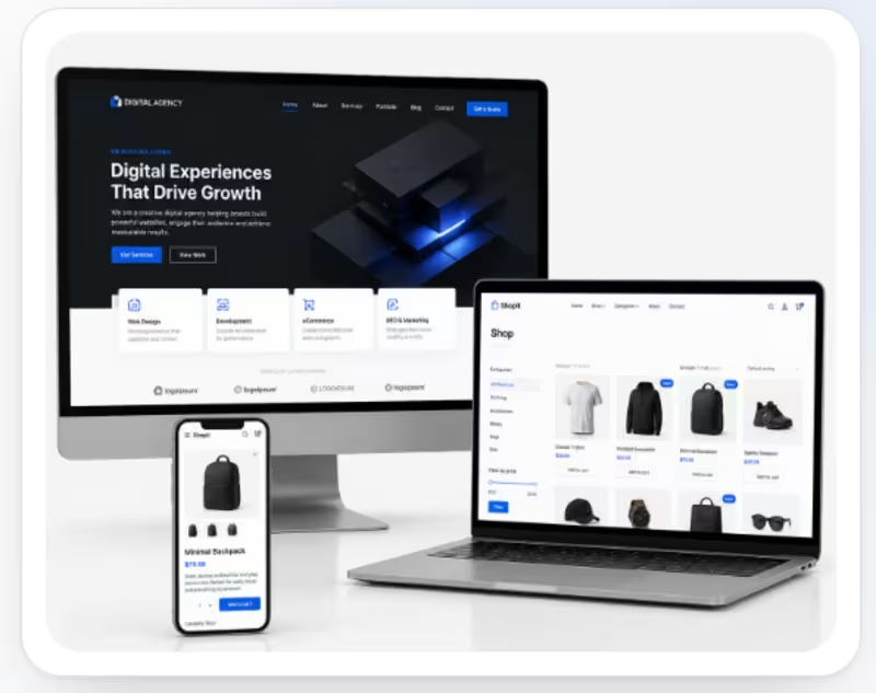
Problem The client needed a professional and user-friendly eCommerce website where customers could easily browse products, filter items, view product details, and shop seamlessly across desktop and mobile devices. The existing online-store experience needed better organization, responsive design, and a more polished shopping experience. Solution I designed and developed a modern WooCommerce eCommerce store with a clean product-focused layout and responsive experience. I organized the shop with intuitive categories, product filters, clear product cards, pricing, and shopping actions. I also optimized the design across desktop, laptop, and mobile screens to provide a consistent and easy-to-use shopping experience. What I worked on WooCommerce store setup Product/shop page design Product categories and filters Responsive desktop and mobile design Product cards and pricing layout Navigation and user experience Clean, conversion-focused eCommerce interface
1
2
156
0
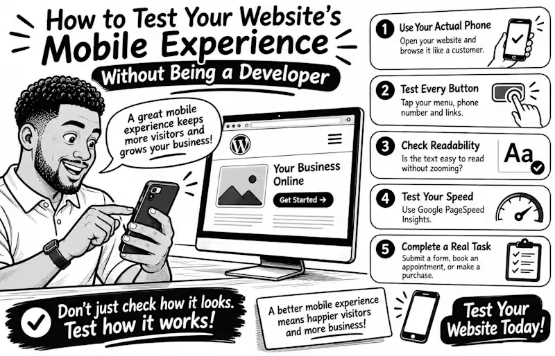
How to Test Your Website's Mobile Experience Without Being a Developer Your website may look perfect on a laptop but become frustrating on a phone Tiny buttons, unreadable text, and complicated forms can make simple tasks harder than they should be The good news? You don't need coding skills to test your mobile experience. Try these 5 simple checks Use your actual phone. Open your website and browse it like a customer. Can you find important information quickly? Test every button. Tap your menu, phone number, contact button, and links. Are they easy to press without accidentally clicking something else? Check readability. Is the text comfortable to read without zooming? Does anything extend beyond the screen? Test your speed. Enter your page URL at Google PageSpeed Insights (pagespeed.web.dev) and review its mobile performance report. Complete a real task. Try submitting a contact form, booking an appointment, or completing a test purchase. Don't stop at the homepage! Remember, a good mobile experience isn't just about fitting a smaller screen. It's about helping visitors accomplish what they came to do. Your turn: When did you last test your entire website on your phone? Try it today and tell me what you discover
0
7
1
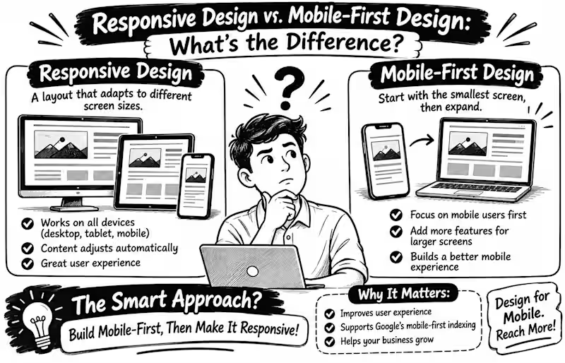
Responsive Design vs. Mobile First Design What's the Difference? Have you ever opened a website on your phone and had to zoom in just to read the text? That’s a reminder that website design must consider more than one screen size. But here’s something many business owners misunderstand: responsive design and mobile-first design are not the same thing. Responsive Design The website layout adjusts to different screen sizes, from smartphones and tablets to desktop computers. Images resize, columns rearrange, and content remains usable. Mobile First Design The designer starts with the smallest screen, prioritising essential content and features before expanding the layout for larger screens. Why does this matter? Google uses the mobile version of website content for indexing, making a good mobile experience important for search visibility. A mobile friendly design should also keep text readable, navigation simple, and buttons easy to tap. Here’s the secret: you don’t have to choose one over the other! Mobile-first is a strategy for building a responsive website. My advice: When building your next WordPress or WooCommerce website, start by asking Can my customers easily find what they need on their phones? Because a beautiful desktop website means little if the mobile experience feels frustrating Your turn When designing a website, do you start with mobile or desktop first? Tell me why in the comments
1
27
Responsive Design
(2)
Follow
Message
Dmitriy Shilko
pro
London, UK
Brand Design✦UI design✦Front-end development.
$25k+
Earned
9x
Hired
5.0
Rating
82
Followers
Follow
Message
Brand Design✦UI design✦Front-end development.

0
UI design, Website design, Logo design.
0
43
3
Shopify store for Verma Jewerly Group
3
133
1
Speak Whiskey / Brand design / Logo Design
1
44
1
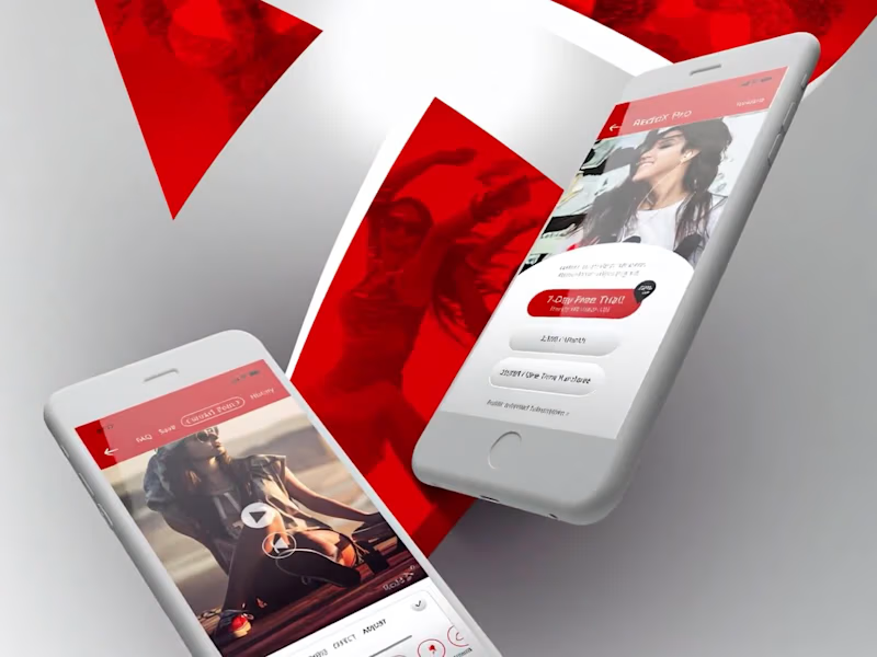
ReddX Mobile app design. Prototyping.
1
82
Responsive Design
(1)
Follow
Message
Cataldo Cappiello
pro
London, UK
Design with purpose: Premium branding for your business
5.0
Rating
9
Followers
Follow
Message
Design with purpose: Premium branding for your business
0
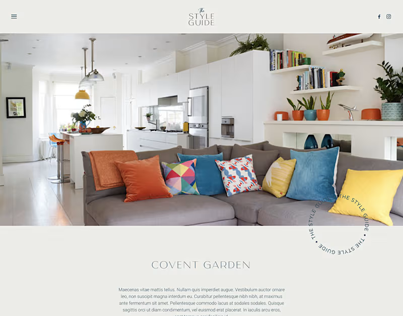
The Style Guide - Website Design
0
32
0
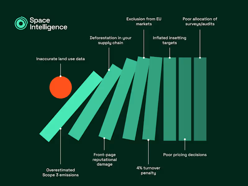
The First Domino (Infographic)
0
5
0
Fictional Podcast Brand in Figma
0
12
0
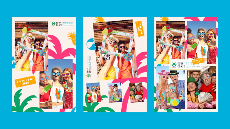
SQUPcon 25 - Brand Collaterals
0
7
Responsive Design
(1)
Follow
Message
Idris Lamina
pro
London, UK
AI Automation & Web Design | n8n · Vapi · Claude API

16
Followers
Follow
Message
AI Automation & Web Design | n8n · Vapi · Claude API
12
A cinematic portfolio concept for a film and motion studio, designed to feel more like an editorial reel than a standard agency website. The site uses a dark visual system, oversized typography, smooth scrolling, restrained motion, and a full-screen project index to make the work feel premium before the user reads a word. The focus was on pacing, atmosphere and confidence: fewer sections, stronger visuals, cleaner movement. Built as a responsive Next.js prototype with Framer Motion and Lenis-style smooth scrolling, including hero, selected work, about and contact sections.
7
12
576
2
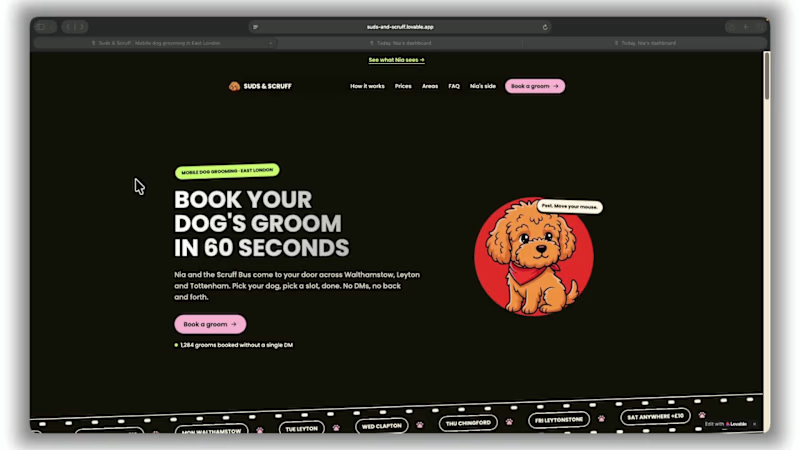
Suds & Scruff Mobile Dog Grooming, Walthamstow, East London Nia is made up. Her problems aren't. She grooms dogs from a van across Walthamstow, Leyton and Chingford, and she works an area a day. Enquiries come in by DM while she's mid-groom, so she answers them at 9pm. Getting one dog booked takes about six messages. Two dogs a week don't turn up, and she's already driven there. What I built: Customers book themselves. Size and coat set the price and the time, and they only see days when the van is in their area. If someone would rather message, the message gets a price, real slots and a booking link back in seconds. The evening before, every customer gets a one-tap "still on?". Say nothing and the slot goes to the next dog on that area's waitlist. Nia gets one line she can undo. Customers move or cancel their own bookings inside the same rules. Nia's dashboard only lists what needs her. Everything else is logged with the minutes it saved: about five hours a week. To see her side, click "See what Nia sees" at the top of the site. It signs you in to a demo account. Texts are simulated and every one is in the Outbox. Demo data resets every night.
2
120
0
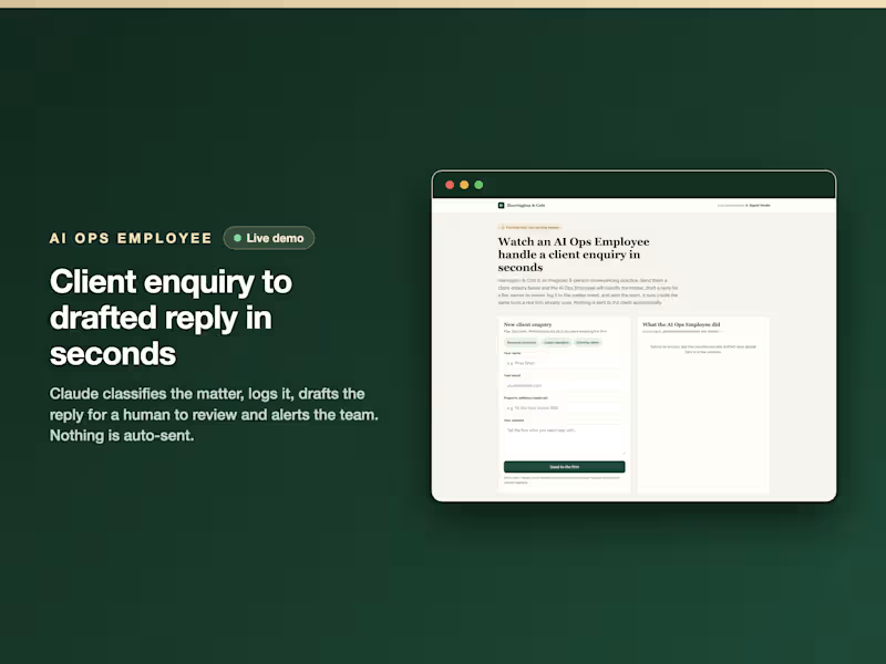
AI Ops Employee: Professional Services Intake (Live Demo)
0
10
0
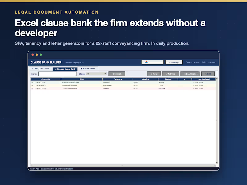
Document Automation for a 22-Staff Conveyancing Firm
0
14
Responsive Design
(1)
Follow
Message
Vikas Assudani
London, UK
Senior Product Designer | AI & B2B SaaS | 0→1
36
Followers
Follow
Message
Senior Product Designer | AI & B2B SaaS | 0→1
1
Bringing Constella’s True Vision Into the Landing Page
1
8
2
How I Redesigned a Spatial Second-Brain MVP
2
20
1
Improving Onboarding and Activation for Constella Mobile
1
11
1
Turning an Offline Car Dealership Into a Modern Marketplace App
1
9
Responsive Design
(1)
Follow
Message
Harry Mccrae
London, UK
I help founders plan, design, and build SaaS platforms
Follow
Message
I help founders plan, design, and build SaaS platforms
0
SunX Designs — Website Rebrand & Build (Built with Bolt.new)
0
5
0
Hessian Coffee Bespoke Website Design & Build
0
9
0
Pelham Interiors — Website Design & Build
0
6
0
BeanSync: Multi-Tenant SaaS (Built with Bolt.new)
0
24
Responsive Design
(1)
Follow
Message
Explore people