Bringing Constella’s True Vision Into the Landing Page
Vikas Assudani

Redesigning a Developer-Built Landing Page to Match Constella’s True Vision
The founder of Constella already had a strong vision: a spatial second brain with a calm, space-inspired identity. But the landing page was built entirely by developers. The result was a mix of good intentions and scattered execution. The message was unclear, the visuals felt disconnected, and the page did not reflect the actual product.
My role as the designer was to take that existing vision and turn it into a clear, aligned, and trustworthy landing experience that finally matched what Constella stood for.
Summary
The original landing page communicated some of the ideas behind Constella, but without visual hierarchy or structure. Key sections were mismatched. Messaging was inconsistent. The identity was present, but not expressed well.
I redesigned the hero, footer, and core sections to bring the brand into alignment: a clearer story, a cleaner layout, and a visual rhythm that matches the spatial second-brain product. The result is a landing page that feels cohesive, communicates value instantly, and makes the product easier to trust.
1. The Problems With the Original Developer-Built Page
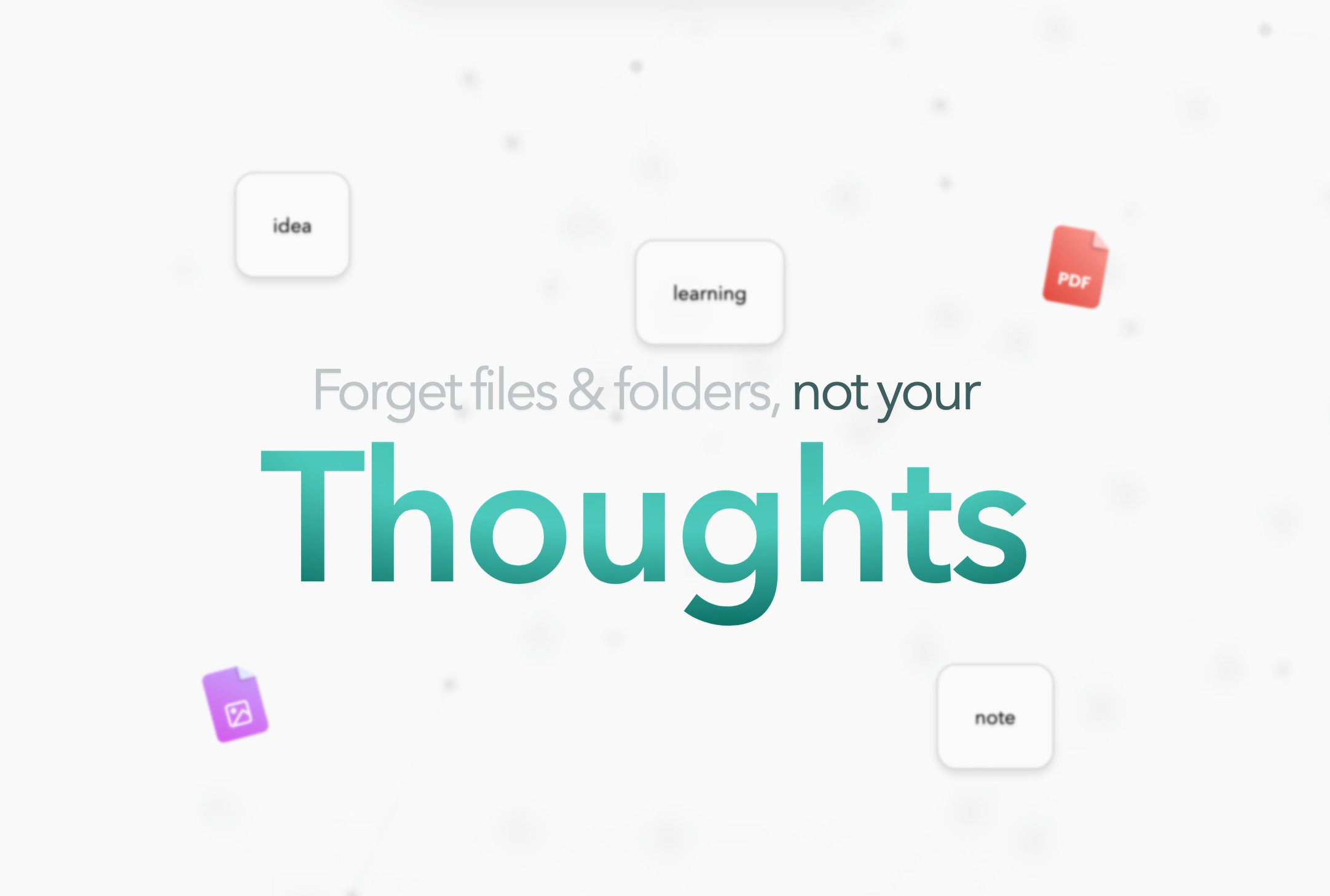
Original Hero Section
Unclear message hierarchy
Visitors had to work to understand what Constella actually did. The hero didn’t communicate the value.
Disconnected visual identity
Constella’s brand direction existed, but the page didn’t express it.
The white/light sections felt generic and didn’t relate to the product’s spatial, calm feel.
Inconsistent structure
Sections felt stitched together.
Spacing, alignment, and flow lacked intention.
Original Footer
Footer lacked organization
The bottom of the page broke the visual narrative and felt unfinished.
2. What Success Looked Like
Realign the page with Constella’s existing brand vision
Make the hero communicate the value instantly
Create a calm, spatial, aurora-inspired atmosphere
Improve flow and reduce visual noise
Give the footer proper structure
3. What I Changed
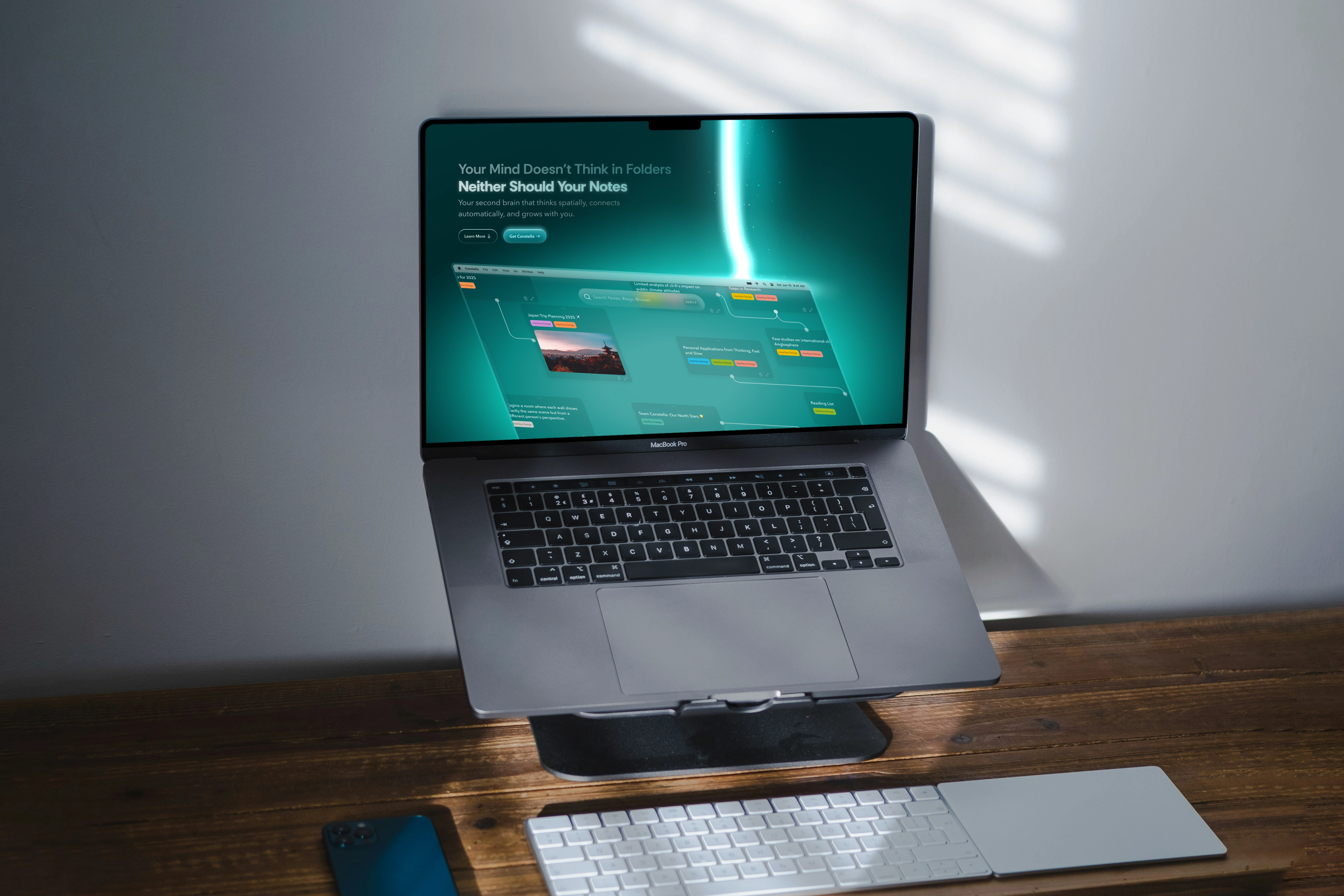
A. A Hero That Finally Matches the Product
I rebuilt the hero to feel aligned with the actual identity:
Clear headline and explanation of the second-brain concept
Stronger product screenshot and visual depth
Aurora-green gradient and atmospheric glow
Cleaner hierarchy and better use of space
After:
The result is a hero that feels intentional, trustworthy, and closer to the product itself.
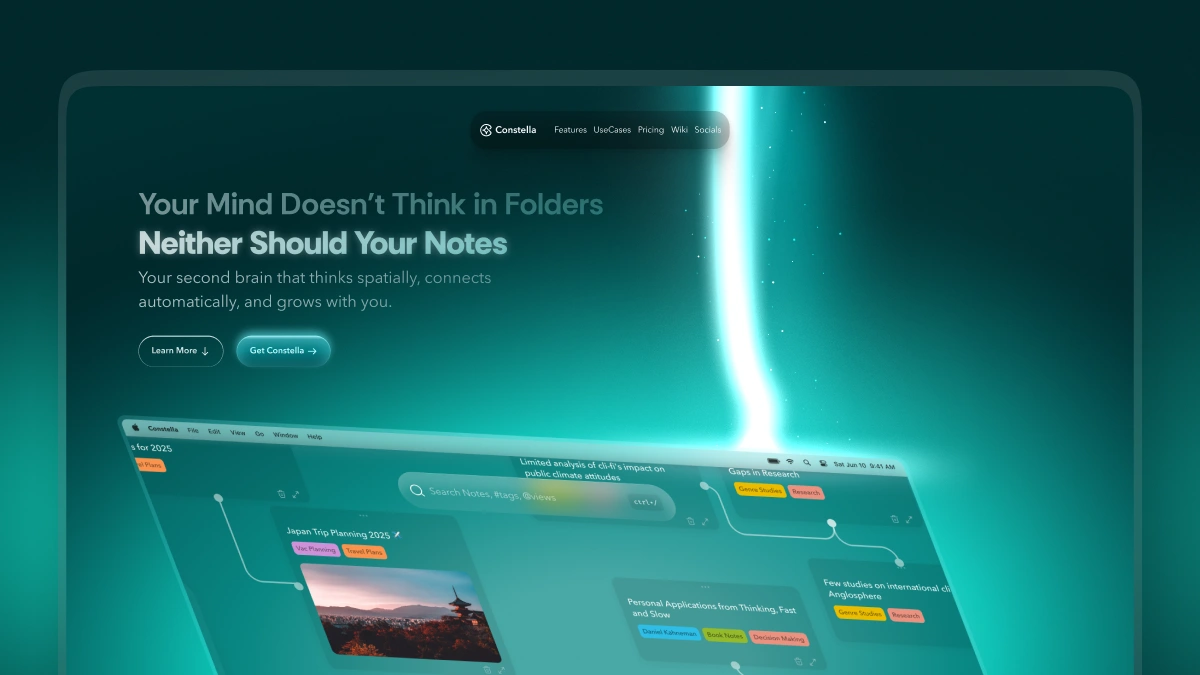
Redesigned Hero Section
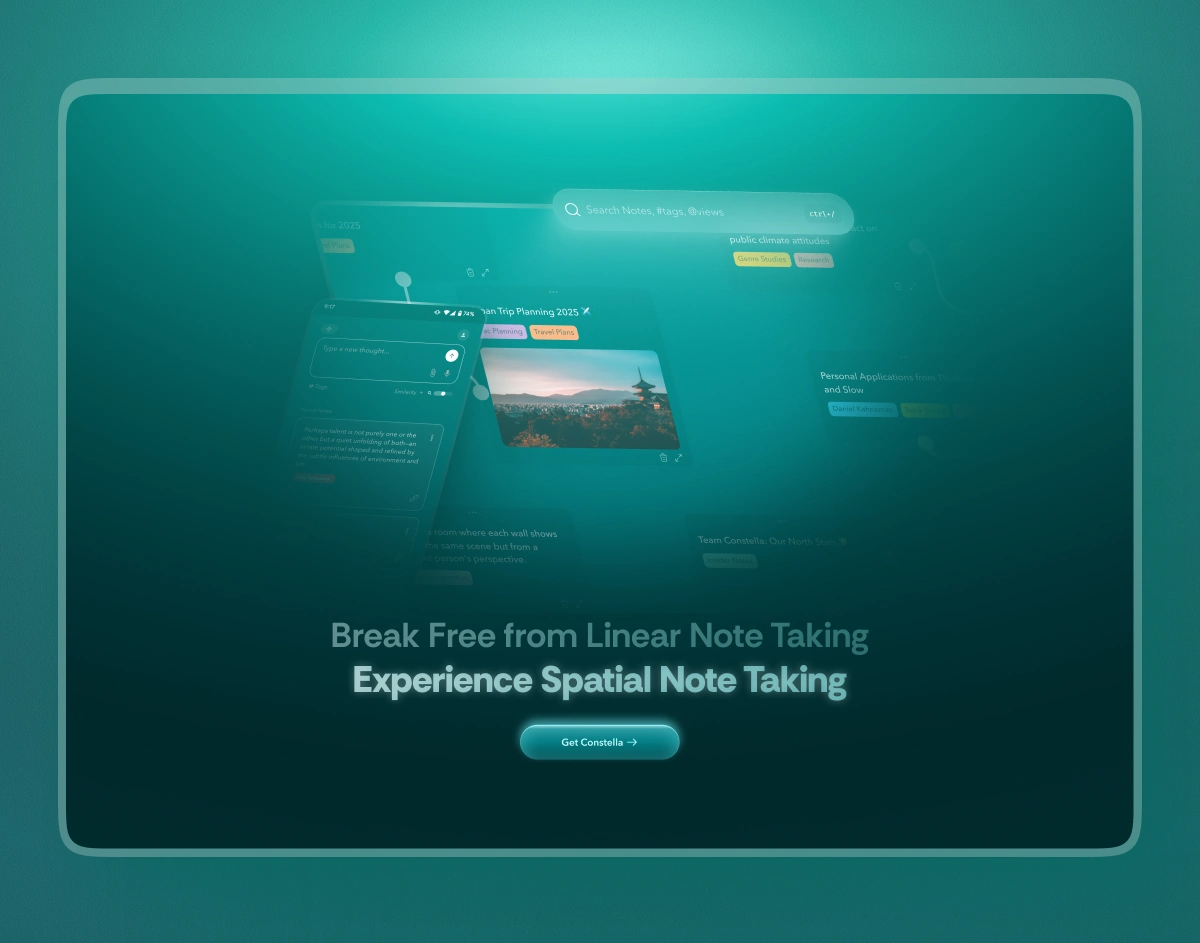
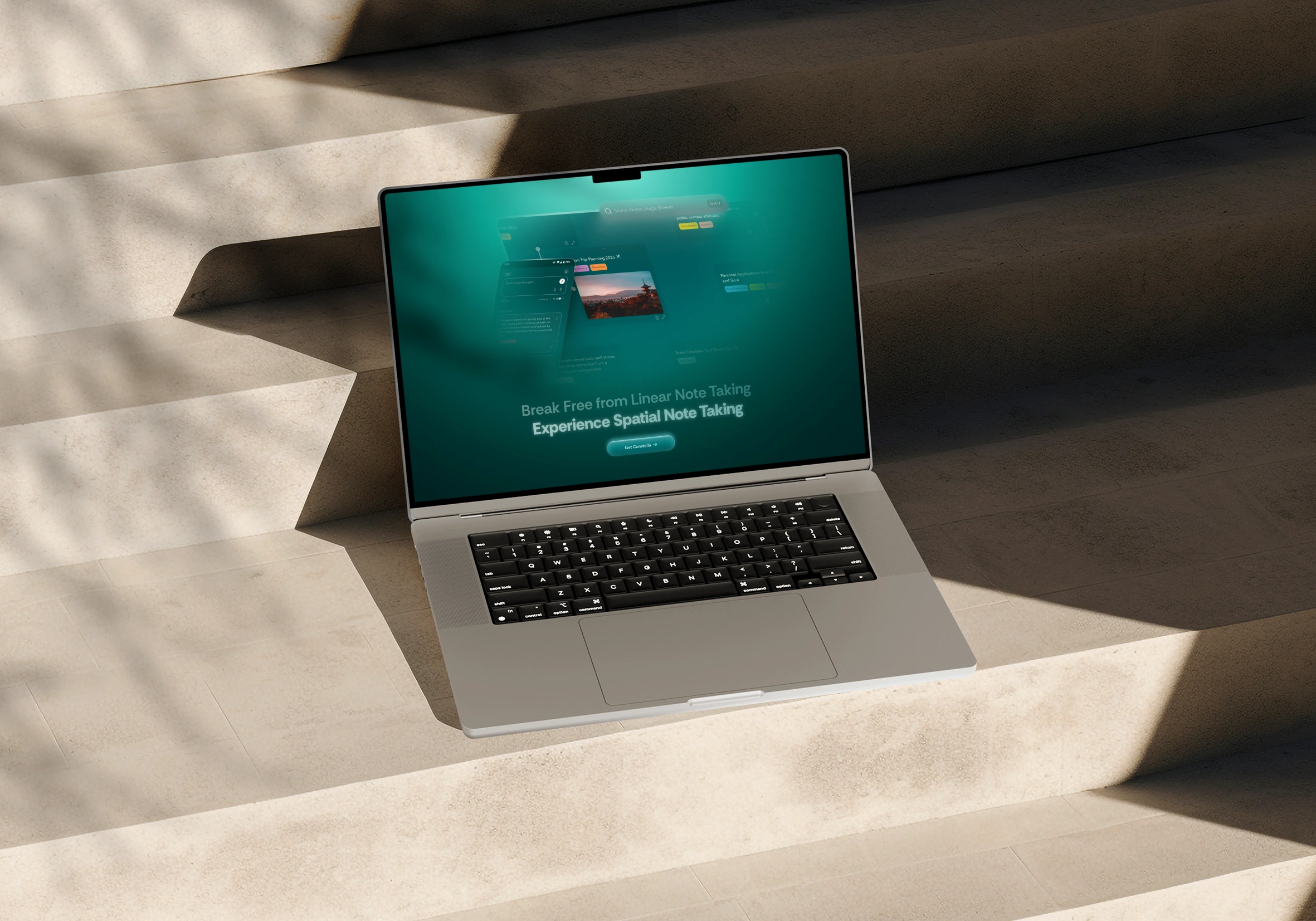
B. Replacing Generic Sections With Brand-Aligned Visuals
Constella’s real identity is spatial, calm, and atmospheric.
I replaced the generic white sections with consistent visual language:
Soft gradients
Subtle space-inspired depth
A smoother flow from hero to content
Fewer distractions, more meaning
C. A Footer That Feels Complete
The footer now includes:
Clean grouping
Confident spacing
Better structure
A clearer brand presence
After:
This brings a sense of closure and professionalism to the page.
Redesigned Foter
4. The Outcome
The redesign did not change the original brand vision.
It aligned it.
Clearer messaging
A hero that tells the story instantly
Visual language that reflects the actual product
A calmer, more trustworthy landing experience
Consistency across sections
A page that feels like Constella, not just a placeholder
Constella now has a landing page that communicates the right identity from the first second.
Like this project
Posted Nov 22, 2025
Turned a mismatched landing page into a clear, premium entry point that reflects Constella’s spatial thinking model and improves first-section clarity.
Likes
1
Views
2