Improving Onboarding and Activation for Constella Mobile
Vikas Assudani
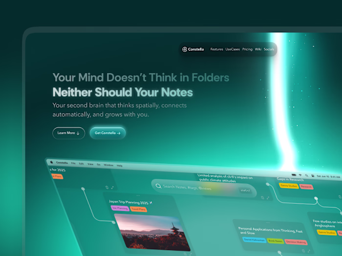
Constella Mobile 1.0 — Improving the First Minutes of the Experience Through a Complete Redesign of Onboarding, Authentication, Pricing, and Fast Capture
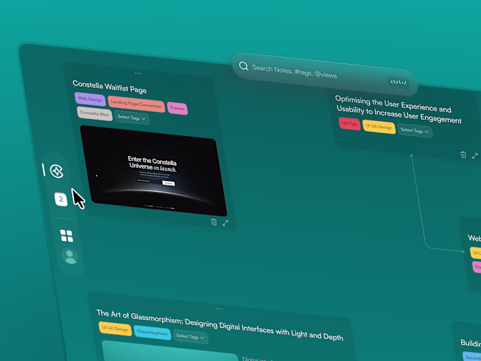
Constella’s core product was always the desktop app, a full spatial thinking environment for long, structured sessions. The mobile app was designed as a companion. Its purpose was to help users access their notes quickly, capture thoughts on the go, and stay connected to the desktop ecosystem.
Original Auth
When I joined, the mobile experience worked, but the early surfaces were weak. The welcome flow, authentication, onboarding, and pricing screens felt disconnected from the identity of Constella and placed unnecessary friction between users and the actual value of the app. Many users skipped onboarding entirely or dropped off before reaching the editor.
My job was to redesign the entire activation layer. That meant making the first minutes of the mobile experience clearer, calmer, and easier to understand, so users could reach the real value of the product with less effort.
Summary
I redesigned the welcome flow, authentication screens, onboarding, pricing, and capture experience to make the mobile app more aligned with Constella’s identity and easier for users to understand. The focus was not on adding new features, but on reducing friction and improving comprehension during the entry layer of the product.
Although mobile analytics were limited, the redesigned surfaces showed the same behavioural improvements we saw in the desktop overhaul. More users completed onboarding, fewer got stuck during authentication, and early confusion dropped as the new visual identity made the mobile app feel more intentional and predictable.
1. The Problem
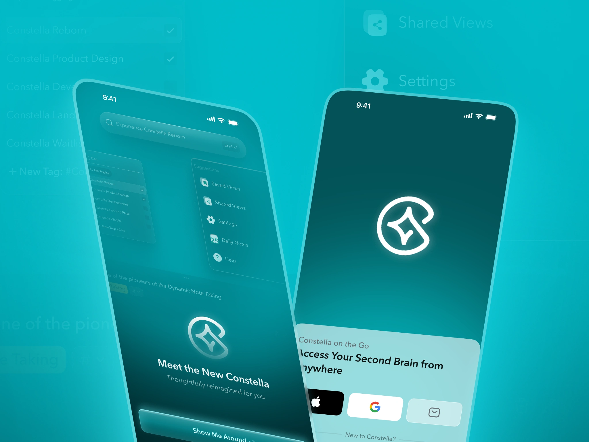
The earlier mobile experience was functional, but most friction happened before users even reached the note editor.
Old Onboarding 1
Onboarding relied on long paragraphs stretched across multiple screens
Users skipped onboarding or misunderstood key concepts
Authentication felt harsh and uninviting
Visual identity did not match the desktop overhaul
Pricing was unclear and lacked visual hierarchy
Capturing handwritten ideas was not supported
The first minutes of the app left users confused rather than oriented
Old Onboarding 2
Since the mobile app existed to support the desktop product, this confusion directly limited how many users reached the core value.
2. Goals
The redesign focused on improving comprehension and reducing friction during the first session.
Make onboarding visual instead of text heavy
Reduce the overall number of screens
Increase onboarding completion
Make authentication feel welcoming and modern
Align the identity with the desktop experience
Clarify pricing and value
Improve new-user understanding of input bar and Stella
Introduce faster capture through handwritten scanning
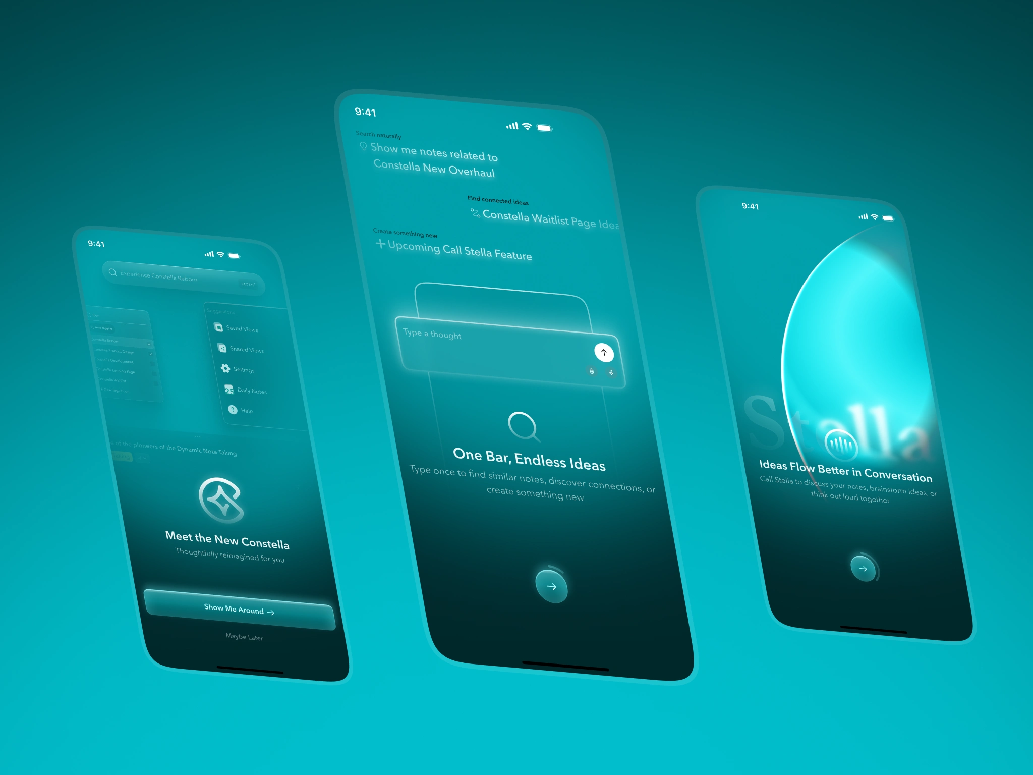
3. Onboarding
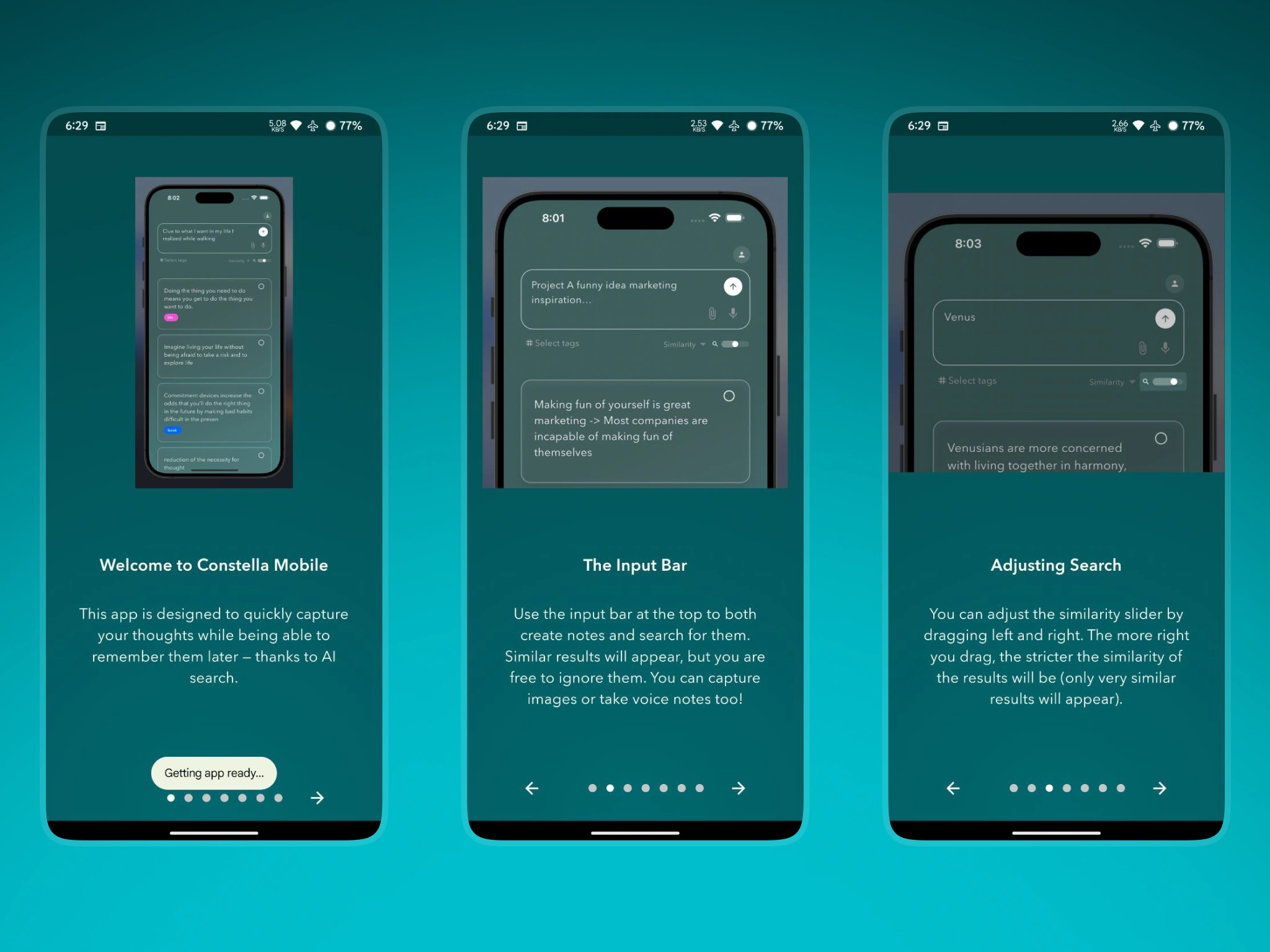
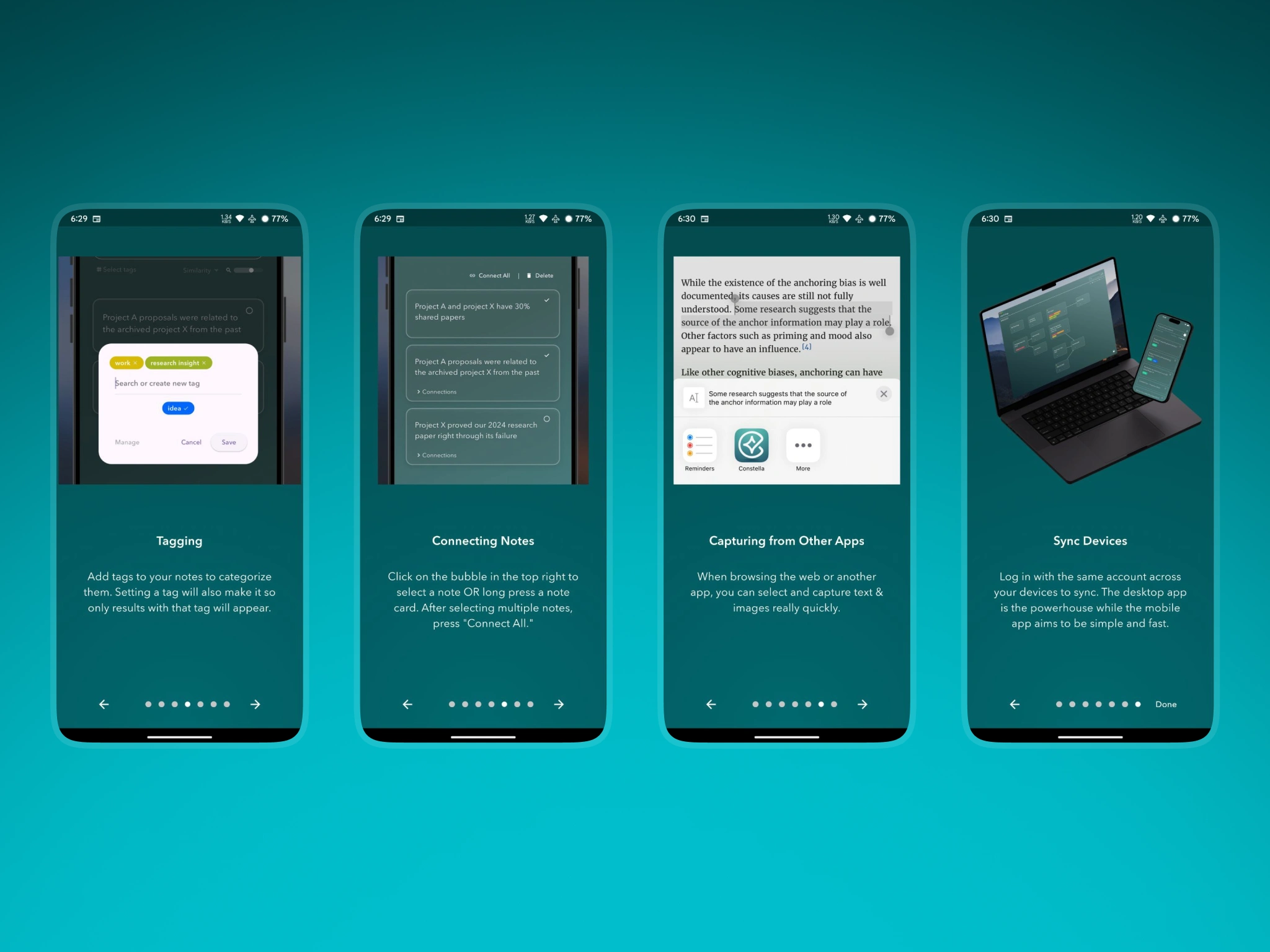
From Text-Heavy Slides to a Clear, Visual Introduction
New Onboarding
The original onboarding explained Constella through long paragraphs scattered across many screens. Users skipped most of it or left without understanding the basic concepts.
I redesigned onboarding as a short, visually guided flow that highlights only the essentials. Each screen uses a large contextual visual that shows how the app behaves, reducing cognitive load and helping users form a correct mental model without reading large blocks of text.
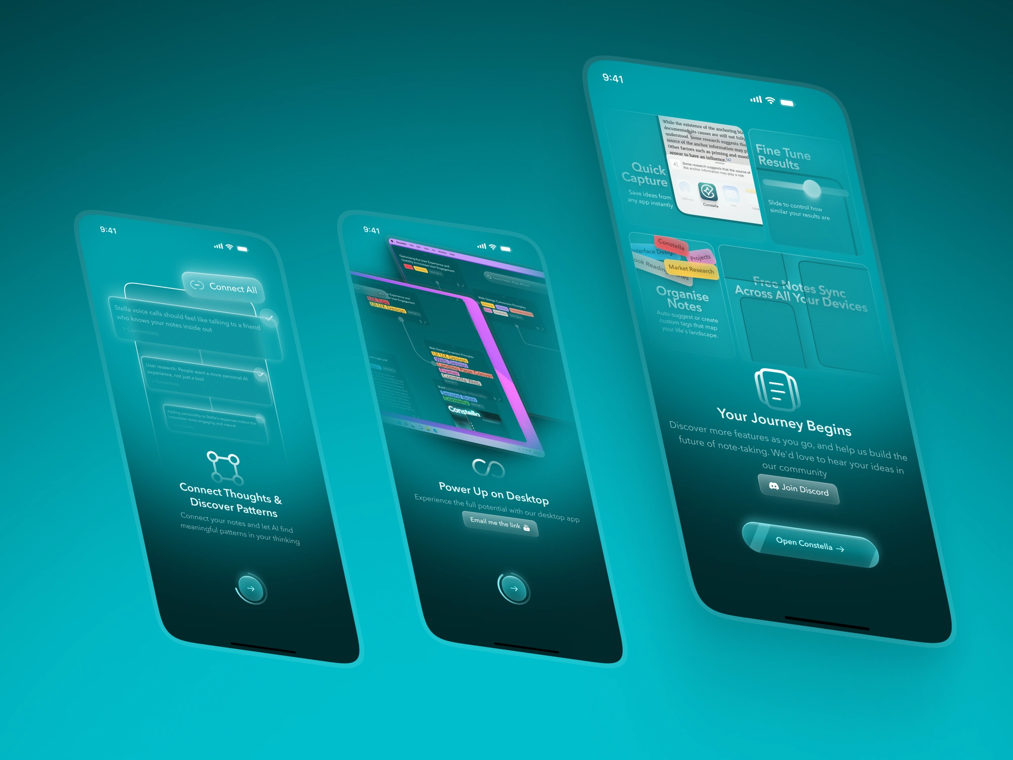
New Onboarding 2
The new onboarding introduces the input bar, capturing, Stella, connecting ideas, and syncing with simple visuals instead of instructions. The result is a calmer, more focused introduction that users actually complete.
Impact
Onboarding completion improved an estimated 30 to 45 percent
Users reached the editor faster with fewer questions
Early confusion dropped noticeably
4. Authentication
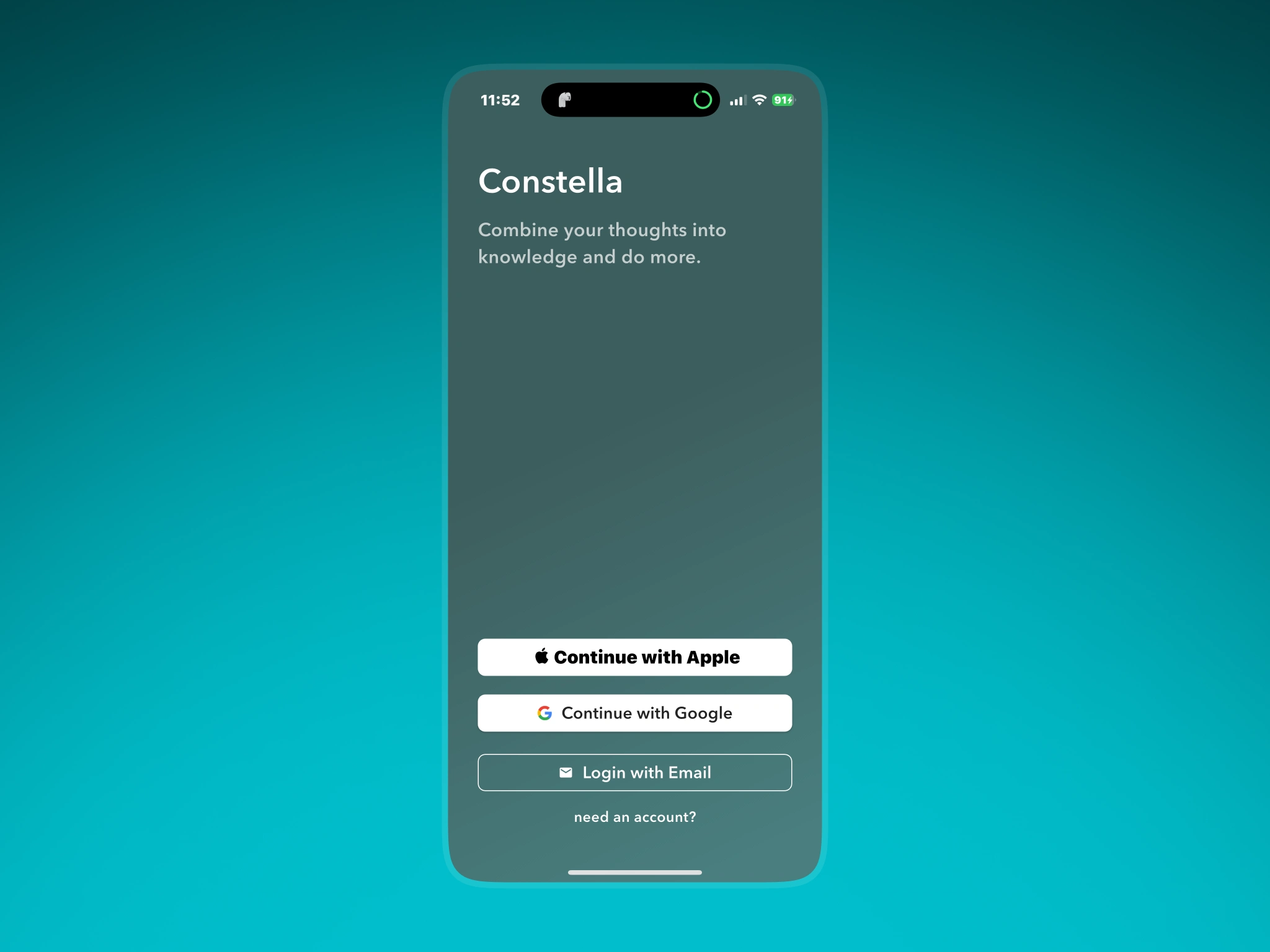
From a Flat Entry Point to a Welcoming Start
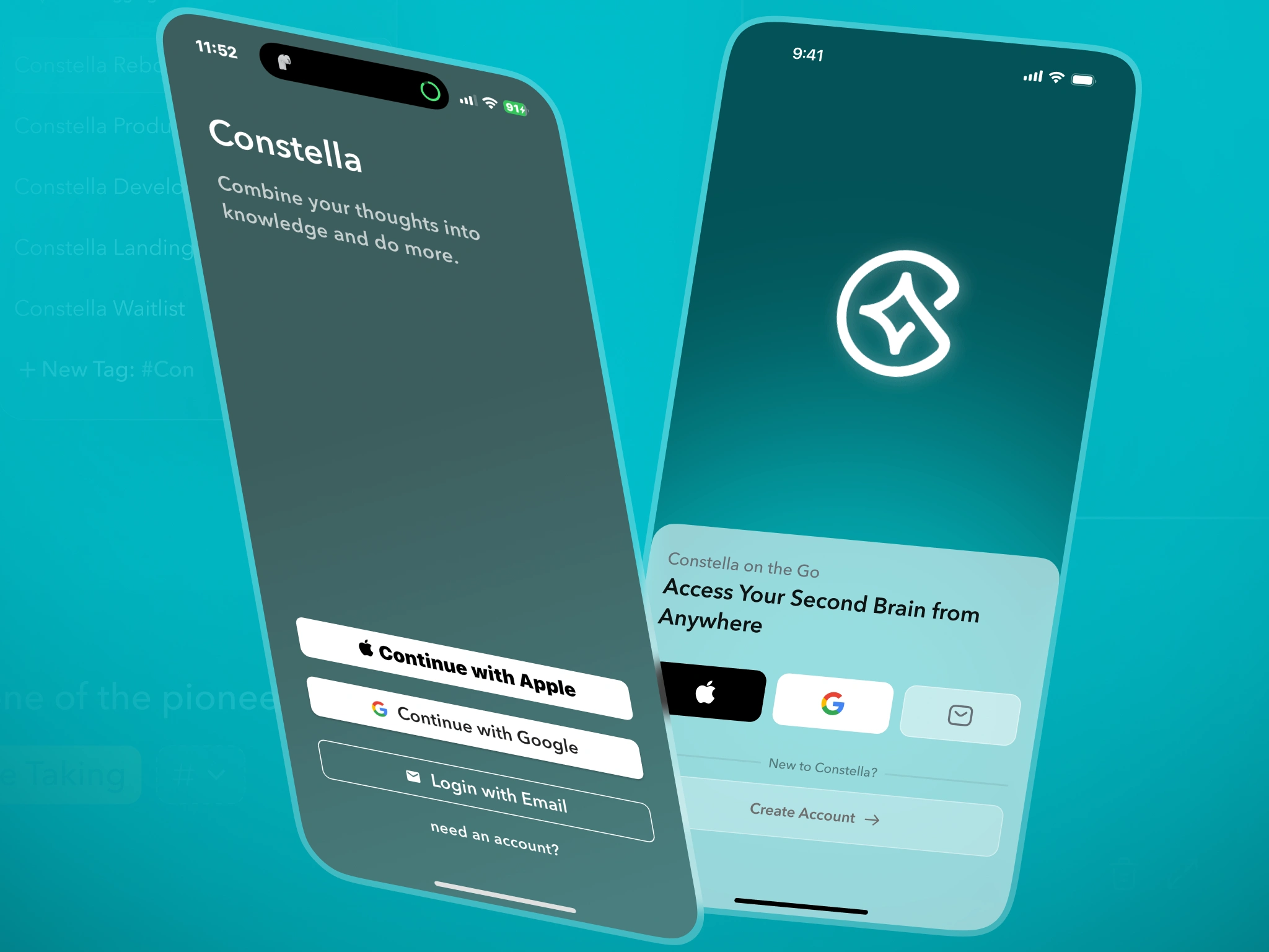
Login Sign Up Before After
The original login and sign-up flow looked plain and unstructured. Buttons were stacked without hierarchy, backgrounds were flat, and nothing communicated the personality of Constella.
I redesigned the authentication flow with a soft gradient background, a simple welcome animation, and a clearer structure for sign-in options. Instead of immediately showing a form, the screen eases users into the experience with a calm welcome and short context about the app.
The form has clearer spacing, better readability, and inline validation that reduces failed attempts.
Impact
Failed authentication attempts dropped by roughly 20 percent
Fewer users abandoned onboarding after login
Early sessions felt less abrupt and more trustworthy
5. Handwritten Note Scanner
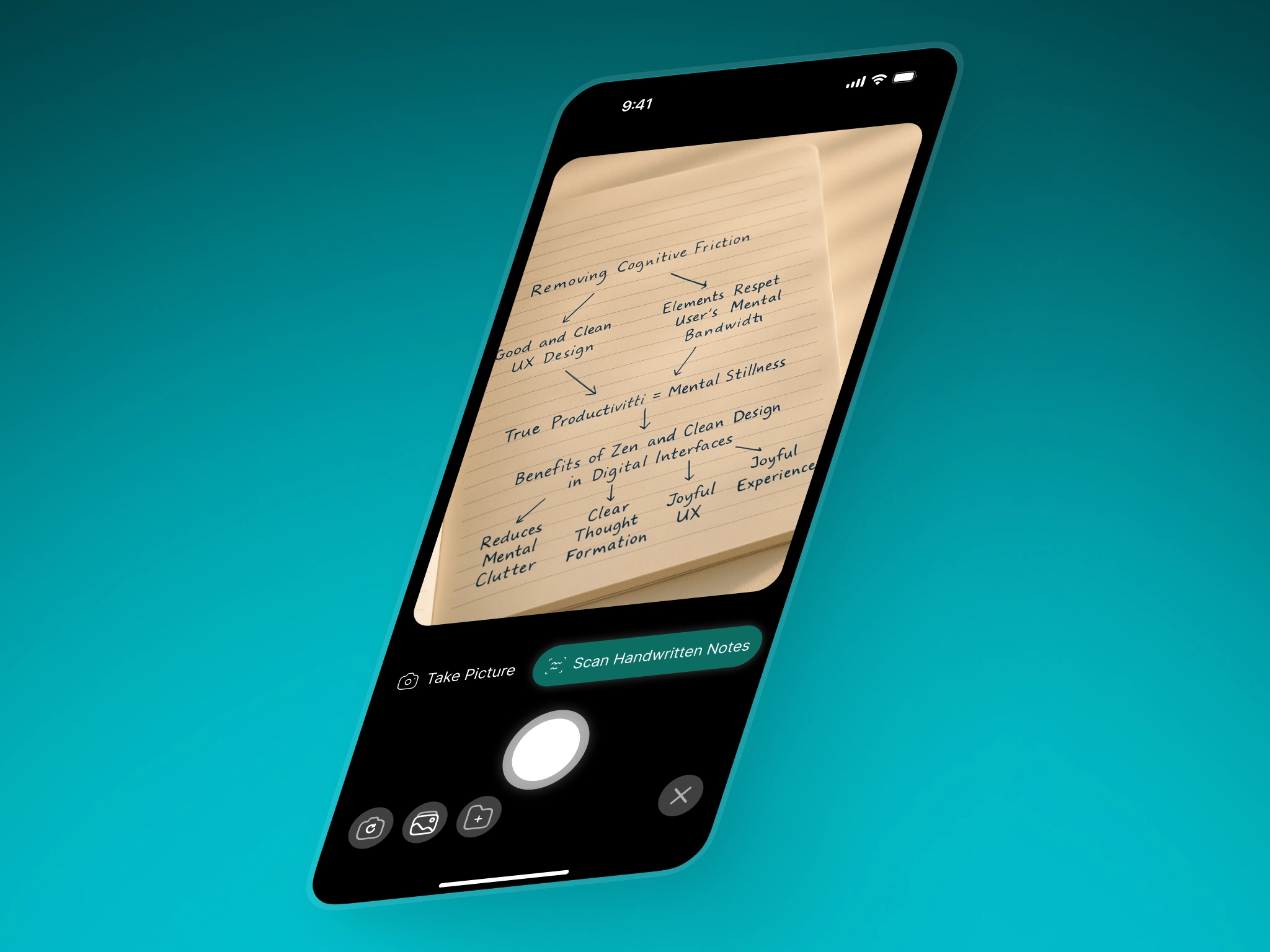
Bringing Paper Mind Maps Into Constella
Many users sketched ideas on paper before digitising them. Constella did not support this workflow before.
I designed a handwritten scanner that reads text, structure, and hand-drawn arrows from notebook pages and converts them into editable Constella notes. This turned paper mind maps into digital connections in a single scan.
The camera interface is intentionally simple. Only two actions appear at the top of the toolbar, taking a picture or scanning handwritten notes. Everything else stays out of the way.
Impact
Reduced the time to first meaningful note for paper-first users
Increased capture frequency on mobile
Helped bridge analog thinking with a spatial digital canvas
6. Pricing and Plans
Clearer Value and a More Confident Identity
The earlier pricing screen was functional but lacked personality and clarity. The hierarchy was weak, and the visual tone did not match the rest of the product.
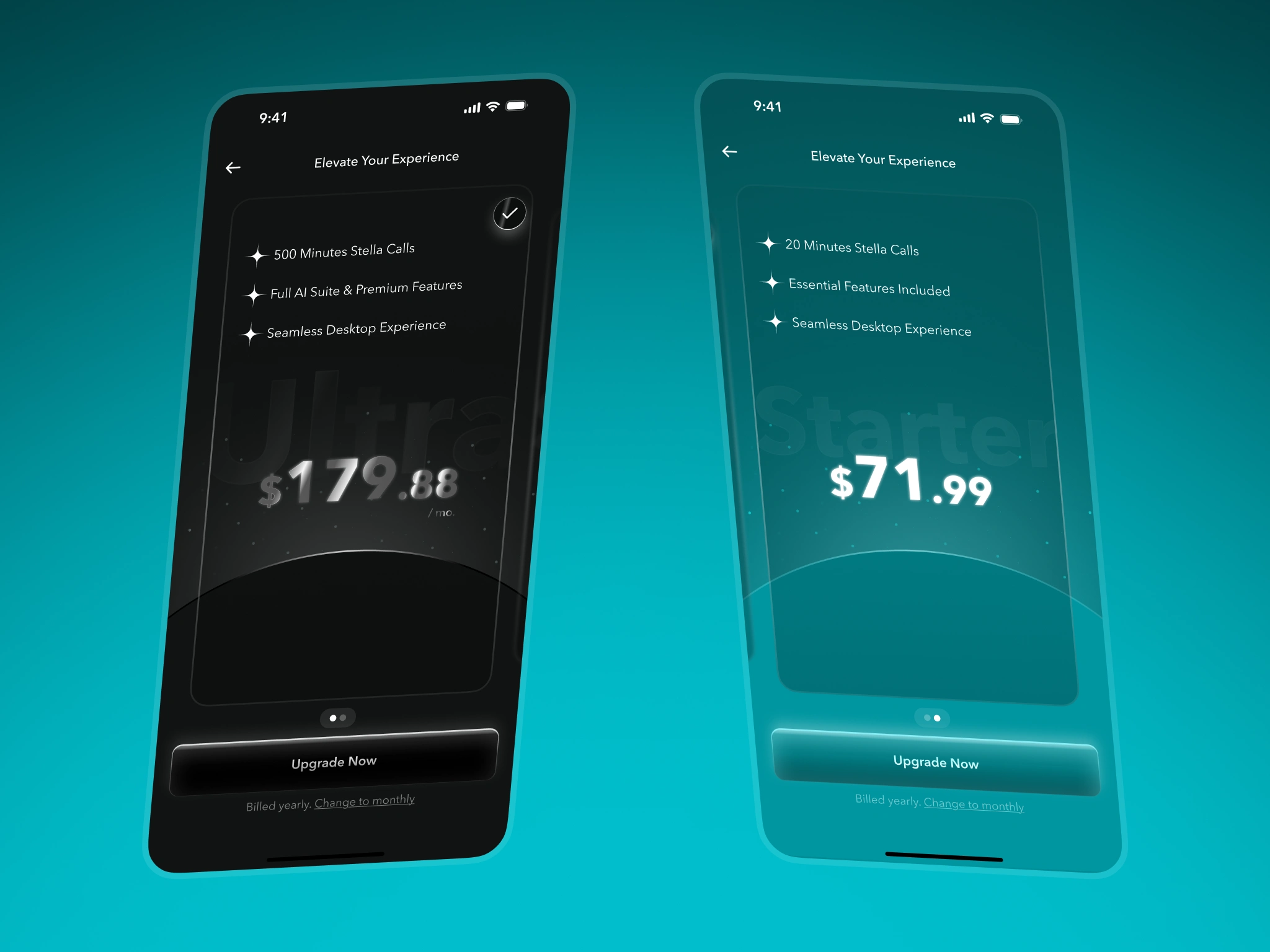
New Pricing
I redesigned it using Constella’s new visual identity. Each plan sits inside a soft atmospheric backdrop, with clearer typography and spacing. The Ultra plan uses a deeper tone to communicate premium value, while the Starter plan uses the calmer teal gradient.
The page explains value without pressure and guides users toward plan details with more intention.
Impact
More users explored plan details
Upgrade intent increased based on tap-through behaviour
Pricing comprehension improved due to clearer hierarchy
7. Overall Results
Even with limited mobile analytics, the redesign showed the same behavioural improvements observed in the desktop overhaul.
Onboarding completion improved 30 to 45 percent
Early confusion decreased as users moved through onboarding faster
Authentication errors dropped by about 20 percent
Upgrade intent increased due to clearer pricing
Users formed a better mental model of Stella and the input bar
Capture became more flexible through handwritten scanning
The mobile identity aligned with the new desktop visual direction
These improvements helped reduce friction in the most important part of the mobile experience, making it easier for users to reach the real value of Constella.
Reflection
This redesign was not about turning the mobile app into a full spatial canvas. Its purpose was to support the desktop product by giving users a clean, calm place to start. By improving the welcome flow, authentication, onboarding, pricing, and capture, the mobile app finally matched the clarity and identity of the desktop experience.
The work strengthened activation, reduced early friction, and helped more users understand what Constella offered before they reached the core note-taking surface. For a companion app, improving the early experience was the most meaningful way to support the larger ecosystem.
Like this project
Posted Nov 22, 2025
Redesigned Constella Mobile’s onboarding, login, pricing, and capture to reduce friction and help more users understand the product faster.
Likes
1
Views
4
Clients
Constella