How I Redesigned a Spatial Second-Brain MVP
Vikas Assudani

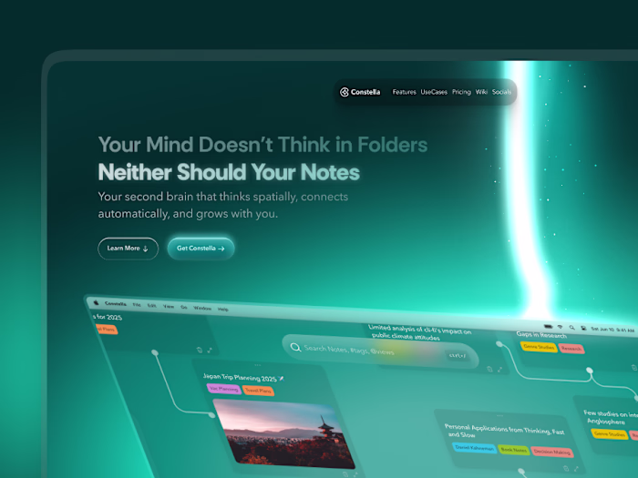
Turning a Functional MVP Into a Real Spatial Thinking Tool
Constella always had a strong idea behind it: a space where notes are not just text but part of a larger thinking environment. The first version struggled to deliver that. There were too many menus, too much UI, and not enough space to actually think.
I stepped in to help shape it into something clearer and easier to live inside. The goal was not to reinvent the product, but to give it the structure and atmosphere it was missing.
Summary
Once the core idea was established, the next challenge was making Constella usable for real thinking. The MVP worked on a basic level, but the experience made it hard to stay focused. The canvas did not have enough space, the tools competed for attention, and interactions did not feel natural.
The redesign moved the product toward a calmer and more predictable environment. Notes, movement, and search started working together instead of pulling users in different directions. These changes directly improved how people used the product.
The updated experience increased search usage by 45–60 percent, improved first-session activation by 25–35 percent, reduced confusion by 70–90 percent, and helped drop churn from 23 percent to 10 percent. Same foundation, but finally an experience people could think inside.
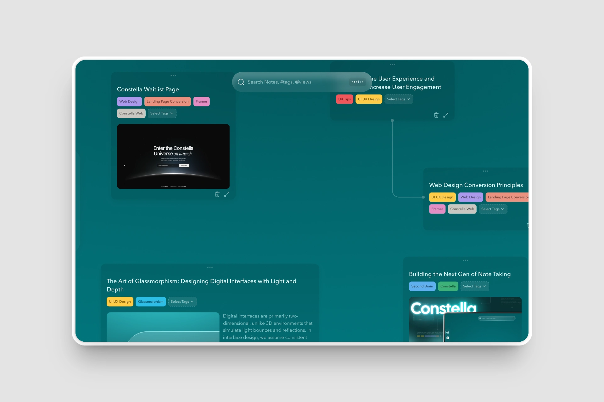
Original MVP
1. The Problems With the MVP
When I joined, the product worked on paper, but the experience pushed against users instead of supporting them.
Clutter everywhere
The top bar had seven always-visible controls covering search and create, tags, journal, settings, a usage badge, and two search sliders
The Stella AI button was always visible in the bottom-right
Saved views, sync, and filters were never hidden
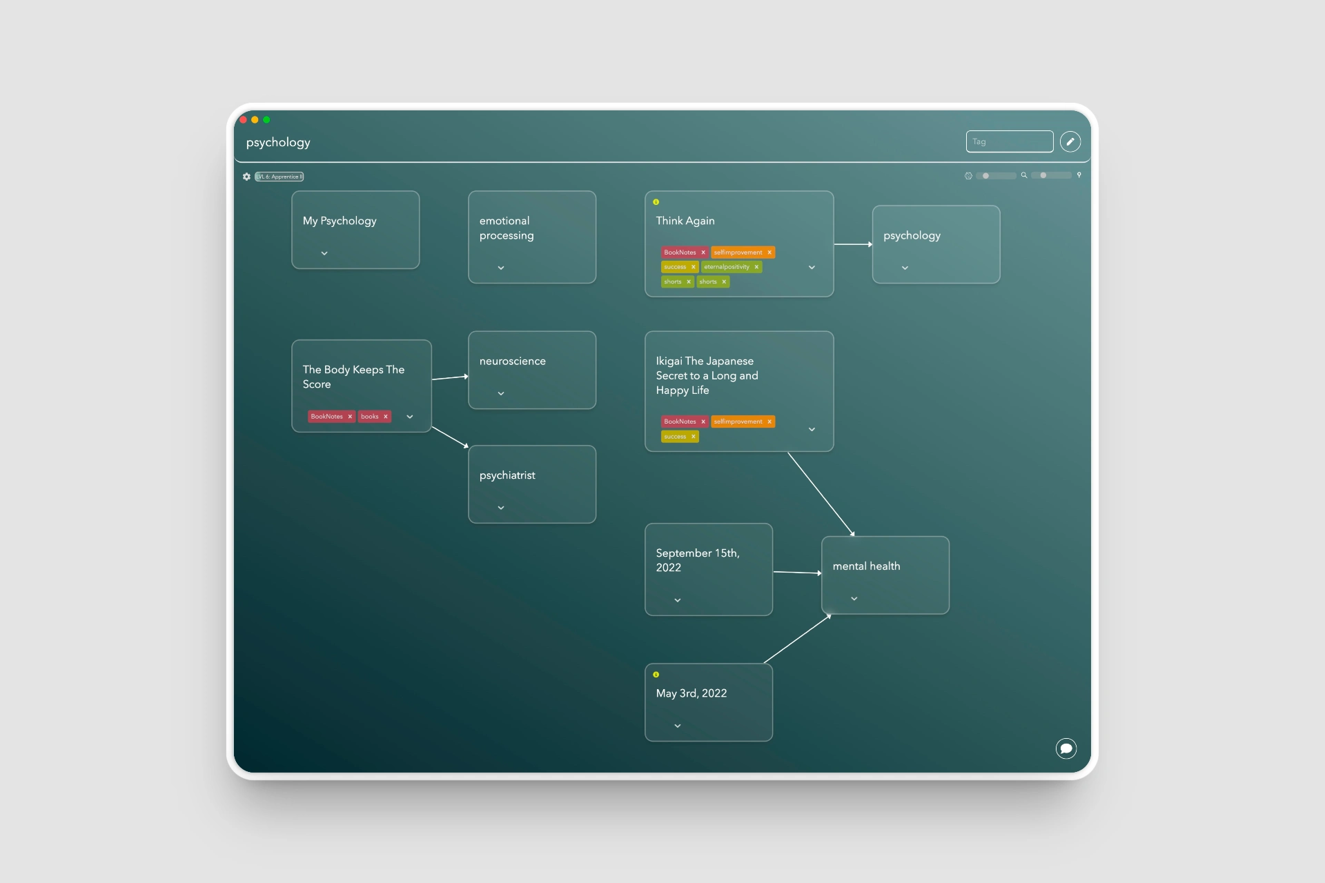
Constella 0.5 - Original Design as MVP
Canvas felt secondary
Most of the screen was taken by menus.
The actual thinking surface was squeezed into whatever space was left.
Interactions felt mechanical
Dragging, zooming, snapping, and expanding notes felt rough.
Opening a note required a double tap with no cue.
Deleting had no clear pattern.
No rhythm or hierarchy
Everything looked equally important.
Cards sat flat, tags were loud, and the canvas felt more like a diagramming tool than a thinking space.
Search was powerful but buried
Search handled both finding and creating notes, but it sat cramped among unrelated UI.
Users could not see how central it actually was.
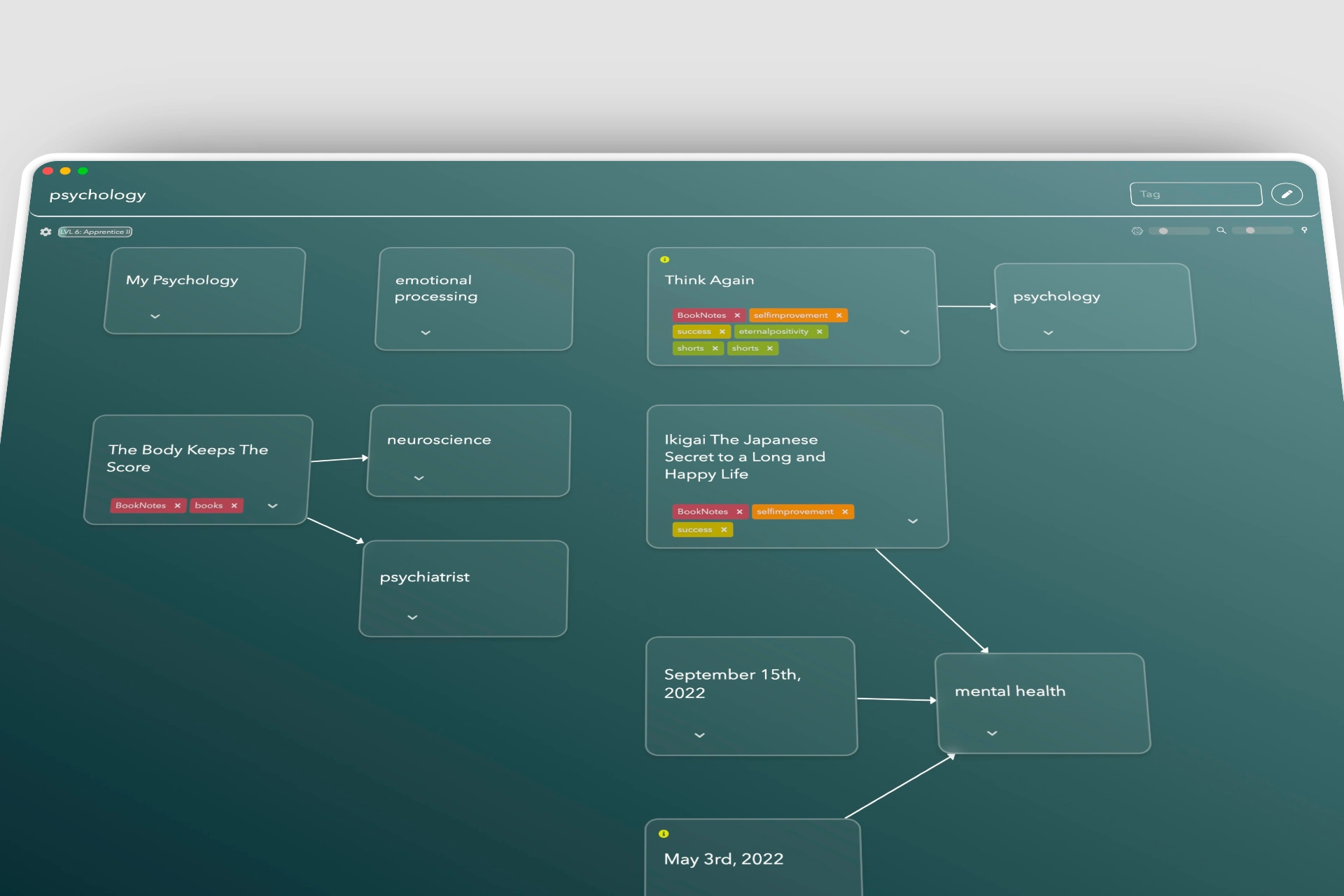
The starting point — functional, but flat and visually crowded.
2. What Success Looked Like
The goals were simple and practical:
Make the canvas the main surface again
Let tools appear only when needed
Reduce noise without removing capability
Improve interaction flow so movement feels natural
Give Constella a clearer and more intentional visual identity
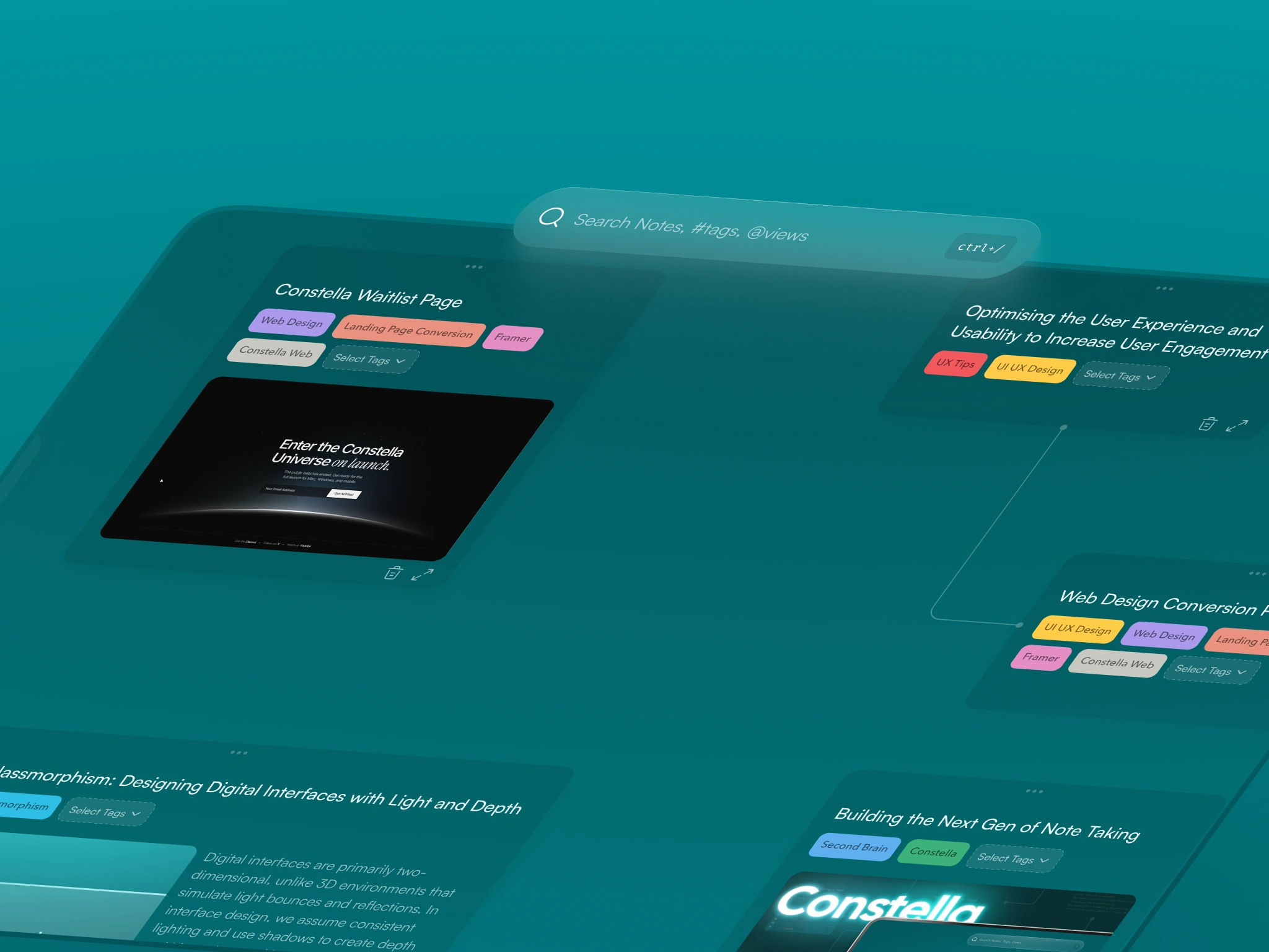
Hover Based Menus
3. What I Changed
A. Restructuring the Interface for Clarity
The first change was philosophical.
The canvas should use the whole screen, and tools should float above it instead of taking its space.
To achieve that:
Moved navigation, journal, settings, command bar, saved views, and sync into floating sidebars on the left and right
These appear only on hover
Search sliders show only when the user types
Removed the persistent bottom-right Stella button
This shift created most of the breathing room the product was missing.
Visible interaction points dropped by about 88 percent.
Constella 1.0 - The Reborn
B. Rebuilding the Canvas for a Real Thinking Flow
I redesigned how cards, tags, and lines behave:
Lines curve in a cleaner and more natural way
Cards sit with soft depth instead of lying flat
More spacing opens up the canvas
Tags no longer dominate the card visually
Card actions such as edit or delete appear only on hover
Opening notes feels intuitive, deleting is discoverable, and nothing competes for attention.
Navigation confusion dropped by 70–90 percent.
Search being the Strongest and Only Interactive Element Except Canvas and Notes
C. Search Became the Command Surface
Search was the strongest feature in the MVP, but no one could see it.
I moved search to the center as a floating glass bar:
No clutter around it
Handles both search and new-note creation
Filters appear only after typing
Reinforced the shortcut for fast access
This led to a 45–60 percent increase in search usage.
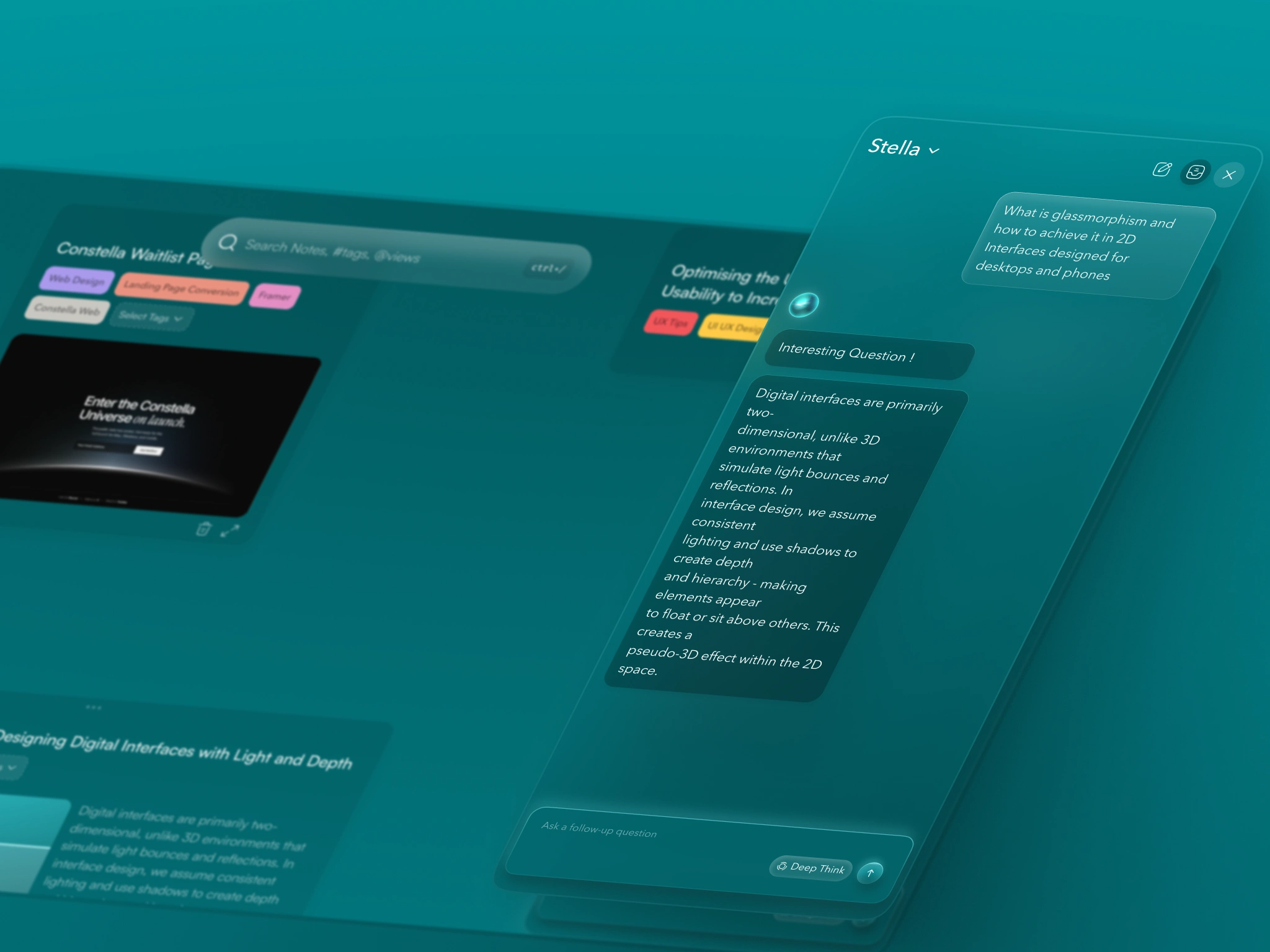
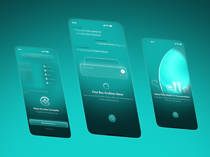
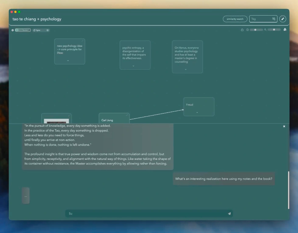
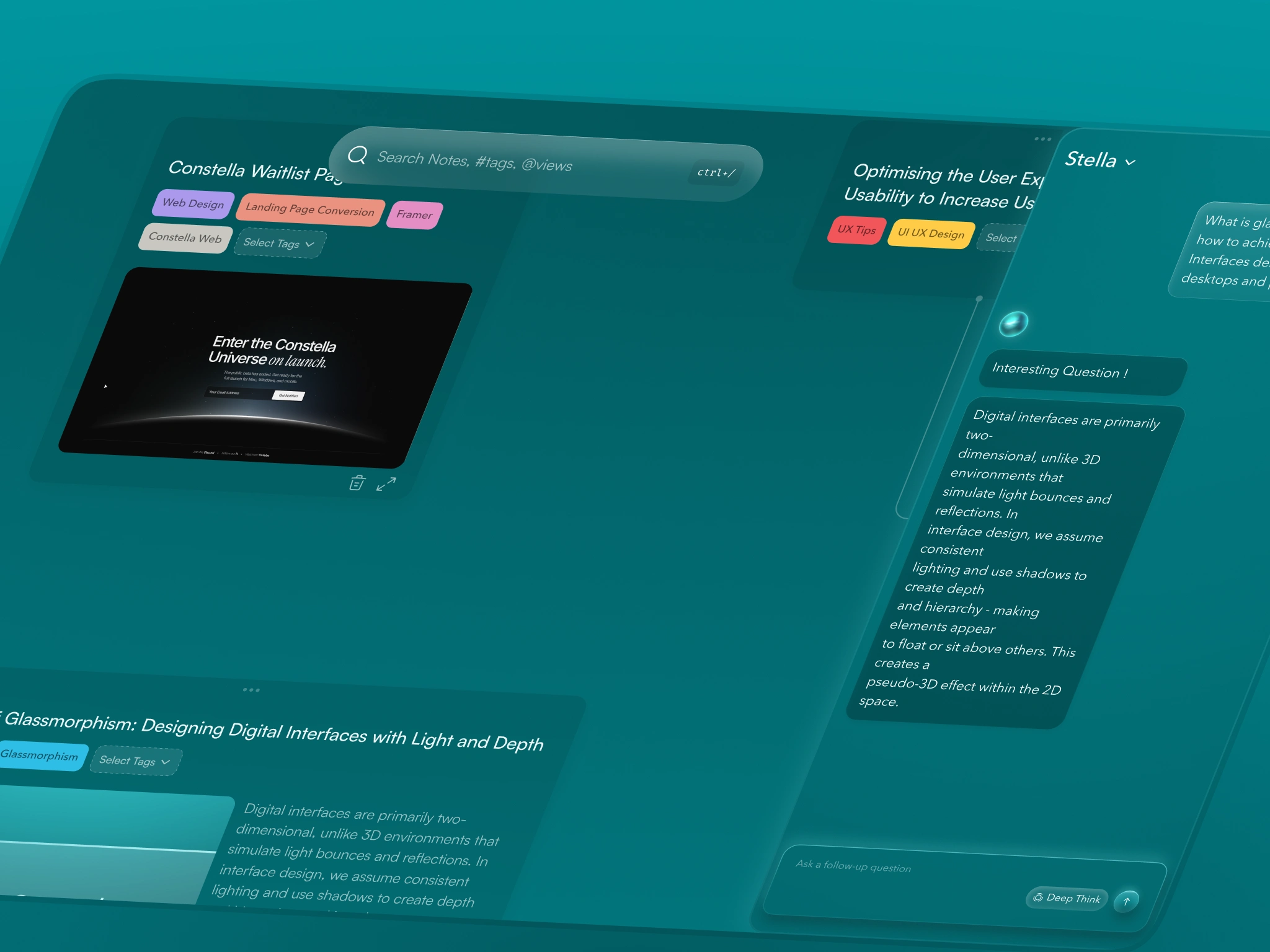
Stella
D. Stella AI Rebuild
In the old version:
Stella slid up from the bottom and took more than half the vertical space
It felt like a chat window
It broke the spatial layout
In the new version:
Stella slides in from the right and uses about 40 percent of the width
The canvas stays intact
The icon and personality feel more aligned with the product
It appears only when invoked
AI assistance now feels like part of the product instead of an add-on.
4. The Outcome
The structure of the product remained the same.
The note system remained the same.
But the experience is completely different.
The canvas feels like a real space to think in
Tools stay out of the way until needed
Motion is smoother and more predictable
Search finally feels central
The visual system is cleaner and more confident
Key results
88% reduction in visible UI interactions
45–60% increase in search usage
25–35% increase in first-session activation
70–90% reduction in navigation confusion
30–40% smoother interactions
Four to six times improvement in positive sentiment
Churn reduced from 23% to 10
These results came from making the experience calmer, clearer, and more intentional.
Canvas
Reflection
This was not a project about aesthetics.
It was about rebuilding how the product works so people can think in it naturally.
Once the structure, spacing, and motion were right, the rest followed.
The redesign did not change the core idea of Constella. It allowed the idea to show its full value.
This is the type of work I enjoy: taking a rough but promising MVP, understanding what makes it unique, and shaping it into a product people can actually live inside.
Like this project
Posted Nov 14, 2025
Turned Constella’s MVP into a calmer, clearer spatial canvas with smoother flow and a thinking experience users prefer.