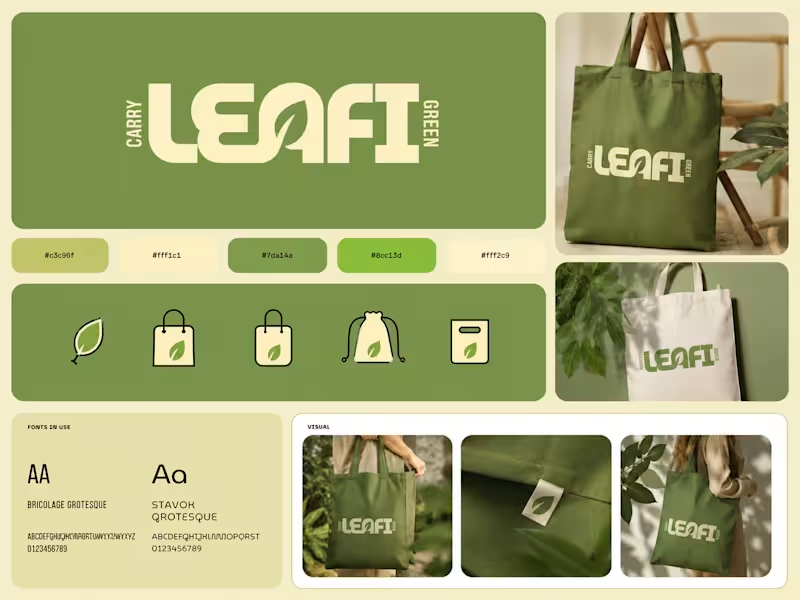
Pitch Deck Designer | Packaging Design | Branding | Web


Pitch Deck Designer | Packaging Design | Branding | Web
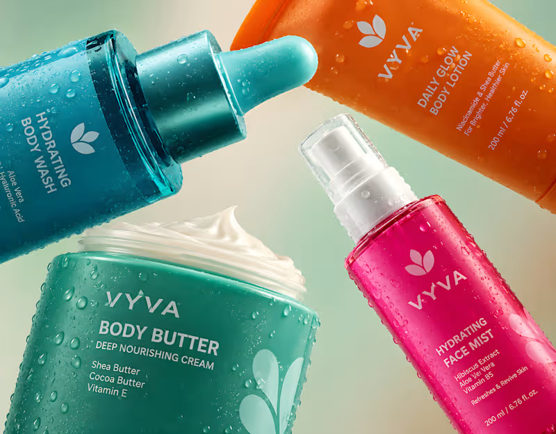
Bold skincare packaging and visual design created to give VYVA a fresh, distinctive shelf presence through vibrant colors, modern typography, premium product styling, and a cohesive visual identity inspired by freshness, hydration, and everyday self-care.
2
0
251
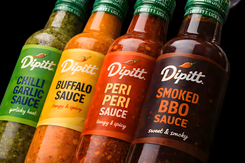
A bold and eye-catching Dipitt Sauce packaging design that blends vibrant visuals, modern typography, and distinctive branding. This food packaging redesign enhances product appeal, strengthens brand identity, and creates a memorable shelf presence.
1
213
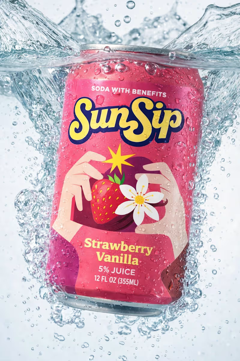
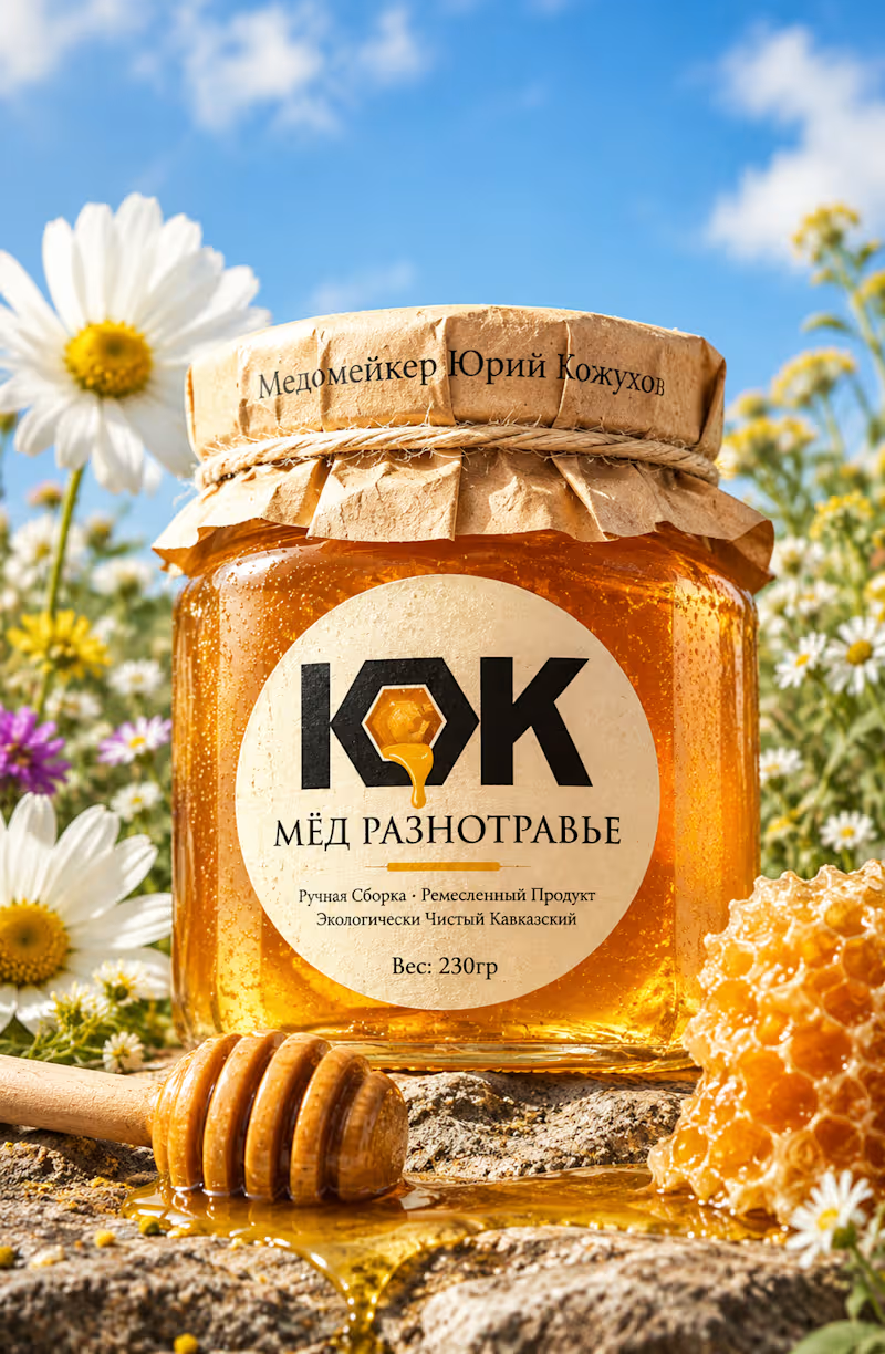

Identity & Packaging Systems Beyond Category Conventions
Identity & Packaging Systems Beyond Category Conventions

Logo Designer for Businesses Ready to Scale
- $•••••
- Earned
- 5x
- Hired
- 5.0
- Rating
- 106
- Followers
Logo Designer for Businesses Ready to Scale

HealthSense Brand Identity
A brand identity project I worked on in March 2026 for HealthSense, a Singapore-based health and wellness information brand focused on making health knowledge clear, accessible, and easy to understand.
The client envisioned something simple, clean, and modern, but with meaning behind it. I explored a minimal wordmark with a medical cross integrated into the lettering, creating a direct connection to healthcare while keeping the identity clear, professional, and memorable.
7
9
815
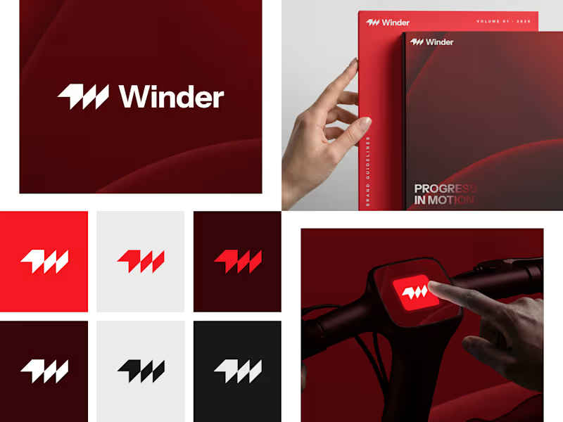
Winder is a bold brand identity built around a geometric W-inspired symbol, combining sharp angles and forward movement to represent progress, speed, and direction.
The identity uses a striking red and deep burgundy palette, supported by clean typography and a consistent visual system across brand guidelines, digital applications, and product mockups.
Progress in Motion.
76
100
5.9K
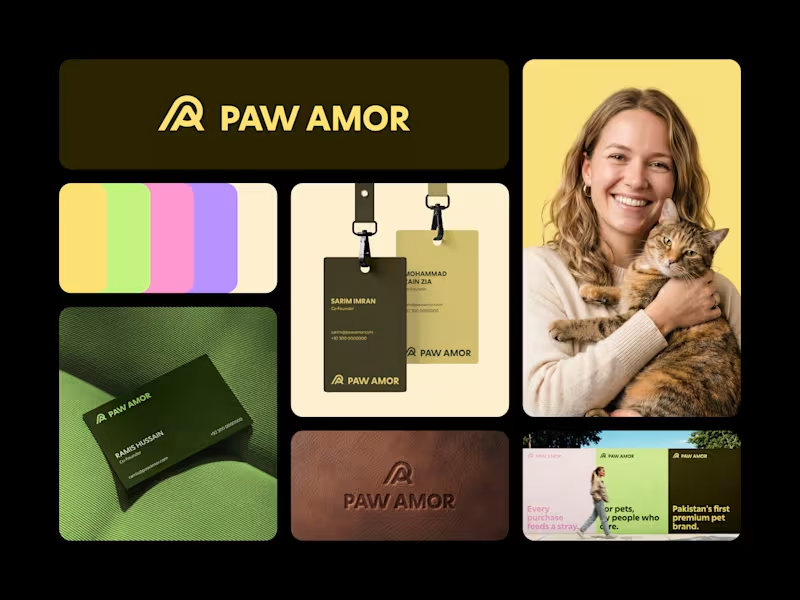
Paw Amor Brand Identity
A premium pet accessories brand concept from Pakistan, designed around the idea of connection between pets and their owners.
The PA monogram represents two forms coming together, inspired by warmth, closeness, and a subtle embrace.
I wanted the identity to feel premium and refined without becoming overly cute or playful, while still feeling warm and approachable.
Logo, color system, business cards, tags, packaging, and campaign applications.
2
4
583



Brands, Visual Identity & Digital Design
- $•••••
- Earned
- 2x
- Hired
- 5.0
- Rating
- 29
- Followers
Brands, Visual Identity & Digital Design

Branding and Marketing Strategist
- $1k+
- Earned
- 3x
- Hired
- 5.0
- Rating
- 26
- Followers
Branding and Marketing Strategist



Top 1% Brand Designer and Content Lead
Evmize - Visual Identity
Evmize is an ecommerce brand focused on premium accessories to customize electric vehicles from a Tesla to Rivian and Polestar.
They reach me with a clear challenge: create a visual identity that communicates Evmize’s core values of modernity, elegance and simplicity, while resonating with forward‑thinking EV riders who care as much about aesthetics as performance.
All design elements were carefully chosen and crafted to convey Evmize’s brand values, including modernity, elegance, and simplicity.
4
4
374


UX/UI | Framer Designer & Developer | SaaS, Startup Websites

UX/UI | Framer Designer & Developer | SaaS, Startup Websites
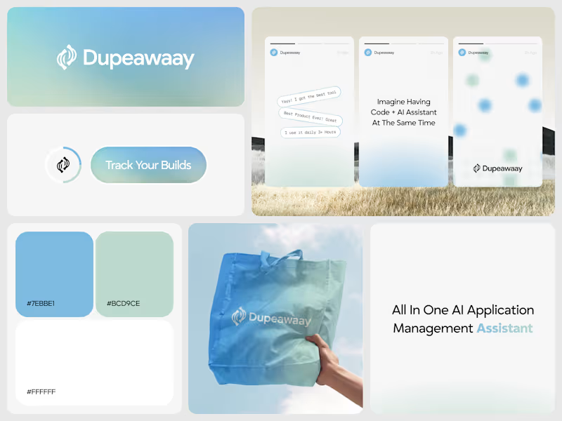
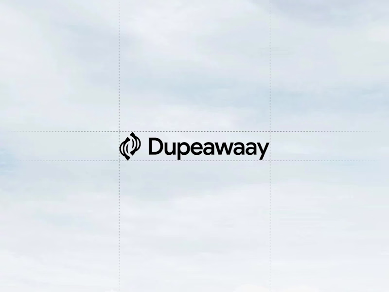
Just wrapped up this logo design for Dupeawaay.
The goal was to create a clean, memorable identity that feels modern, trustworthy, and easy to recognize across digital platforms. I explored a simple geometric approach, focusing on balance, scalability, and a strong visual presence without overcomplicating the mark.
Always enjoy the challenge of turning an idea into a logo that feels both distinctive and timeless.
Would love to hear your thoughts 👇
8
10
802

I Design What People Remember. Not Just Pretty.
- 1x
- Hired
- 5.0
- Rating
- 79
- Followers
I Design What People Remember. Not Just Pretty.
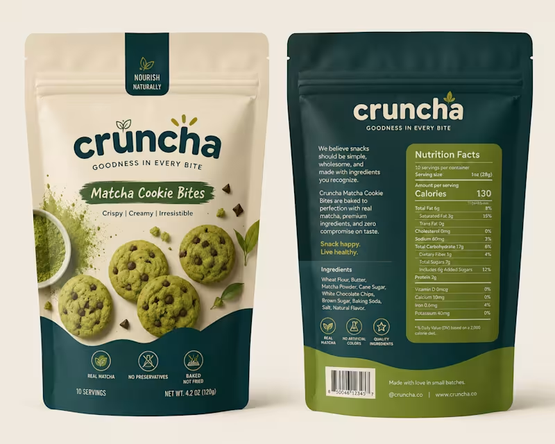
Behind the Design ✦
This concept started with one goal: make the packaging feel as good as the product itself.
I wanted to move away from the usual bright-green matcha aesthetic, so I explored a mix of warm ivory, deep teal, and muted olive — giving it a more premium yet approachable feel.
The bold typography adds personality, while the curved color blocks and ingredient photography give the packaging a distinctive shelf presence.
Piece by piece, the colors, typography, imagery, and packaging style came together to create something that feels fresh, playful, premium, and memorable.
Sometimes the final design looks simple — but there’s a lot of thought behind every detail. ✦
2
334
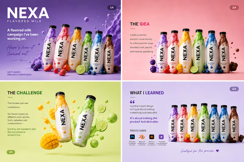
Been working on this one for a while, and I’m finally happy with how it turned out. 🥛✨
This was a fun product design project for a fictional flavored milk brand — NEXA.
The goal was simple: make each flavor feel bold and delicious while keeping the entire range visually connected.
The challenging part was getting the little things right — the liquid splashes, fruit placement, lighting, shadows, colors, and overall composition. It’s easy to add elements to a design. It’s much harder to make everything feel like it belongs together.
One thing I took away from this project: good product visuals aren’t just about making something look good. They’re about making people want to reach for the product.
I also experimented with a mix of 3D, Photoshop, Illustrator, and AI-assisted creative exploration to bring the concepts together.
Pretty happy with where this landed. 👀
Which flavor would you pick? 🍓🥭🍋🫐🍫
#ProductDesign #PackagingDesign #3DDesign #GraphicDesign #CreativeProcess #BrandDesign #ProductVisualization #VisualDesign #AdobePhotoshop #Blender #DesignerLife
2
6
411
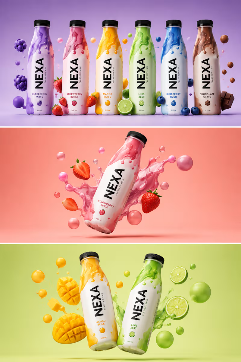
𝐁𝐄𝐇𝐈𝐍𝐃 𝐓𝐇𝐄 𝐃𝐄𝐒𝐈𝐆𝐍
𝑨 𝑵𝑬𝑾 𝑷𝑹𝑶𝑱𝑬𝑪𝑻. 𝑨 𝑵𝑬𝑾 𝑪𝑯𝑨𝑳𝑳𝑬𝑵𝑮𝑬.
Every project teaches you something.
This time, it was about creating a beverage brand that feels bold, playful, and unforgettable.
The goal was simple: design a brand that stands out on the shelf and connects instantly with the right audience.
🎯 𝐌𝐘 𝐀𝐏𝐏𝐑𝐎𝐀𝐂𝐇
Bold Contrast – Each flavor has its own identity.
Fluid Patterns – Inspired by energy and motion.
3D Visuals – To make the product look alive and irresistible.
Storytelling Through Color – Every shade has a purpose and a mood.
💡𝐖𝐇𝐀𝐓 𝐈 𝐋𝐄𝐀𝐑𝐍𝐄𝐃
• Design is not just about looks, it’s about emotion.
• The right colors and composition can make a product speak.
• Patience, details, and iteration always pay off.
𝐀𝐍𝐎𝐓𝐇𝐄𝐑 𝐒𝐓𝐄𝐏 𝐅𝐎𝐑𝐖𝐀𝐑𝐃.
𝐀𝐍𝐎𝐓𝐇𝐄𝐑 𝐋𝐄𝐒𝐒𝐎𝐍 𝐋𝐄𝐀𝐑𝐍𝐄𝐃. 𝐎𝐧 𝐭𝐨 𝐭𝐡𝐞 𝐧𝐞𝐱𝐭. →
TOOLS USED: Adobe Photoshop, Adobe Illustrator
FOCUS
• Brand Identity
• Color Psychology
• 3D Composition
𝐓𝐈𝐌𝐄 𝐒𝐏𝐄𝐍𝐓
Concept to Final – 2 Days
Grateful for the process. Excited for what’s next.
#graphicdesigner #brandidentity #branddesign #packgaing #barnding #designer
1
176