Built with Jitter
Tandem: Bringing two worlds together to keep businesses moving
Portfolio project

Hiring people is only the beginning. Keeping a workforce running is where the real work begins.
The project
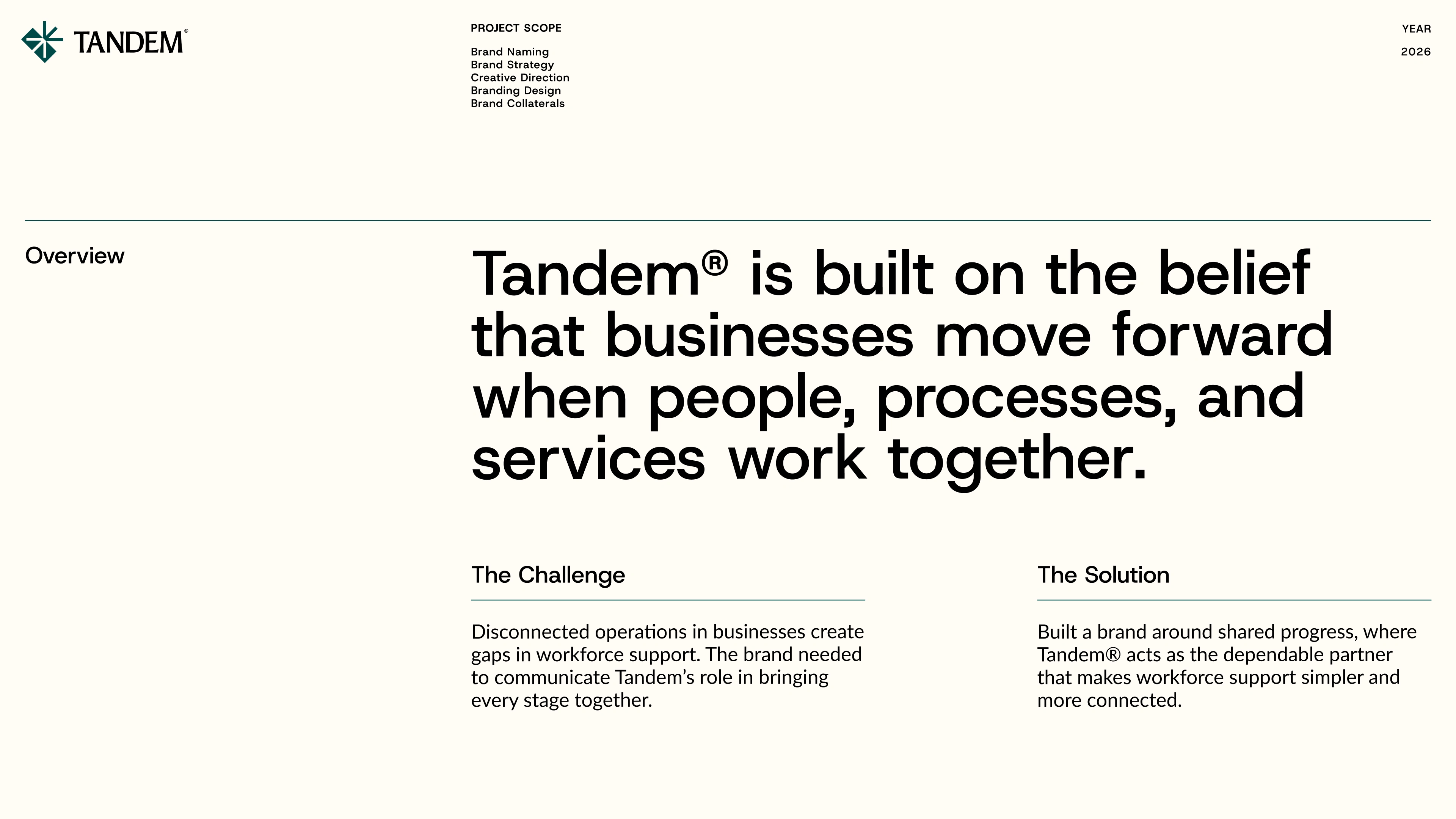
Tandem is a workforce management company helping growing businesses across Europe build and maintain dependable operational teams. Founded in 2022, it brings recruitment, housing, transport, and day-to-day workforce management under one coordinated operation.
Rather than simply delivering talent, Tandem takes responsibility for everything that comes after hiring, giving businesses the operational support they need to focus on growth.
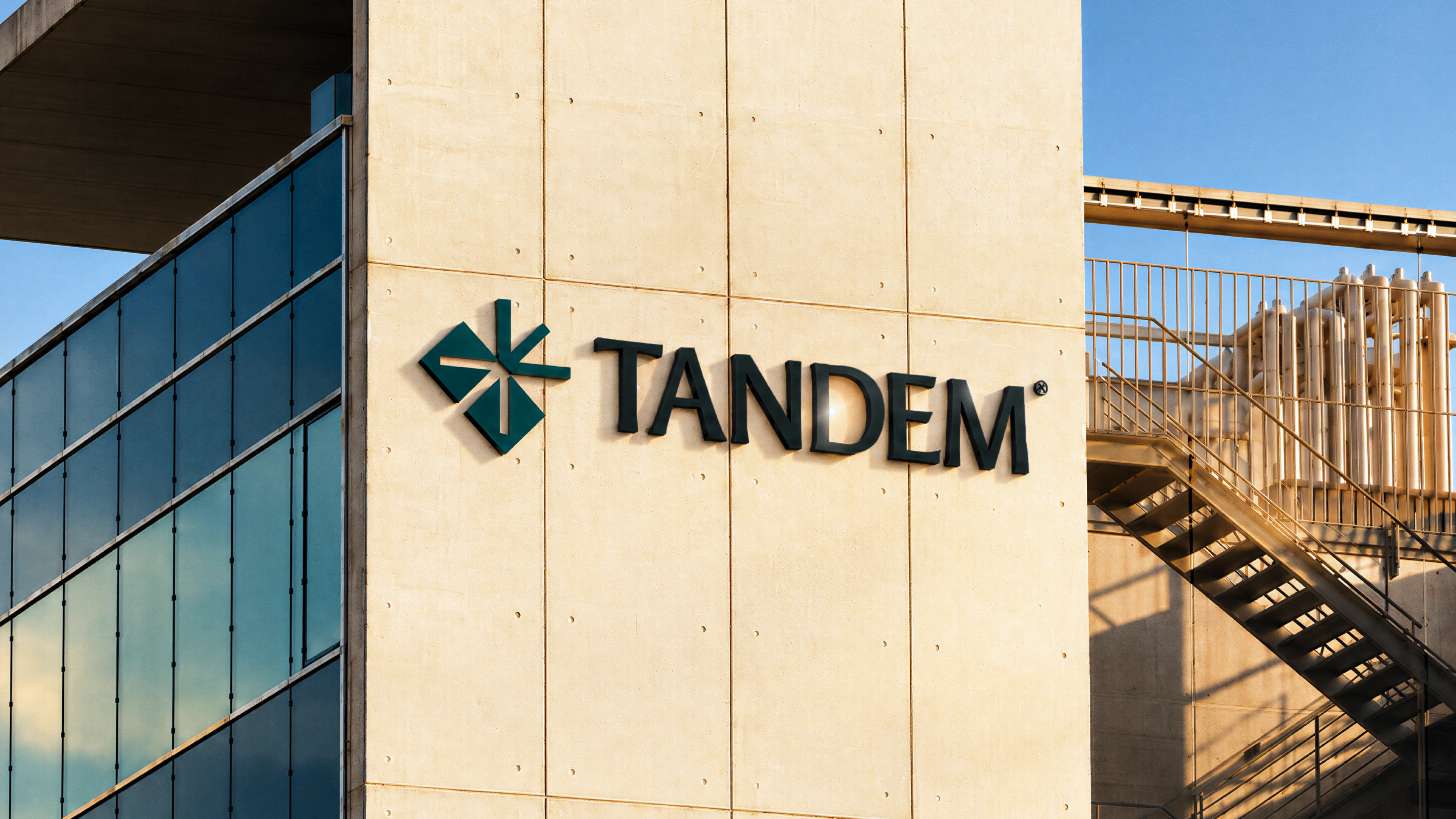
Our job was to build a brand that reflected this responsibility and positioned Tandem as an established, credible, and premium partner.

Brand naming: Two worlds, one direction
The name Tandem represents two worlds, businesses and workers, coming together and moving in sync to create growth for both. It captures the brand's belief that when both sides are supported, everyone moves forward.
Logo & motion: From collision to momentum
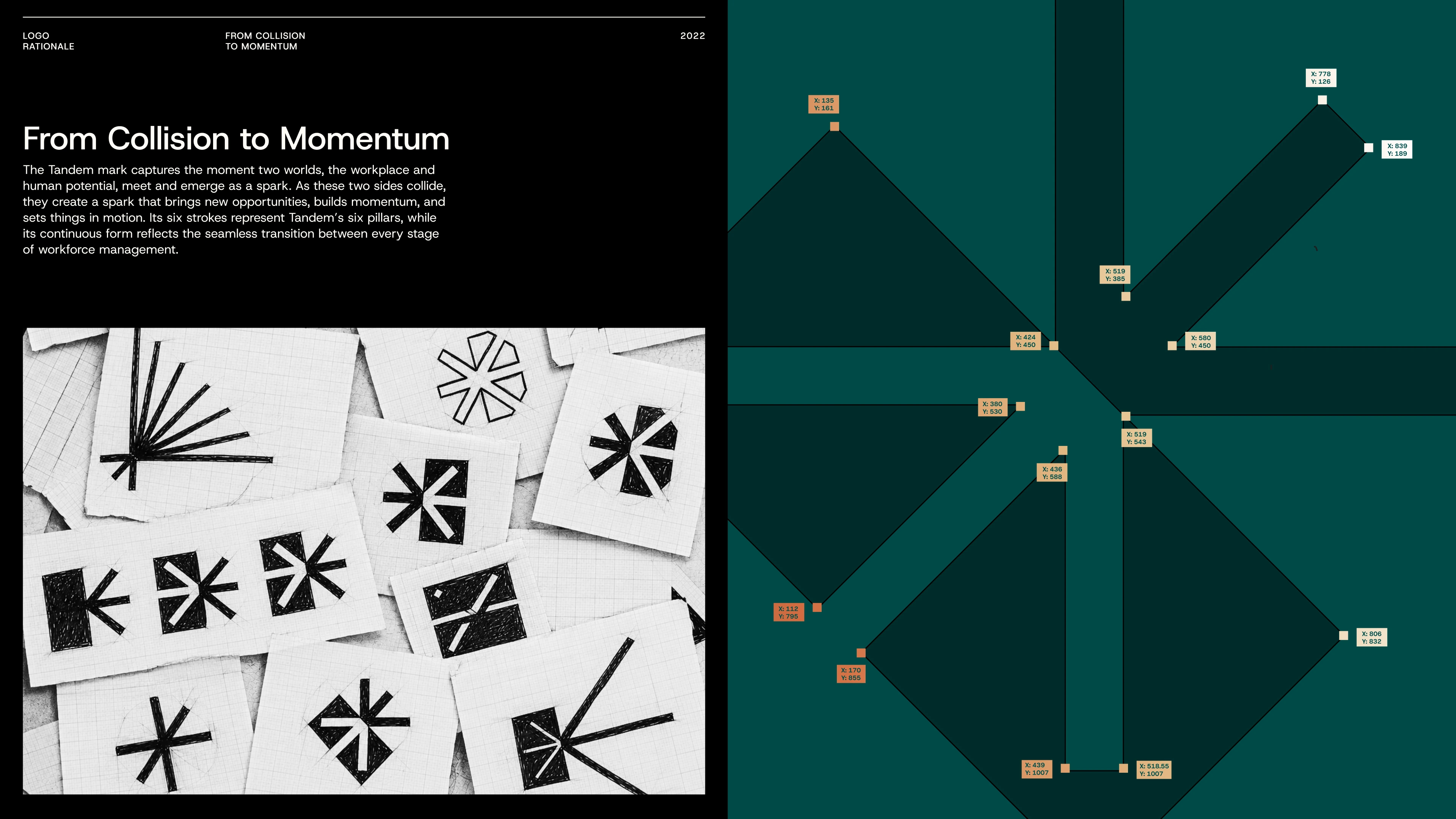
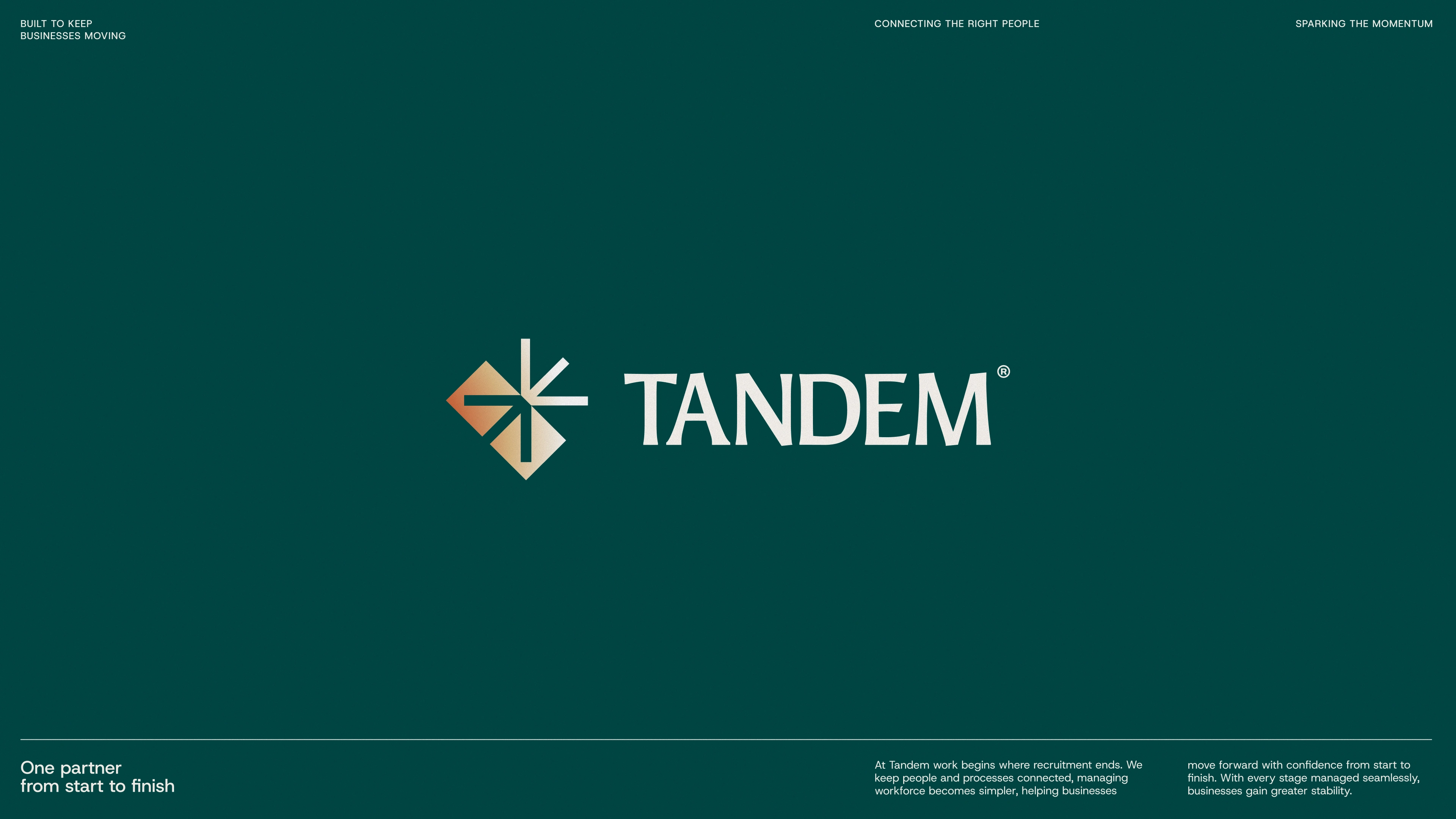
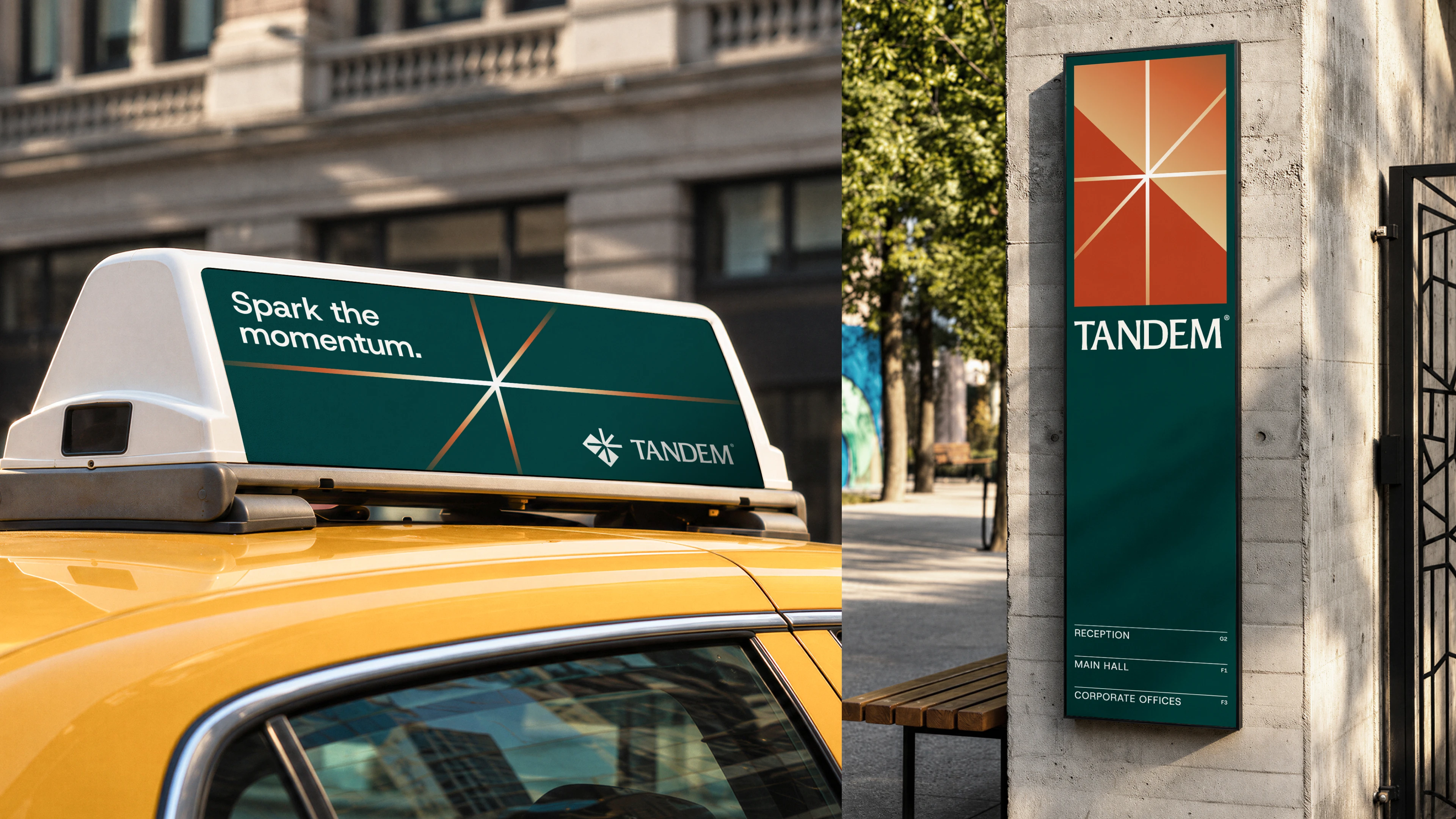
The From Collision to Momentum concept defines the logo and motion language. Two interlocking forms represent the meeting of businesses and human potential, creating a central spark that symbolises new opportunities and momentum. This spark becomes a continuous motion element, with rotating strokes acting like an engine that keeps the system moving.
The strategic differentiation
Most workforce management brands focused on recruitment capabilities, workforce scale, or functional service delivery. Our market analysis revealed an opportunity to combine two less-explored territories: authority and humanity.
We positioned Tandem as an authoritative brand with a human core, combining the confidence of a Hero with the responsibility of a Caregiver. A brand that communicates dependability, ownership, and genuine human responsibility without being overly corporate or impersonal.
This positioning became the foundation for Tandem's brand philosophy, core values, and visual identity.
Colour & typography: Balancing authority with warmth
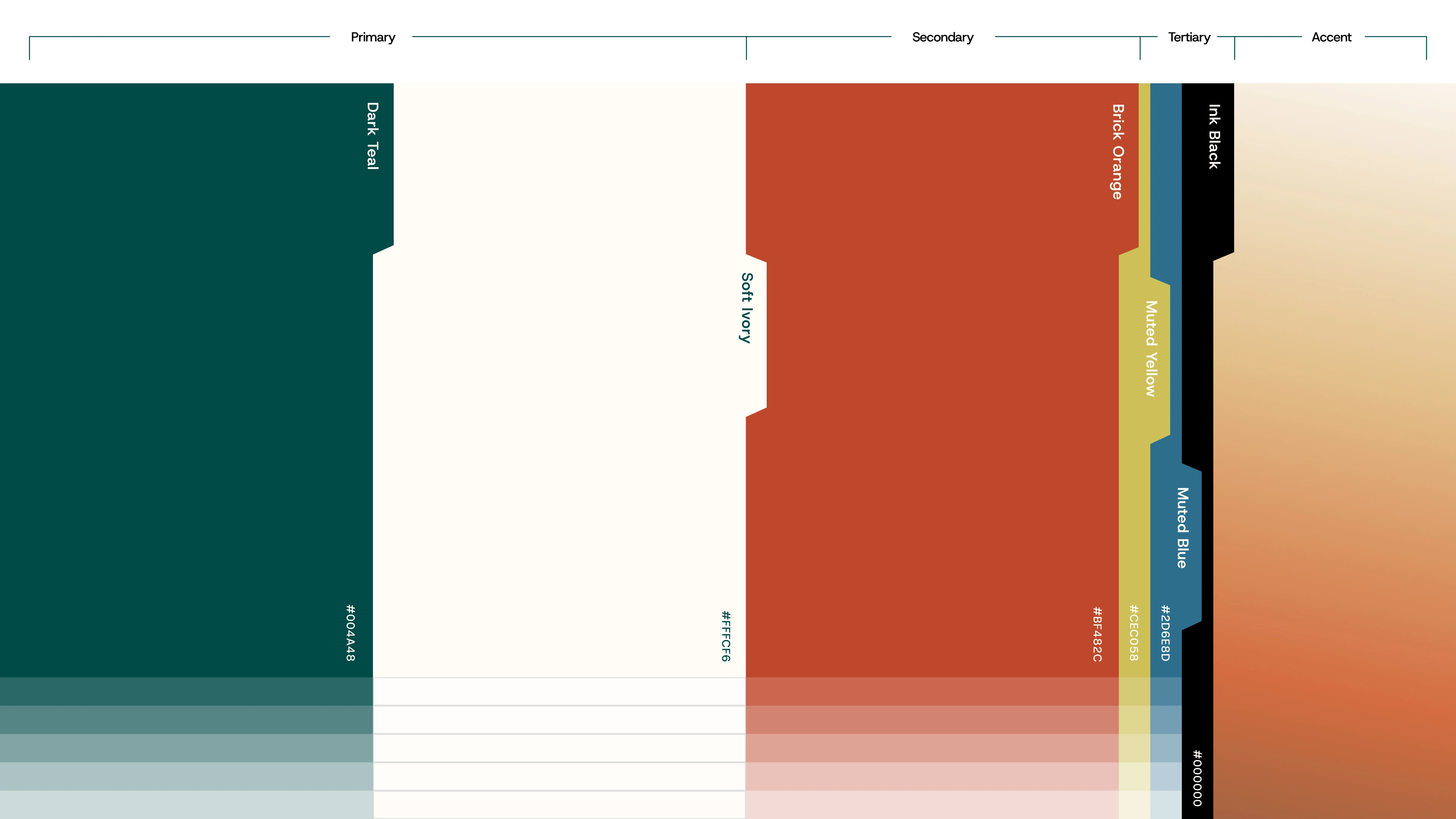
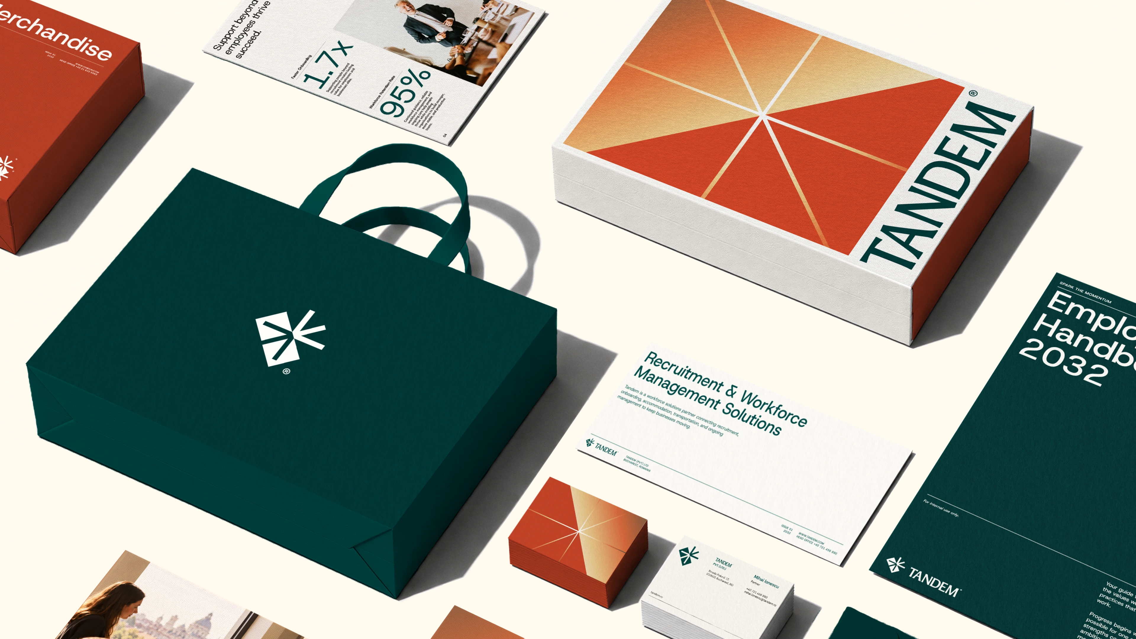
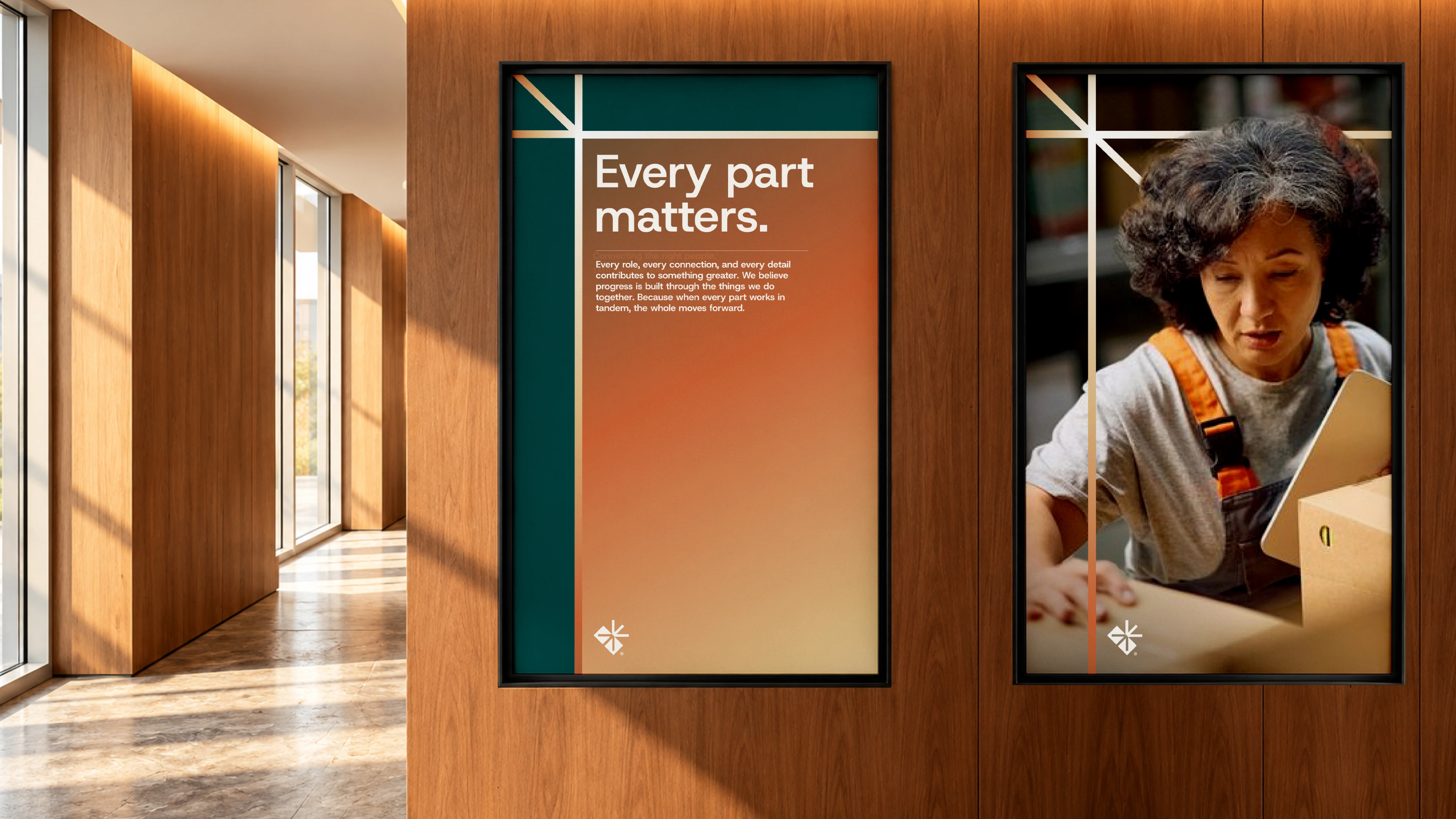
Deep teal establishes trust and authority, while warm gradients of orange, beige, and yellow add a human touch. Paired with clean, contemporary typography and variable weights, the identity balances confidence with approachability.
Corporate identity: Structure builds confidence
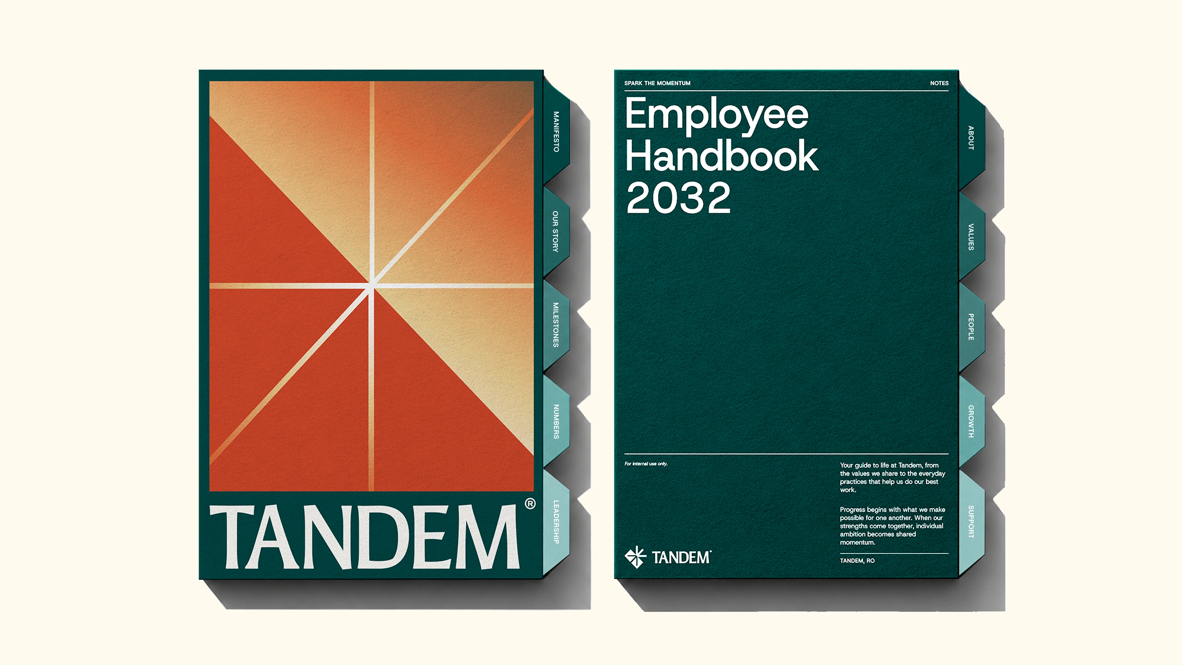
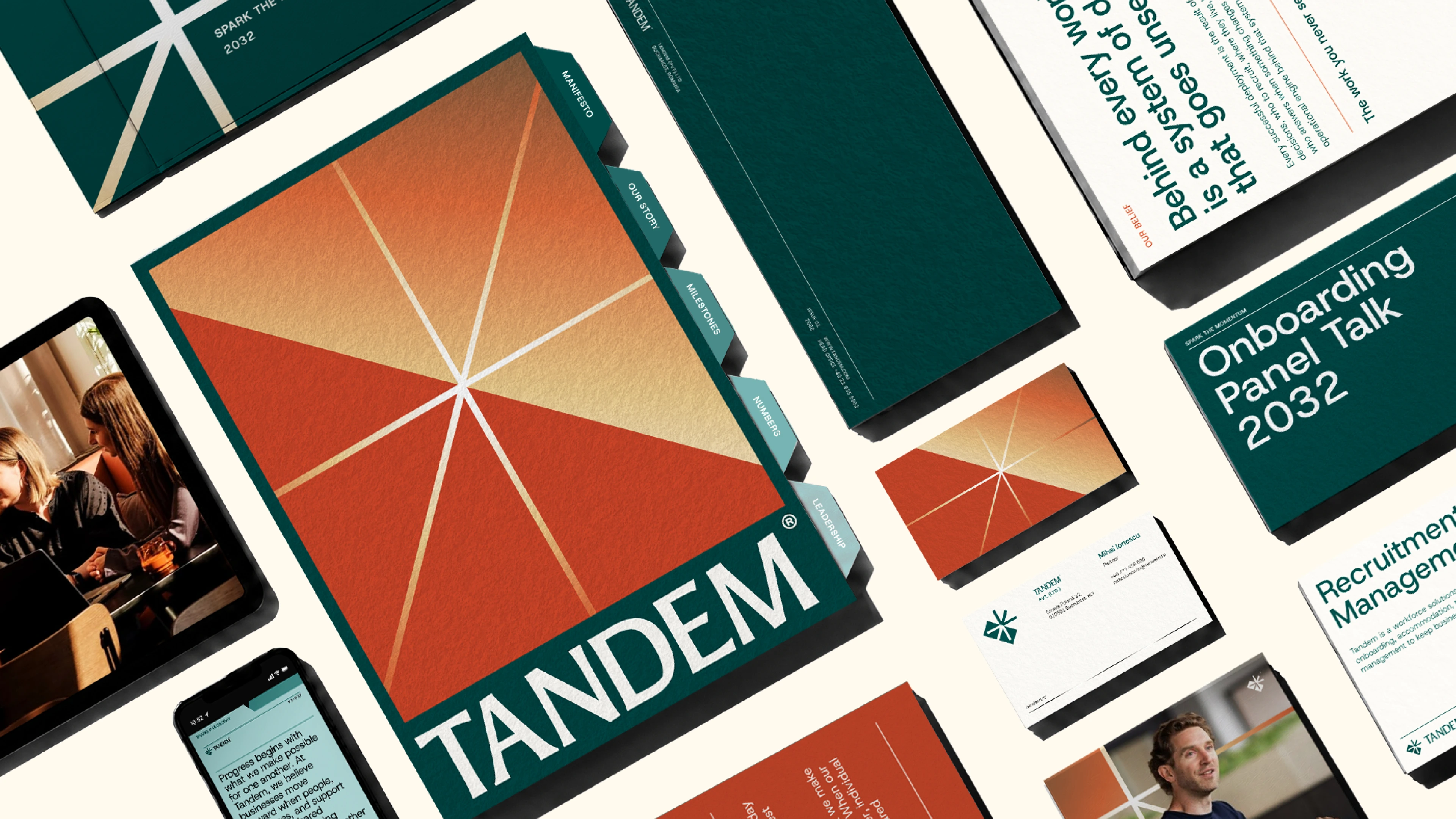
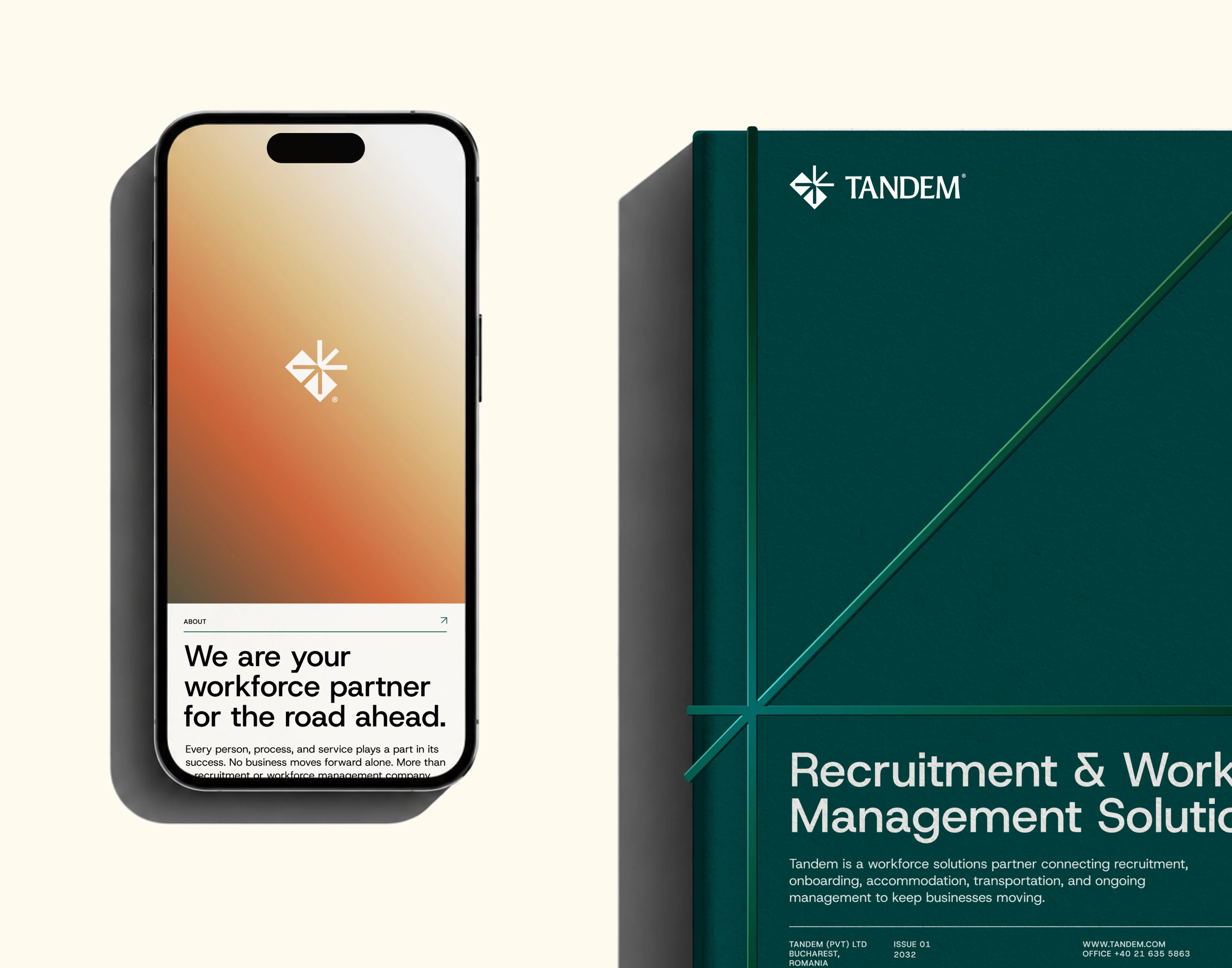
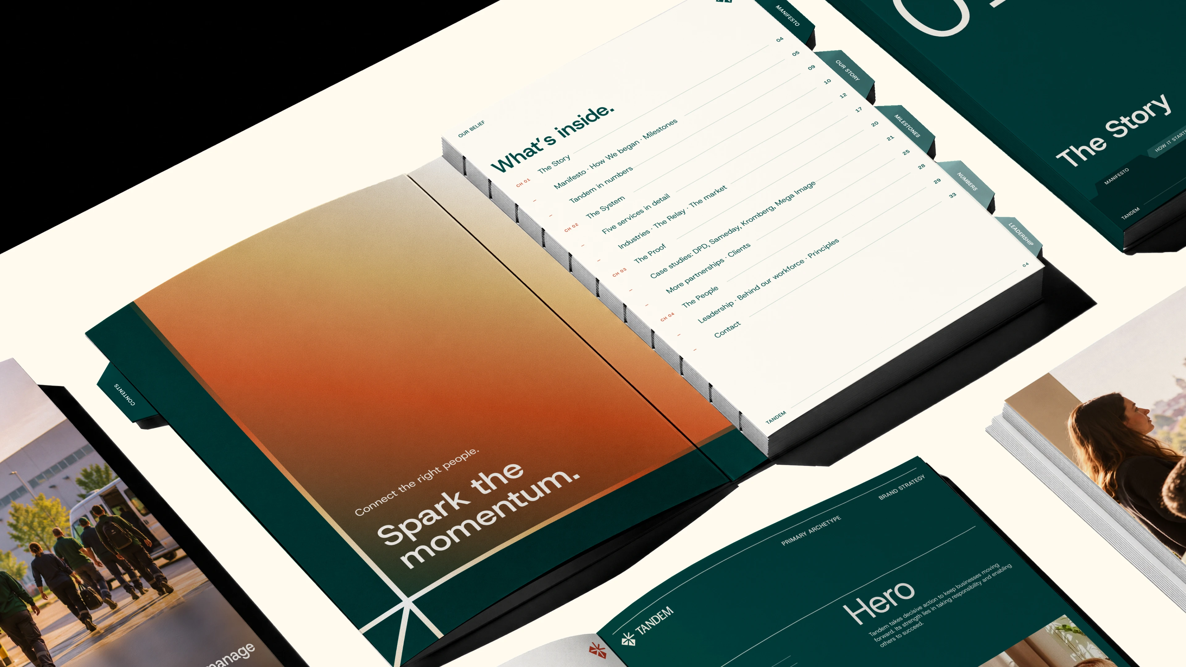
The corporate identity takes inspiration from established business documents and their sense of order and reliability. Structured layouts, clear visual hierarchies, and document-inspired tabs create a consistent system that communicates stability, clarity, and professionalism across brand touchpoints.
TEAM CREDITS
Studio: SUBHAN DESIGNS
Creative Direction: Subhan Mughal
Brand Design: Tooba Zahid
Supporting Team: Divyakshi Mittal
Motion Design: Divyakshi Mittal
If you're looking to build a brand that stands apart without feeling out of place, let's make it happen with Brand Strategy + Visual Identity System.
2 likes · 4 views · Nov 16, 2026
A strategic brand identity for Tandem, bringing businesses and workers together through a more authoritative, human approach.


