
Brand and marketing design and WordPress Website design
- $1k+
- Earned
- 1x
- Hired
- 5.0
- Rating
- 22
- Followers
Brand and marketing design and WordPress Website design


Strategic Logo & Brand Designer, Architect and Curator


Brand Identity Designer


Brand & Product Designer for hire
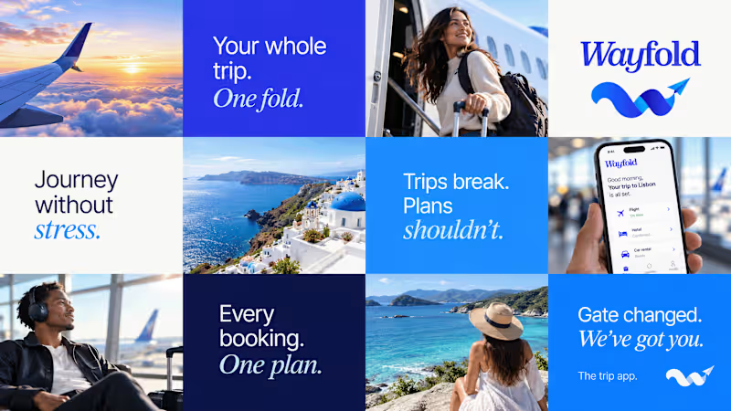

I bring clarity and consistency to every touchpoint.
I bring clarity and consistency to every touchpoint.
This is not just food branding. This is Koma.
Built to create craving, recognition, and lasting impact. Every detail is intentional, crafted to make food brands stand out, connect, and stay unforgettable.
In a crowded market, visibility matters. Koma builds bold identities that turn attention into trust and first impressions into loyalty.
Because great food deserves branding people remember.
0
47

Top Wordpress Developer
Top Wordpress Developer

Design Engineer · Framer Expert · Shopify · React


Design Engineer · Framer Expert · Shopify · React


I just added a new starter template to my Framer Shopify plugin. This is all you need to kickstart your next Ecommerce project with framer. Grab a remix through the plugin and you are on your way. More to come😎.
Checkout the plugin (https://www.framer.com/marketplace/plugins/anopa/).
Grab a remix of this template (https://framer.link/ImjfPpC).
1
2
2.1K

Branding | Web Design | Web Developer
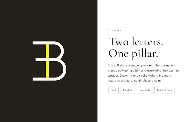
Elisus-Beatty, a trust and legal services firm in Accra, had a plain wordmark and no logo icon.
I rebuilt their identity from scratch: a new mark, “The Pillar”, joining an E and a B around one gold stem, with a Zeus dark and yellow palette, refined typography, stationery and a premium website design.
1
102
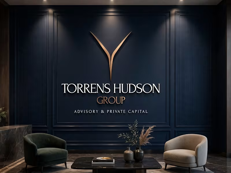
Torrens & Hudson - Brand Identity
Brand identity concept with an editorial serif wordmark, a minimal converging-rivers mark, and a navy, cream and bronze palette.
6
5
1.6K
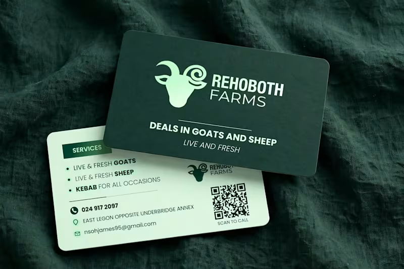
Rehoboth Farms — From Flyer to Business Card | Brand Identity
Rebranded Rehoboth Farms (Live & Fresh) from flyer to premium business card.
Dark green + mint palette, Poppins font, custom goat mark, and a working Scan-to-Call QR that dials 024 917 2097 directly.
Clean, farm-fresh, print-ready
Tools: Photoshop, Illustrator
9
6
444
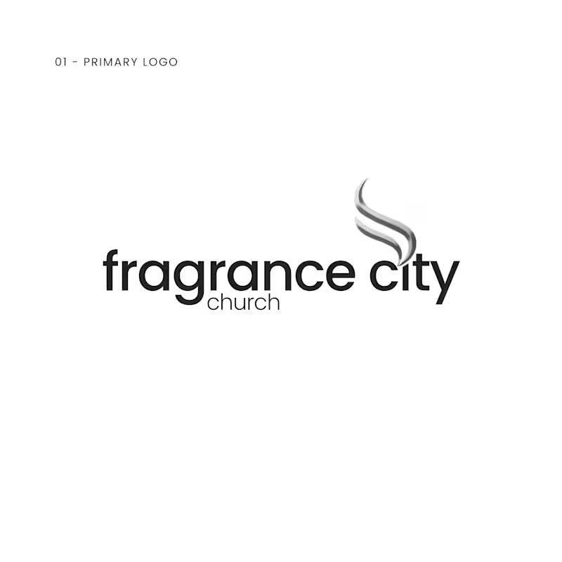
Fragrance City Church — Logo Design
I'm a web designer & developer, but my church thinks "IT guy = can do everything" 😅
So they gave me their logo project.
The brief was minimal, modern, with a silver palette. The name gave me the idea — Fragrance. I designed two silver ribbons rising like incense smoke. Worship ascending ✨ Two ribbons for community, and a nod to the Holy Spirit as wind.
Font: Poppins Bold + Light. Color: Soft Black & Silver Gradient.
Not my usual lane, but I used my web design eye for spacing and hierarchy and built it in Photoshop & Illustrator.
1
262