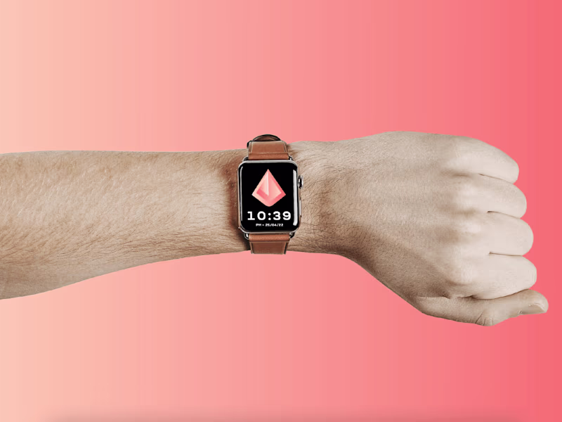
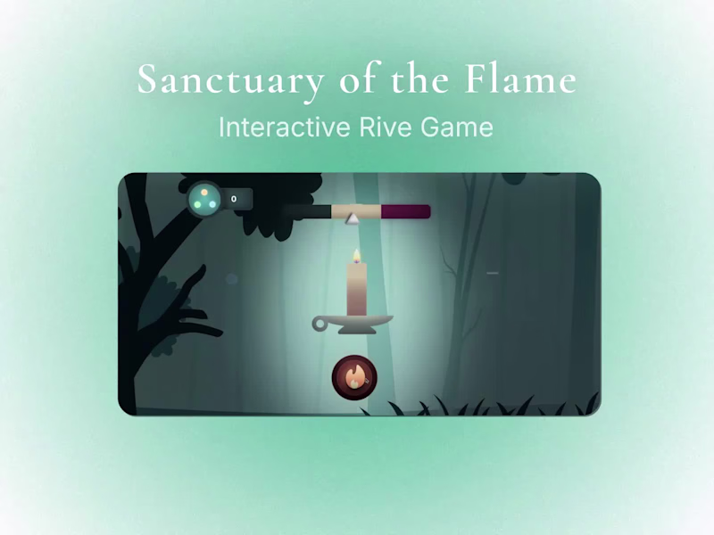
Engaging animations that solve real user problems
Engaging animations that solve real user problems
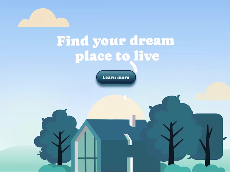
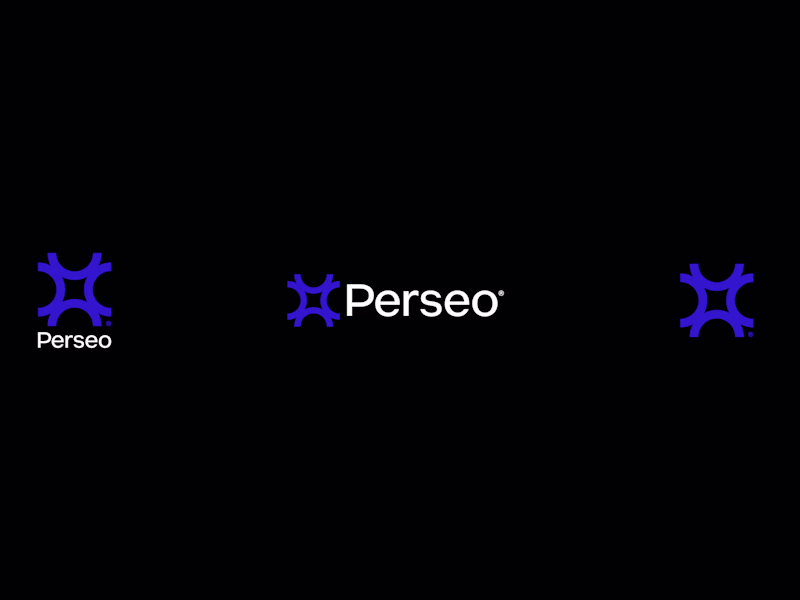
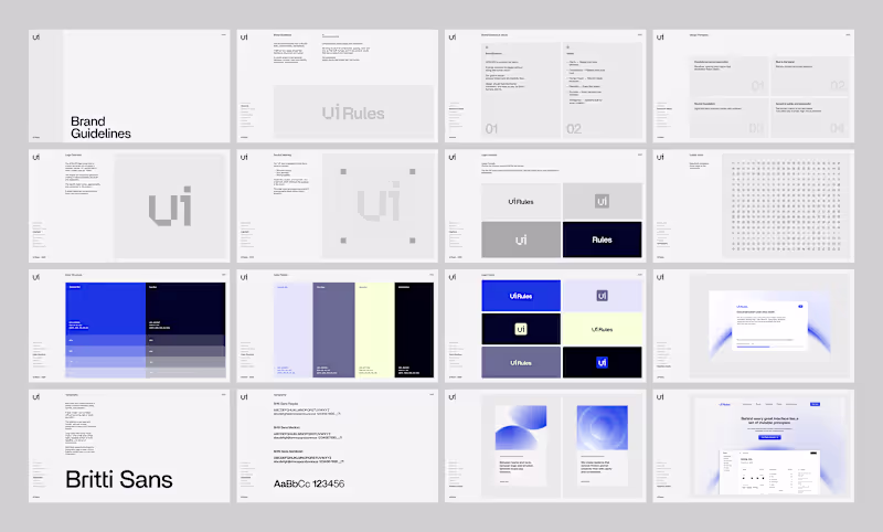
Branding, strategy & design.
- $25k+
- Earned
- 9x
- Hired
- 5.0
- Rating
- 221
- Followers
Branding, strategy & design.
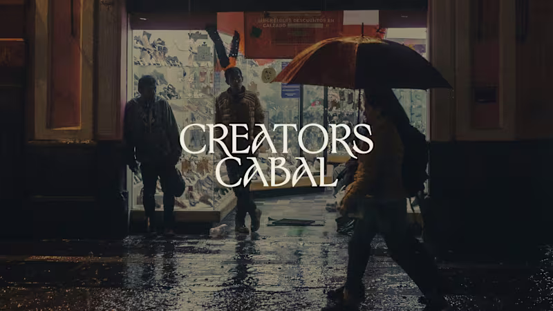

Brand Identity & Content Creation | Video & Motion
- 5.0
- Rating
- 19
- Followers
Brand Identity & Content Creation | Video & Motion


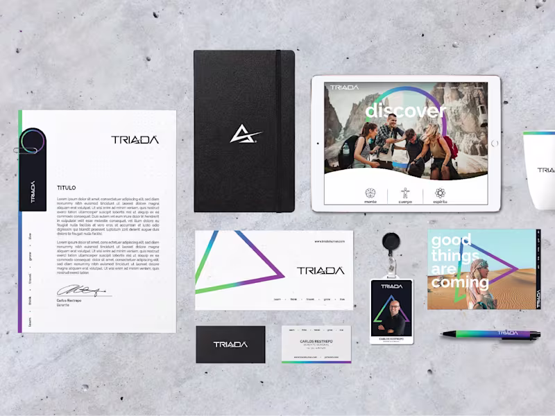
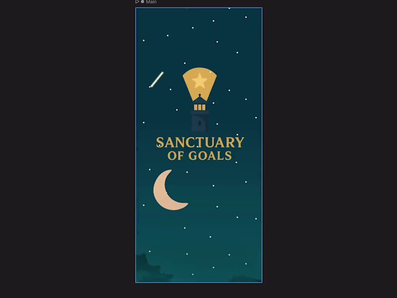
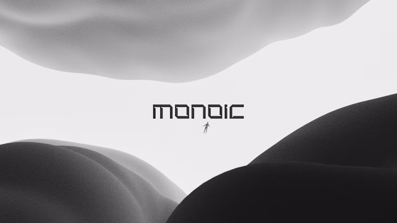
From the first spark to their brightest form.
- $1k+
- Earned
- 11x
- Hired
- 5.0
- Rating
- 39
- Followers
From the first spark to their brightest form.
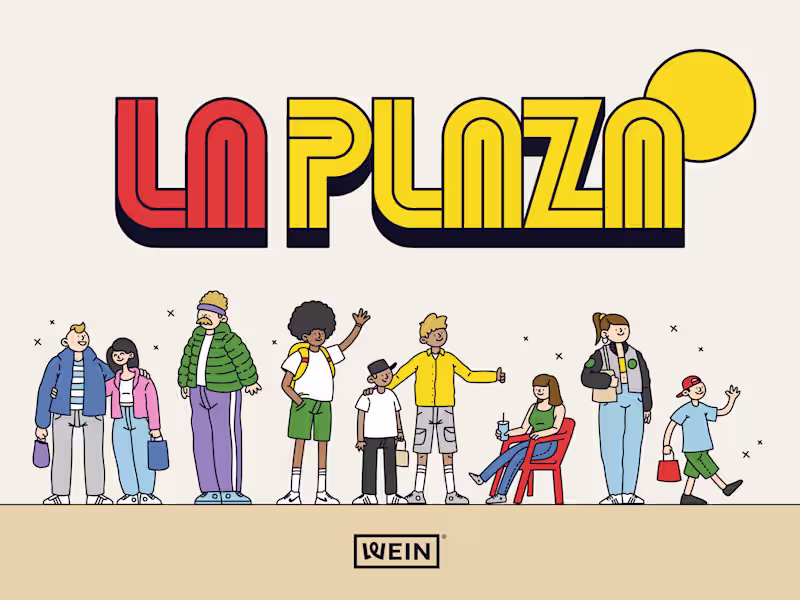
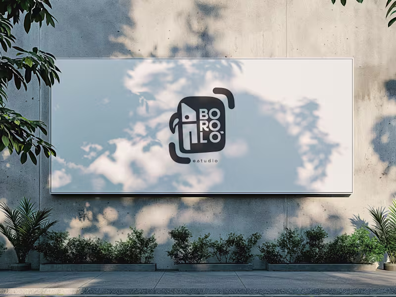
I like to create brands through people🌈🥰.
I like to create brands through people🌈🥰.

Art Director Building brands that connect, compete, and grow
New to Contra
Art Director Building brands that connect, compete, and grow
Designer helping people & brands tell their story boldly.
New to Contra
Designer helping people & brands tell their story boldly.


Stunning web / brand designs for growing companies
Stunning web / brand designs for growing companies