The network for creativity
Join 1.25M professional creatives like you
Connect with clients, get discovered, and run your business 100% commission-free
Creatives on Contra have earned over $150M and we are just getting started
Back to feedPost

AURA is a luxury lingerie brand created to celebrate confidence, femininity, and timeless elegance. The objective of this branding project was to develop a sophisticated visual identity that reflects the beauty, strength, and individuality of modern women.
The logo embraces a minimalist aesthetic, combining refined typography with a rich color palette of deep plum and metallic gold. Every design element was carefully selected to communicate exclusivity, grace, and premium craftsmanship while maintaining a clean and contemporary appearance.
Beyond creating a logo, this project focused on building an emotional connection between the brand and its audience. The visual identity was designed to inspire confidence and transform every customer interaction into a luxurious experience.
The branding system was developed to work seamlessly across product packaging, shopping bags, labels, social media, e-commerce, marketing campaigns, and premium printed materials, ensuring consistency and recognition across every touchpoint.
Project Highlights: Brand Strategy,Luxury Brand Identity,Logo Design,Typography Selection,Color System,Packaging Design,Fashion Branding,Visual Identity Design
This project demonstrates how thoughtful branding can elevate a fashion business into a premium lifestyle brand. By combining minimalist design with timeless elegance, AURA creates a memorable identity that resonates with women seeking sophistication, confidence, and authenticity.


The network for creativity
Join 1.25M professional creatives like you
Connect with clients, get discovered, and run your business 100% commission-free
Creatives on Contra have earned over $150M and we are just getting started



Related posts


🎉 It’s live! I’ve finally updated my design portfolio:
👉
This space has been a long time coming, a reflection of the stories, systems, and identities I’ve been lucky to shape across wellness, healthcare, community & events!
It’s still evolving (aren’t we all?), and I’ll be adding more projects soon, but I’m excited to finally share a fresh look at my work and creative direction!

Congratulations on the new portfolio, Kajal! The grid of bold reds, magenta and cobalt mockups, with that confident serif G repeating throughout, makes the whole identity feel energetic yet cohesive. What guided the way you sequenced your wellness and healthcare projects?

AVYLO Skin Care Packaging Design

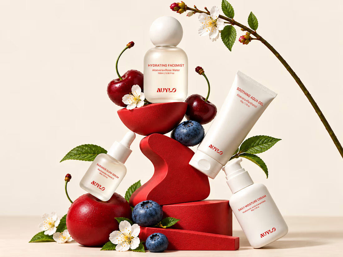
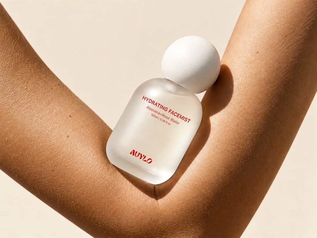
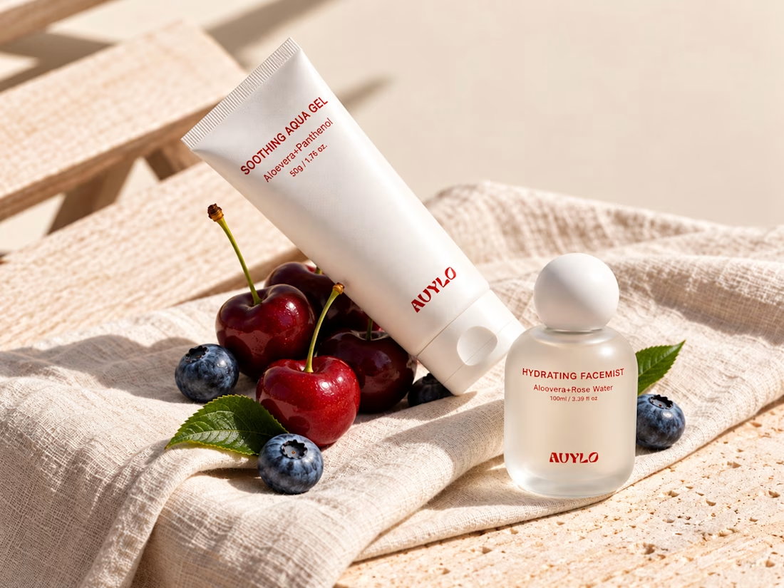

Good job

A green logo is easy to design.
Building a recognizable brand around nature, sustainability, and better living takes more thought.
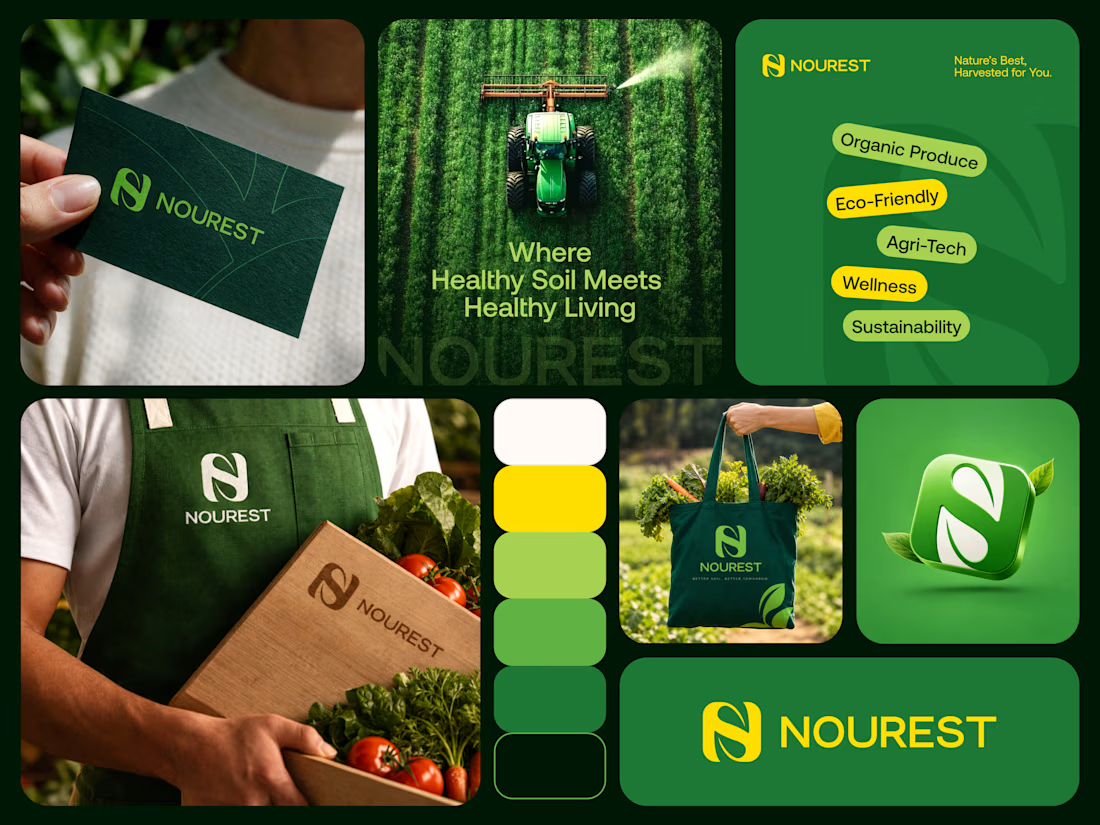
NOUREST explores that balance through its monogram, color system, and brand applications.
NOUREST — Nature-Led Branding & Packaging

Love this . well done