
JENNIFER ARRIETA REYES
Building Memorable Brands from Idea to Identity
New to Contra
JENNIFER is ready for their next project!


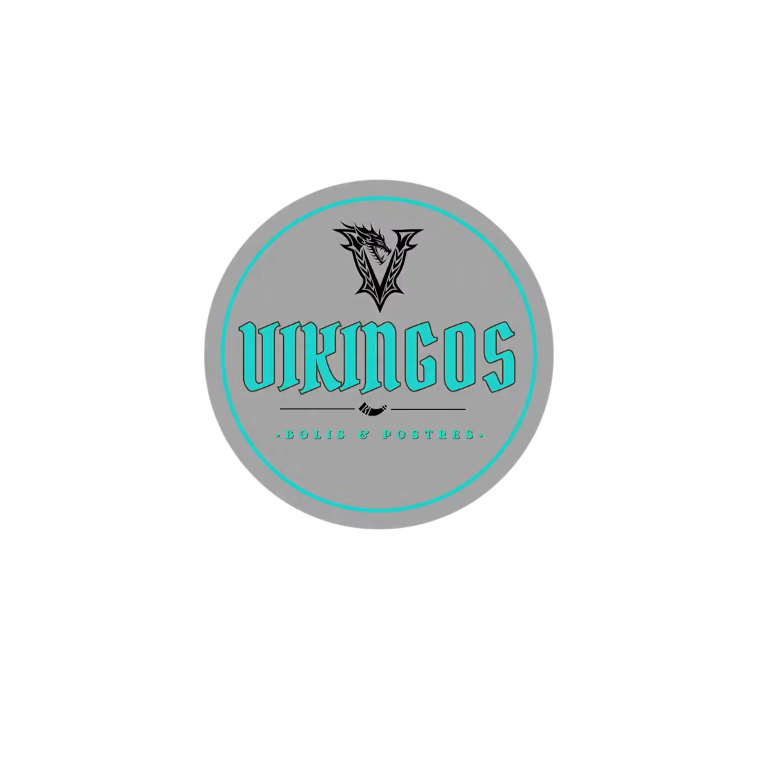
VIKINGOS is a vibrant frozen dessert brand founded by two young siblings with a shared vision of creating refreshing, high-quality fruit treats that bring joy to every customer. Specializing in "Bolis"—a popular Latin American frozen dessert made from natural fruit blends and served in convenient frozen pouches—the brand combines tradition, creativity, and youthful entrepreneurship.
The goal of this branding project was to develop a bold and memorable visual identity that reflects the founders' adventurous spirit while standing out in a highly competitive market. Inspired by the strength and determination associated with Vikings, the logo features a distinctive emblem paired with bold typography, creating a modern identity that is both energetic and instantly recognizable.
The color palette was carefully selected to evoke freshness, fun, and confidence, making the brand appealing to children, teenagers, and families alike. Every element was designed to ensure versatility across product packaging, carts, freezers, uniforms, social media, promotional materials, and future retail locations. More than just a logo, this project established the foundation for a scalable brand capable of growing from a local family business into a recognizable name within the frozen dessert industry.
Project Highlights: Brand Strategy,Logo Design,Food & Beverage Branding,Packaging Design,Visual Identity System,Typography Selection,Color Palette Development,Social Media Branding.
VIKINGOS demonstrates how strategic branding can transform a family-owned startup into a distinctive and memorable consumer brand. By combining a bold visual identity with a clear brand story, the project creates an emotional connection that celebrates entrepreneurship, quality, and the simple joy of sharing delicious frozen treats with family and friends.
3
101
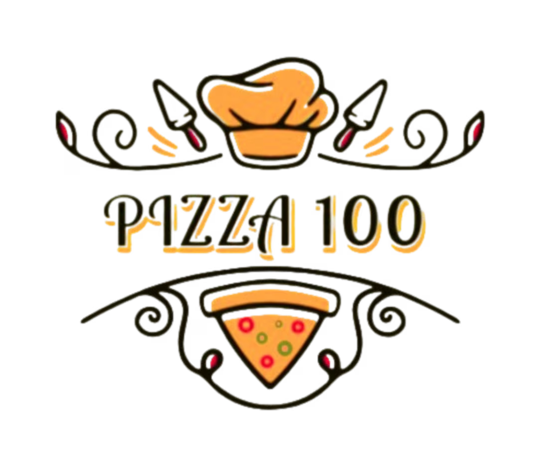
PIZZA 100 is a modern artisanal pizza brand created to celebrate authentic Italian craftsmanship while delivering a vibrant and memorable dining experience. The objective of this branding project was to develop a visual identity that communicates quality, tradition, and personality in a way that stands out in the highly competitive food industry.
Inspired by handcrafted recipes and wood-fired pizza culture, the logo combines a playful chef's hat, decorative flourishes, and a slice of pizza to create a distinctive and approachable brand. The typography balances elegance with warmth, giving the identity a handcrafted character that reflects the authenticity of the product.
The visual system was designed to be flexible across restaurant signage, food packaging, uniforms, delivery boxes, social media, menus, and promotional materials, ensuring strong brand recognition at every customer touchpoint. Beyond designing a logo, the project focused on creating a complete visual identity capable of supporting future business growth while maintaining a welcoming and premium personality.
Project Highlights: Brand Strategy,Restaurant Branding,Logo Design,Visual Identity Design,Typography Selection,Packaging Design,Menu & Signage Design,Social Media Branding.
This project showcases how thoughtful branding can transform a restaurant into a recognizable and engaging brand. By blending artisan tradition with modern design principles, PIZZA 100 delivers a visual identity that reflects authenticity, quality, and a memorable dining experience while remaining versatile for both physical and digital applications.
0
30
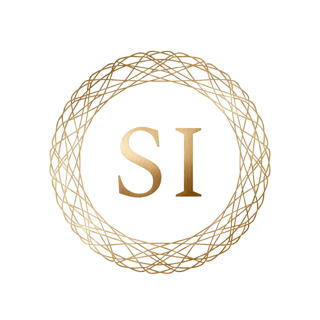
SELAH INVESTMENTS is a corporate investment company focused on building, managing, and growing businesses across multiple industries. This branding project was designed to communicate trust, stability, sophistication, and long-term vision through a clean and timeless visual identity.
The logo is centered around a refined "SI" monogram, enclosed within a custom geometric emblem that symbolizes connection, balance, and sustainable growth. The minimalist composition reflects the company's commitment to strategic thinking, innovation, and excellence while maintaining a premium corporate aesthetic.
A carefully selected palette of matte gold and deep espresso brown reinforces the perception of prestige, financial strength, and reliability. Every element was intentionally simplified to create a highly versatile identity that performs consistently across digital platforms, corporate documents, presentations, signage, and executive stationery.
Rather than creating a conventional investment logo, the objective was to develop a visual identity capable of representing a diversified business group while projecting confidence to partners, investors, and clients.
Project Highlights: Corporate Brand Strategy,Logo Design,Monogram Design,Corporate Identity,Luxury Brand Identity,Typography Selection,Color System Development,Executive Stationery Design.
This project demonstrates how a minimalist approach can create a powerful corporate identity that communicates professionalism, credibility, and long-term value. The result is a modern investment brand designed to inspire confidence, support business growth, and establish a strong presence in both national and international markets.
0
38
AURA is a luxury lingerie brand created to celebrate confidence, femininity, and timeless elegance. The objective of this branding project was to develop a sophisticated visual identity that reflects the beauty, strength, and individuality of modern women.
The logo embraces a minimalist aesthetic, combining refined typography with a rich color palette of deep plum and metallic gold. Every design element was carefully selected to communicate exclusivity, grace, and premium craftsmanship while maintaining a clean and contemporary appearance.
Beyond creating a logo, this project focused on building an emotional connection between the brand and its audience. The visual identity was designed to inspire confidence and transform every customer interaction into a luxurious experience.
The branding system was developed to work seamlessly across product packaging, shopping bags, labels, social media, e-commerce, marketing campaigns, and premium printed materials, ensuring consistency and recognition across every touchpoint.
Project Highlights: Brand Strategy,Luxury Brand Identity,Logo Design,Typography Selection,Color System,Packaging Design,Fashion Branding,Visual Identity Design
This project demonstrates how thoughtful branding can elevate a fashion business into a premium lifestyle brand. By combining minimalist design with timeless elegance, AURA creates a memorable identity that resonates with women seeking sophistication, confidence, and authenticity.
0
38