12yr Fullstack Engineer: UI/UX & 3D Expert 🌟
- $25k+
- Earned
- 2x
- Hired
- 5.0
- Rating
- 53
- Followers
12yr Fullstack Engineer: UI/UX & 3D Expert 🌟




Senior Product Designer & No-code Developer
- $5k+
- Earned
- 1x
- Hired
- 5.0
- Rating
- 6
- Followers
Senior Product Designer & No-code Developer


Expert UI/UX/Product Design Leader


UX/UI & Brand Designer for SaaS

Premium Branding & Packaging for Por
This branding and packaging design was created for Port of Mokha Coffee, a brand known for its rich heritage and high-quality coffee. The project includes a complete visual identity, from packaging and merchandise to logo design and typography. The goal was to reflect the brand's authenticity, luxury, and deep-rooted history in Yemeni coffee culture.
4
7
180
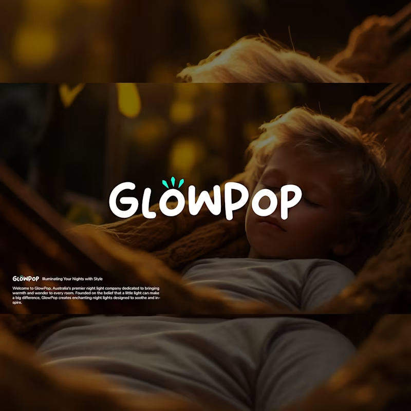
Glowpop Logo Deign
GlowPop: Illuminating Your Nights with Style
Welcome to GlowPop, Australia's premier night light company dedicated to bringing warmth and wonder to every room. Founded on the belief that a little light can make a big difference, GlowPop creates enchanting night lights designed to soothe and inspire.
Our collection features a variety of designs, from whimsical animal shapes to sleek, modern styles, ensuring there’s a perfect fit for every child's bedroom or cozy corner in your home. Each night light is crafted with safety in mind, using soft, energy-efficient LED technology that emits a gentle glow, perfect for nighttime comfort.
2
113

SaaS Truck Management System | SaaS Designer | UI UX Designer
As a UX designer and product designer for Vektor, an all-in-one trucking management system for carriers, I focused on creating an efficient and intuitive user interface. Utilizing Figma, I designed the system to streamline operations for users overseeing truck management. This approach reflects my expertise as a SaaS UI designer, ensuring that the platform meets the specific needs of its users while enhancing their overall experience.
0
198

Aimosa.io (http://Aimosa.io) Landing Page Design and Additional Pages Design
Collaborating with Aimosa, a groundbreaking SaaS platform, I embarked on a transformative journey to boost book author sales through data-driven insights By leveraging Figma, I meticulously designed a responsive SaaS web app that encompassed a captivating landing page, ensuring a seamless user experience. This holistic approach, rooted in contemporary UI/UX design principles, led to a remarkable 40% surge in Aimosa's conversion rate.
Our project not only revitalized web design but also harnessed the power of detailed statistics and analysis to drive book sales, exemplifying the synergy of technology, design, and data-driven decision-making.
0
107

Design Engineer


Product-Focused UI/UX & Dev Partner for SaaS and StartUps.


🎨 UX Designer & AI Artist


UX/UI Designer: Simple, brand-led, accessible experiences.
UX/UI Designer: Simple, brand-led, accessible experiences.

I'm building CareLoop, a health app that connects uninsured and under-insured people to vital resources like clinics, grants, and transit. As a fun side project to inspire I put together a quick logo concept.
Typeface: Plus Jakarta Sans (Modern, clean, friendly)
"Care": Cool gray (Stable, secure)
"Loop": Rainbow mesh gradient (Connecting diverse resources into a unified spectrum)
Does the logo feel trustworthy and welcoming for a healthcare app?
Does the gradient successfully communicate connection and inclusivity?How does it scale down to a small mobile app icon?
Would love your thoughts! 😊
0
110