Quality Web & Product Design 🚀


Quality Web & Product Design 🚀



Just published a free Webflow component — a WebGL lens blur effect built with Three.js and GLSL Signed Distance Fields, ported from a Codrops tutorial by Guillaume Lanier.
A circle stroke reacts to mouse proximity — the blur expands and the stroke thickens as the cursor passes over the edge. A subtle heartbeat animation pulses the radius continuously. The interior displays a customizable image loaded directly from a Webflow Image element, no code required to swap it.
Free to use in any Webflow project.
webflow.com/made-in-webflow/website/lens-blur (https://webflow.com/made-in-webflow/website/lens-blur)
1
1
293

Branding for design-lead brands in interiors & construction


Branding for design-lead brands in interiors & construction

I love a good before and after.
This project was a full transformation for the Pan-American Equestrian Federation, spanning both branding and landing page design. Their previous identity and website felt dated and lacked the clarity and presence the organization truly holds.
This wasn’t just a visual upgrade.
We approached the landing page with a clear objective: communicate a large amount of information with precision and ease. That meant restructuring content, prioritizing what matters most, and creating a strong foundation the brand can continue to build on.
The result is a system that feels more aligned, more intentional, and far more effective.
Take a look at the before and after, and let me know what you think.
Check out the live landing page here: https://www.paecequestrian.com/
1
28
1.5K

Escuelas del Mundo 🚀
From Wordpress to Webflow.
- More Clarity
- More versatility for the client
- An elevated look
4
24
2.2K

I am utterly obsessed with anything real estate &interior design related. Like doom scroll on Zillow and binge watch every interior design show out there kind of obsessed.
That's why whenever I work on brand concepts I tend to bring in this industry.
I am also utterly obsessed with the New England coast and Cape Cod aesthetic. Merge the two together and you get Saltmark properties!
9
22
1.7K


Beauty Focused Branding & Web Design Agency
Beauty Focused Branding & Web Design Agency




Web Design/ Branding/AI implementations 🌐



Web Apps, Automation, AI for Founders & Mission-Driven Teams
Web Apps, Automation, AI for Founders & Mission-Driven Teams
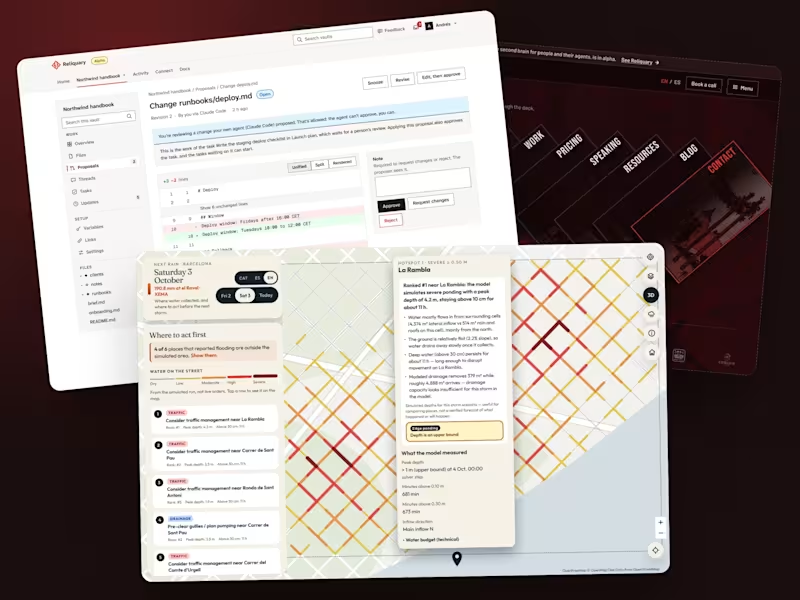
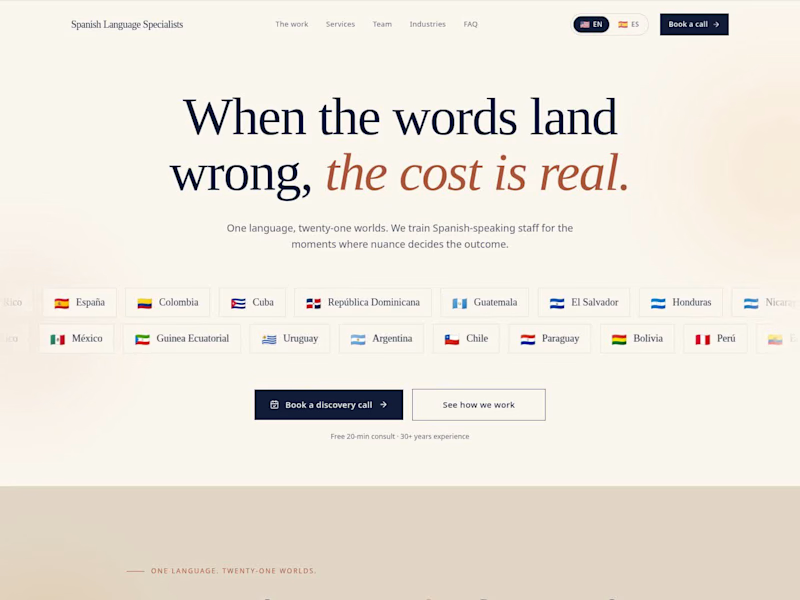
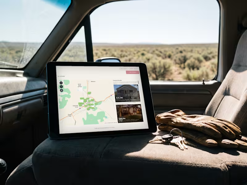
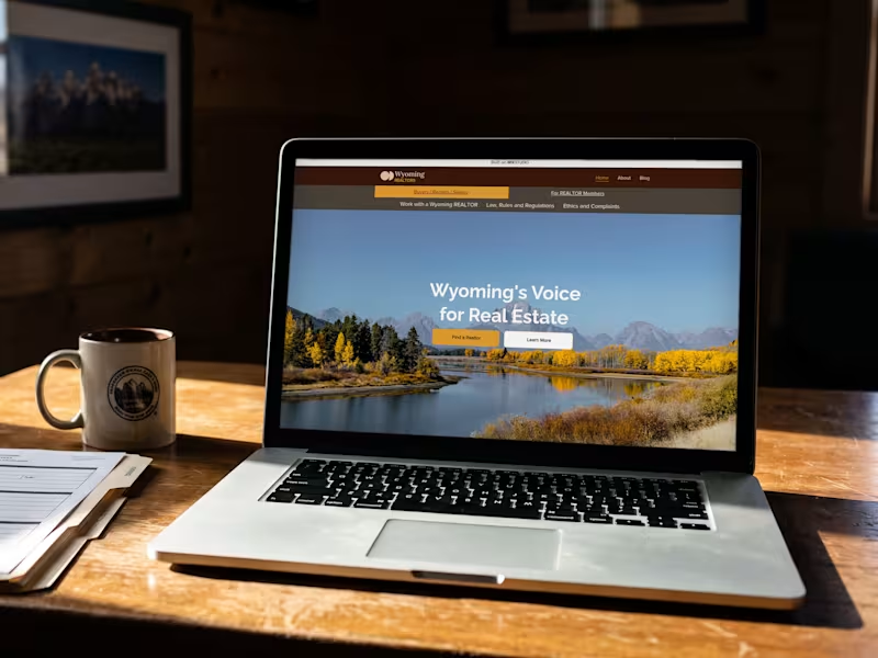


Certified FlutterFlow Expert Agency. TOP 1 Worldwide.

Certified FlutterFlow Expert Agency. TOP 1 Worldwide.
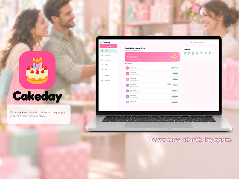


Helping brands grow with strategic marketing visuals
Helping brands grow with strategic marketing visuals
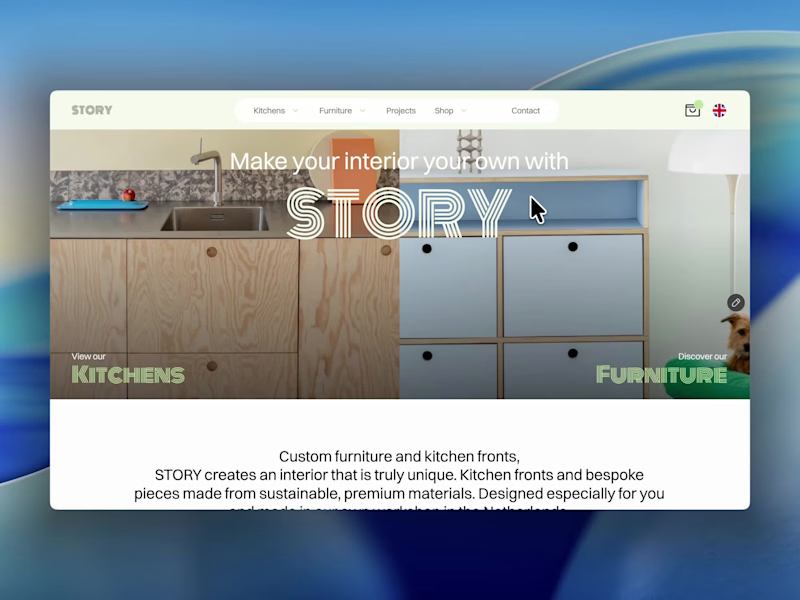
The best part of this website might be the page nobody is supposed to see.
About 4 months ago, we launched the new website for STORY Design Amsterdam.
STORY is all about giving homes personality, so we wanted the website to have some too.
Including their 404 page.
Naturally, I put the owner's dog on it.
If you end up on the wrong page, you might as well enjoy it.
But the fun details only work if the website itself does too.
Before the launch, most of their website traffic came through Instagram.
Today, around 60% comes from Google.
And now we've taken the next step by adding a little shop, so people can buy their kitchen handles directly from the site.
Next up: a great about us page; photoshoots are already planned.
I don't design websites that often.
But when I do, I don't want to create something that could belong to any business.
It should feel like their business. Do you think I achieved that?
26
83
4.3K


Strategy-led branding for wellness, beauty & lifestyle.
Strategy-led branding for wellness, beauty & lifestyle.