Projects using Adobe Firefly in Buenos Aires
Projects using Adobe Firefly in Buenos Aires
Sign Up
Post a job
Sign Up
Log In
Filters
2
Projects
People
$1.5K+ earned
Message
38
Anita Autorino
max
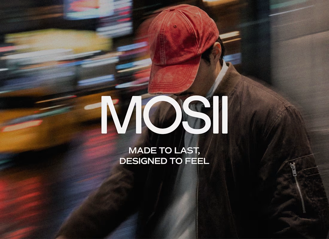
Mosii | Minimal Menswear Brand Identity
38
549
Message
0
Jessica Mena ✦
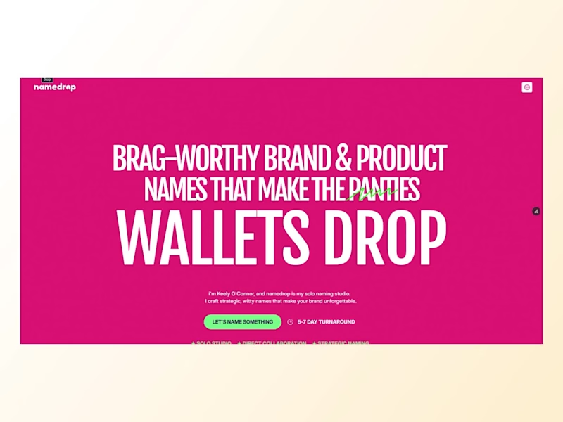
Namedrop Branding and Digital Experience Project
0
20
Message
0
Lisandro Natale
pro
Aetna – Motion Graphics Package
0
8
Message
0
Gustavo Brigante
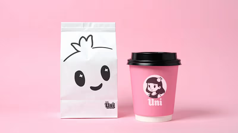
Caffè UNI: Contemporary Coffee Shop Brand Design
0
1
$2.1K+ earned
Message
35
Anita Autorino
max
Mantra | Ayurvedic Skincare Packaging for Men
35
1K
Message
41
Anita Autorino
max
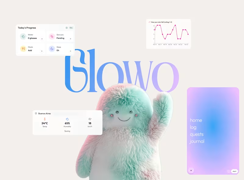
Glowo | A Virtual Pet for Modern Self Care
41
1.1K
Message
23
Anita Autorino
max
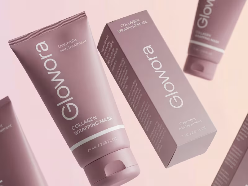
Glowora | Packaging Design for Skincare Brand
23
424
Message
16
Anita Autorino
max
Rey Del Cielo | Mezcal Brand & Label Design
16
341
Message
45
Anita Autorino
max
Why do half the skincare and fashion brands launching this year look like they share the same designer? Serif logotype, tight tracking, one accent color. ✅ It reads as elevated the first time. By the twentieth brand, it reads as a template, not a decision. Safe typography isn't neutral, it's a choice too, sometimes one that avoids taking a position 🤭. So I designed a set of mockups with custom letterforms built to argue the opposite: type with weight, texture, and enough attitude to hold its ground on a shelf full of quiet logos. 💅 What's the last fashion or skincare brand whose type actually made you stop scrolling?
9
45
1.6K
Message
37
Anita Autorino
max
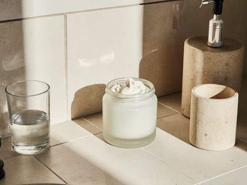
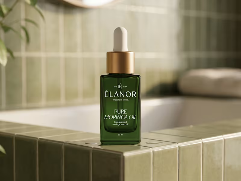
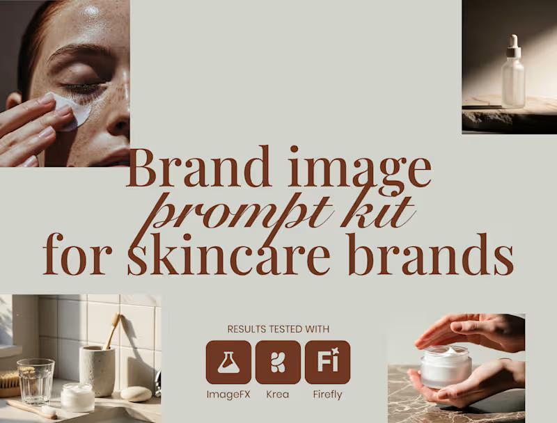
Do you want to generate consistent, eye catching images and mockups like these for your wellness or cosmetic industry clients? I’ve been creating AI-generated packaging and lifestyle imagery, and I recently made a few updates to my Brand Image Prompt Kit for Skincare Brands. If you’re tired of getting random results that look nothing like your brand or are inconsistent, this product ✨ will help ✨ Includes 4 core prompt scenarios, and 20+ ready to use images. 🔗 Brand Image Prompt Kit (https://contra.com/products/jStCKO3s-brand-image-prompt-kit-for-skincare-brands?utm_source=chatgpt.com)
16
37
2.1K
Message
127
Anita Autorino
max
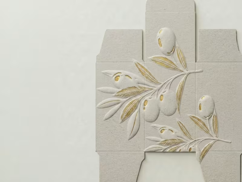
How do you design a skincare brand inspired by olives… without making it look like olive oil? 🤔 🤌🏼 That's the challenge I'm currently working through! The hero ingredient naturally brings to mind food, kitchens, and grocery shelves. But this brand belongs in a premium skincare space. So instead of focusing on the fruit itself, I'm exploring the Mediterranean lifestyle, botanical illustrations, tactile packaging, earthy color palettes, and editorial typography to communicate the ingredient without feeling edible. This project is still a work in progress, but I thought it would be interesting to share the exploration before the final result. Curious... if you had to communicate olives without illustrating an olive, where would you start?
38
127
8.2K
Message
185
Anita Autorino
max
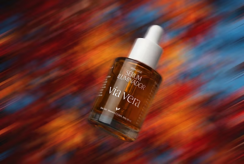
NEW ENERGY ALERT As we leave autumn 🍂 and head into winter🧣 here in Argentina, I keep thinking about how much freelancing celebrates momentum, growth, and doing more. For the past months I have been chasing momentum and design frenzy, however, after being at the verge of burnout this season, I am aiming for something different: consistency & peace of mind. I used motion blur in this visual to represent transition instead of rushing forward. Because sometimes the best thing you can bring to your work is not more energy but less noise. What energy are you bringing into your next season of freelance work?
50
185
12.4K
Message
106
Anita Autorino
max
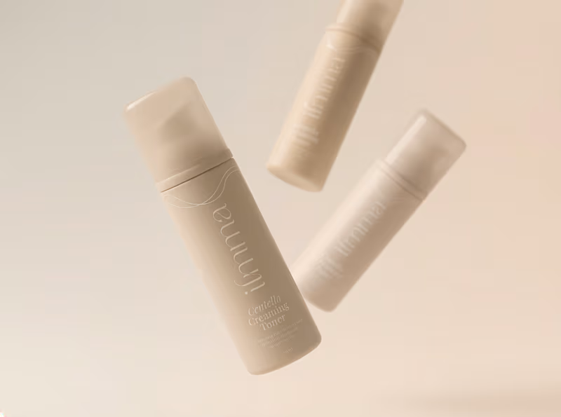
Wrapping up a skincare project I've been working on for the past few weeks. From brand strategy and identity to packaging design for 4 amazing products, it's always rewarding to see everything come together in the final mockups. Sharing a few sneak peeks before the brand officially launches ✨ Curious, what's your favorite phase of the branding process?
37
106
5.8K
Message
49
Anita Autorino
max
Is minimalist design actually simple, or just harder to get right? Across all my skincare packaging projects, the approach is the same. Minimal does not mean empty. It means every detail works twice as hard. Constraints are what make the design work. Most of the work happens in what you barely notice. Adjusting typography so it feels editorial, not generic. Letting spacing create hierarchy and make reading effortless. Removing anything that does not serve the product. If it is decorative, bye. 👋🏼 When everything is reduced, every decision becomes visible. There is nowhere to hide. What is the first thing you remove to make a design feel cleaner?
10
49
5.3K
Message
28
Anita Autorino
max
If you’ve ever designed for a skincare brand, you know the real time sink isn’t the logo. It’s the endless Pinterest scrolling. 🫠 The hunt for the “right” mockup. 🤔 The hours spent trying to visualize the brand before you can even present it. So I built a product that recently won a challenge 🏆 as a trending digital product for 2026. I created a curated Brand Image Prompt Kit for Skincare Brands that helps designers and founders generate packaging mockups and lifestyle visuals using AI, without guessing their way through it. It includes 4 core prompt scenarios, customizable templates, and 20 example visuals generated with Krea, ImageFX, and Adobe Firefly. If you want to explore it: 🔗 Link (https://contra.com/products/jStCKO3s-brand-image-prompt-kit-for-skincare-brands)
4
28
5.4K
Message
114
Anita Autorino
max
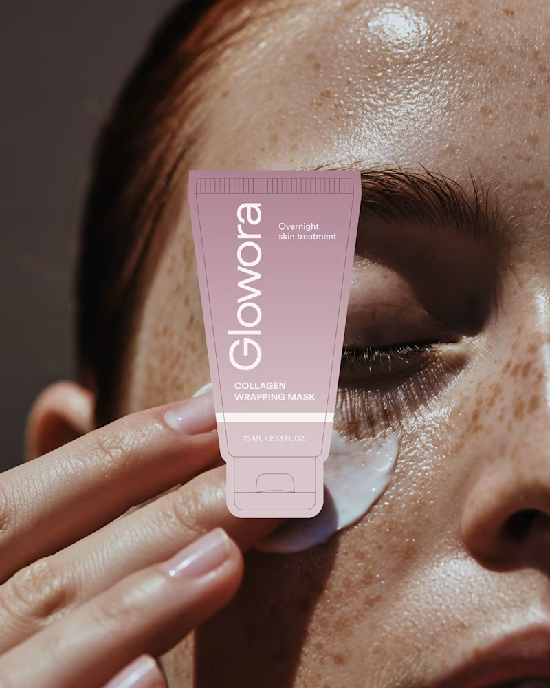
My most recent project: Glowora. A skincare concept built around refined femininity. The client already had a logo and some products but they needed a brand refresh that would feel consistent with their current branding which was not being fully respected. The moodboard translates directly into the packaging through softness, contrast, and intentional restraint. From inspiration to execution, every detail is designed to feel calm, elevated, and timeless.
35
114
6.4K
Explore projects