Glowora | Packaging Design for Skincare Brand
Approve request to show earnings
View
Anita Autorino
Verified
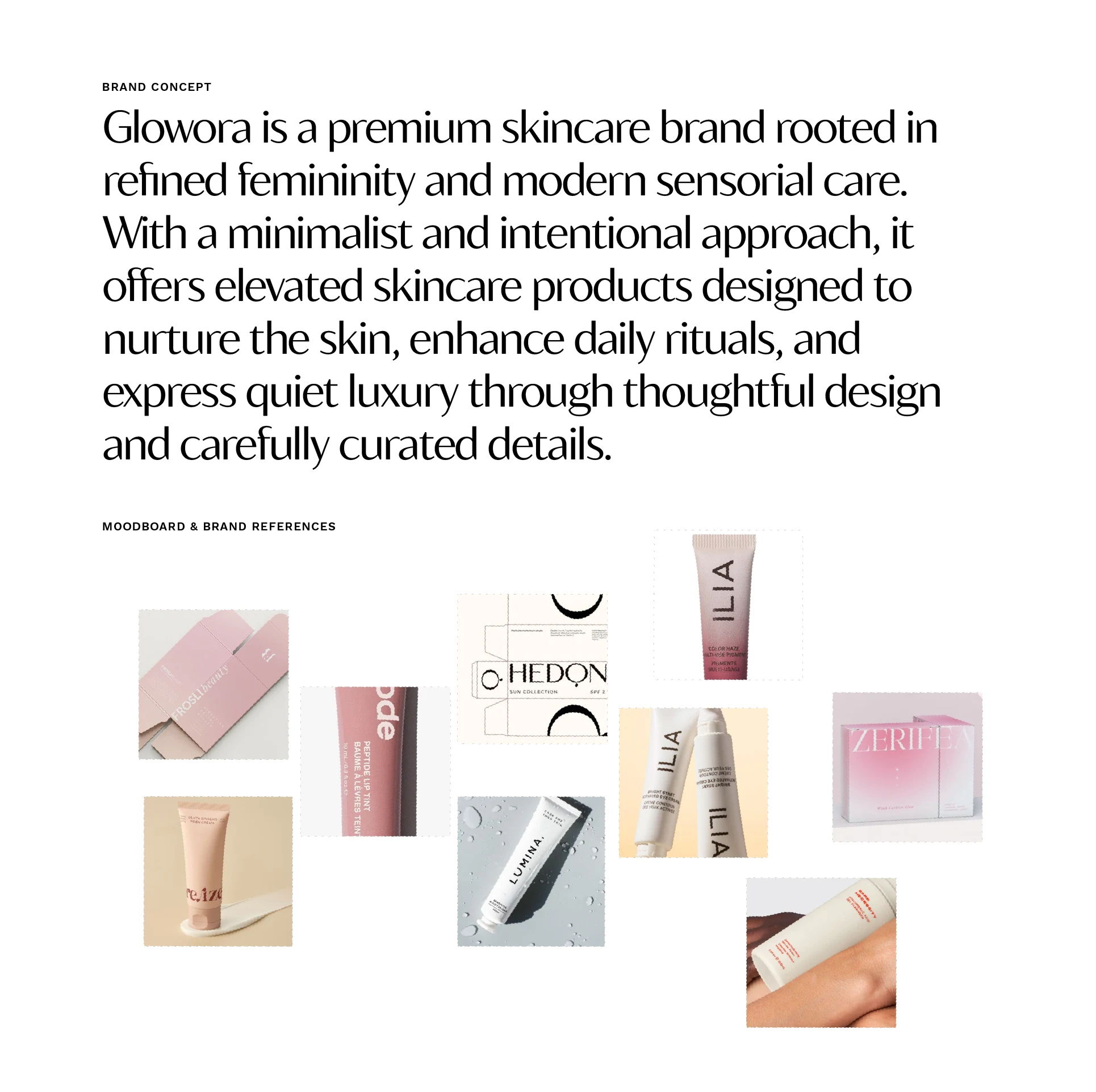
The ask
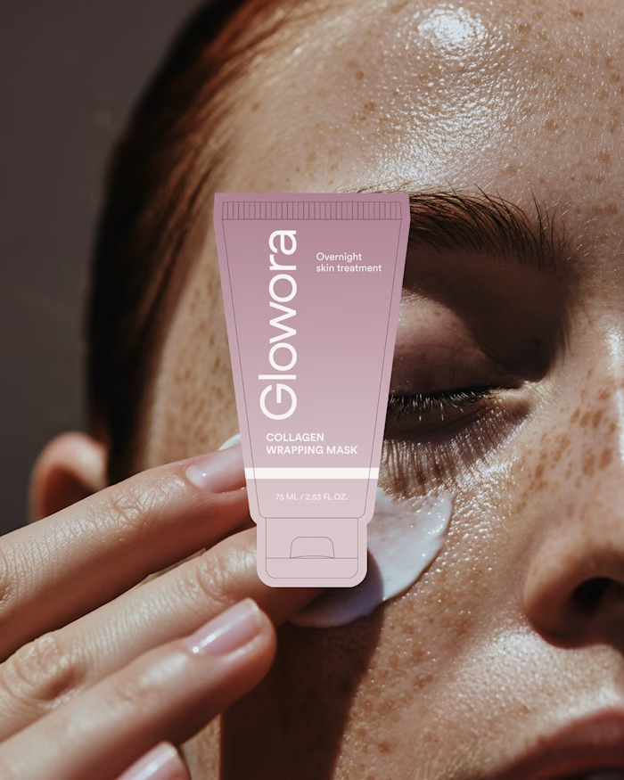
Glowora approached me with a clear foundation already in place: a defined logo and brand identity that was not being consistently applied across their existing products. The challenge was to translate that identity into packaging and label designs that truly reflected the brand’s premium positioning.
The project focused on expanding the original color palette, refining the visual hierarchy, and developing a cohesive packaging system that feels elevated, feminine, and intentional. The result is a more accurate and confident look and feel that aligns Glowora’s products with the brand they were always meant to represent.
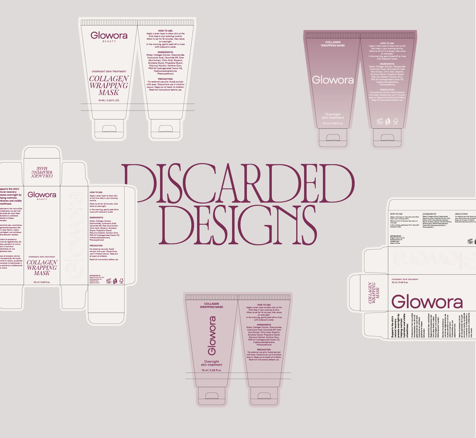
Different discarded designs that were part of the design process.
Throughout the process, multiple visual directions were explored, including more expressive editorial layouts and the introduction of a secondary typeface to push the brand into a bolder, fashion driven space. While these concepts were visually strong and well crafted, they ultimately didn’t align with the client’s preference for a cleaner and more restrained expression.
This exploration phase was key in refining the final direction, helping clarify that a more minimal approach best supports Glowora’s identity and reinforces its premium, timeless positioning.
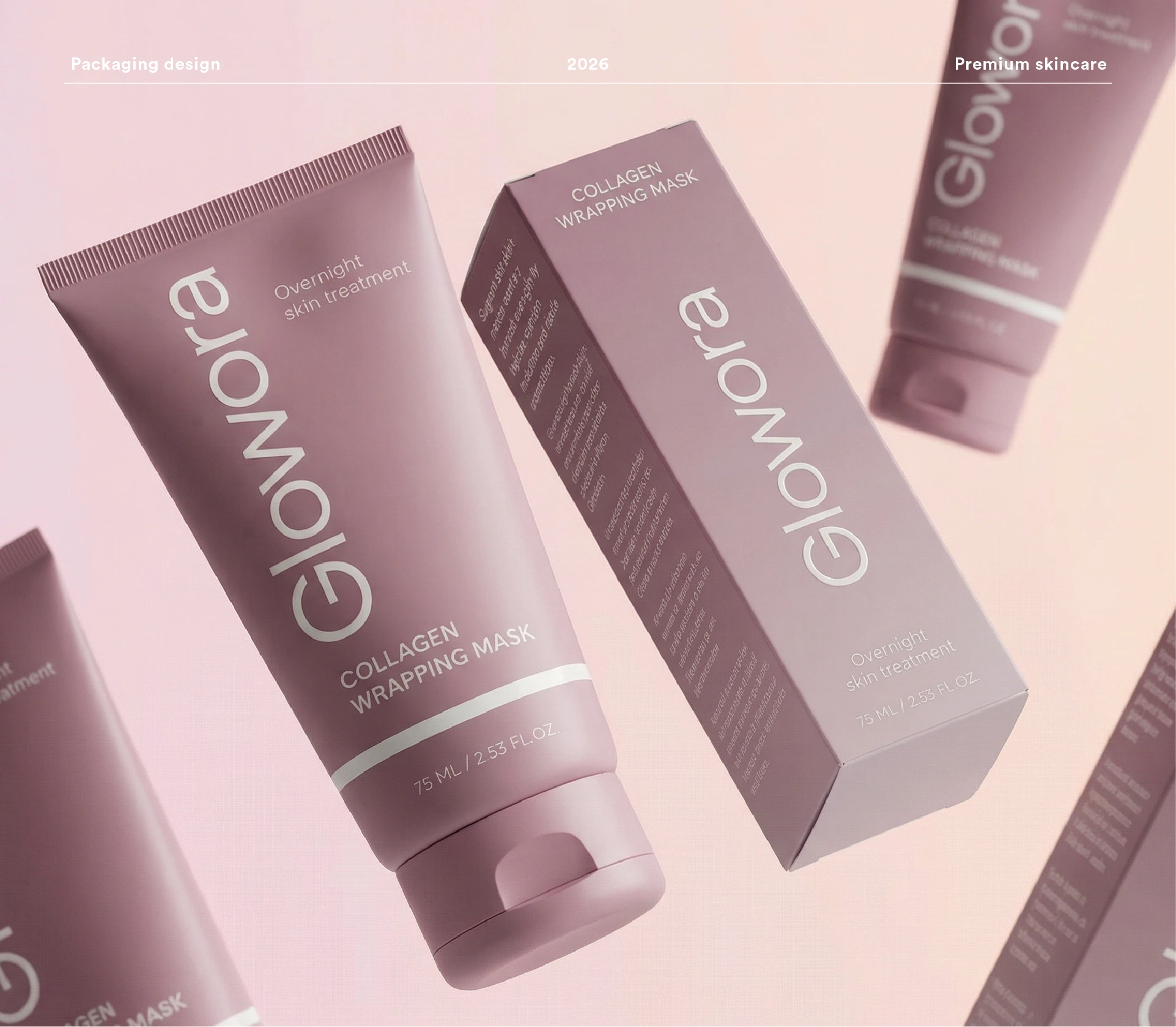
The final design
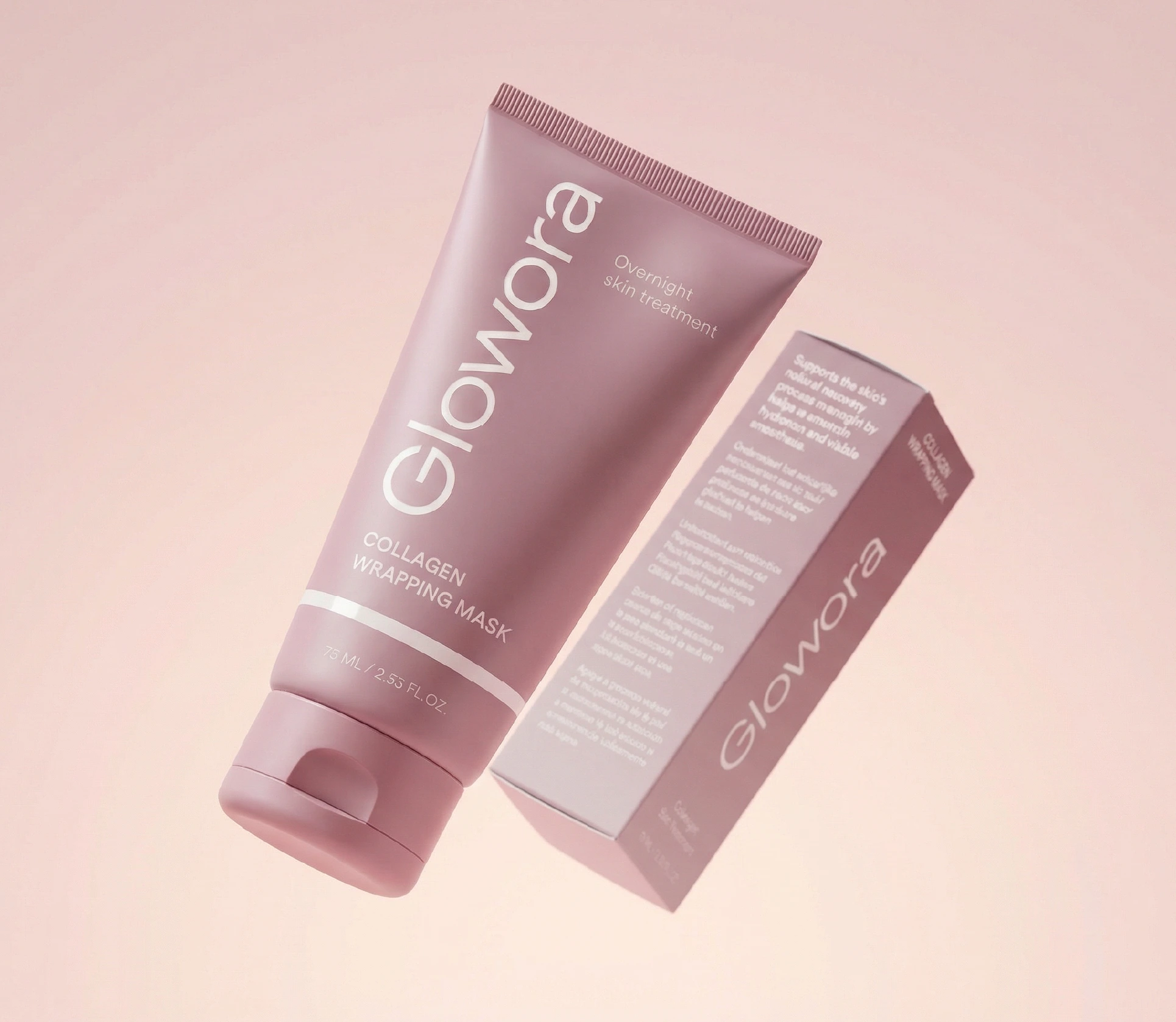
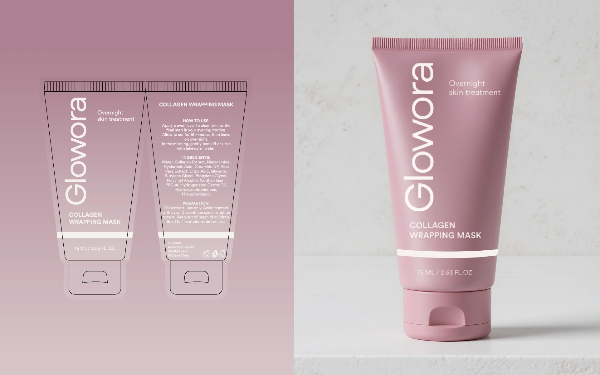
Generated mockup in Photoshop + Adobe Firefly with Nano Banana Extension
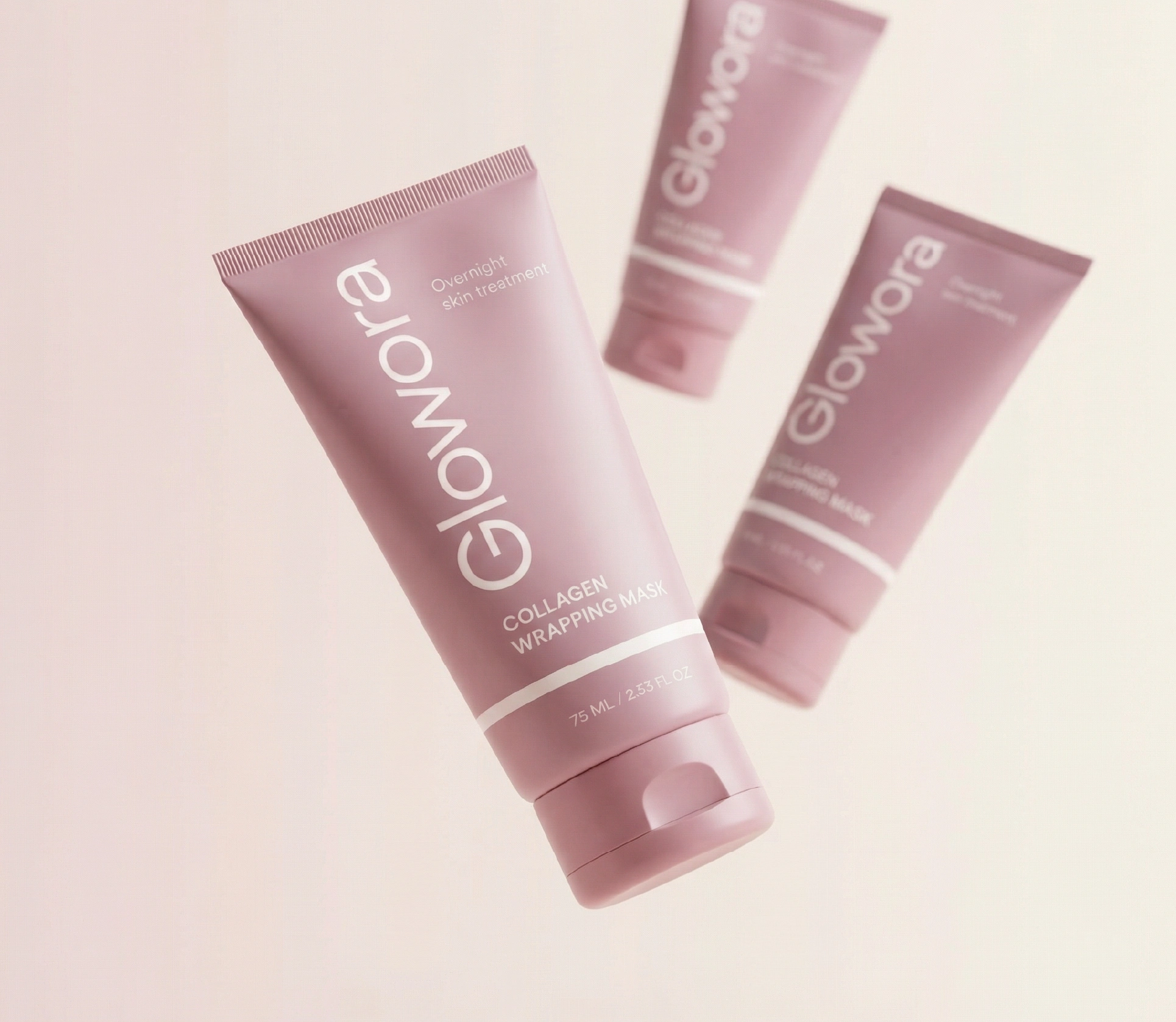
Generated mockup in Photoshop + Adobe Firefly with Nano Banana Extension
Box, using a gradient and sans serif font for a clinical and more scientific approach
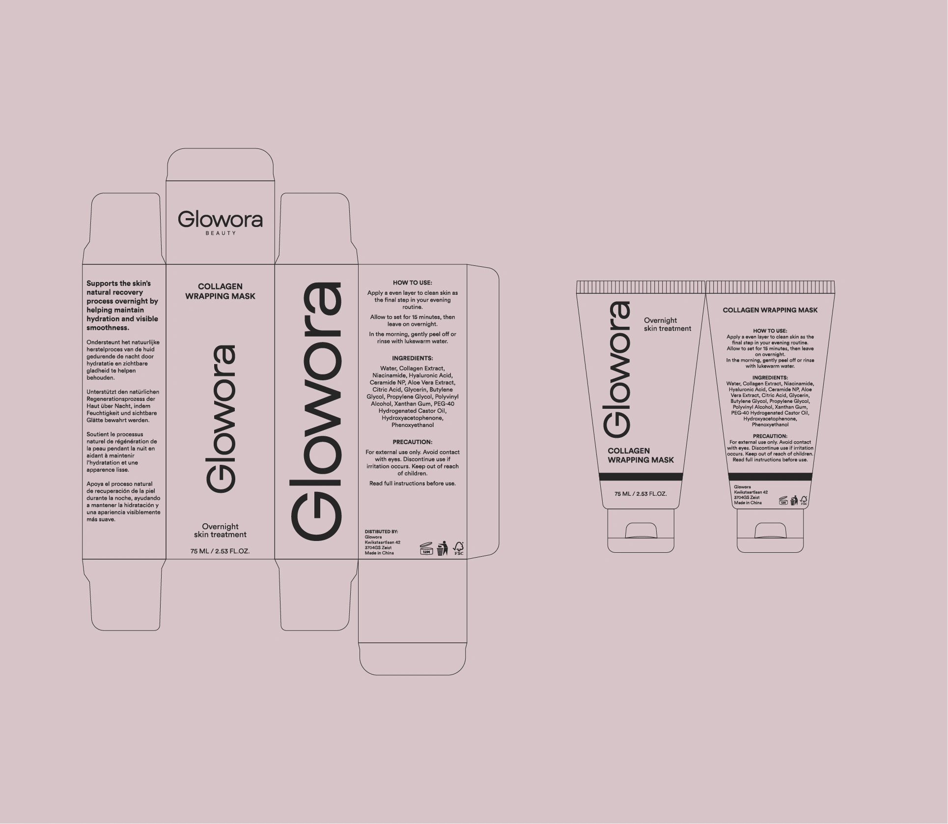
Final look and feel, layout of box and tube
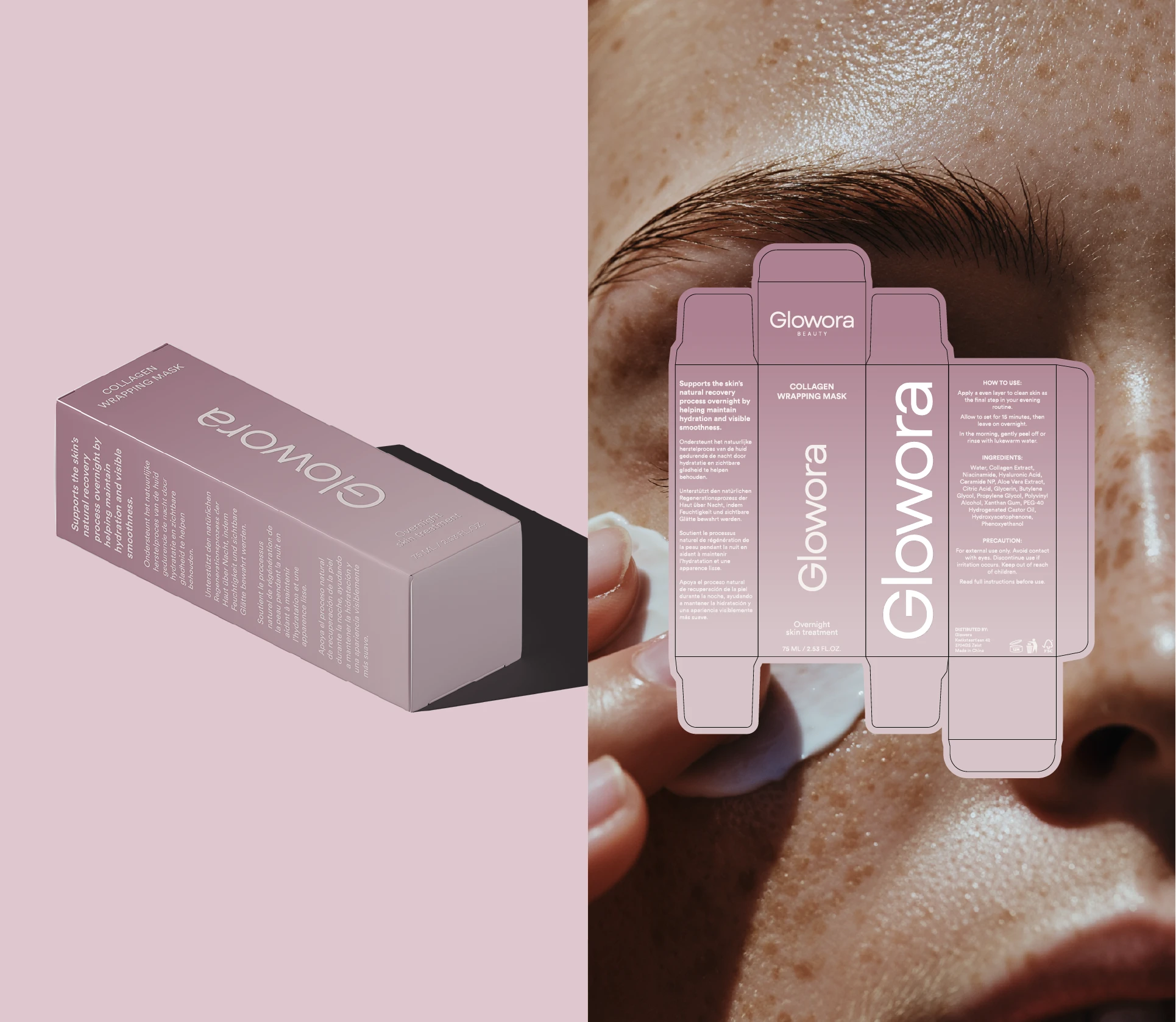
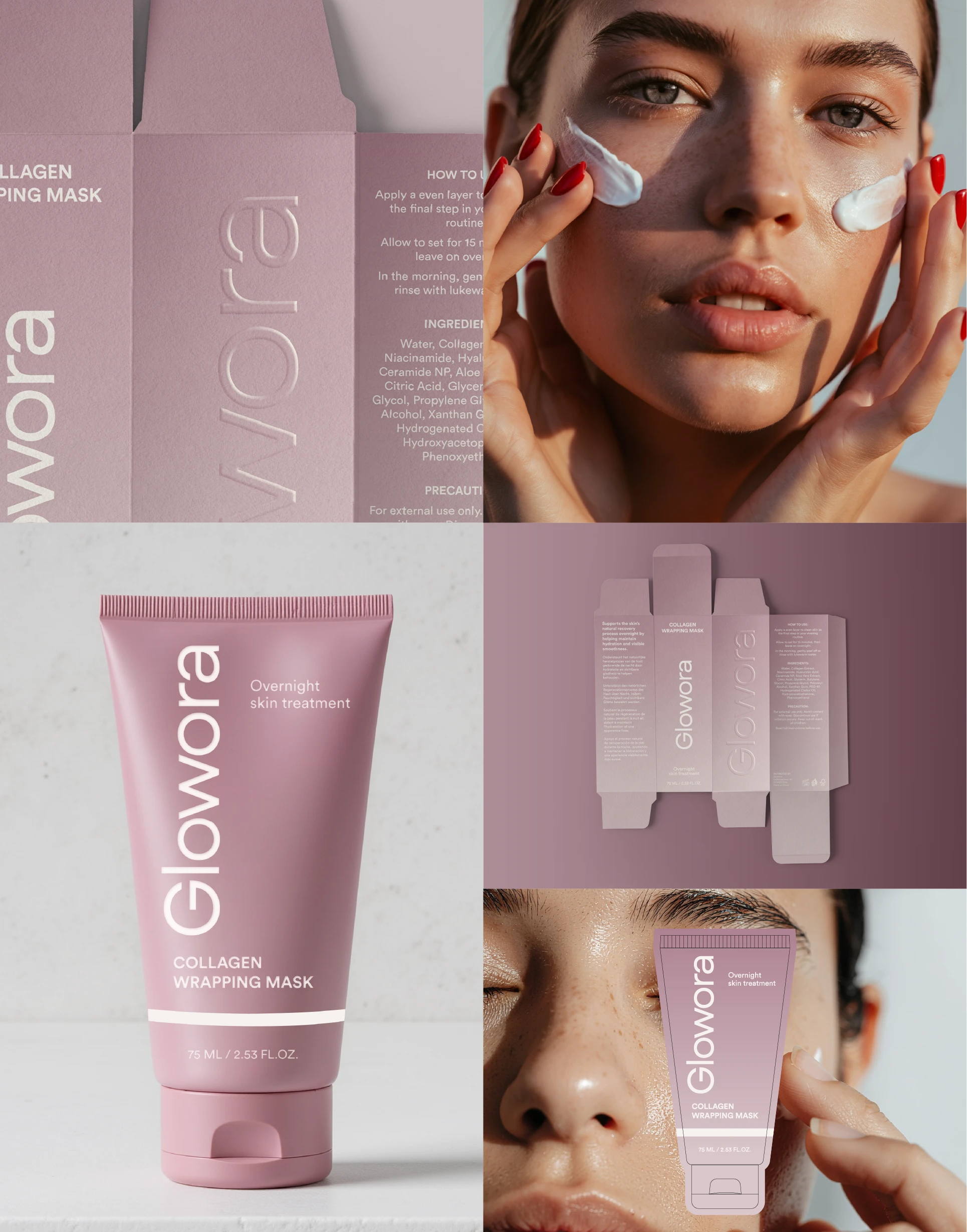
The final outcome is a cohesive packaging and label system that brings Glowora’s brand to life with clarity and intention.
By refining the color palette, simplifying the layouts, and establishing a consistent visual language, the product now communicates femininity, quality, and quiet luxury at every touchpoint. The result is a design that feels confident, timeless, and aligned with the brand’s values, allowing Glowora to present its products in a way that is both elevated and unmistakably its own.
Like this project
Posted Jun 20, 2026
Packaging and label redesign for Glowora, refining the color palette and visual system to align products with a minimal, premium brand identity.
Likes
2
Views
48
Timeline
Jan 5, 2026 - Jan 14, 2026