Collection of typographic logos & monograms 2025
Anita Autorino
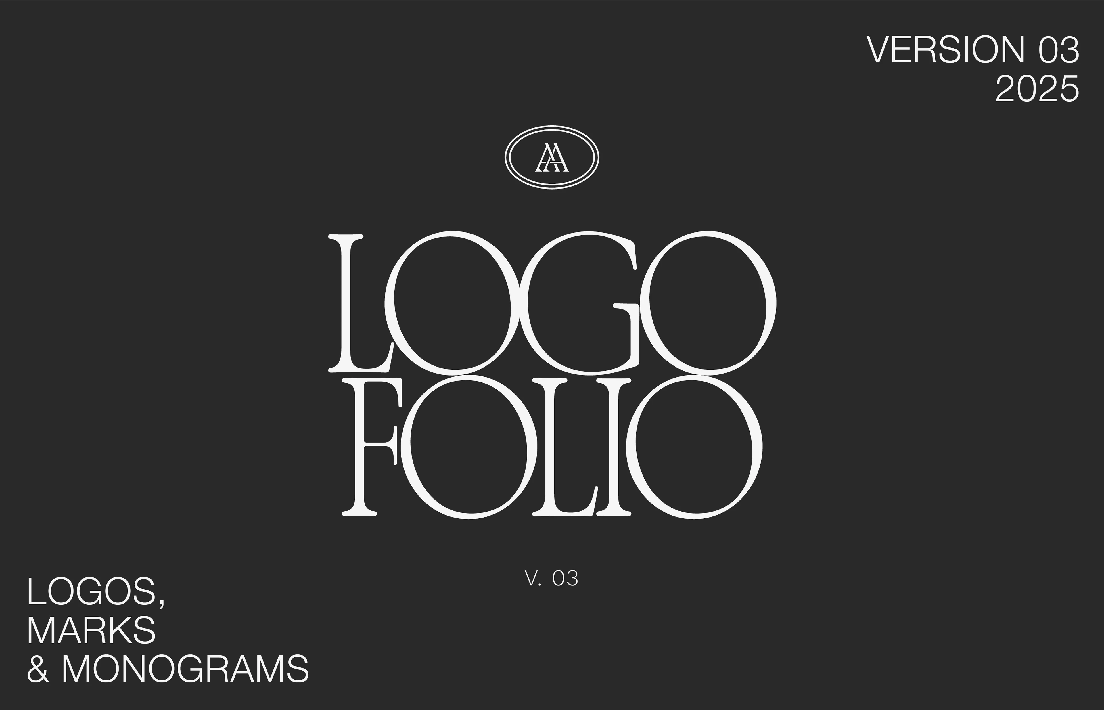
2025 Logofolio
This folio presents a curated selection of delivered client logo work that defines my typographic design style. The projects span skincare, produce, and lifestyle brands, with a strong focus on typography as the core of each identity. My work centers on intentional font combinations, custom letterform design, refined monograms, and minimal yet organic details, always prioritizing clarity, balance, and timelessness.
Each logo is designed as a functional brand asset, not an experiment, built to perform consistently across real brand systems and age with purpose rather than trends.
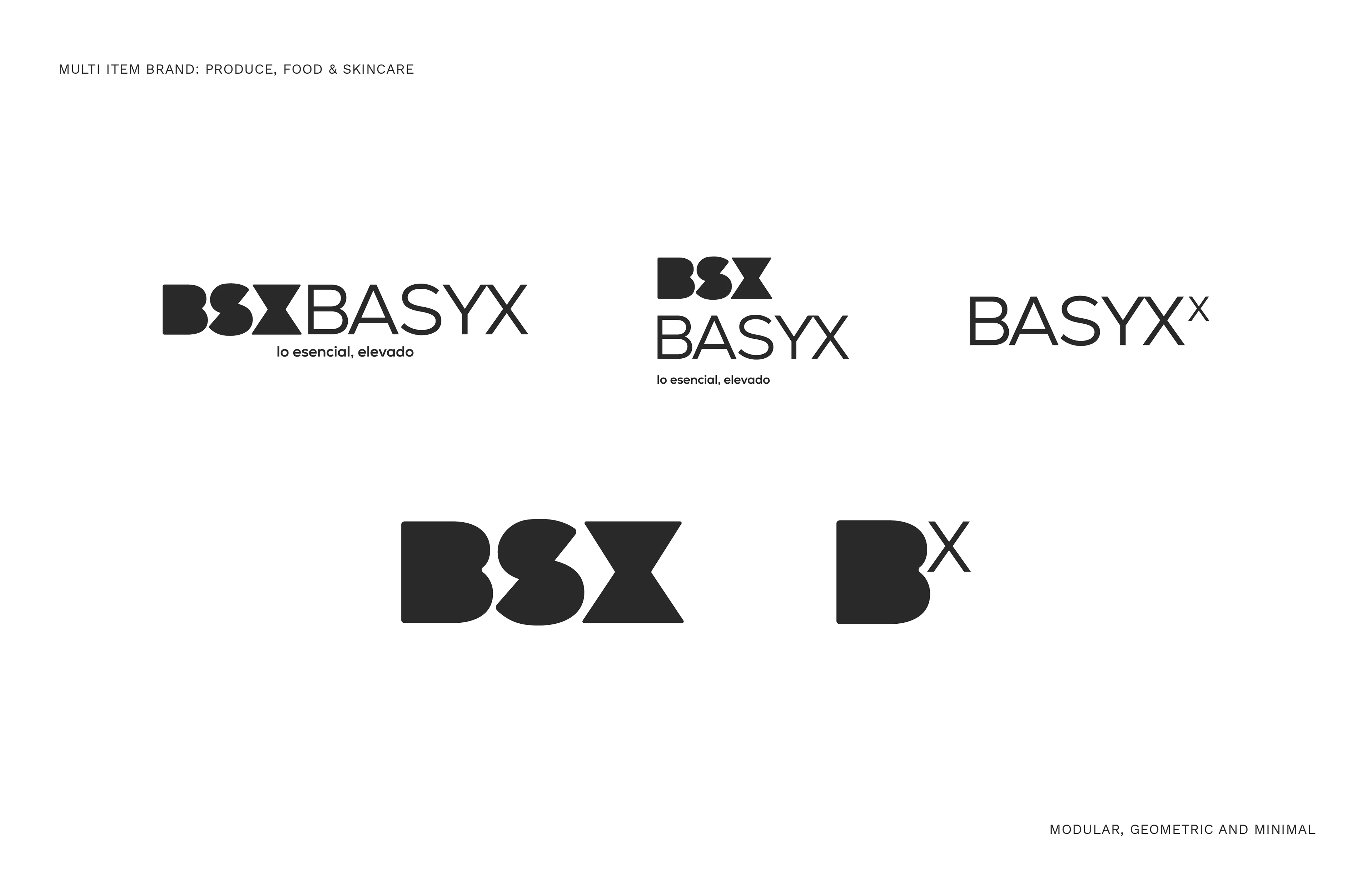
Modular symbol work for a geometric inspired multi item brand.
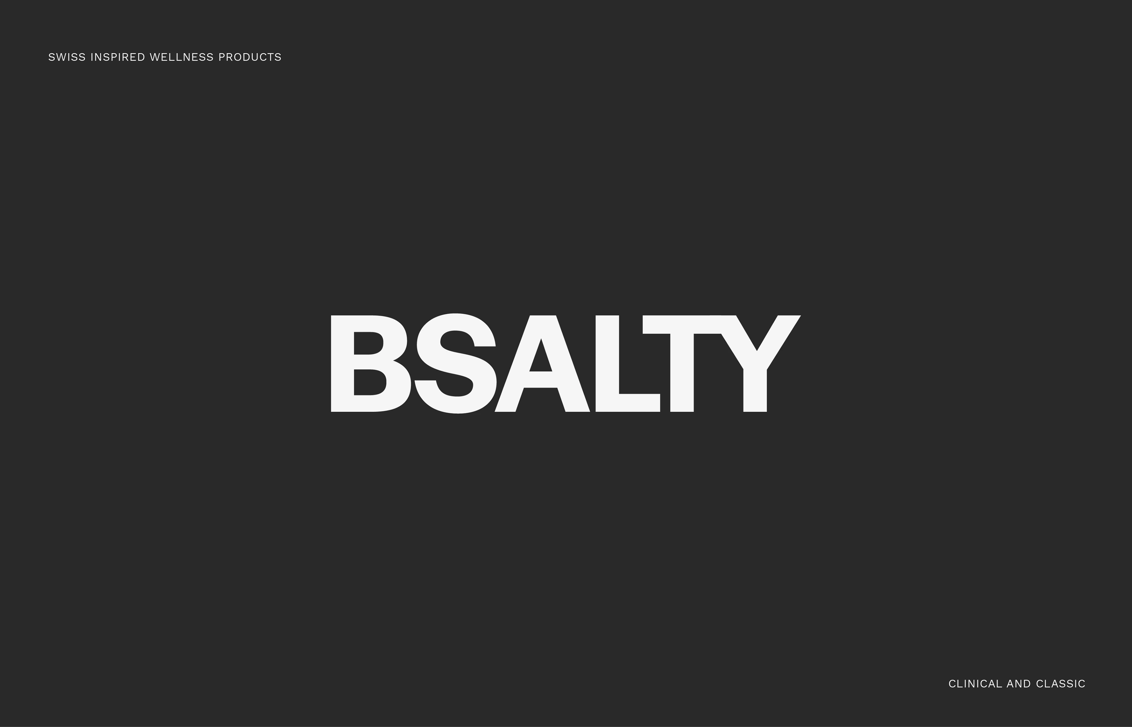
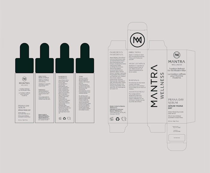
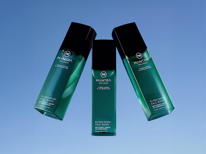
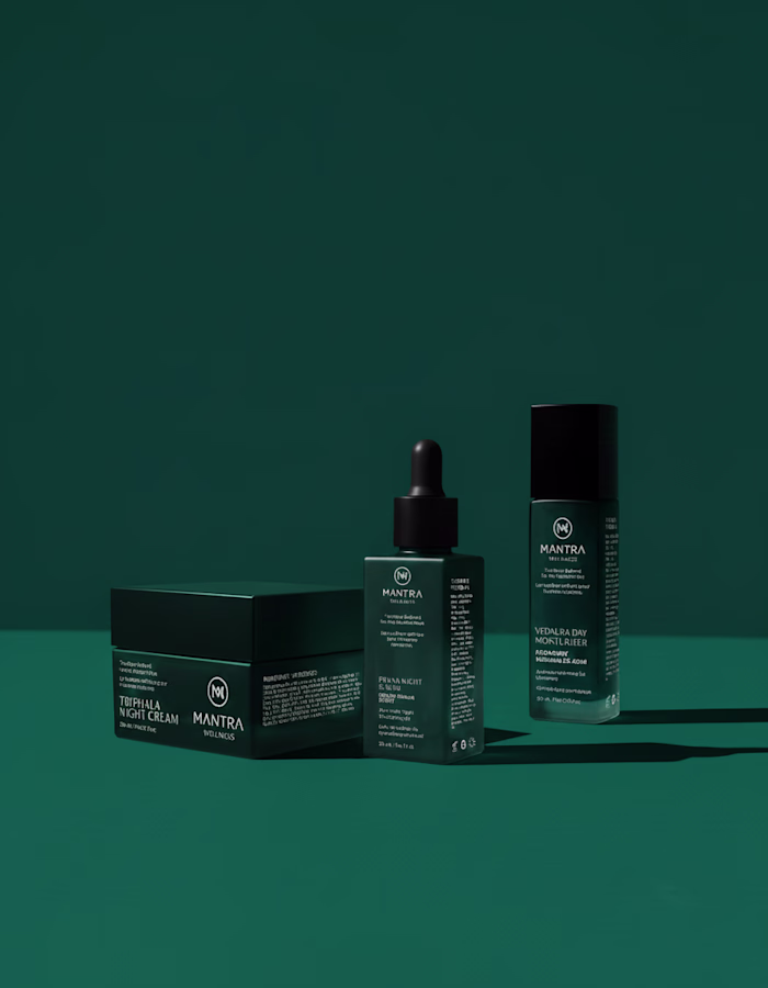
Swiss inspired wellness products, sans serif logo with manually curated and adjusted typography and letterspace
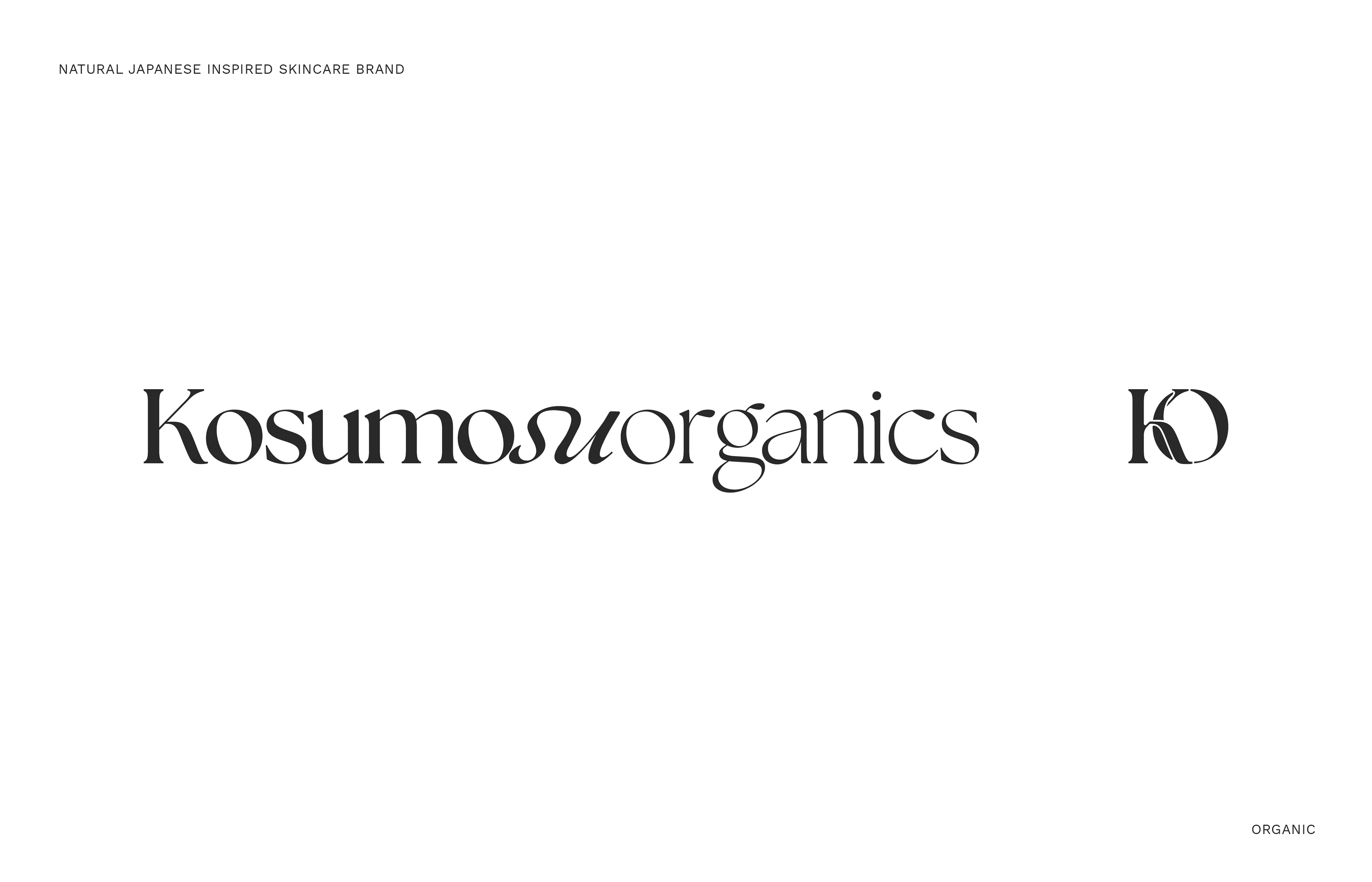
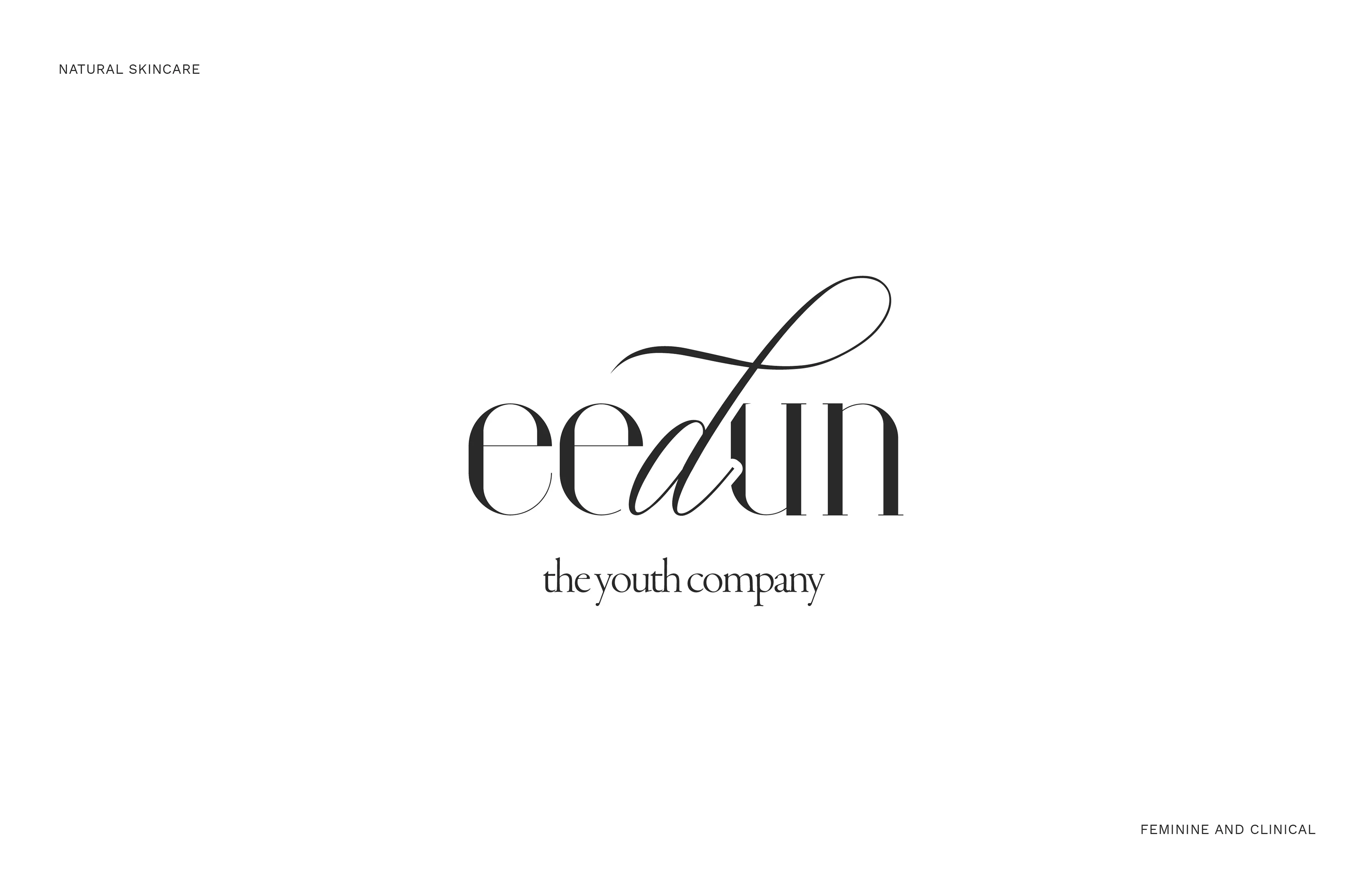
Organic logo with different font combination for a dynamic shape and readability. Monogram with intertwined letters.
Geometric logo redesign with a monogram and clear secondary application.
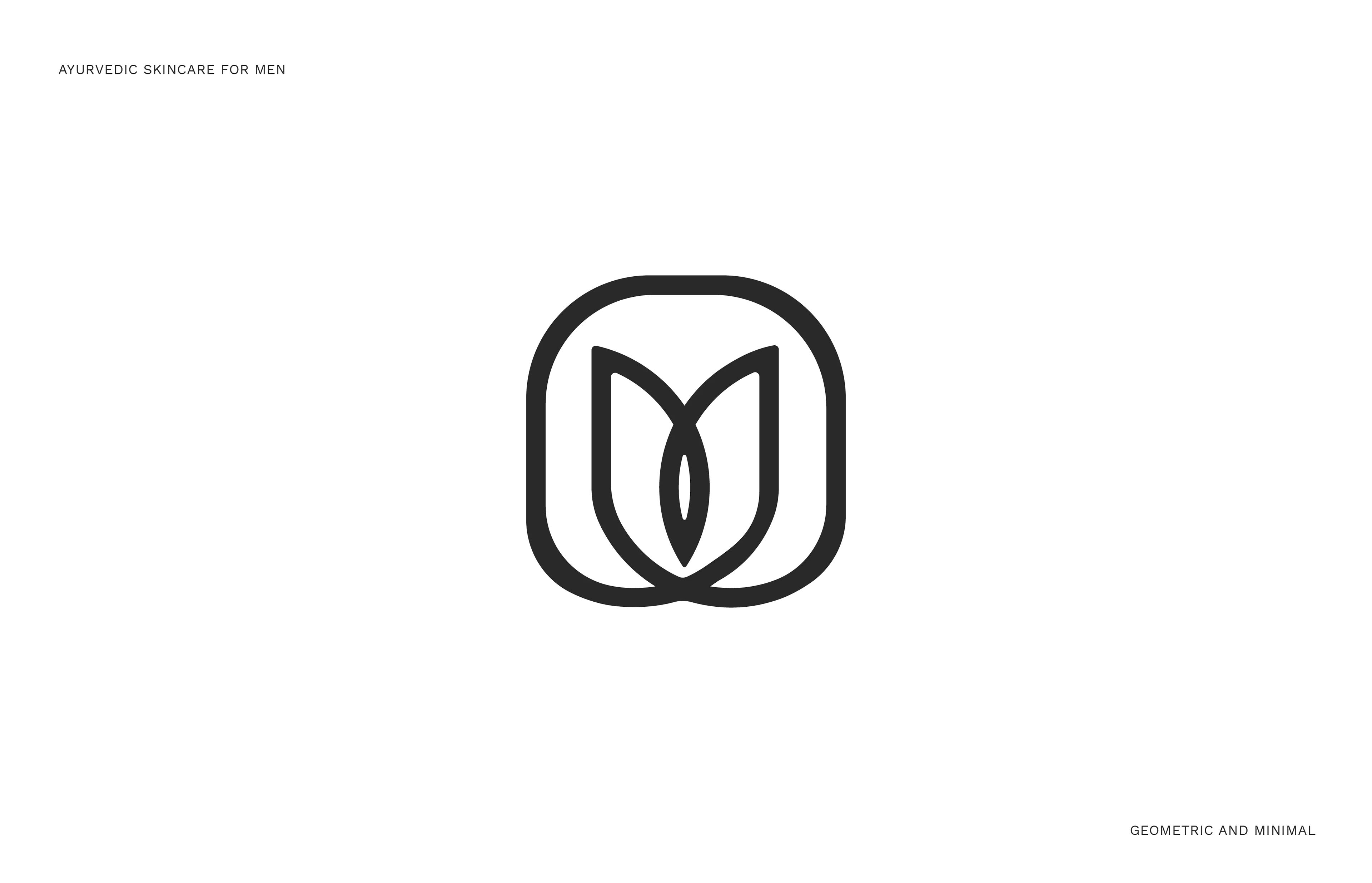
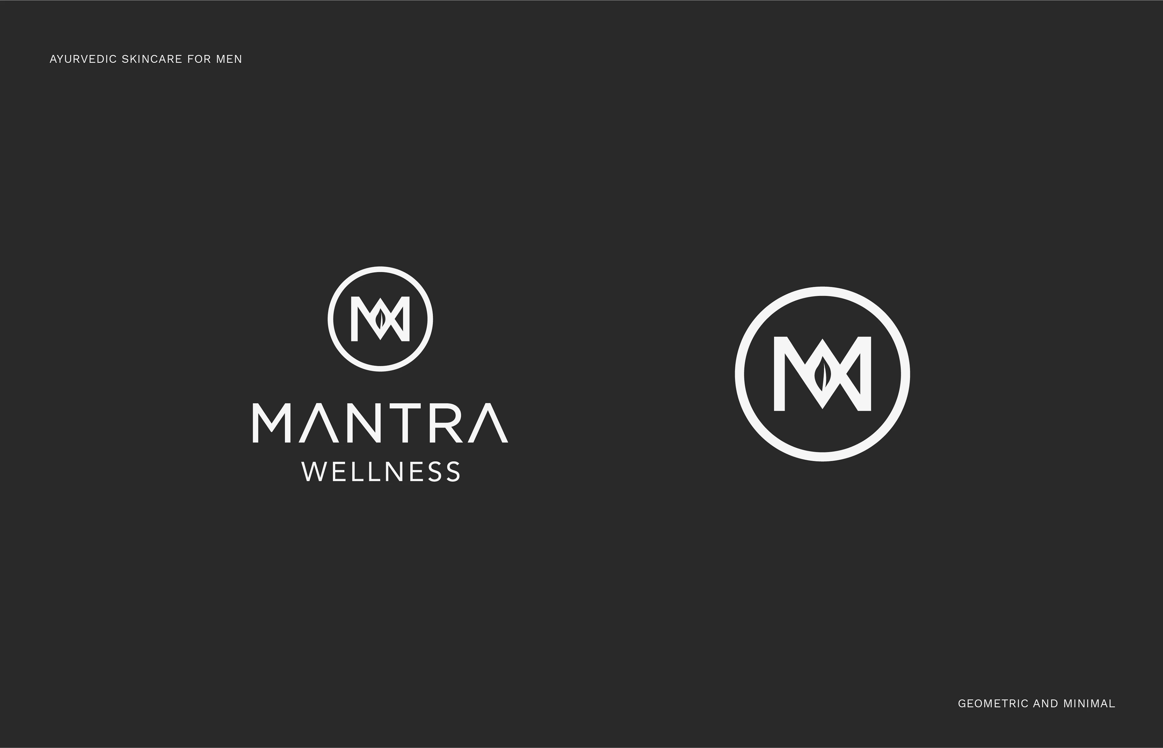
Monogram design for Mantra Wellness, geometric grid design and illustration.

Monogram design for Mantra Wellness, geometric grid design and illustration.
Typography as Craft
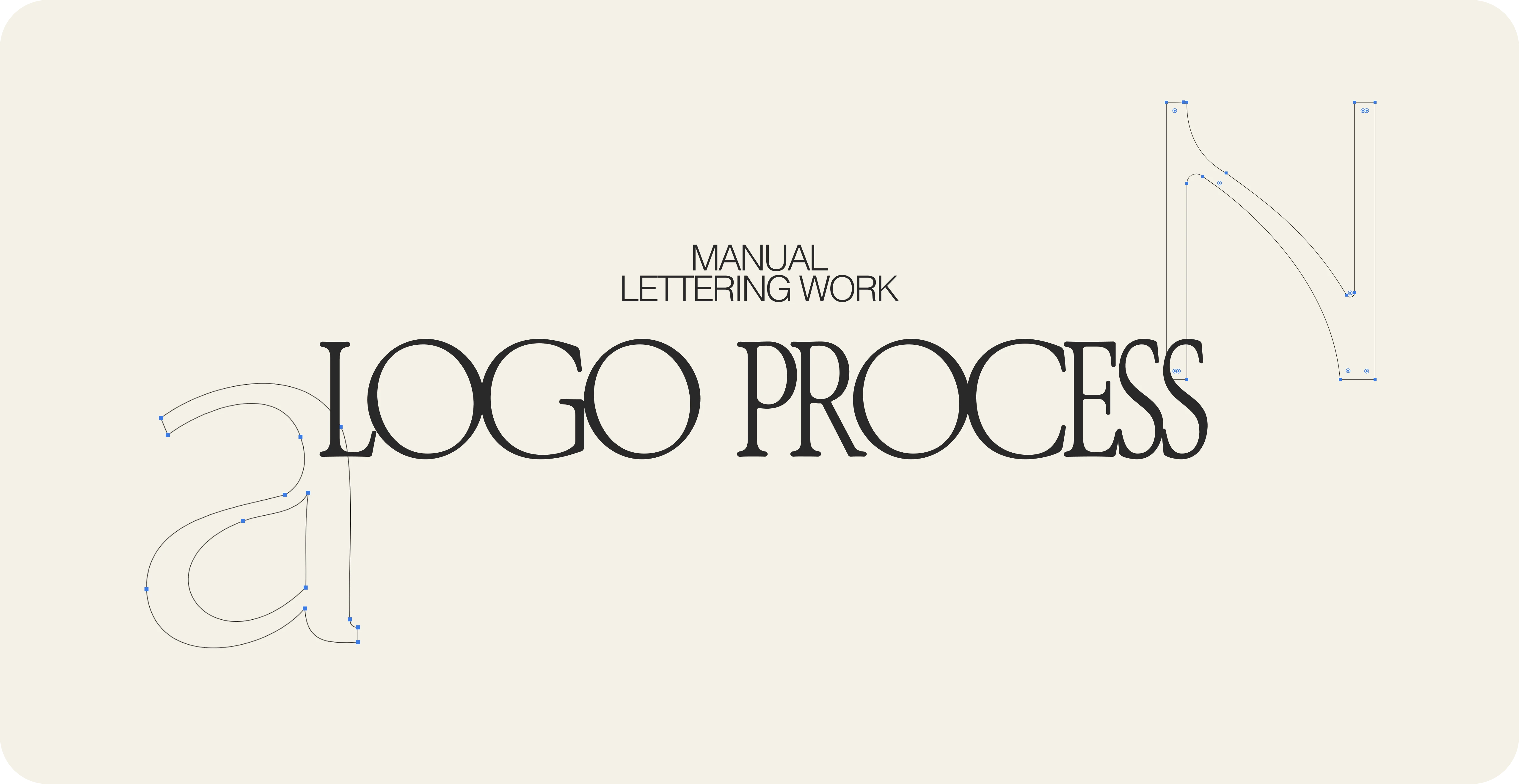
My work is rooted in typography as a construction process, not just selection. Rather than relying on off-the-shelf fonts, I refine, adjust, and rebuild letterforms to create logos that feel intentional and ownable.
Each mark involves manual intervention, from subtle kerning decisions to fully customized lettering. This approach allows me to shape unique identities while maintaining the simplicity and clarity that define my style.
The result is typography that doesn’t just look good, it works hard. Distinct, balanced, and built to hold presence across packaging and brand systems without losing its character.
Like this project
Posted Jan 10, 2026
Curated 2025 logofolio for skincare and wellness brands focused on custom typography, refined lettering, and timeless design built for real-world brand systems.
Likes
13
Views
170