
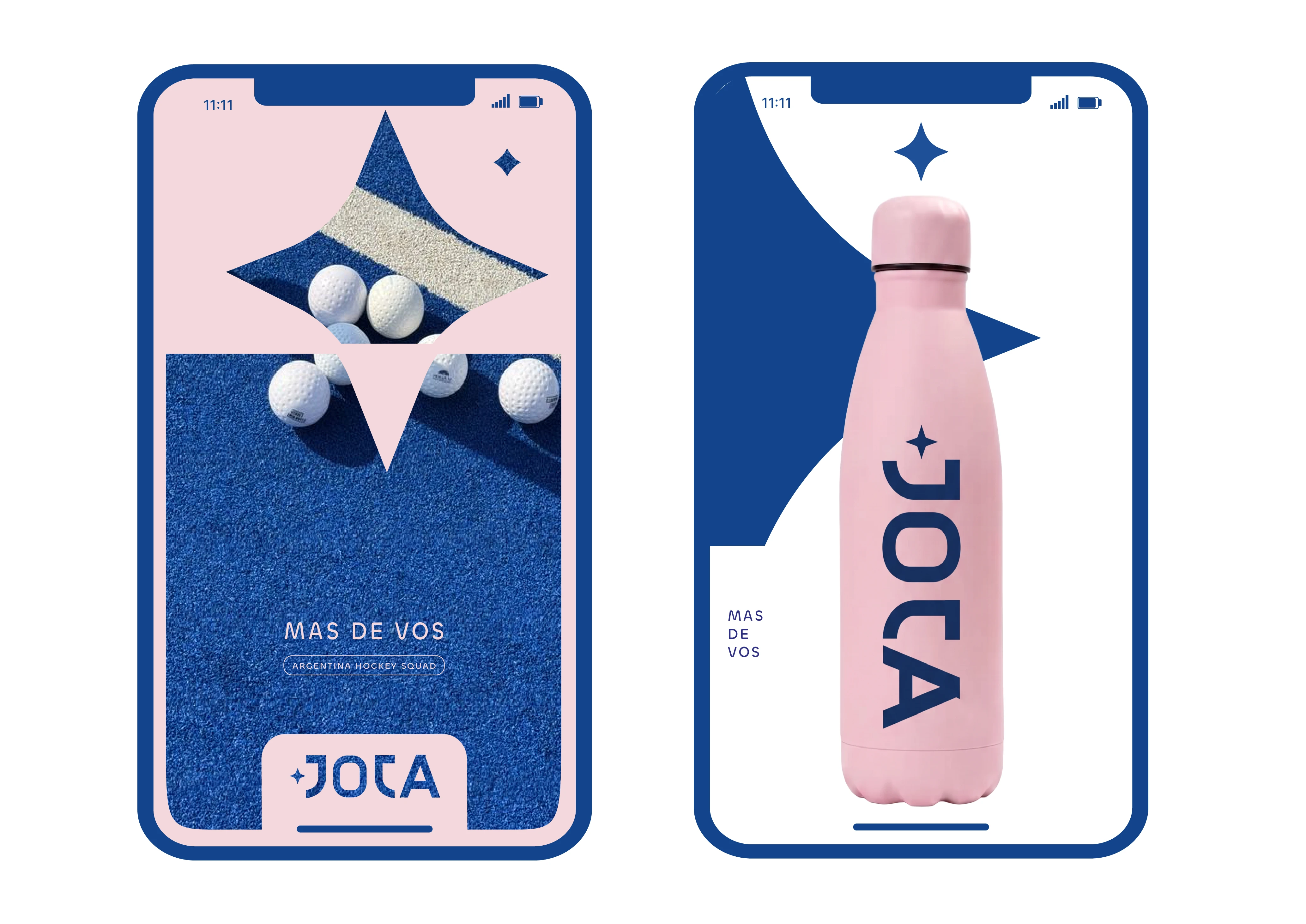
JOTA Field Hockey Brand Packaging Design
JOTA is an Argentine field hockey brand built for players who play with personality. The founder reached out to rethink how the brand shows up beyond the stick itself.
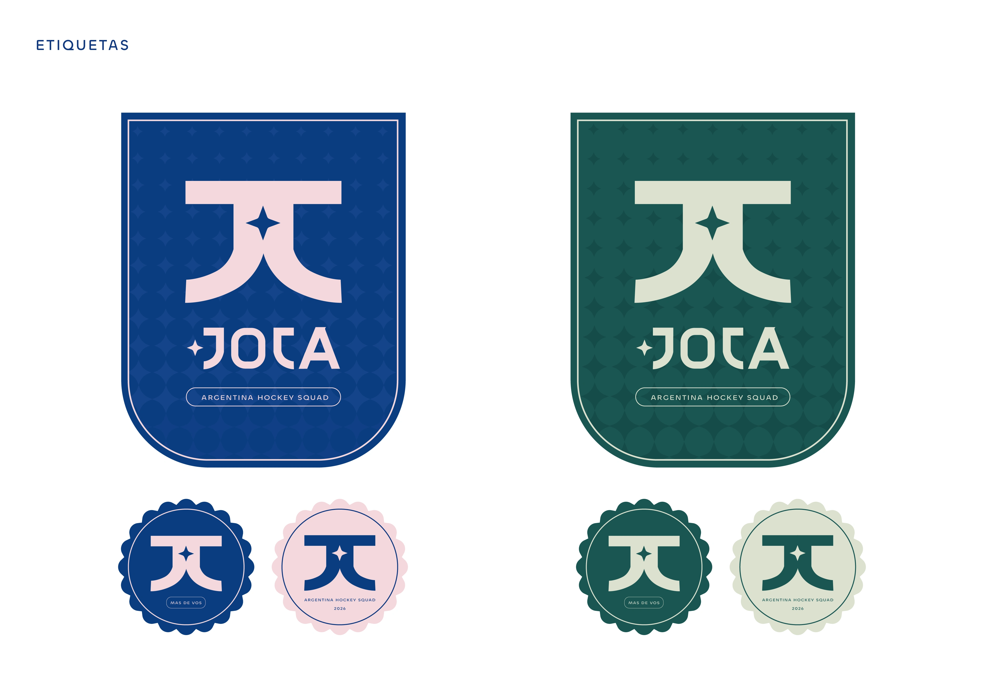
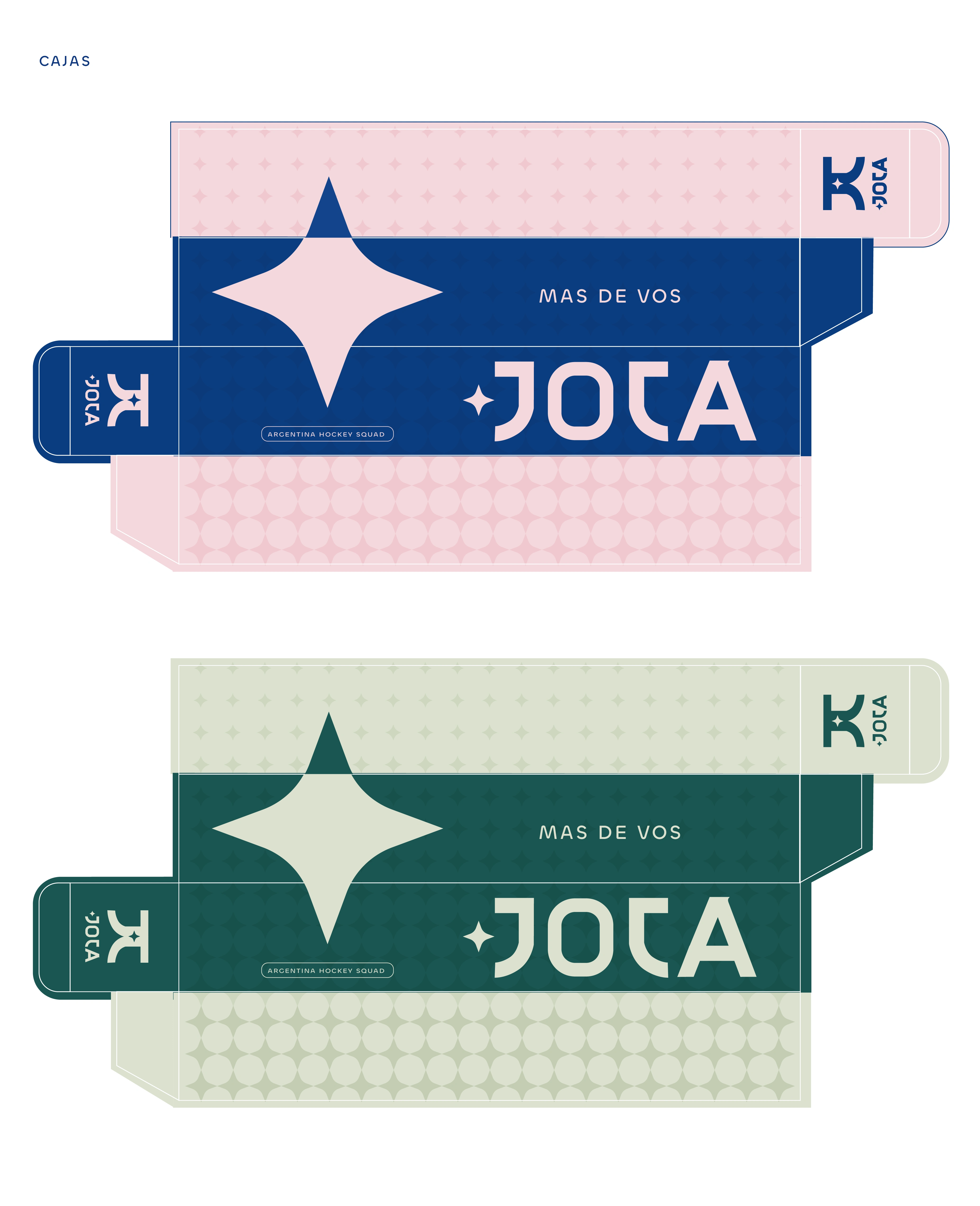
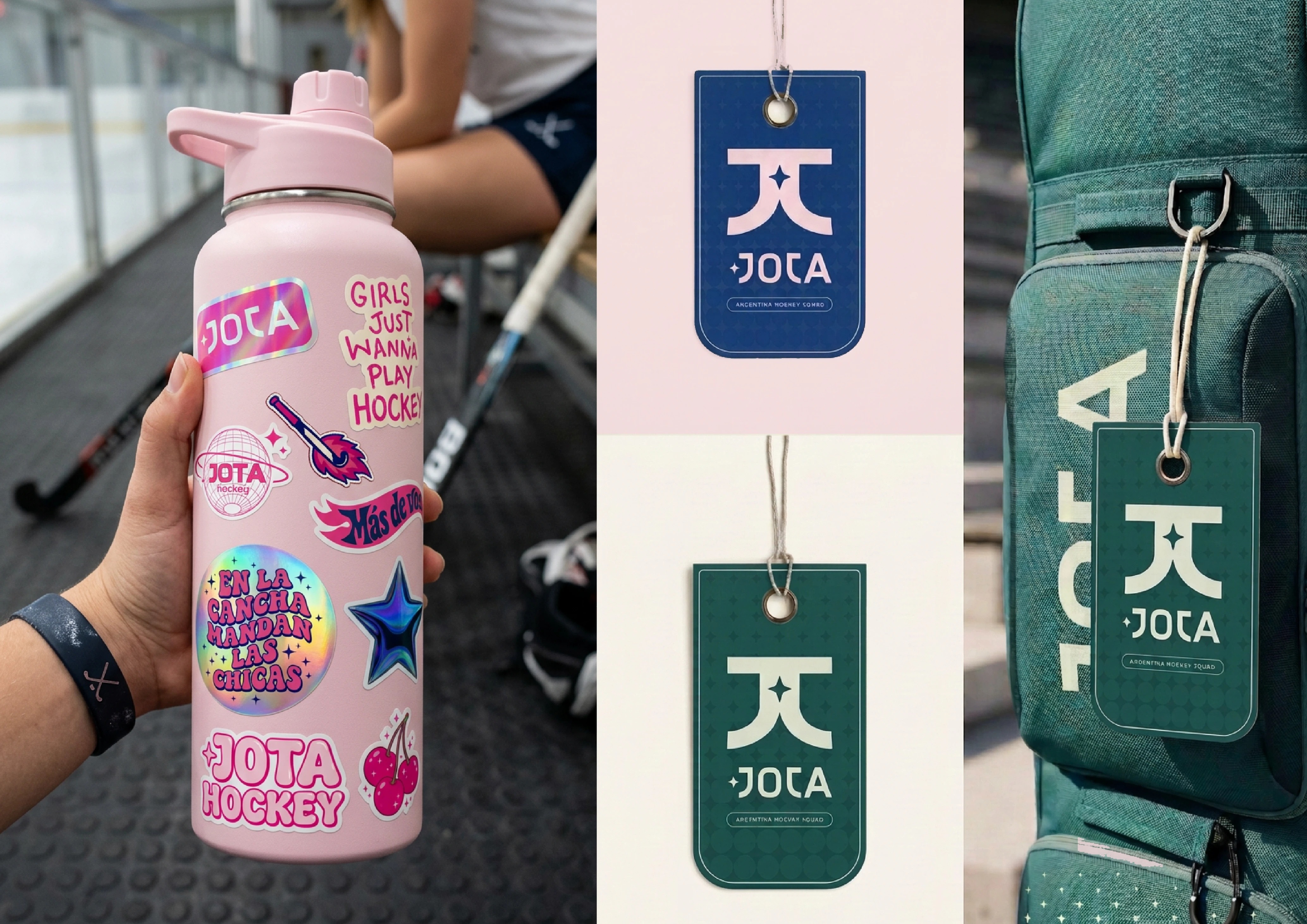
Working from the existing logo, I developed a packaging proposal that extends the identity into a full visual system. The four-point star becomes a cutout, a pattern and a recurring mark; the navy-and-pink palette carries it across every piece.
Scope: stick box redesign, product label, social media templates and a sticker sheet.
My role: concept, packaging and label design, visual system, social and sticker applications.
Concept proposal. Logo by the brand.
2 likes · 13 views · Nov 1, 2026
Packaging redesign and brand identity system for JOTA, a field hockey brand built for players with personality. A clear, unified packaging design that works across the whole product line.

