Why do half the skincare

Anita Autorino

Why do half the skincare and fashion brands launching this year look like they share the same designer?
Serif logotype, tight tracking, one accent color. ✅ It reads as elevated the first time. By the twentieth brand, it reads as a template, not a decision.
Safe typography isn't neutral, it's a choice too, sometimes one that avoids taking a position 🤭.
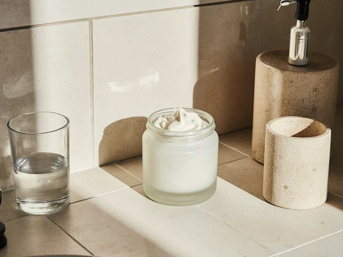
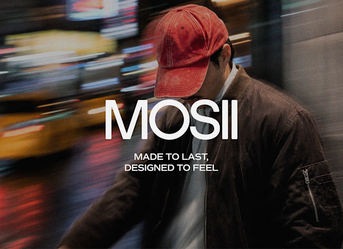
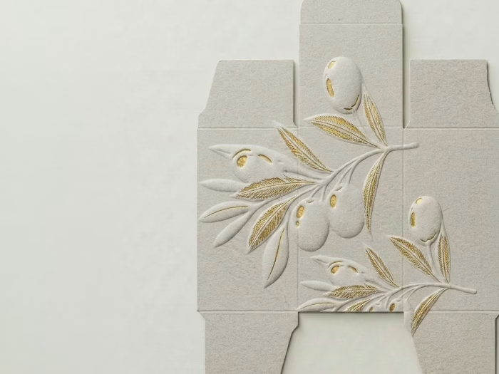
So I designed a set of mockups with custom letterforms built to argue the opposite: type with weight, texture, and enough attitude to hold its ground on a shelf full of quiet logos. 💅
What's the last fashion or skincare brand whose type actually made you stop scrolling?
Like this project
Posted Sep 3, 2026
Why do half the skincare and fashion brands launching this year look like they share the same designer? Serif logotype, tight tracking, one accent color. ✅ I...
Likes
0
Views
7