Results that are similar to your search
Similar results

Design partner for founders with underperforming products
- $50k+
- Earned
- 7x
- Hired
- 5.0
- Rating
- 321
- Followers
Design partner for founders with underperforming products

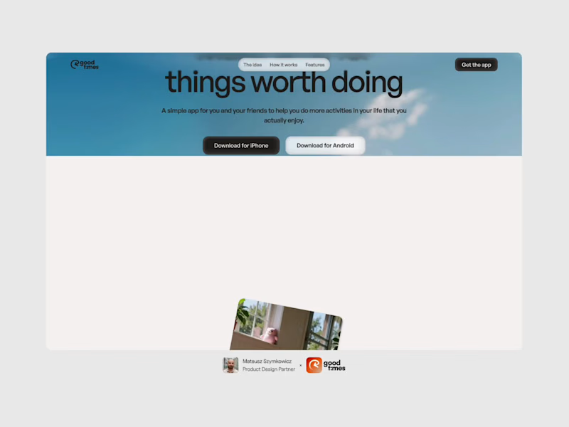
The Good Times website is live 👀
Most app sites start with a phone mockup and a list of features. This one starts with the problem, so you can see yourself in it first. The app shows up after that, as the answer.
https://goodtimestimer.com/
(https://goodtimestimer.com/)Built with Astro.
53
106
4.6K


Building my own product, I keep doing the exact thing I warn founders about.
Made a splash animation I loved. Watched it on a real device and it dragged. Told founders a hundred times: the first impression is a budget you spend in two seconds.
The advice I give for a living is the advice I have to force myself to take.
39
128
5.7K


Senior Product Designer with 8+ years of experience
- 1x
- Hired
- 4.4
- Rating
- 47
- Followers
Senior Product Designer with 8+ years of experience

AI Workflow Automation Landing Page
TaskGenius is a modern landing page concept for an AI workflow automation platform. The design highlights product capabilities through a strong visual hierarchy, premium dark UI, and engaging sections that showcase automation, analytics, integrations, and customer success while keeping the experience clean and easy to navigate.
2
3
436

Concept Work: Audi - Vehicle Car Website
Audi Drive is a luxury automotive landing page concept designed to capture the feeling of performance, precision, and premium craftsmanship. Instead of relying on information-heavy layouts, the experience uses a cinematic hero section, minimal navigation, and focused calls to action to let the vehicle become the center of attention. The dark visual theme, atmospheric lighting, and clean typography create a premium first impression while guiding users naturally toward exploring or booking a test drive. The goal was to balance strong visual storytelling with a simple, user-friendly experience that reflects the Audi brand.
Key Design Features
Cinematic Hero Experience: A full-screen automotive visual with dramatic lighting and motion that immediately communicates performance and luxury.
Minimal Navigation: A clean, distraction-free navigation bar that keeps the focus on the vehicle while making key sections easy to access.
Clear Call-to-Action Buttons: Primary actions like Order Now and Demo Drive are visually prioritized to encourage quick user decisions.
Premium Visual Hierarchy: Large typography, generous spacing, and a balanced composition create an elegant reading flow and improve usability.
Luxury Dark Interface: A dark color palette combined with subtle glass effects and blue accent lighting enhances the premium feel while maintaining strong readability.
User-Centered Layout: Every element is intentionally placed to reduce cognitive load, making the interface both visually engaging and easy to navigate.
2
4
350

AirFly - Flight Booking Website UI Design
AirFly is a luxury-oriented travel UX concept that moves away from the sterile, cluttered layouts typical of booking engines. The theme focuses on "The Joy of Departure," utilizing a dark, cinematic aesthetic to evoke the mystery and excitement of travel. By combining high-impact photography with a streamlined search interface, AirFly transforms a functional task into a premium digital experience, ensuring users feel the "safely travel" promise from the first click.
Key Design Features:
Cinematic Hero Header: A breathtaking full-width landing page visual that establishes immediate emotional trust and brand authority.
Intuitive Search Widget: A glassmorphic flight selector that simplifies complex "One Way," "Multi City," and "Traveler" variables into a single, sleek bar.
Dynamic Retargeting Section: A "Still Interested in New York?" component designed to reduce cart abandonment through personalized, data-driven flight recommendations.
Trust Indicators: Seamlessly integrated social proof through a "Trusted by popular companies" marquee and clear payment gateway icons (Apple Pay, Google Pay, Visa).
1
332

Zentrix Real Estate Company Brand Identity Design
Zentrix isn't just a company; it's a commitment to excellence, innovation, and a client-centric philosophy that transforms the real estate journey. They're here to make a meaningful impact in the lives of their clients and the communities they serve. Welcome to a new era of real estate, where Zen meets the power of Trix, at Zentrix.
Zentrix isn't just a company; it's a commitment to excellence, innovation, and a client-centric philosophy that transforms the real estate journey. They're here to make a meaningful impact in the lives of their clients and the communities they serve. Welcome to a new era of real estate, where Zen meets the power of Trix, at Zentrix.
The logo of Zentrix is a combination of strip lines in the shape of a building. The consistent strip lines depicts that there is consistency between their work and there is harmony in their work process.
Challenges
The branding part was not really challenging but still a bit challenging was to incorporate the luxurious as well as trustworthy vibe to the logo. After some sketches, we were able to do it.
Solutions
To overcome the obstacles, we conducted research and meetings, as well as a lot of brainstorming and sketching. As a result, many ideas came to mind, and we were able to determine exactly what we and the client desired for the logo.
1
243

Product Designer & Figma Design System Specialist 🪄


Senior design partner for startups and SaaS teams
- 1x
- Hired
- 5
- Followers
Senior design partner for startups and SaaS teams


Accessible UX. Scalable Systems. Real Results.
Accessible UX. Scalable Systems. Real Results.

Designed a token-based theming architecture to support scalable multi-brand implementation across a distributed enterprise platform.
The system established a layered model of core tokens, semantic mappings, and controlled theme overrides, enabling brand variation without compromising accessibility or structural consistency.
By formalizing token inheritance and override rules, the architecture reduced duplication, strengthened governance, and enabled predictable system expansion across departments and sub-brands.
0
88

Defined a scalable typography system grounded in mathematical hierarchy and semantic token architecture to support consistent implementation across a multi-brand design system.
The engagement formalized a golden-ratio type scale, established semantic token mapping, and embedded WCAG-aligned contrast and readability standards across components and documentation.
By codifying typography as a governed token layer rather than a visual preference, the system improved cross-team consistency and reduced downstream implementation variance.
0
102

Developed and formalized a cross-functional governance framework to support long-term sustainability of a large-scale design system.
The engagement focused on defining contribution workflows, semantic token standards, review processes, documentation structure, and accessibility guardrails to ensure system consistency across distributed design and engineering teams.
By aligning ownership models and establishing clear contribution pathways, the framework reduced friction between teams and created a scalable foundation for system growth and adoption.
1
177

Led the evolution of a large-scale university design system supporting 1,000+ multi-brand sites across distributed academic and administrative teams.
The engagement focused on strengthening token architecture, semantic structure, and governance workflows while embedding WCAG 2.1 AA accessibility standards across components and documentation.
By formalizing contribution models and aligning design, engineering, and content teams around shared system principles, the initiative reduced build time by 60% and improved accessibility maturity at scale.
This work established a governed, scalable foundation for long-term system growth across the enterprise platform.
1
176

Staff Product Designer · Design Systems & Platform
Staff Product Designer · Design Systems & Platform


AI Design Engineer · Framer Pro Expert


AI Design Engineer · Framer Pro Expert



Product & Web Designer for AI/Tech Startups
Product & Web Designer for AI/Tech Startups

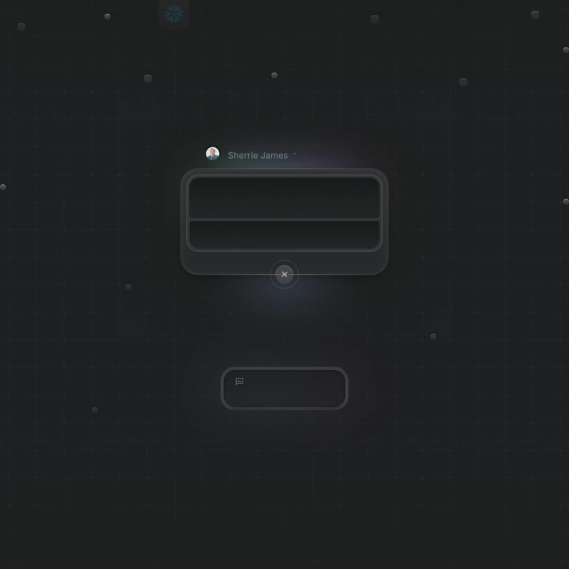

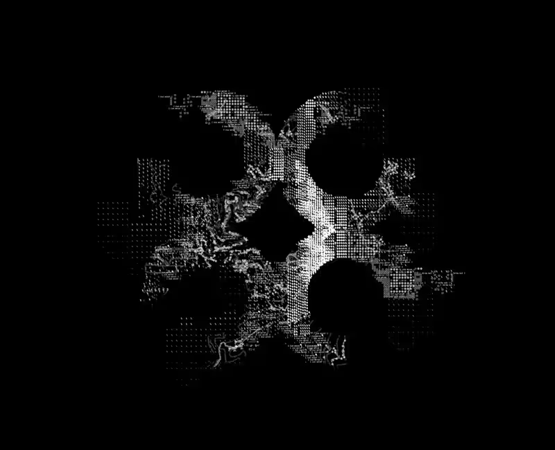
Building a brand pattern for a diagnostics AI company — this one’s a work in progress!
I’ve been experimenting with micro-details like symbols (slashes, squares, text fragments) and topographical map lines inspired by the brand’s origin location to bring depth and structure to the logomark.
Still refining the details over the next few days, but I think it has started to shape up really well!
4
650