The Dashboard Turnaround

Igor Rodriguez


The Dashboard Turnaround
Enterprise SaaS · Design Principles · Cross-Functional
Summary
MISSION
Iru needed a dashboard that gave administrators a clear, actionable view of their entire device management ecosystem across endpoint security, compliance, identity, and vulnerabilities. The dashboard was supposed to be that place. It wasn't working.
CHALLENGE
The previous team had built a version focused on AI features not on what a dashboard actually needs to do. Users landed on it and left immediately. Pendo showed 0% interaction. I was brought in with one quarter to fix it, using only existing components, with no additional engineering resources for new UI work. The constraint wasn't just time, it was that every decision had to work within what already existed.
MY CONTRIBUTION
I audited the existing design for every UX and visual problem, ran competitive benchmarking across 7 dashboard references, conducted with my PM detailed conversations with cross-departmental stakeholders and clients to understand what information actually mattered, and redesigned the entire dashboard within the existing custom component the previous team used. I also defined a true responsive breakpoint system, a gap in the design foundation that no one had addressed which the incoming VP of Design is now backing as a platform-wide standard.
KEY OUTCOME
47% increase in dashboard interaction at launch. 62% and growing as of the most recent Pendo pull. Leadership is now using this data to propose the dashboard as the platform's primary homepage, a product strategy decision driven by design evidence and user behavior.
0% interaction rate at handover
62% engagement increase and still growing
1 quarter timeline with existing components only
Leadership proposing dashboard as homepage
DISCOVERY
Before touching Figma I needed to understand exactly why the existing dashboard had failed. Pendo data told the what, 0% interaction, immediate drop-off. I needed to understand the why. I ran a full audit of the AI team's version and identified six distinct failure categories:
Typography chaos: 10+ type sizes and weights in use with no hierarchy logic
Color overload: Too many colors competing for attention, no semantic meaning
Grid only worked for one view: The layout broke in empty, single-product, and multi-product states
Purposeless empty states: No upsell opportunity, no onboarding direction
Wrong information: Data chosen without input from other departments or clients
Nothing was interactive: Except for AI features, nothing was clickable or actionable
Insight: "The previous team built a dashboard for their features. I needed to build a dashboard for the people using the product. Those are two completely different briefs."
PLANNING
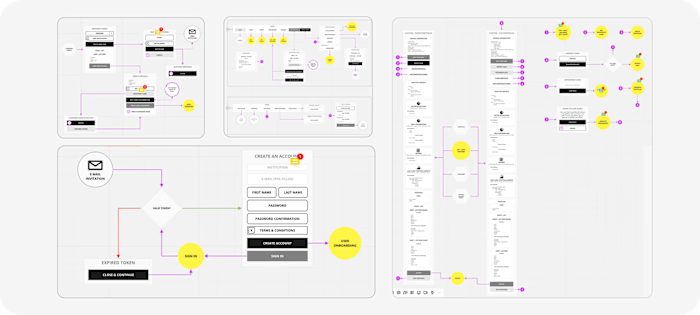
I was provided Stripe as a reference point. I expanded that to 7 benchmarks, covering structural layout, visual language, and out-of-the-box Shadcn patterns. From the benchmarks I extracted three principles: hierarchy before data, interaction over display, and system-wide consistency.
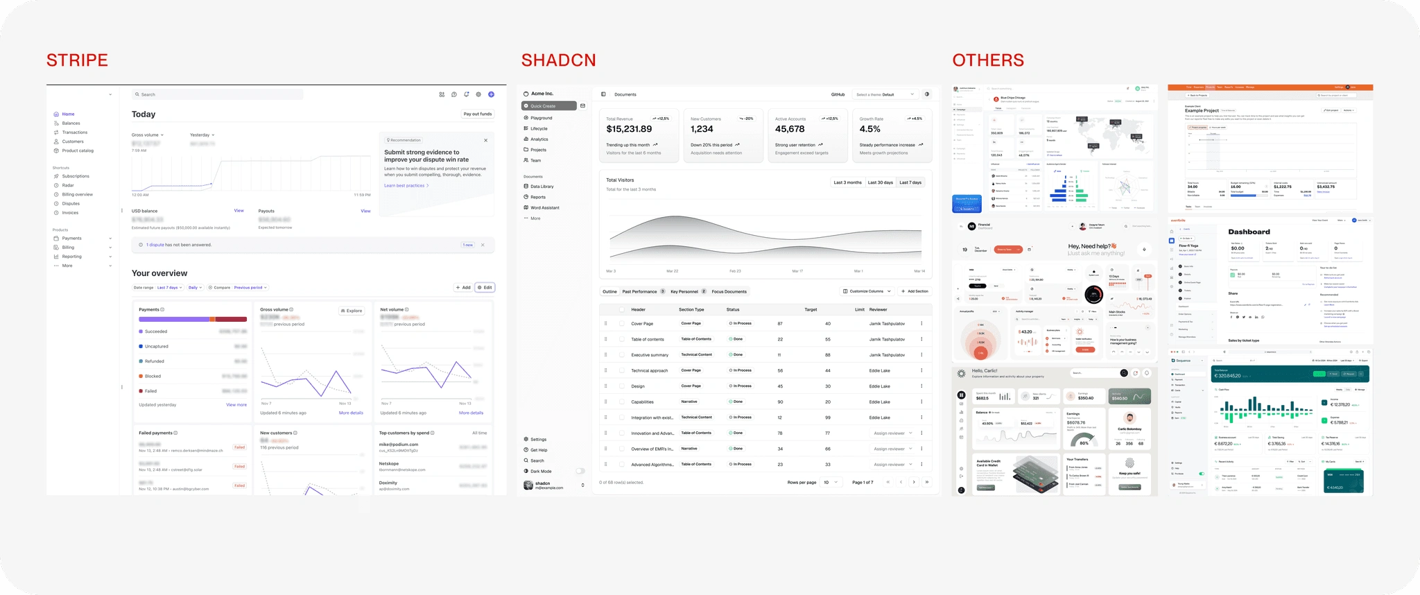
Benchmarks
RESEARCH
Before designing a single component I spent time in detailed conversations with every department that had a stake in what the dashboard showed and with clients directly. This surfaced data needs that the previous team had never considered: compliance status across frameworks, vulnerability severity by OS, active user counts relative to licensed seats, and device check-in health.
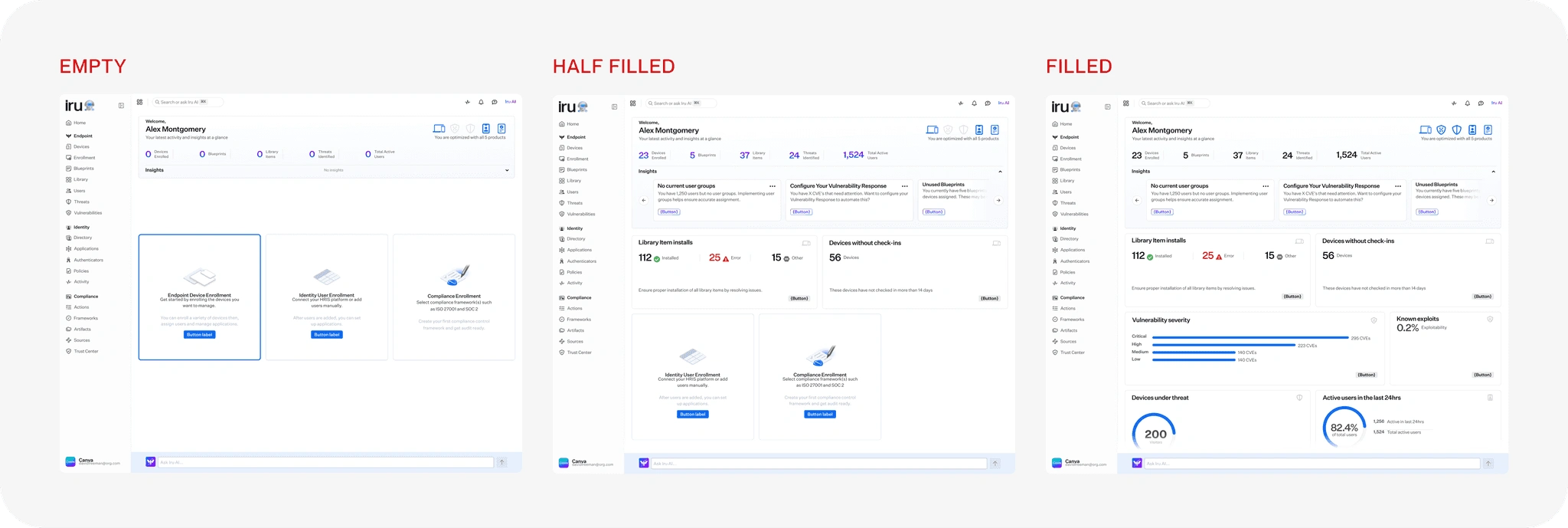
Previous Attempt
CONSTRAINTS
One quarter. Existing components only. No new engineering resources for UI work. Every decision had to be achievable within what already existed in the Shadcn-based design system.
Typography reduced to 3 sizes, 2 weights
Monochromatic color system with semantic exceptions only
Grid that works across all states
Empty states with purpose: each redesigned as an upsell and onboarding moment
Everything important is interactive: every data widget links to its source
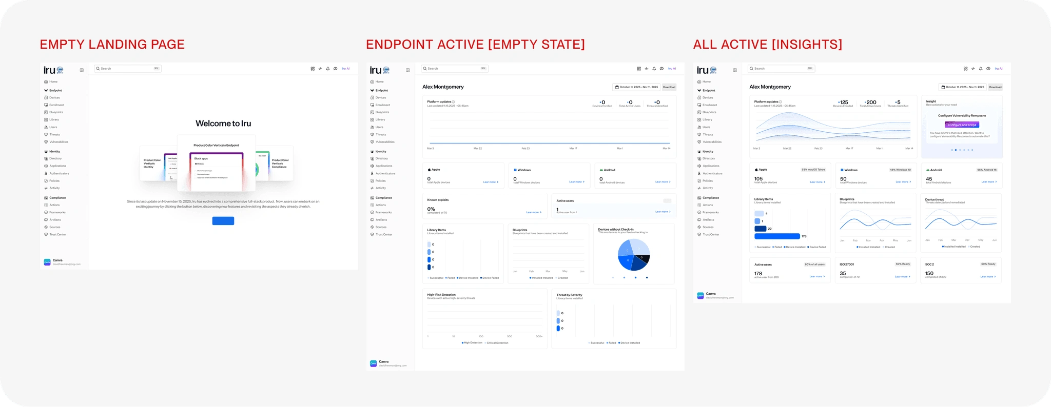
First Outcome
RESPONSIVE
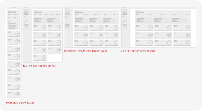
During the redesign I identified a foundational gap: Iru had been using Tailwind's default breakpoints, which weren't calibrated for our actual product viewport distribution. I proposed and designed Iru's first custom breakpoint system: Mobile (393px), Tablet (1024px), Desktop (1280px), Large Desktop (1520px), Wide Screen (2560px).
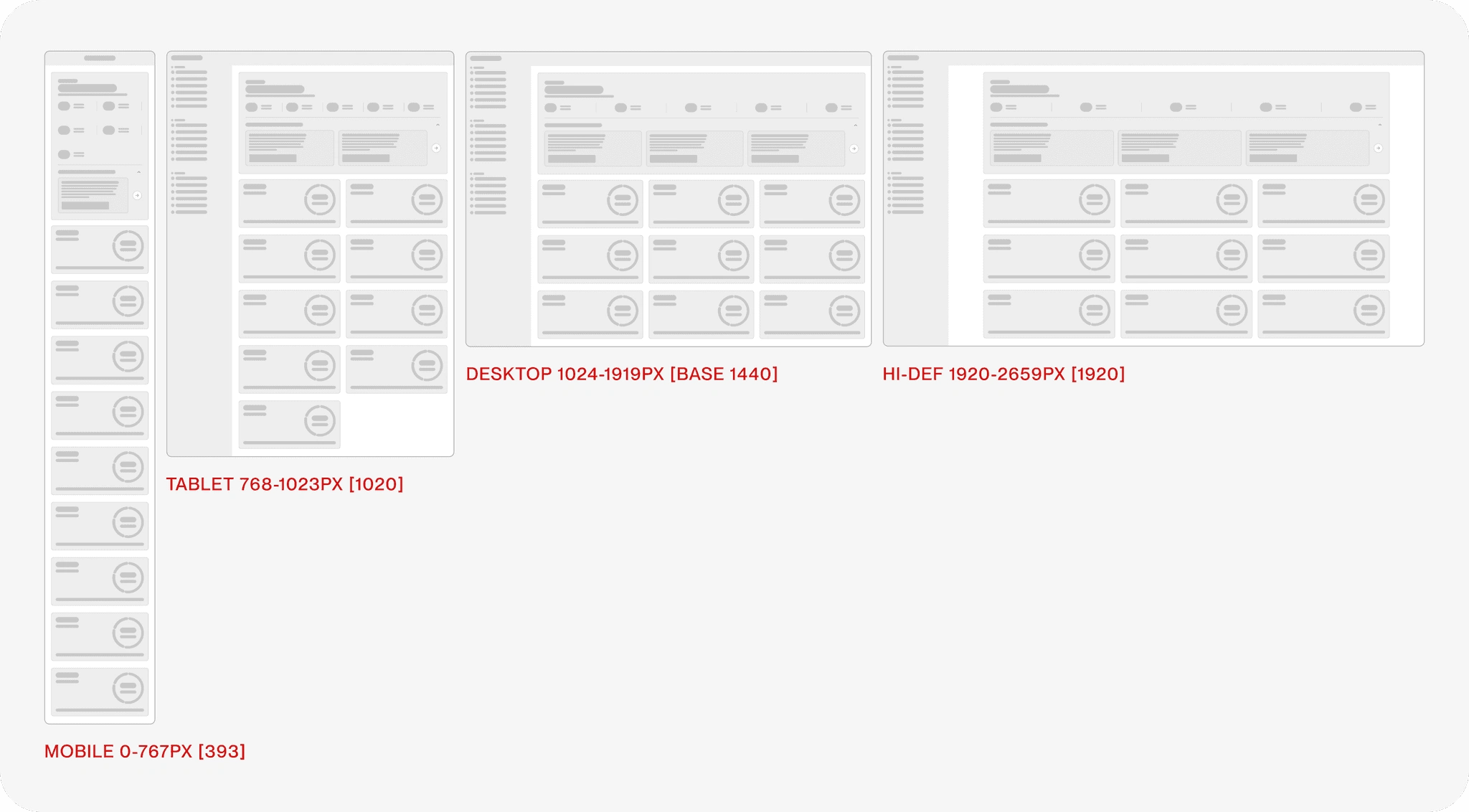
Responsive
OUTCOME
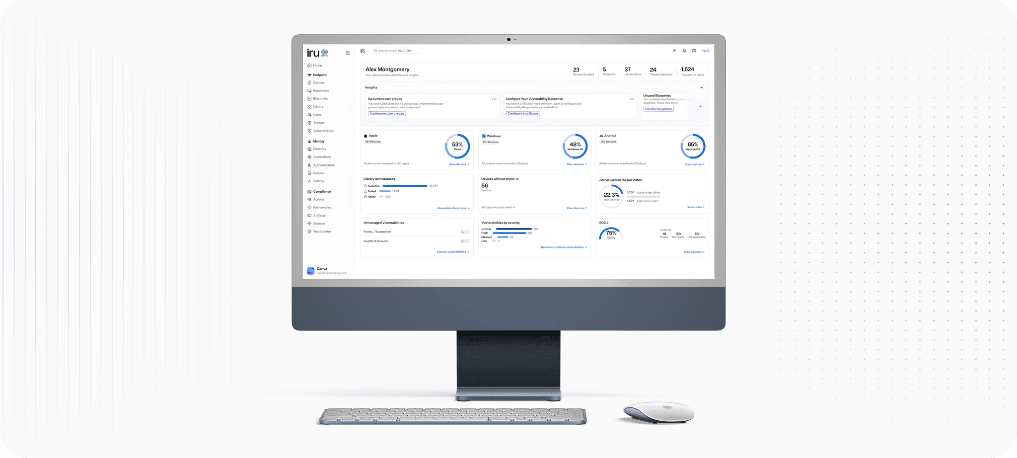
The shipped dashboard surfaces what Iru administrators actually need at a glance: device health, vulnerability severity, compliance readiness, and active user counts across every fleet. Every widget is interactive. Every number links to its source. The before/after contrast tells the story: the AI team's version had a 0% interaction rate. The redesigned version has a 62% engagement increase and is actively being discussed as the platform's new homepage.
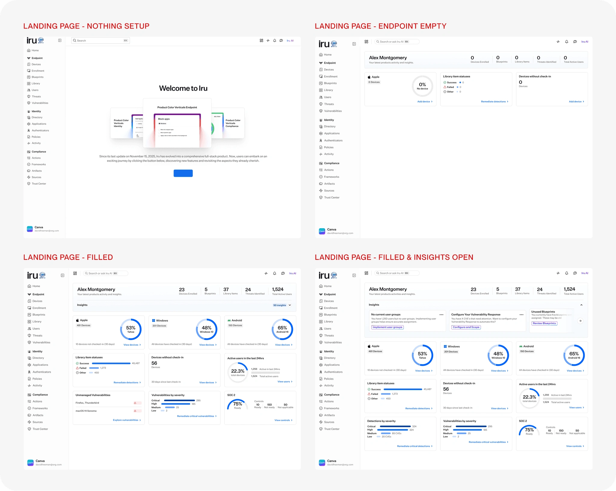
Final Outcome
DIRECTION
V2 introduced dashboard customization. V3 is in active brainstorm: an AI-assisted homepage that surfaces the most critical actions for each administrator based on their fleet's current state.
REFLECTION
The most interesting thing about this project isn't the 62% number. It's that the constraint was the design. Working within an existing component library forced a level of clarity and discipline that a blank-canvas redesign never would have required. Every improvement had to come from better decisions, not new UI.
Like this project
Posted Jul 24, 2026
Redesigned Iru's dashboard within one quarter using only existing components, raising interaction from 0% to 62% (47% at launch).
Likes
0
Views
1
Timeline
Dec 1, 2024 - Ongoing
Clients
Kandji