
Designer | Illustrator | Storyteller


Allow me to reintroduce myself.
My name is Rudy, a visual designer working across product design, brand identity, editorial design, icon design, and illustration.
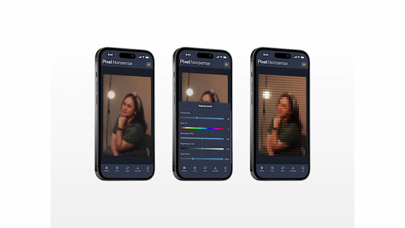
I've finally put together a collection of my work from 2025–2026. A mix of freelance projects, personal explorations, and visual experiments.
Here's a look at what I've been making over the past two years.
More of my work at https://rudypagnel.me
4
2
60

Brand Strategist & Art Director


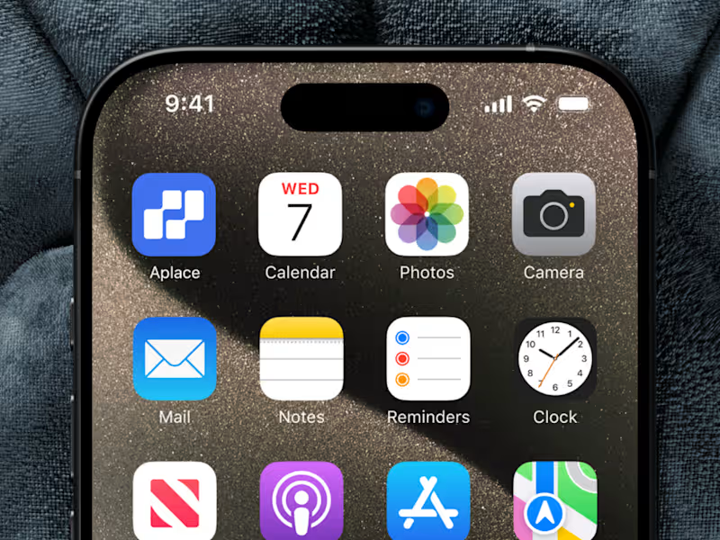
Aplace. Real Estate Brand Identity and UI/UX Design
Finding a place to call home is more than a property search. It is a decision shaped by personal needs, lifestyle, and future plans. Yet navigating property listings can often feel overwhelming, especially when information is difficult to compare and the digital experience lacks clarity.
Aplace is a conceptual digital real estate platform designed to simplify how people discover, buy, and rent properties. The project explores how brand identity and digital product design can work together to create a more intuitive experience, helping users move through the property discovery process with greater confidence.
The Challenge.
The challenge was to create a cohesive brand and digital experience for a platform that brings property discovery into one accessible interface. The design needed to communicate trust and clarity while presenting property information in a way that feels structured, approachable, and easy to navigate.
The Process.
Research and Exploration.
The project began by considering the needs of users navigating digital property platforms. Searching for a property involves more than browsing images. Users need to understand listing details, compare options, and navigate information efficiently before making an important decision.
These considerations informed the design direction, with an emphasis on clarity, usability, and a consistent experience across the brand and digital interface.
Brand Concept Development.
Aplace was developed around the idea of making property discovery feel more accessible. The name suggests a destination, a space, or somewhere to belong, connecting the practical function of a real estate platform with the personal meaning people associate with finding a place.
This concept provided a foundation for a brand that feels approachable and contemporary while maintaining the credibility expected from a property related service.
Visual Identity and Direction.
The visual direction focused on creating a clean, modern, and cohesive brand presence. Rather than relying on unnecessary visual complexity, the identity emphasizes clarity and consistency, allowing the brand to communicate its purpose through a straightforward visual language.
The objective was to establish an identity that could translate naturally into a digital product, ensuring that the brand and interface felt like parts of the same experience.
UI/UX Design.
The interface design translated this direction into a structured digital experience. Layouts, information hierarchy, and navigation were considered to help users understand property listings and move between relevant information more intuitively.
The design prioritizes the presentation of property details, creating a clear visual structure that supports browsing and comparison. The interface aims to reduce unnecessary friction by making essential information easier to identify and the overall experience easier to follow.
Brand and Digital Integration.
An important part of the project was connecting the visual identity with the user interface. Typography, visual hierarchy, and the overall design language were approached as a unified system rather than separate design exercises.
This integration helps maintain consistency between how Aplace presents itself as a brand and how users experience it through the platform.
The Result.
Aplace brings brand identity and UI/UX design together in a conceptual real estate platform built around clarity, accessibility, and trust. The project establishes a visual and digital direction that supports the practical needs of property discovery while recognizing the personal significance of finding a place to live.
By connecting brand expression with interface design, Aplace demonstrates how a cohesive digital experience can make a complex service feel more organized, approachable, and intuitive.
1
78
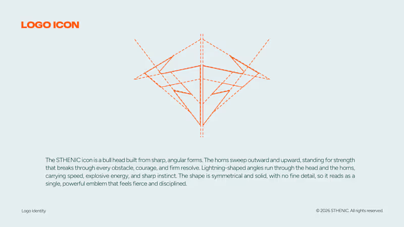
In this case i make a design and direction for an identity of STHENIC.
Sthenic is a Muay Thai brand making fight gear with streetwear concept. I explore and make an urban direction for STHENIC so it will looks as a young urban without losing context of sport brand itself. Every looks in the social media and imagery will took every audience journey and feel about how strong, modern, and authentic of Sthenic.
I build direction and design for all the identity that includes primary and secondary logos, a brand mark, a color palette, a typography system, and a logo guidelines, imagery, artdirection, imagery, partnership, etc.
0
15

Typography enthusiast, social media guru


Multidisciplinary Designer | Social Media, Branding, & UI/UX
Multidisciplinary Designer | Social Media, Branding, & UI/UX


Designing Solutions with Strategy and Creativity.
Designing Solutions with Strategy and Creativity.


View more →

Brand Designer & Illustrator
Brand Designer & Illustrator



Logo and graphic designer
Logo and graphic designer


Creative Designs, Professional Management
Creative Designs, Professional Management


View more →