KisahKita Logo Design
About the Logo
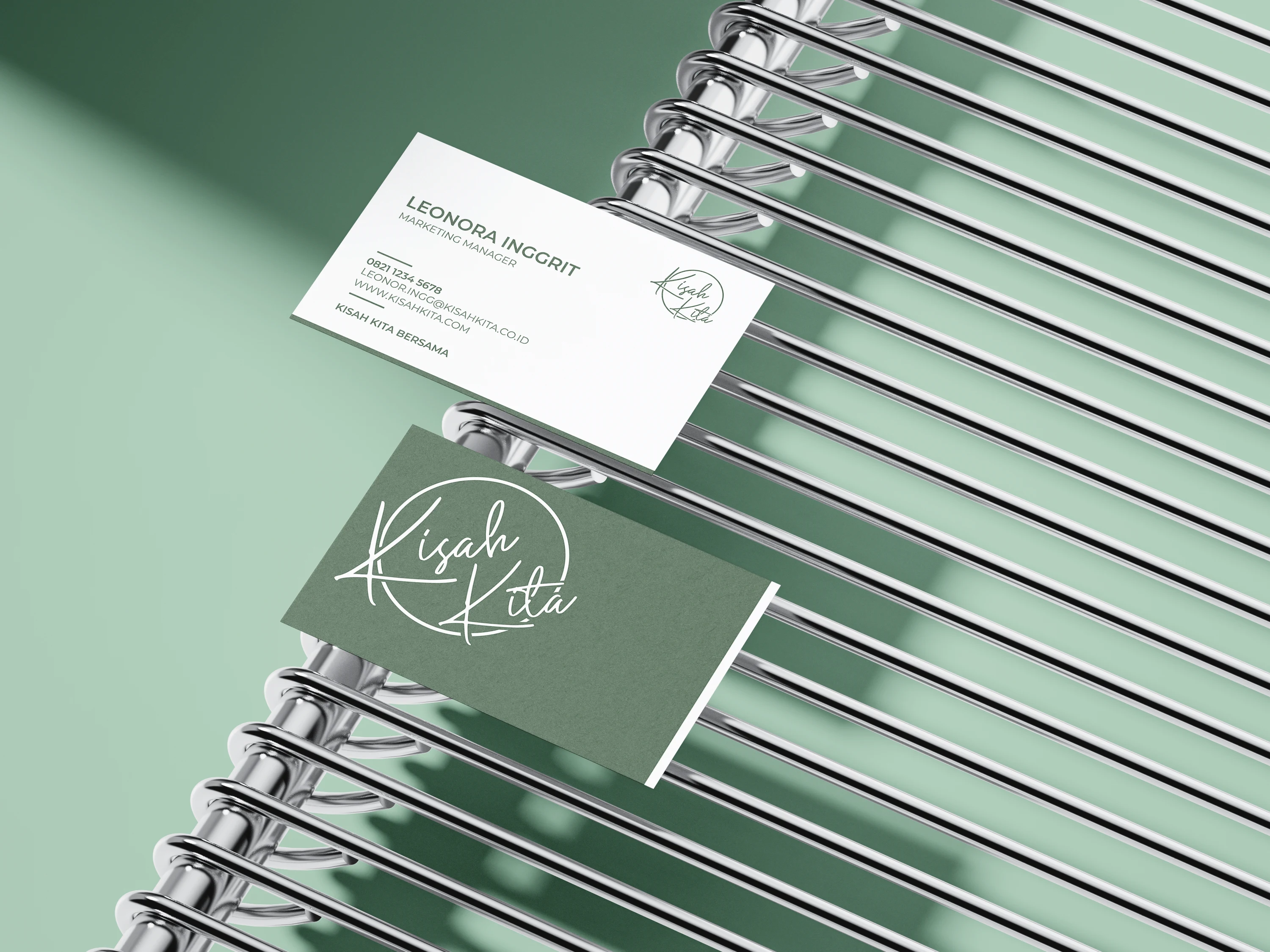
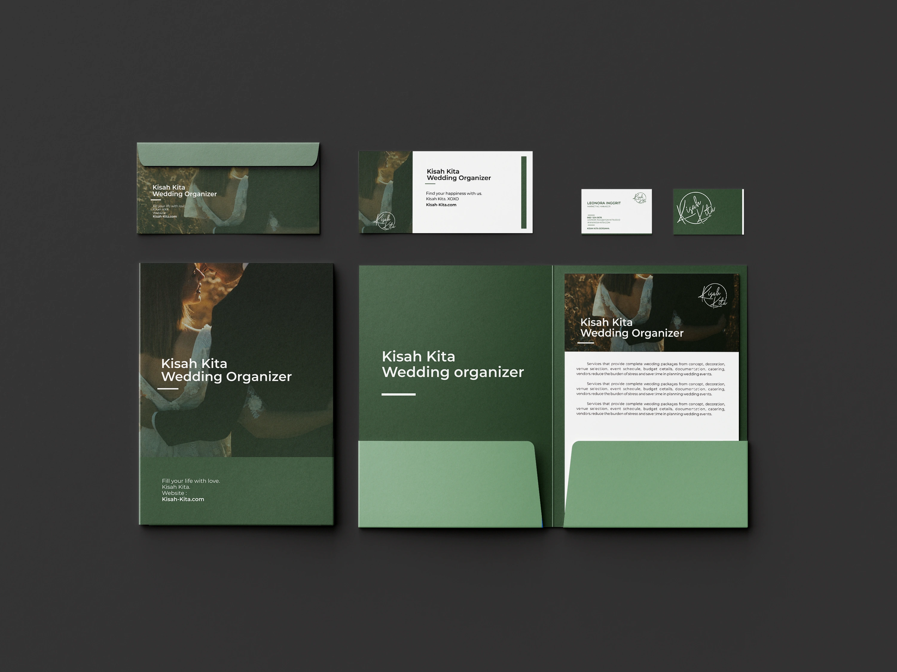
This project is a part of our campus assignment to create a logo for KisahKita, a wedding organization that specializes in managing all aspects of marriage events. The aim of KisahKita is to bring a nature-inspired touch to every wedding they organize, emphasizing a fresh, natural atmosphere.
The logo design follows a typography style that is simple, minimalist, yet elegant, capturing the essence of KisahKita’s brand. By keeping the design clean and modern, the logo resonates with couples looking for a professional yet approachable service. The choice of green as the main color is intentional, symbolizing nature and the serene, refreshing vibe KisahKita brings to each wedding event. The overall aesthetic reflects a balance between nature and sophistication, aligning with the brand’s mission to make every wedding a beautiful and natural celebration.
Here's the preview

KisahKita Logo



Further more
Portoflio
Contact me
Like this project
Posted Oct 4, 2024
For the KisahKita logo design, the project aims to create a simple, minimalist, and elegant typography-based logo. The brand, a wedding organization, emphasizes


