Rumah Pemasaran Logo Design
Rayhan Musthofa
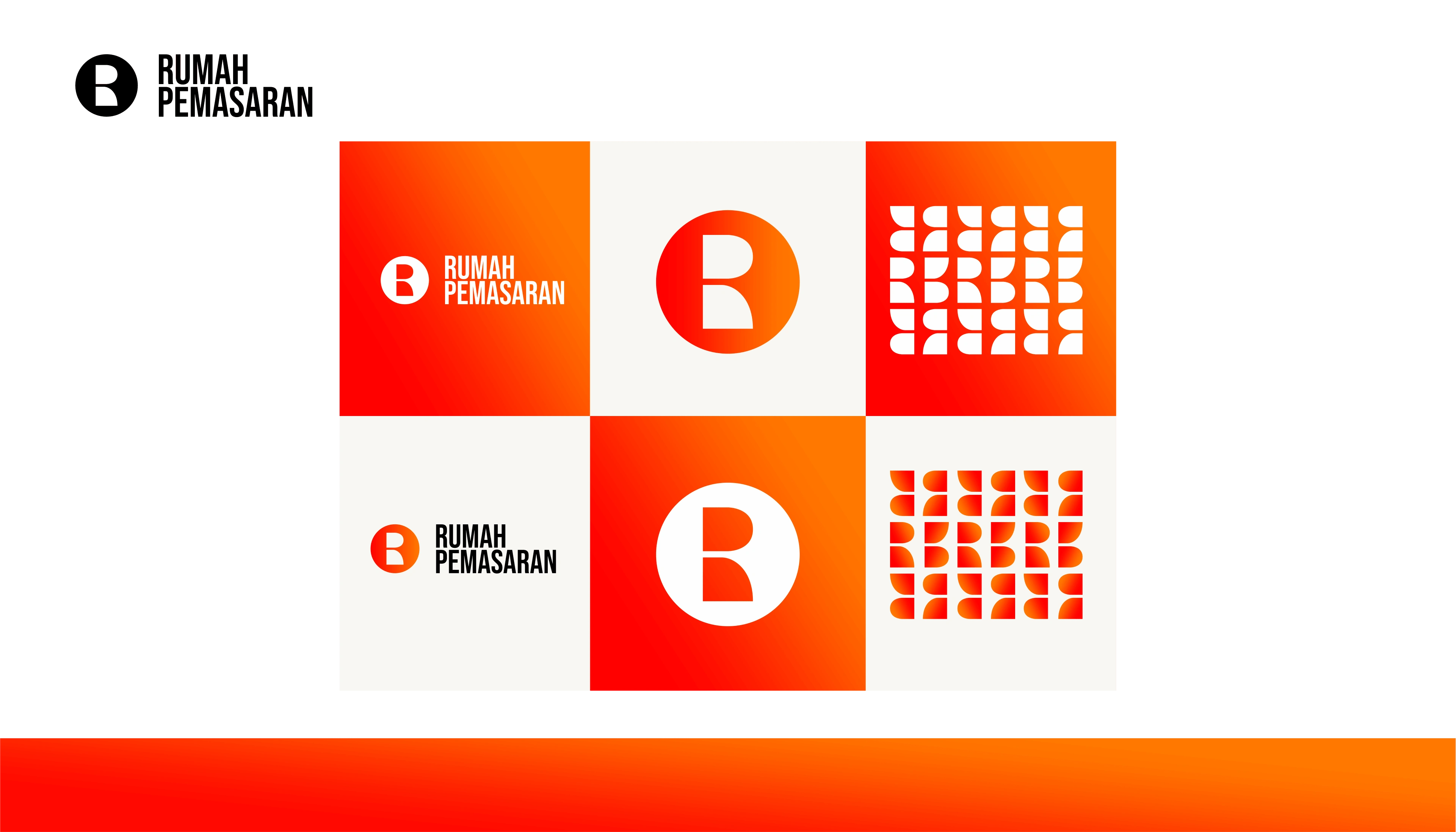
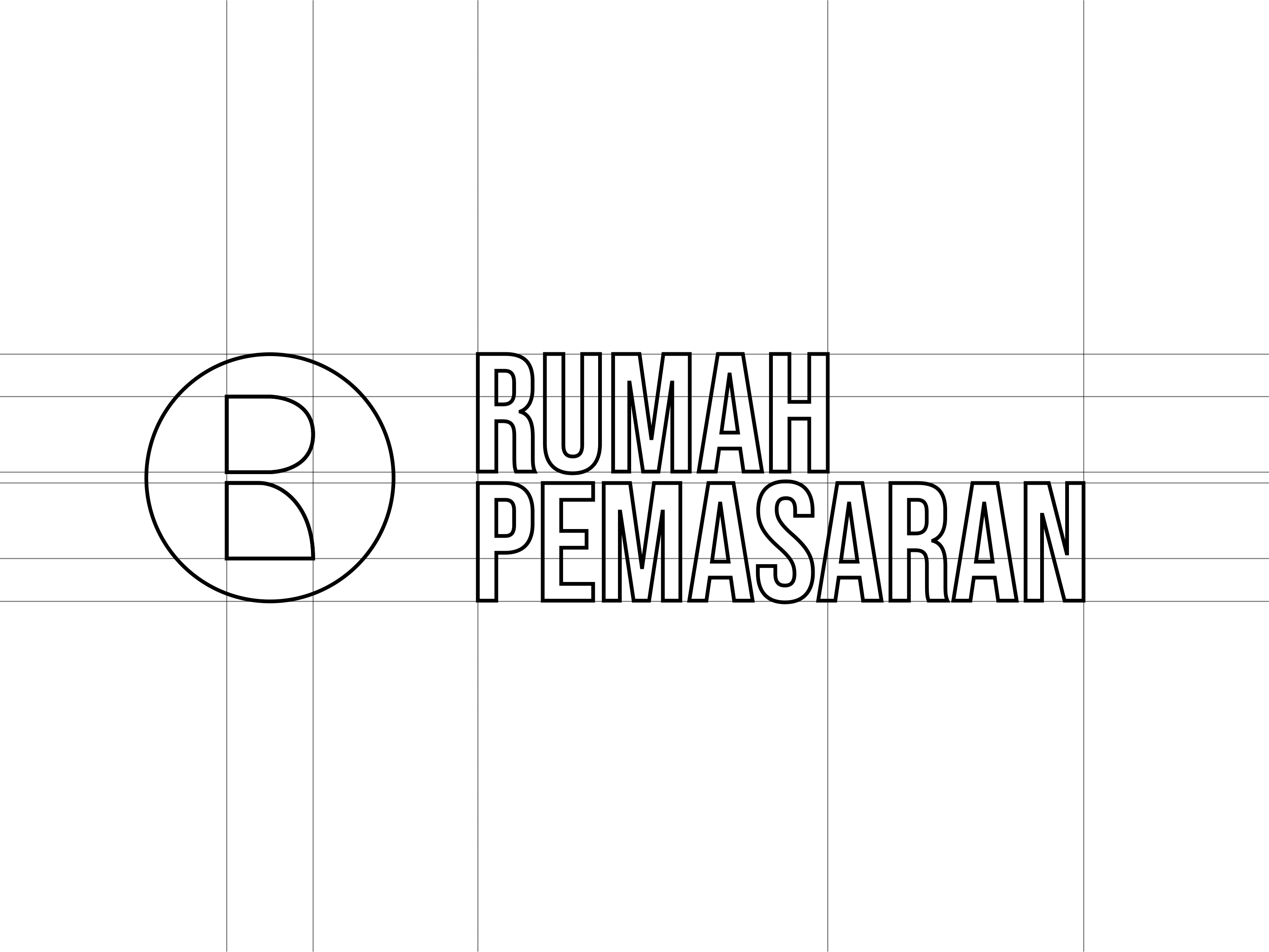
About the Logo
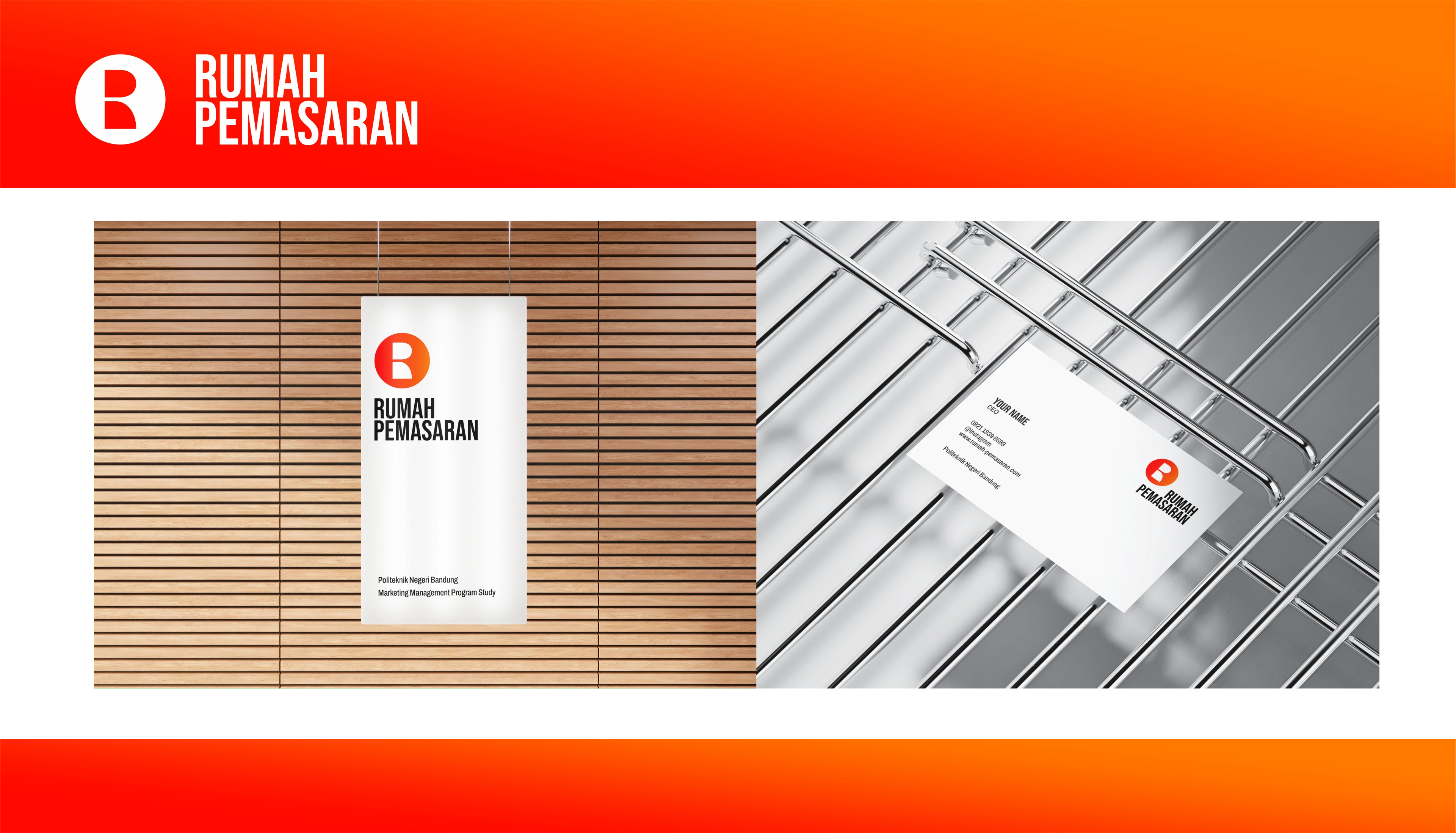
Rumah Pemasaran is a teaching factory of Marketing Management Program, Administrasi Niaga Faculty in Politeknik Negeri Bandung. using a Coin concept that making it looks like a coin, and there is a shape in the middle that refer to Letter R and P that creating a hole that seem like a window and a door because Rumah Pemasaran means Marketing House. the color itself refer to friendly, friendship, warm, bright, and happy.
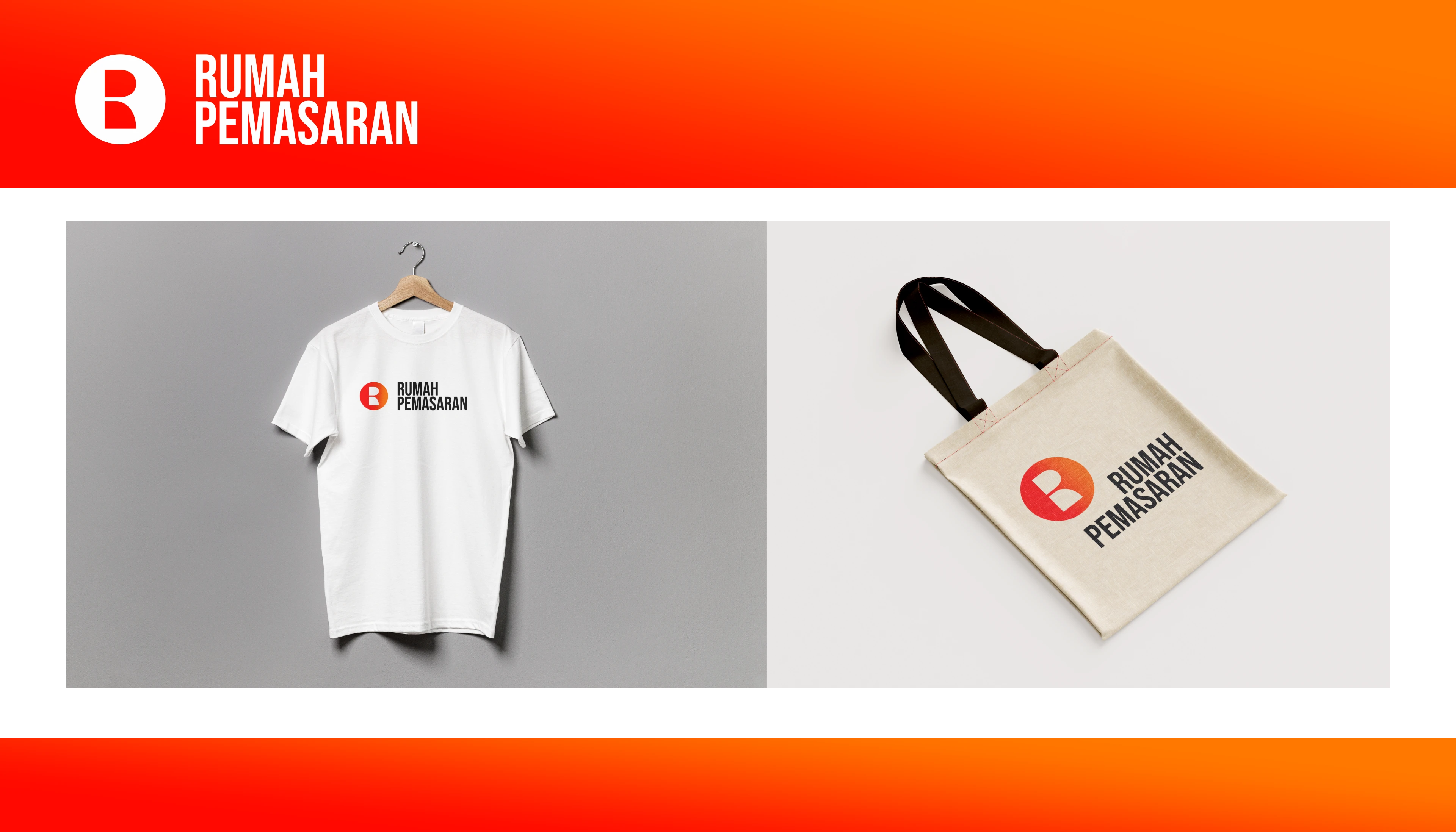
Here's the preview of my work :

Rumah Pemasaran Logo
Further more
Portfolio
Contact me
Like this project
Posted Nov 23, 2023
Rumah Pemasaran is a teaching factory of Marketing Management Program, Administrasi Niaga Faculty in Politeknik Negeri Bandung.