Brand Identity Design for SEAP Forests IP

Riksa Dipraja


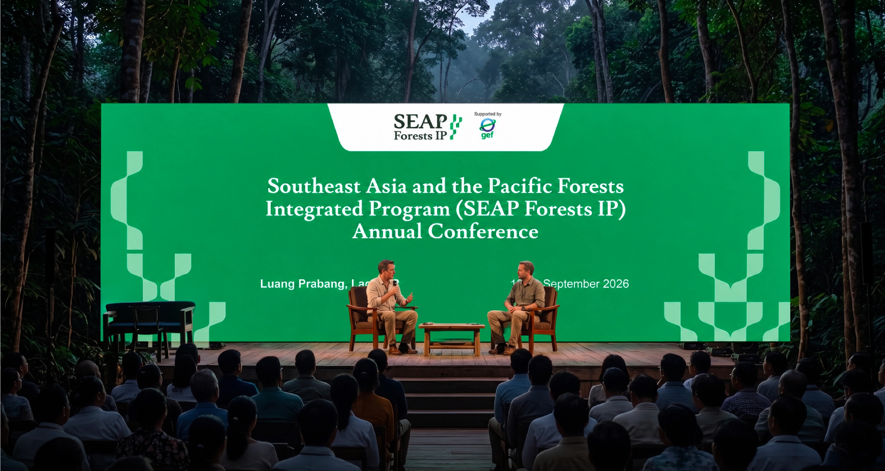
Southeast Asia and the Pacific Forests Integrated Programme
Brand Identity Design
Keywords: Connected, Collaborative, Sustainable
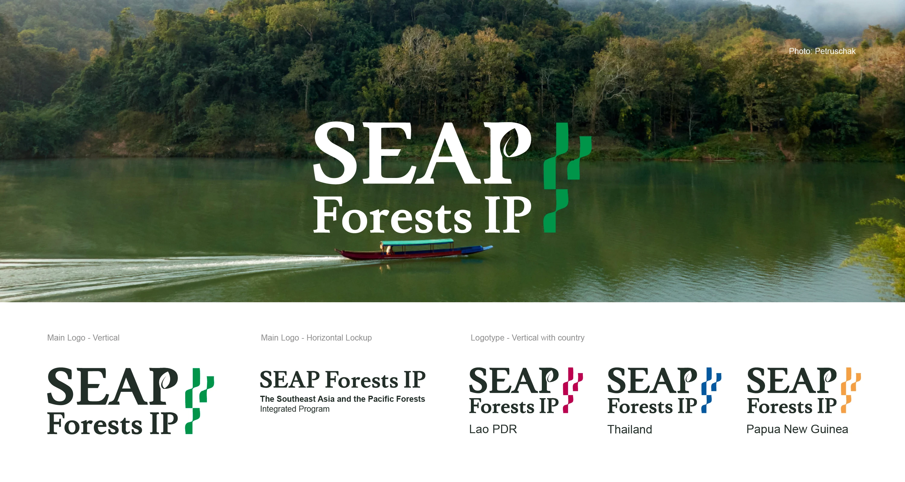
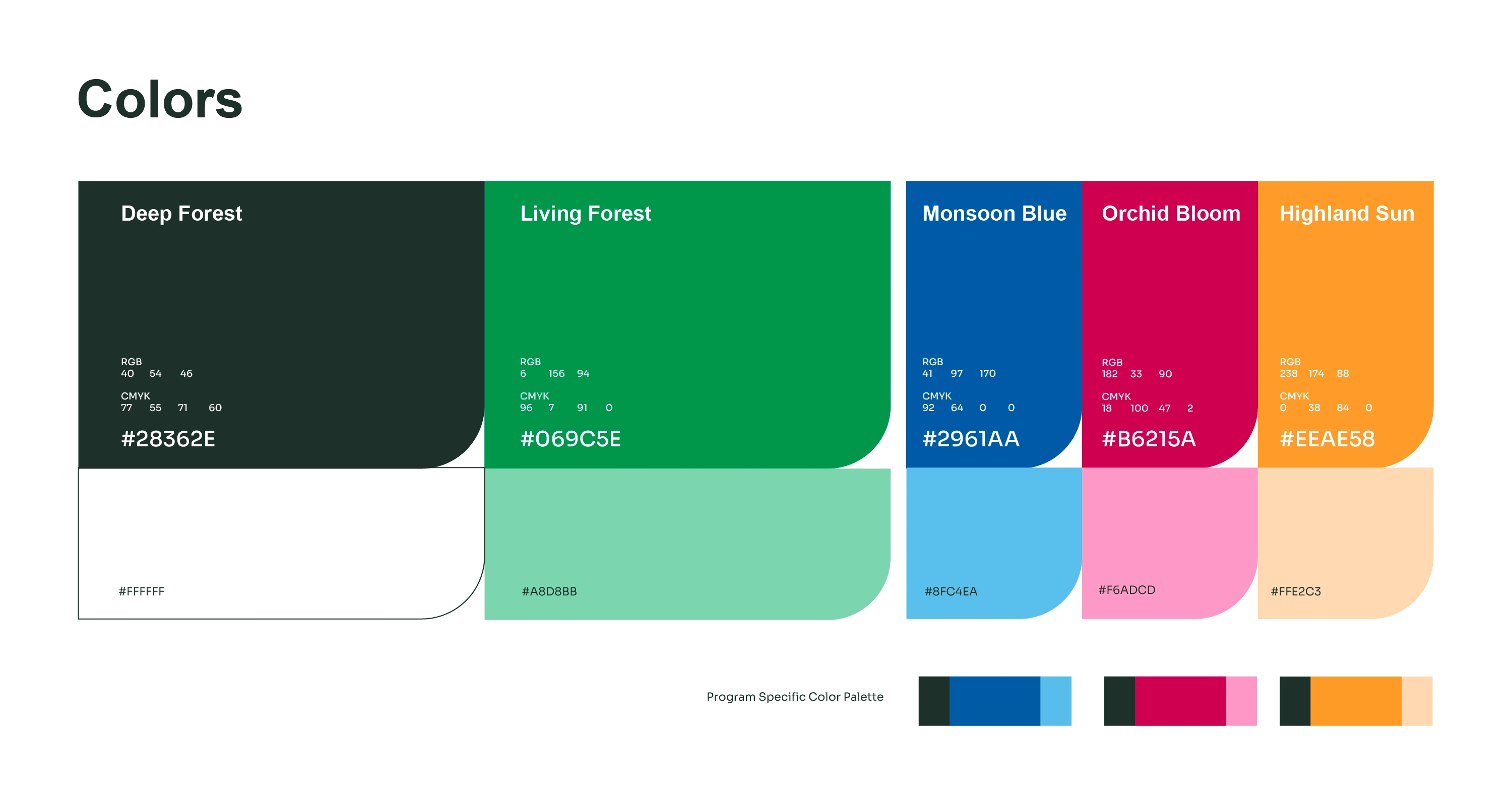
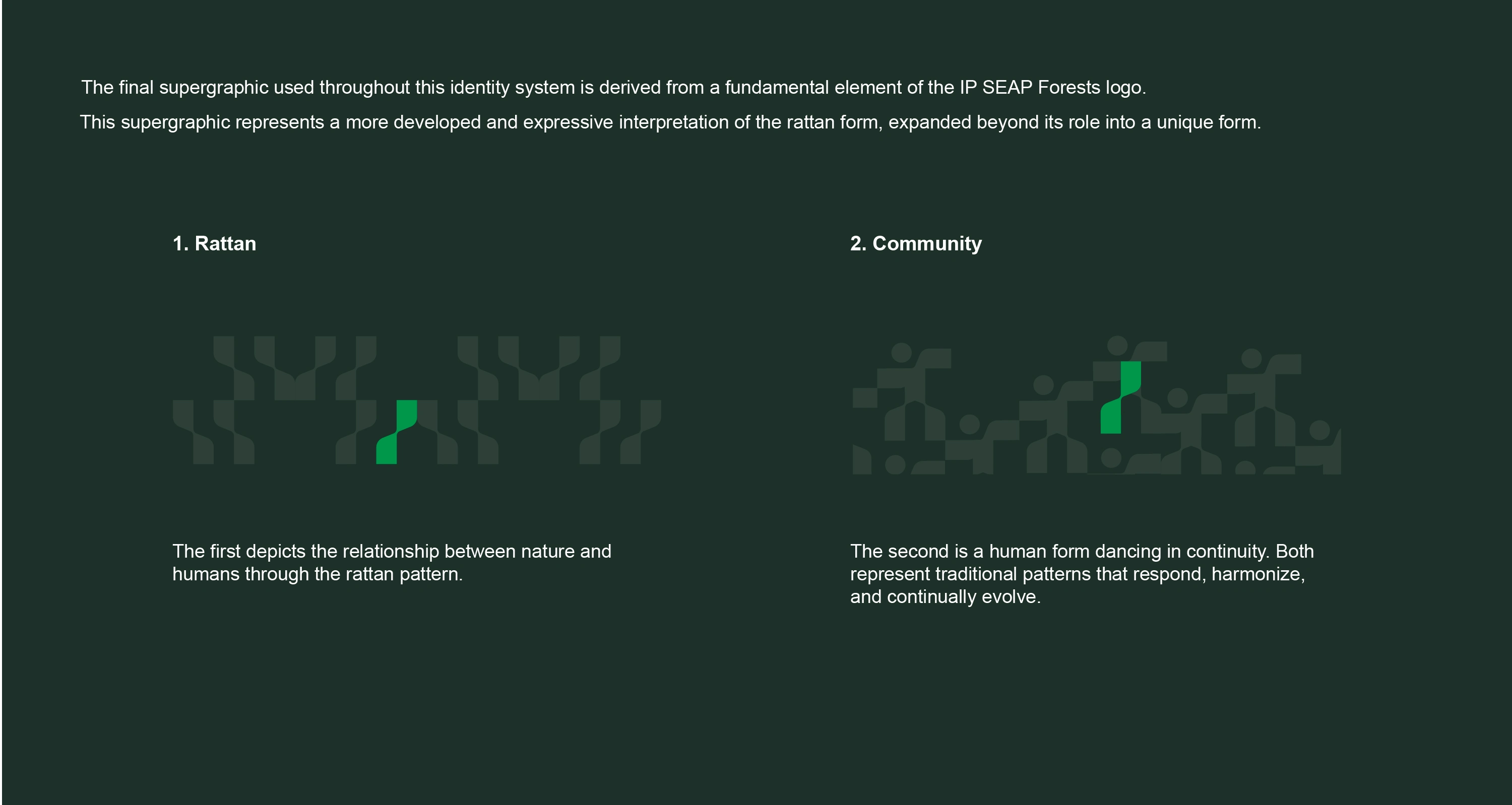
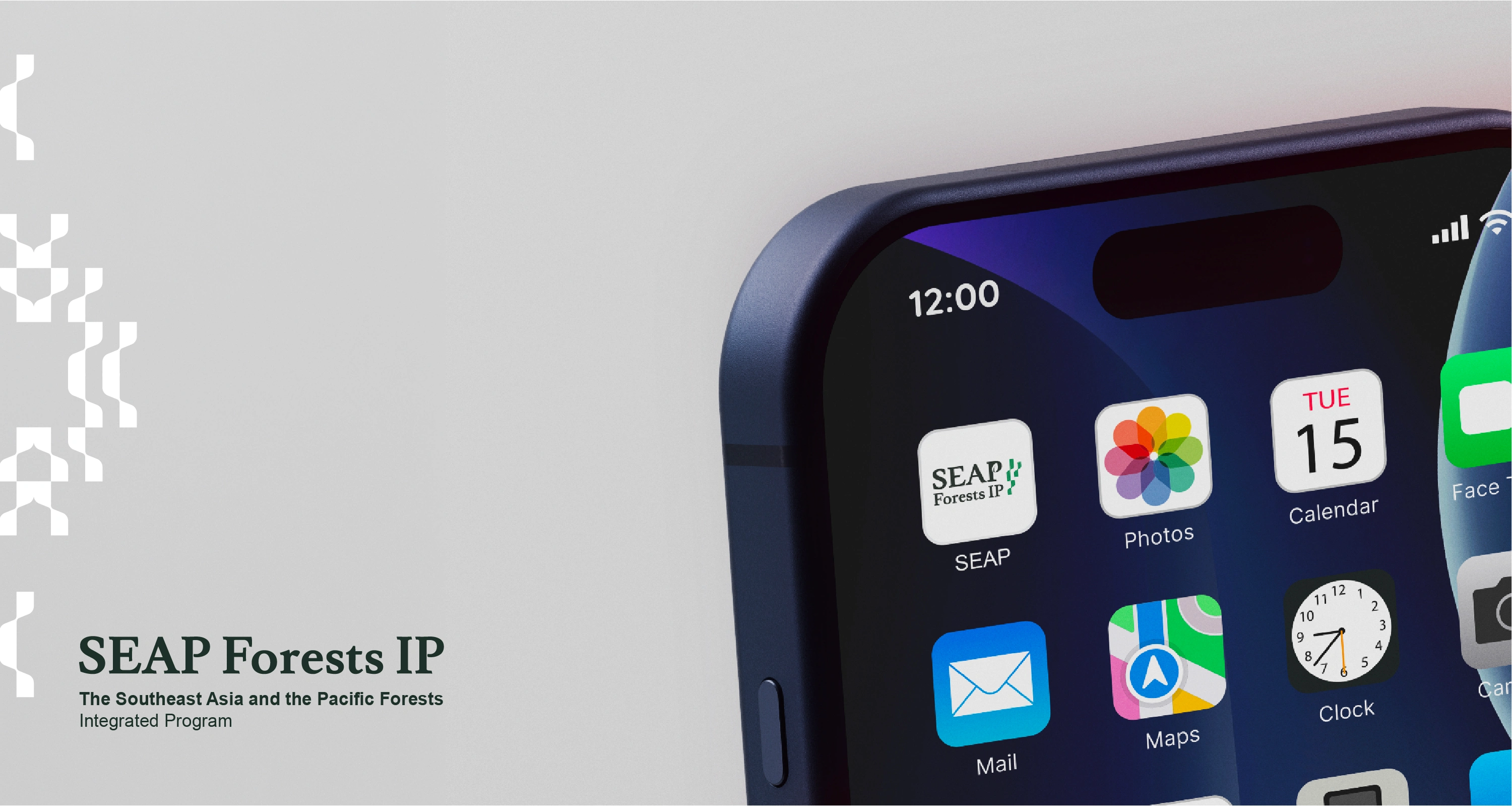
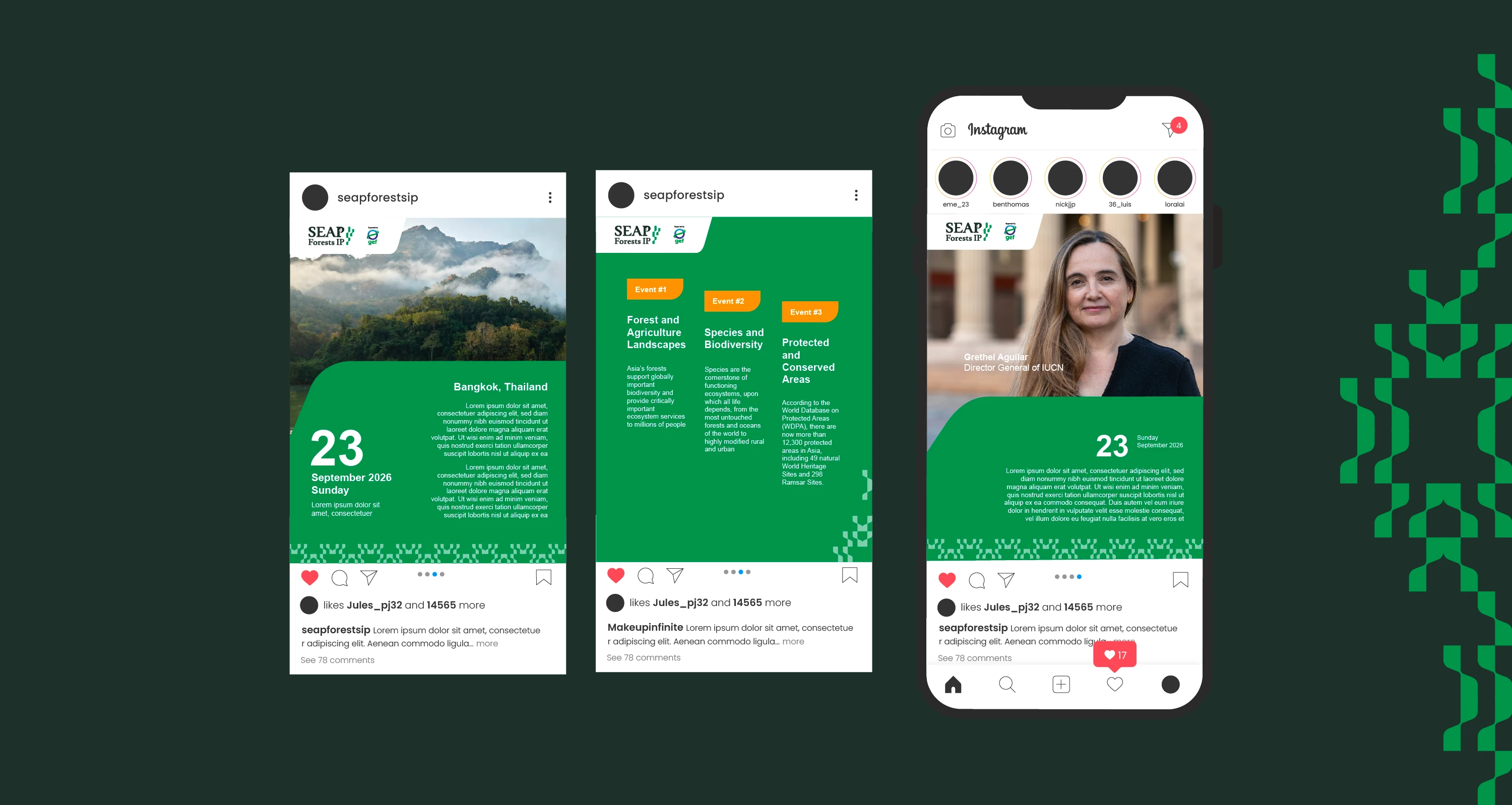
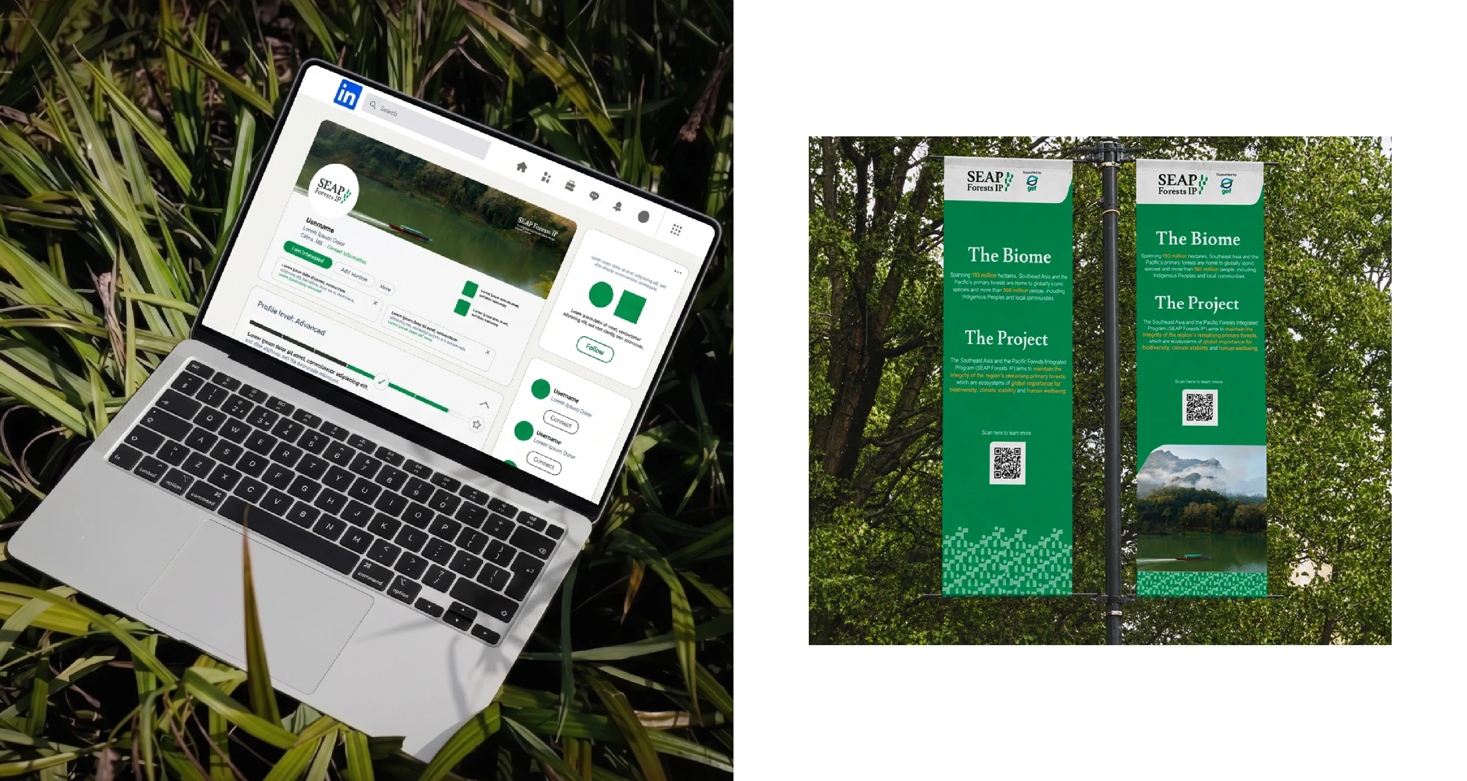
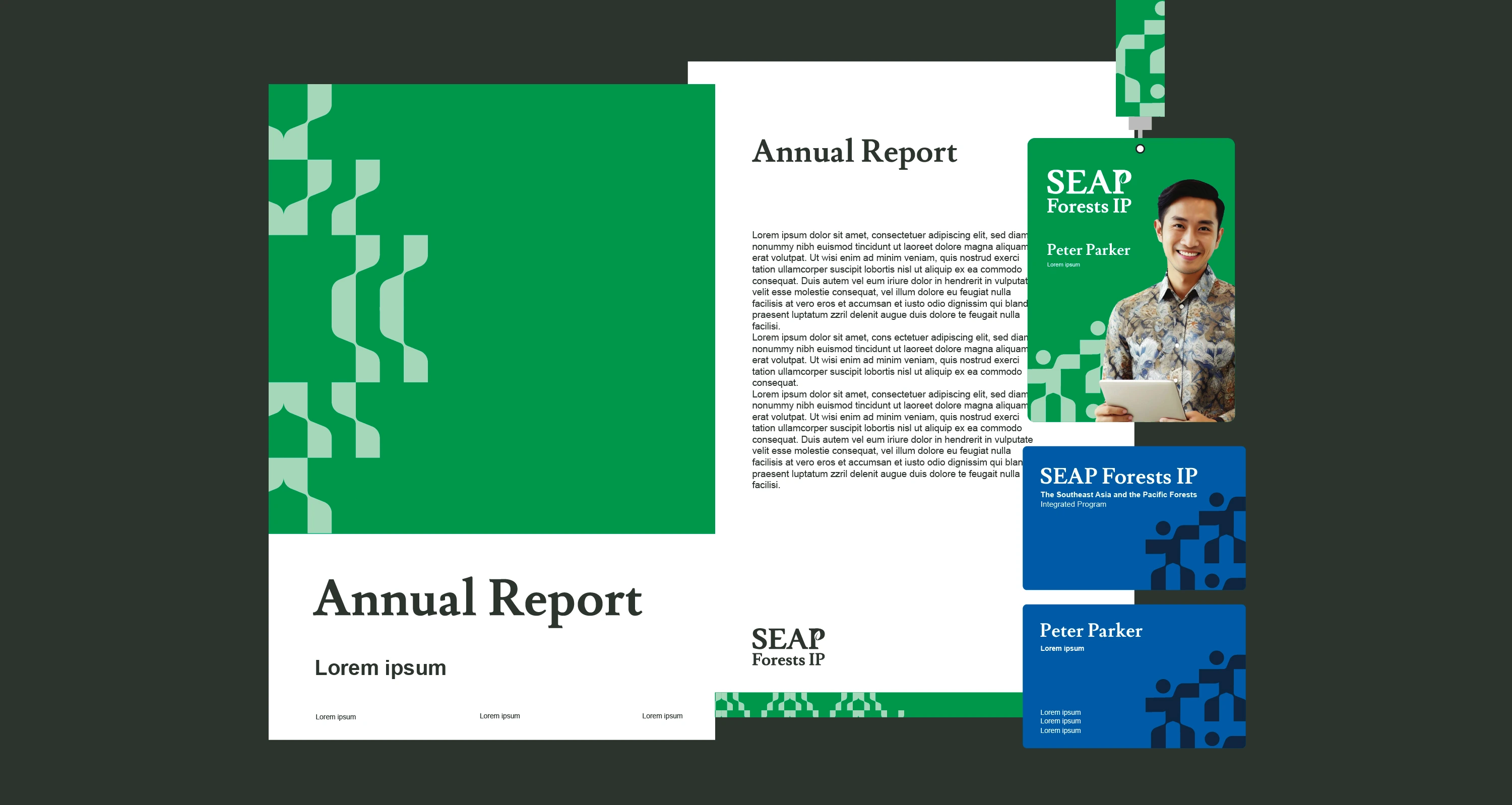
In collaboration with Catalyze Communications, I developed the visual identity for the SEAP Forests Integrated Programme. The identity is built around the idea that forests connect people, cultures, and ecosystems beyond national borders. Inspired by the woven structure of rattan, the visual system represents unity, resilience, and shared responsibility, creating a scalable identity that supports communication across reports, campaigns, and stakeholder engagement.
Challenge
Create a visual identity that represents a regional conservation programme involving multiple countries and stakeholders. The challenge was to communicate collaboration, shared responsibility, and environmental sustainability through a single visual language that could work across diverse cultures and communication platforms.
Concept
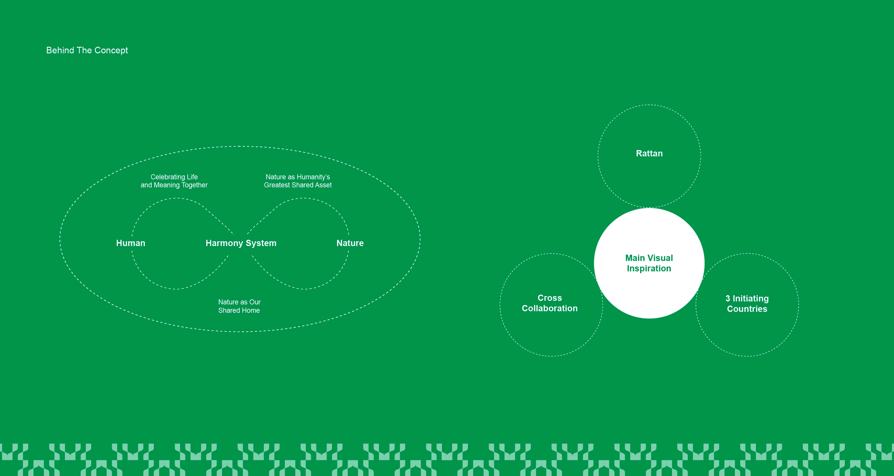
The identity is inspired by the harmony between people and nature, expressed through the woven structure of rattan. The interlocking forms symbolize connection, resilience, and cross-border collaboration, while reflecting forests as a shared asset that unites communities toward a common environmental future.

Thank you!
If you are looking to create a unique brand identity or an engaging illustration that aligns with your business story, let's discuss further.
Like this project
Posted Jul 17, 2026
Developed a brand identity for SEAP Forests emphasizing connection, resilience, and sustainability.