JAVA - LOGO DESIGN IDENTITY

Insanramah Khasanah.



JAVA
Logo Design for a Culture Clothing
Java is a clothing brand built around one idea, presence as a form of culture. Taking its name from the Indonesian island renowned for its rich and layered heritage, Java translates that cultural depth into a modern streetwear identity. Bold, textured, and unapologetic.

PROBLEM
In a saturated streetwear market, most local brands either lean too hard into nostalgia or chase global trends without a distinct voice. Java needed an identity that could hold both, rooted in Indonesian cultural identity, yet visually loud enough to compete on a global shelf.

Color & Typography
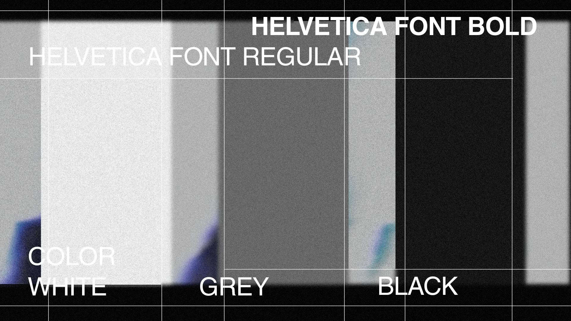
Typography is set in Helvetica, keeping the wordmark clean and grounded. This clean base is deliberately paired with the logomark's grunge, noise heavy texture, letting the contrast do the work. Structured type against a raw, worn down mark. The palette stays monochromatic, black, grey, and white, keeping the identity uncompromising while letting that texture carry the brand's character.
Concept & Rationale
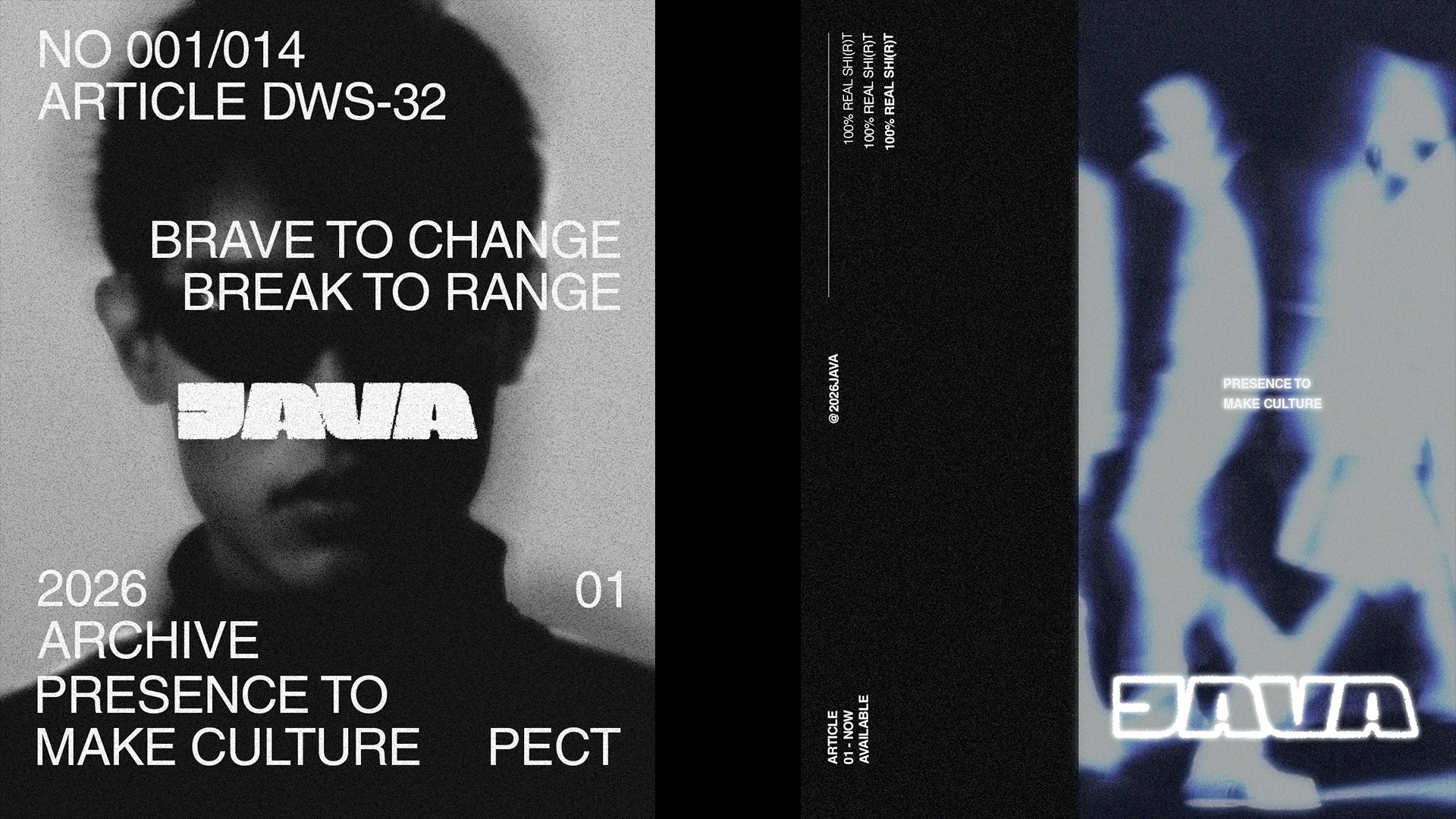
The logo direction merges grunge texture with modern structure. It's a deliberate contrast that mirrors the brand's spirit, proud of its roots, but unafraid to disrupt. The rawness of grunge represents rebellion and authenticity, while the modern form keeps it wearable, sharp, and current.
This duality is what allows Java to walk into new markets with confidence. Not asking to be noticed, but simply being present.

"You like the idea? Let's work together."
Email : pectiiive@gmail.com
Instagram : Pectiiive
Contact Number : +62 851 4763 3353
Like this project
Posted Oct 17, 2026
Brand identity for Java, a clothing brand blending grunge texture with modern structure to bring bold cultural presence into streetwear.