Freelance Web Designers in ApeldoornFreelance Web Designers in Apeldoorn
I find and fix what's confusing your customers.
26
Followers
I find and fix what's confusing your customers.
Web Devops Eng. Creating to put a smile on a clients face.
$1k+
Earned
1x
Hired
29
Followers
Web Devops Eng. Creating to put a smile on a clients face.
Strategic Brand & UI/UX Designer | Building high-end designs
New to Contra
Strategic Brand & UI/UX Designer | Building high-end designs
Cover image for Lucero – Brand Identity &
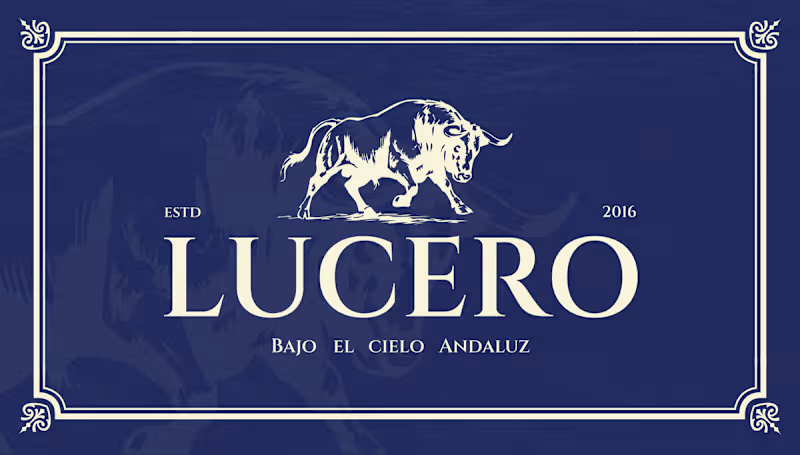
Lucero – Brand Identity & Web Design for an Authentic Andalusian Restaurant Services: Brand Identity, Logo Design, Web/UI Design, Custom Illustration, Exterior Signage About the Project Lucero is an authentic Spanish restaurant established in 2016, dedicated to bringing the rich, passionate culinary heritage of Andalusia to its guests. The objective of this project was to elevate their visual identity to match the premium, atmospheric, and romantic dining experience they provide—true to their tagline, "Bajo el Cielo Andaluz" (Under the Andalusian Sky). The Challenge Designing for traditional cuisines often comes with the risk of falling into touristy clichés. The challenge was to capture the authentic spirit of Southern Spain in a way that feels highly sophisticated, established, and elegant. The visual identity needed to communicate quality and tradition while appealing to a modern, discerning clientele seeking a high-end gastronomic experience. The Solution & Design Choices Logo & Iconography: The centerpiece of the brand is a majestic, hand-drawn illustration of a Spanish bull—a powerful symbol of strength and heritage. This is paired with a highly refined, classic serif typeface. The logo is designed to work beautifully across a flexible grid, easily adapting to light and dark backgrounds. Color Palette: I moved away from the expected bright reds and yellows of typical Spanish branding. Instead, the primary palette relies on a rich, deep midnight blue—representing the Andalusian night sky—perfectly contrasted with a warm, elegant cream tone. Custom Pattern Design: To add rustic charm and texture to the brand, I illustrated a bespoke, hand-drawn pattern. Featuring staple ingredients and culinary elements like garlic, vine tomatoes, pomegranates, and tapas, this pattern adds a playful yet artisanal touch to menus and packaging. Digital Experience: I designed a premium, responsive website interface that immediately invites users to "Dine under the Andalusian sky." The dark UI mirrors the intimate, warmly lit atmosphere of the physical restaurant, utilizing rich photography and elegant typography to drive reservations. Physical Branding & Storefront: The identity translates seamlessly into the physical environment. From the elegant window decals welcoming guests at the bistro-style storefront, to the classic, round projecting outdoor sign, the brand establishes a strong, sophisticated presence on the street. Deliverables Primary Logo & Responsive Brand Marks Color Palette & Typography System Custom Hand-Drawn Brand Pattern Responsive Website Design (Desktop & Mobile) Exterior Signage & Window Graphics
0
31
Cover image for Connectr – Brand Identity &
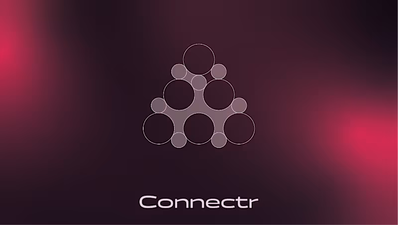
Connectr – Brand Identity & Digital Experience for Human-Centric Tech Services: Brand Identity, Logo Design, UI/UX Web Design, Copywriting Strategy, OOH (Out of Home) Design About the Project Connectr is a forward-thinking consultancy and recruitment agency operating at the intersection of IT and human behavior. Their core philosophy is simple but powerful: implementing technology is the easy part; getting people to adopt and embrace it is the real challenge. They needed a visual identity that clearly communicates their mission to bridge the gap between hard tech and human connection. The Challenge The IT consultancy space is heavily saturated with cold, hyper-corporate, and strictly digital aesthetics (often relying on standard "tech blue" color palettes). The challenge was to design an identity that feels instantly credible in the tech space, but radiates warmth, empathy, and human energy to attract both top-tier consultants and progressive clients. The Solution & Design Choices Logo & Geometric Grid: The core of the identity is the custom "node" icon. Built on a strict geometric grid of intersecting circles, the mark symbolizes a network of individuals connecting to form a cohesive, stronger entity. It visually represents the brand's core offering: bringing the right people together. Color Palette & Gradients: To break away from traditional tech branding, I introduced a striking, energetic magenta-to-red gradient. Set against deep, dark backgrounds (almost a rich plum/black), this gradient creates a glowing effect that feels vibrant, human, and modern. Crisp white is used for typography to maintain high legibility and contrast. Typography & Messaging: The brand's voice is bold and direct. The visual identity gives center stage to strong copy like "Tech snappen. Mensen begrijpen." (Understand tech. Understand people) and the core tagline "Meer mens. Meer impact." (More human. More impact). The clean, modern sans-serif typography ensures this messaging hits home instantly. Digital Experience: I designed a seamless digital experience across desktop and mobile. The website uses generous whitespace paired with the brand's signature soft gradients to create an interface that feels intuitive, clean, and welcoming—crucial for a platform focused on recruitment and human connection. OOH Campaign: The brand comes to life in the physical world through impactful billboard designs. Using dark backgrounds with the glowing gradient and relatable photography, the posters act as powerful recruitment tools and brand-awareness drivers in urban environments. Deliverables Brand Strategy & Core Messaging Geometric Logo Design & Identity System Responsive Website UI/UX Design Mobile Interface Design OOH Campaign Assets (Billboards & Posters)
0
37
Cover image for Neuralis – Brand Identity &
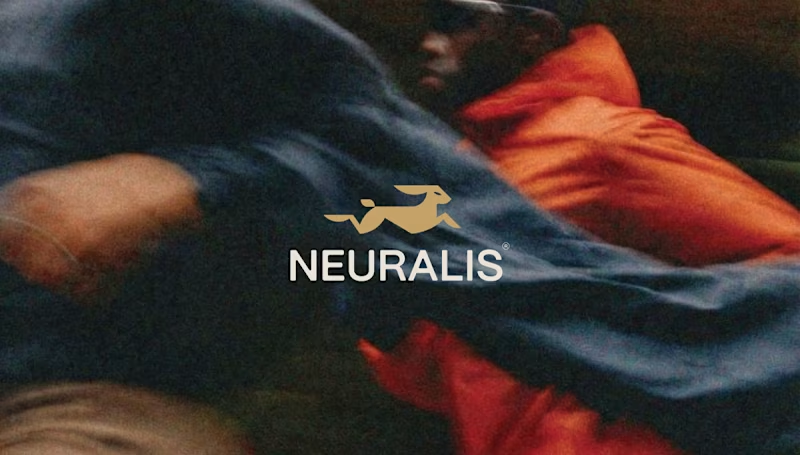
Neuralis – Brand Identity & UI/UX Design for an Urban Run Club Services: Brand Identity, UI/UX Design, Art Direction, App Design, OOH (Out of Home) Design About the Project For Neuralis, I had the opportunity to design the complete brand identity and app interface. Neuralis isn't just another running app; it's a premium, community-driven platform that connects and motivates athletes in cities like London, Amsterdam, and Berlin. The brand's mission is clear: elevate performance through the power of the pack. The Challenge The challenge was to create a visual language that feels high-end and minimalist, yet exudes the raw, athletic energy of urban street running. The brand needed to breathe a performance-oriented mindset while remaining deeply connected to a tight-knit community. The Solution & Design Choices The Logo & Mark: The core of the identity is the stylized, geometric golden hare. This symbolizes speed, agility, and relentless forward momentum. The logo is designed on a strict grid, ensuring perfect balance and scalability across all formats. Color & Typography: I opted for a bold, high-contrast palette. The base consists of deep dark gray and black, creating a 'stealthy' and premium feel. The gold adds a touch of exclusivity, while the bright action red is used for interface elements and key typography to instantly grab attention. The sleek, sans-serif typography gives the overall design a modern, urban aesthetic. UI/UX App Design: The iOS app interface is designed with a strict focus on clarity during workouts. By using striking, floating widgets (like the red 'Outdoor group run' card), users can check their route, fellow runners, distance, time, and calories burned at a single glance. Copywriting & Campaign: To reinforce the community's mindset, powerful slogans were integrated into the brand identity: "Forward is the only way", "PACE DICTATES THE PACK", and "WE RUN TOGETHER". These elements come to life across striking billboards, urban posters, and merchandise like tote bags. Deliverables Concept & Art Direction Logo & Brand Guidelines Mobile App Design (iOS Interface) Merchandise (Tote Bags) OOH Campaign Assets (Billboards & Posters)
1
2
59
Cover image for Bouwbaas – Brand Identity &
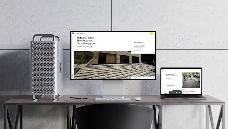
Bouwbaas – Brand Identity & Digital Presence for Modern Construction Services: Brand Identity, Web Design, UI/UX Design, Print Design, OOH (Out of Home) Design About the Project Bouwbaas is a construction and carpentry firm built on a foundation of robust, tight, and reliable craftsmanship. They needed a visual identity that steps away from the clunky, outdated aesthetics typical of the construction industry. The goal was to design a brand that feels as solid and meticulous as the physical work they deliver to their clients. The Challenge How do you make a construction brand look premium, modern, and trustworthy without losing its approachable, hardworking core? The challenge was to balance high-end digital minimalism with structural, bold typography and color choices that work just as well on a muddy construction site as they do on a high-resolution display. The Solution & Design Choices Logo & Identity System: The core of the identity is a structural, interlocking "BB" monogram. It conveys strength and architectural precision. The color palette pairs a deep, professional navy with a striking, vibrant blue and crisp white. Typography & Voice: Using a clean, sans-serif typeface, the brand voice is straightforward and confident ("Robuust. Strak. Betrouwbaar."). This no-nonsense approach is translated directly into the brand's visual hierarchy. Digital Experience: To showcase their projects, I designed a minimal, highly visual website. The layouts prioritize large, high-quality imagery of their carpentry and renovation work, ensuring a seamless experience across all devices, from desktop to mobile. App Design: The brand extends to mobile touchpoints with a sleek, highly legible app interface and an instantly recognizable home screen icon. Physical Branding & Print: A construction brand lives in the physical world. I designed clean, authoritative corporate stationery, including premium business cards. Furthermore, I created large-scale environmental graphics, like branded site fencing, which serves as an impactful billboard while a project is underway. Deliverables Brand Strategy & Identity System Custom Monogram Logo Responsive Website Design Mobile App Iconography Corporate Stationery (Business Cards) Environmental/Site Signage
0
43
Webflow Developer & Brand Designer for Your Success
I shape brand identities through design & strategy
1x
Hired
4.9
Rating
84
Followers
I shape brand identities through design & strategy
Crafting timeless designs that leave a lasting impact
6
Followers
Crafting timeless designs that leave a lasting impact