Jett Wonen Interiors
Roos van Gestel
Context
Project: Dutch interior brand Jett Wonen, combining craftsmanship, luxury, and a worldly touch.
Challenge: Create a brand identity that feels both refined and accessible. Rooted in Dutch expertise, but inspired by global influences.
My role: Brand designer & creative director, from strategy to visual identity, storytelling, and art direction.
Foundation & Brand Pillars
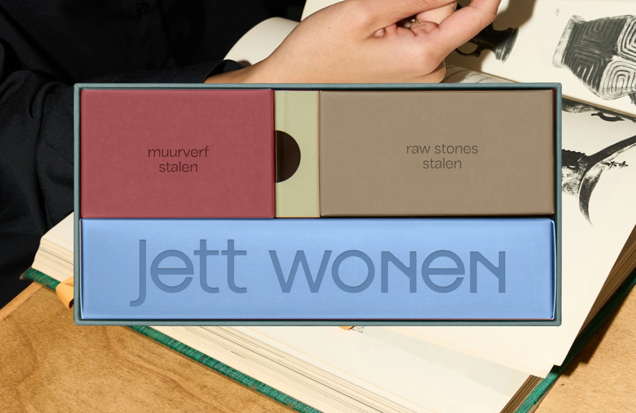
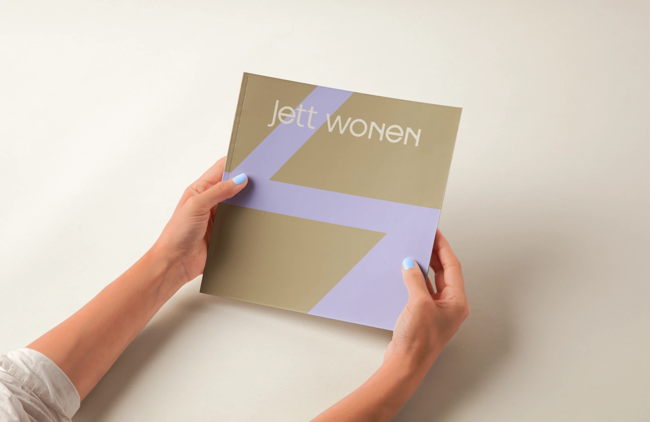
Logo A simple typographic wordmark set in POI Carbonic. Geometric with subtle personality, clear, professional, and distinct from generic fonts. A calm anchor in a dynamic brand world.
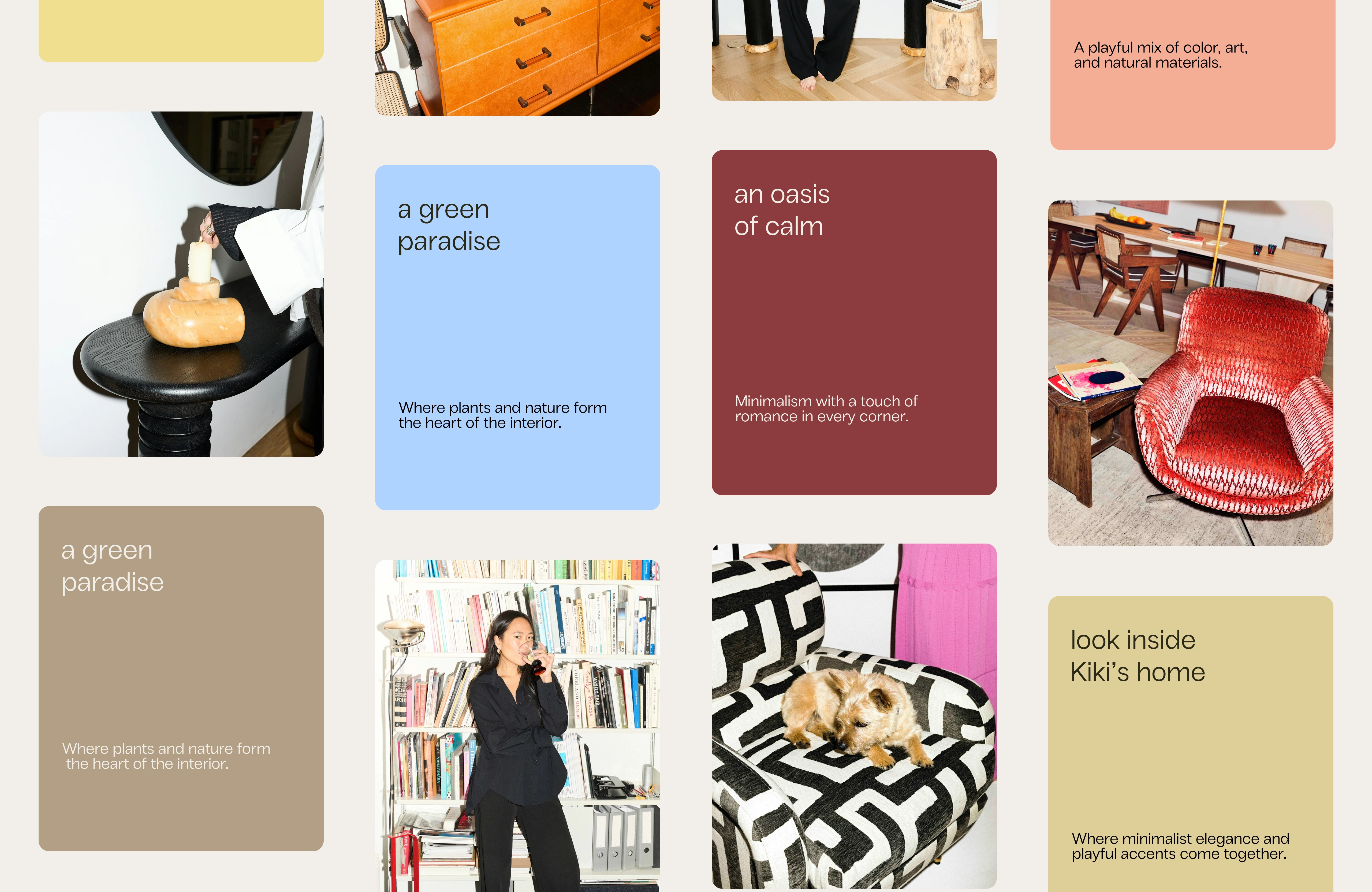
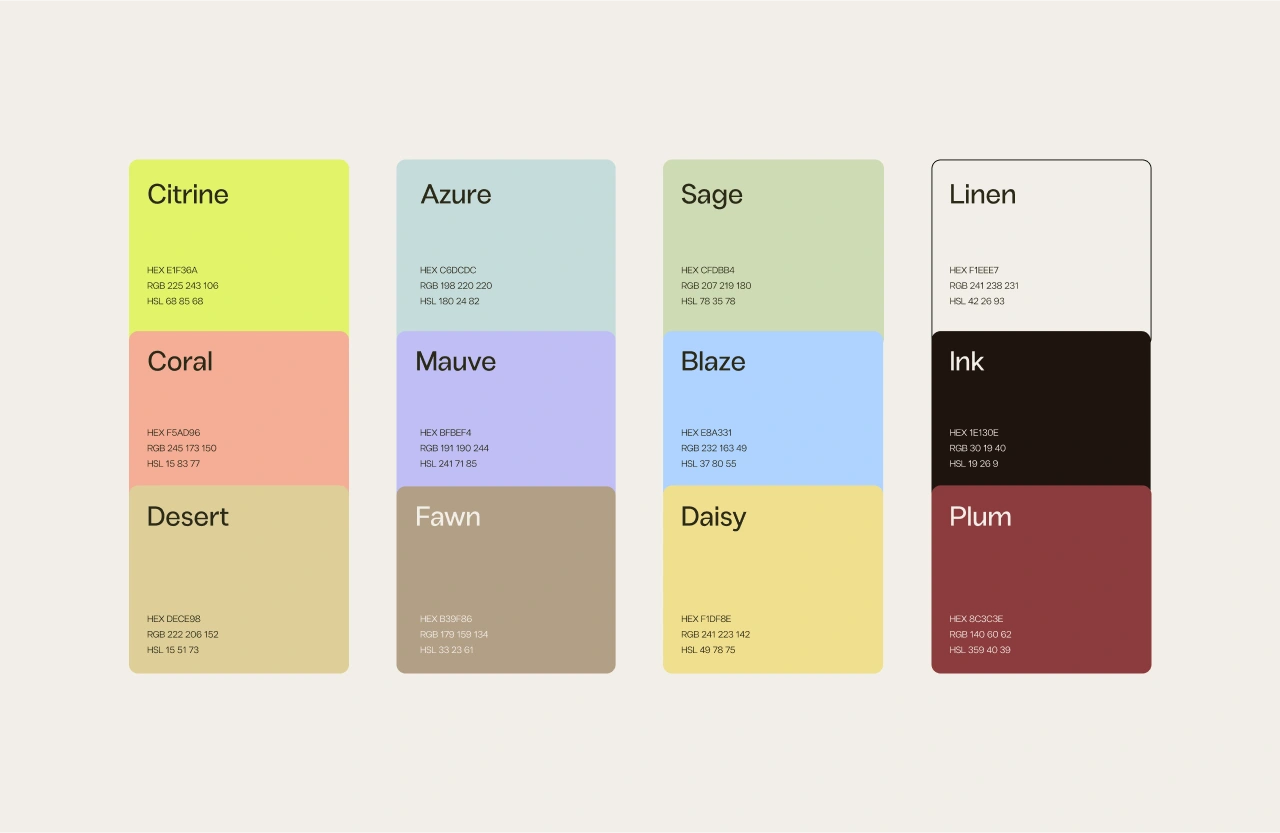
Color Palette Saturated, energetic tones add vibrancy and modernity. Deep hues bring depth and refinement. Neutral shades keep the system timeless and accessible. Together they create a brand that feels playful, professional, and trustworthy.
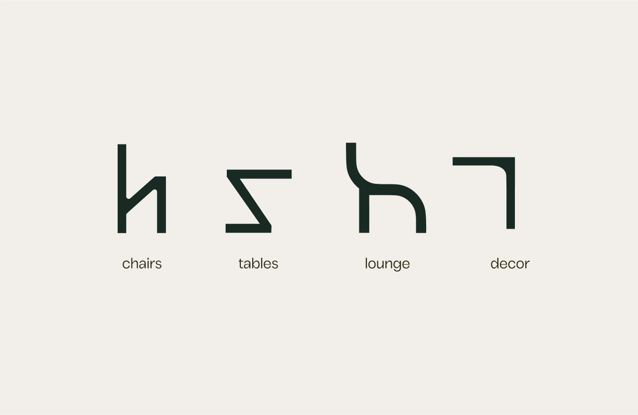
Form Language
Geometric simplicity inspired by furniture structures. Abstract yet clear, forming the basis for patterns, packaging, and other visual codes.
Voice & Positioning
Simple and clear. Personal and bespoke. Luxurious yet accessible. Inspiring while practical.
Taglines capture this blend:
“Dutch crafted. Unique by nature.”
“Set the standard in interior design.”
“Worldly style, local charm.”
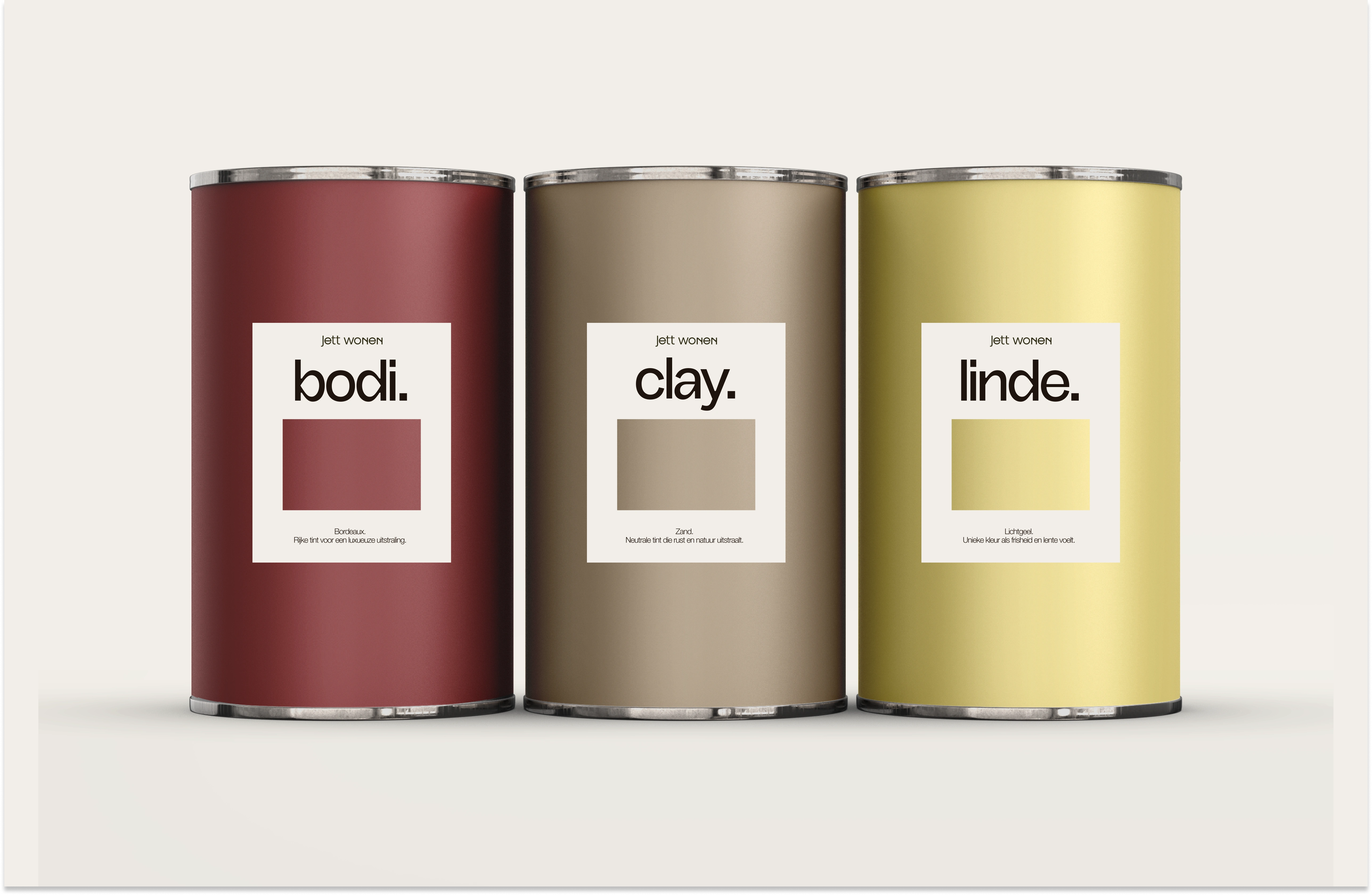
Naming
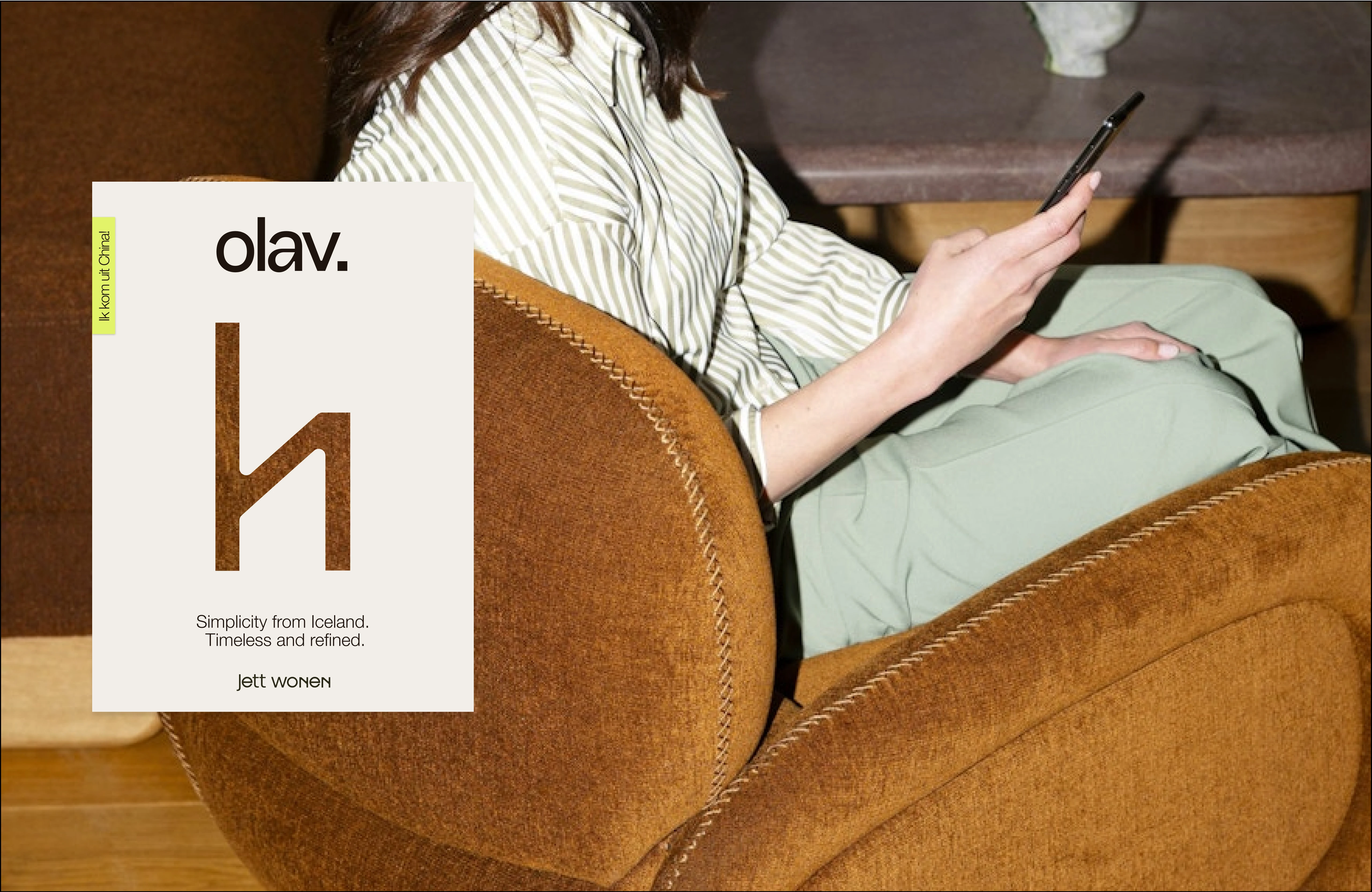
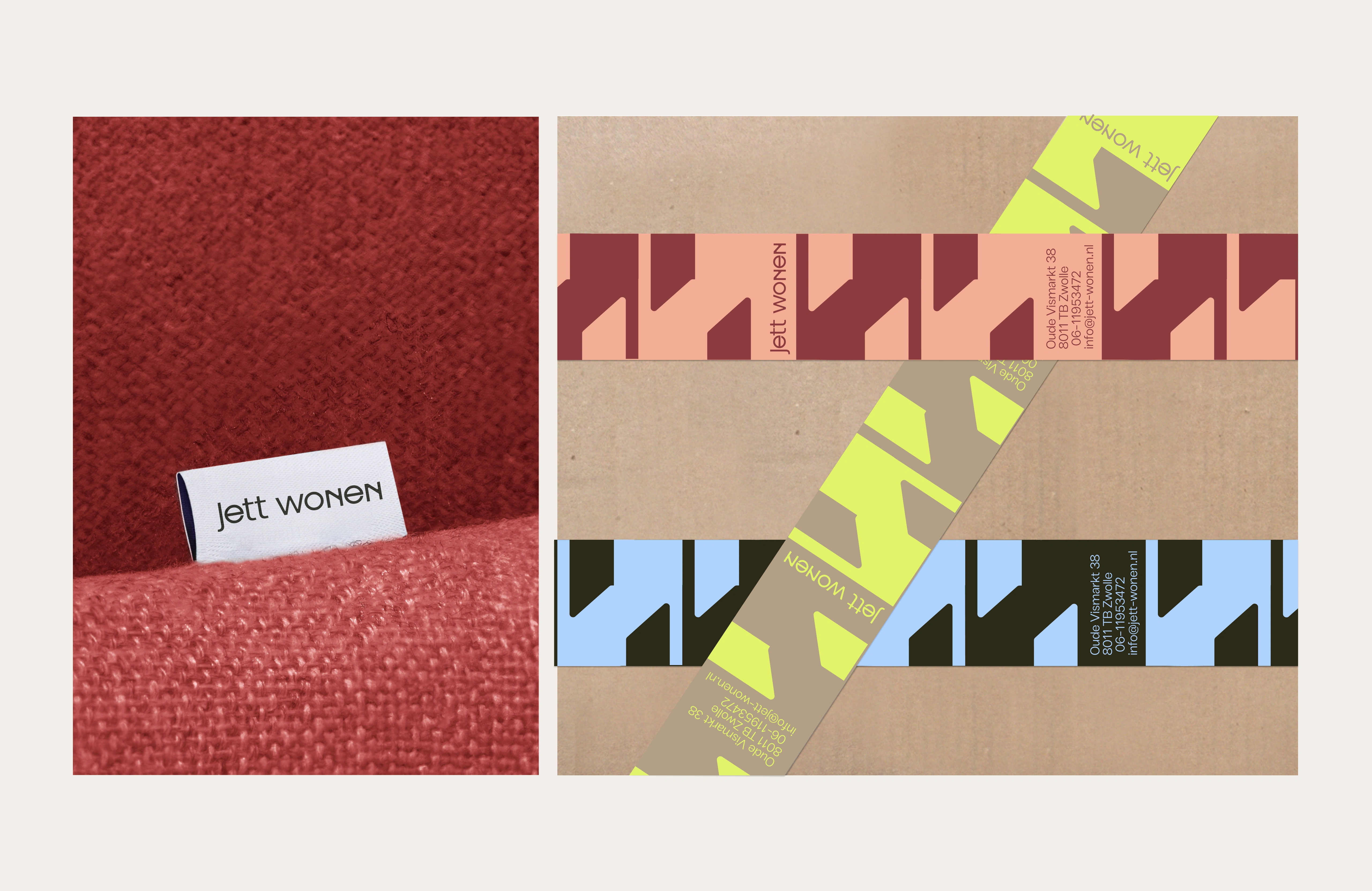
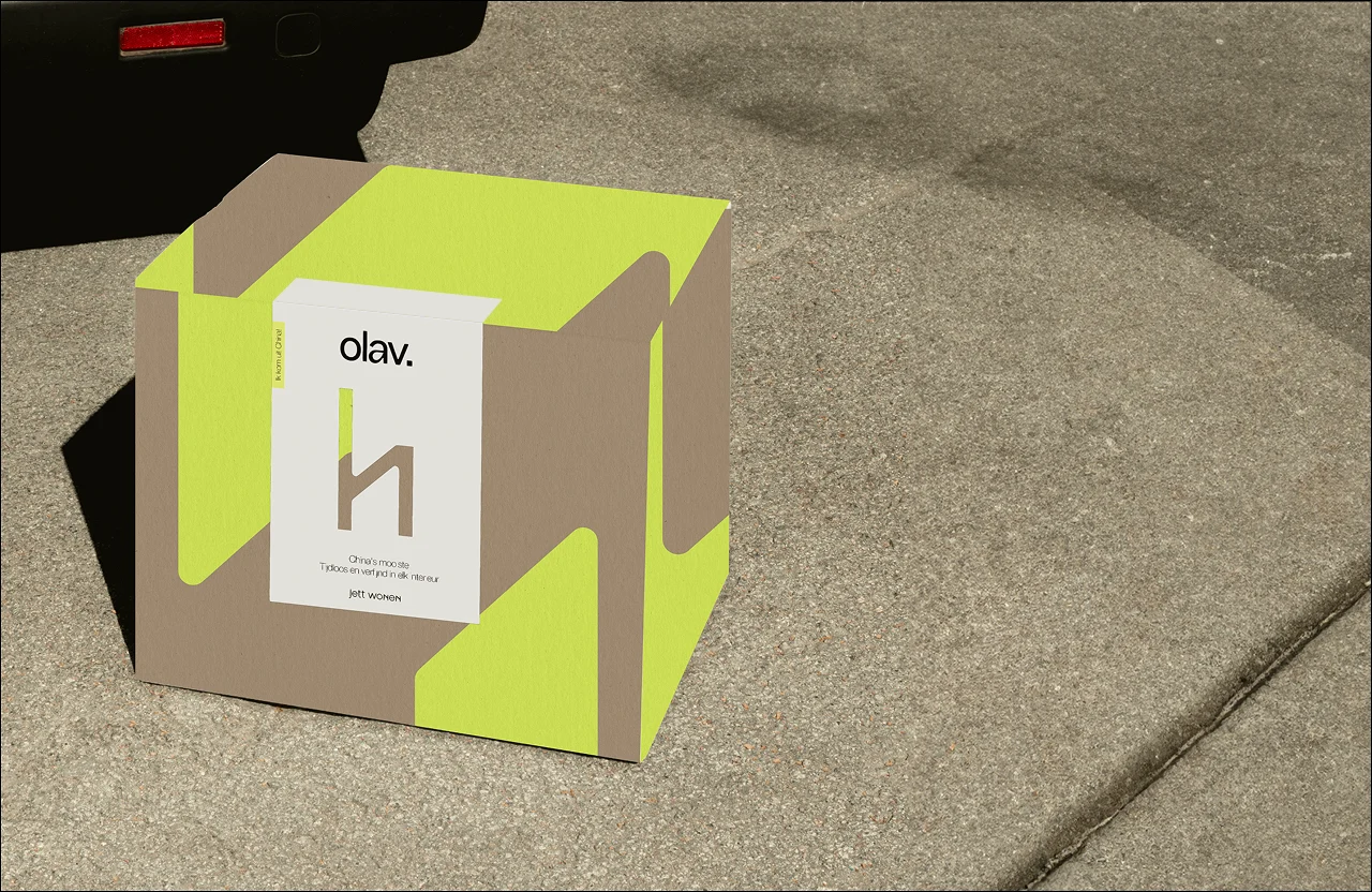
Every piece receives a name tied to its origin: “I come from…” Labels and packaging highlight story, origin, and material — turning each product into a unique character.

Strategic Concept & Visual Direction
Flash It!
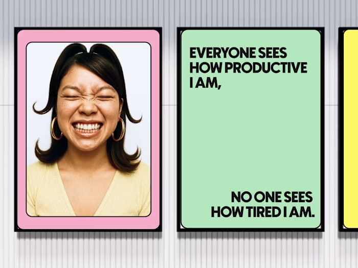
Editorial photography with direct flash highlights unique details and textures. This bold, timeless style gives interiors an elevated, high-end edge.
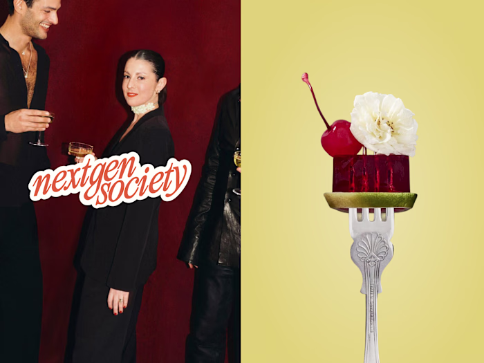
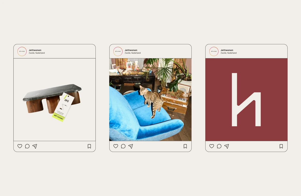
A Look Inside
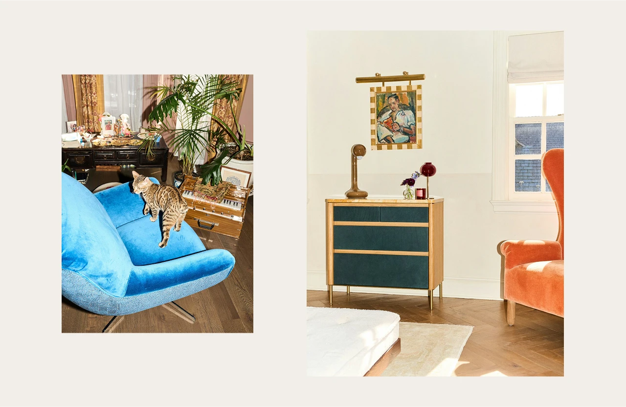
Warm, lived-in interiors are shown as they are, with real details like a personal accessory or a pet on the sofa. This creates emotional connection: authentic, human, yet refined.
Craftsmanship
The makers are central. From Henriëtte sketching at the design table to Jacko laying floors with precision, the process is shown in detail. Authenticity and expertise made visible.
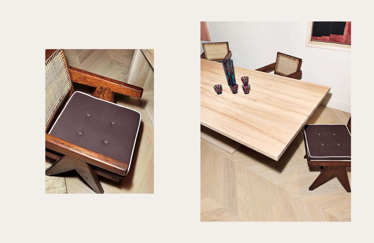
Product Photography
Furniture captured in pure form, supported by close-ups of textures and fabrics. These “blocks” integrate across print, web, and social, reinforcing brand recognition.


Campaign & Expressions
Website & Digital: Clear, structured, and rooted in storytelling.
Socials: A mix of bold photography, behind-the-scenes craftsmanship, and lived-in interiors.
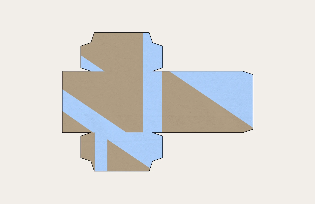
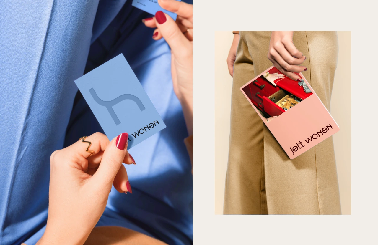
Packaging: Patterns and naming labels connect each product to its unique story.
Process & Collaboration
We explored two creative routes — bold editorial vs. warm lived-in — and refined them together with the founders. The process balanced Dutch roots with global inspiration, shaping not just a logo but a full brand world.

Result & Impact
The outcome: a brand that is refined yet approachable. Dutch at heart, worldly in influence.
Every product now carries its own story, from its name and label to its visual expression.
The impact: Jett Wonen positions itself as the Dutch standard in interior design.
We’ve been impressed from the very beginning, and we’re genuinely delighted with how everything has come together. It’s been such a rewarding collaboration. - Client
Like this project
Posted Sep 11, 2025
Created a refined, approachable brand identity for dutch furniture brand Jett Wonen.
Likes
4
Views
27
Timeline
Dec 4, 2024 - Jan 7, 2025