Beyond Bids Strategic Rebrand
Roos van Gestel
Project: Beyond Bids, strategic tender consultancy rebrand
Challenge: Position Beyond Bids not as a traditional tender agency, but as a sharp strategic partner with skin in the game. The brand needed to communicate performance, transparency, and commitment in a way that feels human, confident, and distinct. Without falling into corporate clichés or consultancy sameness.
My role: Brand designer & Art Director. Creating a visual and verbal identity that turns tender strategy into a bold, structured brand world. Linking precision to personality and performance to partnership.

Foundation & Brand Pillars
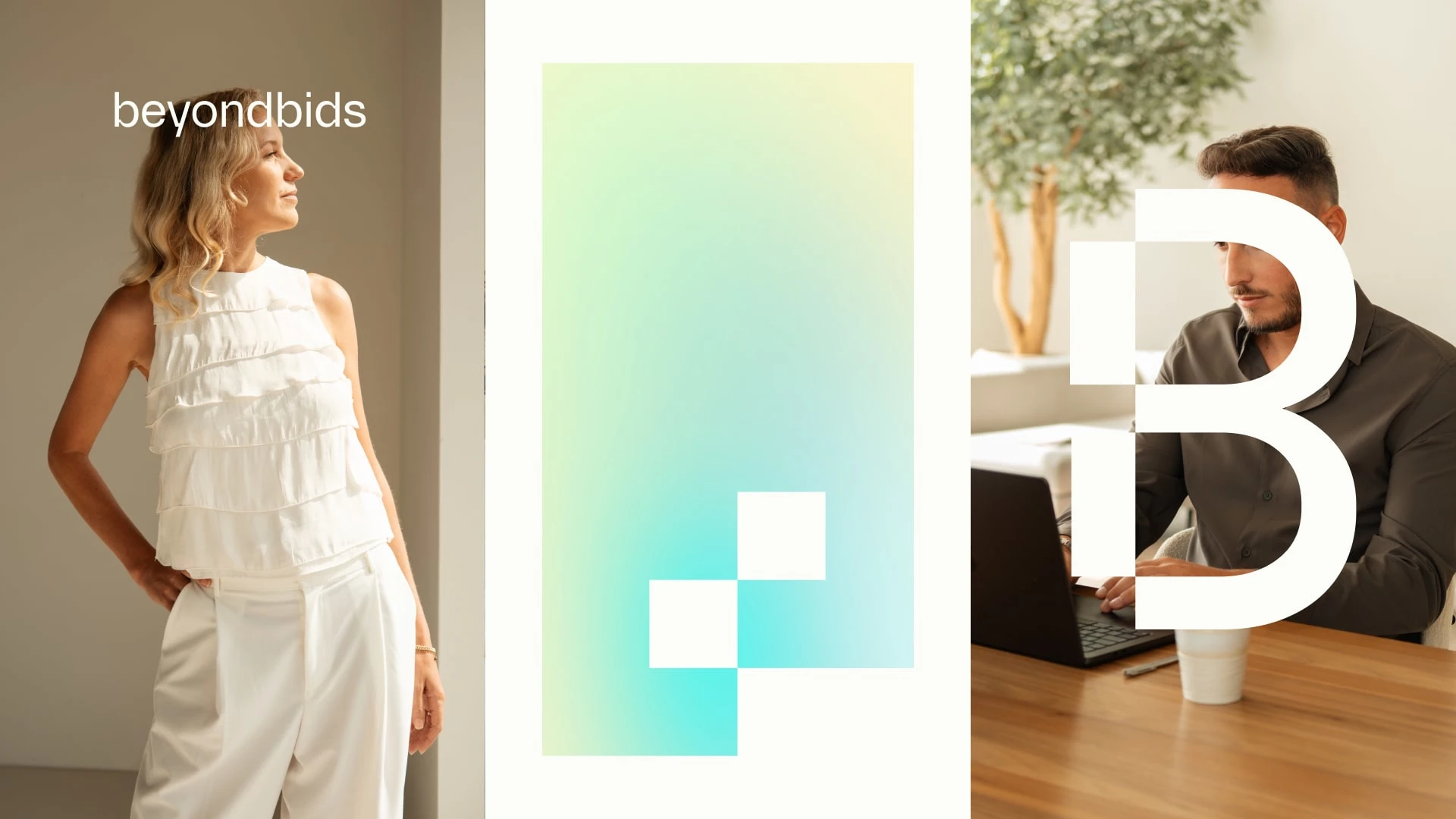
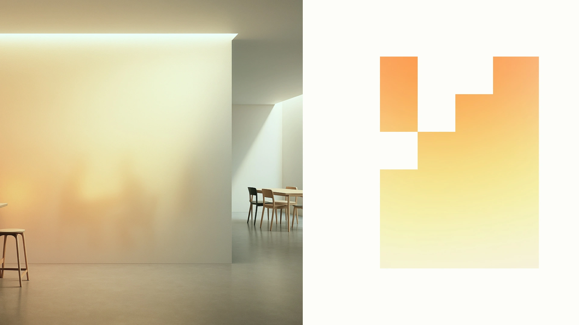
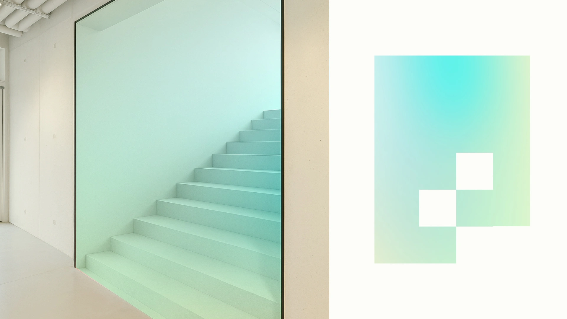
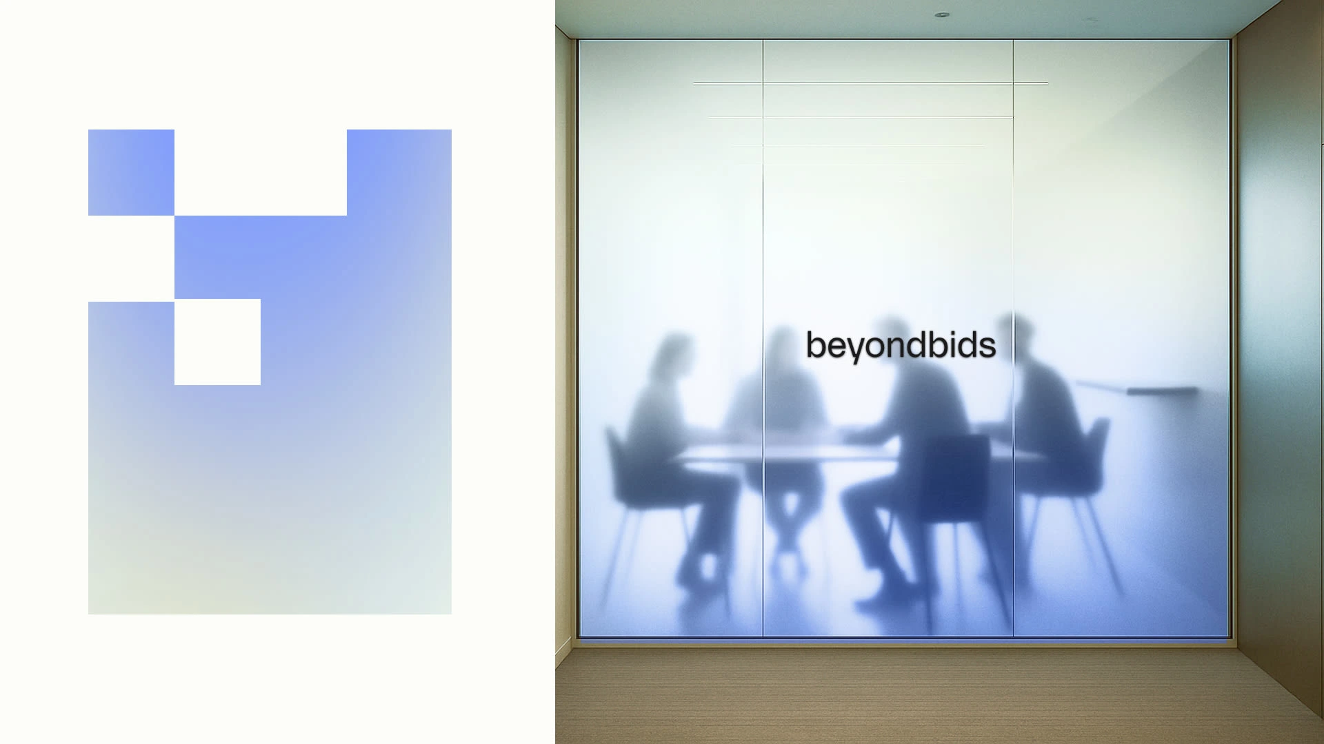
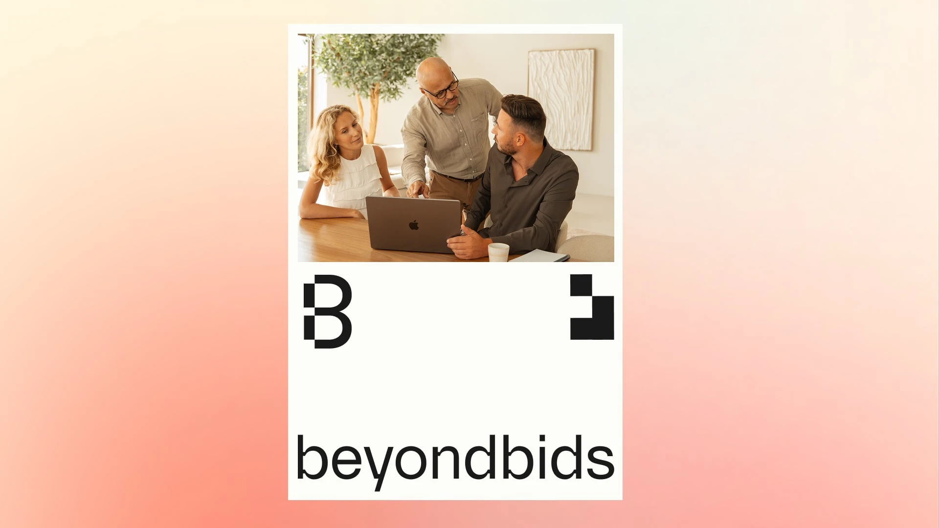
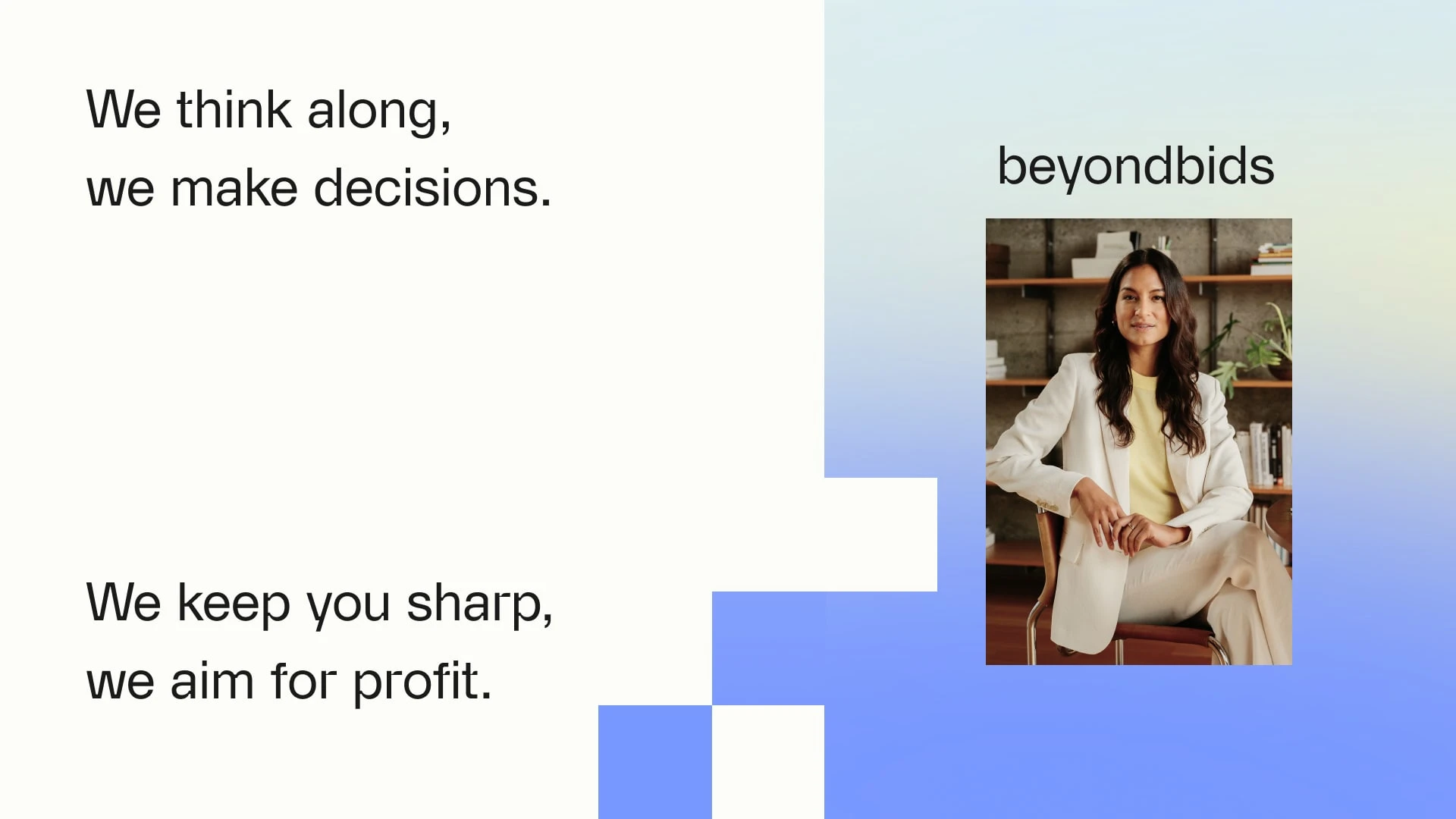
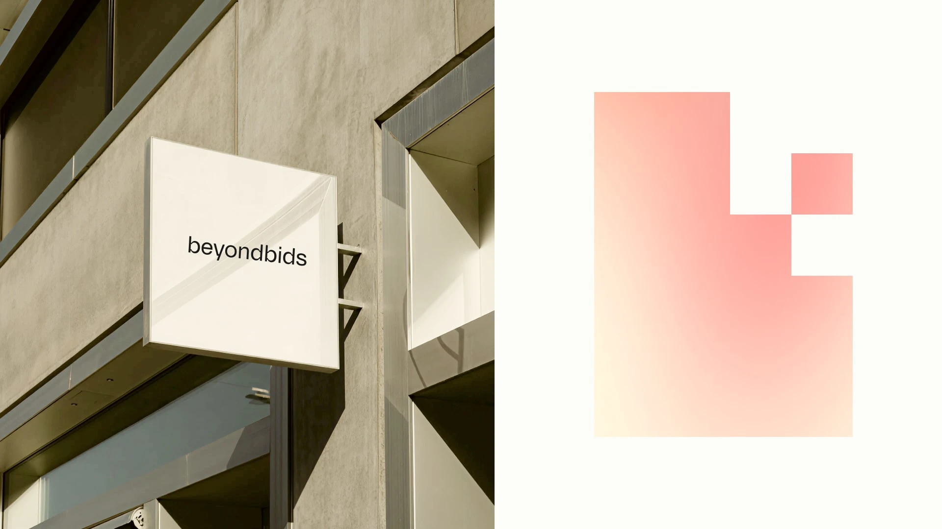
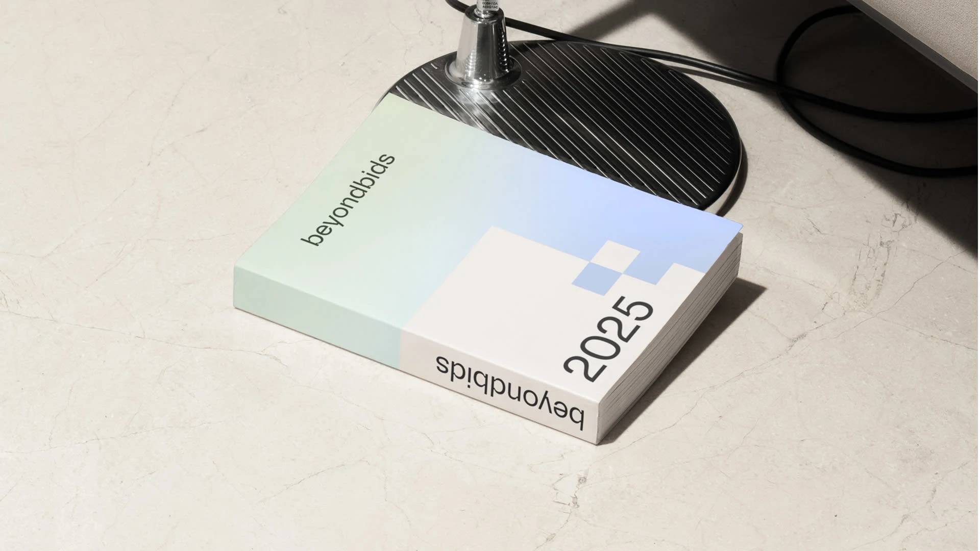
Logo
A minimal wordmark written in one breath: beyondbids.
No capitals. No decoration. Only focus.
Subtle square cuts in the letterforms introduce character and precision. The modular icon acts as a visual anchor across applications. All built from the same square geometry.
Geometric, deliberate, structured.
Symbolising sharp thinking, clear decisions, and strategic alignment.
The system is designed for adaptability: from pitch decks and social posts to spatial branding and campaign statements.
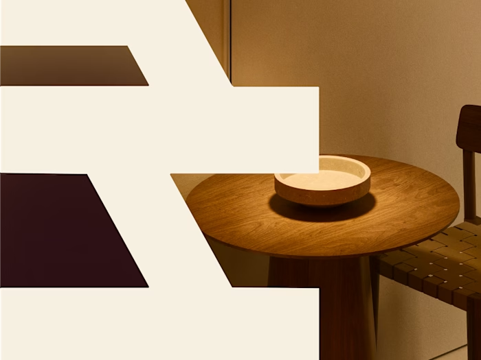
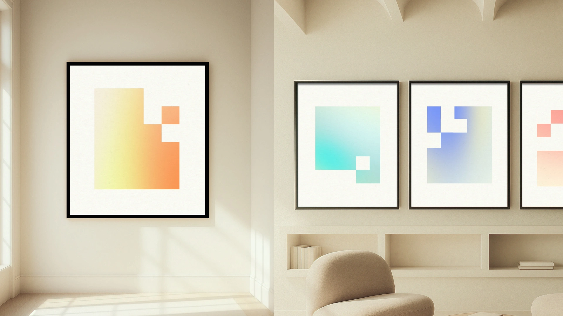
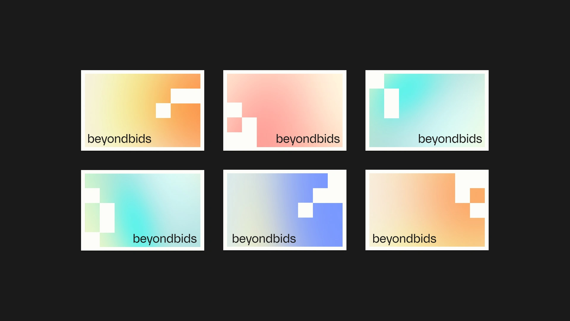
Color Palette
Black and off-white form the base: calm, controlled, professional.
Layered gradient accents add movement and nuance: soft blends of warm and cool tones that signal progression, strategy, and forward momentum.
The contrast between strict structure and subtle color transitions reflects the brand’s duality:
Hard on strategy. Human in collaboration.
Typography & Voice
Clean, contemporary typography built on contrast:
Rinter for rhythm, authority, and strong statements.
Inter for clarity, readability, and digital precision.
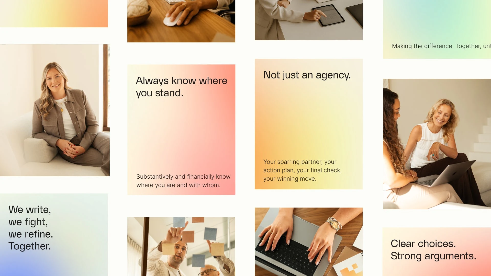
The tone of voice is direct, focused, and without noise. Serious, but never cold.
Short sentences.
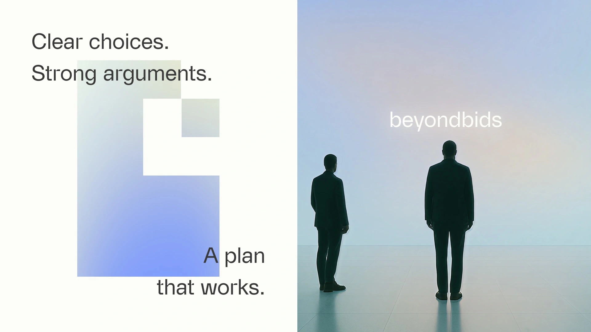
Clear choices.
Strong arguments.
Examples:
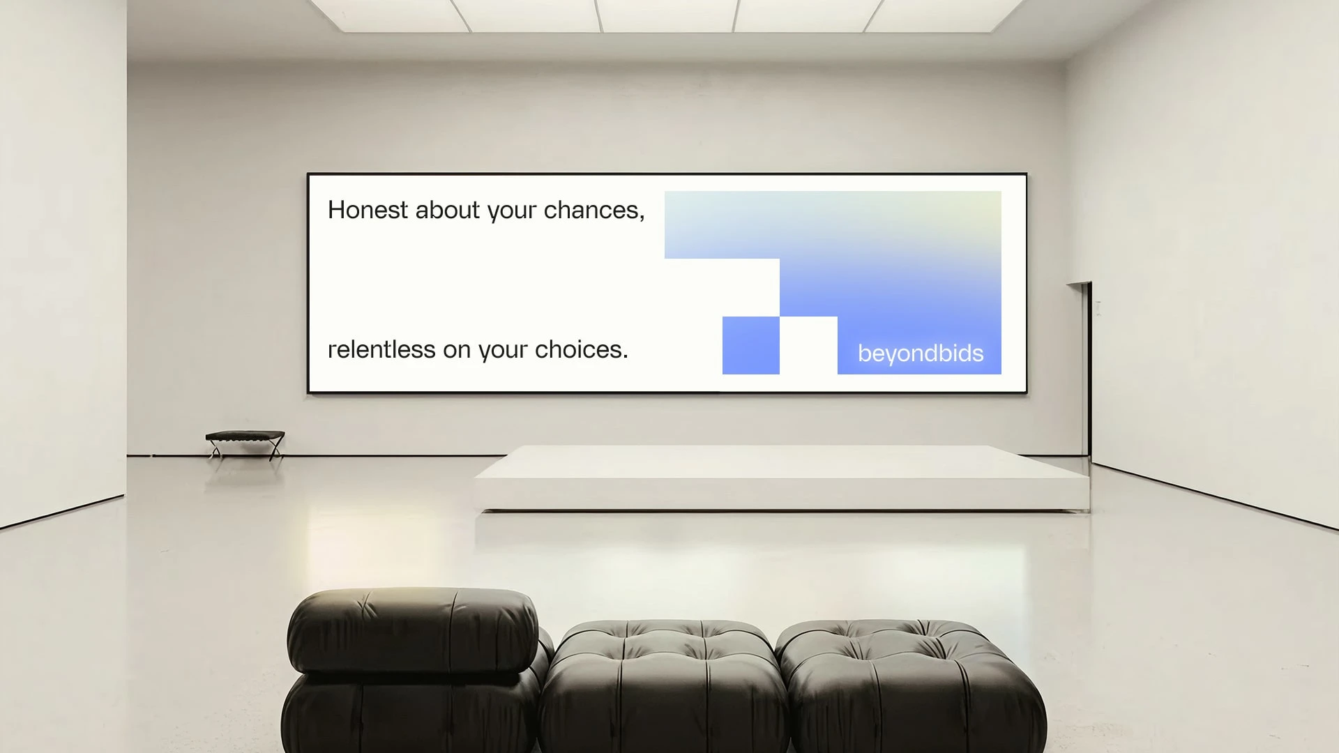
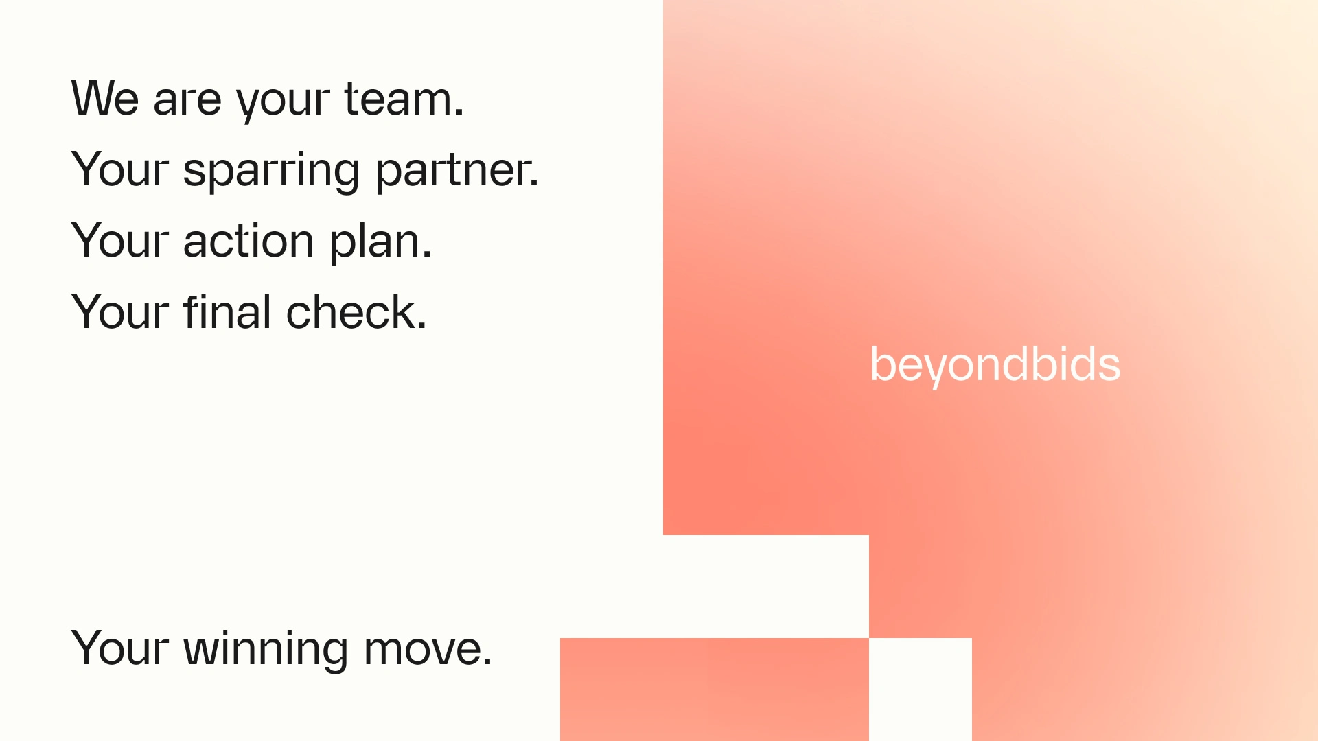
“Clear choices. Strong arguments.”
“Full commitment. Radical honesty.”
“Not a thick plan. A good plan.”
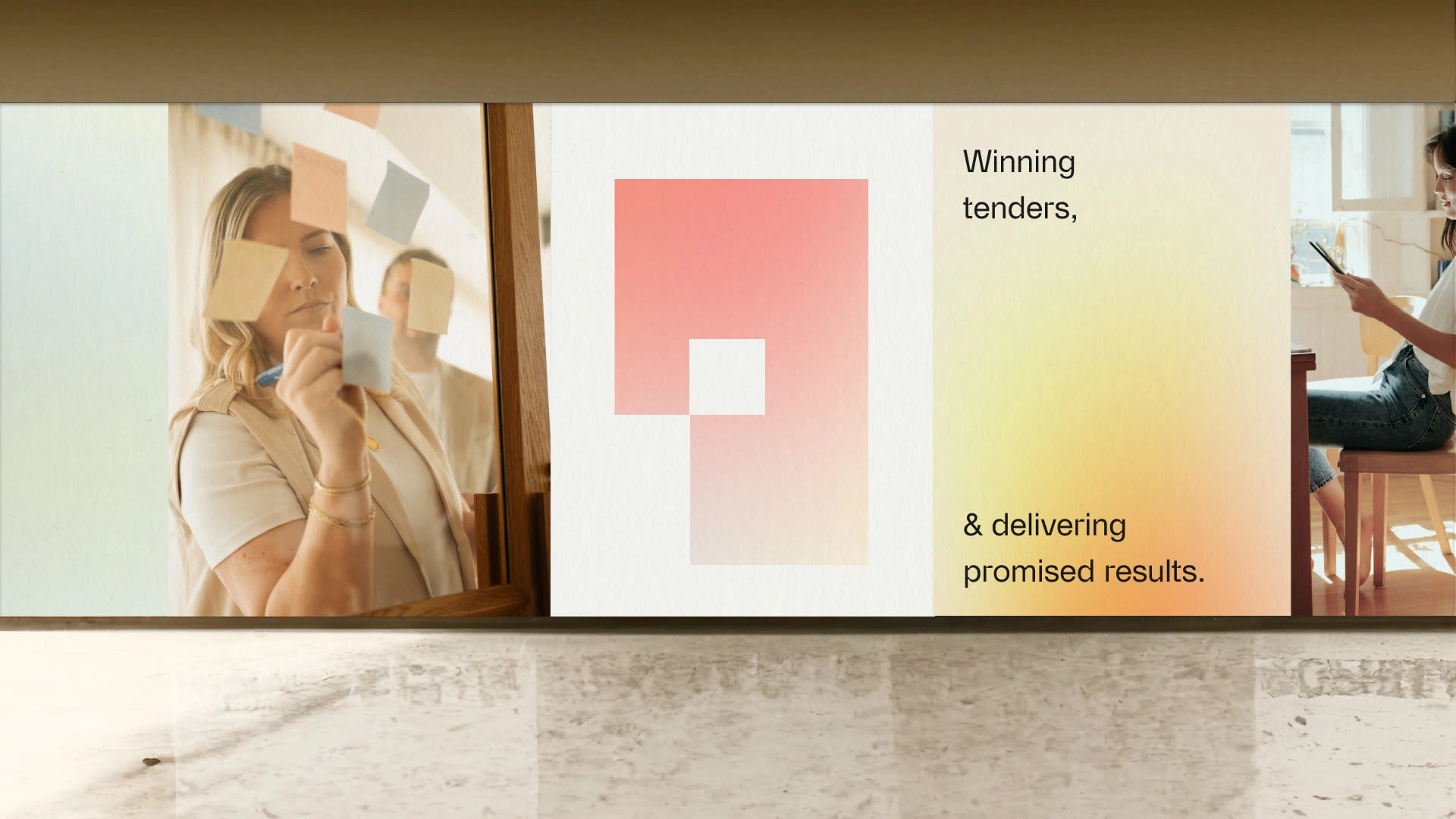
“Winning tenders & delivering promised results."
It’s language that connects strategic sharpness with personal involvement. Turning tender writing into partnership, and partnership into performance.
Core Idea
Writing as strategy.
Not just tenders, but a decisive move towards winning and delivering.
Beyond Bids reframes tender writing from paperwork to performance — from obligation to opportunity.
This is not about submitting documents.
It’s about making choices that win.
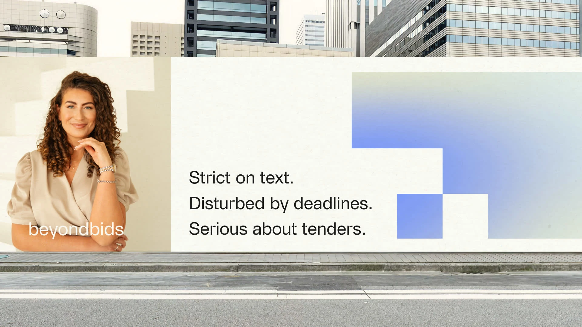
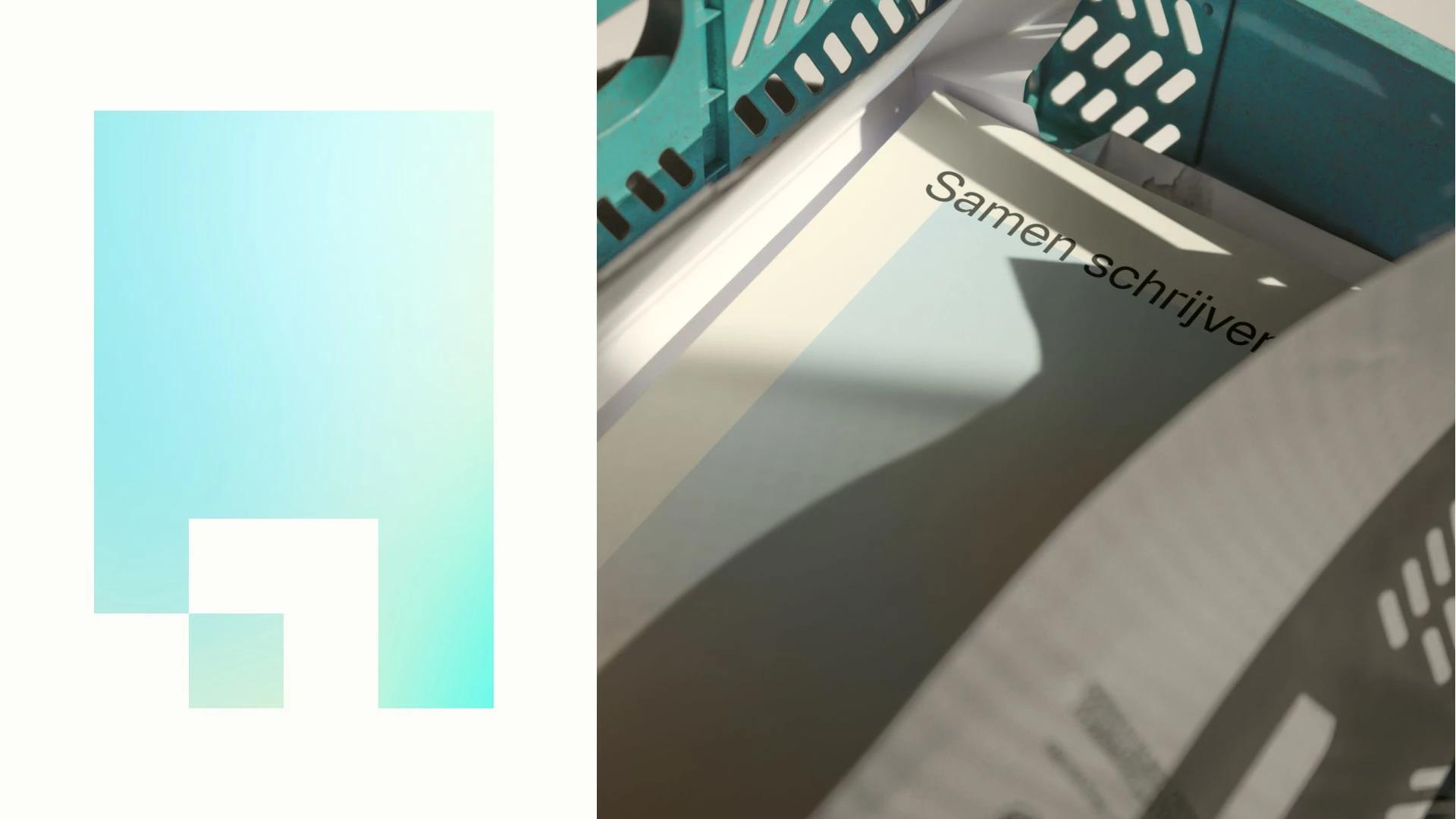
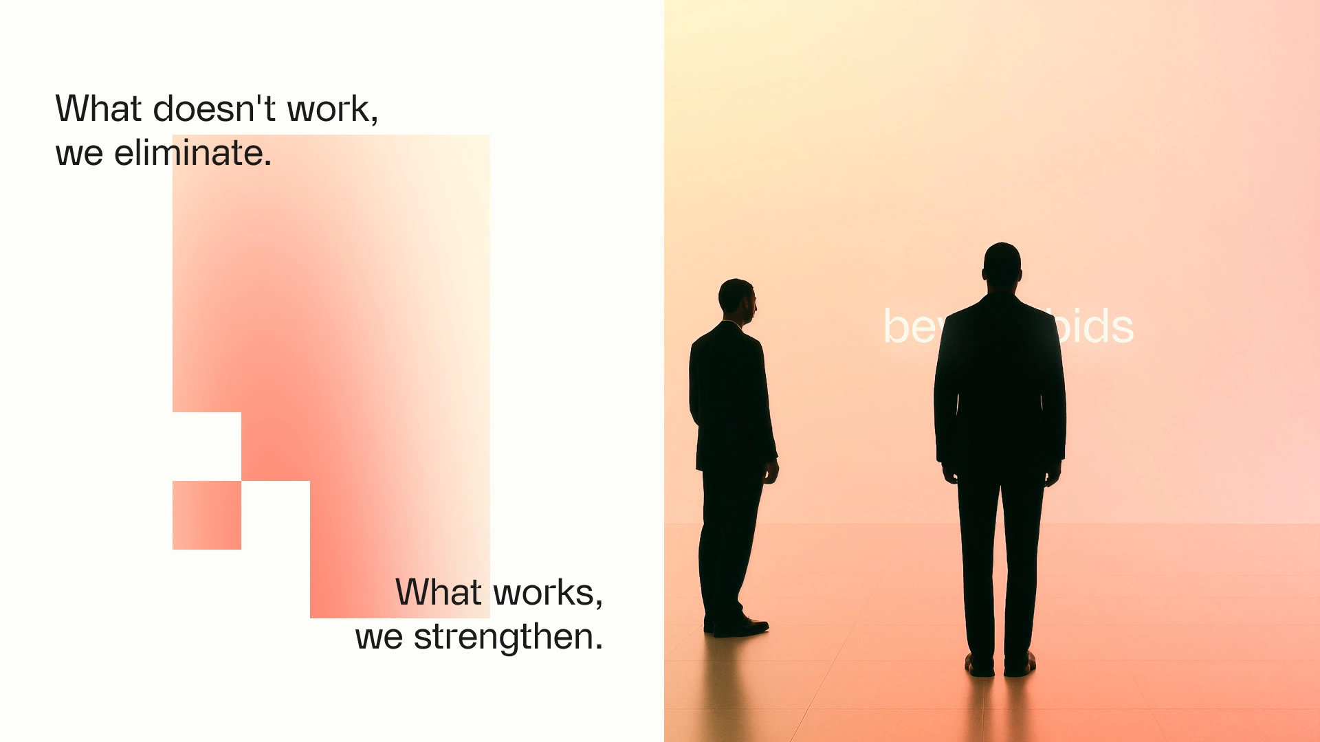
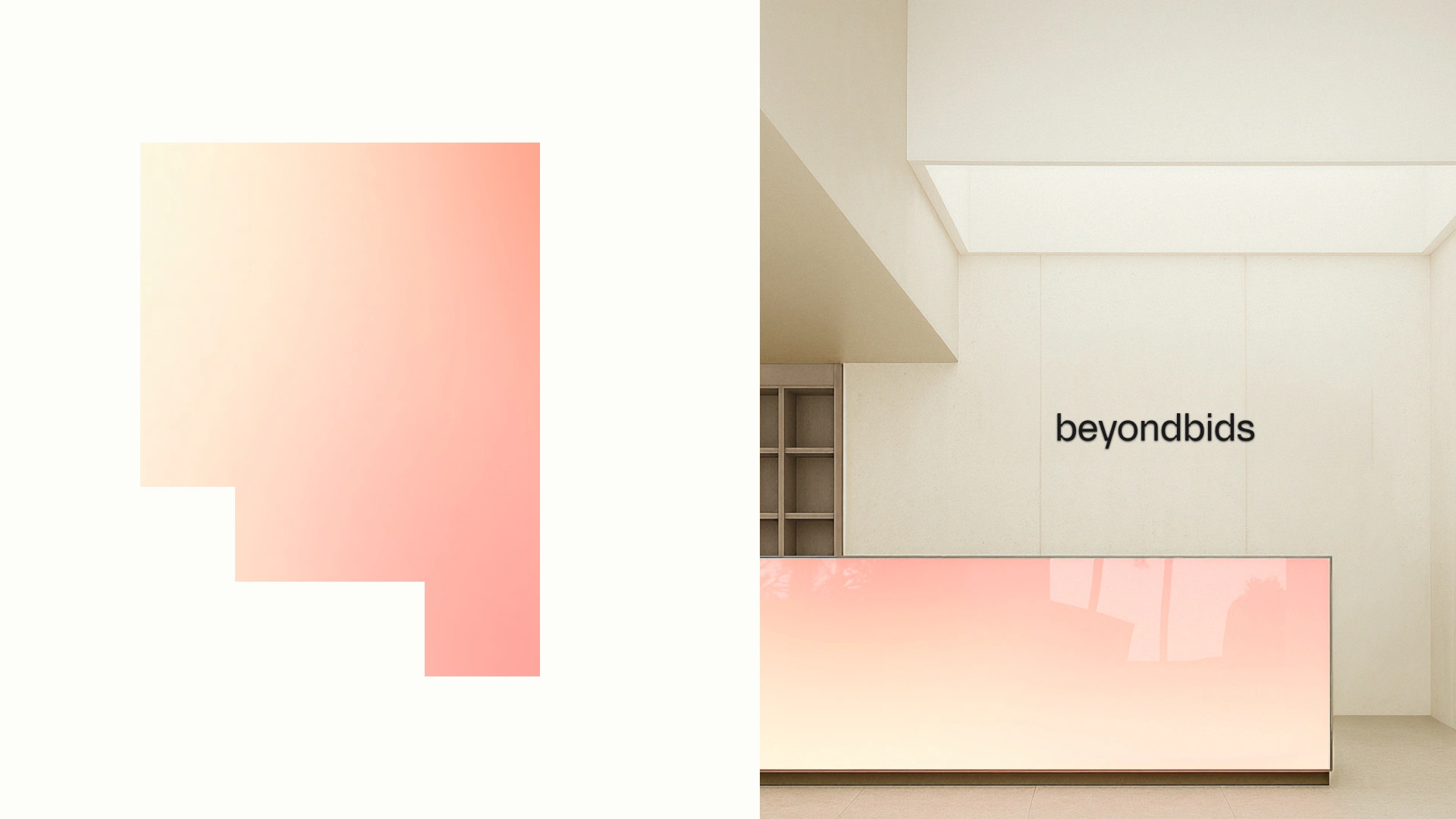
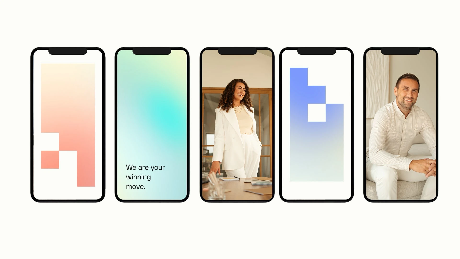
Visual Language
Precision meets partnership.
Structured square grids combined with soft gradients and human photography.
Sharp geometry symbolizes focus, structure, decision-making.
Layered gradients introduce movement, nuance, and forward thinking.
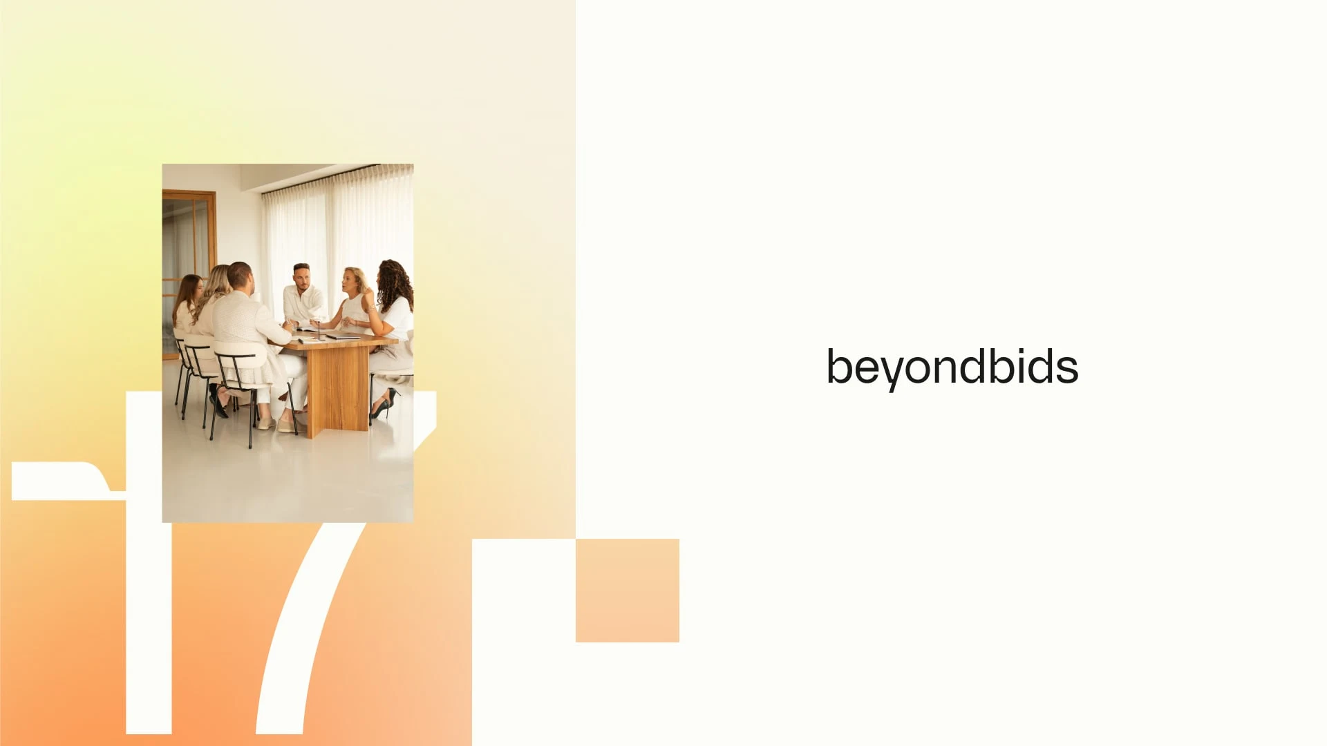
Real people imagery show collaboration, concentration, and commitment.
Visible focus and shared ownership.
Design System
The modular square icon becomes the foundation of the system:
Used as framing device
Integrated into layouts
Translated into spatial branding
Applied in social, decks, and campaigns
Everything aligns to a grid. Everything connects. Everything becomes intentional.
The modularity ensures instant recognition across all touchpoints: from LinkedIn posts to office walls.
Structured. Consistent. Scalable.
A brand system that performs like the team behind it.
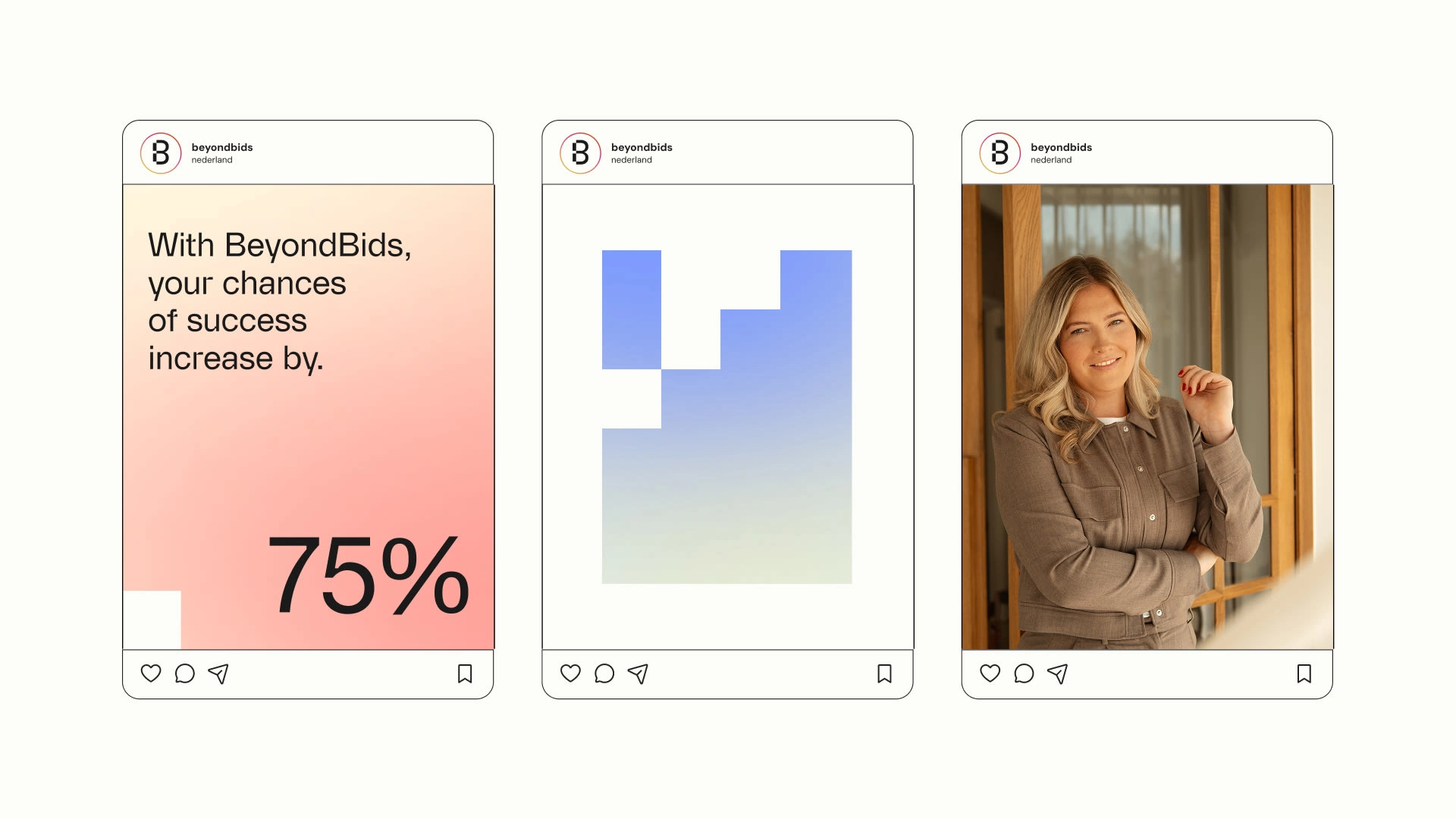
Campaign & Expressions
Messaging
The messaging is designed for impact in decks and social formats. It works in short, structured statements that land immediately.
Lines function as slide headlines, LinkedIn visuals, and campaign anchors.
Every sentence is a statement. No filler. No abstraction. Just clarity and direction.
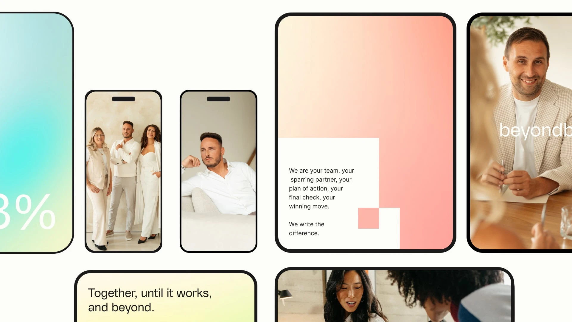
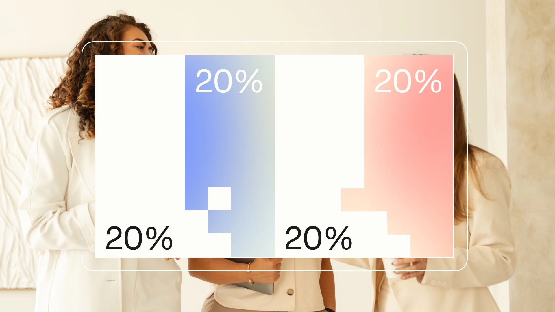
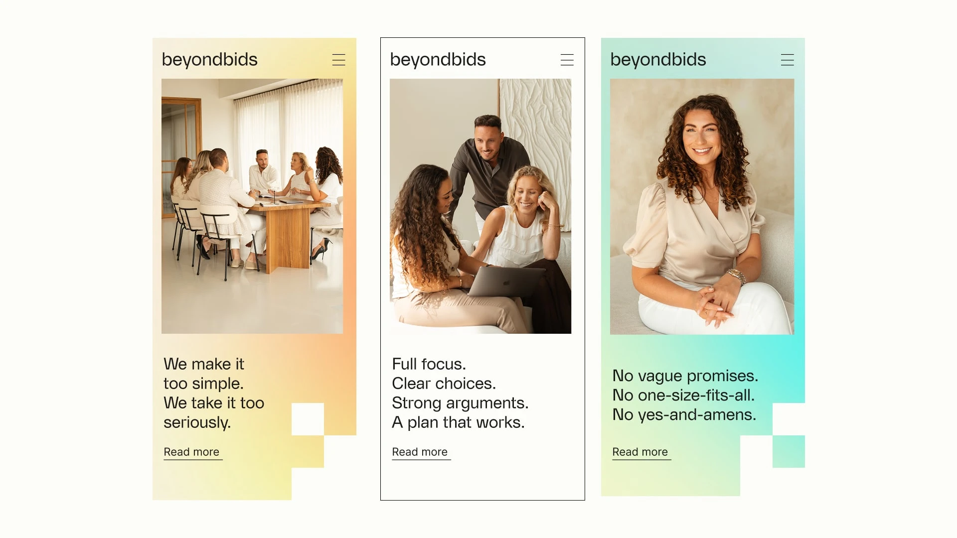
Digital & Social
The digital presence is built on strong typographic hierarchy and modular square elements. High contrast, clear grids, and breathing space ensure immediate readability.
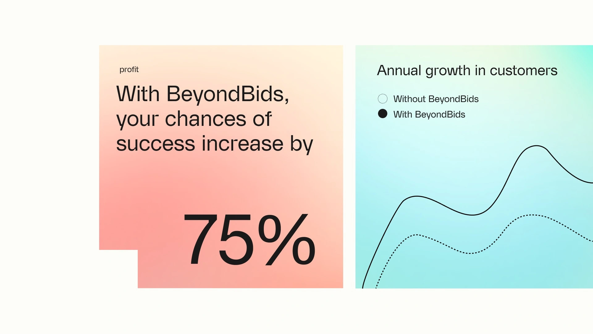
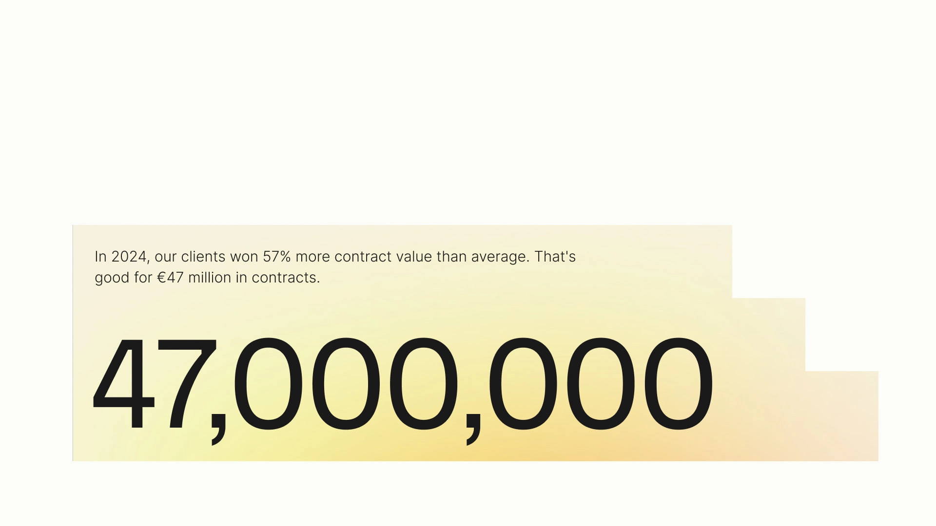
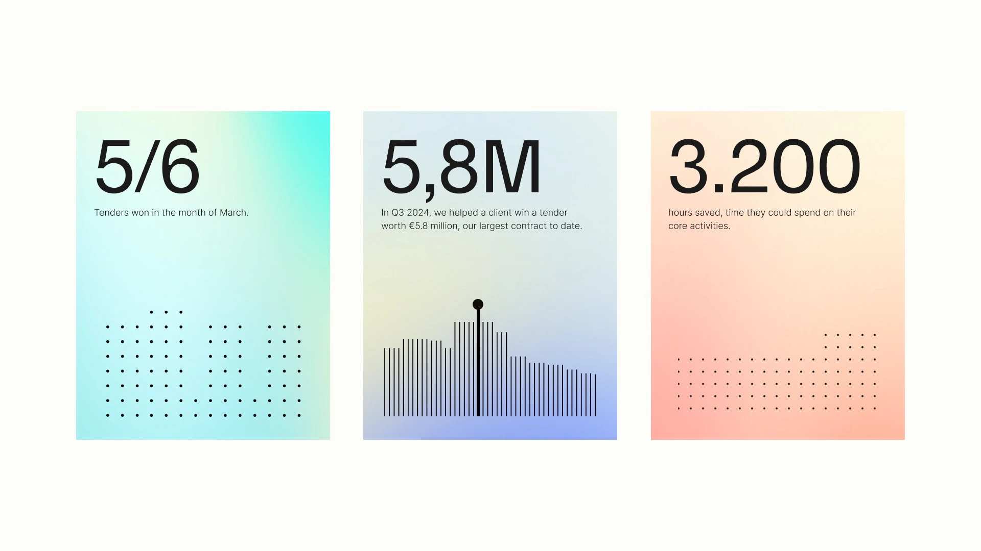
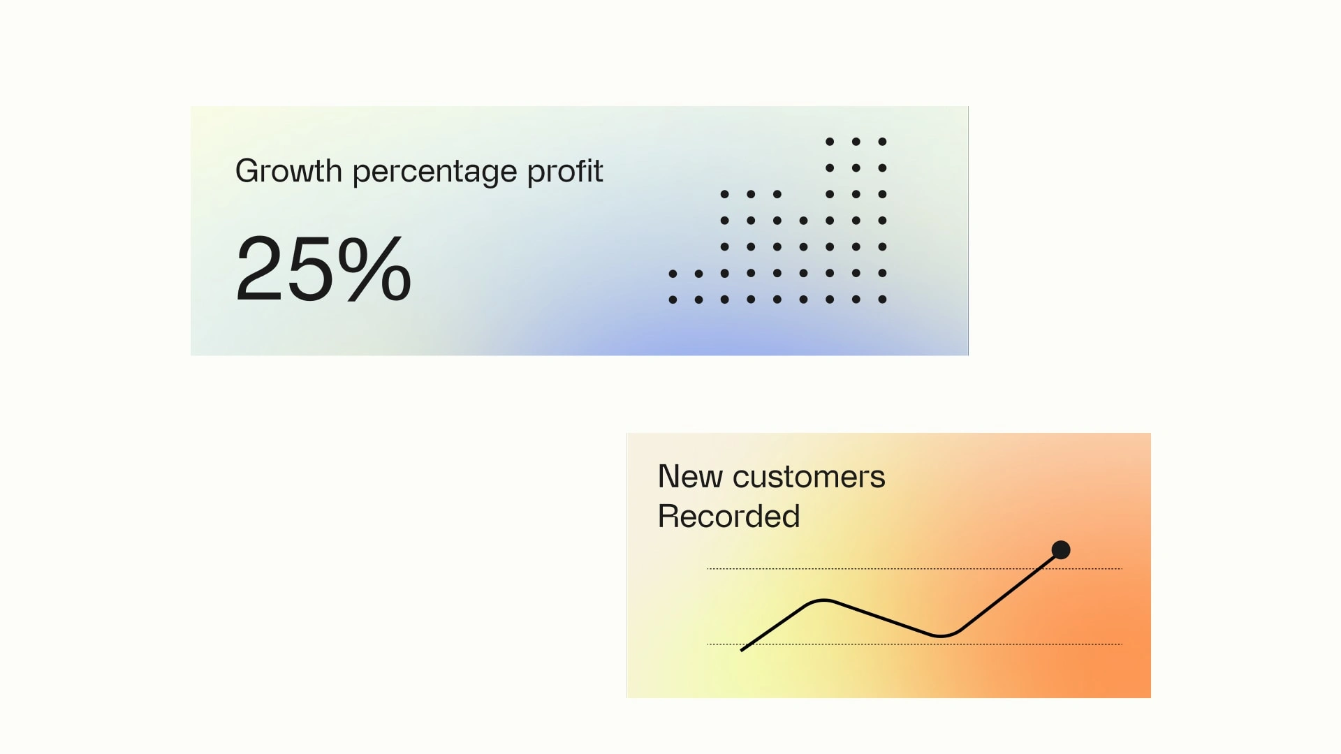
Performance statistics are used as proof, not decoration. Figures like 57% more value, €47 million won, and a 75% success rate reinforce credibility in a single glance.
Each post feels decisive and structured, aligned with the brand’s no-noise philosophy.
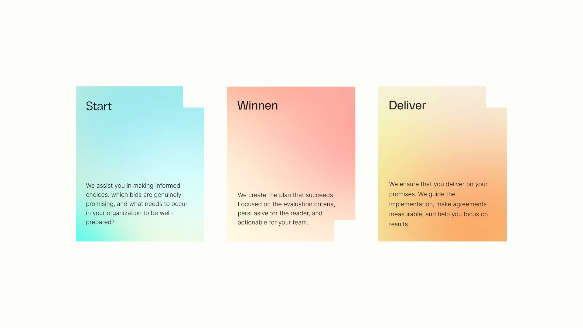
Service Integration
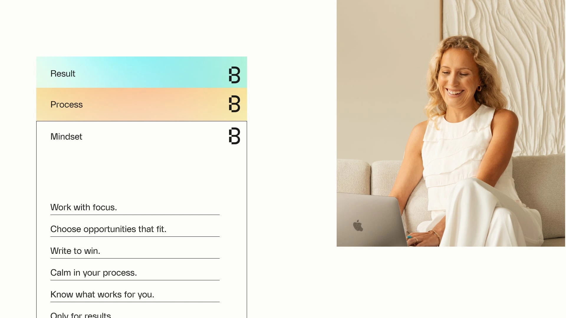
The service is translated into three clear stages: Start. Win. Deliver.
Campaign expressions make the process tangible through structured slides, defined frameworks, and case-driven proof.
Instead of explaining expertise, the brand demonstrates it. Through clarity, structure, and measurable results.
Visual outcome: A sharp, scalable brand identity where every element reinforces clarity, precision, and commitment. The brand feels structured, confident, and instantly recognizable across digital, print, and spatial applications.
Impact for the client: Beyond Bids no longer communicates as “a tender agency.” It positions itself as a strategic partner with skin in the game, focused on winning and delivering. The identity now matches the ambition and measurable results behind the company.
My reflection: This project proves that even in a highly formal, process-driven industry, branding can be bold and distinctive.
“We’re extremely satisfied with Roos, her work, and the way the process was handled. A very strong recommendation, she’s one of a kind.” - Beyond Bids
Like this project
Posted Mar 3, 2026
Rebranded Beyond Bids into a strategic bid consultancy partner with a bold, structured identity.
Likes
1
Views
13
Timeline
May 3, 2025 - Sep 3, 2026