LumoLED Sustainable Lighting
Roos van Gestel
Project: LumoLED, sustainable lighting rebrand
Challenge: Position LED lighting not just as a technical product, but as part of a sustainable lifestyle. The brand needed to communicate efficiency, eco-friendliness, and aspiration in a way that feels modern and desirable.
My role: brand designer & art director. Creating a visual and verbal identity that links technology to emotion and product to impact.
Foundation & Brand Pillars
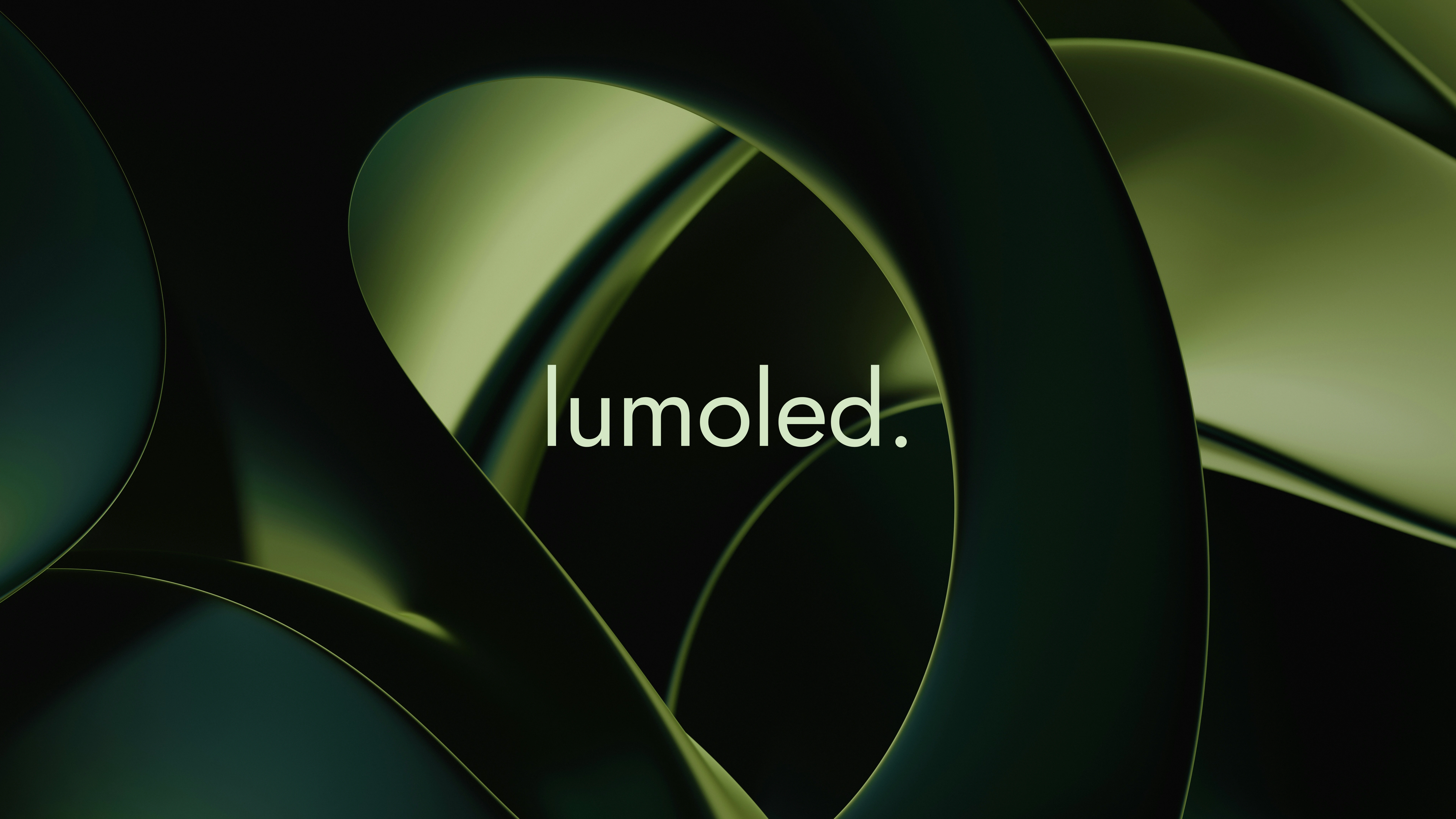
Logo
A minimal wordmark paired with a modular icon. Organic, yet geometric — symbolizing both nature and technology. The system is designed for adaptability: on packaging, campaigns, or social.
Color Palette
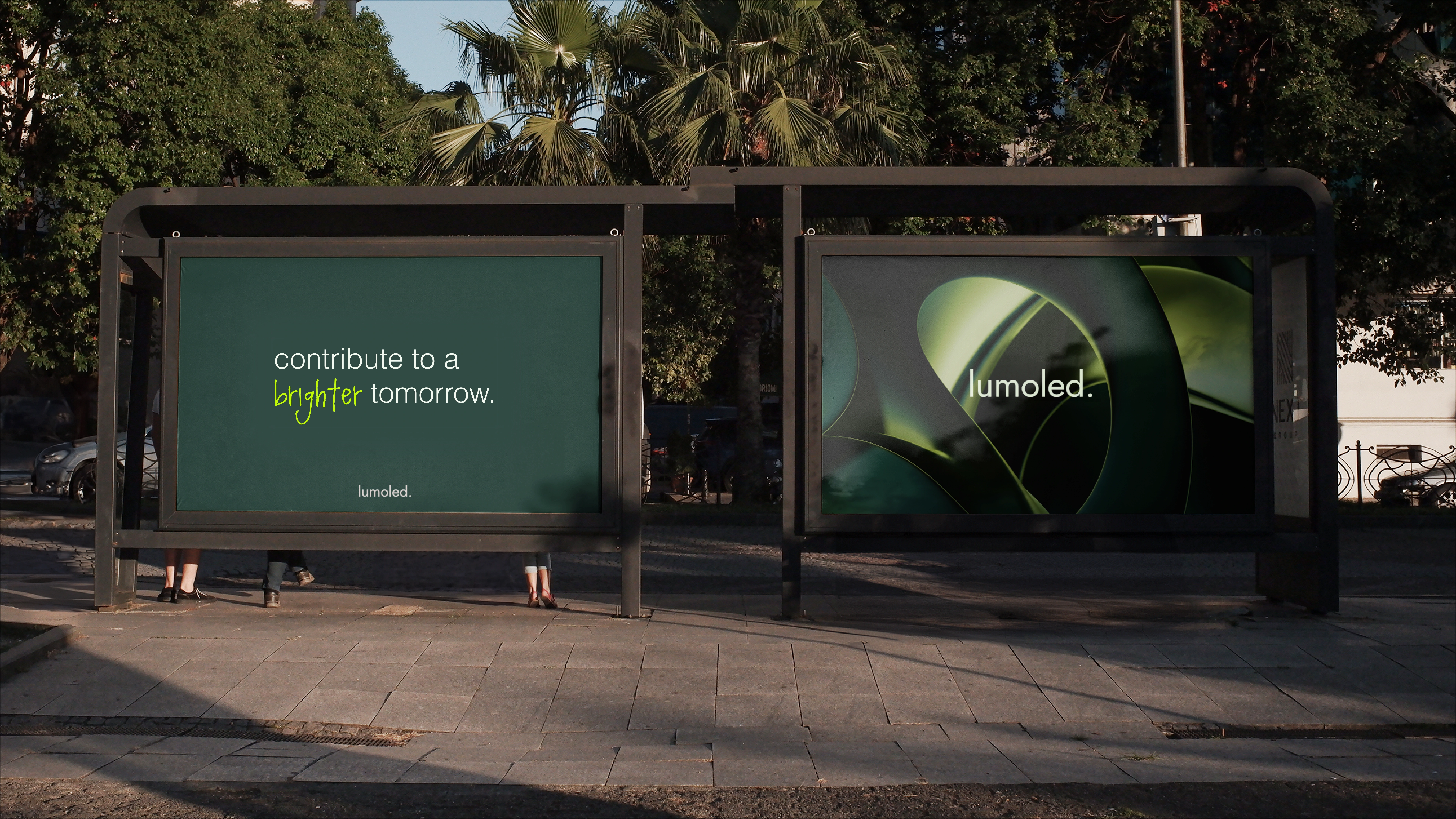
Dark green, soft mint, and white form the base: calm, natural, trustworthy. Neon green accents inject energy and modernity, signaling innovation and forward motion.
Typography & Voice
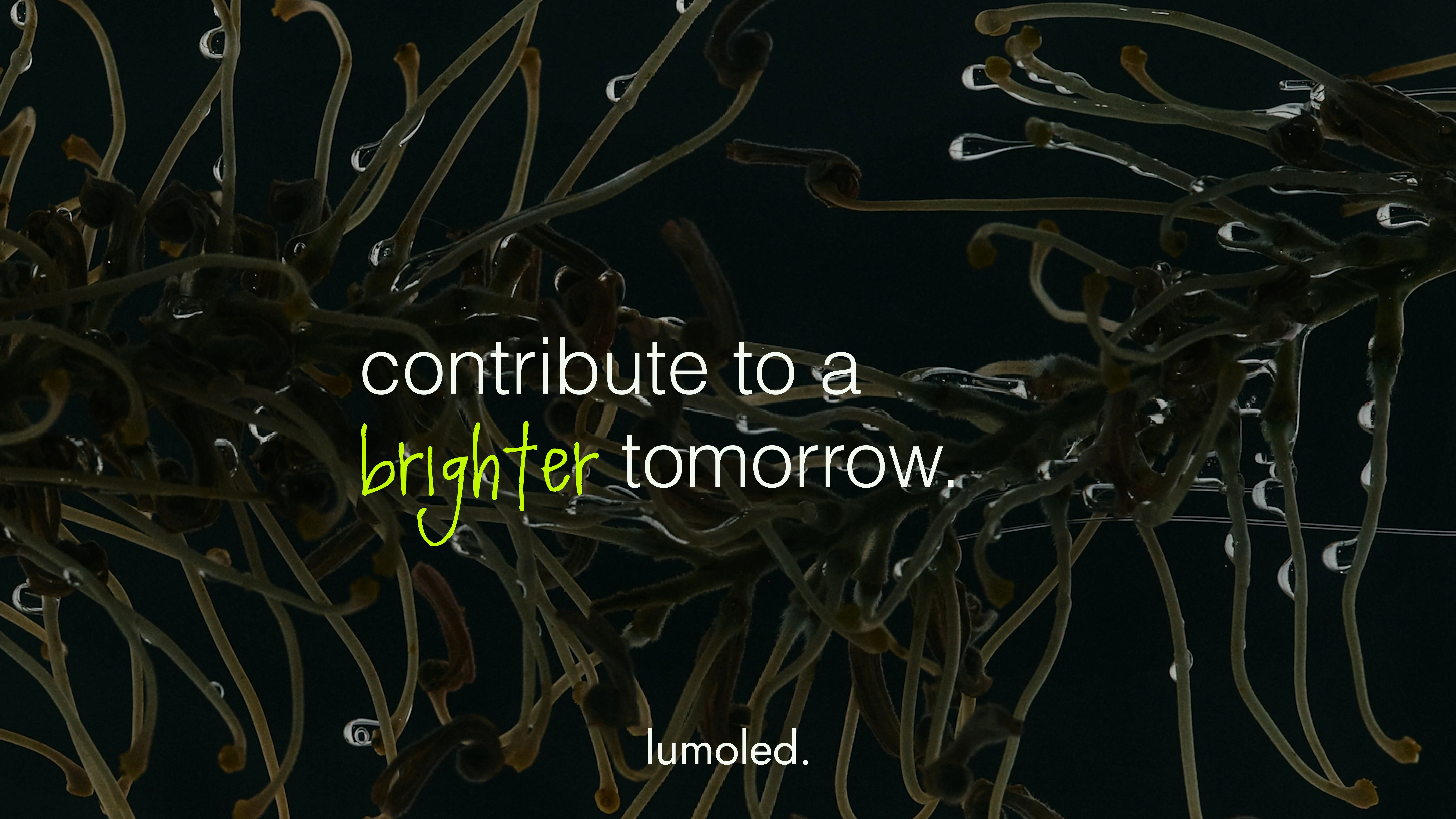
Simple, contemporary type with hand-written accents. The balance between clarity and play. The tone of voice is sustainable, future-focused, but also accessible:
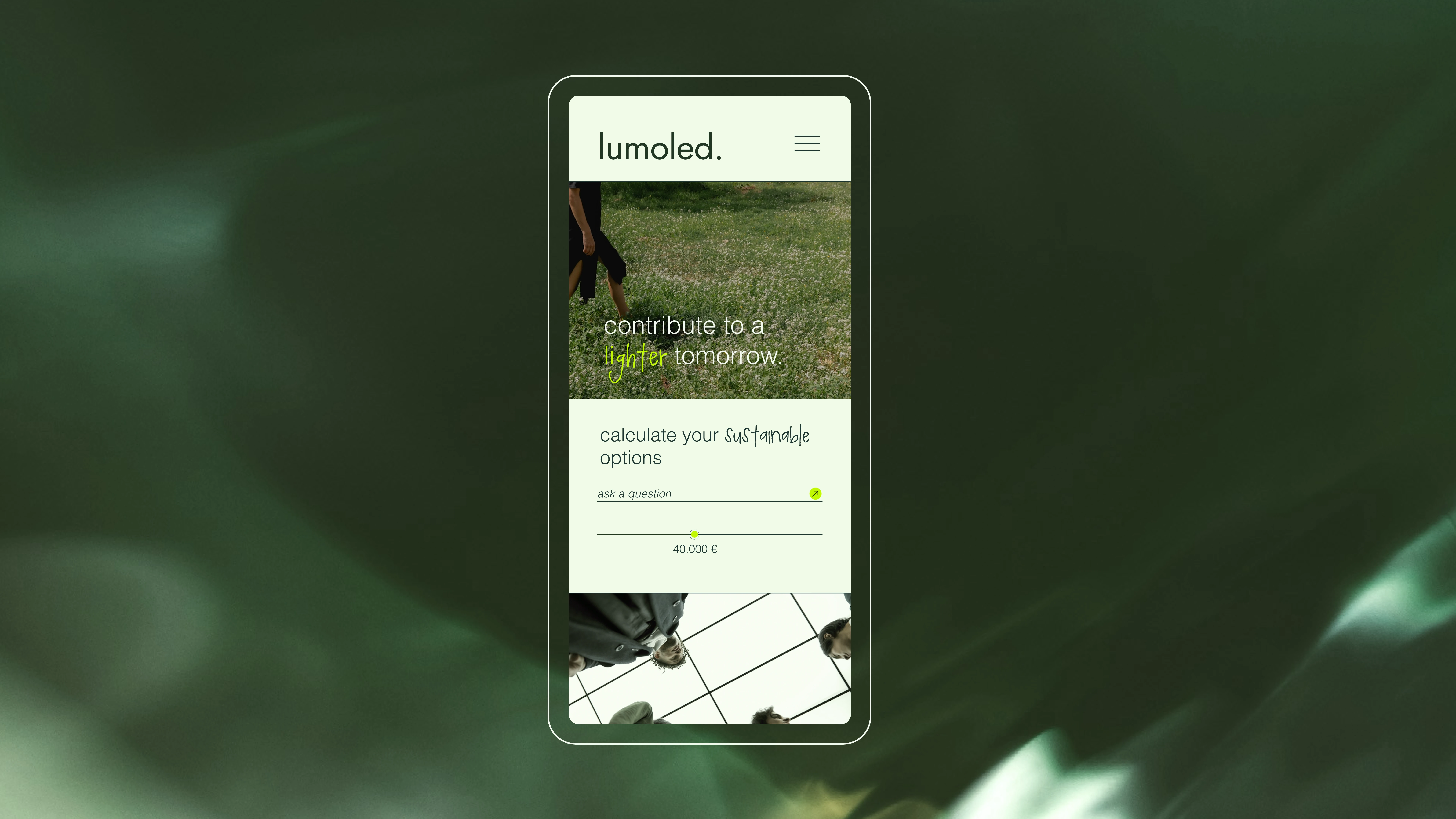
“Contribute to a brighter tomorrow.”
“Join the movement with your choice.”
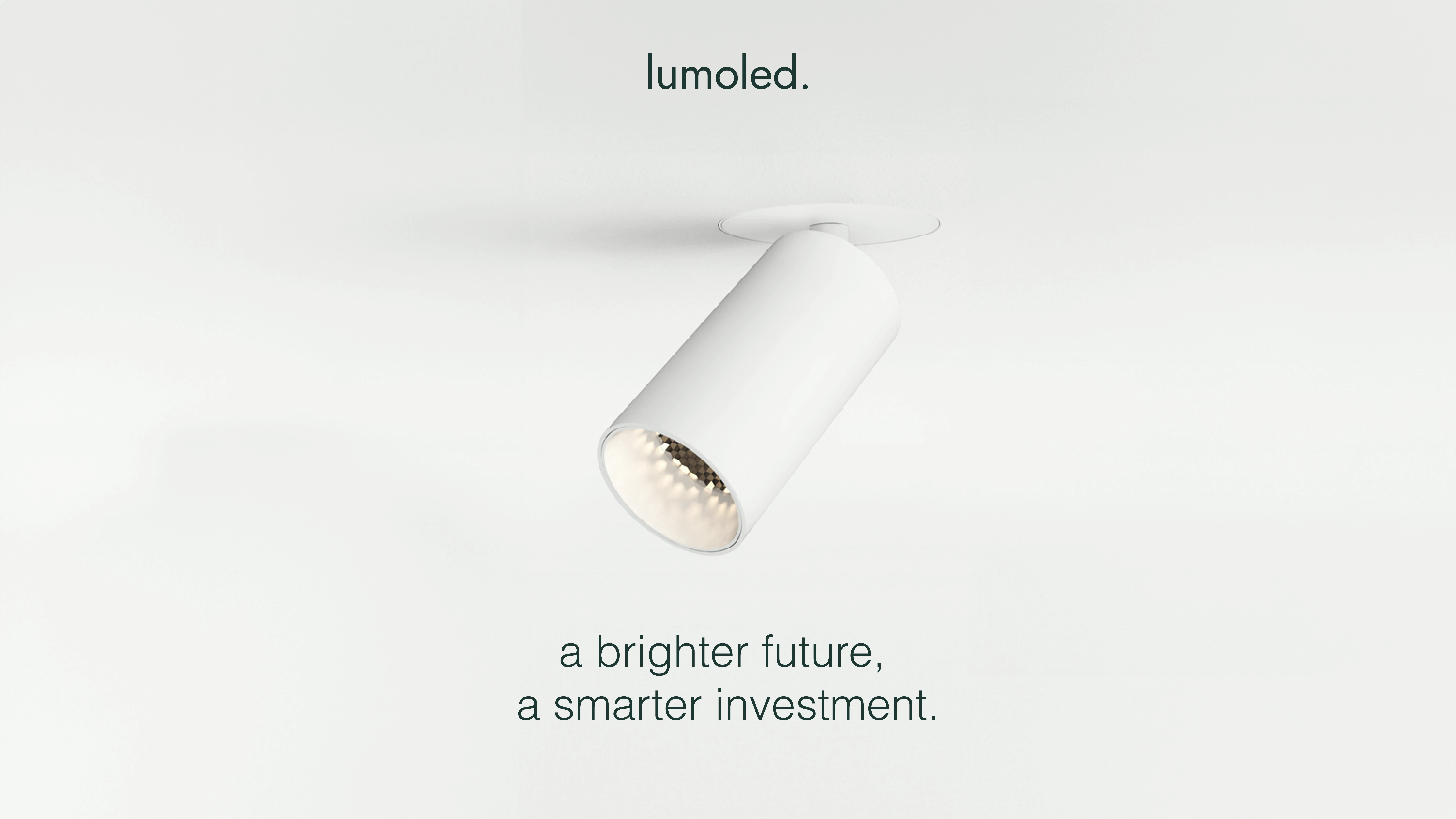
“A brighter future, a smarter investment.”
It’s language that connects ecological awareness with personal empowerment.

Strategic Concept & Visual Direction
Core Idea
Lighting as movement. Not just lamps, but part of a global shift towards sustainable choices.
Visual Language
Scientific meets human → LED grids combined with organic textures (leaves, droplets, roots).
Green handwritten accents → highlight key words, add freshness, and underline eco-focus.
Imagery of people → showing sustainability as a lifestyle choice, not a technical niche.
Design System
The organic icon repeats as patterns, framing photography and social content. The modularity ensures instant recognition and cohesion across all mediums.

Campaign & Expressions
Messaging
Campaigns focus on choice, impact, and future:
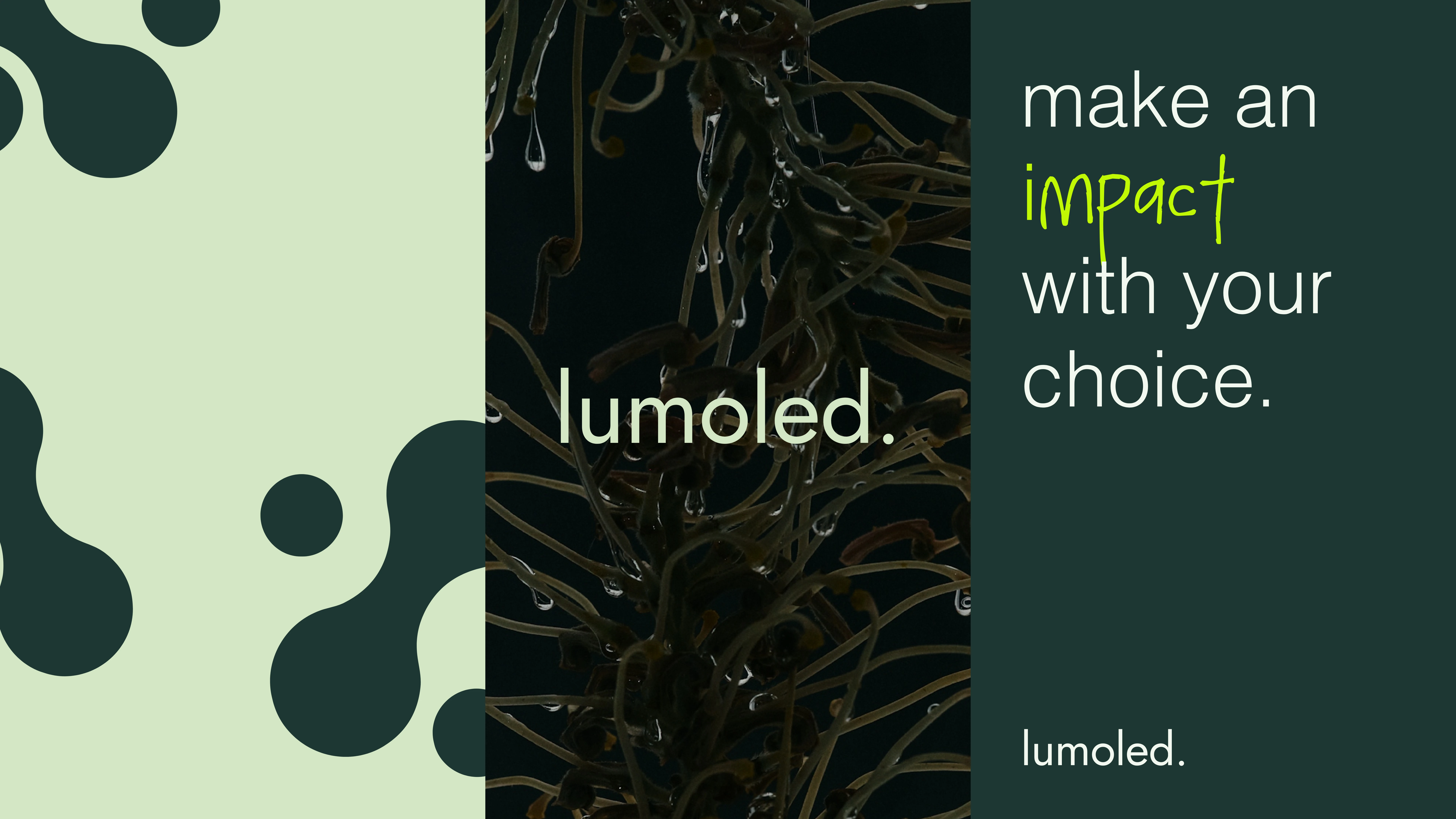
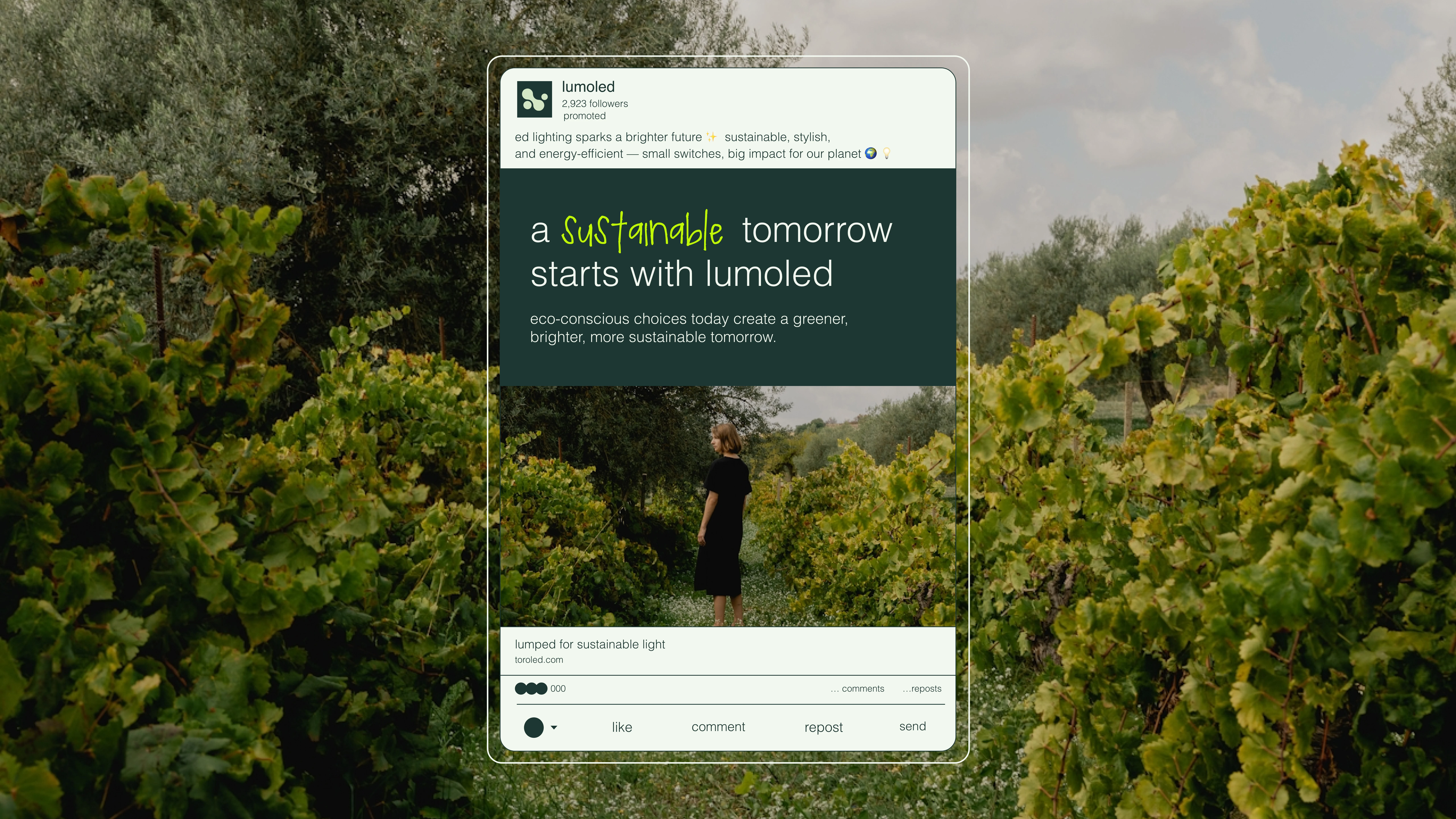
“Make an impact with your choice.”
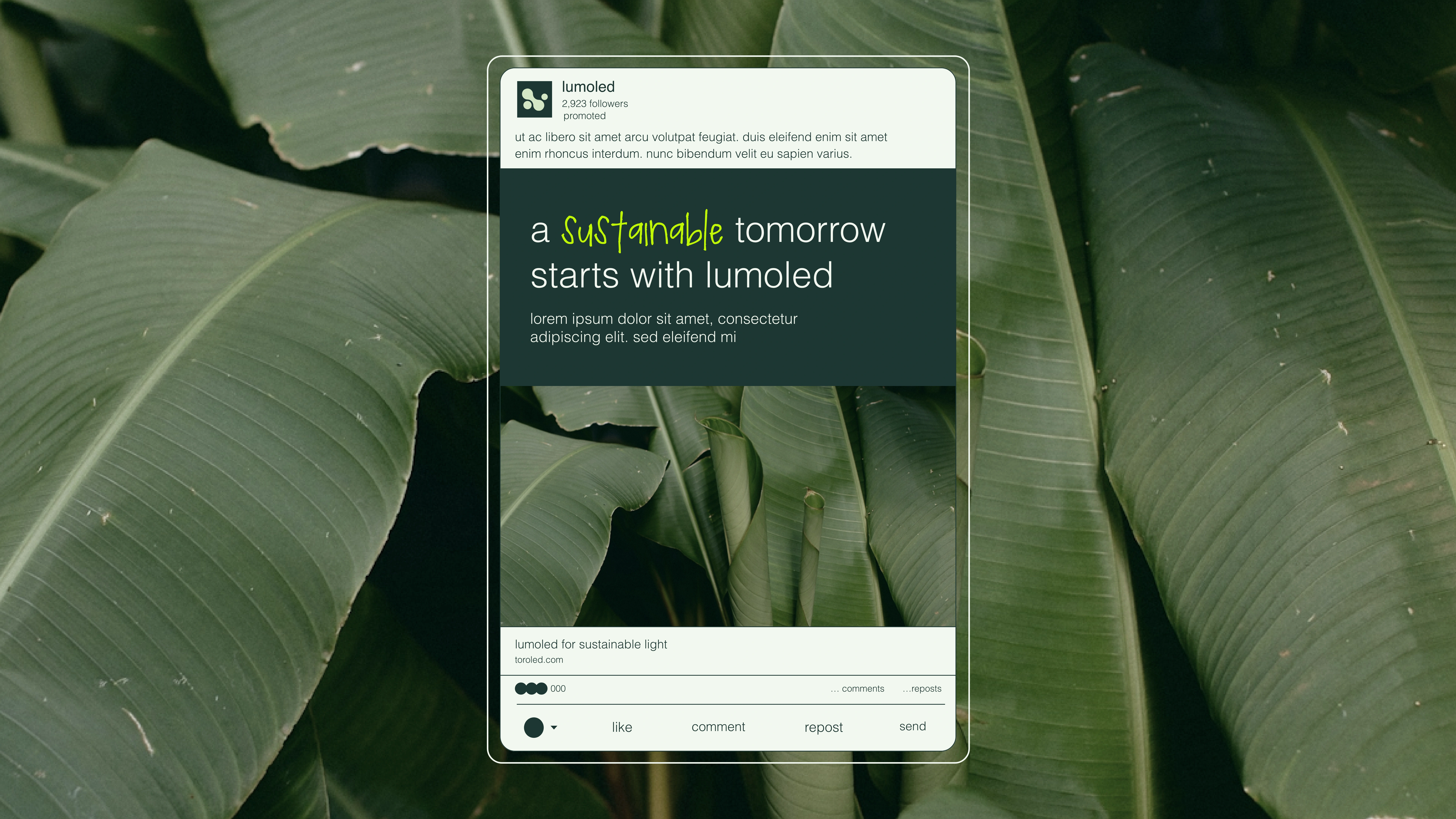
“A sustainable tomorrow starts with LumOLED.”
Digital & Social
From LinkedIn ads to website visuals, the brand tells a consistent story: LED as efficiency, sustainability, and aspiration. Each post blends product, planet, and people.
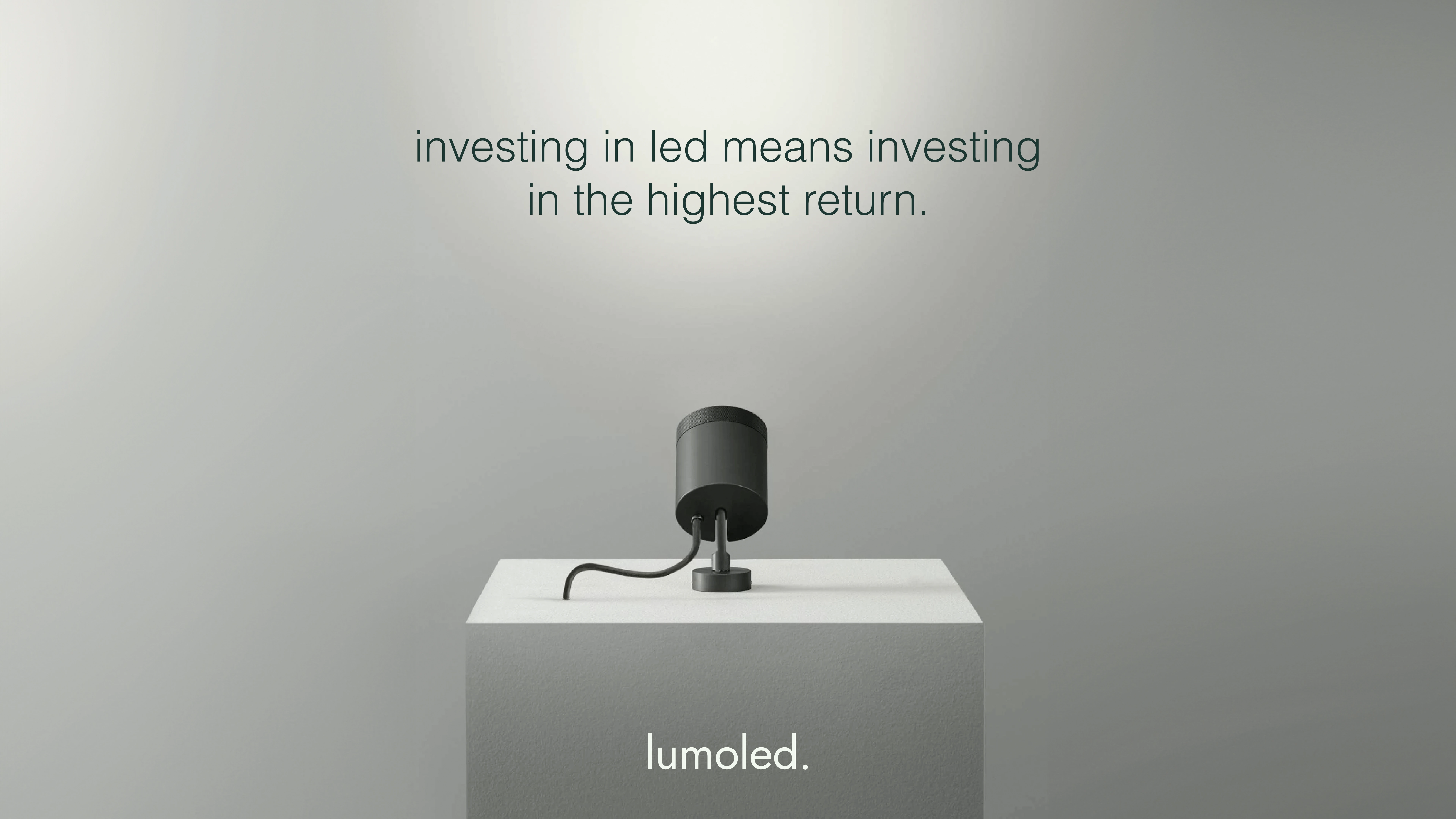
Product Integration
Hero shots of the lights are shown in minimalist, elevated ways. By pairing clean product visuals with strong taglines, the technical merges seamlessly with the aspirational.

Process & Collaboration
We built LumOLED’s identity by merging market research with visual storytelling. Together with the client, we refined the balance: technical precision meets eco-aspiration.
Result & Impact
Visual outcome: A strong, recognizable identity where every detail — from logo to tagline — reinforces the sustainable narrative.
Impact for the client: LumOLED now communicates more than “lighting.” It stands for choice, change, and contribution.
My reflection: Proof that even a technical product can shine with warmth and emotion, when design connects people to purpose.
"Roos managed to take something as technical as LED lighting and turn it into a movement. The brand now feels alive; sustainable, stylish, and impactful. It’s exactly the energy we wanted to bring to the market." – Founder, LumoLED
Like this project
Posted Sep 27, 2025
Rebranded LumoLED to position LED lighting as part of a sustainable lifestyle movement.
Likes
3
Views
37
Timeline
Apr 27, 2024 - May 29, 2024