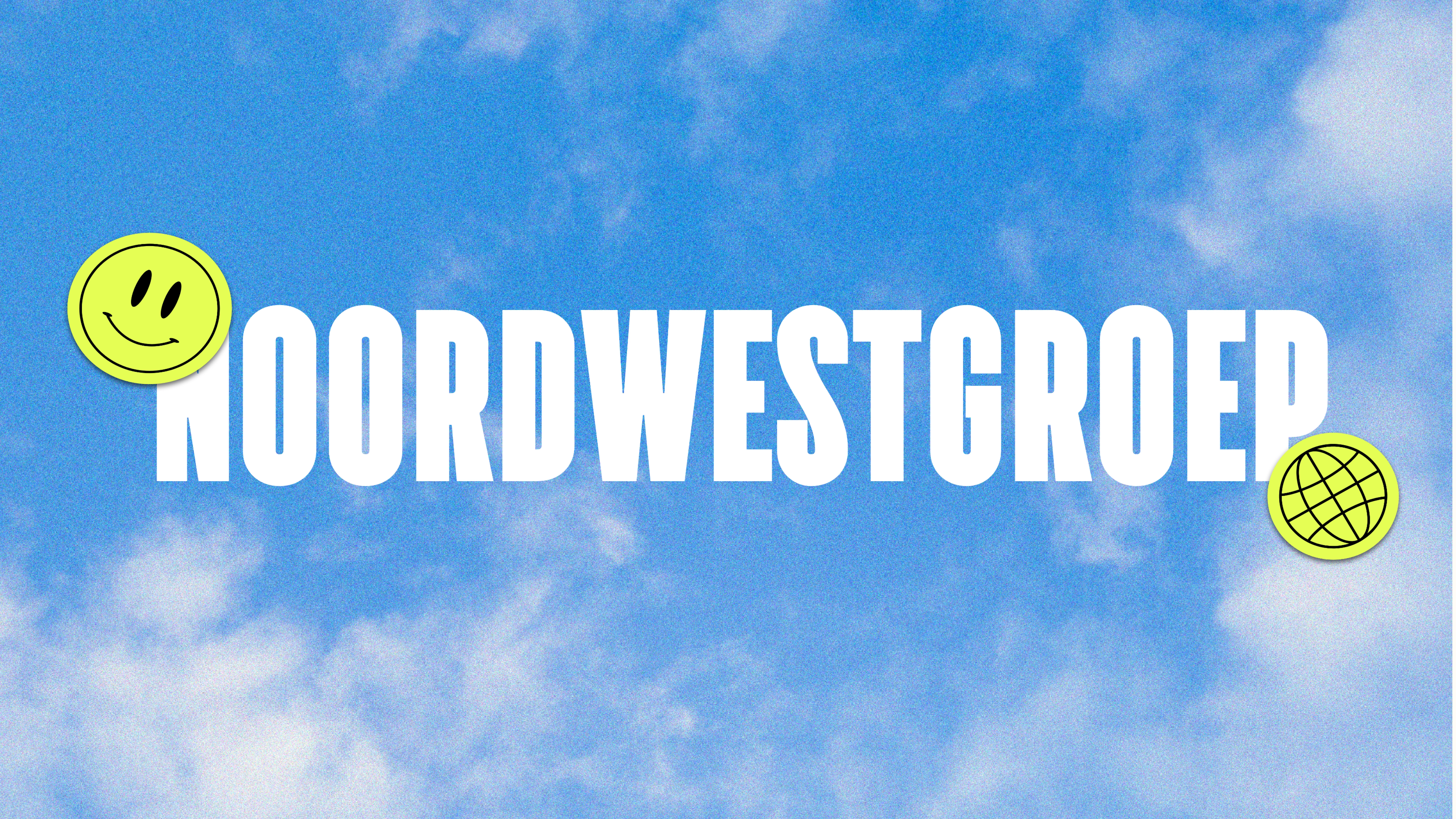
NoordWestGroep
Roos van Gestel
Project: NoordWestGroep – rebranding of a Dutch labor development company
Challenge: Break away from the stereotype of being patronizing or outdated. Position NoordWestGroep as a bold, inclusive force where so-called outsiders prove their strength and work ethic.
My role: Brand designer & creative director — reshaping the entire brand identity, strategy, and visual system.
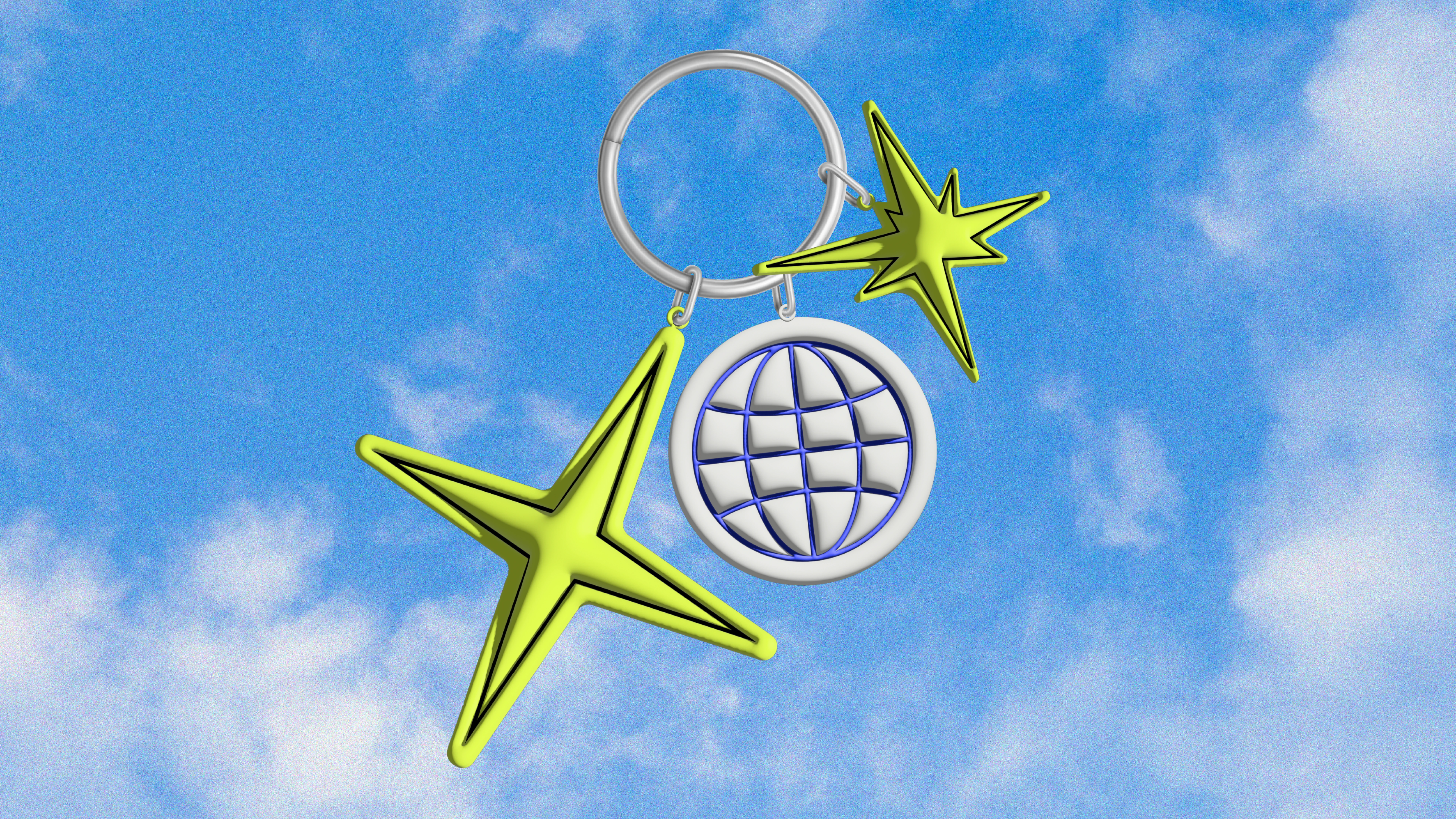
Logo
A dynamic logo that can go in every direction. Static and strong, but with room for movement and its own will. A bold counterpart to the stereotype of labor development companies.
Color Palette
Blue, yellow, white, and black. A powerful and striking combination that emphasizes the rebellious and renewing spirit of NoordWestGroep. Impossible to miss, just like NoordWestGroep.
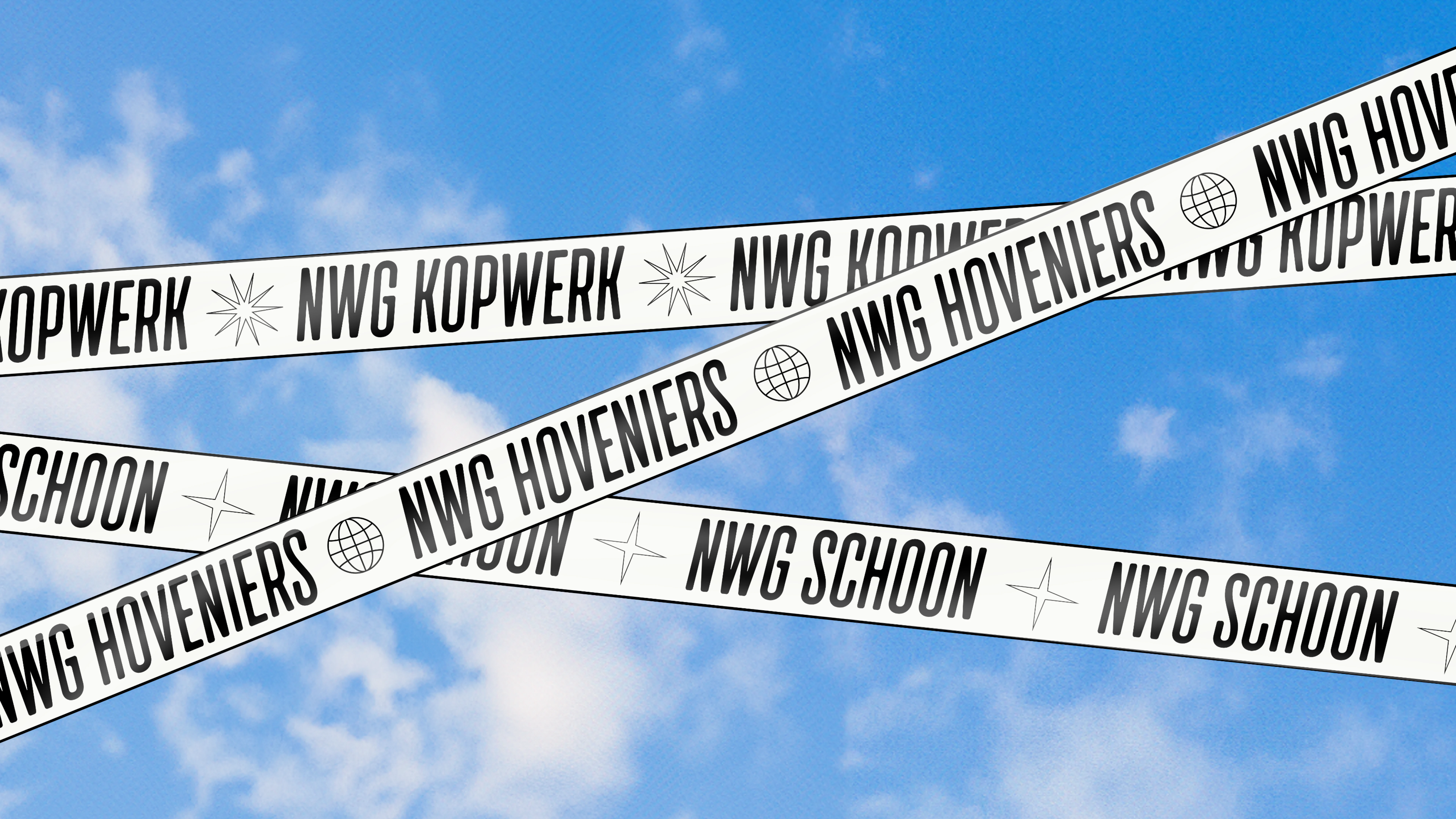
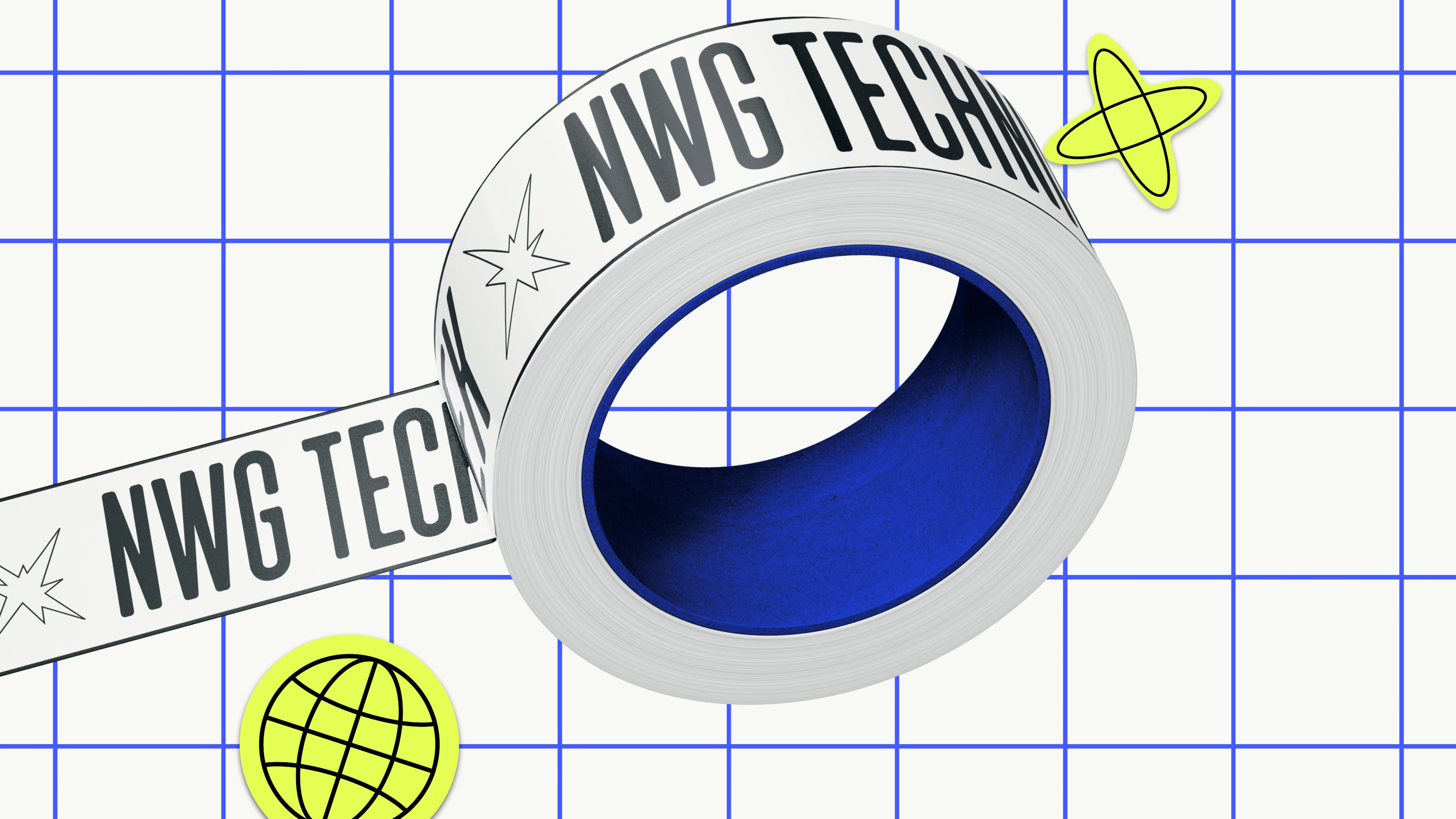
Visual Language
The imagery reflects a contrary spirit. To stick or mark something? Why not. Abstract icons, open for interpretation, with a modern and inclusive feel. A brave new perspective on what a labor development organization should look like.
Tone of Voice
Rebellious, direct, and unapologetic. NoordWestGroep has an edge, doesn’t conform to norms, and speaks clearly.
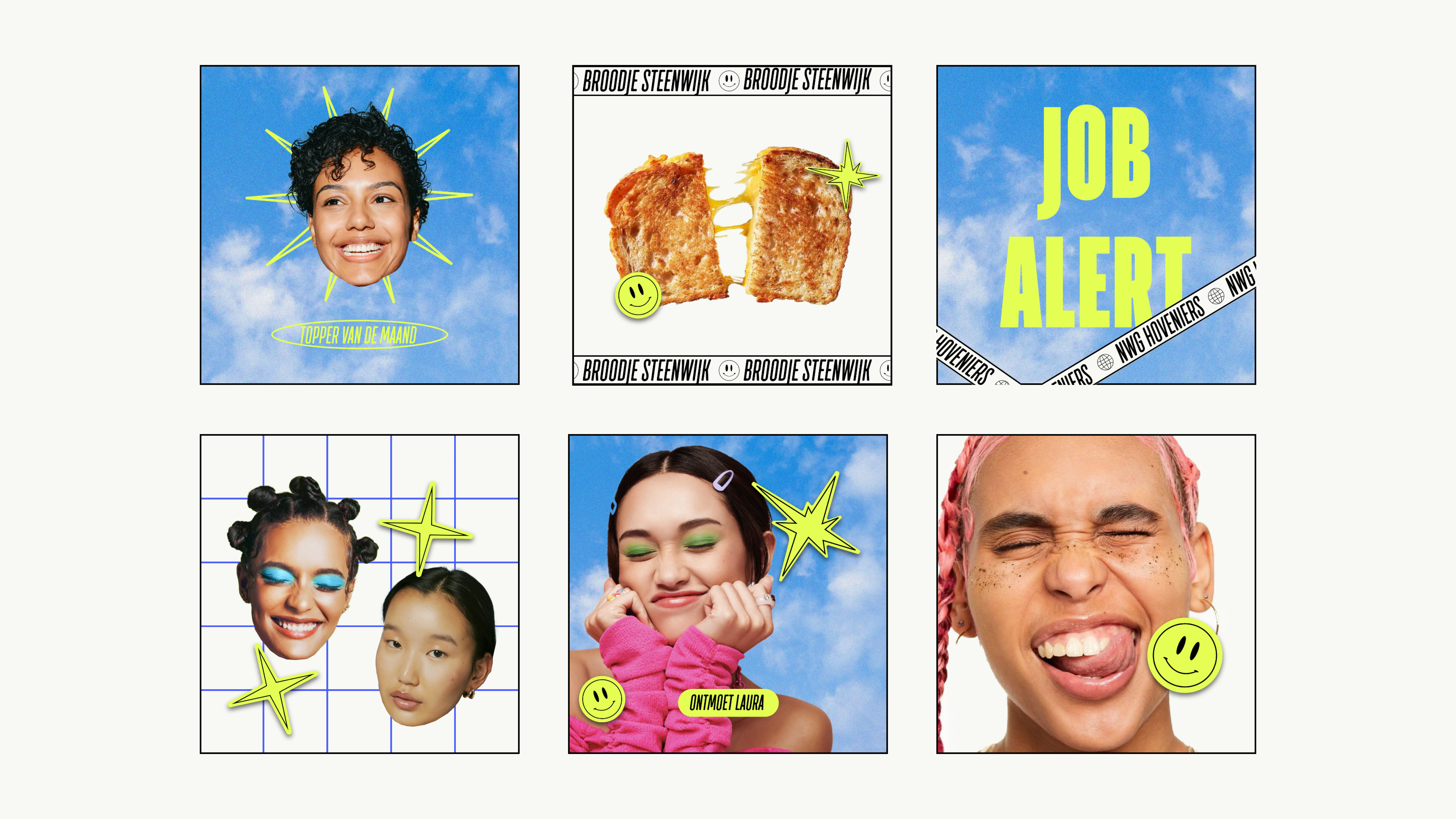
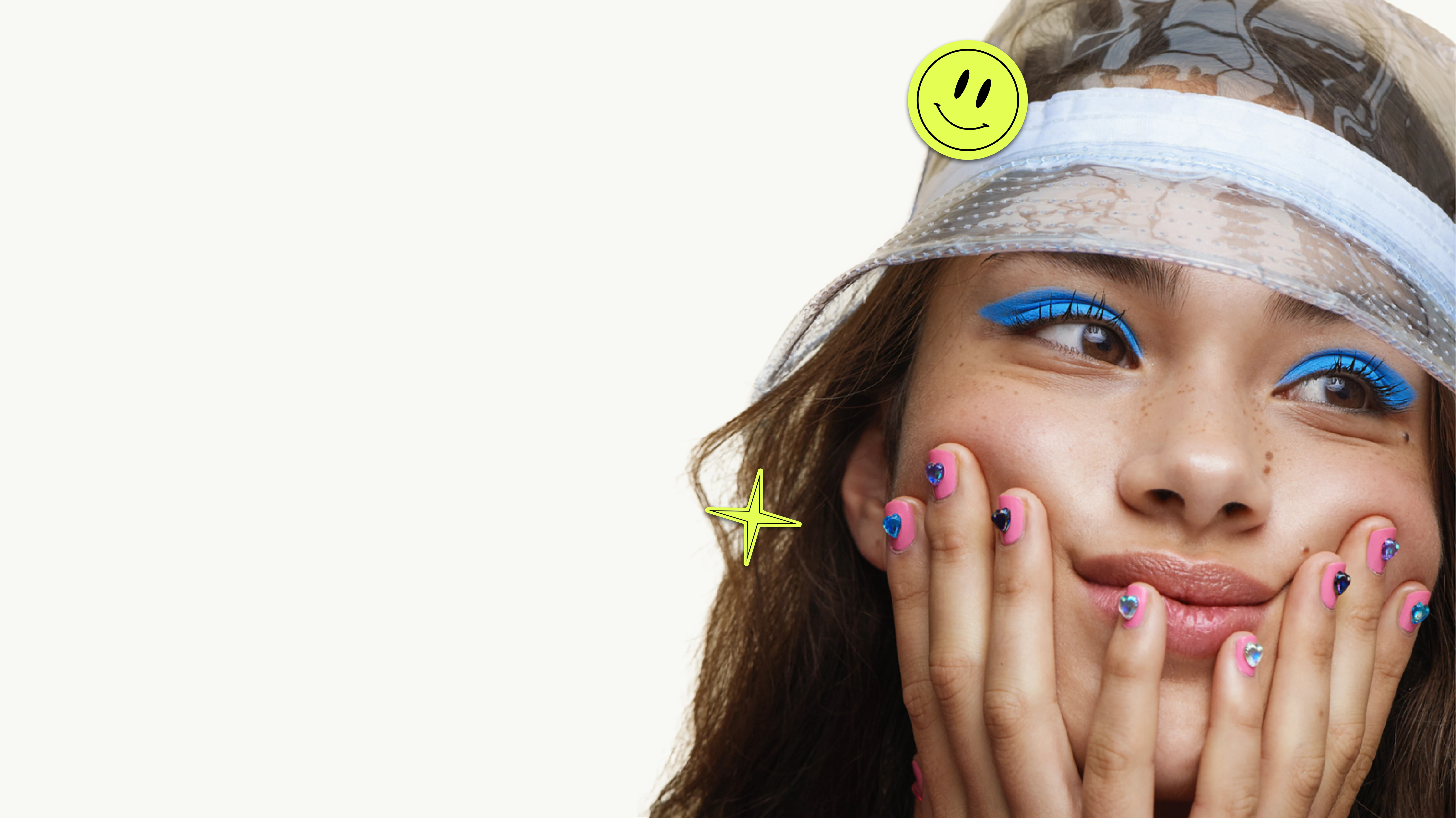
Little Faces (Koppies)
A visual bank made up of close-up portraits mixed with so-called “little faces.” Unconventional and quirky photography that gives NoordWestGroep its own cast of characters. By embracing humor and playfulness, the brand dares to be different and confronts prejudice head-on.
Photography
The “little faces” are combined with close-up portraits and props that clarify the work activities. Poses emphasize the rebellious nature of NoordWestGroep and keep the balance between character and craft.
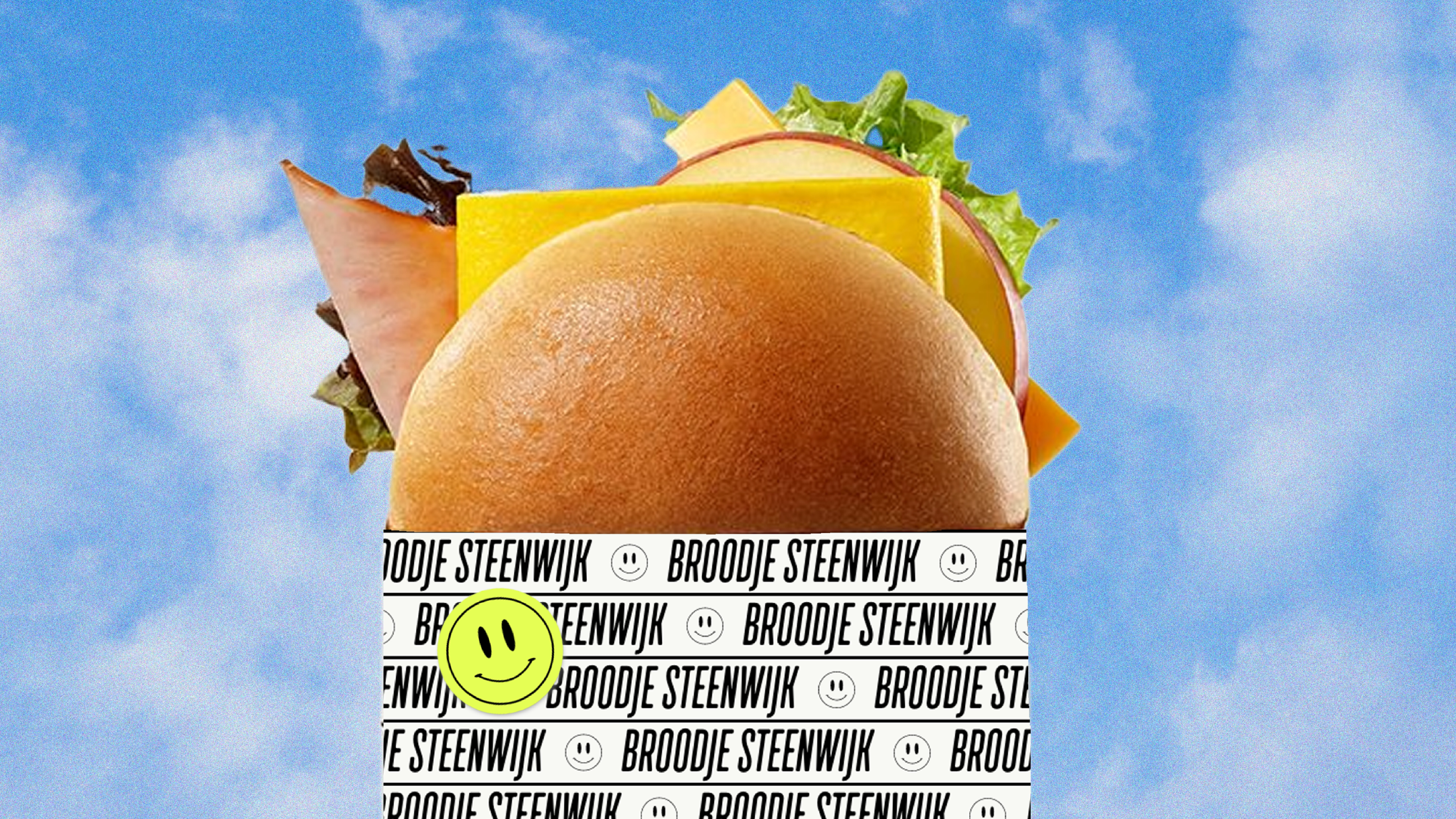
Aim for the Sky
A recurring background of clear blue skies evokes optimism and motivation, while a grid system adds a school-like structure. When people in Steenwijkerland see a bright poster with a blue sky, they instantly know: this is NoordWestGroep.
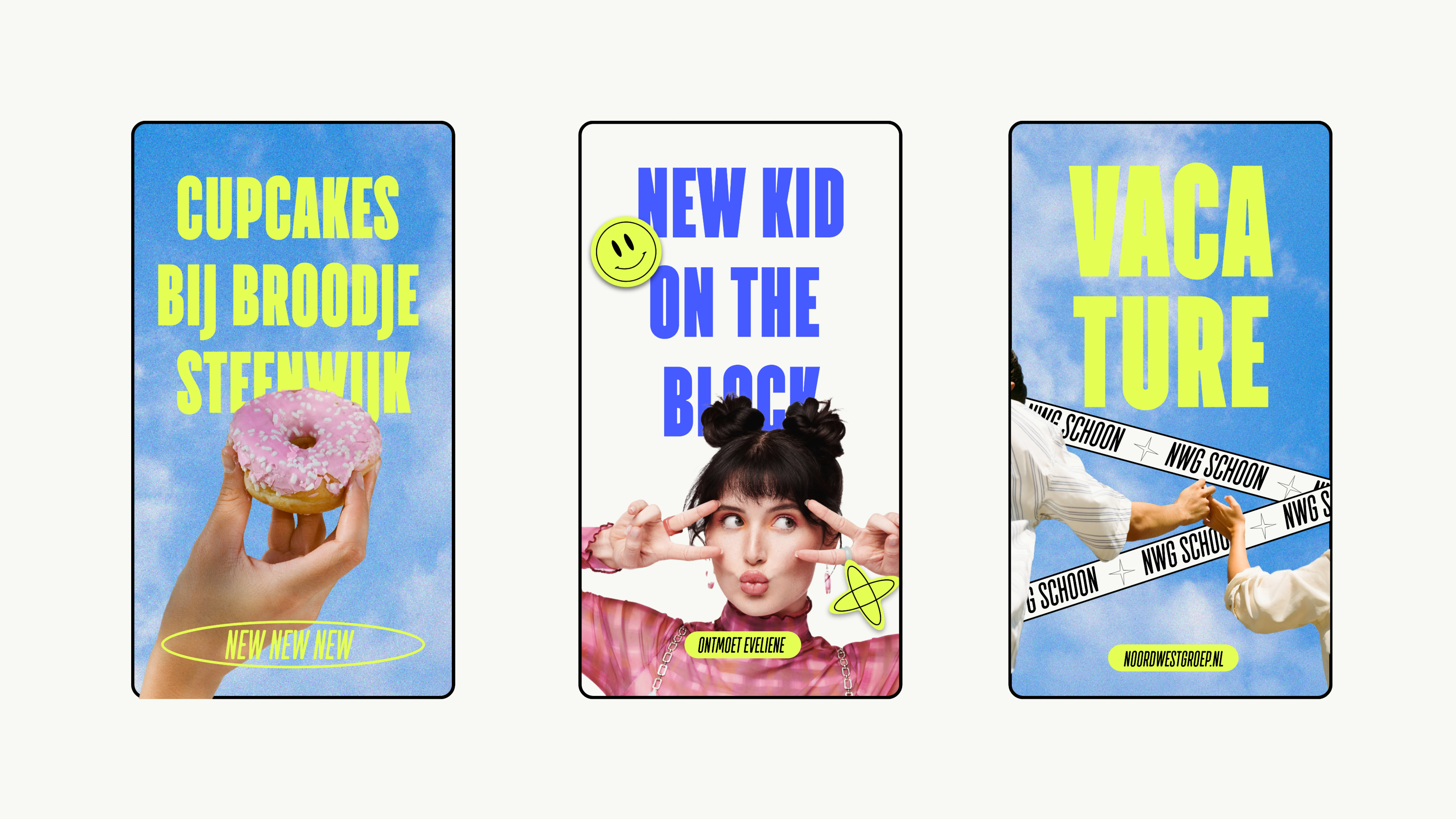
Campaign & Expressions
Advertising: Bold taglines with rebellious wit, always impossible to miss.
Socials: A lively, rebellious tone that highlights employees, job opportunities, and services — building a community and proud workforce.
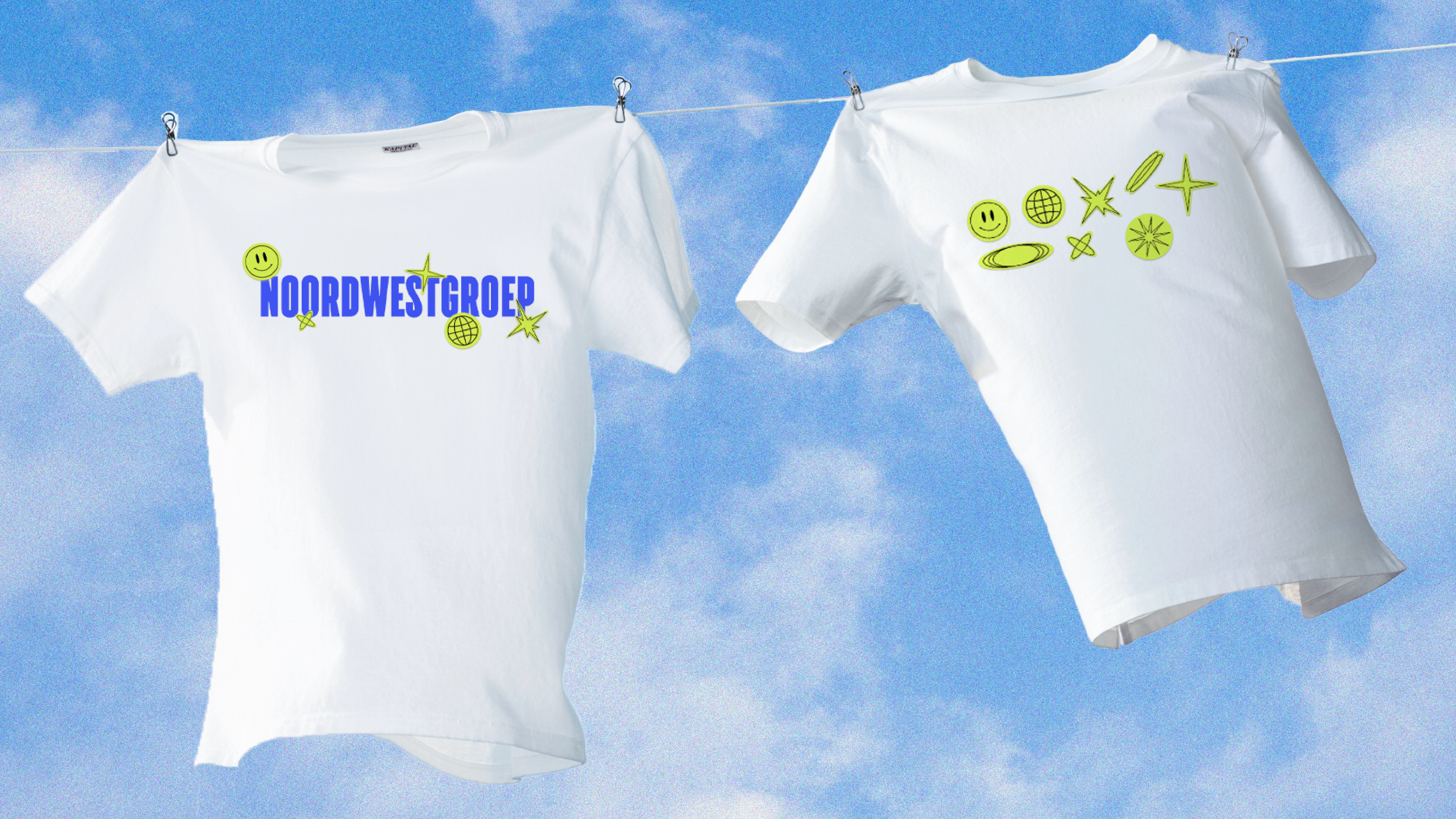
Merchandise: Original and stylish branded items, creating pride and connection among employees.
Website: A digital platform combining bold identity with optimism, designed for both accessibility and impact.
Process & Collaboration
The process began with strategy and research to understand stereotypes around labor development. From there, we developed the full brand: logo, colors, photography, tone of voice, campaigns. Together with stakeholders, job seekers, employees, employers, and partners — the identity was refined to resonate broadly.
Result & Impact
The result is a brand with pride, humor, and strength. No longer hidden behind clichés, but outspoken and visible.
The impact: NoordWestGroep became a recognizable, positive force in Steenwijkerland. A rebellious but trustworthy organization that stands for inclusion, quality, and hard work.
We were blown away by how Roos translated our mission into a fresh and rebellious brand. She helped us break free from old stereotypes and gave our people a face to be proud of." – Marketing Manager
Like this project
Posted Sep 11, 2025
Rebranding the work organisation NoordWestGroep to break stereotypes and promote inclusivity.
Likes
14
Views
124
Timeline
May 11, 2024 - Jun 11, 2024