WorkMate
Roos van Gestel
1. Context
Project: Workmate – HR tech with a human face
Challenge: How do you bring wellness in a corporate world full of hard edges? Workmate wanted to feel approachable, relatable, alive.
My role: Brand designer & creative director. Translating big feelings into bold visuals.
Foundation & Brand Pillars
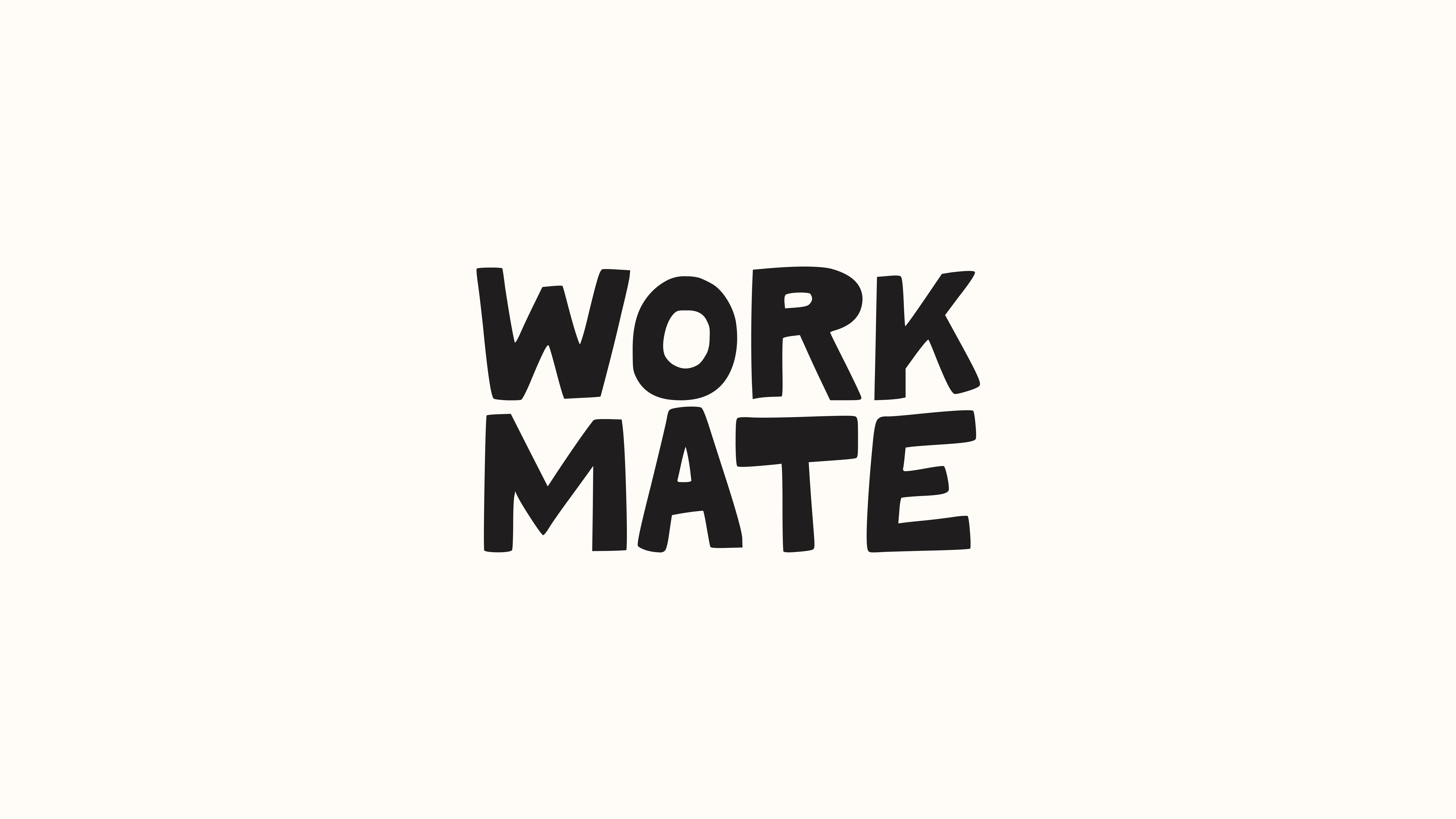
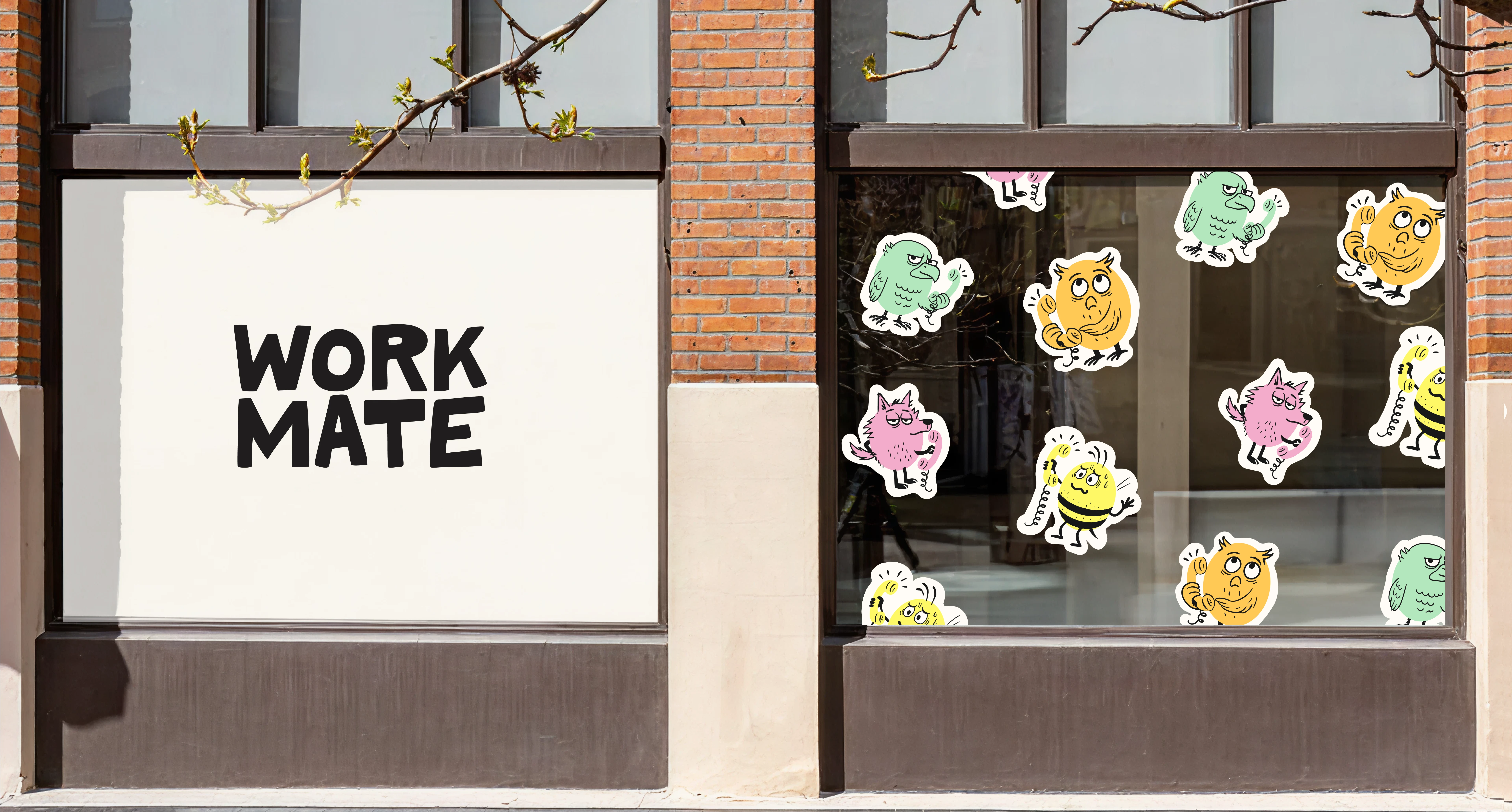
Logo
The Workmate logo translates personality into form. Handwritten letterforms give it a human, approachable quality, while irregular lines add warmth and authenticity. A visual system that feels connected. Less corporate, more personal.
Typography
Newake Regular – Bold and full of character. For headlines that make a statement: strong, yet approachable.
Indivisible Regular – Clear and calm. Functional and effortless to read, balancing the tone.
Color Palette
Colours express Workmate’s core: a soft, human counterforce in a tough work environment. They feel caring, setting an emotional tone without heaviness. Bold in their softness, just like Workmate.
Strategic Concept & Visual Direction
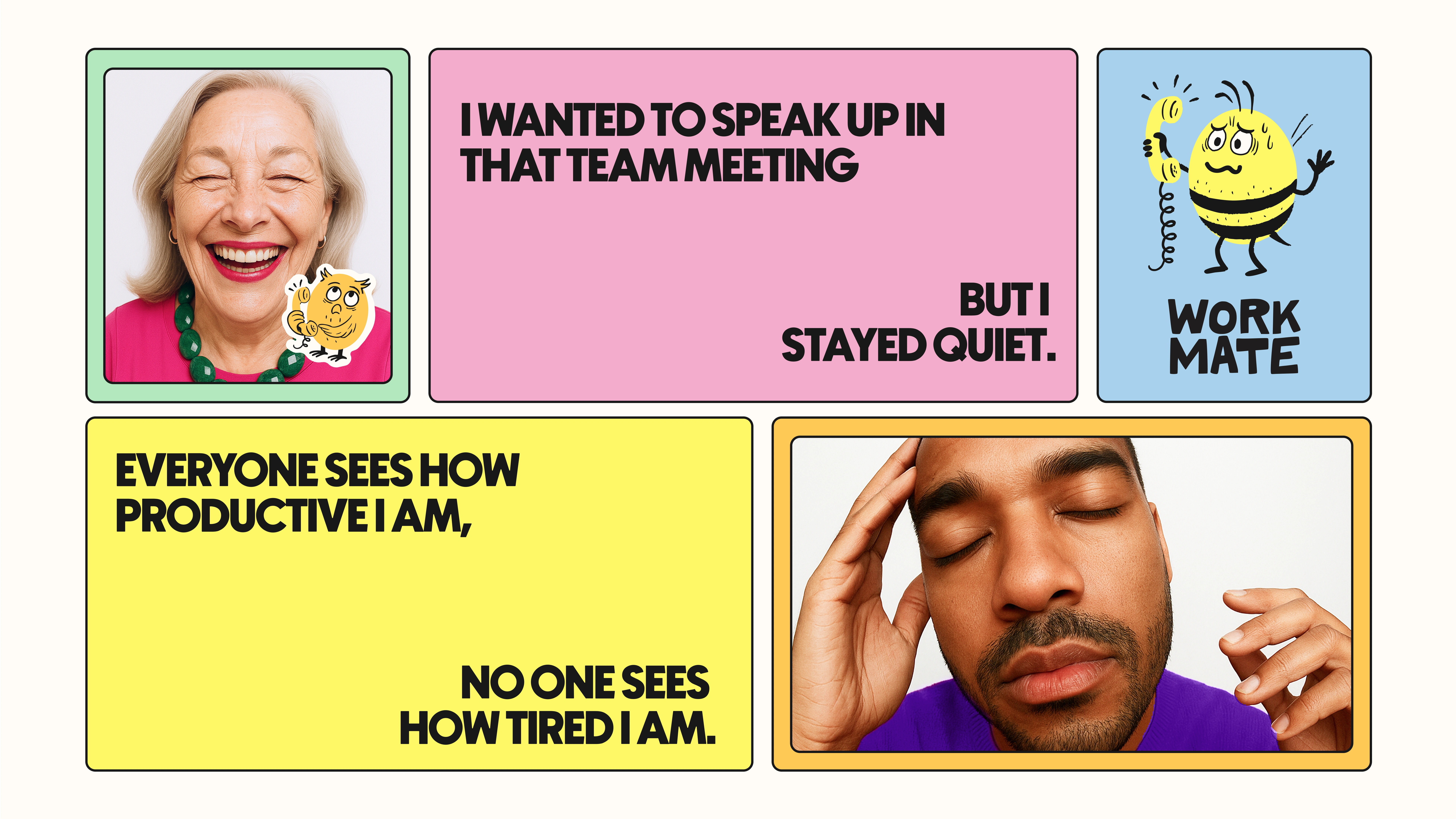
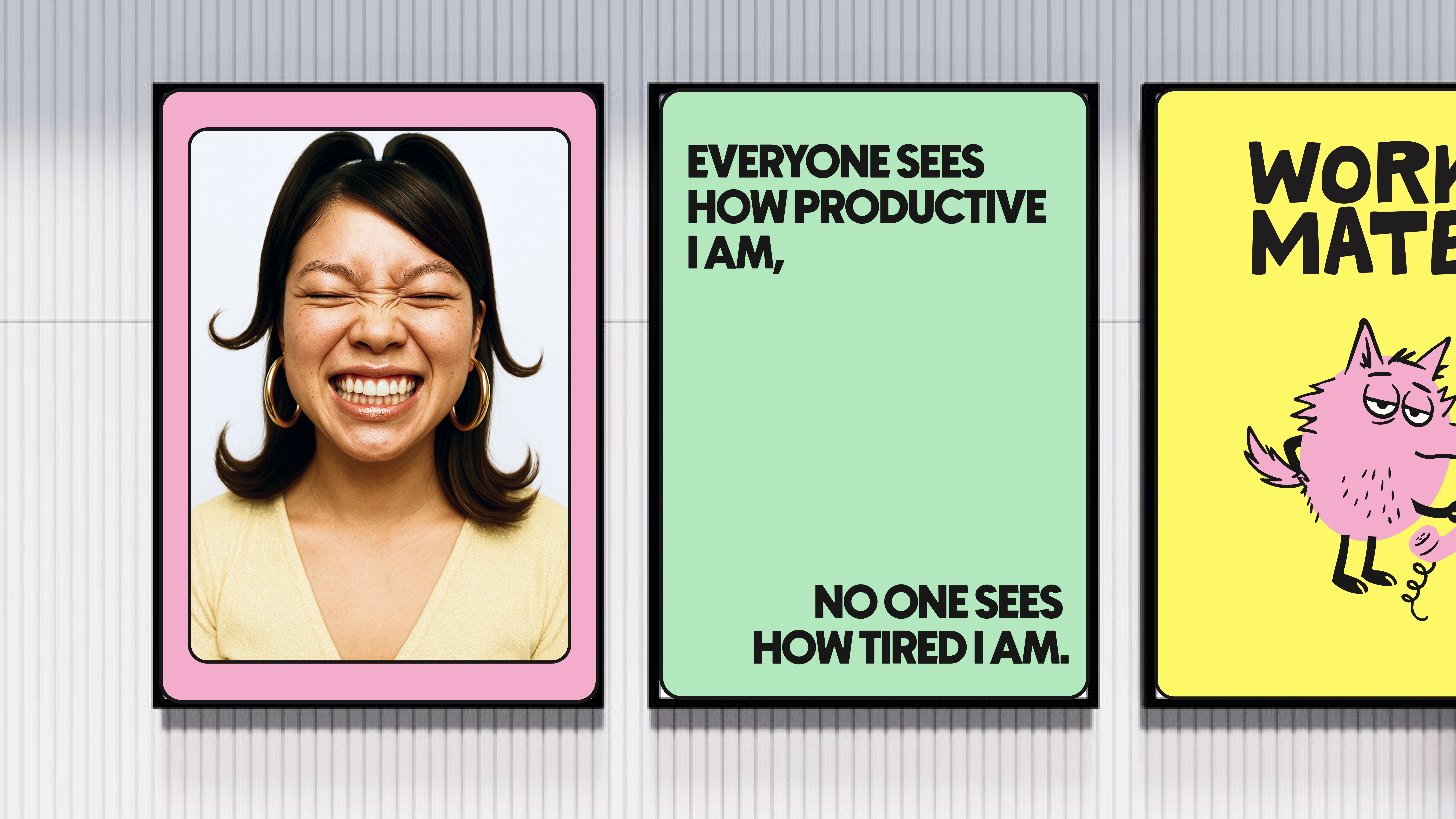
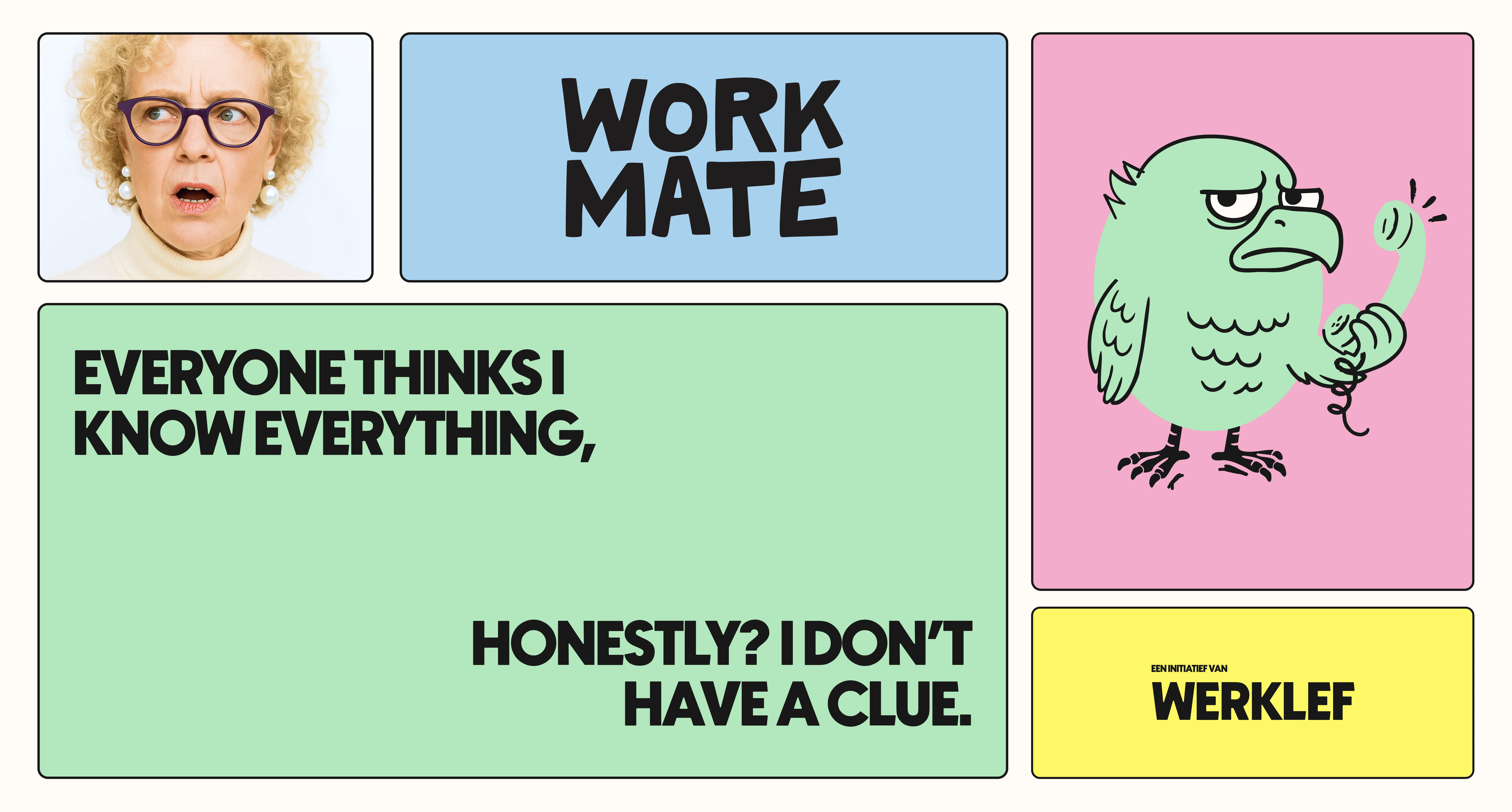
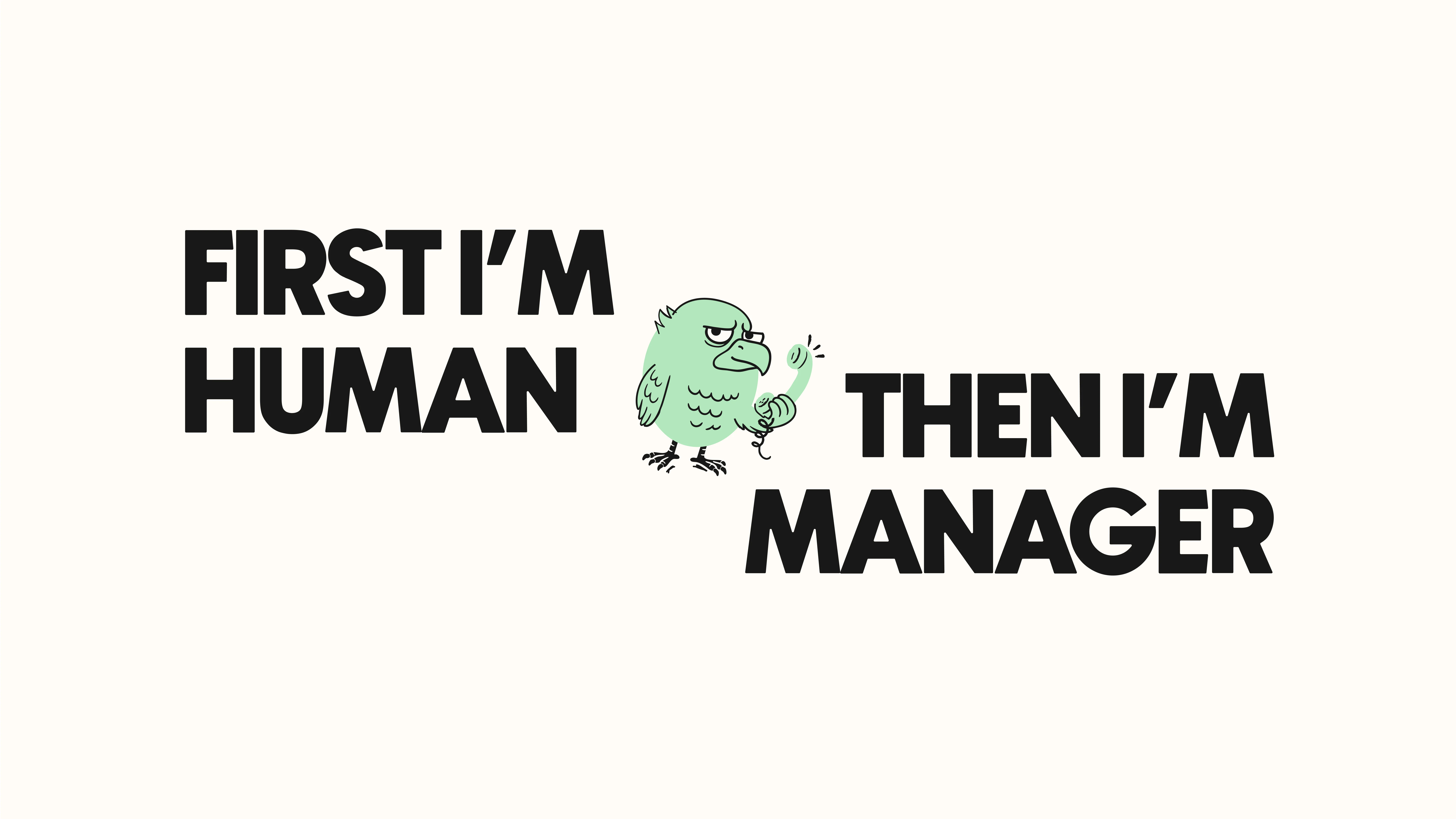
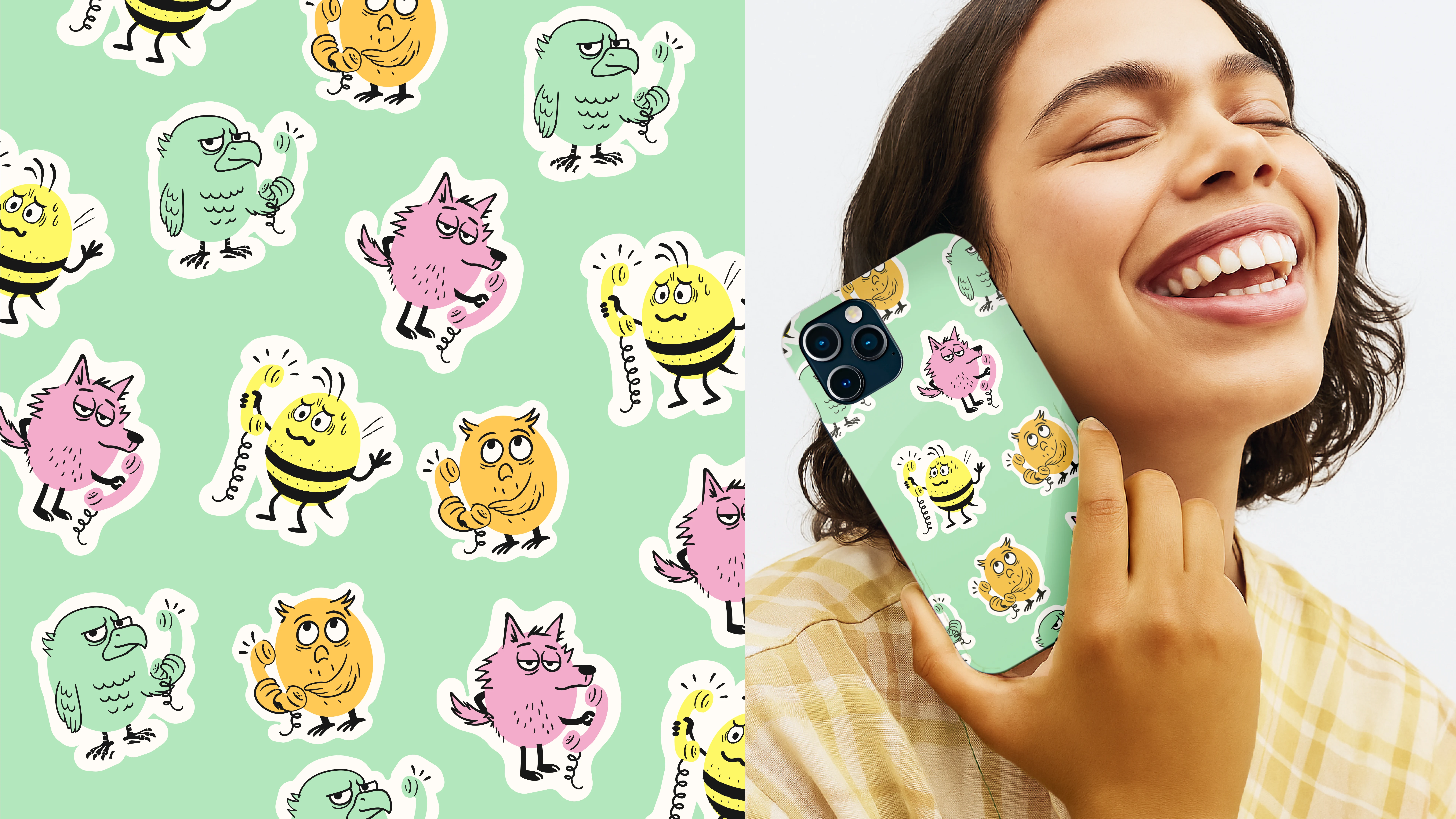
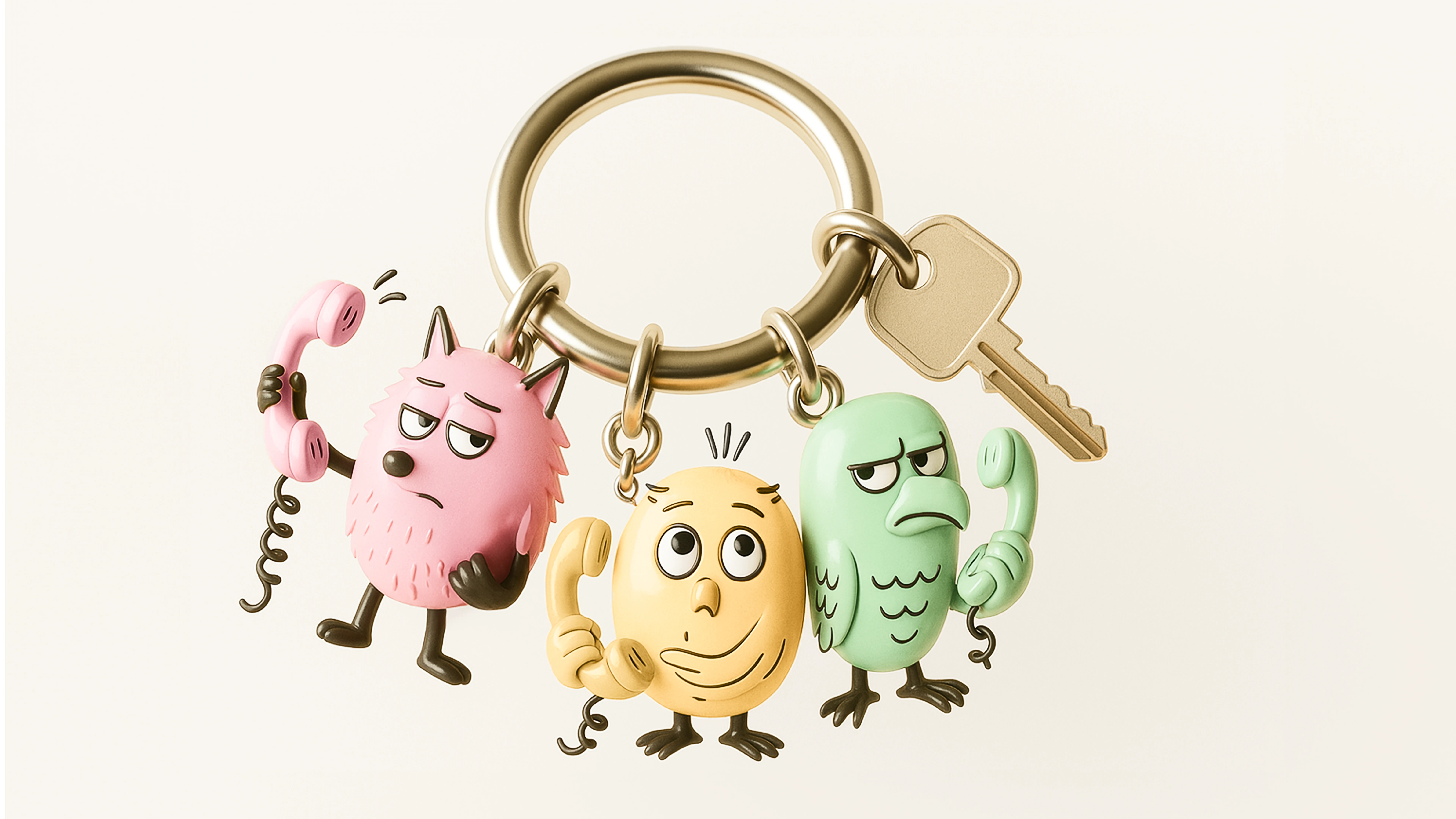
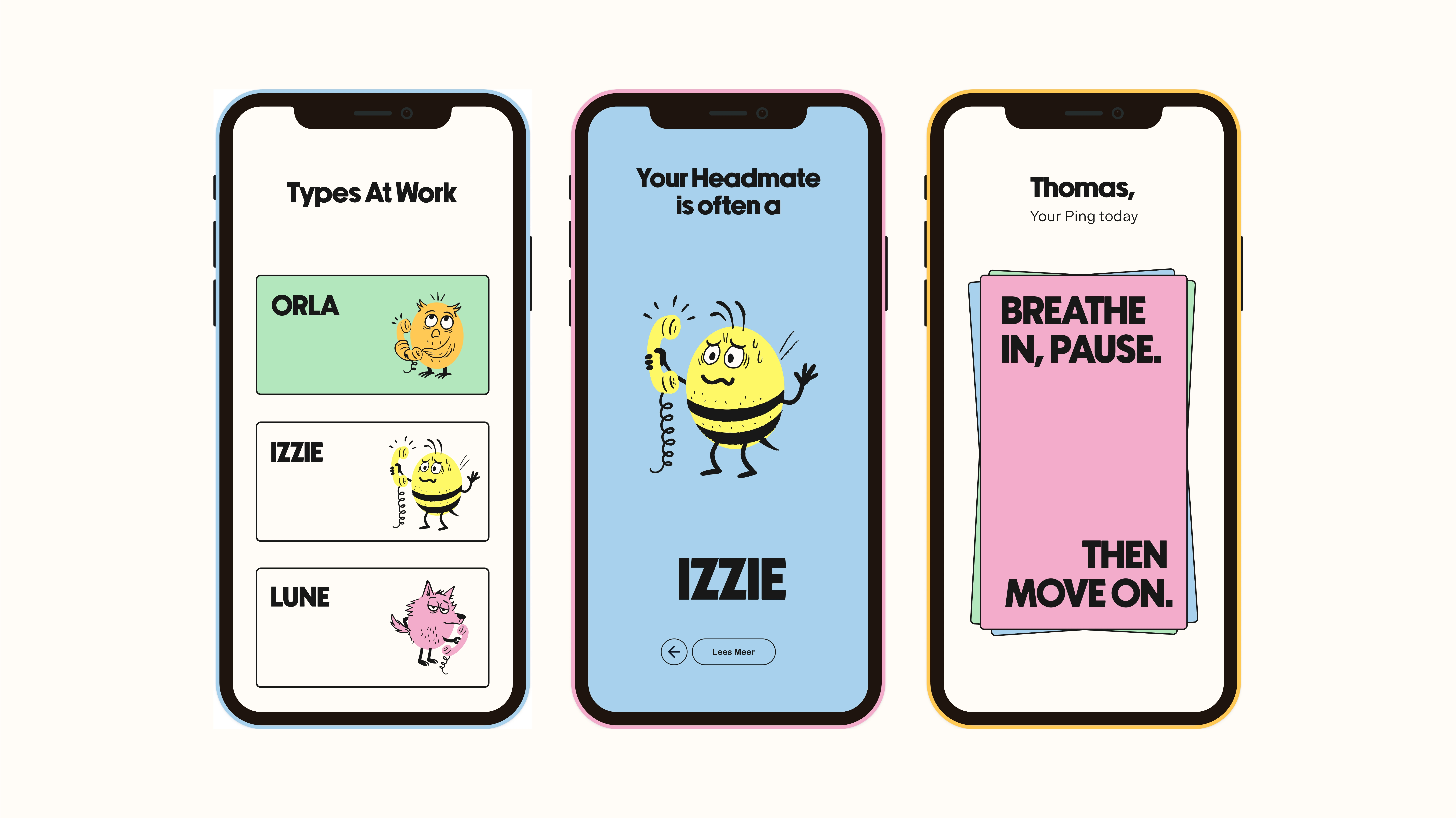
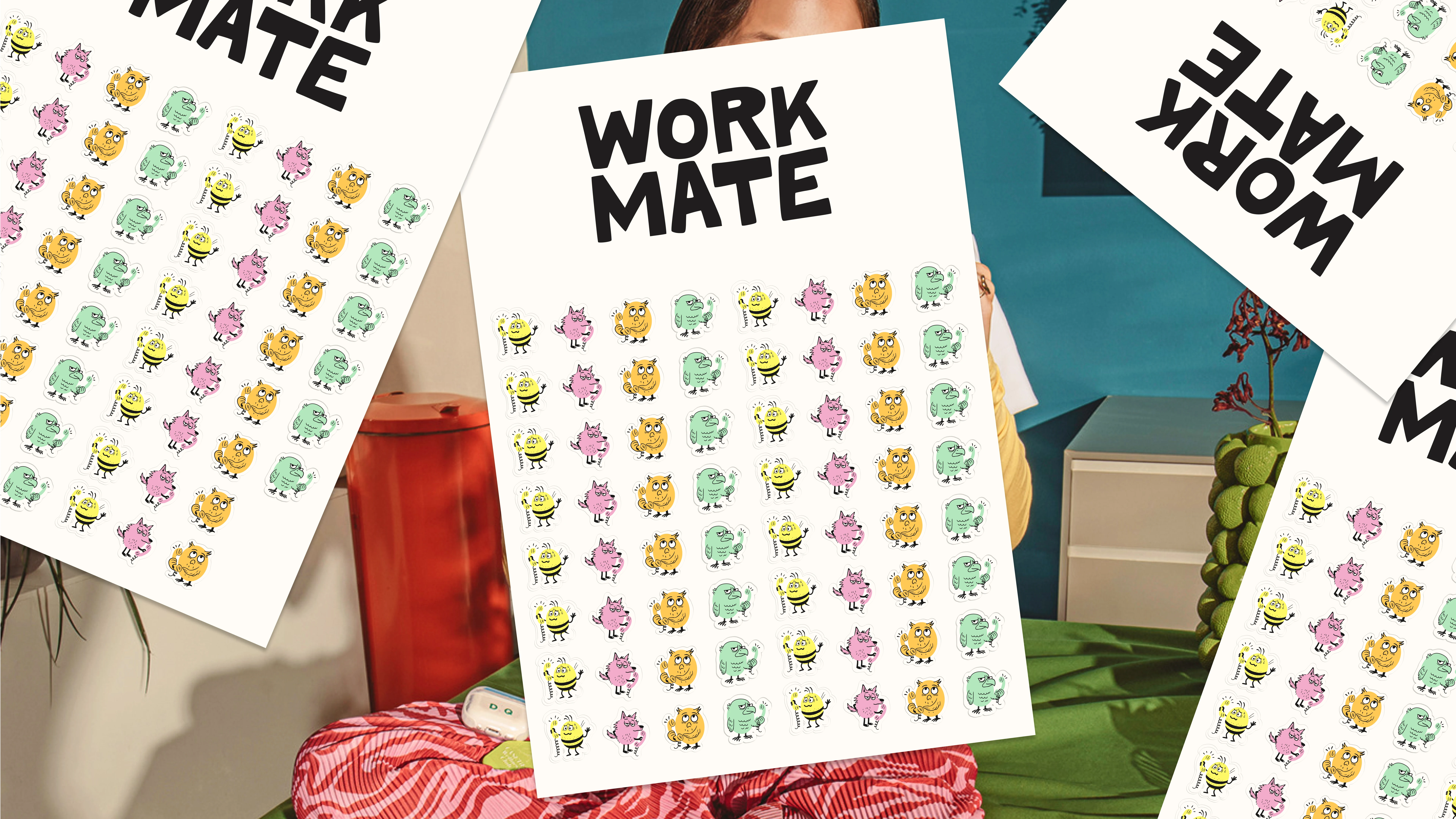
Headmates
Work struggles are often complex and personal, but they’re usually about behaviors, not identity. That’s why we created the Headmates: characters that give shape to what’s otherwise invisible.
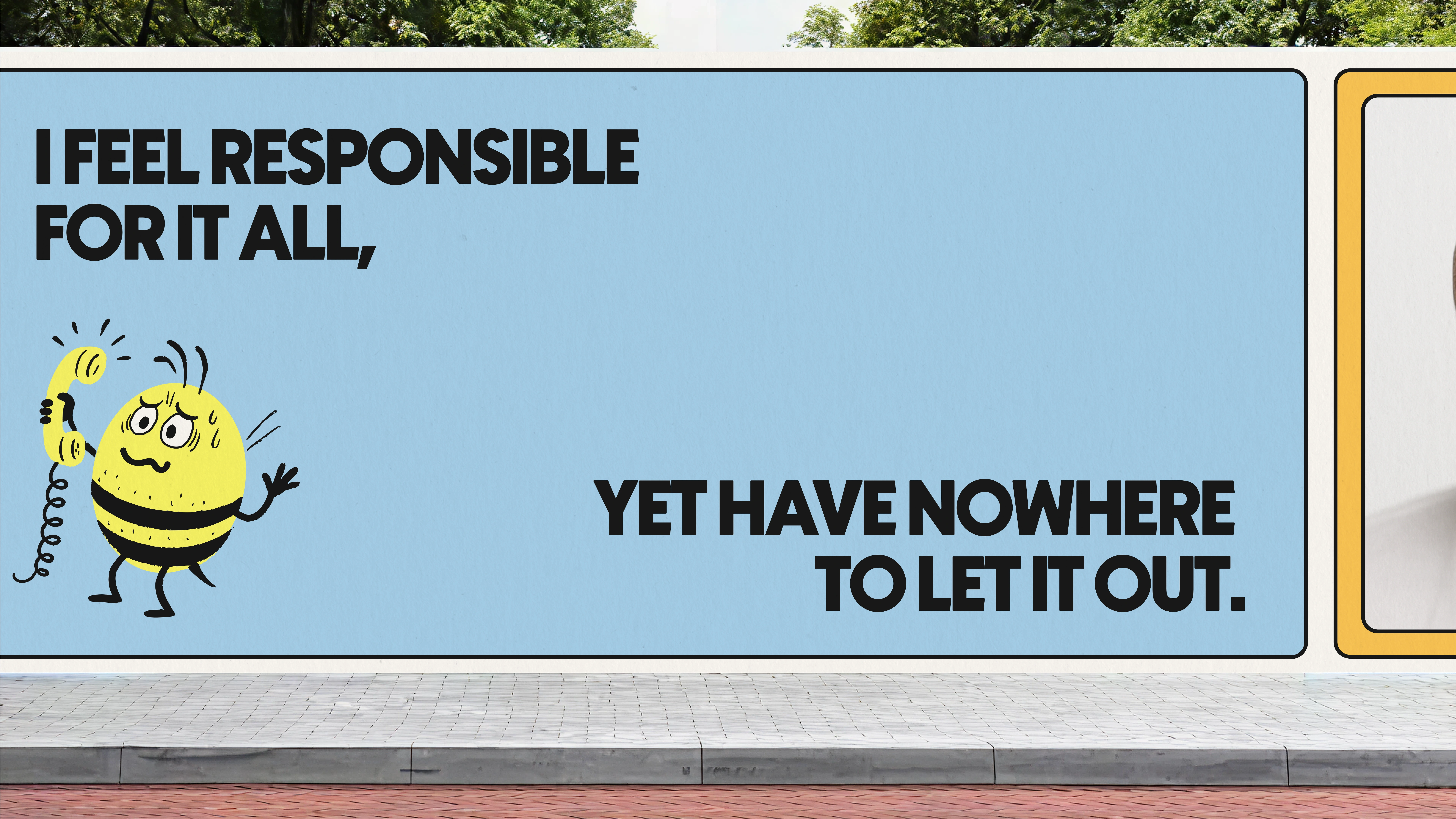
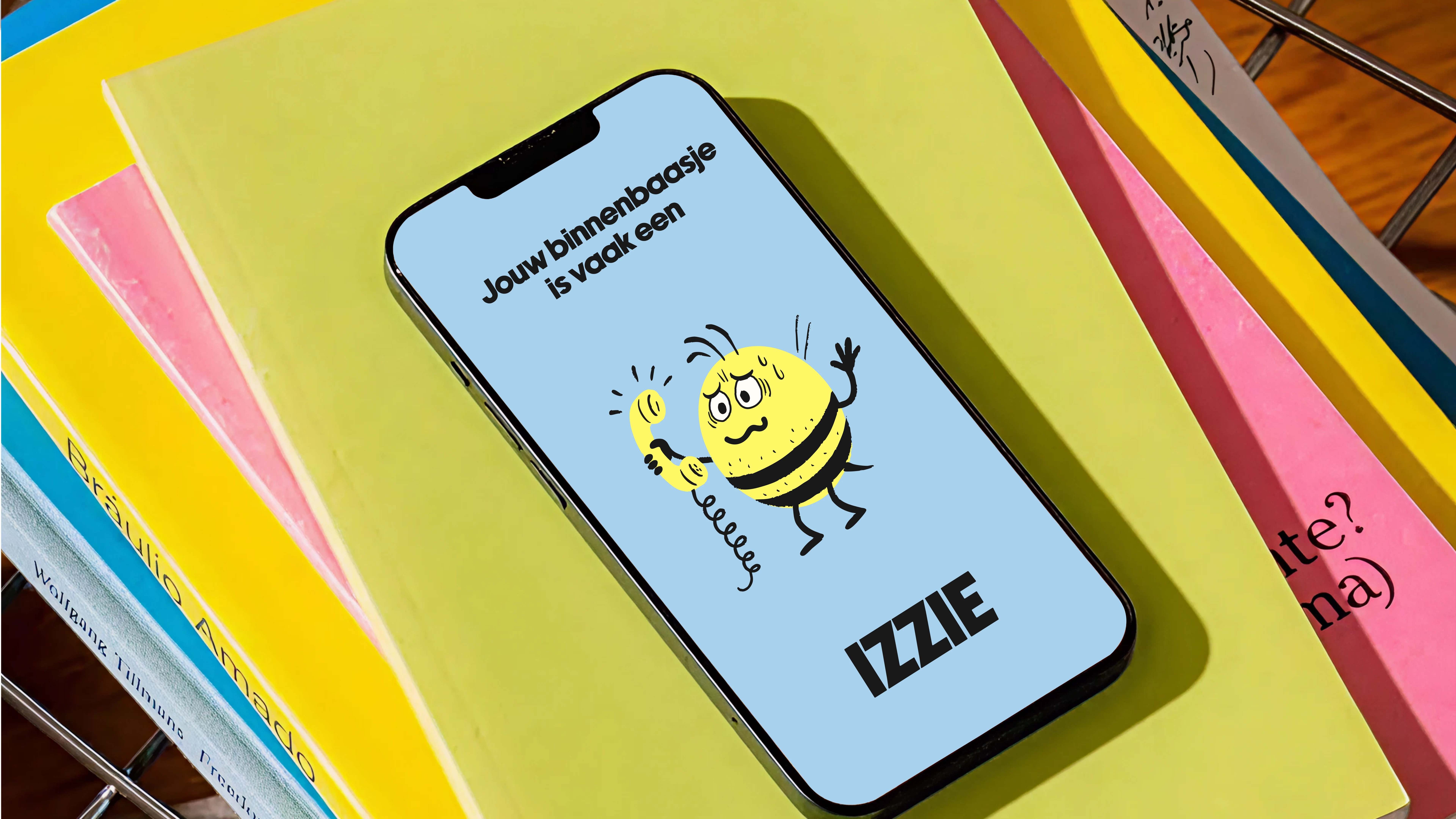
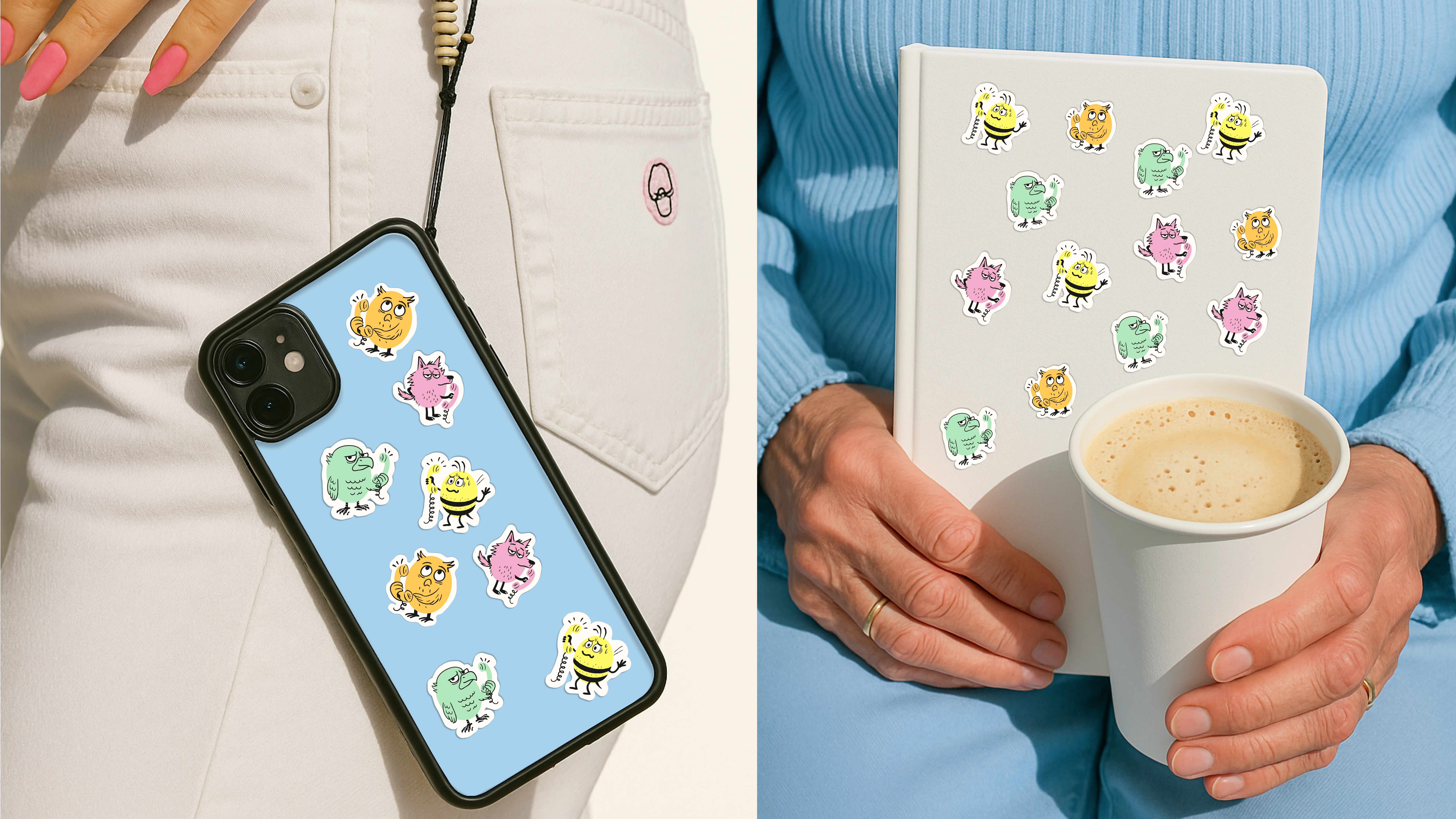
Izzy – The Burnout Bee
Never says no, hides exhaustion, runs on empty.
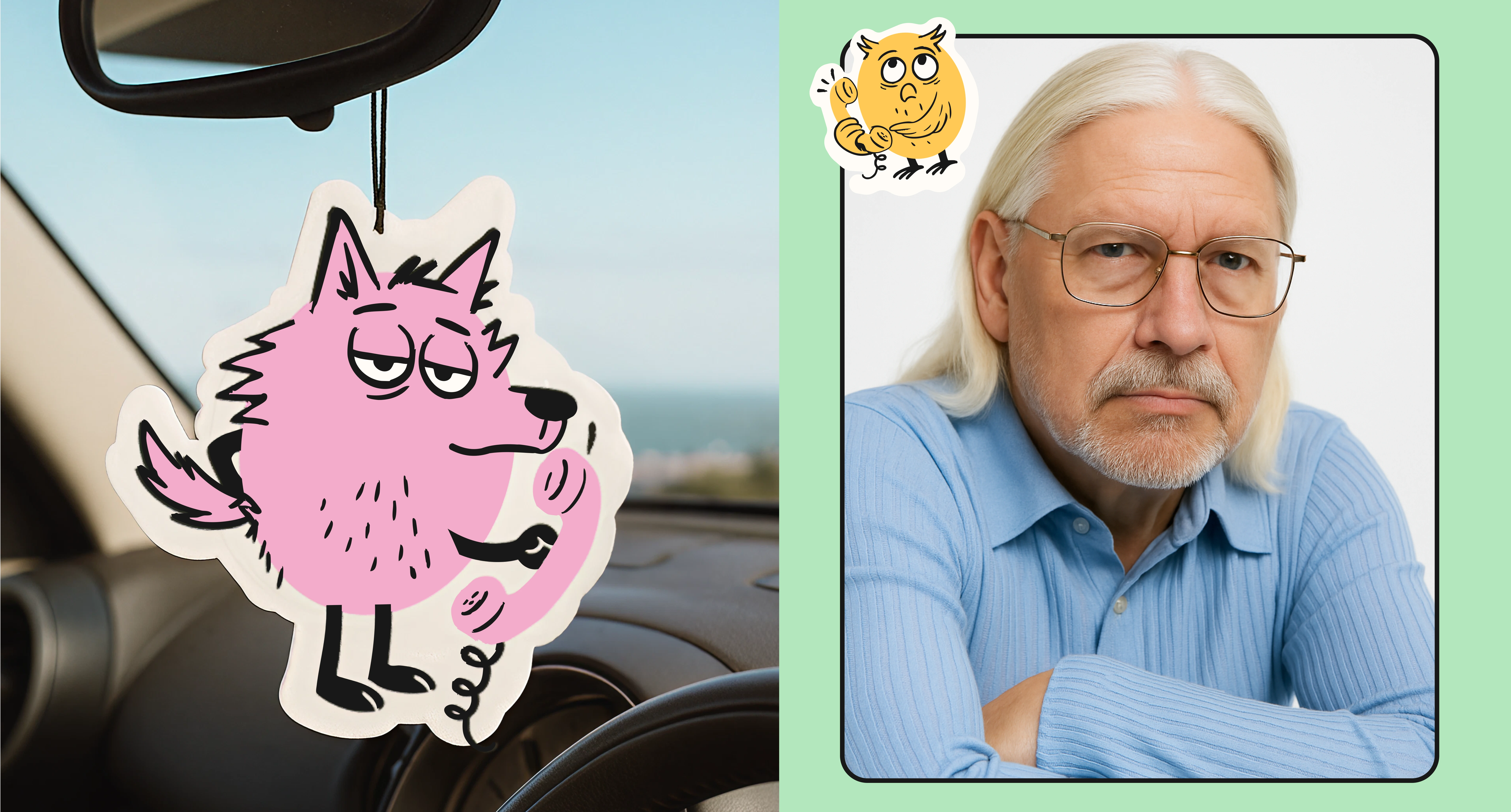
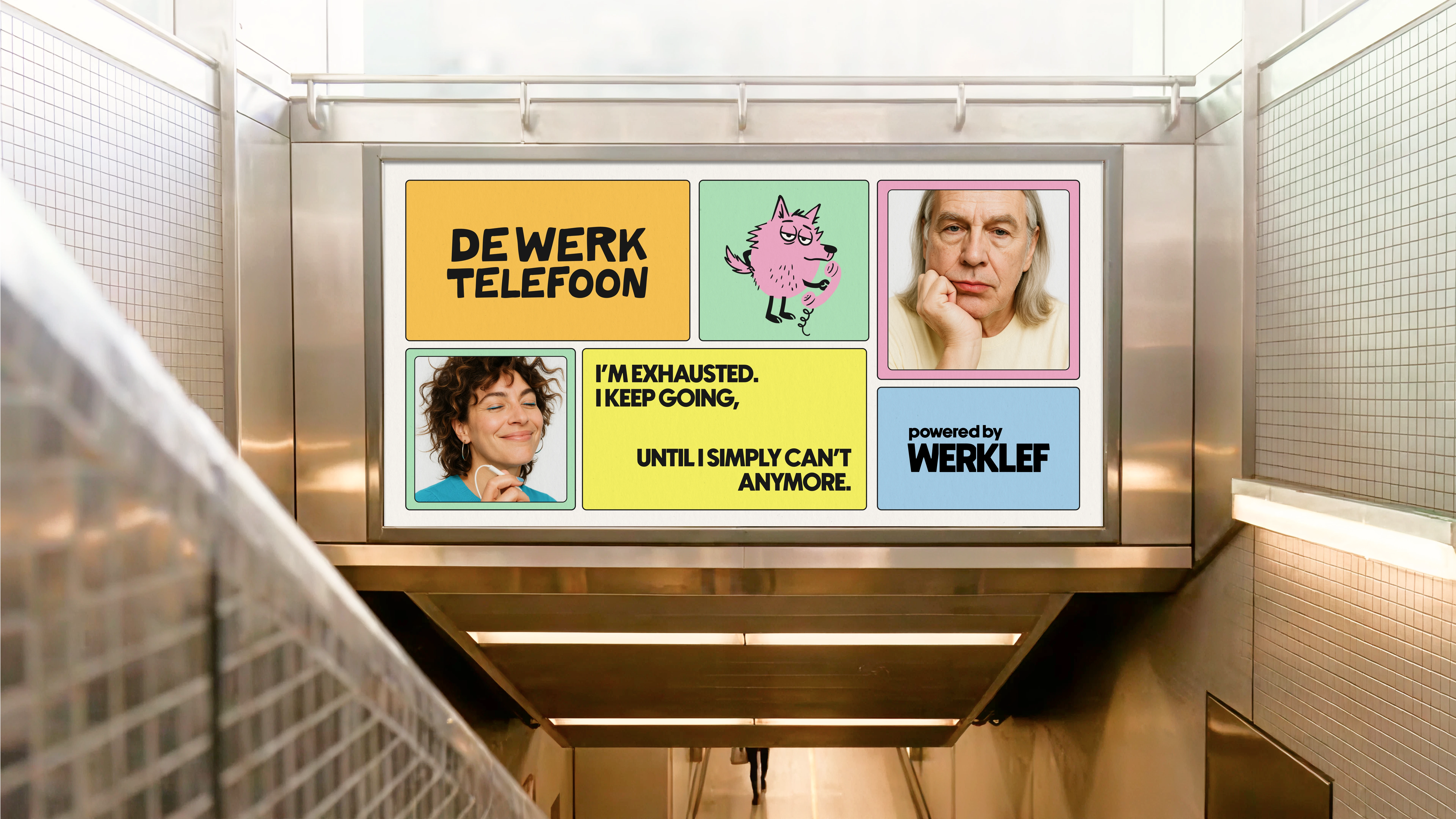
Lune – The Lone Wolf
Present but disconnected, avoids emotions, feels isolated.
Orla – The Silent Owl
Holds back ideas, avoids conflict, remains unseen.
Ari – The Aloof Eagle
Equates control with strength, struggles with openness.
These guys make challenges easier to name, creating enough distance to reflect without judgment.
The Headmates were born from 100+ real-time burn-out cases I studied.
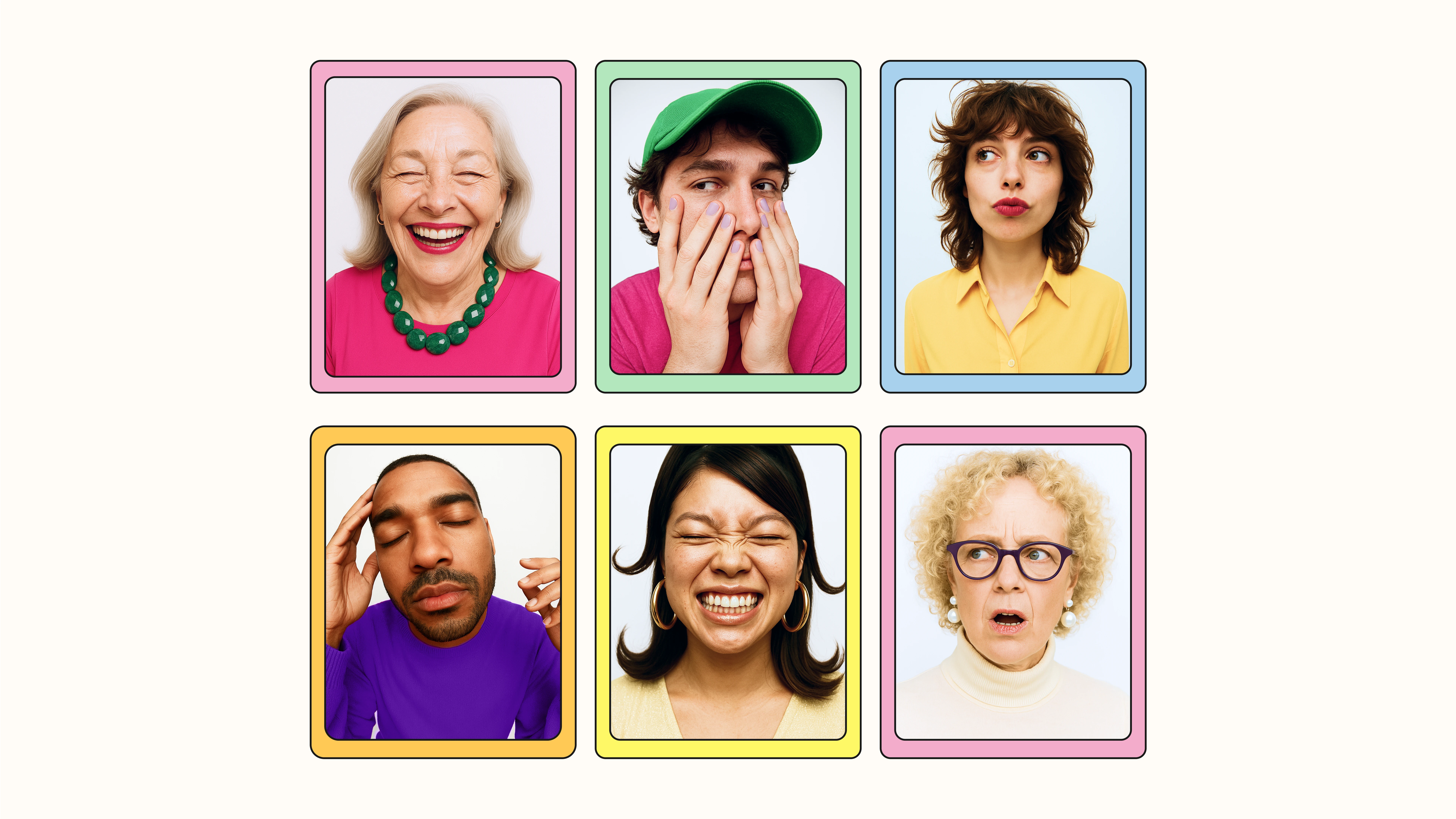
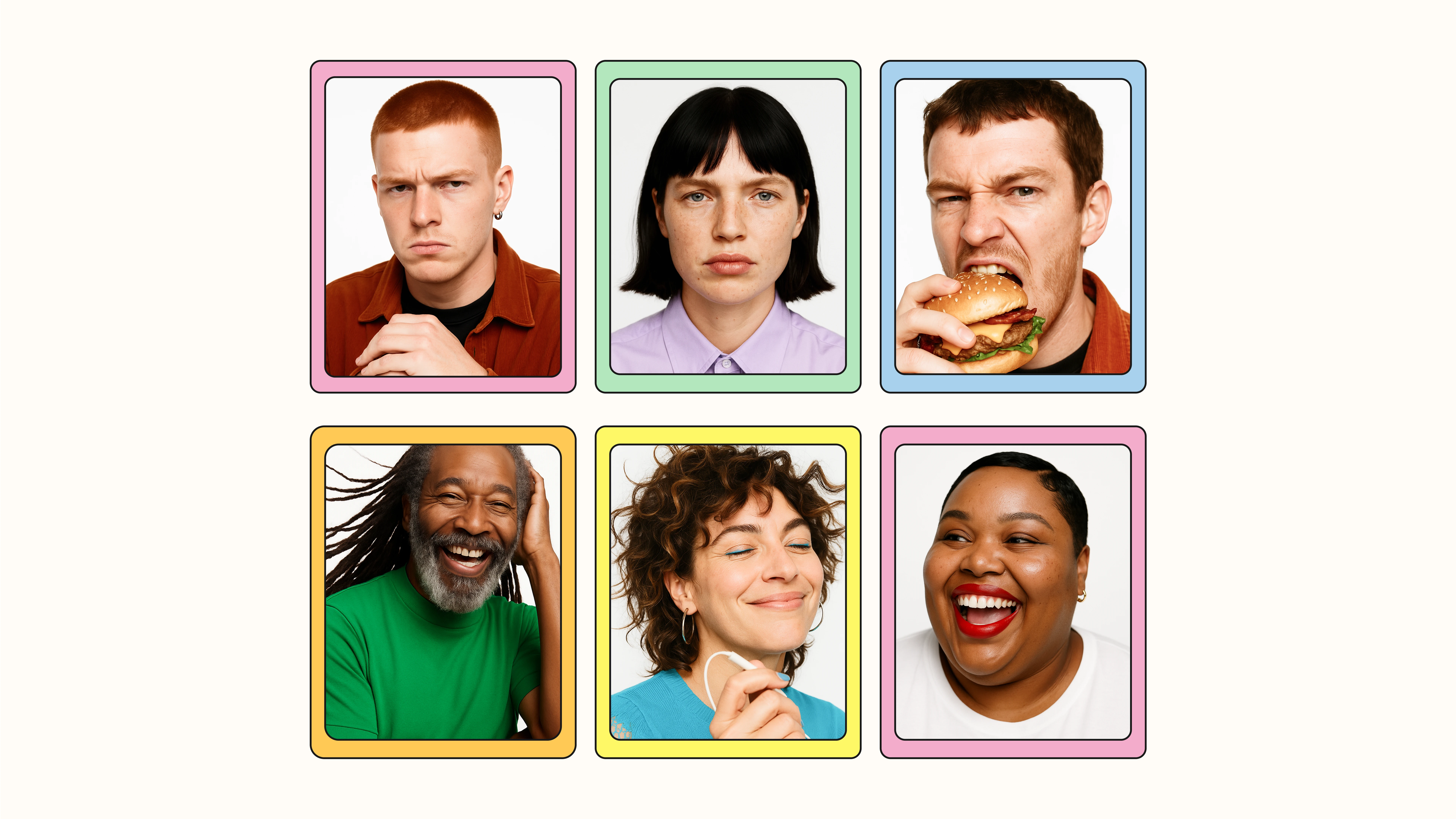
Portraits
AI-generated, but rooted in real stories. No stereotypes, no “one working type.” Each portrait highlights differences — in faces, expressions, posture. The style is expressive and human: not archetypes, but true personalities.
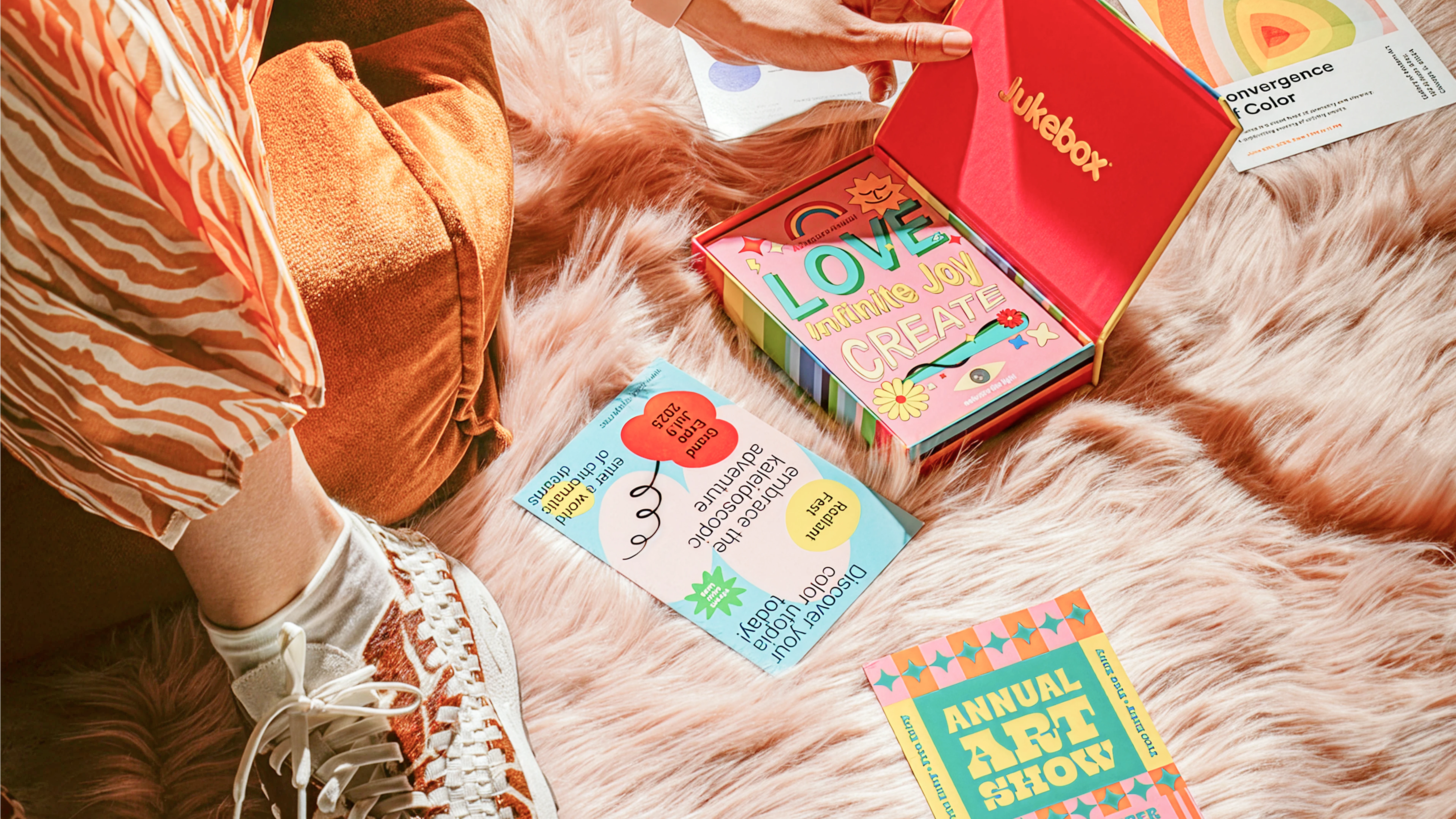
Image Bank
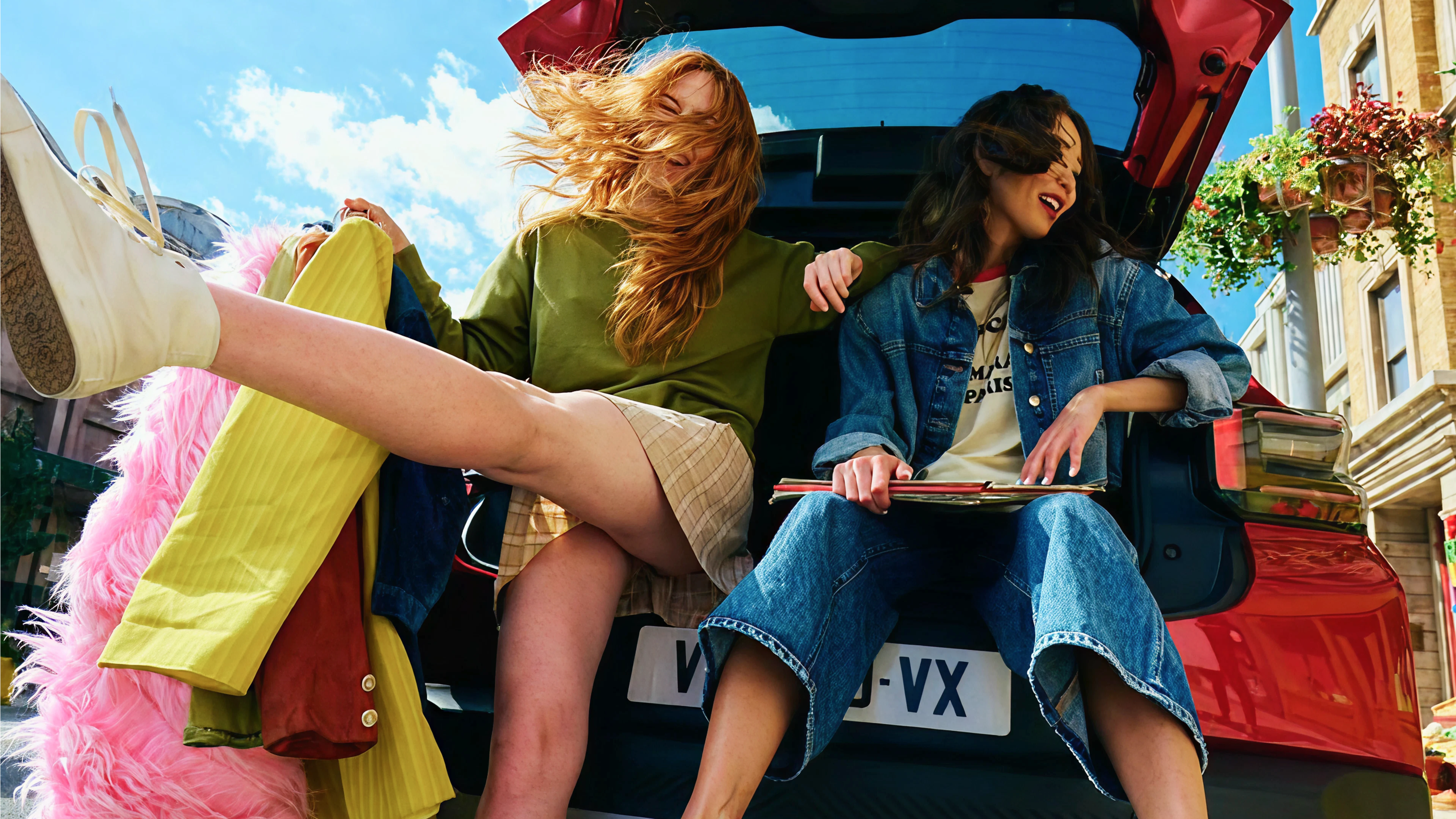
Supporting atmosphere shots place Workmate in everyday contexts. From pocket to desk, from coffee machine to meeting room. Always close by, always accessible — Workmate is there.
Campaign & Expresions
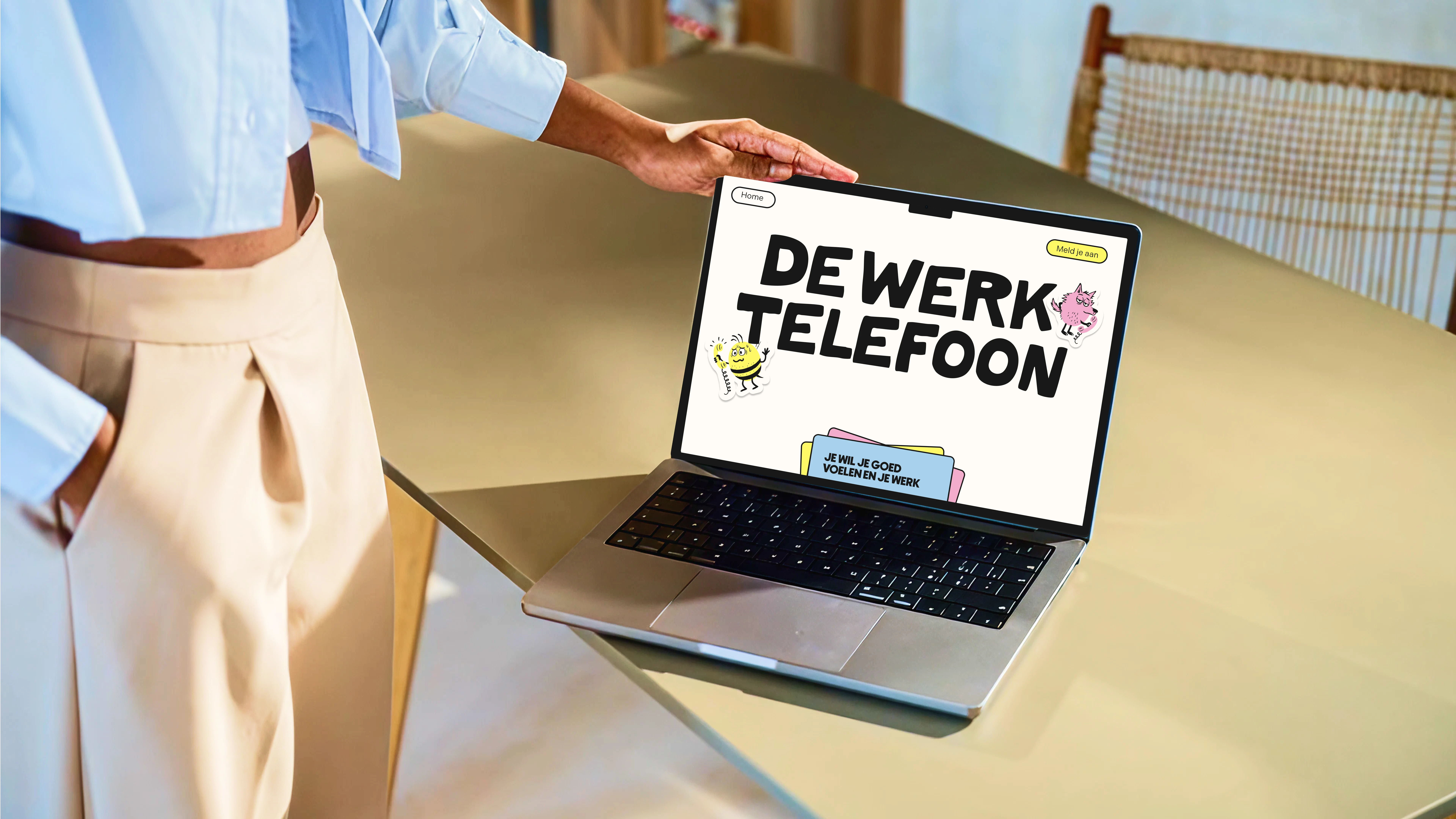
Website & Digital: Online, Workmate comes alive through a clean, human-first website.
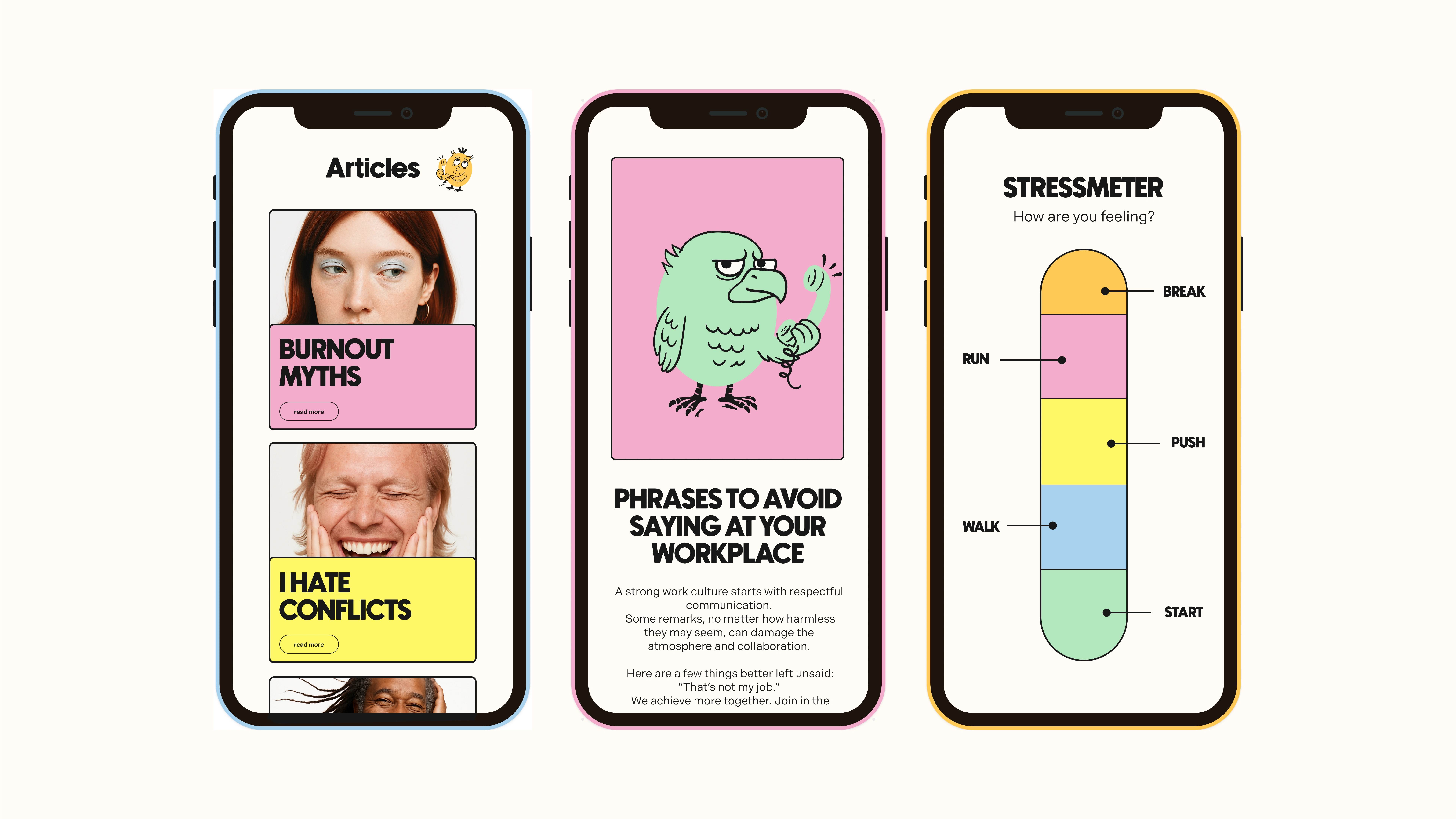
Social & Templates: On socials, the mix of Headmates, portraits, and real-world imagery creates recognizability on repeat.
Campaigns & Art Direction: Campaigns tell stories through faces and moments, never stock smiles. Always real emotion.
Process & Collaboration
Approach: The process moved from research to sketches, from raw insight to tangible brand codes.
Collaboration: I worked closely with the Workmate team, making sure the brand didn’t just look good, but felt theirs.
Value Added: My role was to take something abstract. Feelings, struggles, atmosphere, and give it shape through visuals and characters.
Result & Impact
Visual outcome: A brand that is soft yet bold, with characters and portraits that stand out in the HR space.
Impact for the client: For Workmate, it was more than a new identity: it shifted them from being “just an app” to becoming a movement people could connect with.
My reflection: For me, it’s proof of what design can do: humanise stigmatised problems and make the invisible visible.
"It has landed, and I’m SO happy. Honestly, incredibly impressed with how you’ve managed to give my companies a real face, such an achievement. Thank you so much!!" - Founder Workmate
Like this project
Posted Sep 11, 2025
Created a warm, human identity for HR brand Workmate. From logo to characters and campaigns, turning a program into a brand people connect with.
Likes
15
Views
111
Timeline
Jun 2, 2025 - Jul 25, 2025