Nivavi Brand Identity Design
Roos van Gestel
Project
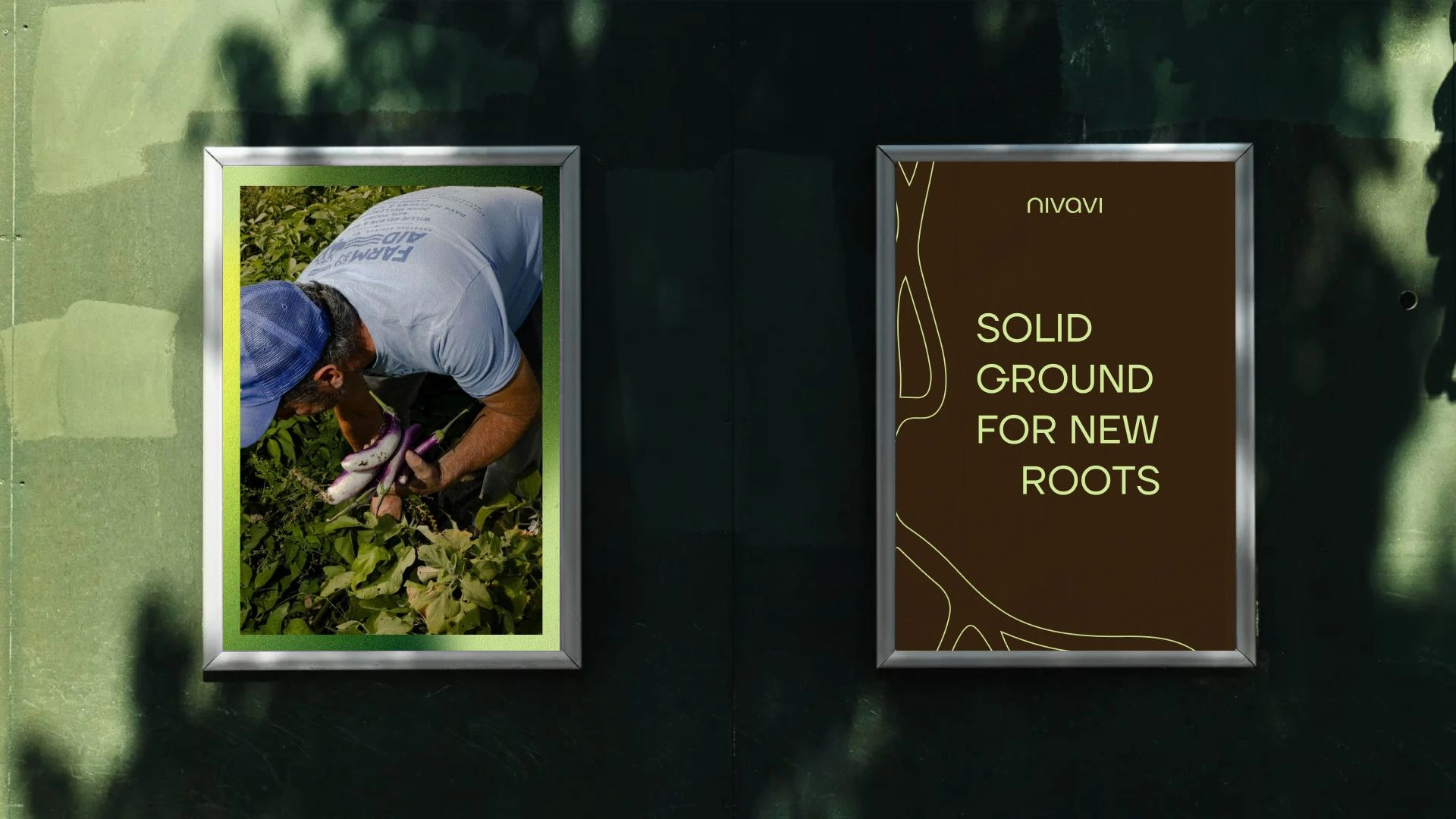
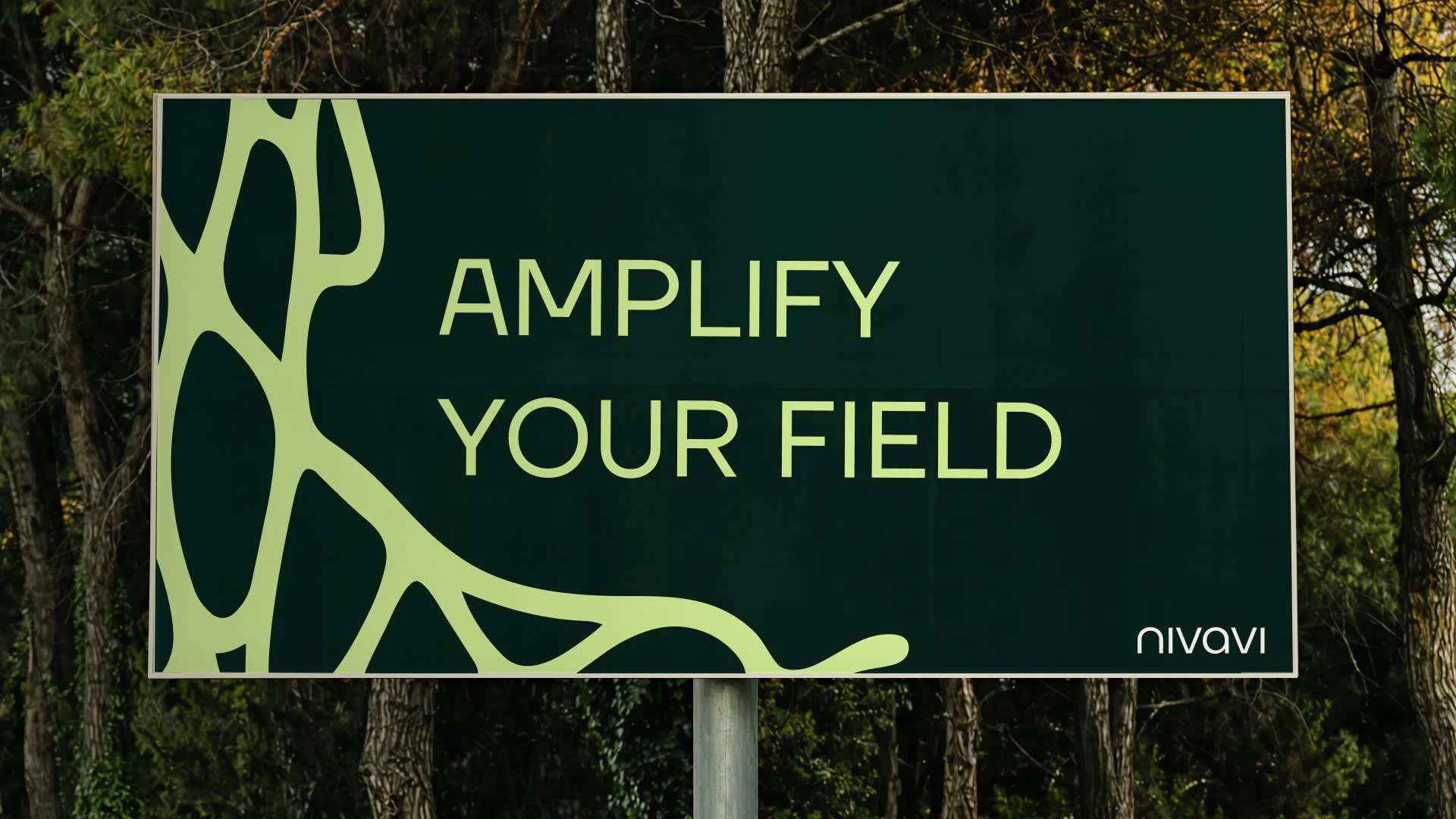
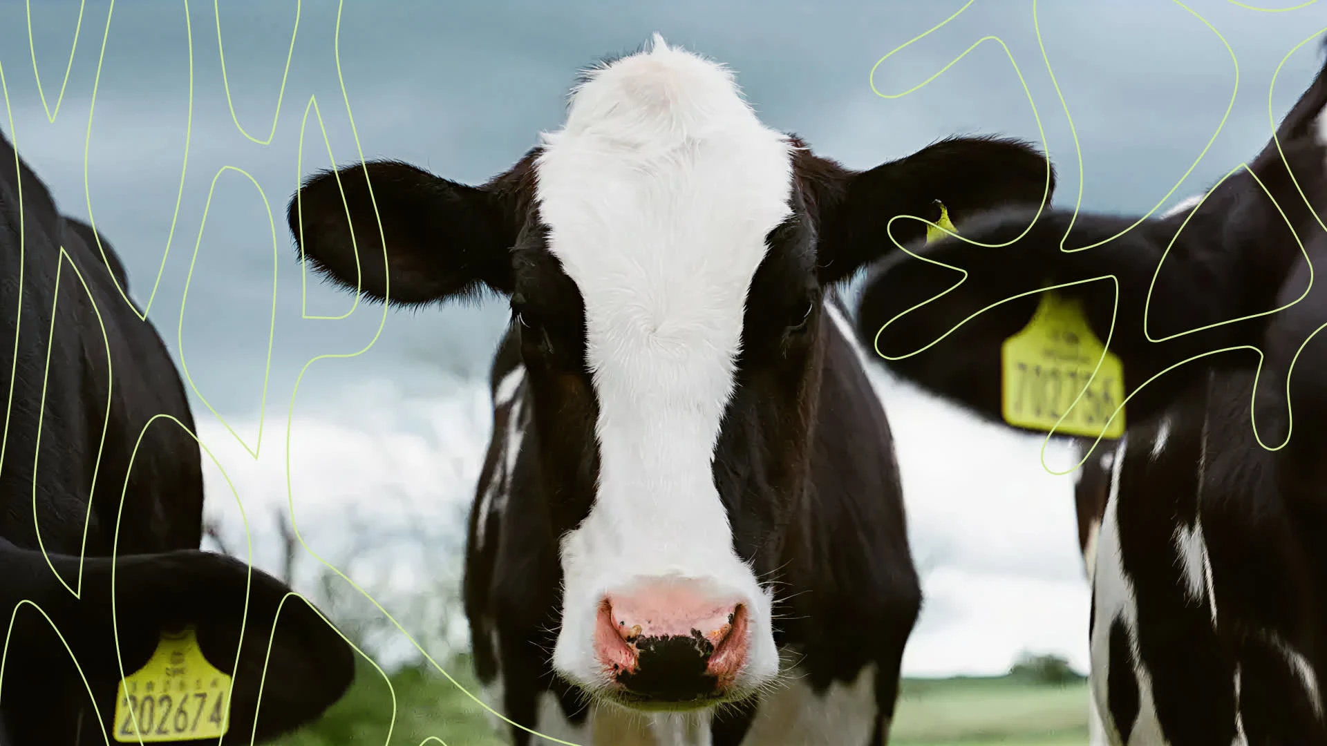
Nivavi, autonomous farming technology brand identity.
Challenge
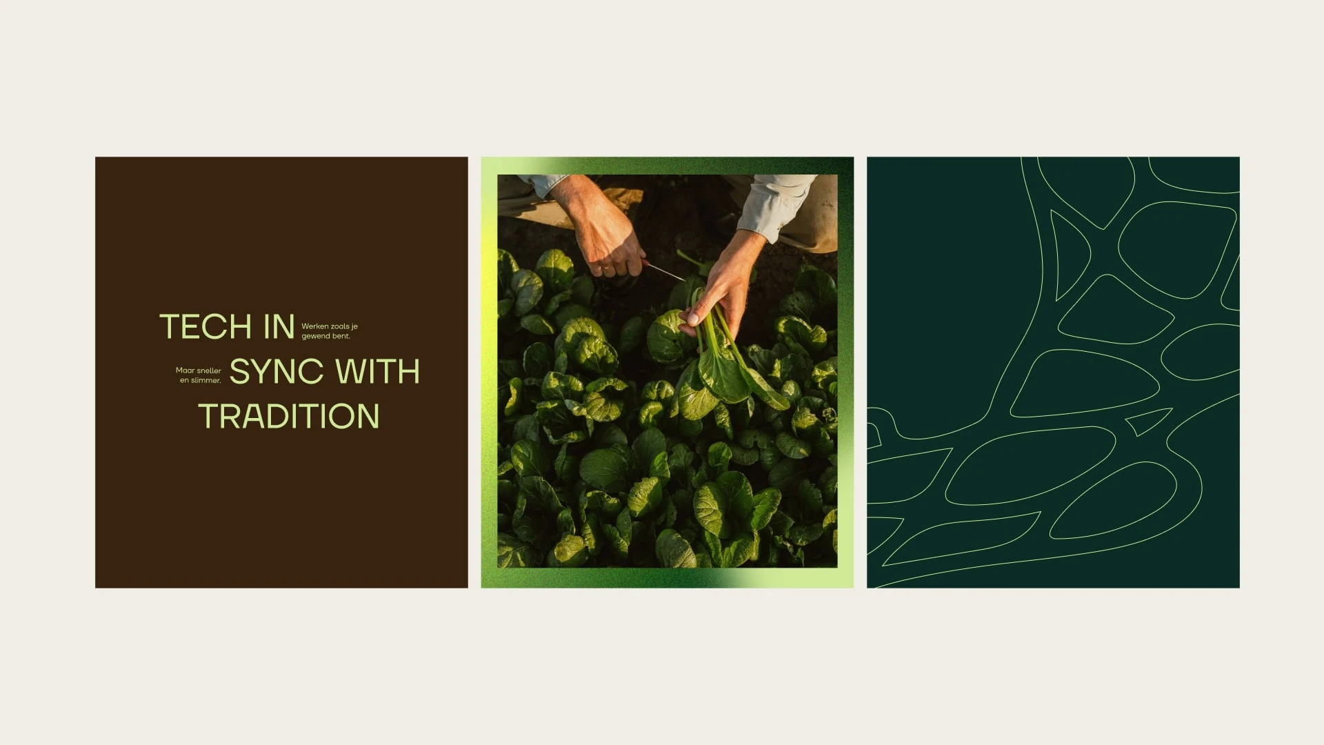
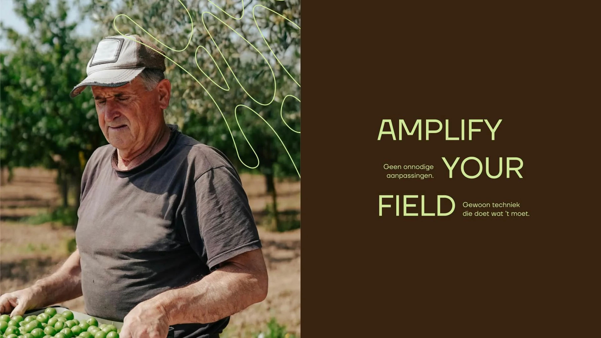
Nivavi develops autonomous technology for agriculture. The challenge was to create a brand that feels progressive and precise while staying connected to the world it comes from: the land, the farmer, and the rhythm of the field. The identity needed to communicate innovation and trust without becoming overly technical or distant.
My role
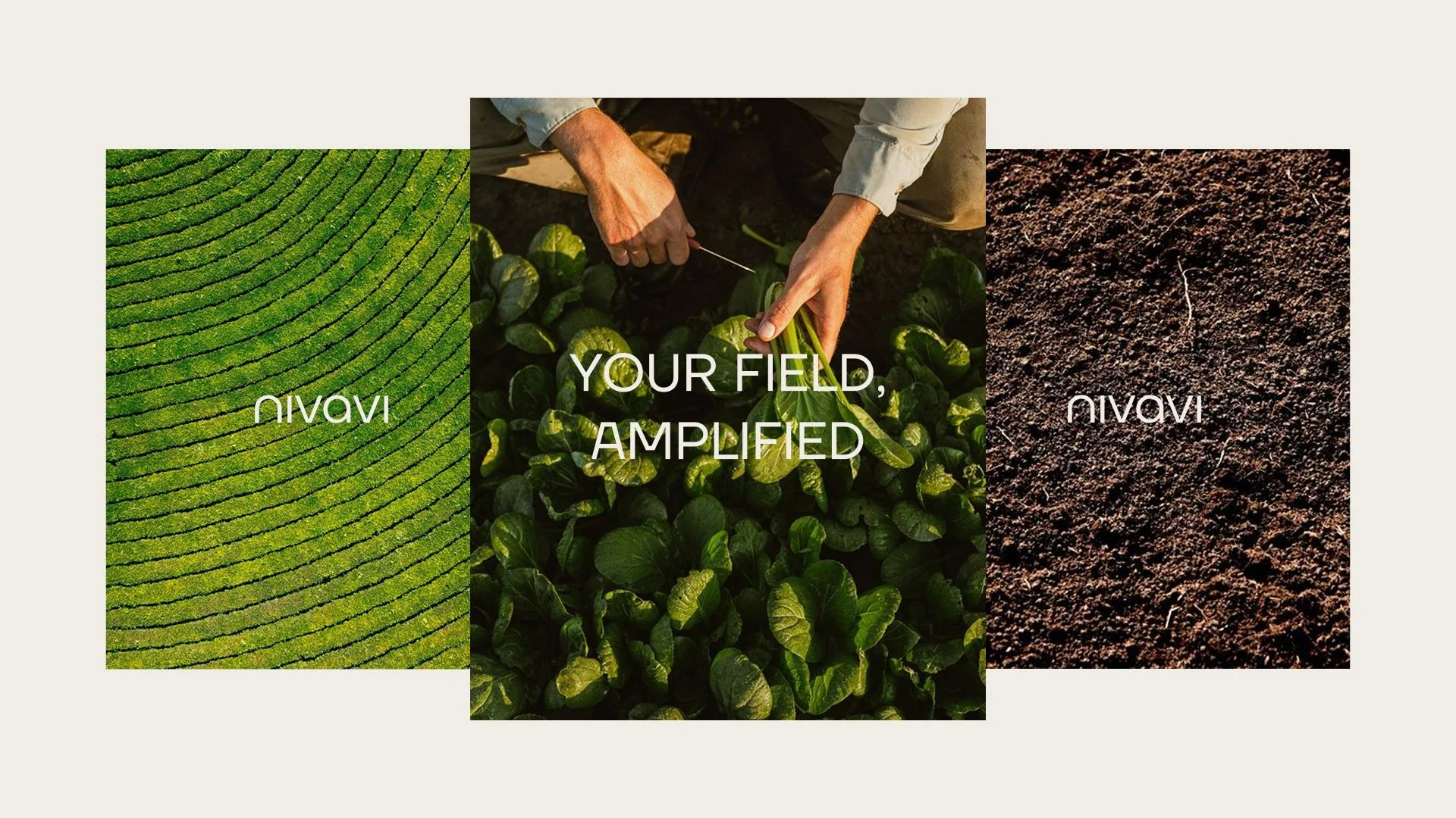
Brand designer & art director. I developed a visual identity built around patterns inspired by farmland seen from above, turning fields, routes and structure into a clear graphic system. A brand world that connects technology with the land it grows from.
Foundation & Brand Pillars
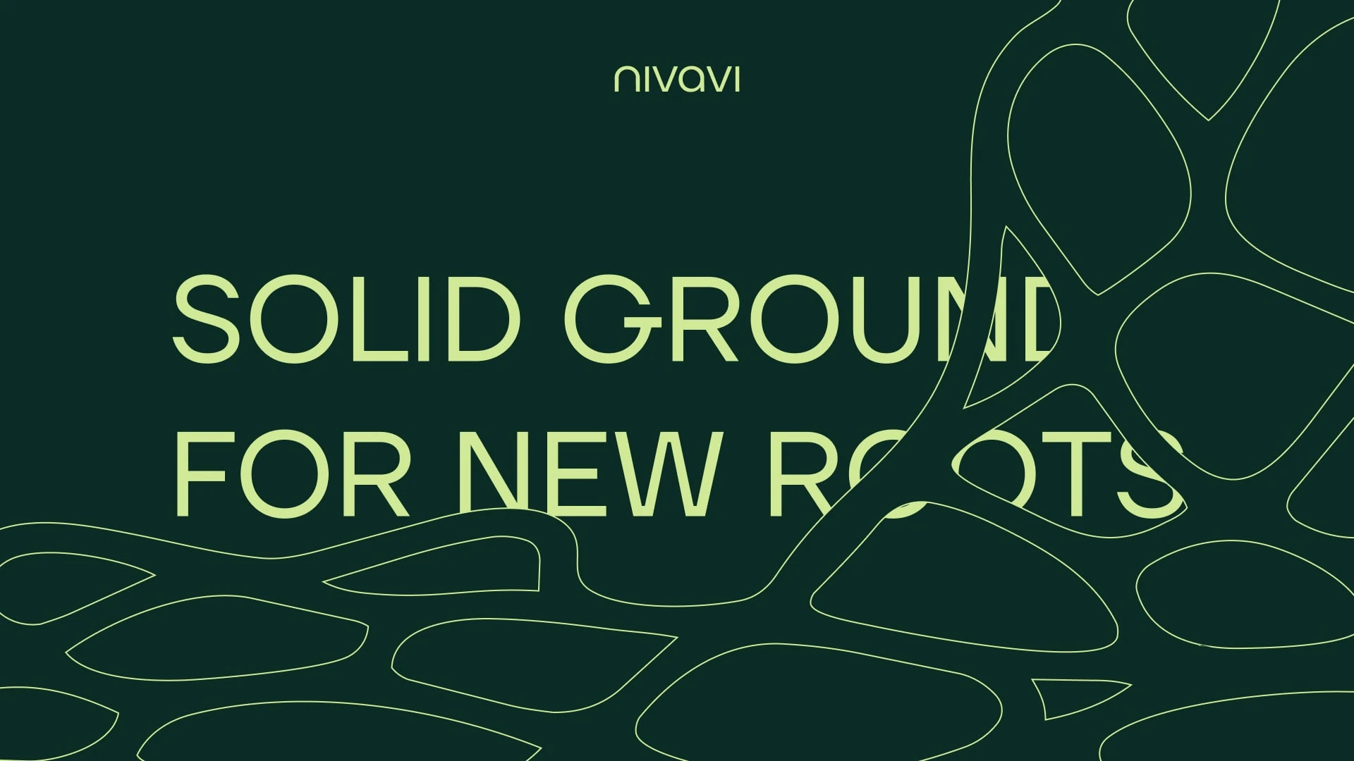
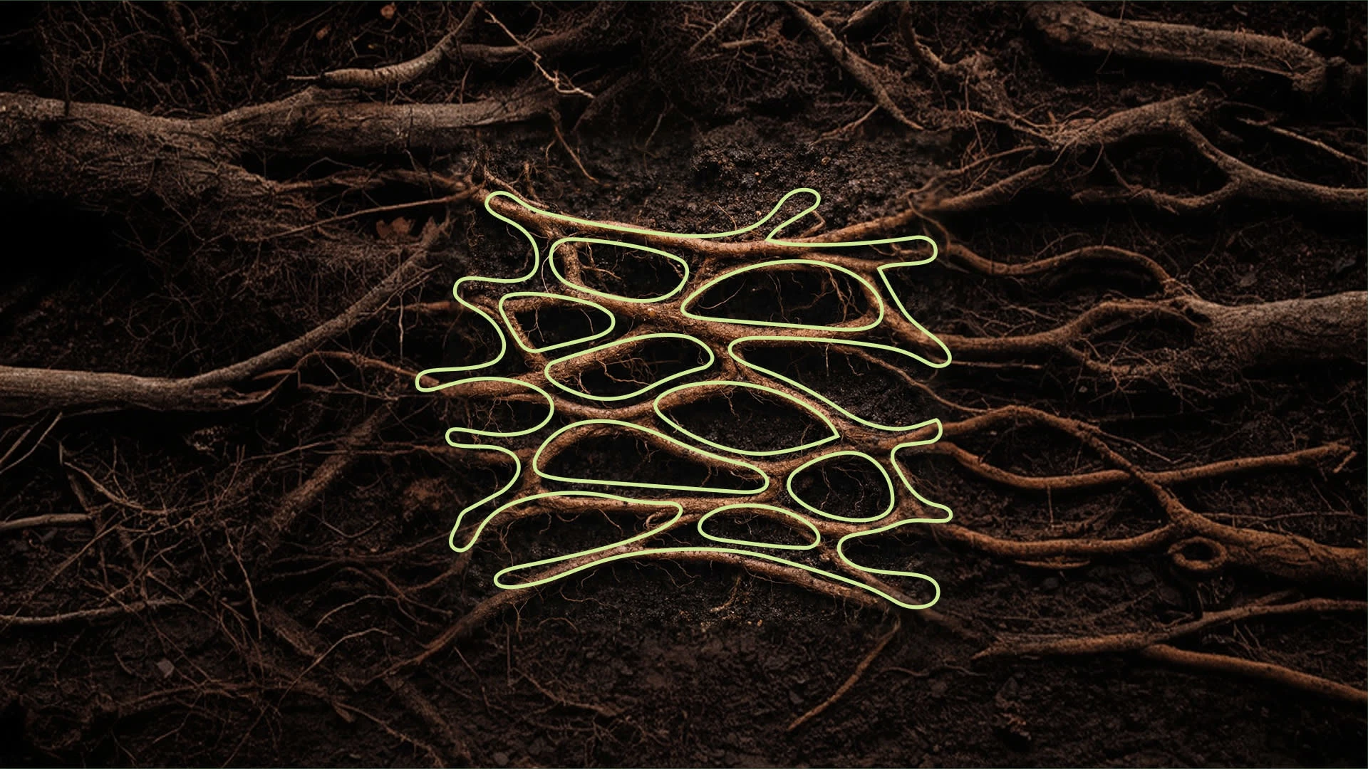
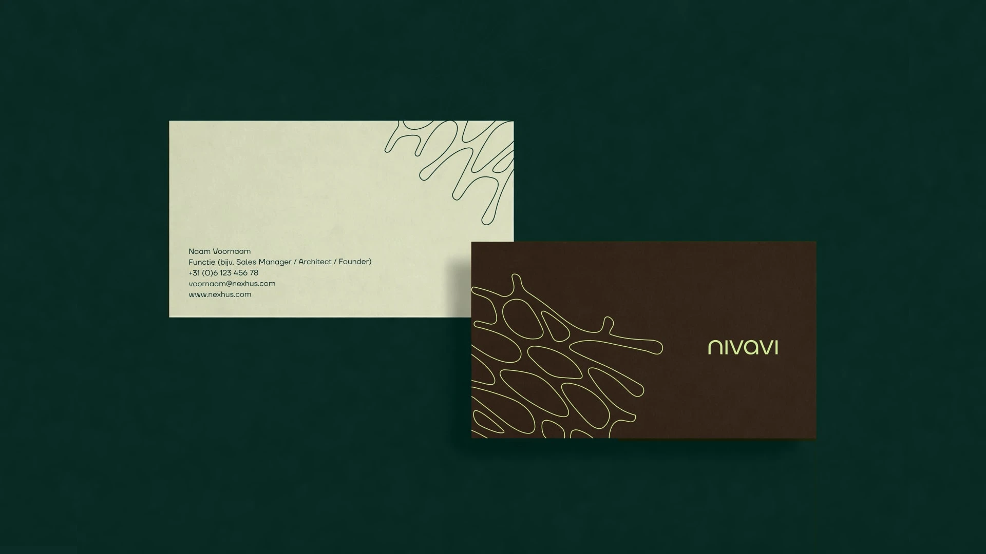
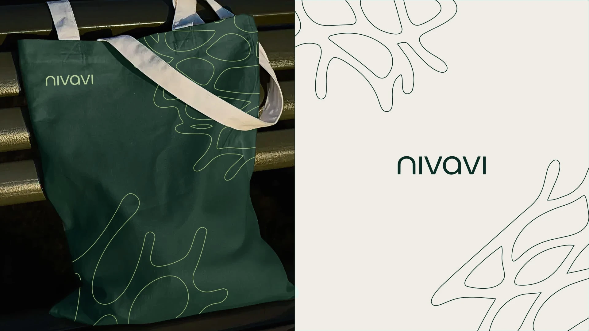
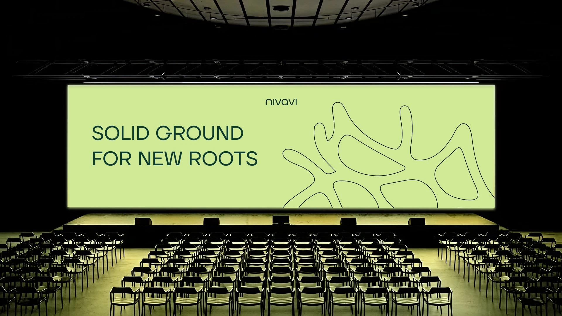
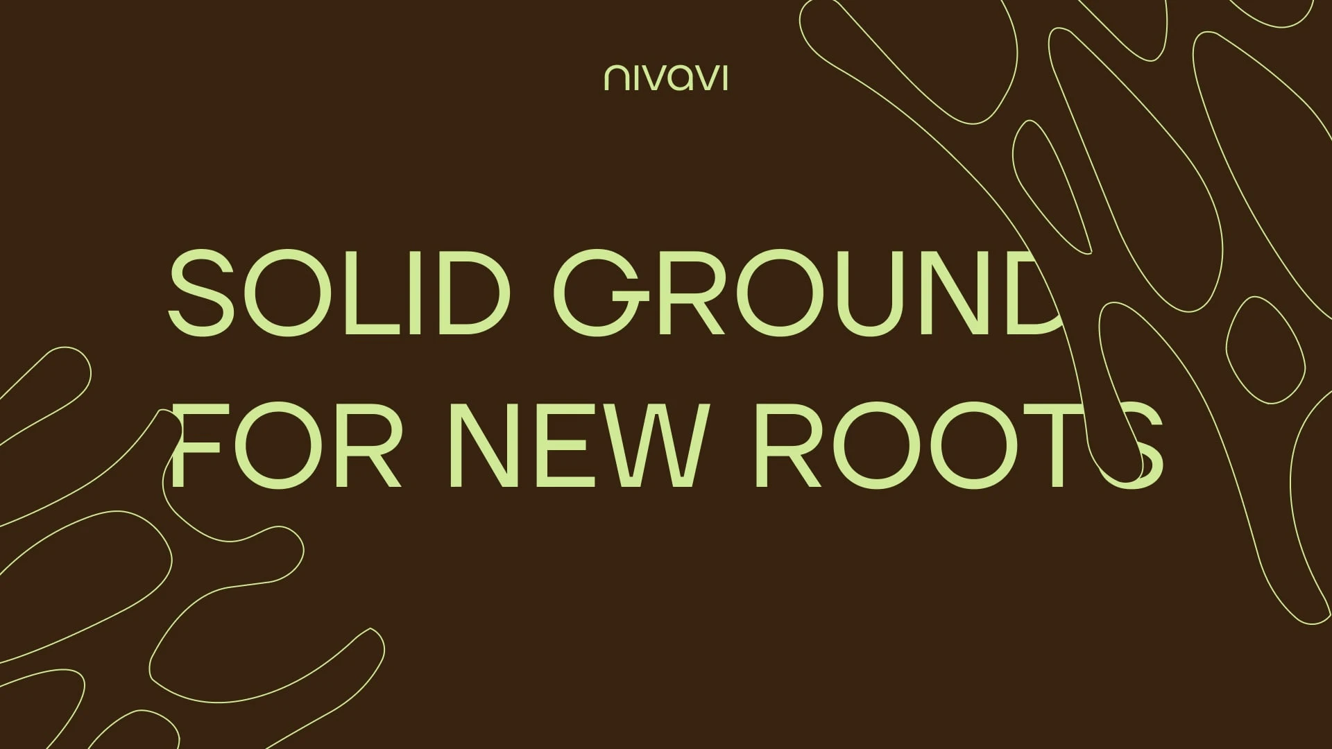
Logo
A structured mark inspired by the logic of the land.
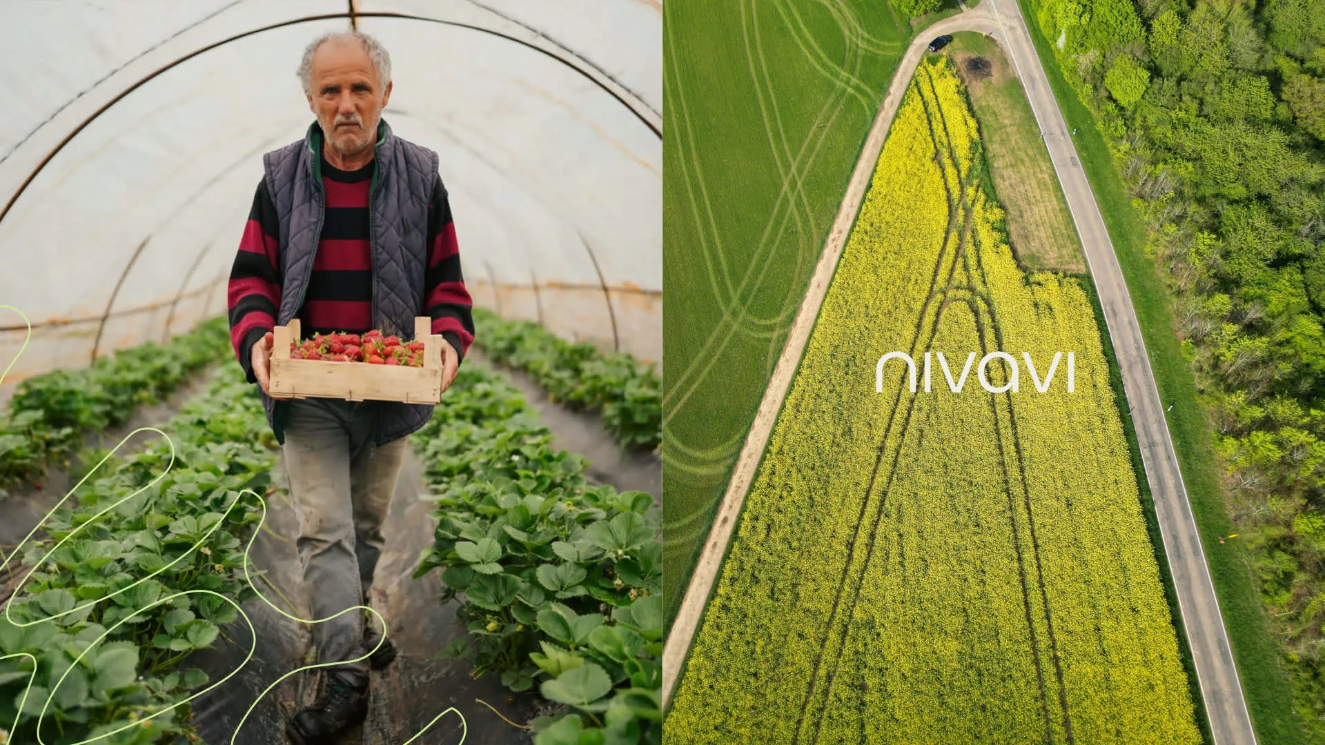
The Nivavi symbol is built from the geometry of farmland seen from above: plots, routes and movement across the field. These shapes come together to form the N of Nivavi.
Clean, modular and deliberate.
Symbolising autonomy, precision and progress in agriculture.
The system is designed to scale across applications: from machinery interfaces and digital platforms to presentations, product communication and field demonstrations.
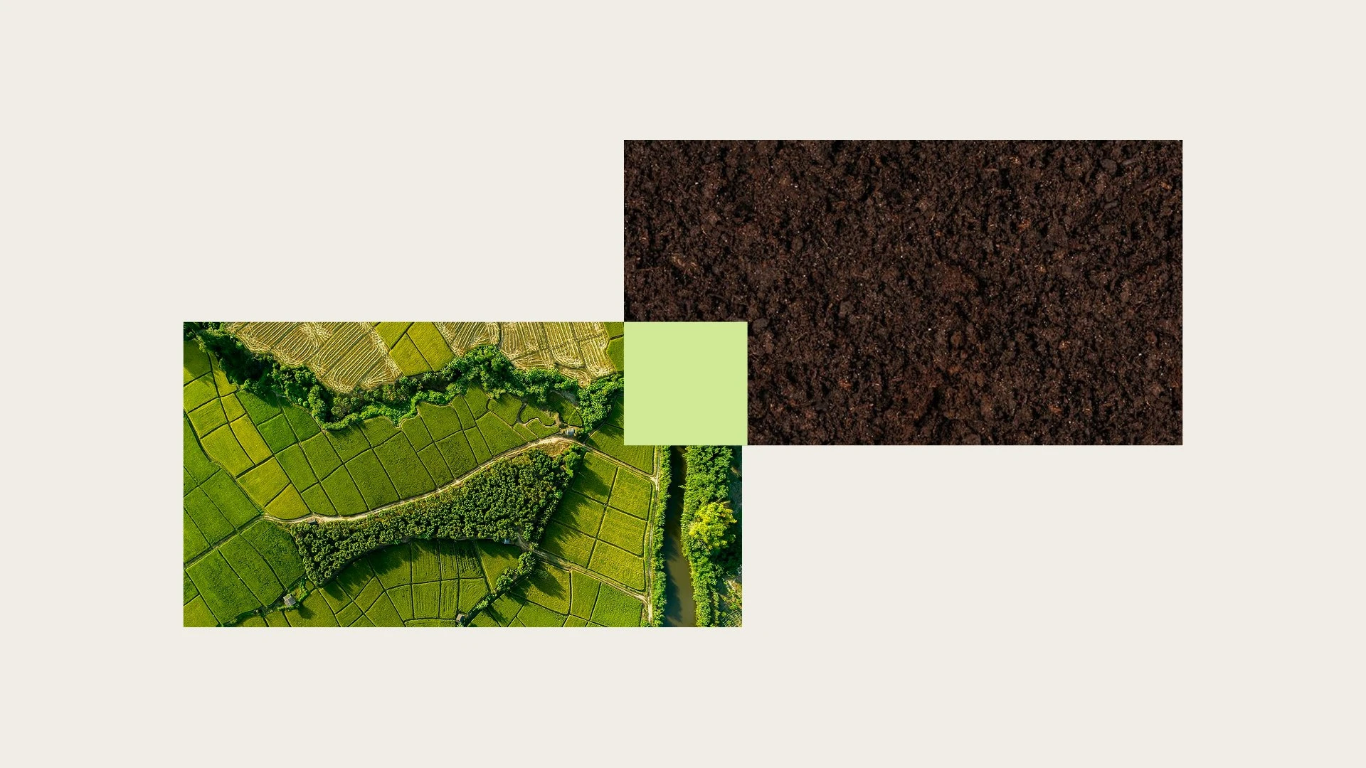
Color Palette
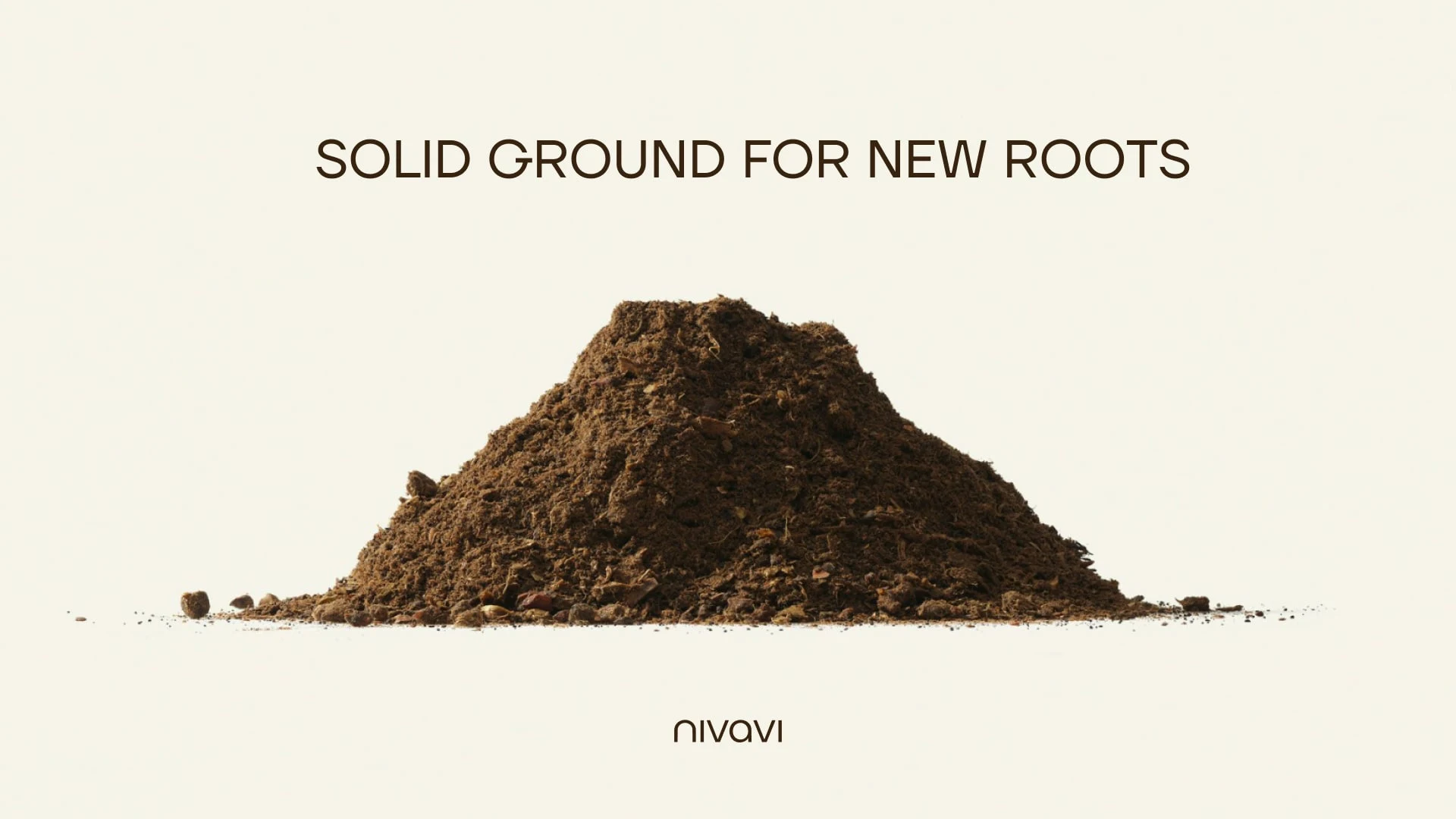
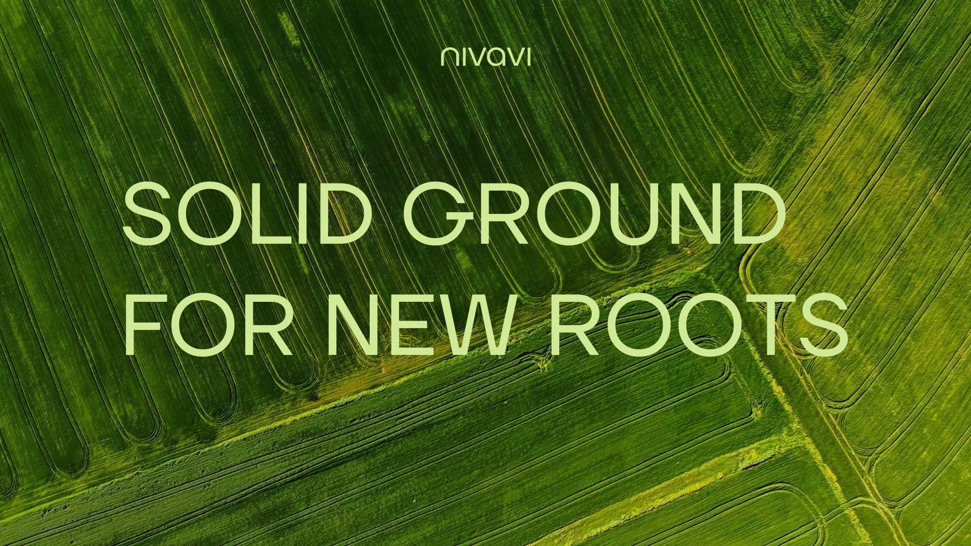
Natural tones form the base: deep greens, earth tones and soft neutrals that reflect the agricultural landscape.
A vibrant yellow accent introduces energy and visibility, representing innovation, movement and technological progress.
The palette balances two worlds:
Rooted in the land. Driven by technology.
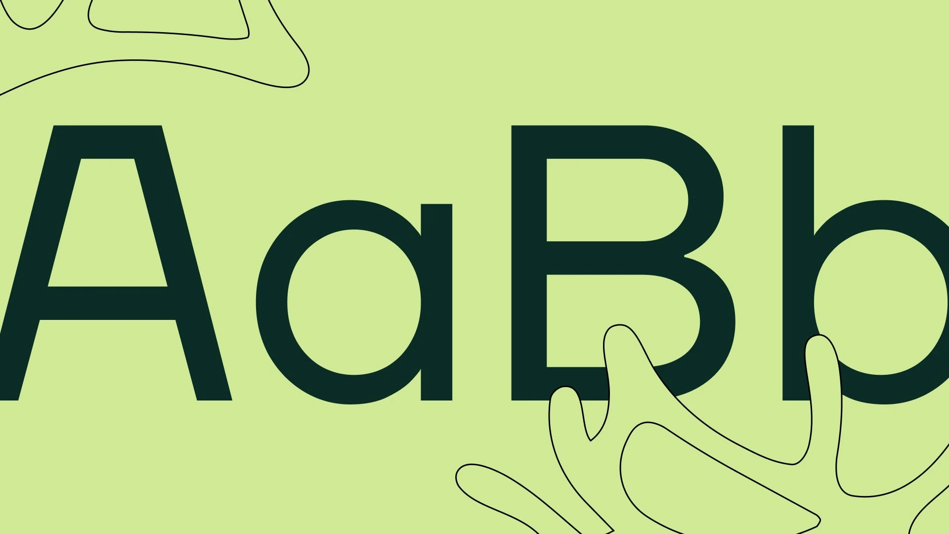
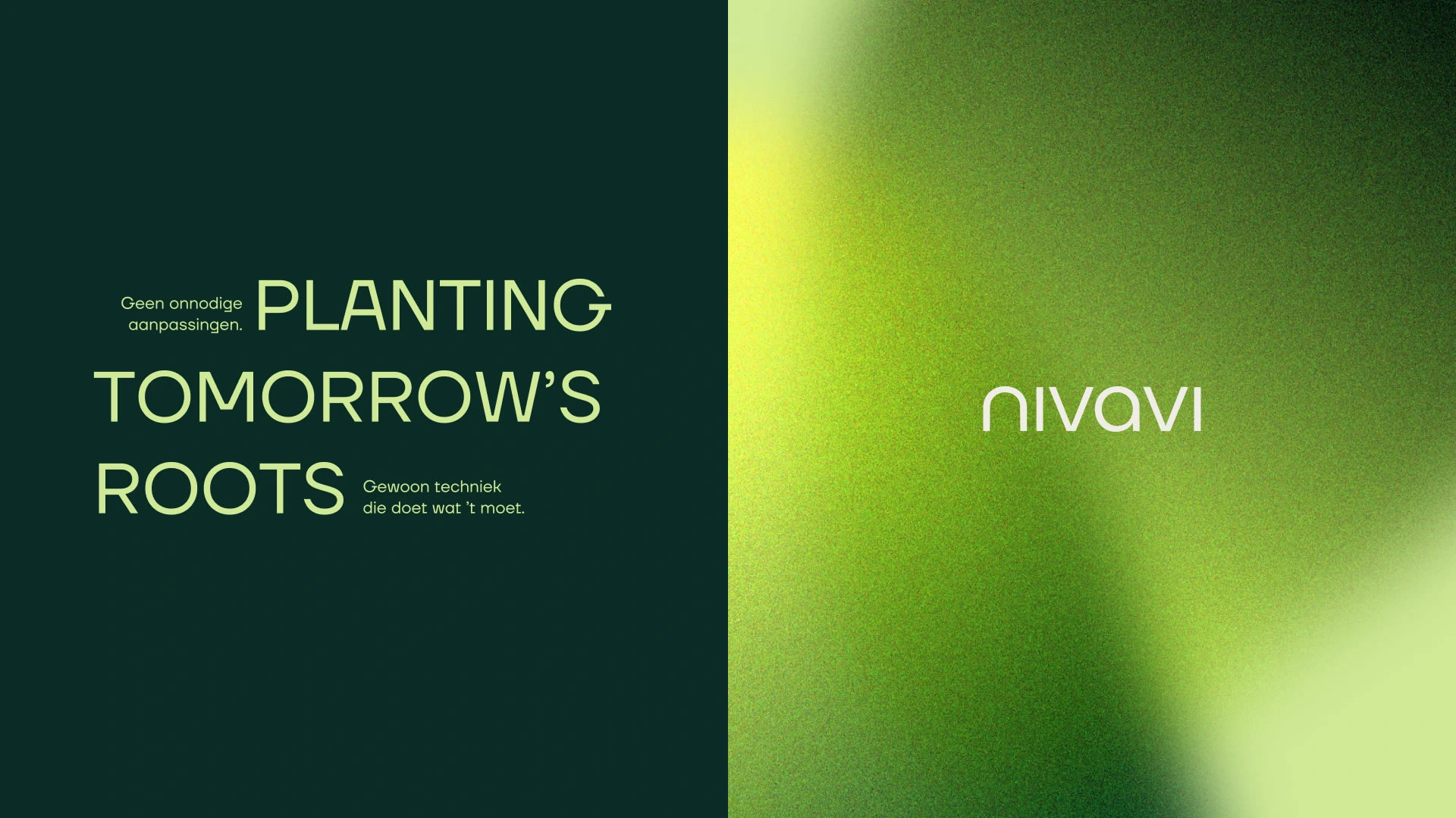
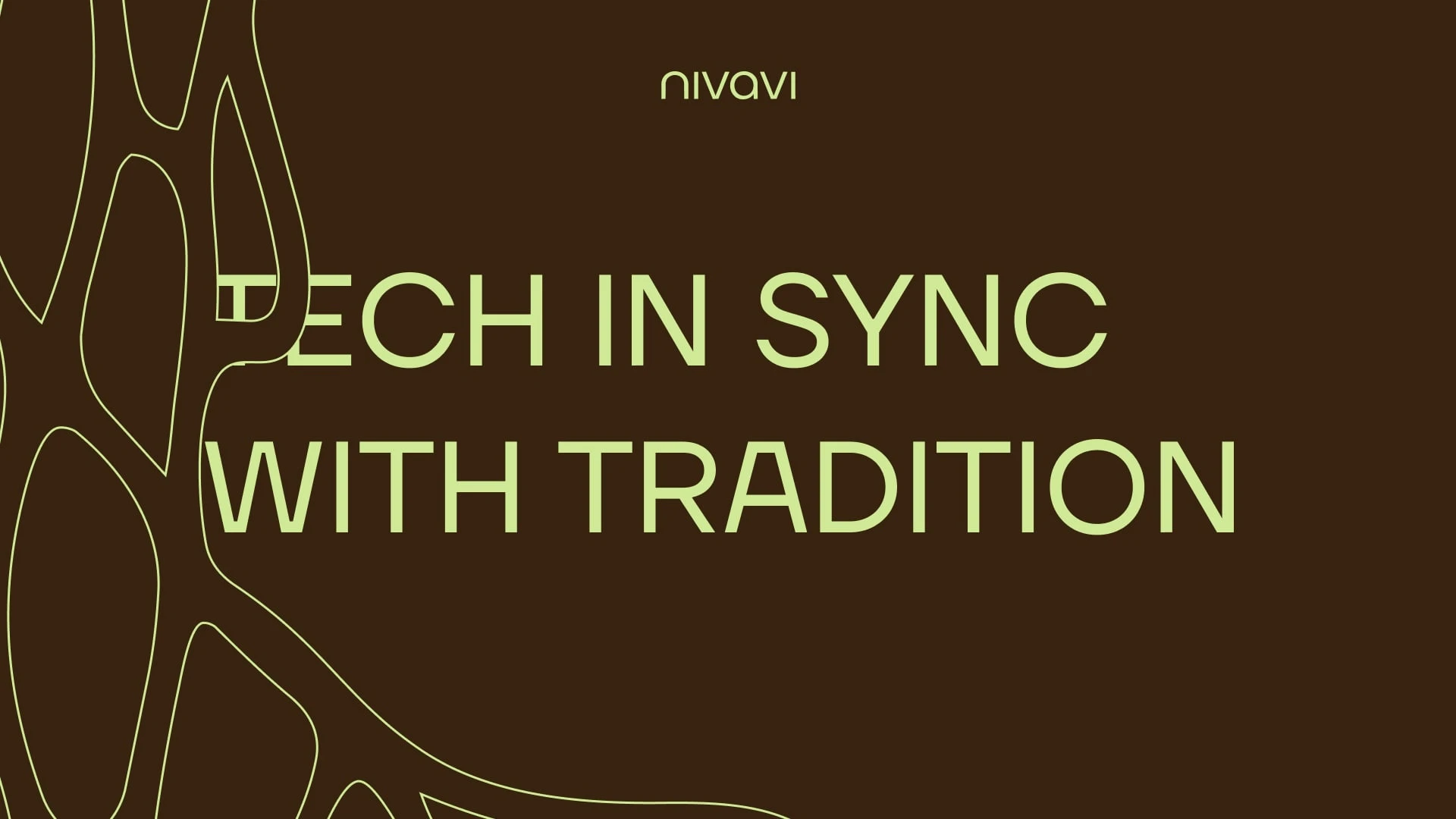
Typography & Voice
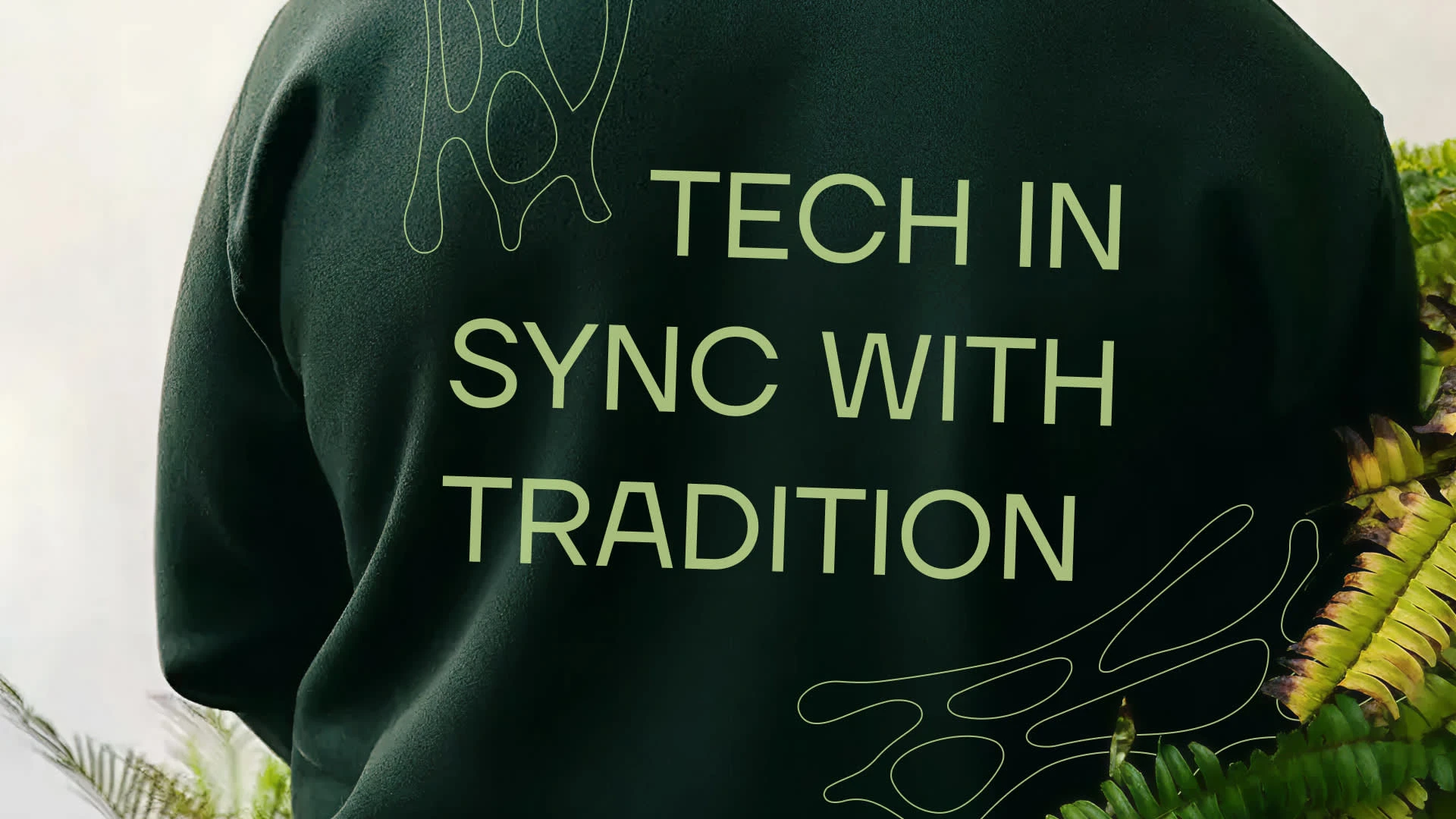
Clean, modern typography designed for clarity and confidence.
Typography is used to communicate precision and reliability while remaining accessible to the agricultural community.
The tone of voice is calm, direct and grounded.
Confident, but never overly technical.
Short sentences.
Clear language.
Practical thinking.
Examples:
“Autonomy that works in the field.”
“Technology that supports the farmer.”
“Built for real conditions.”
“From the soil to smart systems.”
It’s language that connects technological innovation with agricultural reality, turning autonomy into something practical, reliable and understandable.
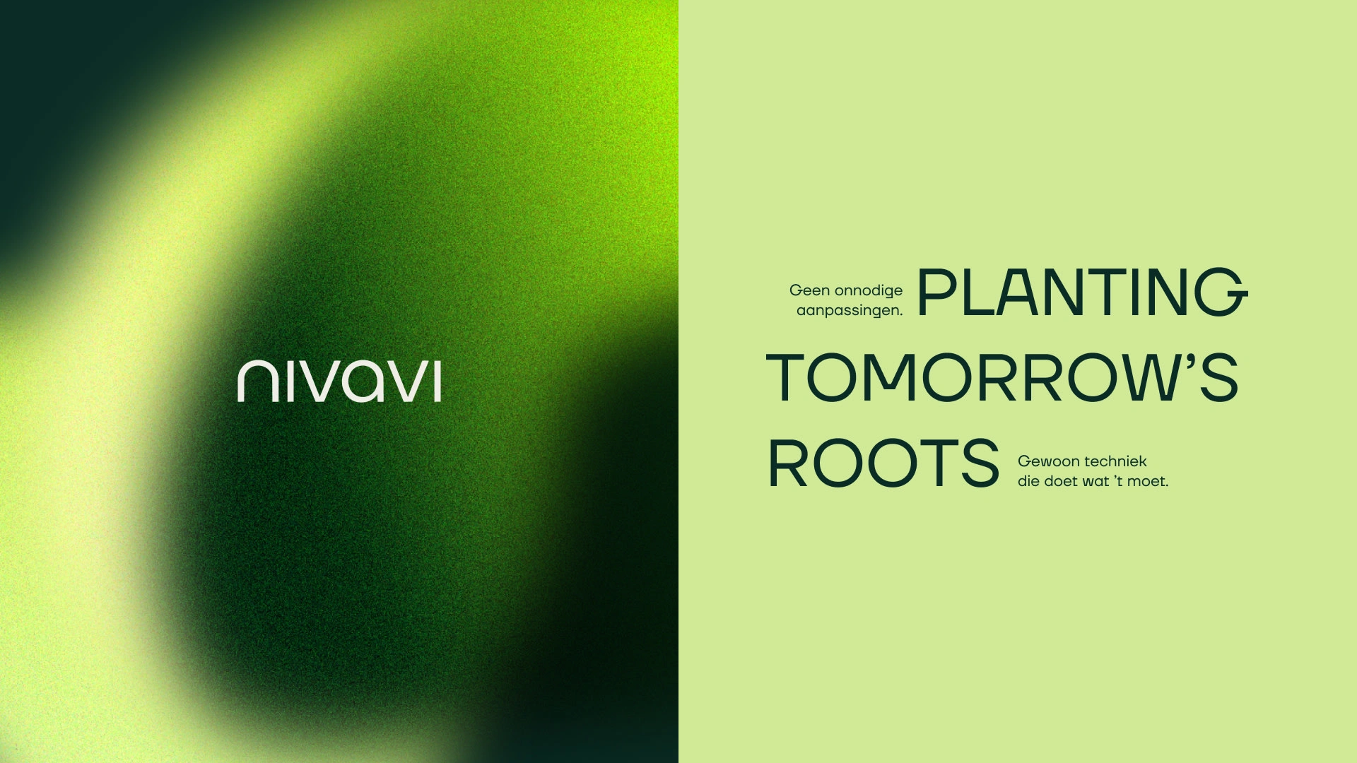
Core Idea
Autonomy rooted in the land.
Not technology for its own sake, but innovation that grows from real agricultural needs.
Nivavi reframes automation in farming: from distant technology to something practical, understandable and grounded in the field.
This is not about replacing the farmer.
It’s about giving the farmer better tools to stay in control.
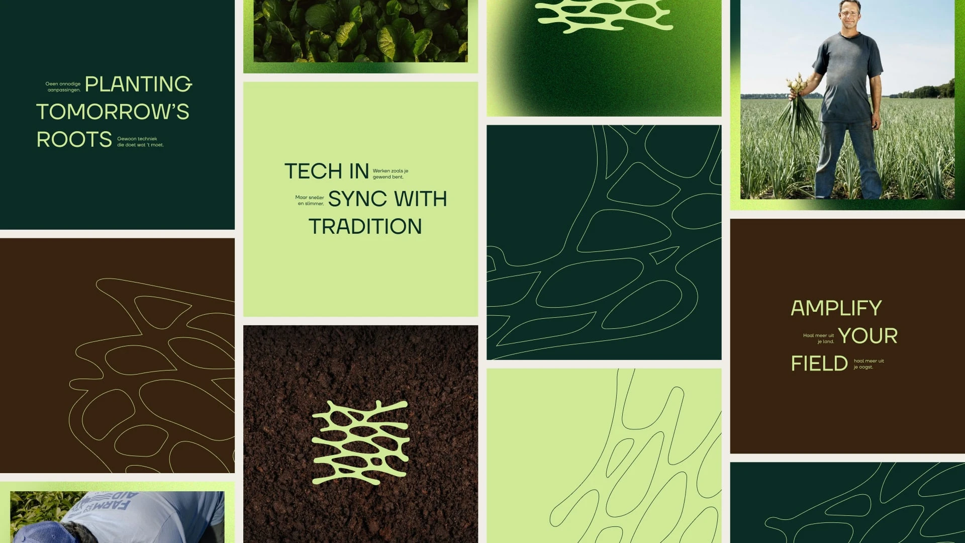
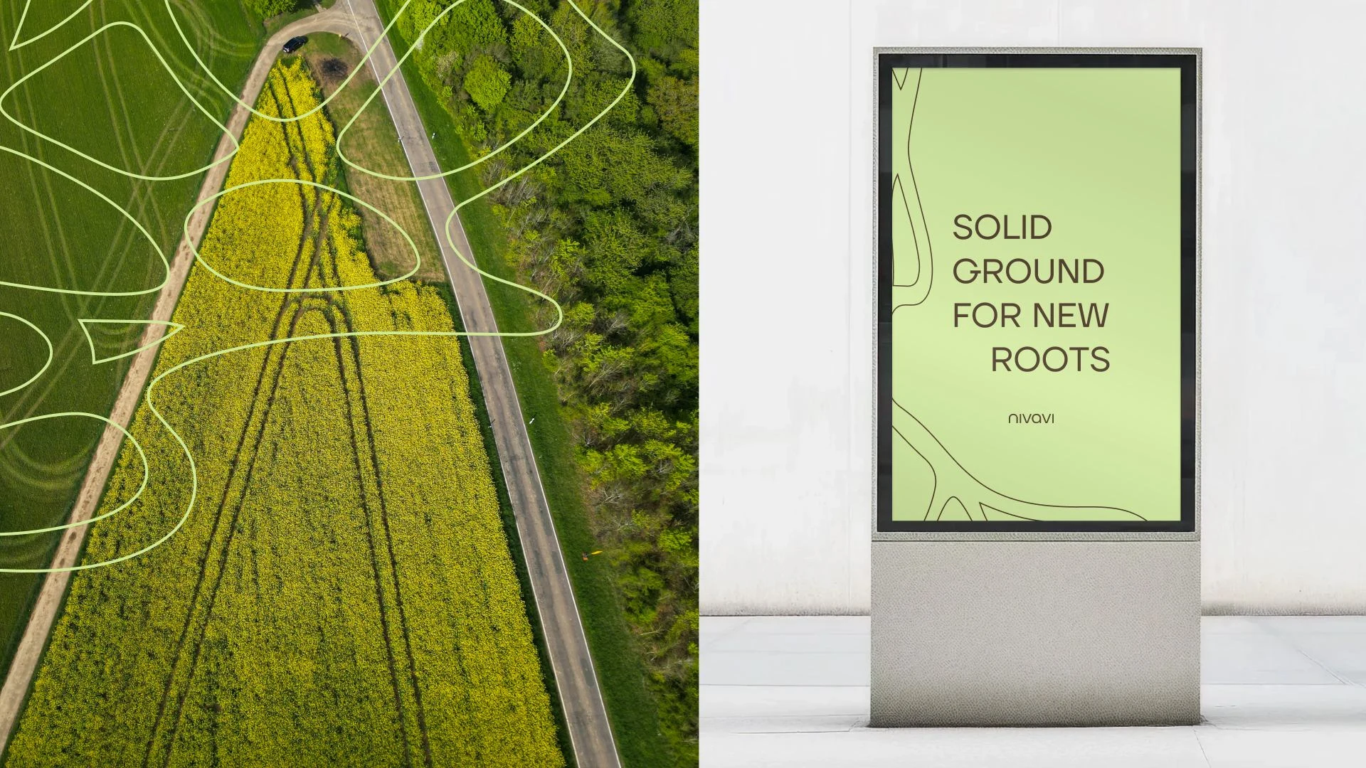
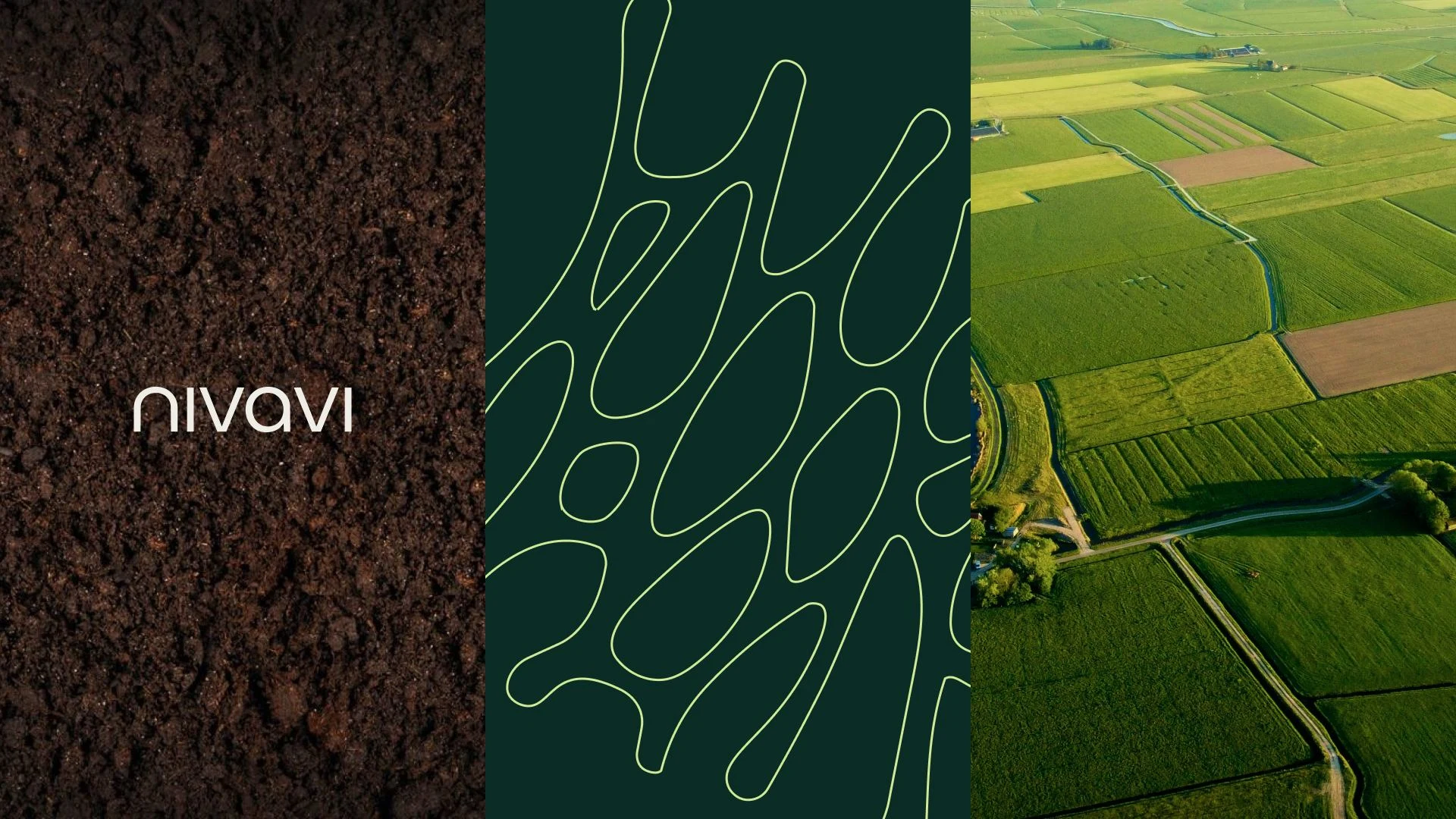
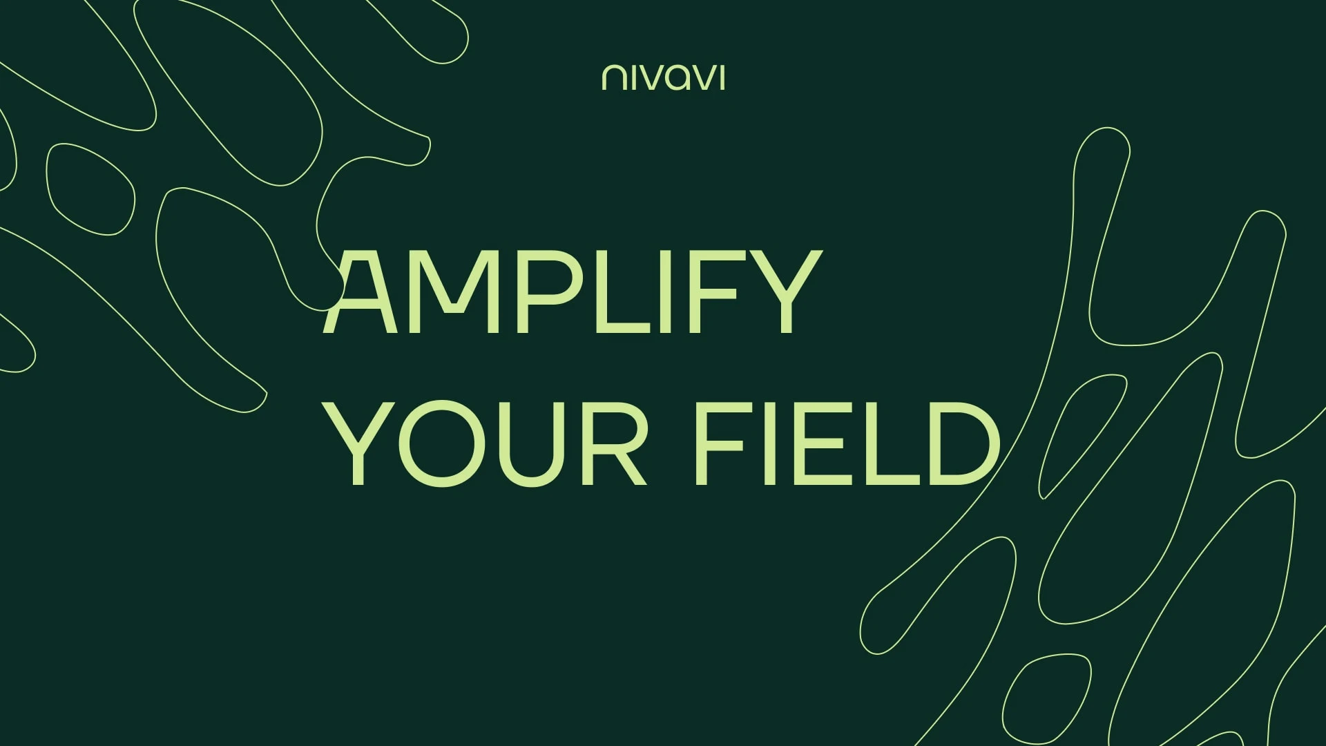
Visual Language
Technology shaped by the land.
Structured field patterns combined with natural tones and clear, confident layouts.
The geometric forms are inspired by farmland seen from above: plots, routes and movement across the field.
Clean shapes symbolise precision, reliability and smart systems.
Natural colors and subtle accents introduce warmth, visibility and energy.
The visual language connects two worlds:
agricultural heritage and technological progress.
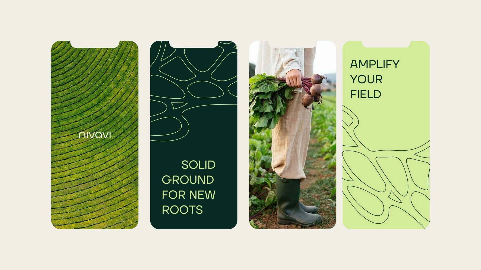
Design System
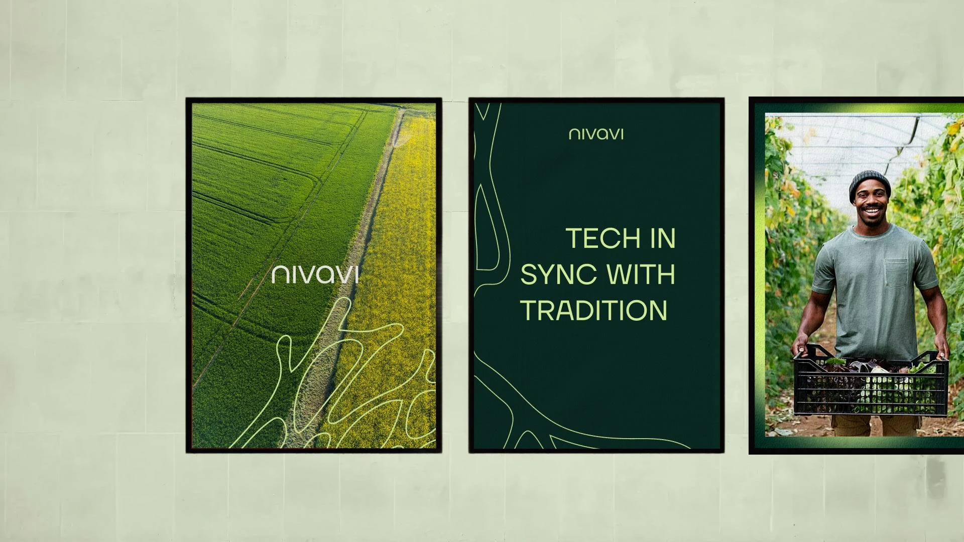
The field-inspired shapes form the foundation of the system.
Used as graphic elements
Integrated into layouts
Applied across digital platforms, presentations and product communication
Everything builds from the same geometric logic.
Patterns connect.
Layouts align.
Visual elements repeat with intention.
The modular system ensures consistency across all touchpoints: from interfaces and presentations to communication in the field.
Structured. Clear. Scalable.
A brand system that reflects the precision and reliability of the technology behind it.
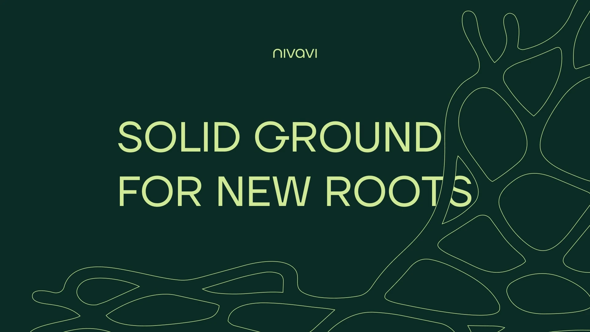
Messaging
The messaging is designed to communicate innovation in a clear and grounded way.
Short, structured statements that translate complex technology into understandable ideas.
Lines work as slide headlines, product communication, and campaign messages.
Every sentence focuses on clarity and practical value.
No unnecessary complexity.
Just technology that makes sense in the field.
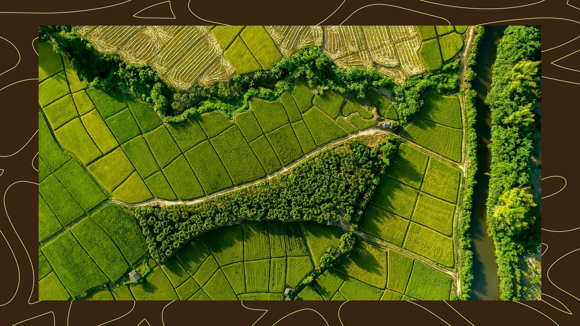
Digital & Social
The digital presence builds on strong typography and modular field-inspired graphics.
Clear layouts, natural colors and strong contrasts ensure immediate readability.
Visual elements reference farmland patterns and routes, reinforcing the connection between technology and the landscape it operates in.
Each communication feels structured, calm and confident — aligned with the brand’s practical and no-nonsense philosophy.
Technology Integration
The technology is communicated through clear, understandable steps.
Observe.
Decide.
Act.
Campaign expressions translate the system into tangible use cases: how autonomy supports daily agricultural work and improves efficiency in the field.
Instead of explaining complex systems, the brand shows how technology works in practice. Through clarity, structure and real agricultural context.
Visual outcome
A clear and scalable brand identity where every element reflects the balance between technology and the land it serves. Structured patterns, natural colors and precise typography create a system that feels confident, modern and grounded. The identity works consistently across digital platforms, presentations, product communication and future applications in the field.
Impact for the client
Nivavi now communicates as an innovative technology company rooted in agriculture. The brand makes complex autonomy understandable and trustworthy, positioning Nivavi as a forward-thinking partner for farmers and the future of autonomous farming.
My reflection
This project shows how agricultural technology can be communicated in a way that feels both progressive and human. By building the visual language directly from the logic of the land, the brand connects innovation with the world it is meant to support.
“Roos exceeded my expectations. I’m really impressed with the result.” - Niels van Vlinsteren, Owner Nivavi
Like this project
Posted Mar 12, 2026
Developed Nivavi's brand identity connecting agriculture with innovation.
Likes
1
Views
17
Timeline
Feb 3, 2026 - Apr 3, 2026