ComfyDays Lingerie

Project: ComfyDays – lingerie brand built around archetypes and storytelling
Challenge: How to create a lingerie identity that feels empowering, playful, and high-end, without falling into clichés of either luxury or fast fashion.
My role: Brand designer & creative strategist. Building the visual identity, brand world, and campaigns from the ground up.


Logo
Minimalist and elegant, designed as a timeless anchor in a brand world that is otherwise expressive and playful.
Typography
A balance between editorial serif fonts for headlines (bold, feminine, high-end) and soft sans-serifs for body copy (accessible and clear).
Color Palette
Soft pastels meet rich tones. Pale pinks, creams, and muted lilacs give lightness and intimacy. Deeper shades like burgundy and midnight add depth, sensuality, and contrast.
Visual Language
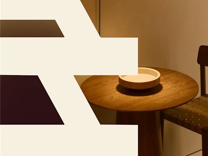
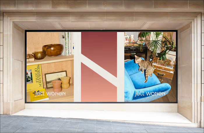
Inspired by archetypes — every design element reflects a “muse.” Modular layouts allow each muse to have its own space while still belonging to one universe.
Tone of Voice
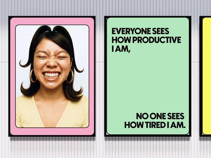
Confident, playful, and inclusive. Short slogans act as brand statements (“Soft can be strong” / “Confidence in comfort”), while longer copy builds an emotional connection to each muse.


Muses
Instead of focusing on one singular woman, ComfyDays introduces “Muses.” Each muse represents a different archetype of femininity: soft, bold, playful, introspective. Together, they create a universe that every customer can identify with.
Imagery
Editorial yet intimate. Photographs highlight natural bodies, textures of fabric, and close-up details. Each muse lives in her own mini-world — a bedroom, a café corner, a sunlit balcony.
Experience
The brand world is not just about lingerie, but about how it makes you feel in your space. Editorial visuals are paired with everyday lifestyle cues, turning ComfyDays into more than a product: a mood, a muse, a lifestyle.


Website: Structured like a magazin, each muse gets her own collection, blending product with editorial storytelling.
Social Media: Short videos, reels, and carousels bring muses to life. Playful archetype quizzes invite interaction.
Packaging: Minimal, tactile, and feminine.


Process & Collaboration
I worked closely with the ComfyDays founders to translate their vision into an identity that feels high-end but also accessible. Together we developed the muse concept, structured the visual world, and built an editorial photography style that makes each archetype tangible.
Result & Impact
The outcome: a brand identity that combines empowerment with playfulness.
The impact: ComfyDays stands apart from mainstream lingerie by telling a story — not about one woman, but about many.
For me, it’s proof that identity can be both editorial and personal, creating a world that customers don’t just buy from, but feel part of.
"I’m going all in with the new branding and I’m sooo happy!! You honestly made my life more fun, and helped me fall in love with my brand all over again. I’m so grateful. LOVE IT." – Maureen, Founder ComfyDays
Like this project
Posted Sep 26, 2025
Developed a unique brand identity for ComfyDays, focusing on empowerment and storytelling.
Likes
14
Views
393
Timeline
Apr 26, 2025 - Jul 6, 2026


