NexHus Tiny Homes
Roos van Gestel
Project: NexHus – rebrand of a Dutch tiny-house brand
Challenge: Translate the philosophy of small living into a complete brand identity that feels architectural, calm, and aspirational.
My role: Brand designer & creative director. From foundations to visual world, giving form to the essence of “living smaller, but richer.”
Foundation & Brand Pillars
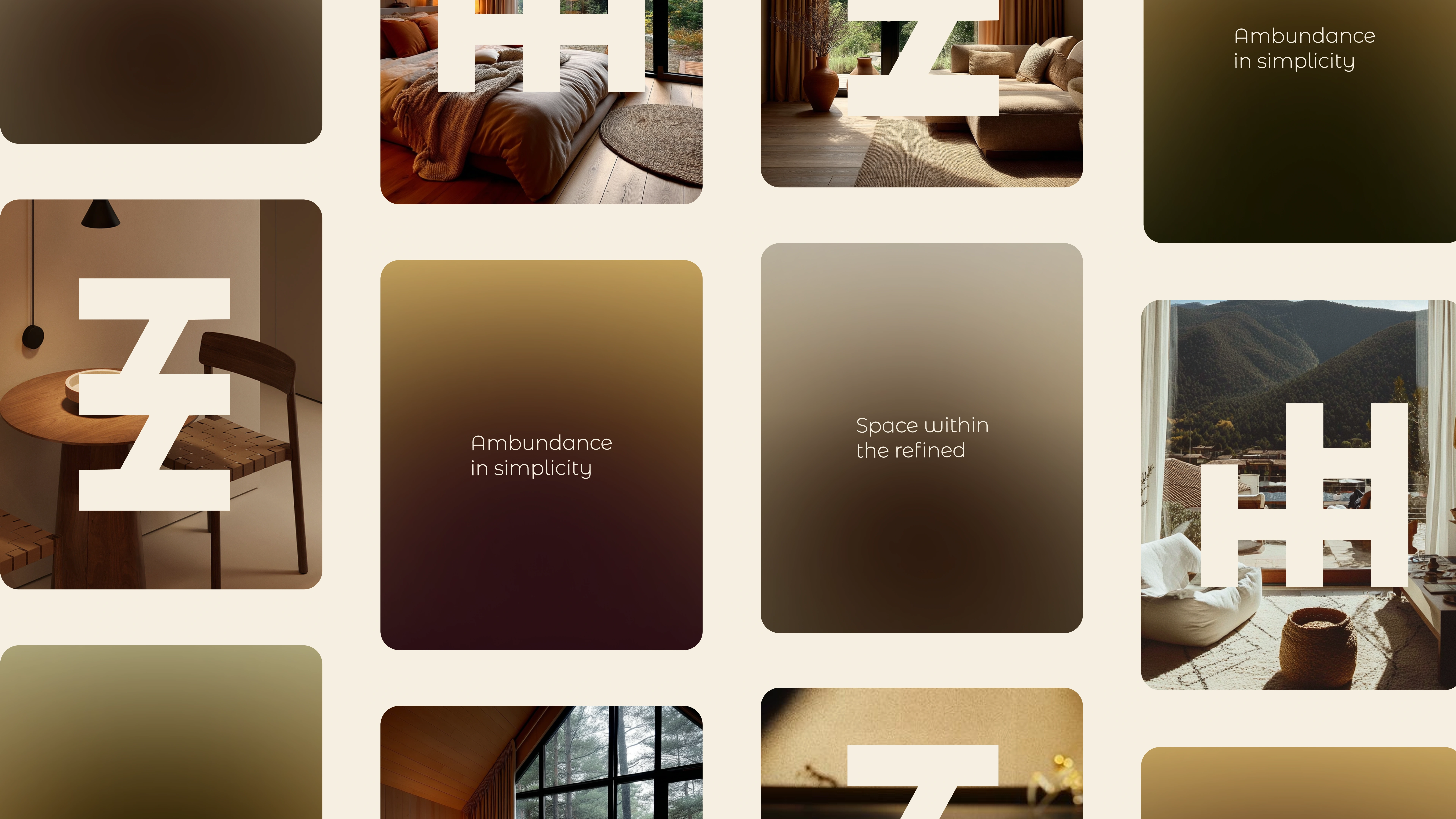
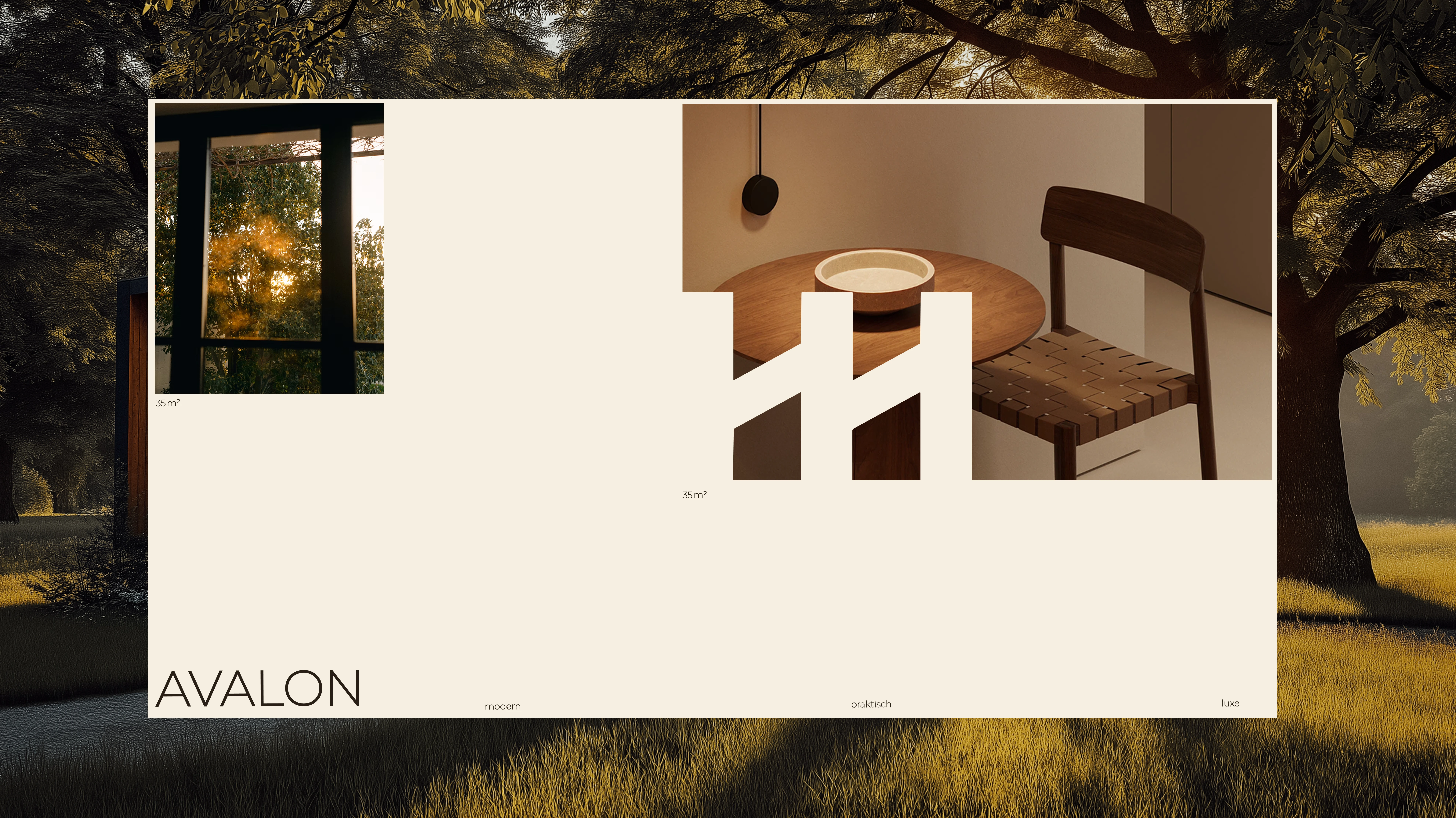
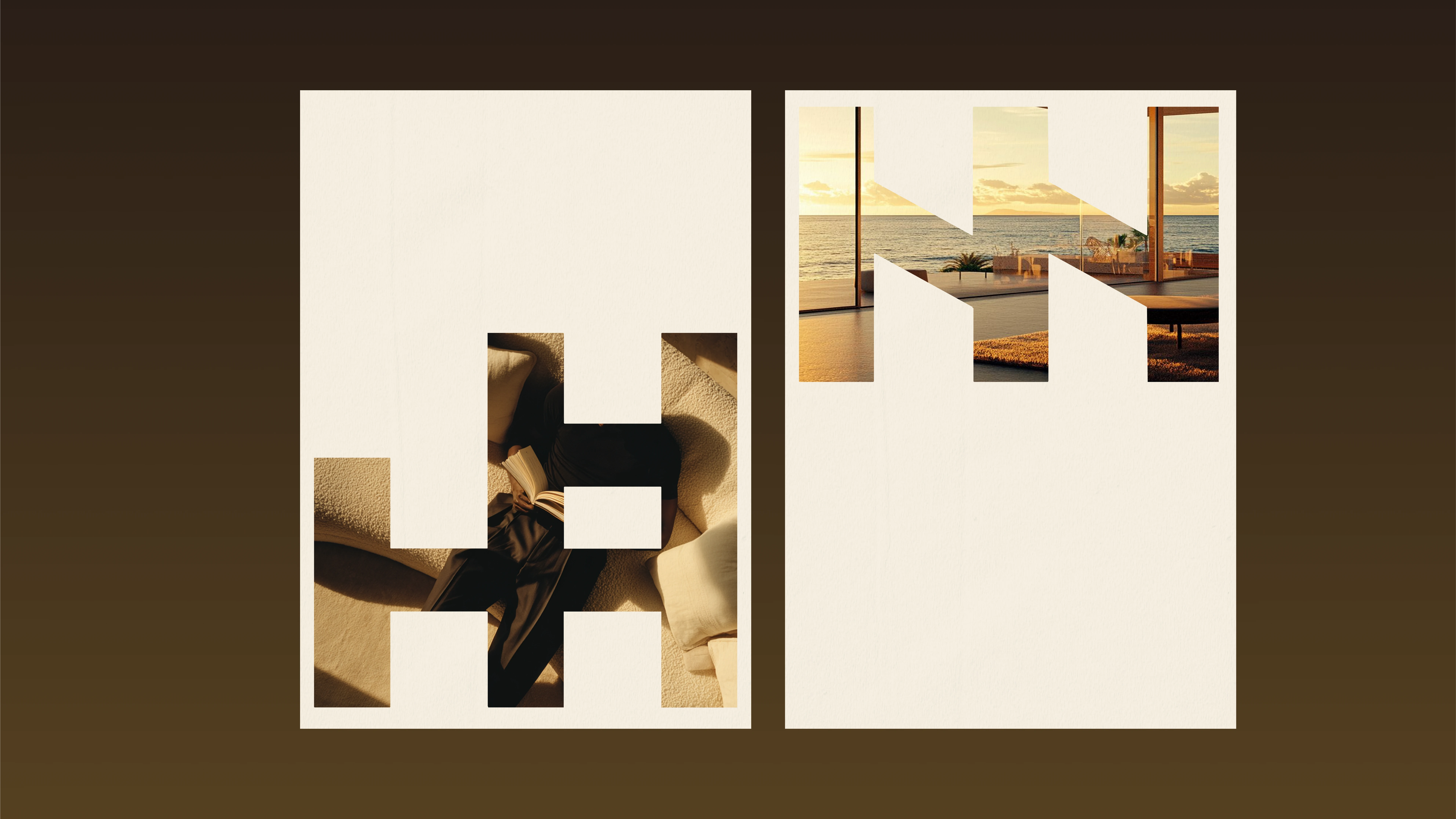
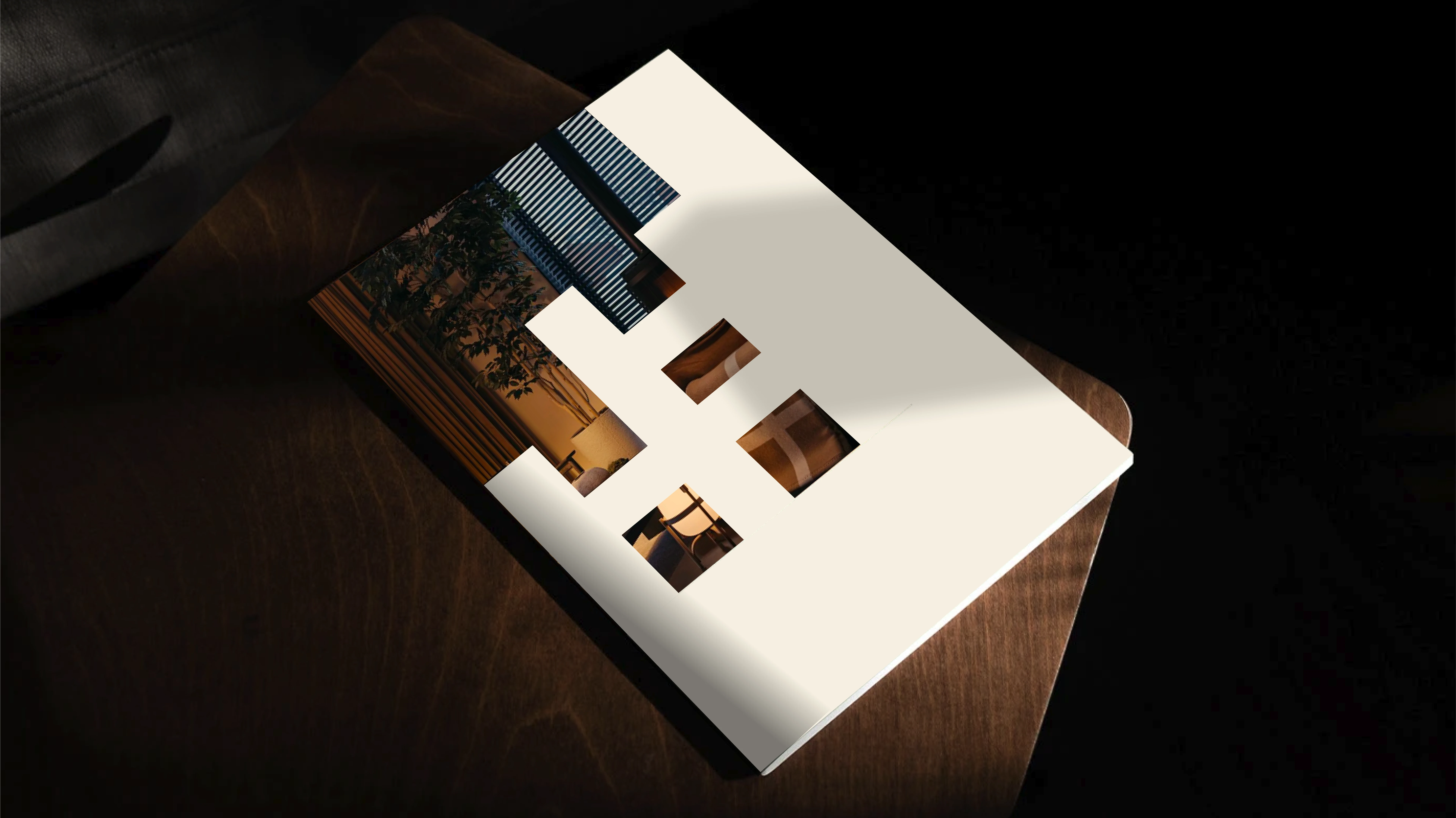
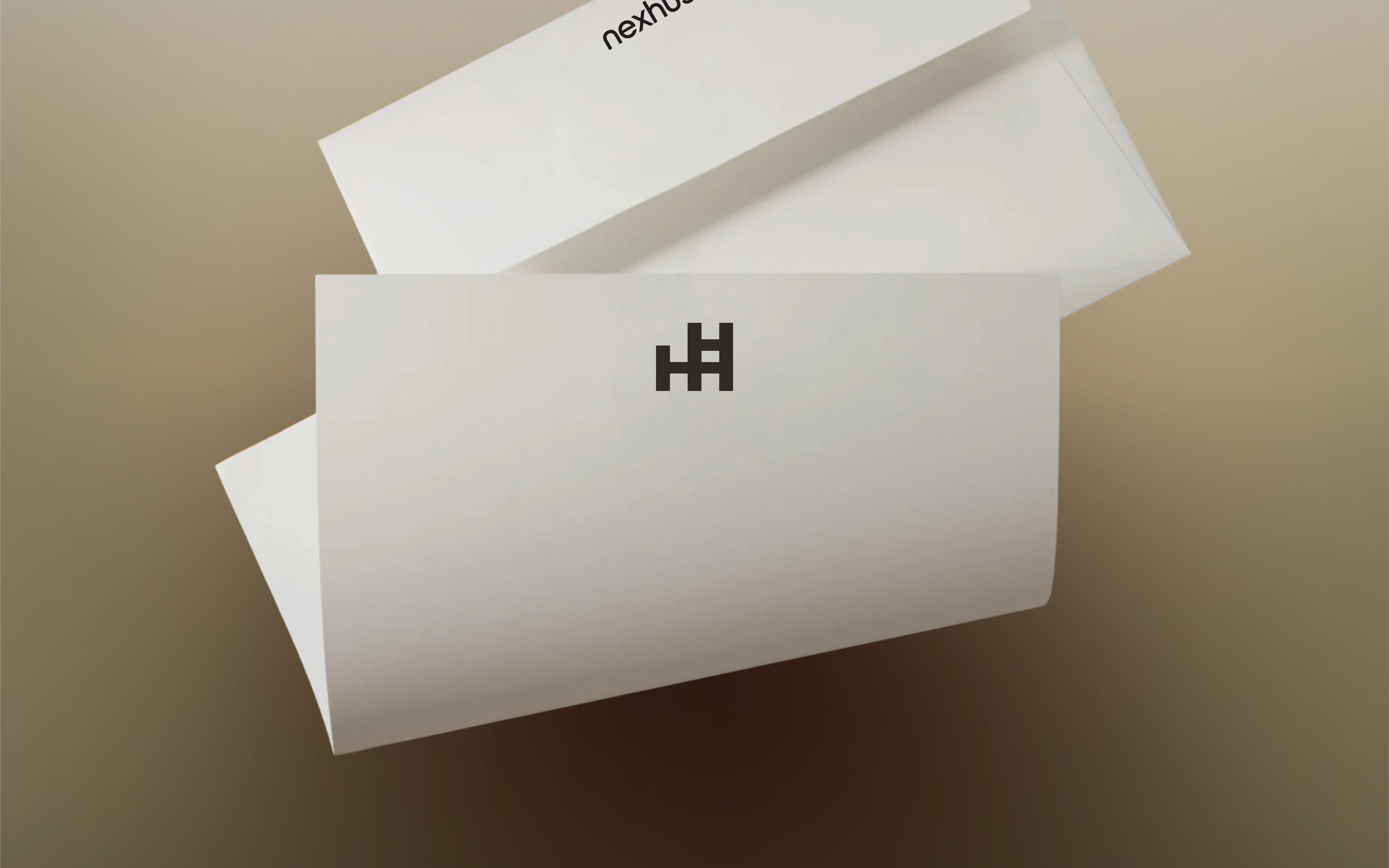
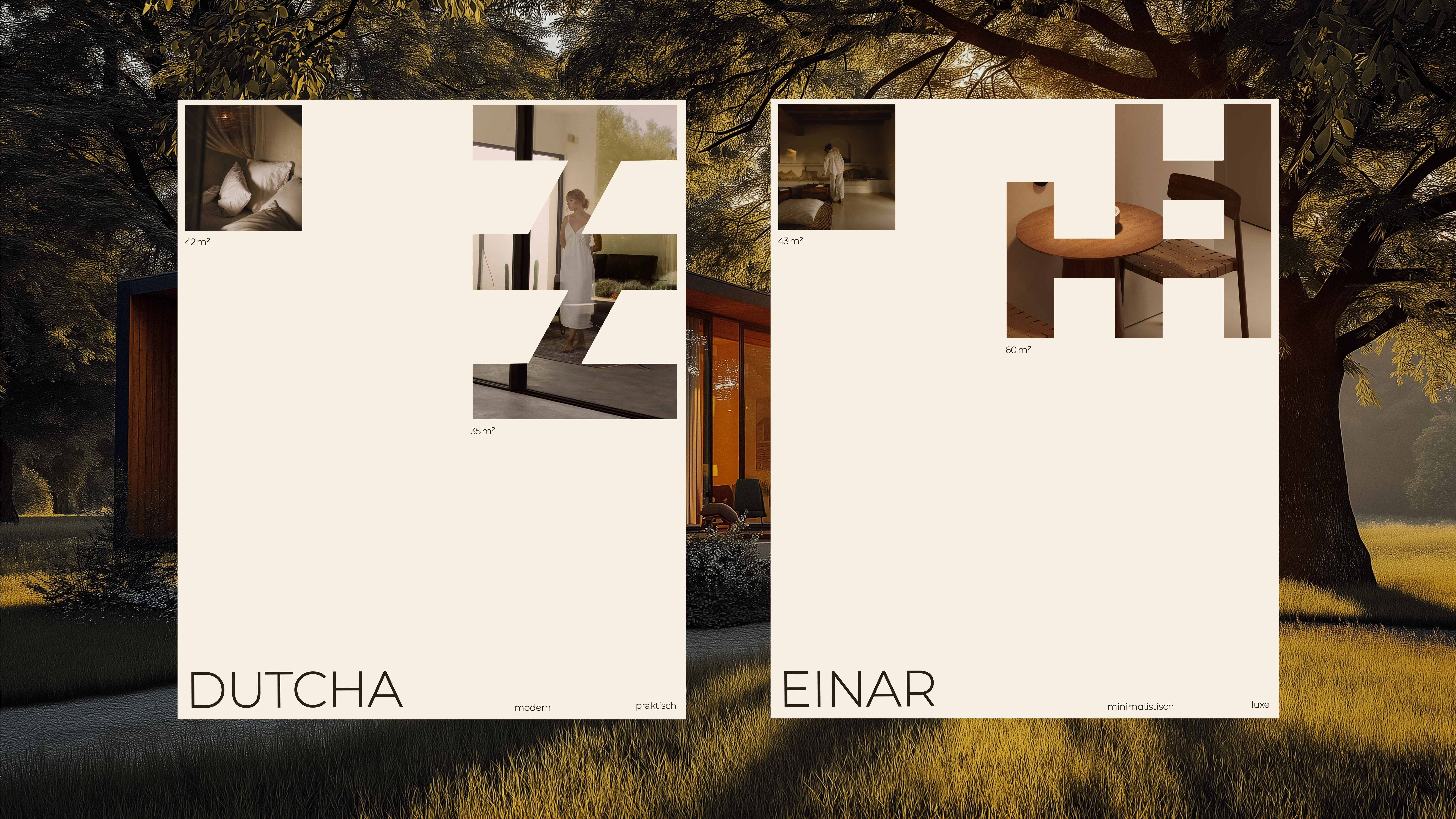
Logo
The logo forms the foundation of the identity. Previously stacked, it is now written out horizontally. This creates calm, adds breathing space, and emphasizes the clarity of the design. Simple, stable, and architectural in its most pure form.
Typography
Headlines use a geometric sans-serif with Scandinavian minimalism — precise and strong. Body text sits in a calm, readable typeface that gives space to content and imagery. Together they create a system that feels both strict and human.
System
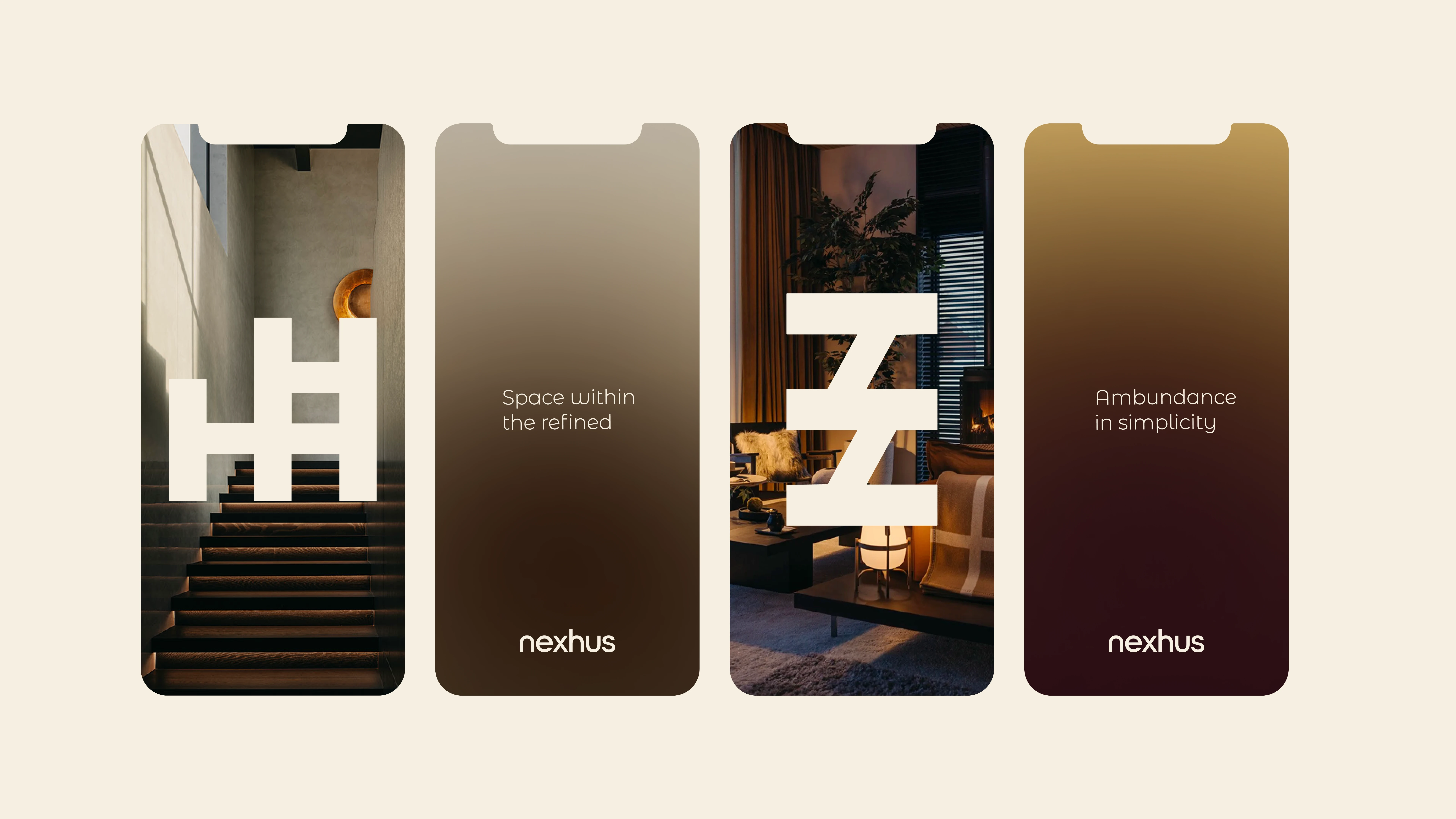
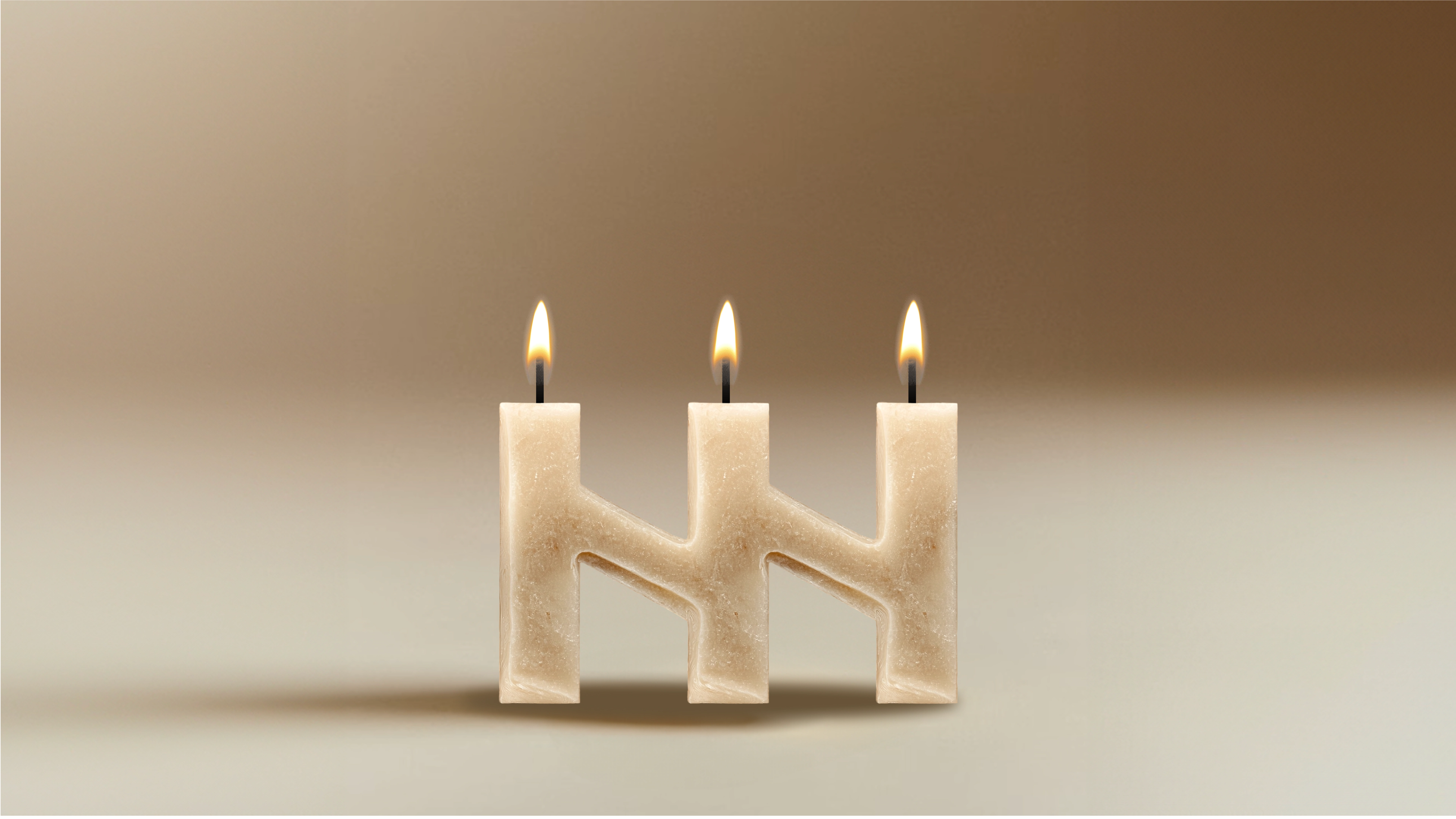
The N and H act as load-bearing walls of the identity. Not just letters, but architectural elements that hold the system together. They open as windows, work as pillars, and create rhythm like the structure of a house. Always bold, always structural.
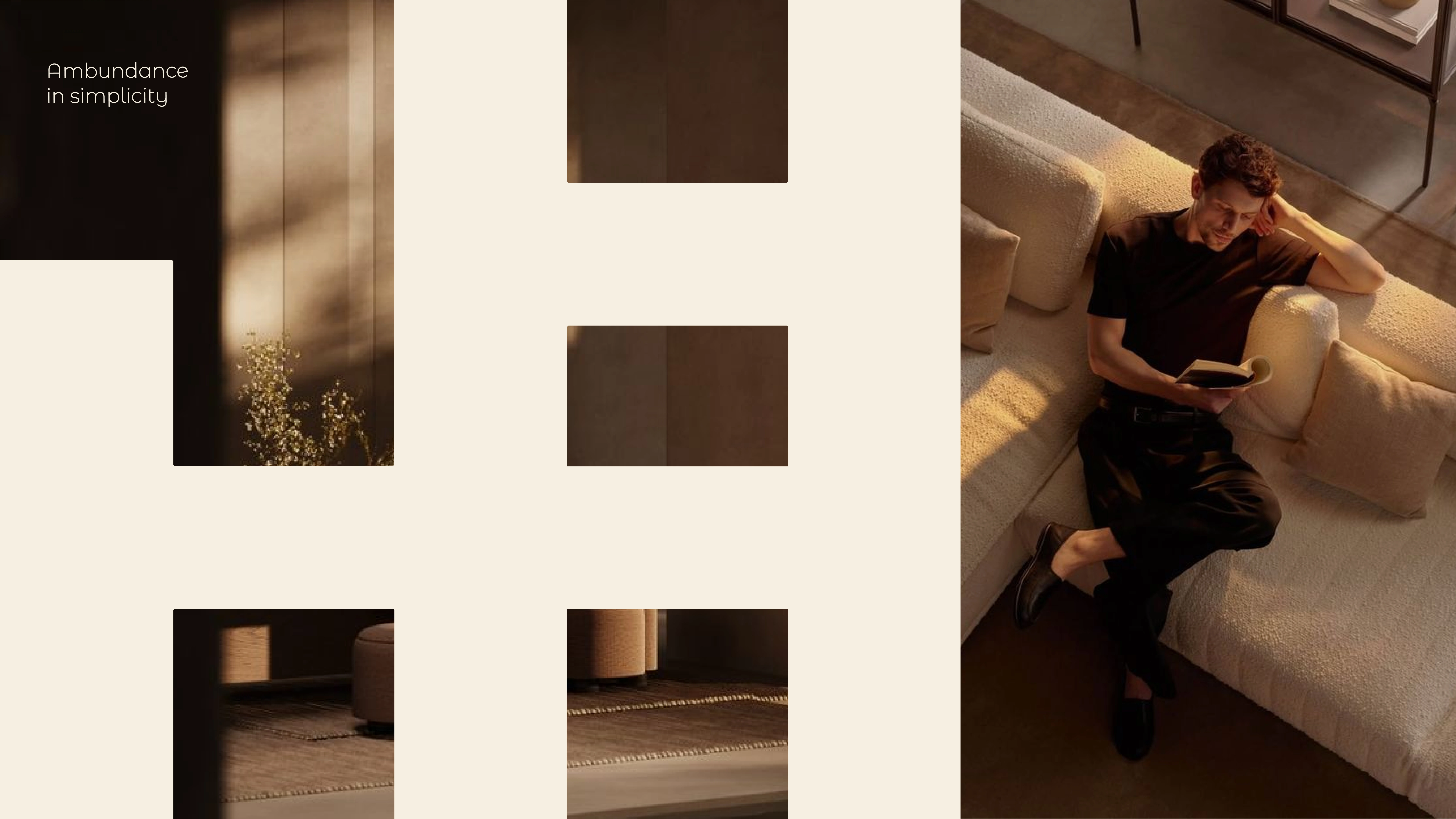
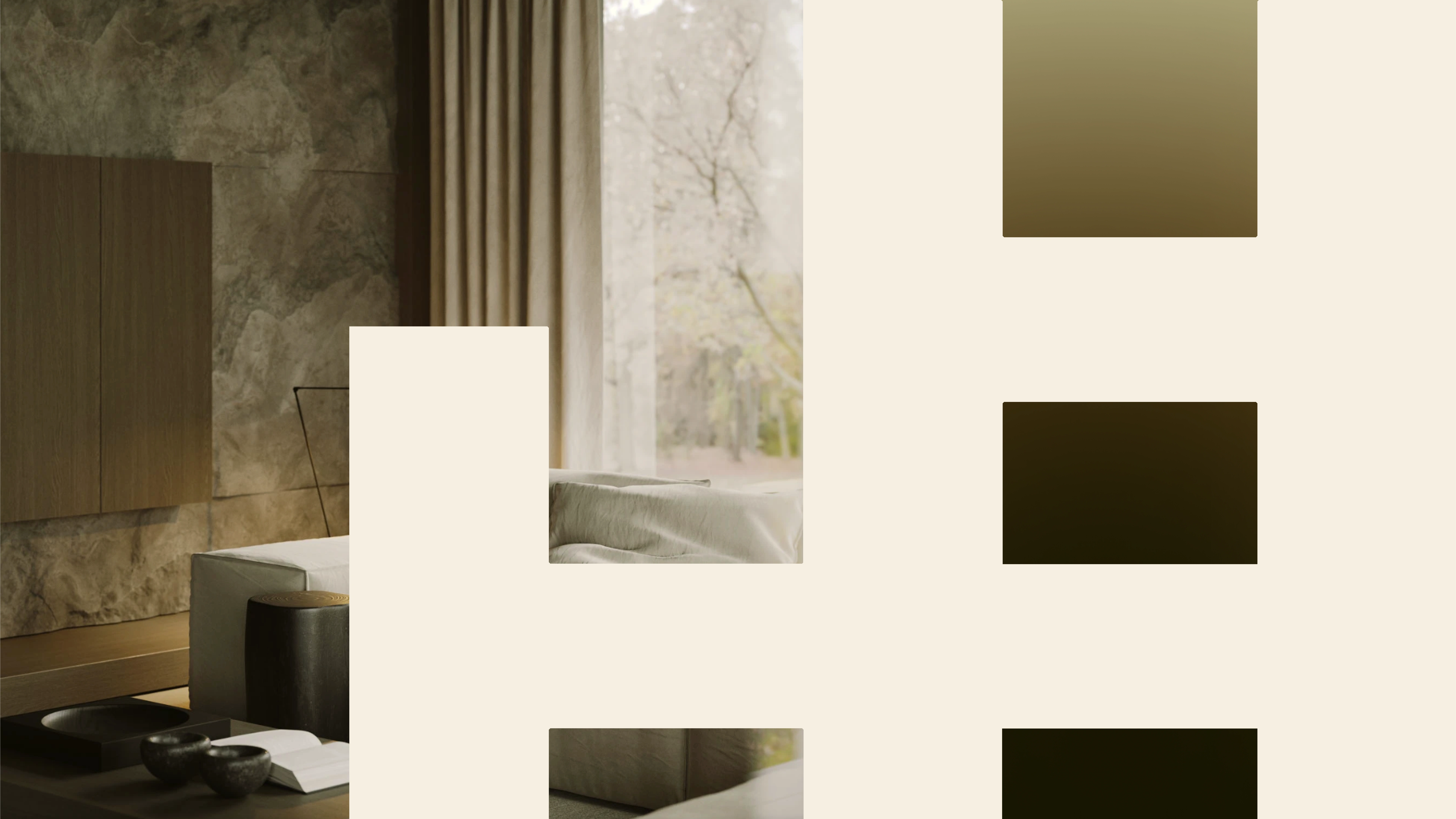
Color Palette
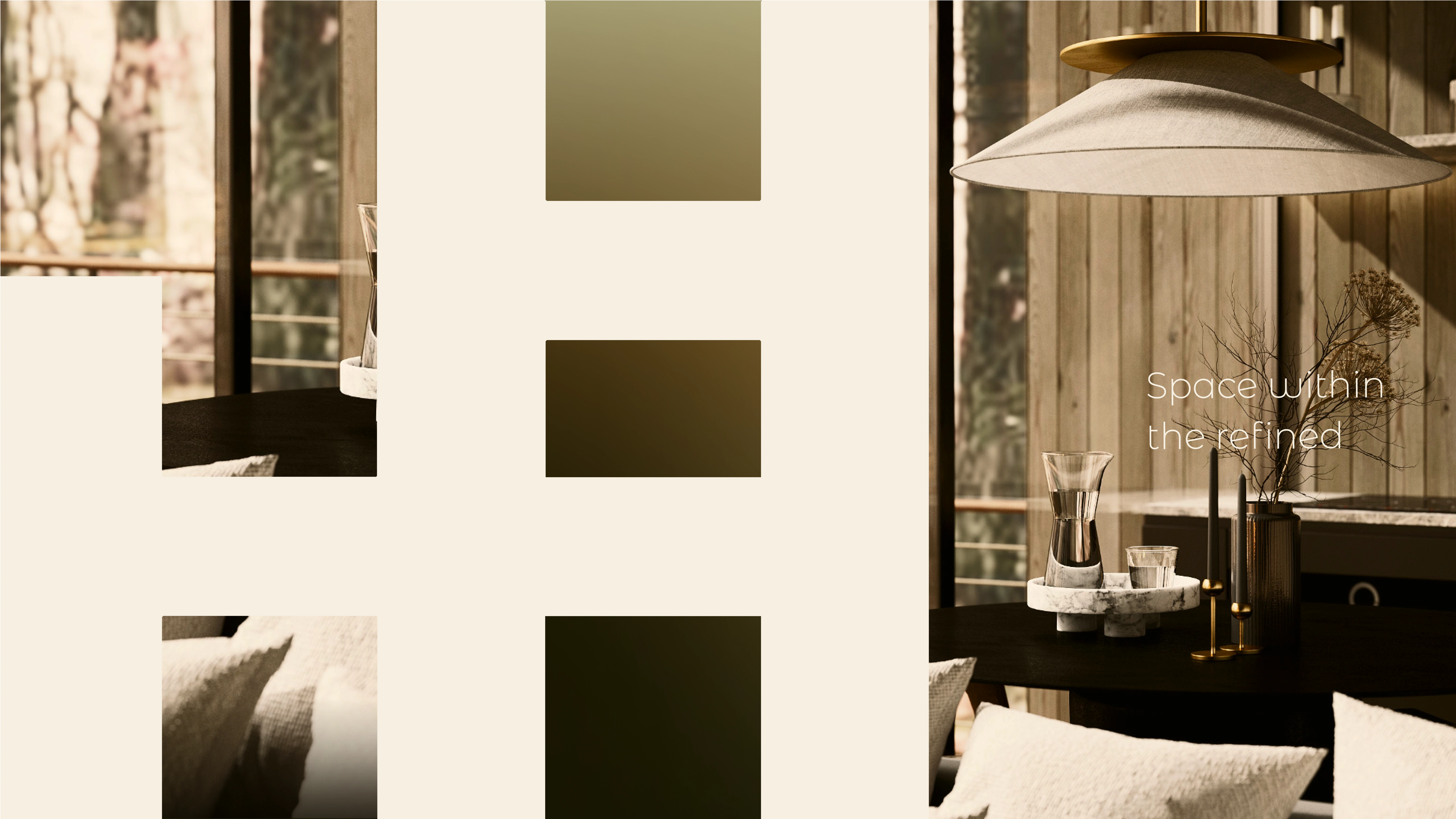
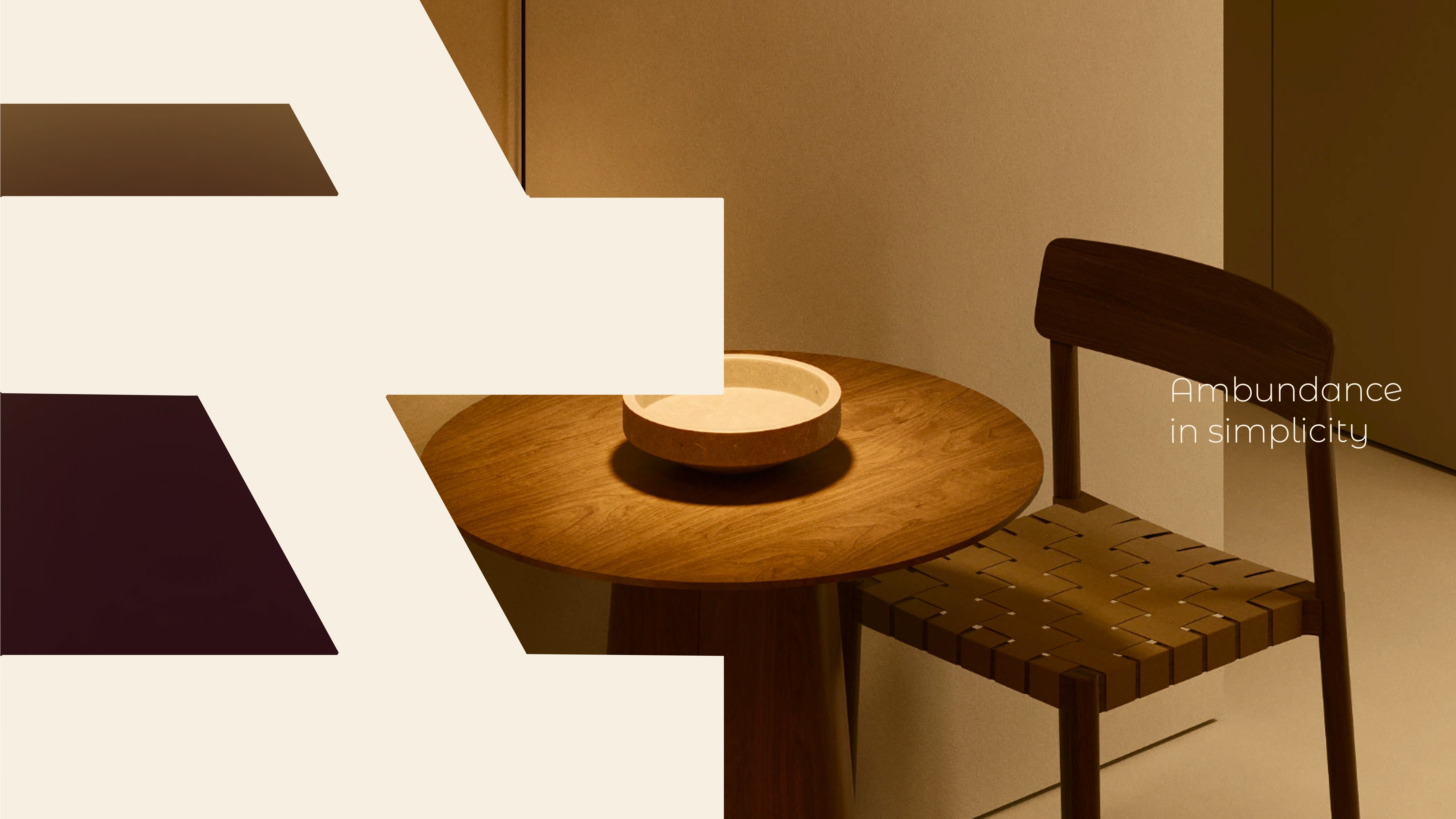
A warm base of sand, ivory, and beige. Contrasted with deep brown, black, and midnight blue for tension and luxury. Subtle gradients add depth, like light shifting into shadow within a space. Calm, earthy, but with character.
Tone of Voice
Language is built in three layers, like architecture:
Layer I – Slogans: short and powerful — “Space within,” “The refined,” “Abundance in simplicity.”
Layer II – Statements: minimal, poetic intros that highlight values (“Less walls, more horizon.”)
Layer III – Copy: atmospheric, longer texts that carry the promise: small living means more. More horizon, more rest, more connection.
Strategic Concept & Visual Direction
Imagery
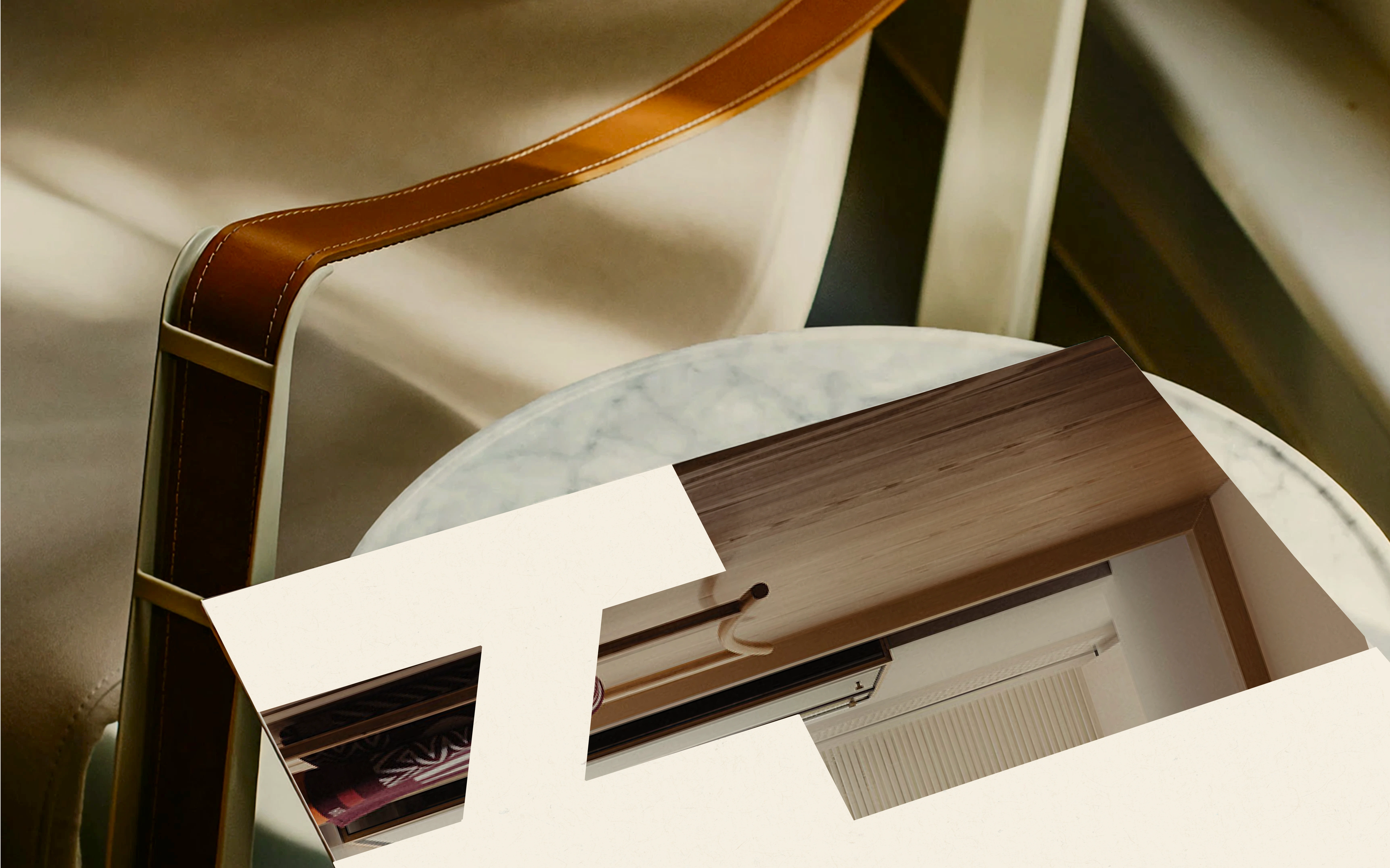
Not documentation of an object, but the experience of living. Always in soft light that opens spaces and makes materials tactile. Close-ups show wood, linen, and stone; wide shots open the horizon. Calm, inviting, human.
Essence
NexHus is not about living bigger, but about living richer. Each house becomes a window to freedom: moving with the seasons, connecting with the horizon, where walls disappear.
Campaign & Expressions
Website & Digital: A modular system where logo, colors, and form language come together into a calm architectural grid.
Socials & Print: Every card, post, or layout is part of the same system. Always recognizable, always serene.
Spatial Branding: The N and H function as architectural frames in physical spaces, reinforcing the brand world.
Result & Impact
The outcome: a brand identity with clarity and depth, grounded in architecture but alive in every medium.
The impact: NexHus now speaks consistently across channels, making “small living” feel aspirational, human, and free.
The identity is strong enough to carry the brand forward, modular enough to adapt as NexHus grows.
"The branding feels strong and consistent. Compliments for the clear visual style — it reflects NexHus beautifully." – NexHus Team
Like this project
Posted Sep 12, 2025
Rebranded tiny home brand NexHus with a minimal, architectural identity that makes small living feel bigger, richer, and more aspirational.
Likes
12
Views
66
Timeline
Aug 22, 2025 - Sep 11, 2025