NextGenSociety Brand Identity Development
Roos van Gestel
Challenge
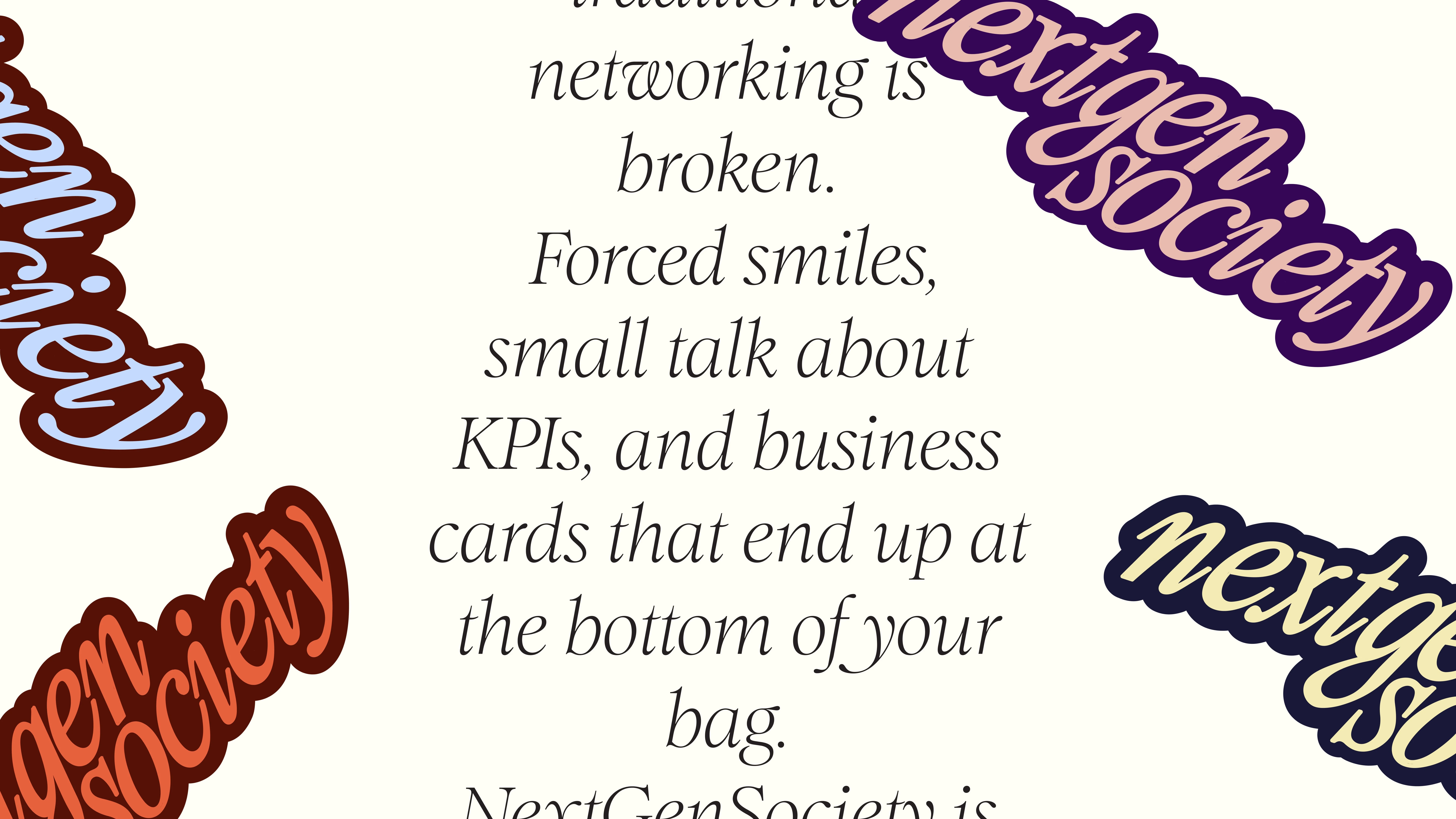
NextGenSociety is a new generation networking platform designed to move away from traditional, formal business clubs. The challenge was to create a brand that feels energetic, cultural, and contemporary while still maintaining credibility and ambition. The identity needed to reflect a community of driven young professionals without falling into corporate clichés or typical networking aesthetics.
My role
Brand designer & art director. I developed a bold and expressive visual identity that reframes networking as something dynamic, social, and human. Through distinctive typography, flexible color combinations, and a playful graphic language inspired by cards and stickers, the brand creates a recognizable system that feels confident, contemporary, and community-driven.
Foundation & Brand Pillars
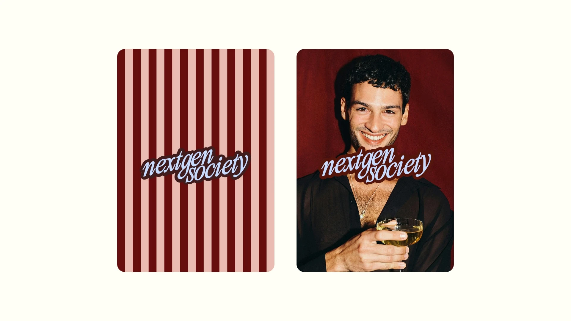
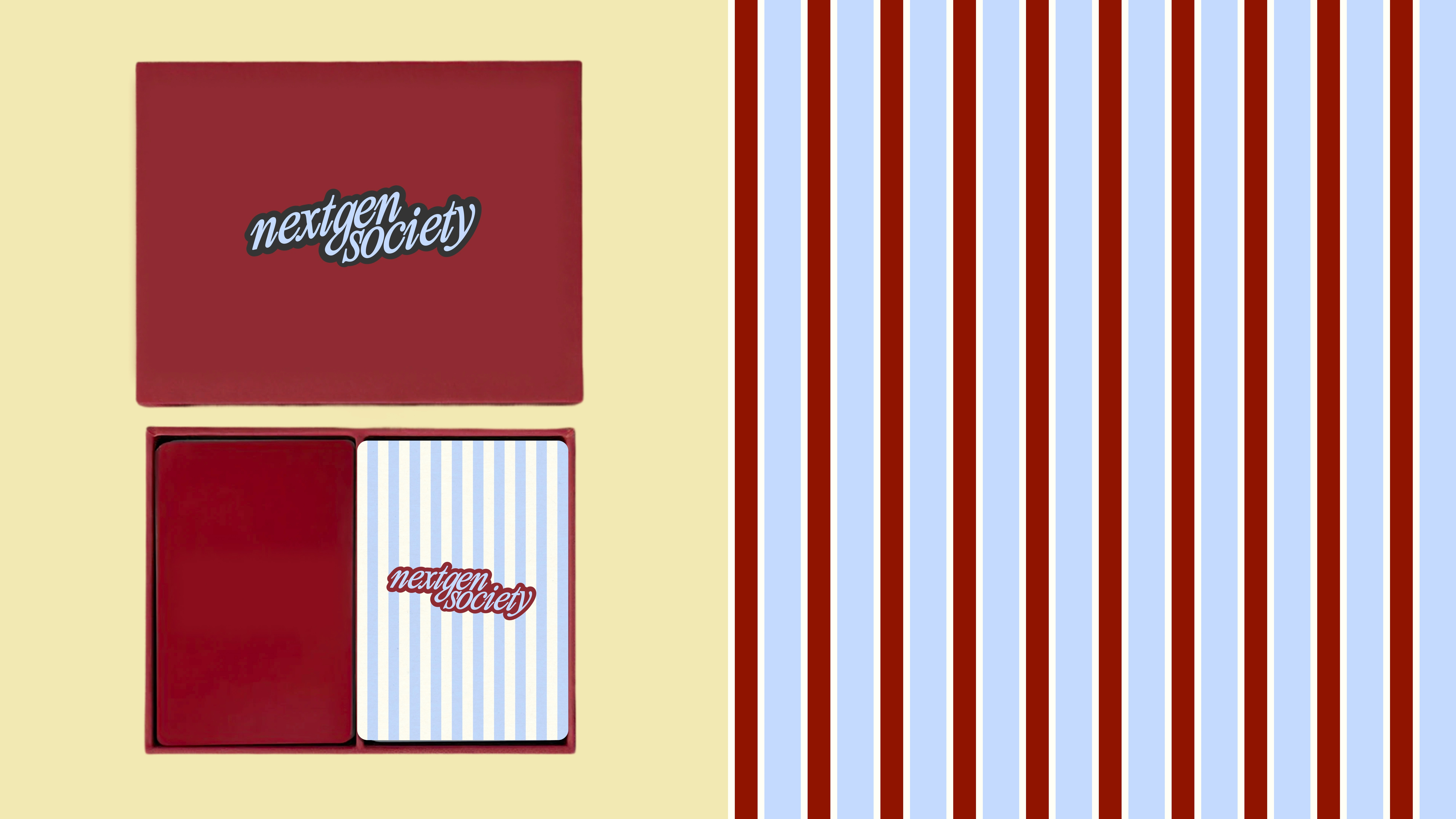
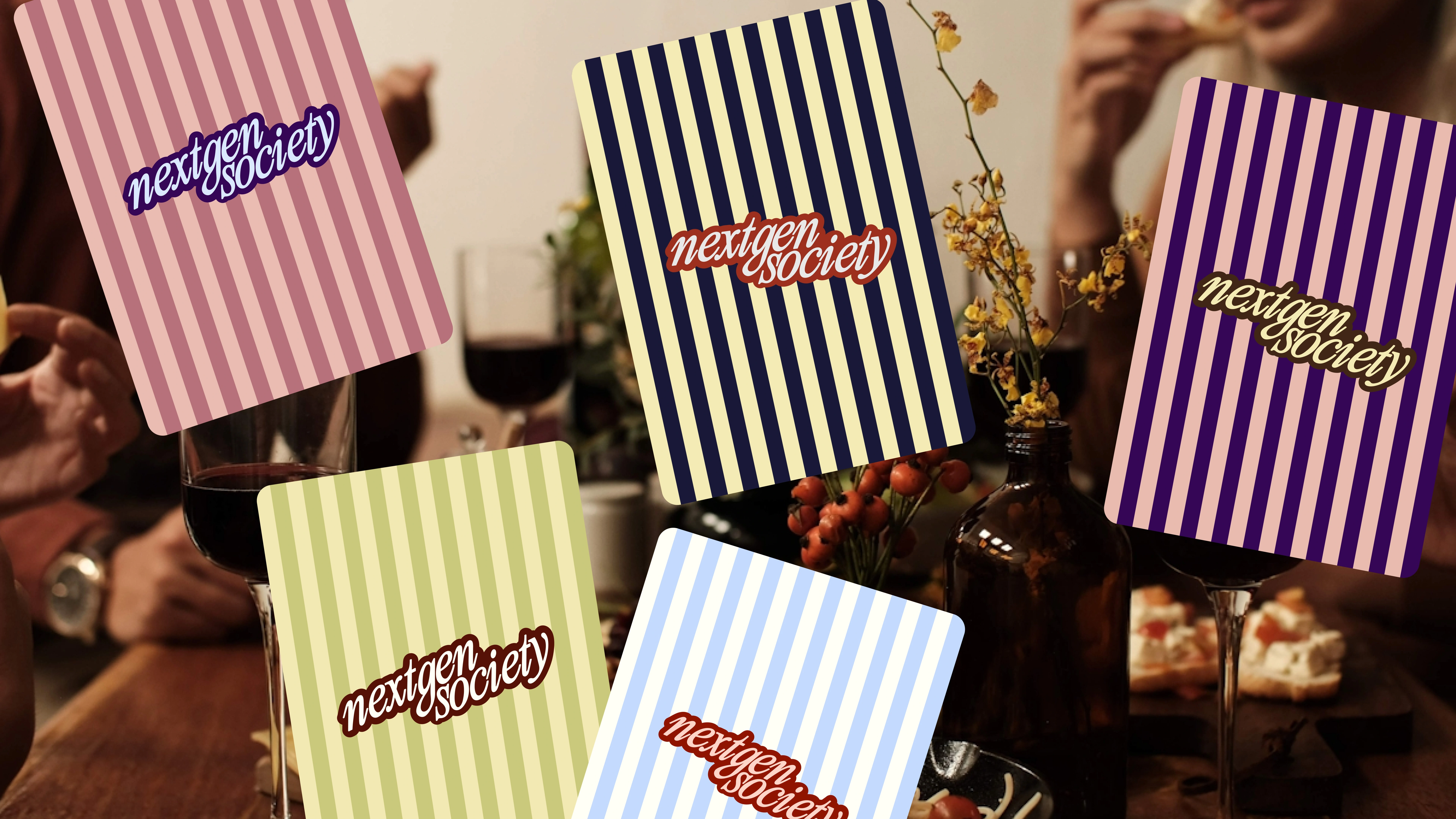
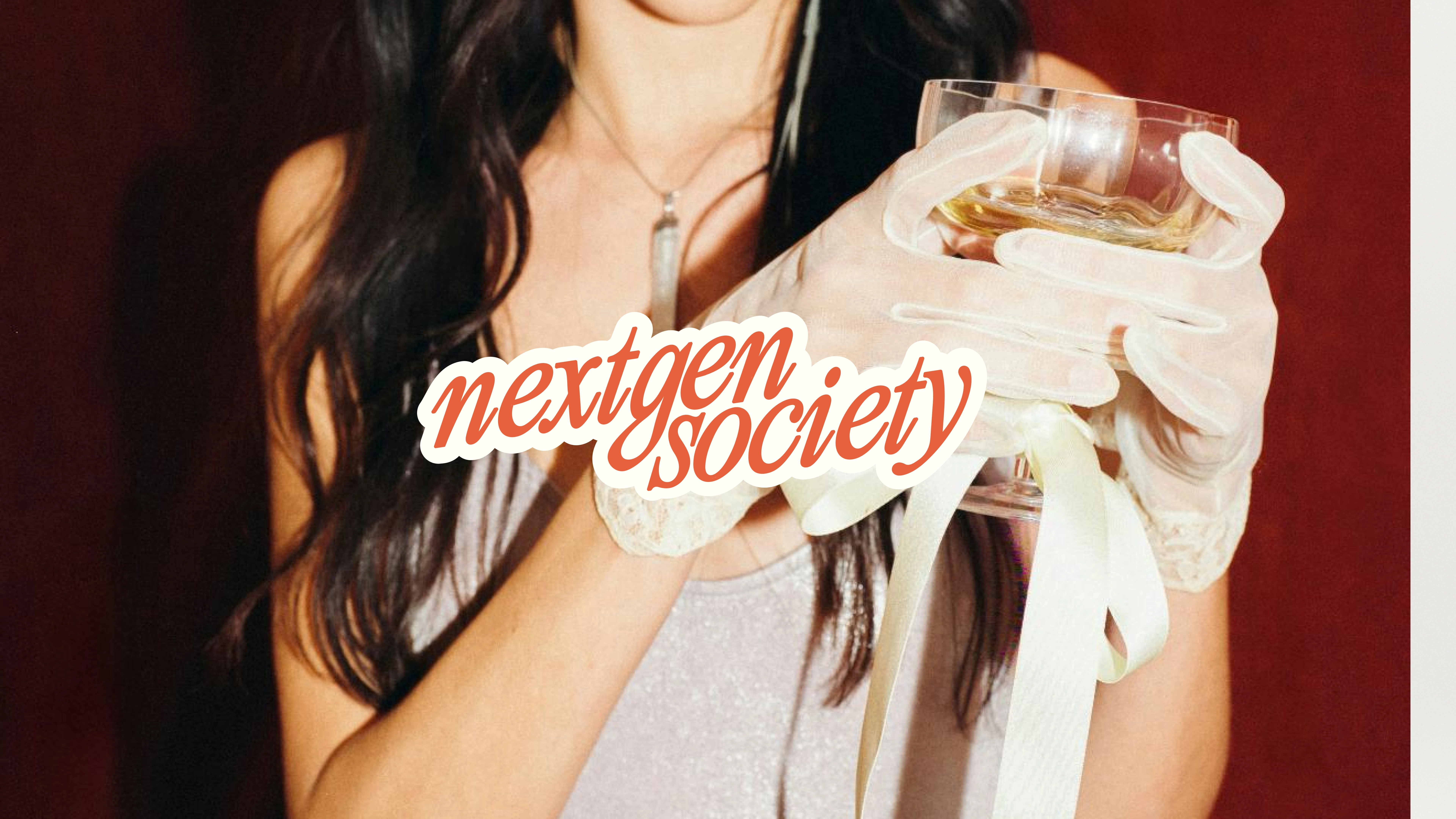
Logo
A bold wordmark designed to feel expressive and immediate.
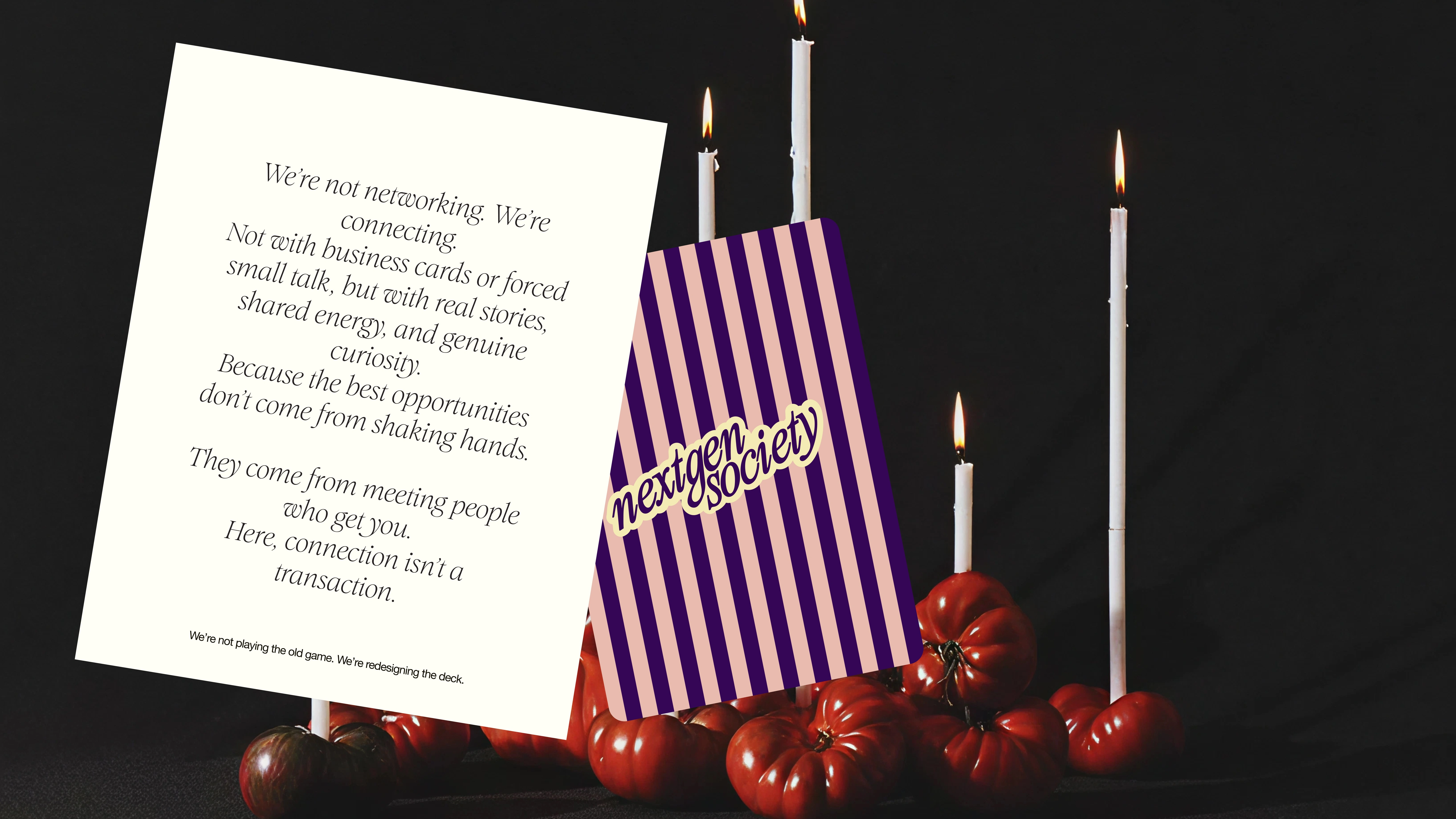
The NextGenSociety logo leans slightly forward, giving it a sense of movement and energy. The angled form feels almost like a sticker placed on top of the world around it: confident, visible, and slightly rebellious.
It reflects a generation that doesn’t wait to be invited in, but creates its own space. The mark is designed to remain strong across formats: from social posts and event materials to merchandise and spatial applications.
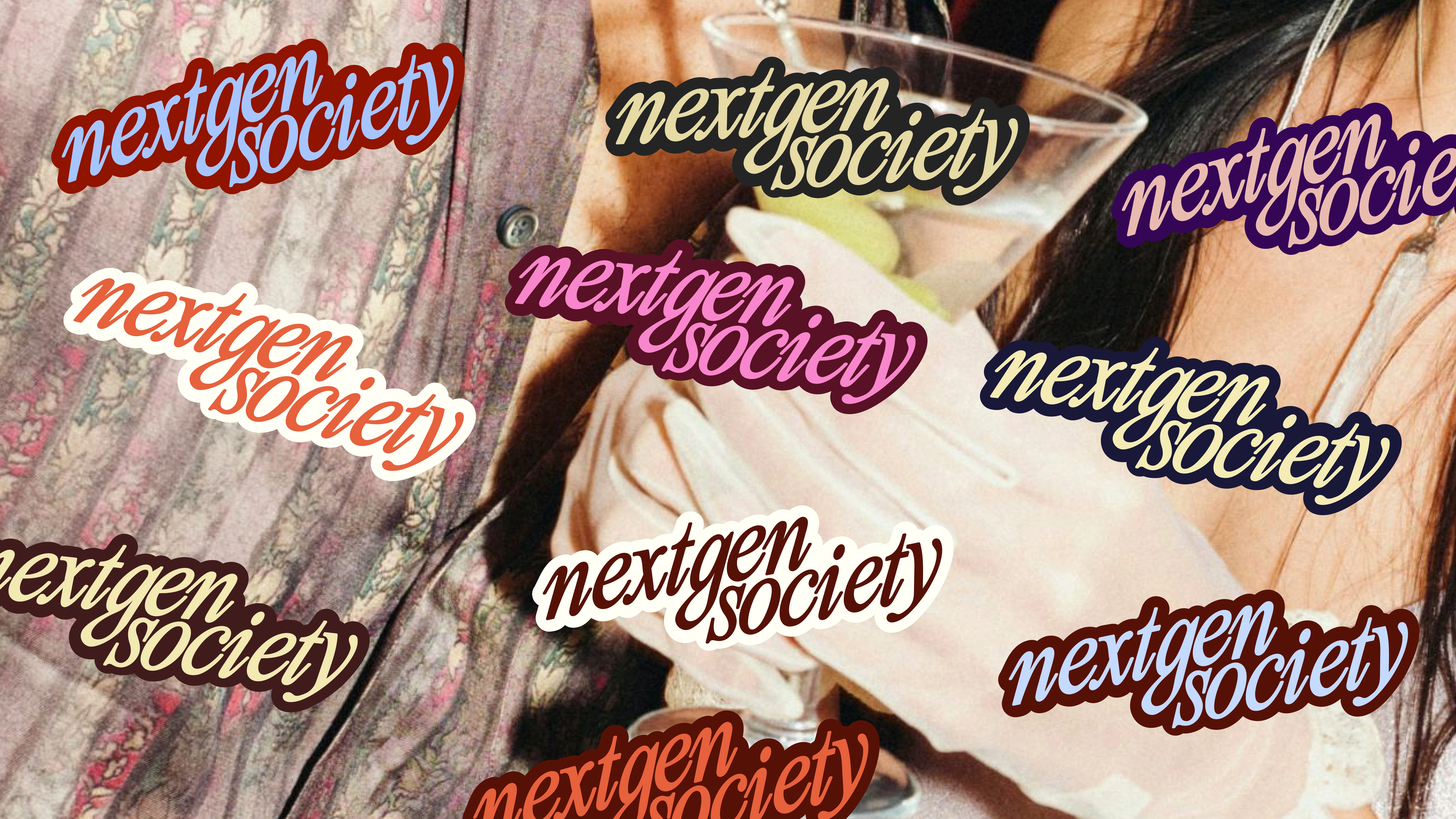
Color Palette
The palette balances classic and contemporary tones.
A strong black-and-white base keeps the identity sharp and confident, while vibrant accent colors introduce energy and cultural relevance.
This combination reflects the brand’s position between two worlds:
ambitious and professional, but young and culturally aware.
The colors allow the brand to feel flexible and expressive across different contexts — from events and digital platforms to community communication.
Typography & Voice
The typography combines contrast and character.
A distinctive display typeface adds personality and attitude, while a clean grotesque supports clarity and structure in longer texts and digital environments.
Together they create a typographic system that feels both cultural and professional.
The tone of voice is direct, energetic and slightly provocative.
Confident, but never corporate.
Short lines.
Clear ideas.
Strong statements.
Examples:
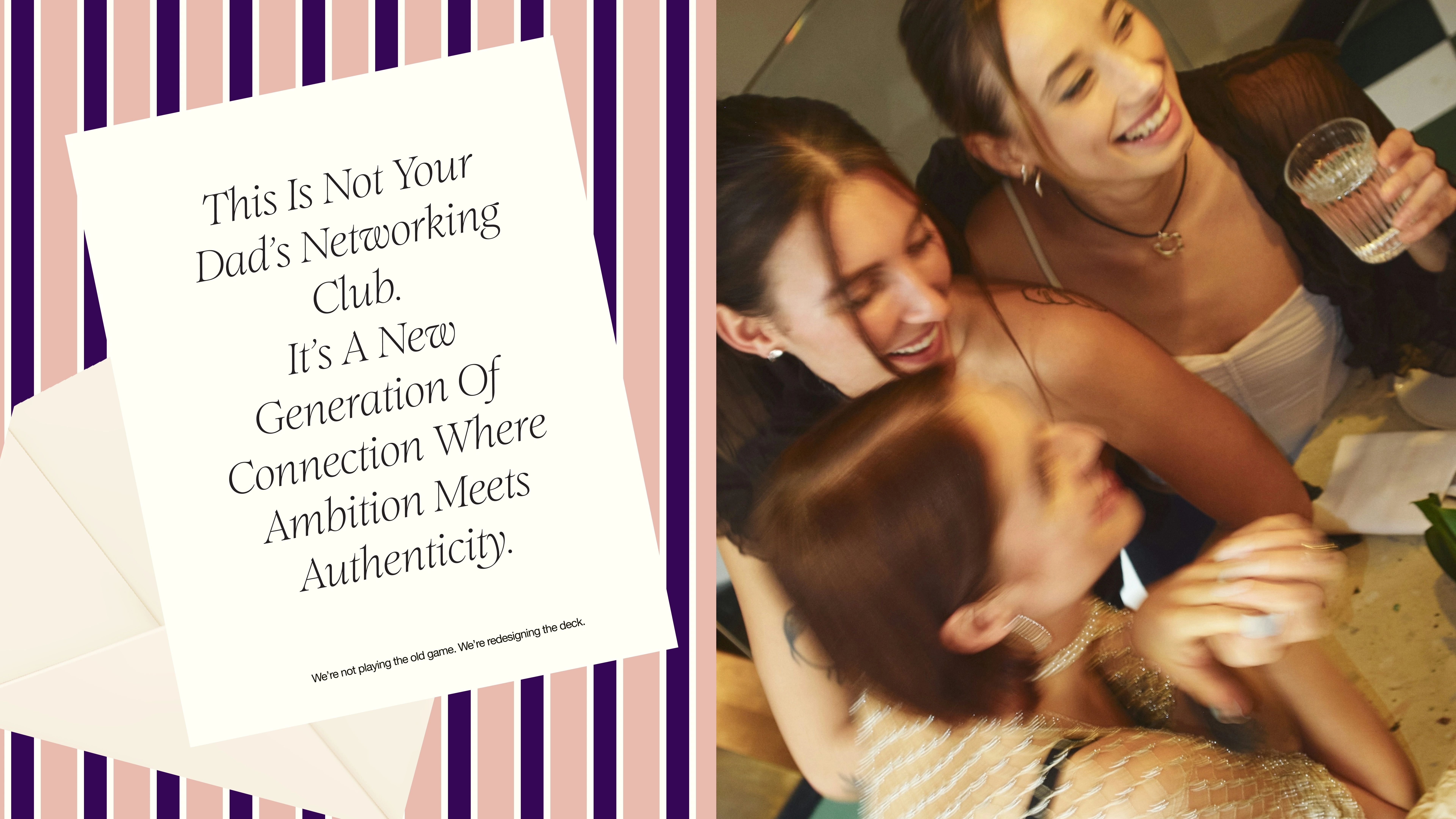
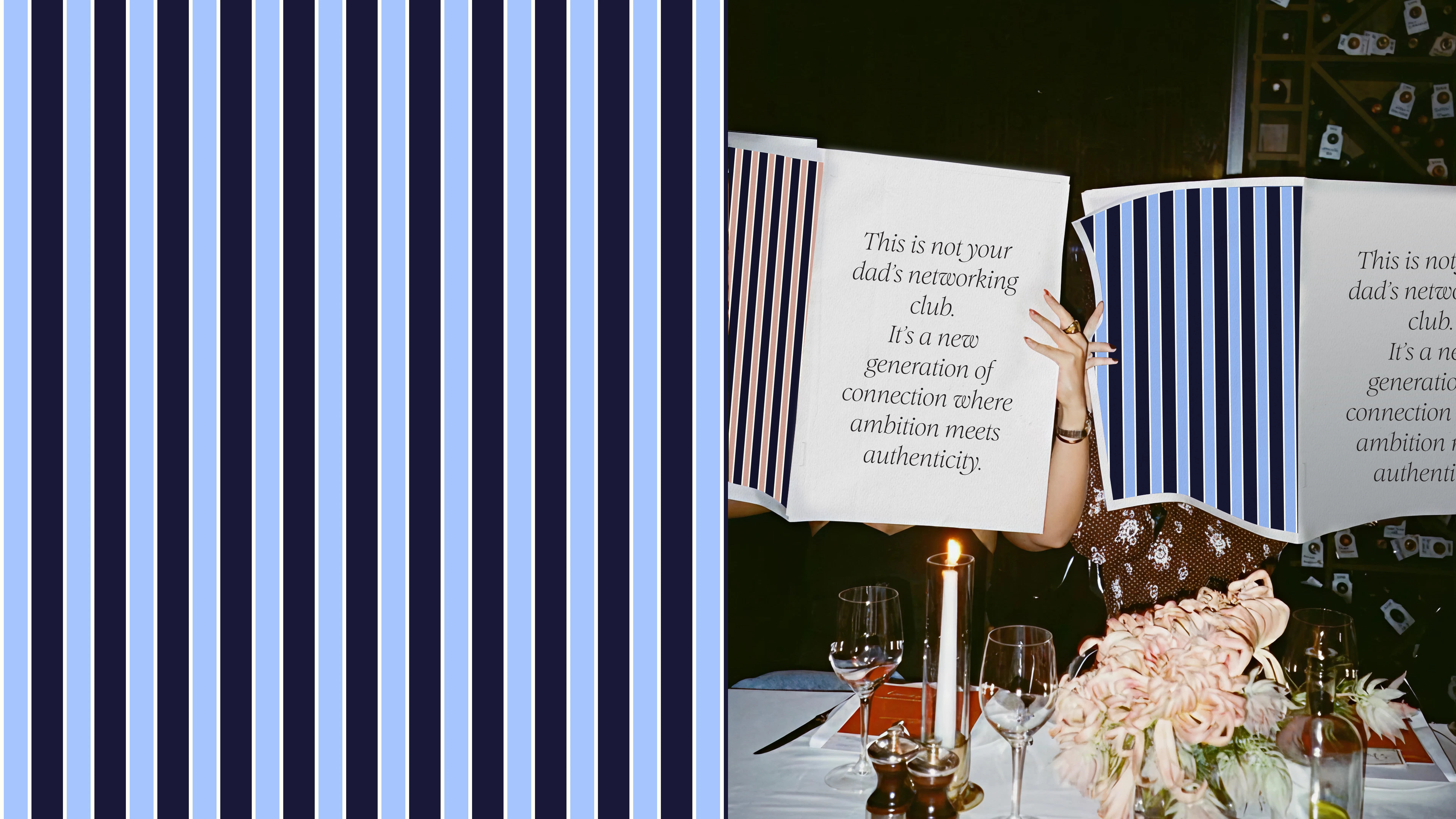
“This is not your dad’s networking club.”
“New generation. New rules.”
“Meet the people building what’s next.”
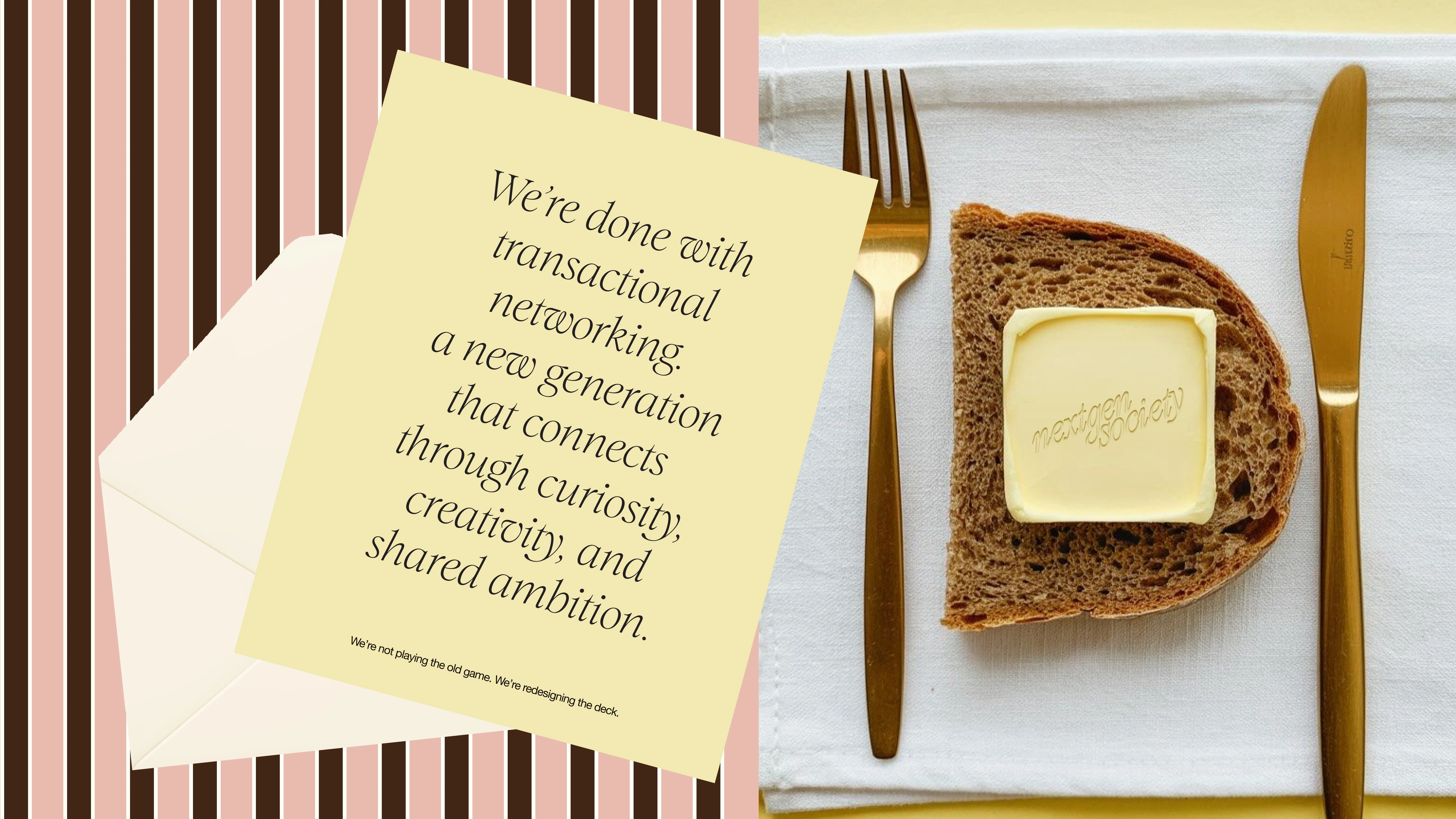
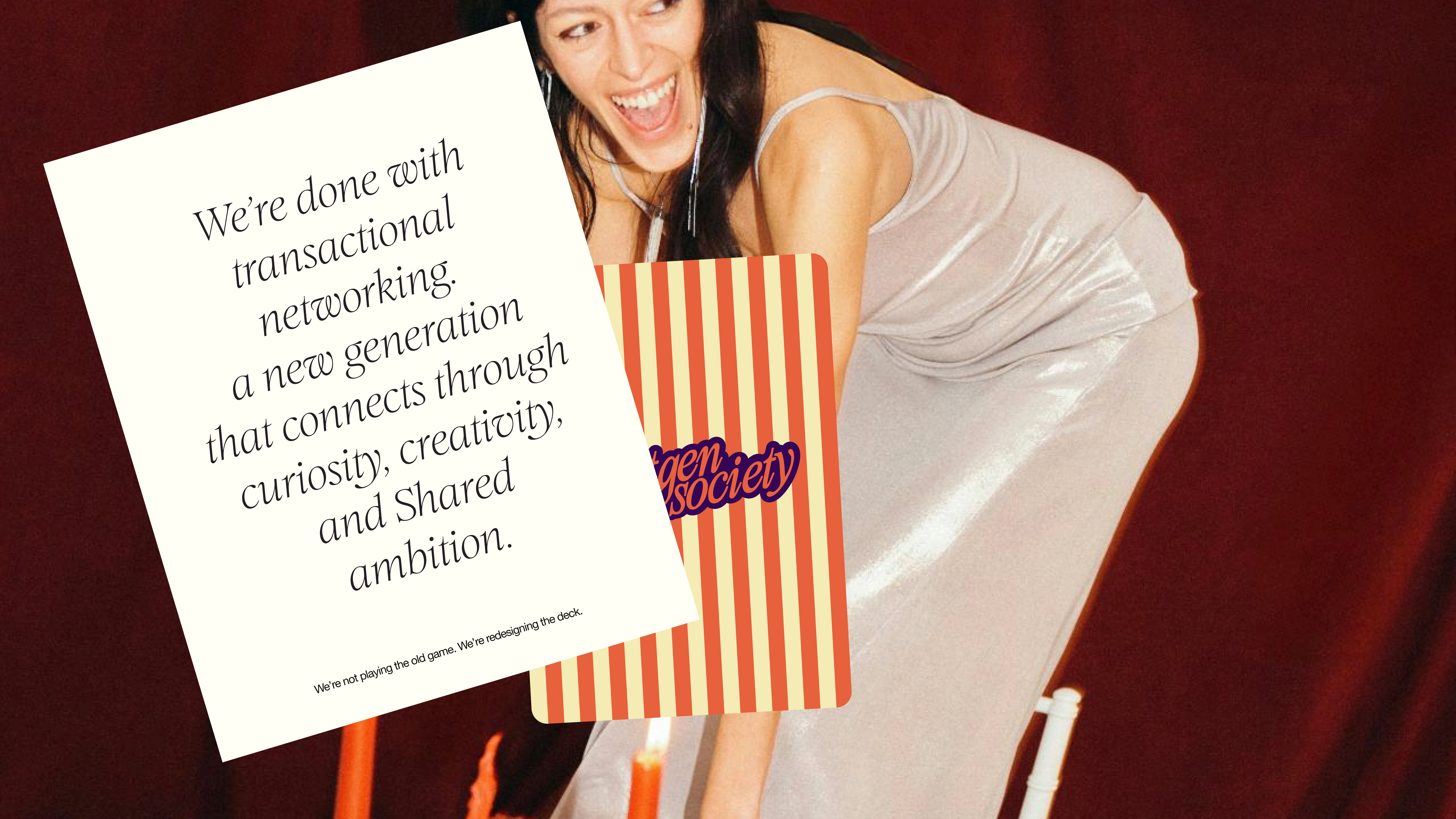
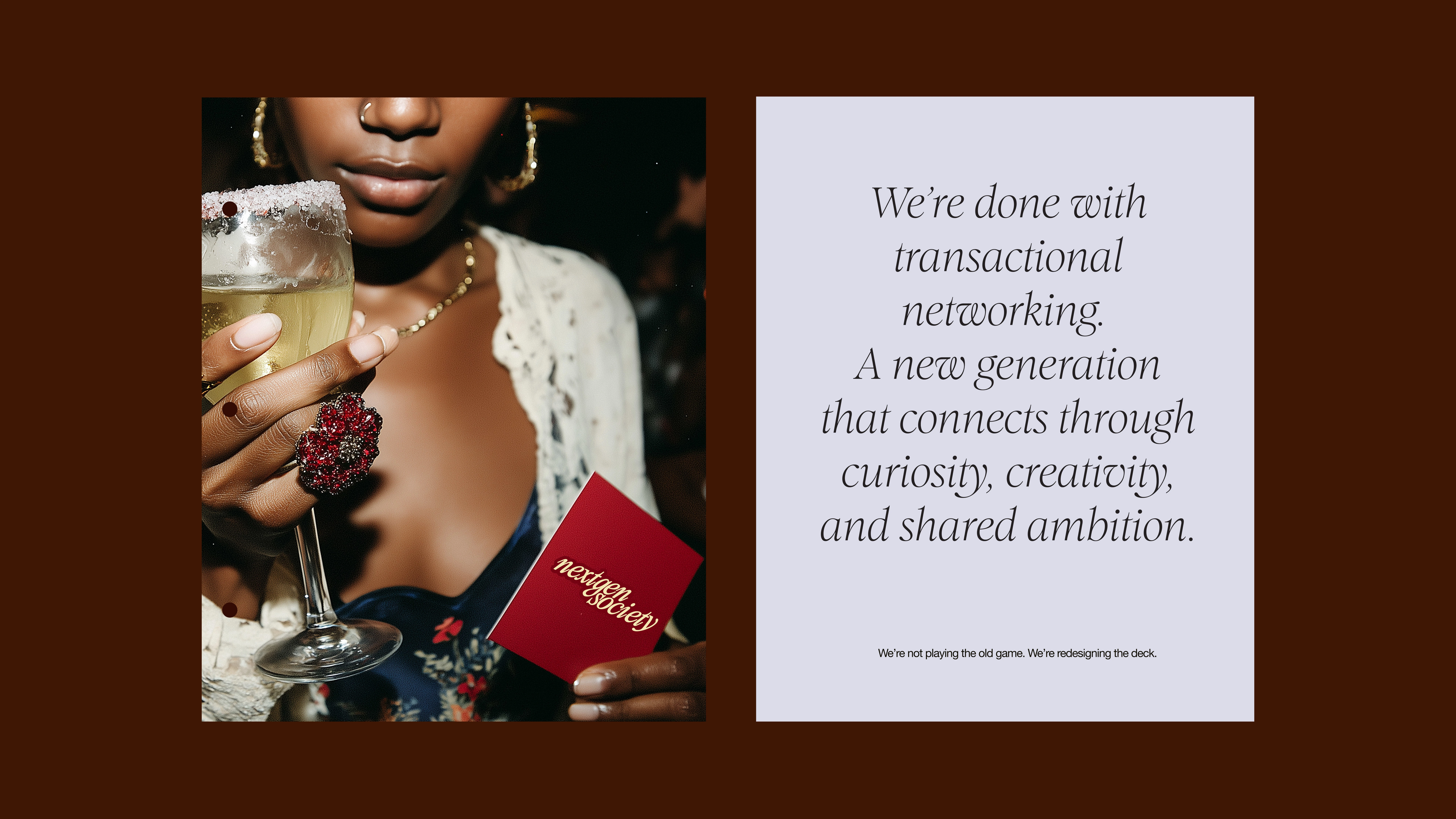
“We’re not playing the old game. We’re redesigning the deck.”
It’s language that reframes networking from formal obligation to genuine connection — turning ambition into community and meetings into momentum.
Core Idea
Networking rewritten for a new generation.
Not formal introductions or transactional conversations, but real connections between people building what’s next.
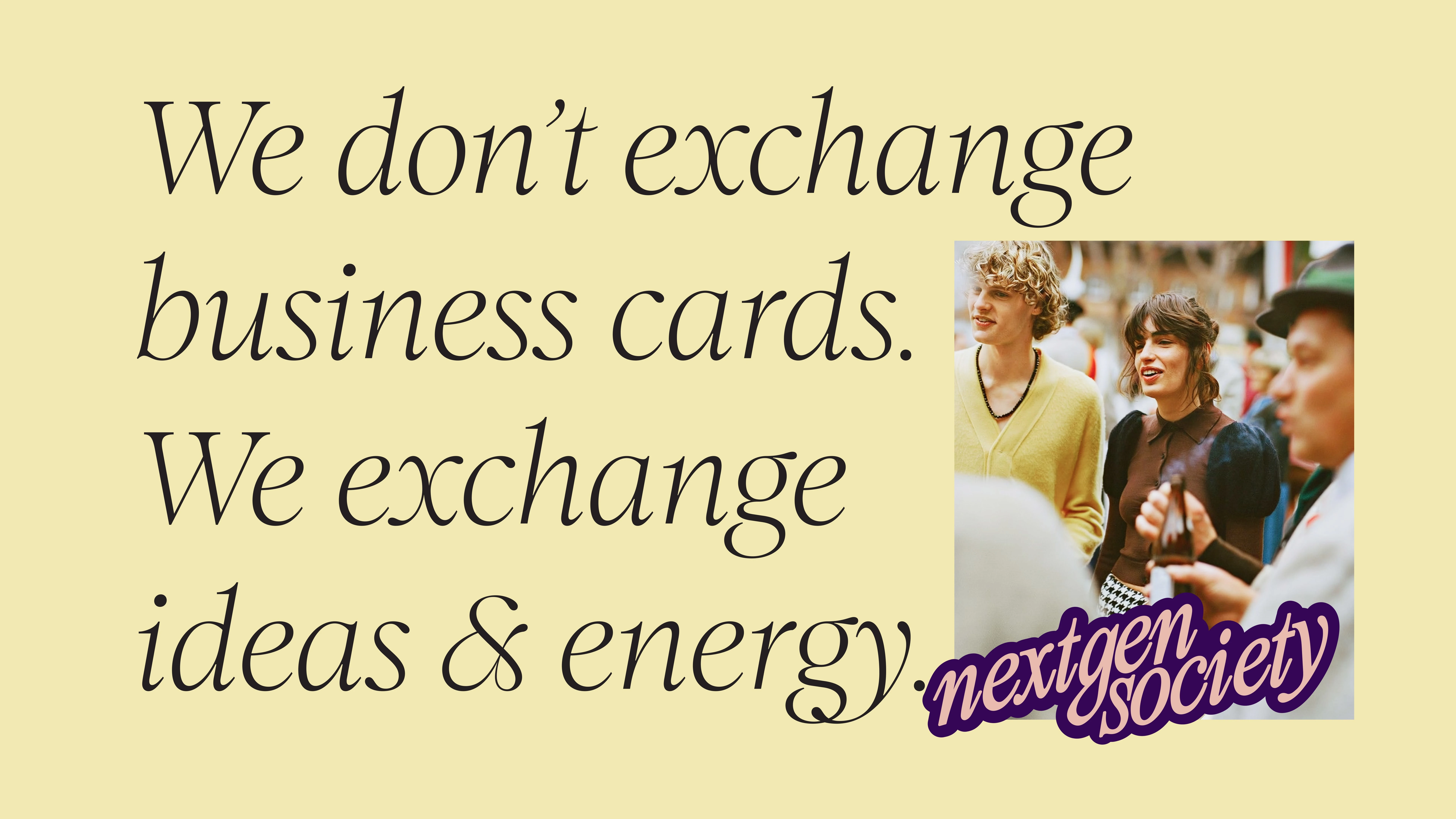
NextGenSociety reframes networking: from stiff business culture to something social, ambitious and human.
This is not about collecting contacts.
It’s about building a community that grows together.
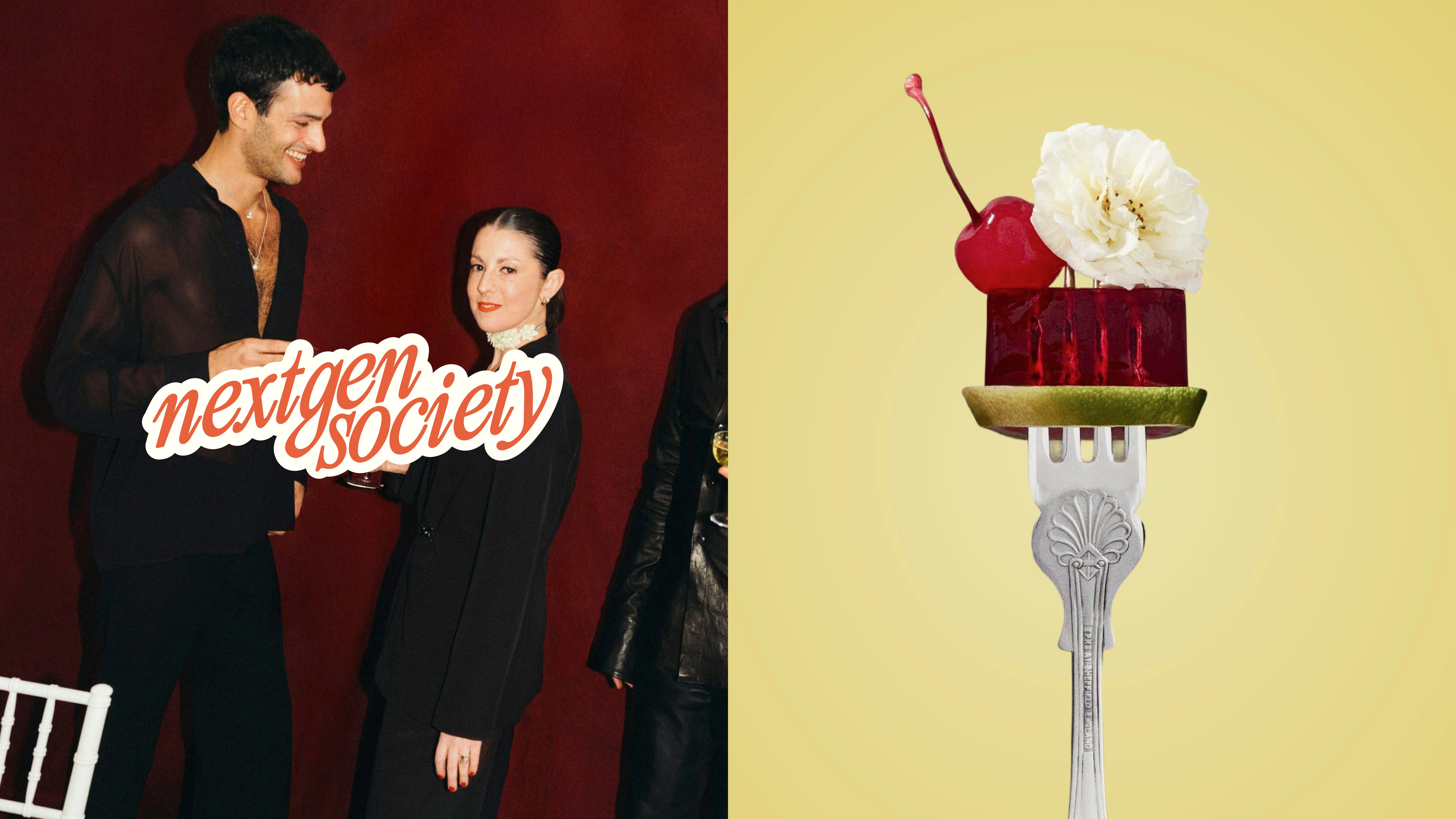
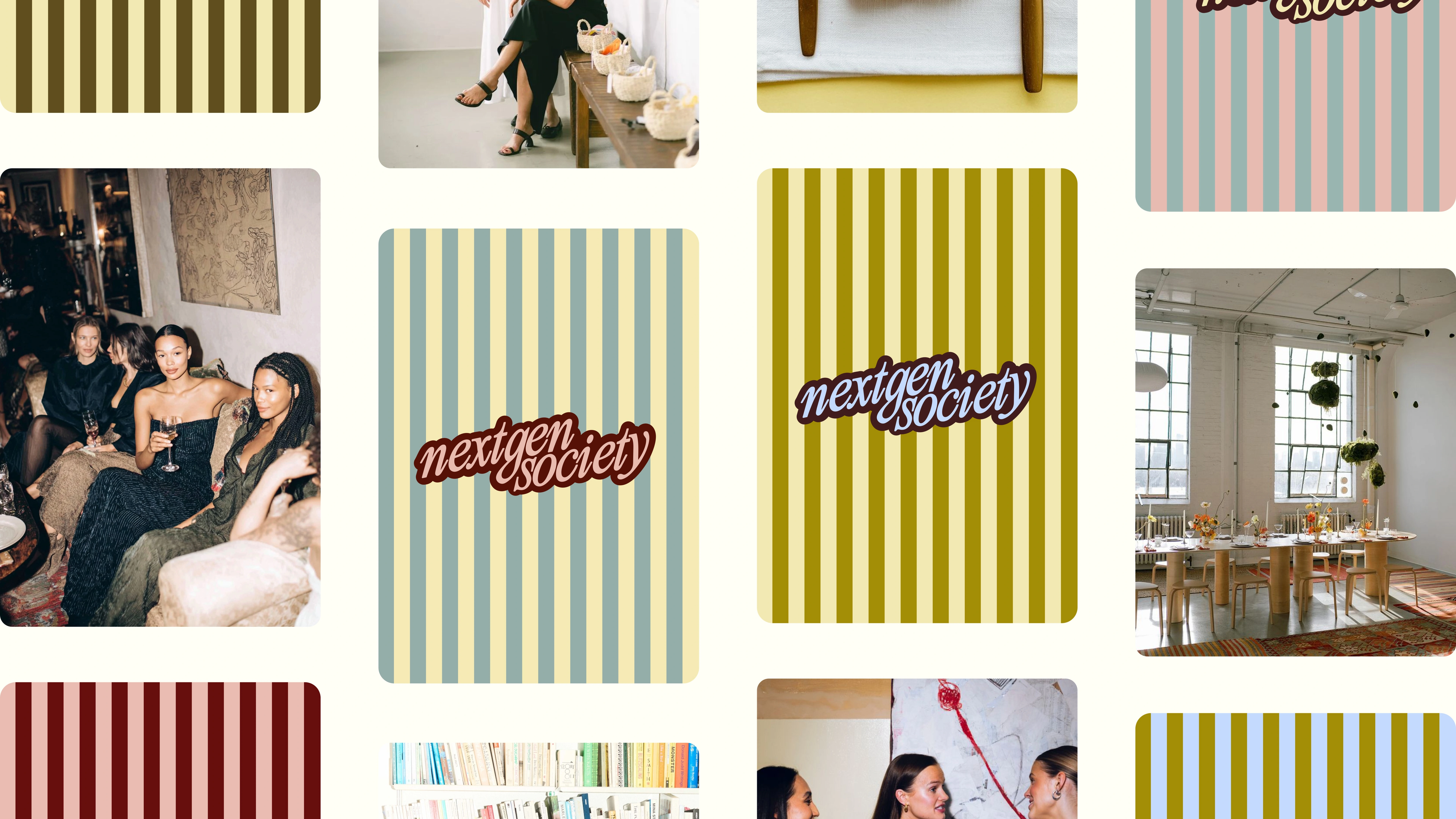
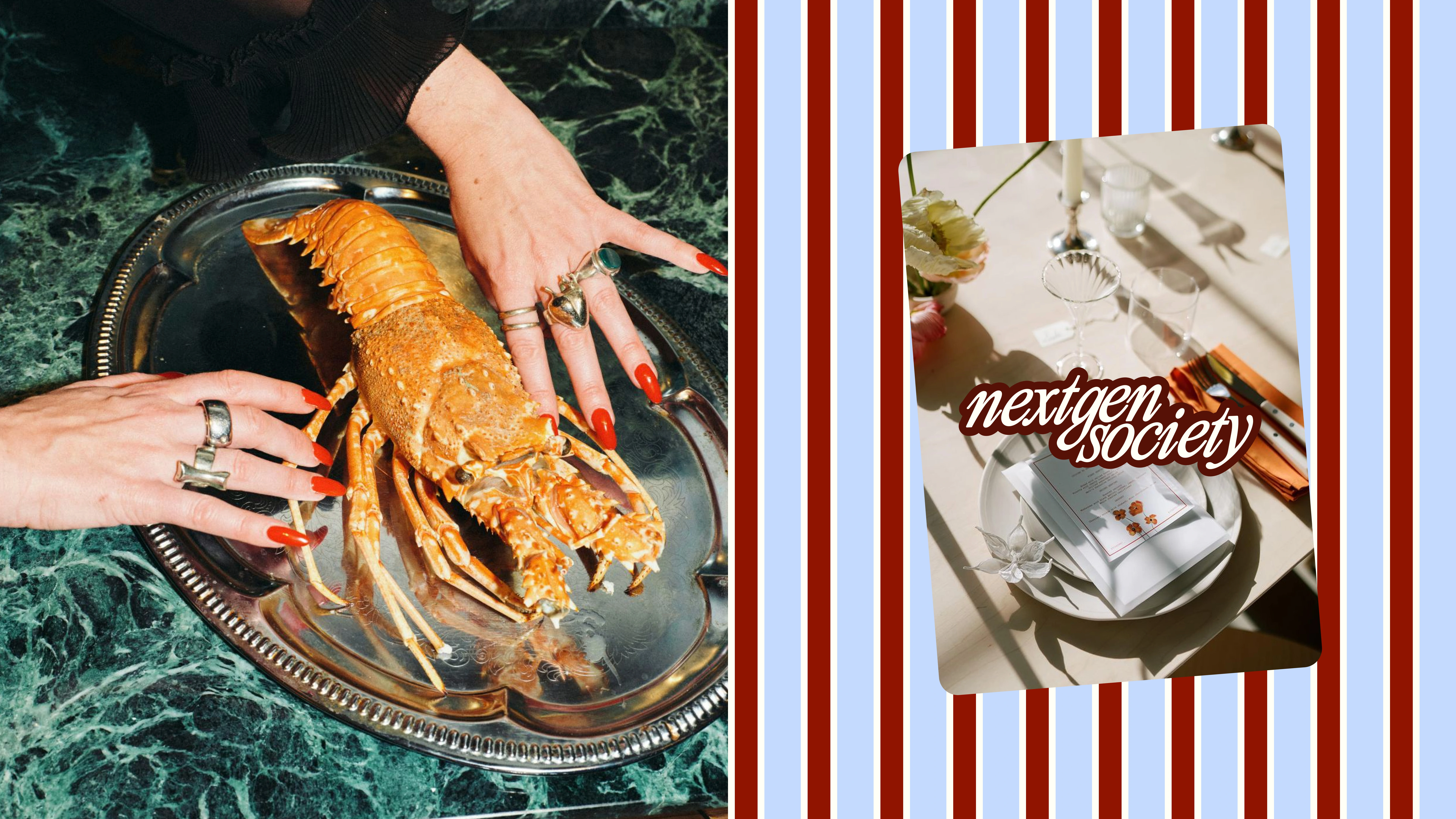
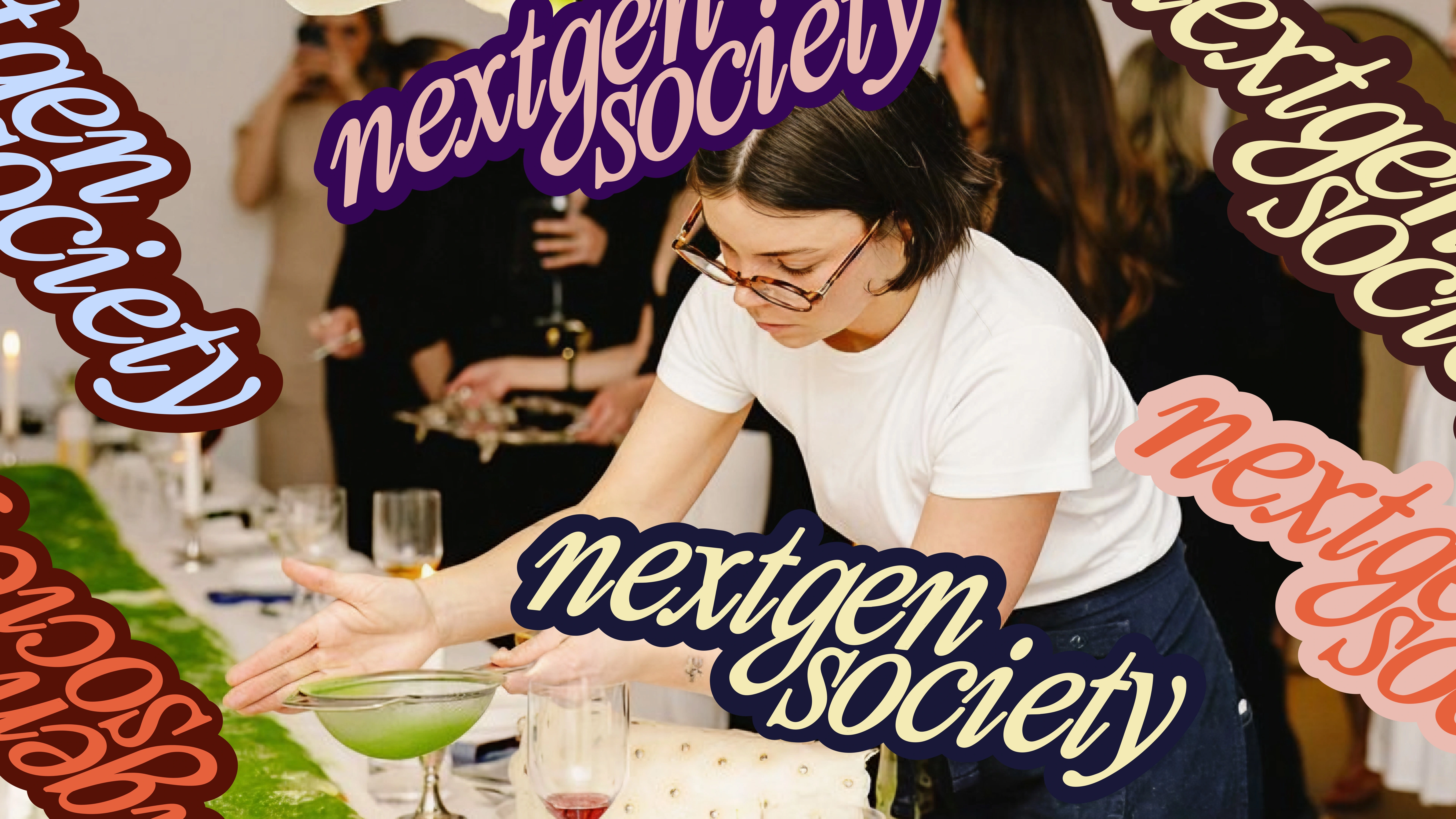
Visual Language
Energy meets credibility.
Bold typography combined with vibrant color combinations and expressive graphic elements.
The slightly angled wordmark and sticker-like compositions create a sense of movement and presence. Visual elements feel layered and placed rather than perfectly controlled, reflecting the spontaneous and social nature of the community.
Real photography shows interaction, curiosity and momentum; people meeting, talking and exchanging ideas.
The visual language connects two worlds:
professional ambition and cultural energy.
Design System
The graphic system builds around bold typographic compositions and modular visual elements.
Used as framing devices
Integrated into layouts
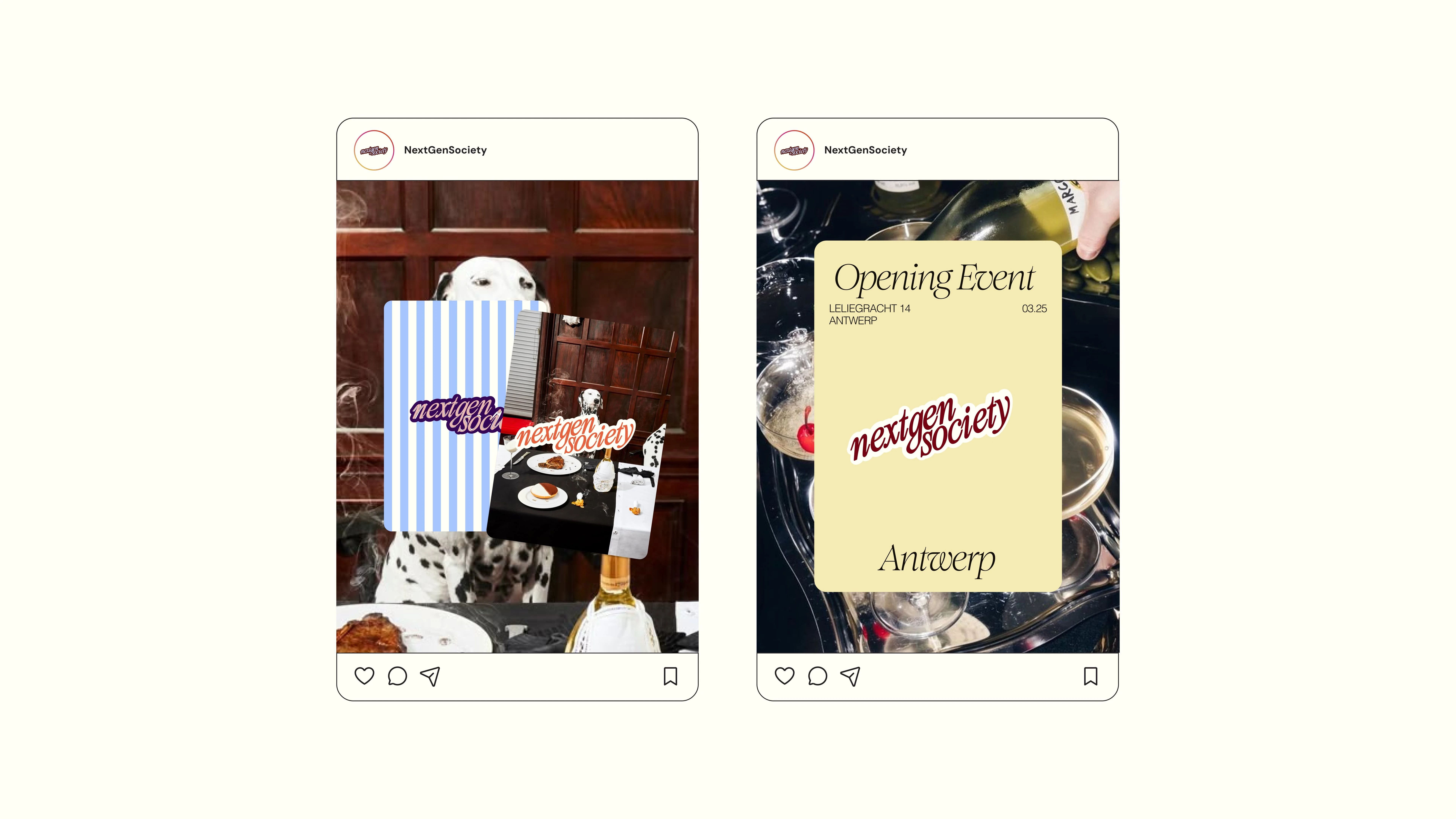
Applied across social content, event communication and merchandise
The system is flexible but recognizable.
Typography leads.
Color adds energy.
Graphic elements create rhythm.
Every touchpoint feels part of the same ecosystem — from Instagram posts to event materials and community communication.
Expressive. Consistent. Scalable.
A brand system that grows with the community behind it.
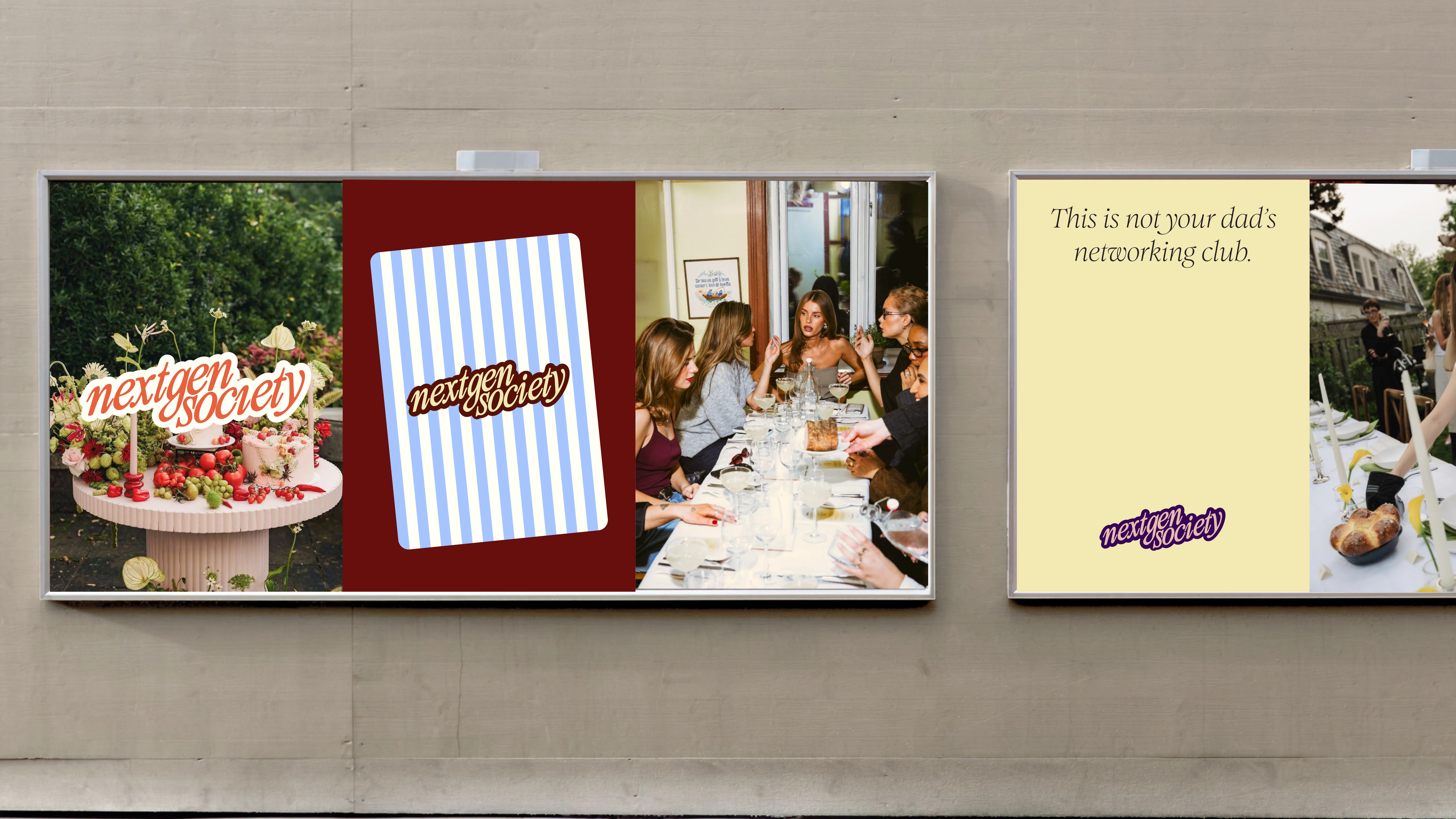
Messaging
The messaging is designed to feel direct, energetic and culturally aware.
Short, confident statements that capture the spirit of a new generation of professionals.
Lines work as social headlines, event visuals and community statements.
Every sentence lands immediately.
No corporate jargon. No empty buzzwords.
Just clear ideas about ambition, connection and building what’s next.
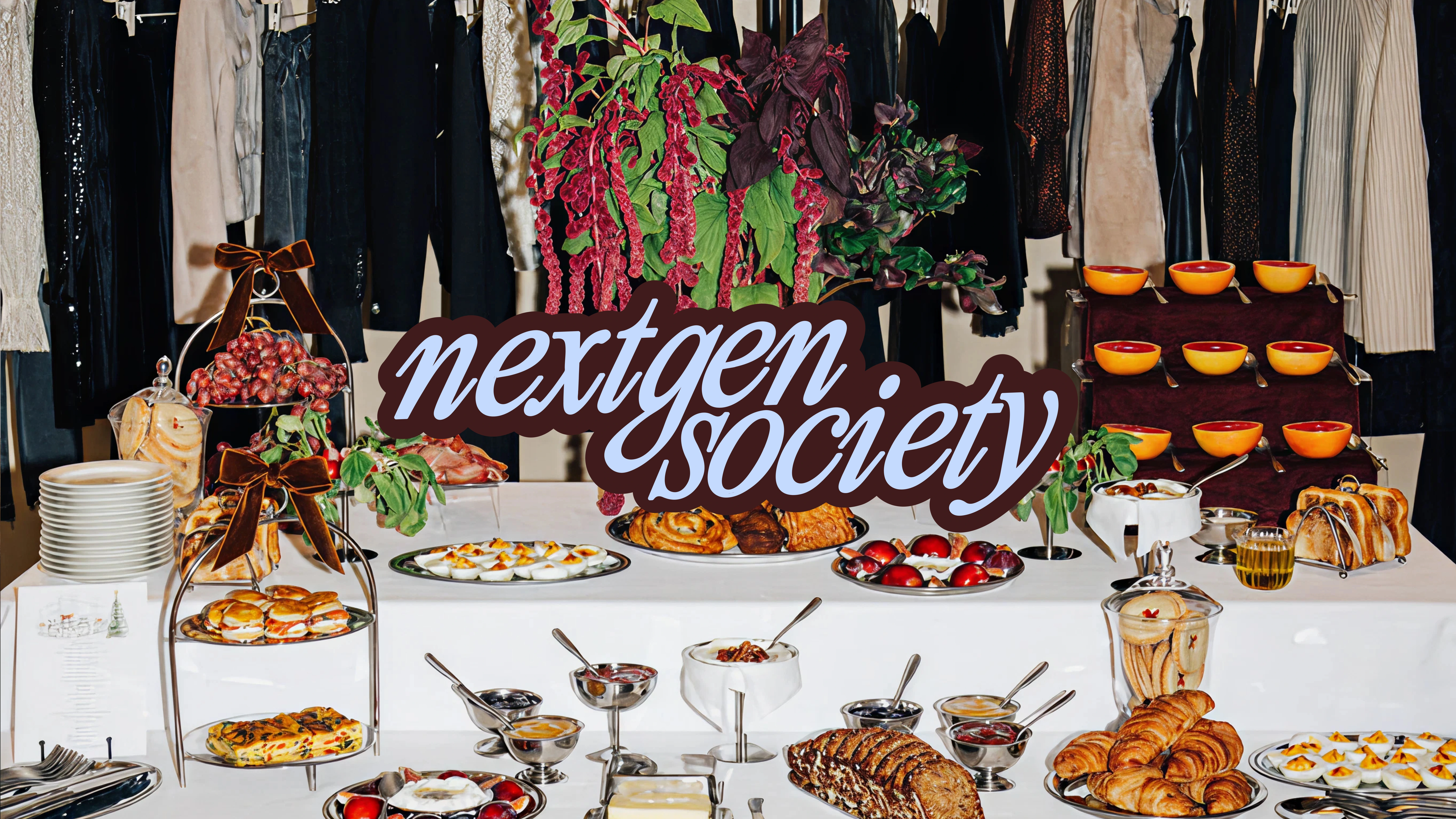
Digital & Social
The digital presence is expressive, bold and highly shareable.
Strong typographic compositions combined with vibrant color combinations and layered graphic elements create posts that stand out instantly.
Layouts feel dynamic rather than rigid, reflecting the social and spontaneous nature of the community.
Real photography shows interaction, curiosity and connection — moments that feel natural rather than staged.
Each post carries the same energy as the community itself: confident, social and forward-looking.
Community Expression
The community is expressed through moments of connection.
Meeting new people. Sharing ideas. Building collaborations.
Campaign expressions highlight the value of being part of a network that grows together.
Instead of presenting networking as a formal process, the brand shows it as something social, ambitious and alive.
Not just collecting contacts, building a working generation.

Visual outcome
A bold and expressive brand identity that immediately stands out. Distinctive typography, vibrant color combinations and dynamic compositions create a system that feels energetic, contemporary and highly recognizable. The identity works seamlessly across digital platforms, event communication, social content and community touchpoints.
Impact for the client
NextGenSociety now communicates as a confident platform for a new generation of professionals. The brand moves networking away from traditional business culture and positions it as something social, ambitious and culturally relevant. It attracts a community of people who want to meet, exchange ideas and build what’s next together.
My reflection
This project shows how branding can redefine something familiar. By shifting networking from formal and transactional to expressive and human, the identity creates space for a new kind of community — one that feels energetic, open and built for the next generation.
"Thanks again for all the amazing ideas and the way you brought everything to life. I can’t wait to bring NextGenSociety into the world.” - Divinia Hoey, Founder NextGenSociety
Like this project
Posted Mar 16, 2026
Developed a bold brand identity for NextGenSociety, reflecting a unique, contemporary networking platform.
Likes
1
Views
18
Timeline
Sep 10, 2025 - Sep 30, 2026