The network for creativity
Join 1.25M professional creatives like you
Connect with clients, get discovered, and run your business 100% commission-free
Creatives on Contra have earned over $150M and we are just getting started
Back to feedPost
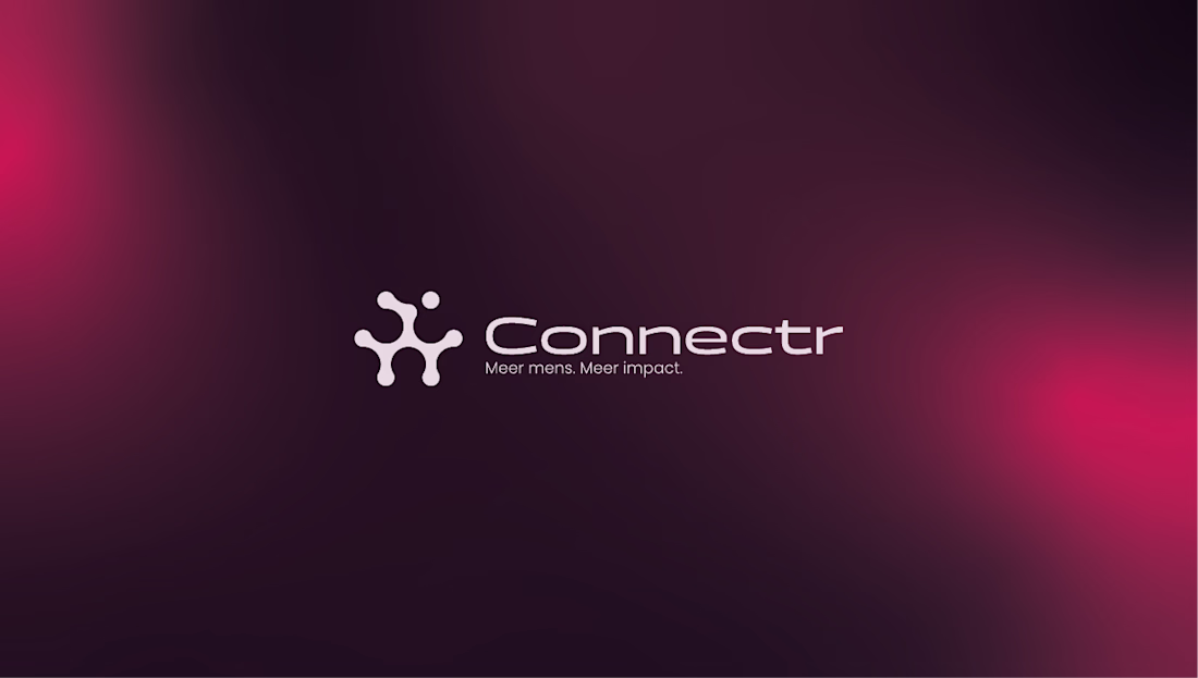
Connectr – Brand Identity & Digital Experience for Human-Centric Tech
Services: Brand Identity, Logo Design, UI/UX Web Design, Copywriting Strategy, OOH (Out of Home) Design
About the Project
Connectr is a forward-thinking consultancy and recruitment agency operating at the intersection of IT and human behavior. Their core philosophy is simple but powerful: implementing technology is the easy part; getting people to adopt and embrace it is the real challenge. They needed a visual identity that clearly communicates their mission to bridge the gap between hard tech and human connection.
The Challenge
The IT consultancy space is heavily saturated with cold, hyper-corporate, and strictly digital aesthetics (often relying on standard "tech blue" color palettes). The challenge was to design an identity that feels instantly credible in the tech space, but radiates warmth, empathy, and human energy to attract both top-tier consultants and progressive clients.
The Solution & Design Choices
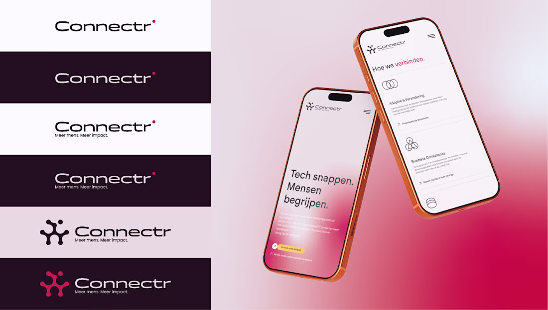
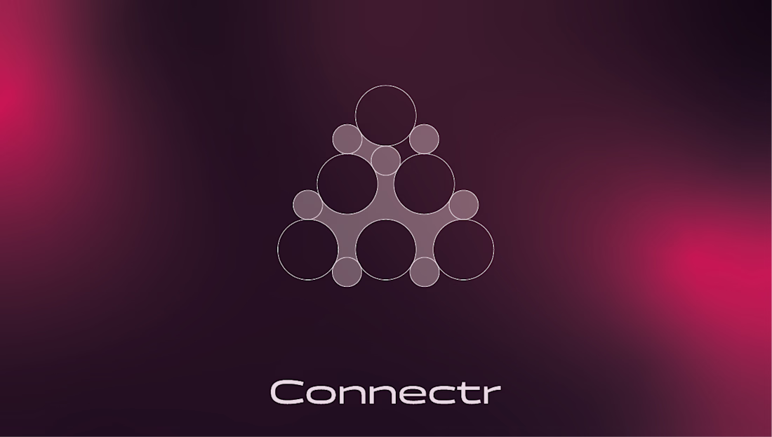
Logo & Geometric Grid: The core of the identity is the custom "node" icon. Built on a strict geometric grid of intersecting circles, the mark symbolizes a network of individuals connecting to form a cohesive, stronger entity. It visually represents the brand's core offering: bringing the right people together.
Color Palette & Gradients: To break away from traditional tech branding, I introduced a striking, energetic magenta-to-red gradient. Set against deep, dark backgrounds (almost a rich plum/black), this gradient creates a glowing effect that feels vibrant, human, and modern. Crisp white is used for typography to maintain high legibility and contrast.
Typography & Messaging: The brand's voice is bold and direct. The visual identity gives center stage to strong copy like "Tech snappen. Mensen begrijpen." (Understand tech. Understand people) and the core tagline "Meer mens. Meer impact." (More human. More impact). The clean, modern sans-serif typography ensures this messaging hits home instantly.
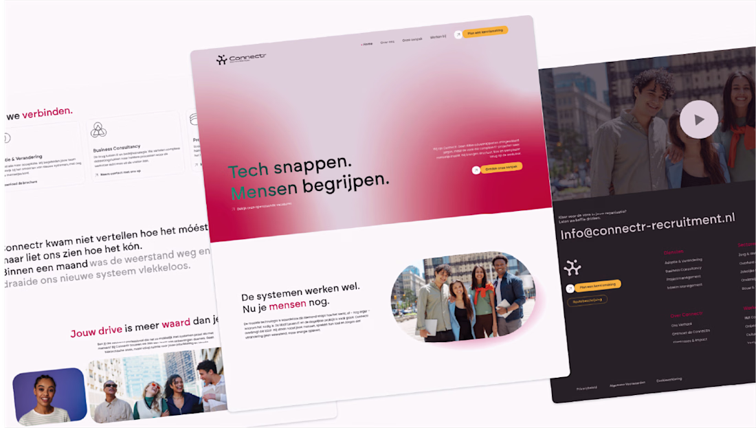
Digital Experience: I designed a seamless digital experience across desktop and mobile. The website uses generous whitespace paired with the brand's signature soft gradients to create an interface that feels intuitive, clean, and welcoming—crucial for a platform focused on recruitment and human connection.
OOH Campaign: The brand comes to life in the physical world through impactful billboard designs. Using dark backgrounds with the glowing gradient and relatable photography, the posters act as powerful recruitment tools and brand-awareness drivers in urban environments.
Deliverables
Brand Strategy & Core Messaging
Geometric Logo Design & Identity System
Responsive Website UI/UX Design
Mobile Interface Design
OOH Campaign Assets (Billboards & Posters)
The network for creativity
Join 1.25M professional creatives like you
Connect with clients, get discovered, and run your business 100% commission-free
Creatives on Contra have earned over $150M and we are just getting started
Related posts
🚀 The new Edge Hound website is live. Not Framer this time, but the dev team did a stellar job with the implementation.
Most AI fintech sites explain the tech. This one had to explain the category.
Decision intelligence for capital markets - agentic AI that replaces the analyst function for brokers, neo banks, and investing platforms.
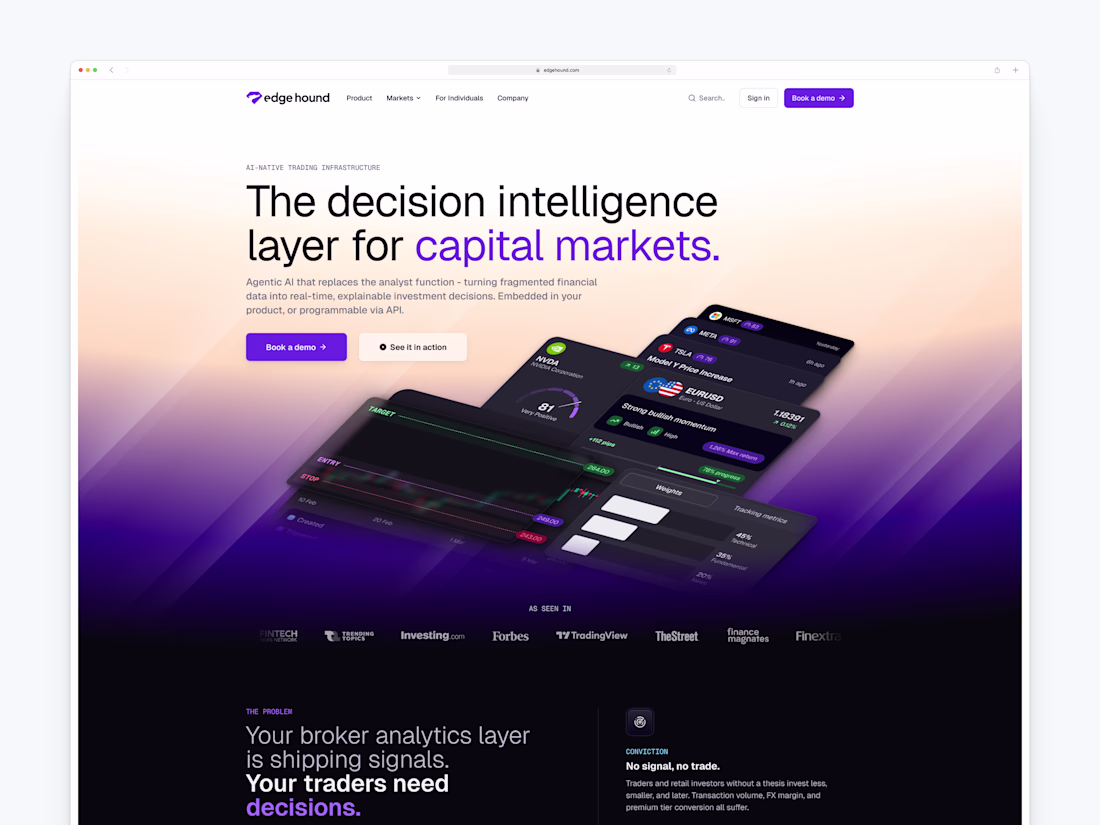
I think you did the right call by explaining the category here. This whole space is so new and different, and taking advantage of it is definitely the right call from your end.
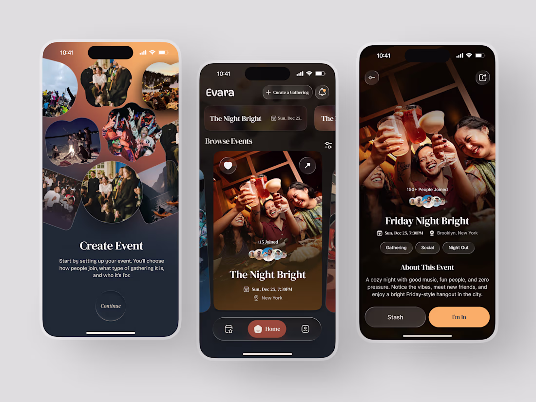
Most event apps help you find something to do. Evara was designed to help you find somewhere to belong.
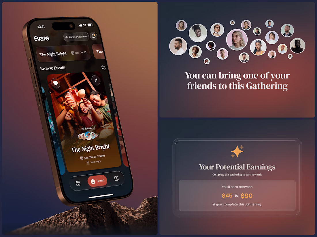
The brief was a social gathering platform built around intention - not just events, but curated experiences where the host chooses who joins, what kind of gathering it is, and who it's for. The Night Bright. Friday Night Bright. A cozy night with good music, fun people, and zero pressure.
The design reflects that warmth completely. Deep amber gradients, organic photo collages, rich brown surfaces, and an event detail page that feels like a personal invitation rather than a ticket listing. 150+ people joined. Gathering. Social. Night Out. "I'm In" in amber gold is a button that actually feels like a decision worth making.
And then the layer that makes Evara different - hosts earn between $45 and $90 for completing a gathering. The platform rewards the people who create the experience, not just the ones who attend it.
This is what social app design looks like when the product actually cares about connection.
Does this feel like an app worth showing up for? 👇
Tools: Figma
#AppDesign #SocialApp #MobileDesign #UIDesign #DarkUI #ContraFreelance #EventApp #ProductDesign
Clean layout and super intuitive design!
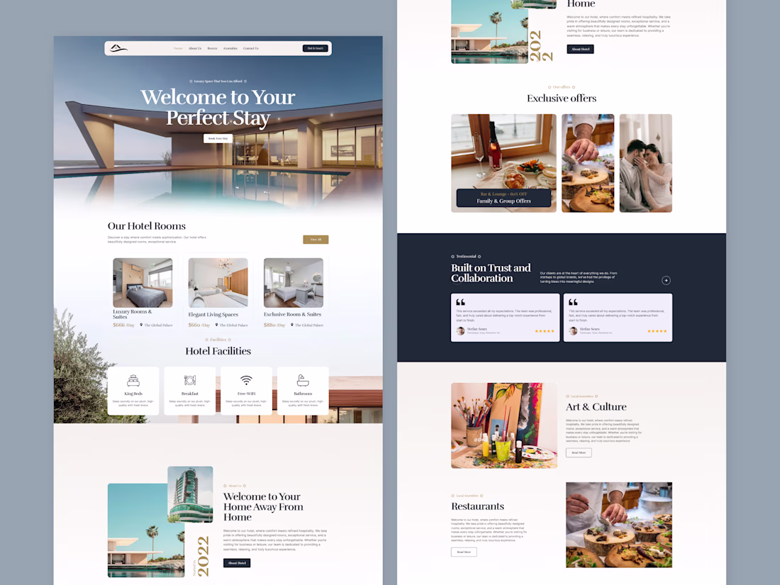
Luxury meets seamless digital experiences. ✨
Designed a modern hotel booking website with an elegant UI, intuitive navigation, premium room showcases, exclusive offers, and a smooth reservation flow. Every detail is crafted to enhance user experience and inspire more bookings.
What do you think of this concept? 🏨
Click the link below to view the full project. 👇
Nice work !
Trending
Claude
Claude has entered the design space. How are you using Claude Design?
Contra University
Learn from expert creatives how to earn more using next-gen AI tools.
creativeaiflow
Creative AI workflows are evolving. What tools do you use, and what are their strengths and weaknesses?
freelancerlife
Freelancer life is wins, pivots, and everything in between. What’s yours right now?