
pro
Miya Campbell
Marketing Strategist, Web Designer & Brand Identity Expert
New to Contra
Miya is ready for their next project!


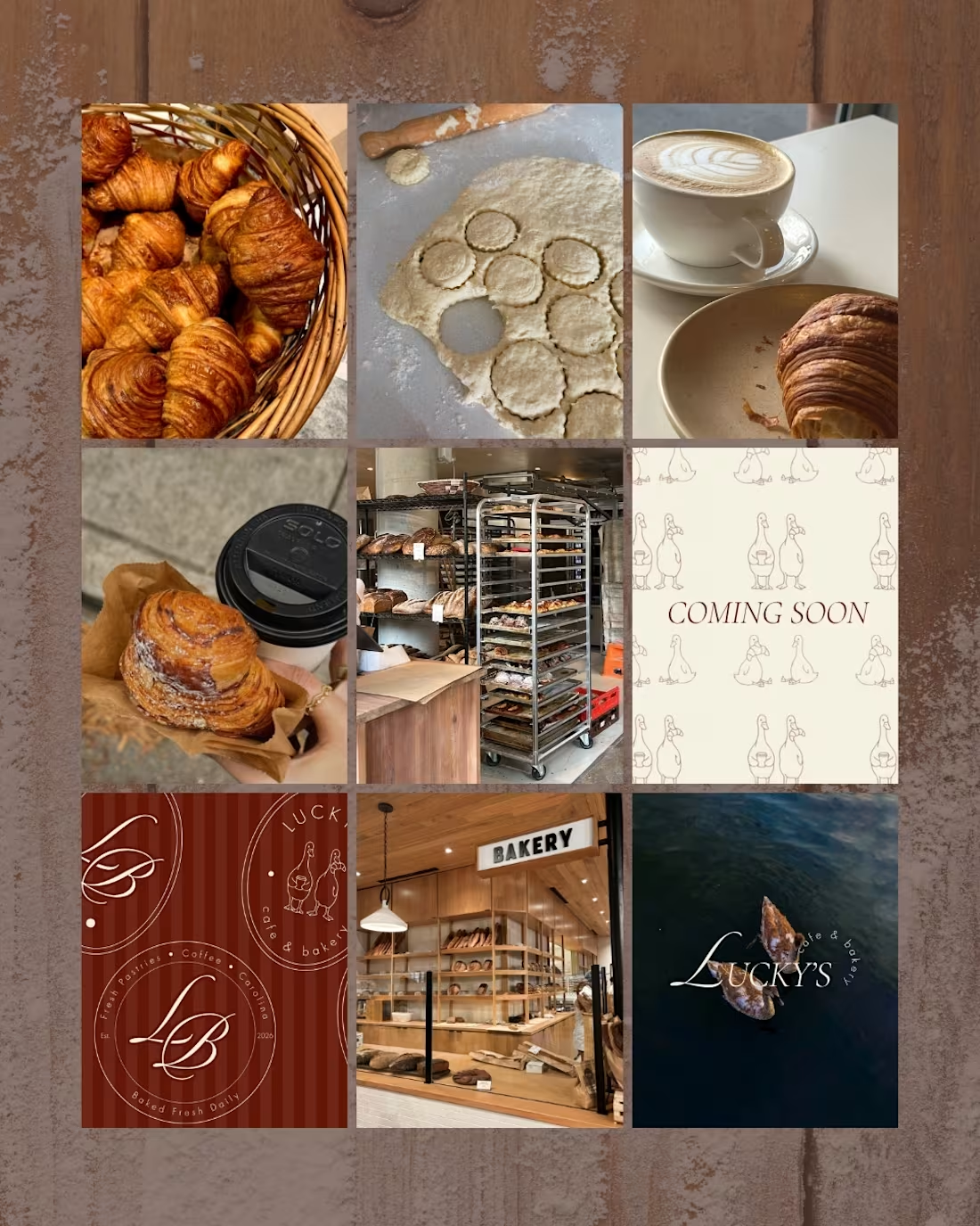
Lucky’s Café & Bakery | Brand Identity, Website + Print Design
For Lucky’s Café & Bakery, I developed a complete brand identity inspired by Carolina kitchens, neighborhood cafés and slow mornings. The direction was warm and nostalgic while still feeling bold, editorial and modern.
The identity centered on a custom wordmark, rich cream, brown and red color palette, expressive typography and a playful duck mascot featured with coffee and pastries. I extended the system across a custom website, menus, coffee cups, signage and other physical brand applications.
My work included:
• brand strategy and creative direction;
• primary and secondary logo variations;
• custom duck mascot illustrations;
• color palette and typography system;
• brand voice and supporting taglines;
• responsive website design and development;
• website copy and visual storytelling;
• menu, coffee cup and signage design;
• print-ready brand assets;
• brand guidelines and mockups.
The final system gave Lucky’s a recognizable personality and a cohesive experience across its digital, print and physical touchpoints.
2
88
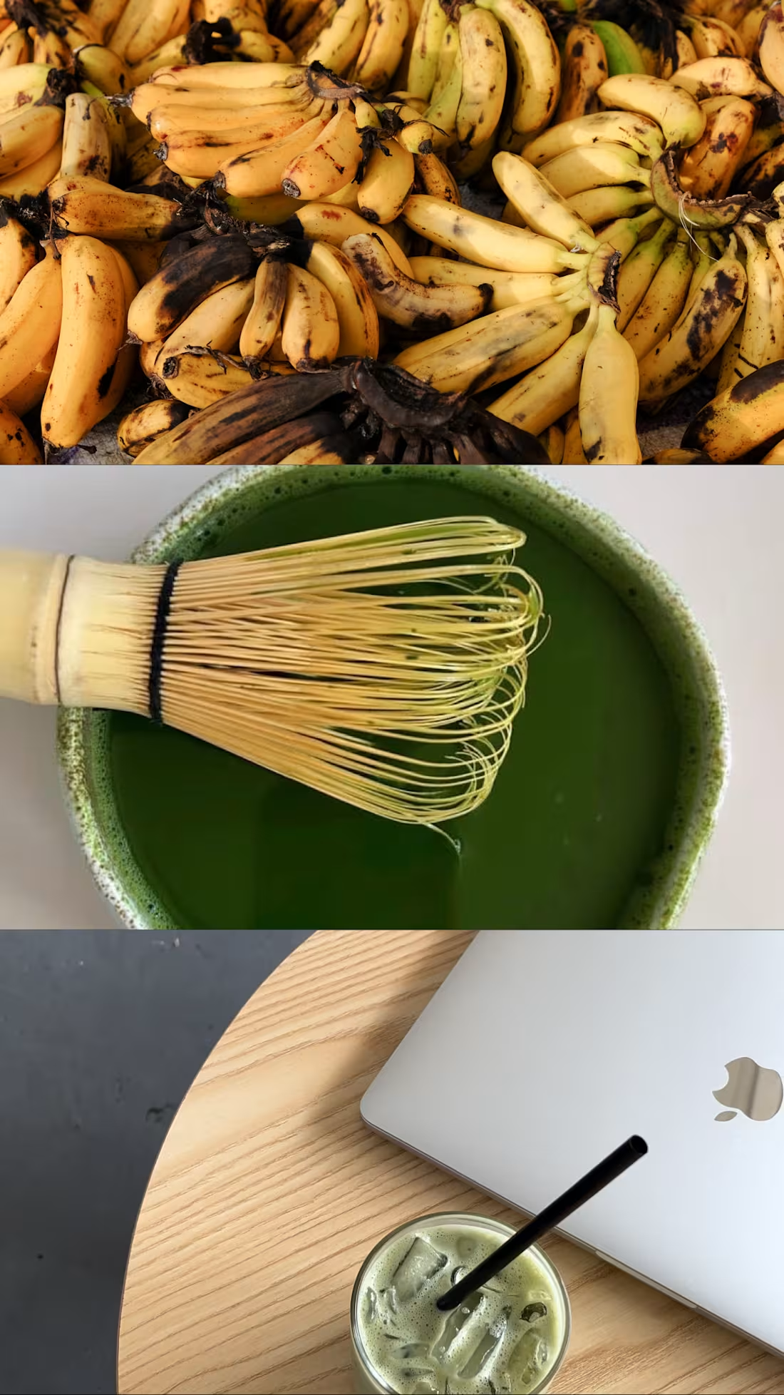
Folake & Co. | Website Design + Digital Experience
For Folake & Co., a DMV-based coffee and matcha cart, I developed a five-page website concept designed to translate the brand’s playful personality, cultural influence and vibrant menu into a more complete digital experience.
The visual direction built on Folake’s existing organic wordmark and earthy color palette while introducing stronger typography, layout structure, photography and calls to action. The website was designed to feel colorful and energetic without becoming visually overwhelming, allowing the coffee, matcha, plantain syrup and event experiences to remain central to the story.
I structured the website around the different ways someone might discover and interact with the business, whether they wanted to learn more about Folake, explore the menu, book the cart for an event or find upcoming appearances.
My work included:
• website strategy and creative direction;
• user journey and information architecture;
• custom five-page website concept;
• responsive Home page design;
• About page and brand storytelling;
• Menu page organization and presentation;
• Book the Cart inquiry experience;
• Events page design;
• custom-coded interactive website prototype;
• navigation and page-flow development;
• visual hierarchy and typography system;
• integration of the existing logo and brand assets;
• earthy color palette application;
• photography selection and image placement;
• coffee, matcha and product-focused storytelling;
• booking and inquiry calls to action;
• mobile-responsive layout planning;
• embedded imagery and website assets;
• final prototype testing and presentation preparation.
The final concept gave Folake & Co. a digital home that felt as distinctive and inviting as the physical cart experience. It brought the brand story, menu, bookings and events into one cohesive space while creating a stronger foundation for visibility, customer discovery and future growth.
This website was developed as a pitch concept and was not ultimately published by the brand.
22
59
1.4K
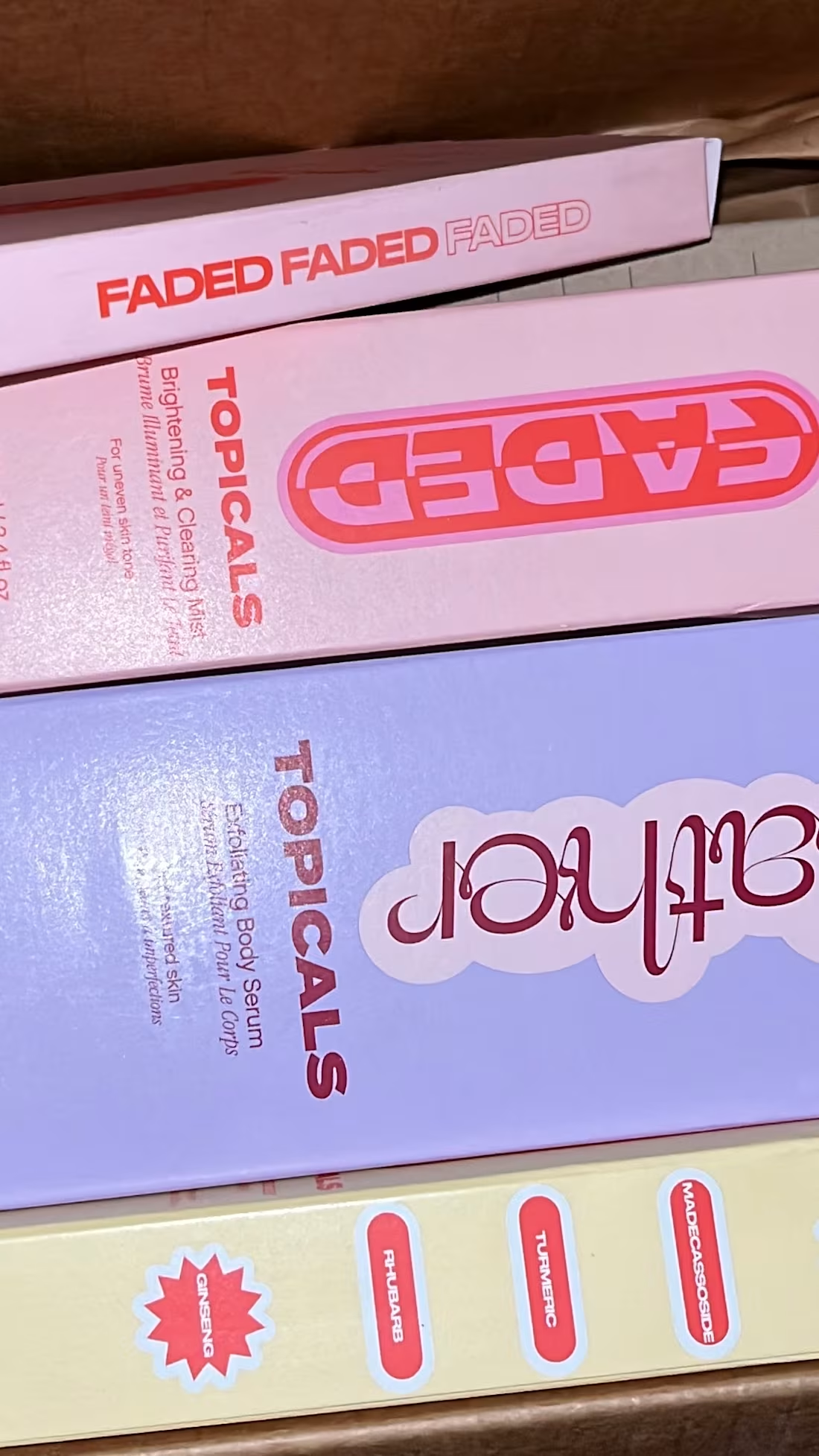
UGC + Social Media Content | Beauty & Lifestyle
For this collection, I created and curated social-first content centered around beauty, fashion and lifestyle products, including content featuring Glossier, Starface, BREAD Beauty Supply, Valentino Beauty and YSL Beauty.
The work was developed to balance polished brand storytelling with the more natural, relatable quality of UGC. I created content across multiple formats and considered how individual assets could support organic social, product discovery, engagement and paid digital campaigns.
My work included:
• UGC concept development and creative direction;
• short-form video for Reels and TikTok;
• product-focused video content;
• lifestyle and product photography;
• unboxing and product discovery content;
• in-store and experiential content capture;
• social-first hooks and on-screen copy;
• video editing, pacing and text overlays;
• static social media content and graphics;
• carousel and Story content;
• launch and collaboration-focused content;
• organic and paid social creative variations;
• product styling and visual composition;
• platform-specific content adaptation;
• caption and CTA development;
• content repurposing across digital platforms.
The final body of work demonstrates my ability to take a product and build multiple pieces of social content around it while maintaining strong visual direction, platform awareness and a clear understanding of how people naturally discover and engage with products online.
0
59
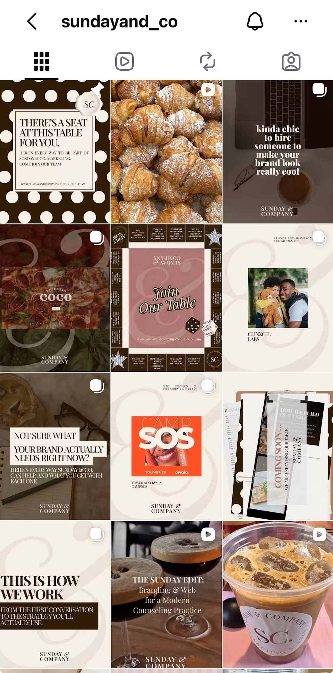
Sunday & Co. | Social Media Content + Digital Marketing
For Sunday & Co., I developed the agency’s ongoing social media and digital content system, translating the larger brand identity into a recognizable mix of video, graphics, campaigns and recurring content.
The creative direction was built to feel editorial, warm and visually distinctive while still giving the content a clear marketing purpose. Rather than treating every post as a standalone asset, I developed recurring concepts and visual formats that could support brand awareness, service promotion, portfolio storytelling, community building, recruitment and client acquisition.
My work included:
• social media strategy and content planning;
• development of content pillars and recurring series;
• short-form video concepts for Reels and TikTok;
• video filming and editing;
• hooks, scripts and on-screen copy;
• custom social media graphics;
• carousel and static post design;
• Sunday Service branded content;
• Welcome to Our Table campaign content;
• monthly roundup and educational content;
• Join Our Table recruitment creative;
• service and portfolio-focused content;
• campaign concept development;
• organic social content;
• paid social and advertising creative;
• promotional graphics and CTAs;
• copywriting and caption development;
• art direction and visual storytelling;
• content repurposing across Instagram, TikTok and LinkedIn;
• content calendar development;
• performance review and ongoing content optimization.
The result is a cohesive content ecosystem that gives Sunday & Co. a recognizable social presence while allowing the brand to move between education, personality, portfolio work, services and promotional content without losing its visual identity.
1
2
102