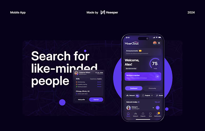
Want a Mobile App UI/UX Design that scales and converts?🚀
- $10k+
- Earned
- 5x
- Hired
- 4.7
- Rating
- 234
- Followers
Want a Mobile App UI/UX Design that scales and converts?🚀
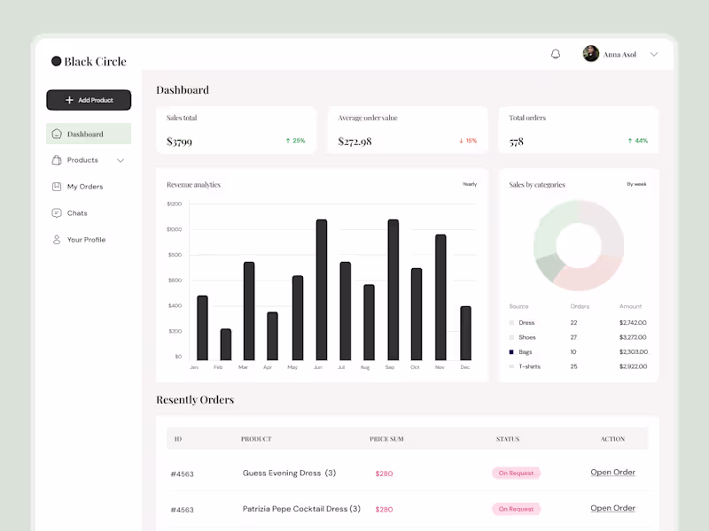
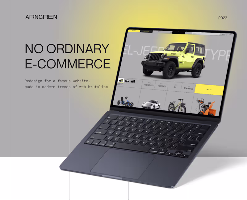
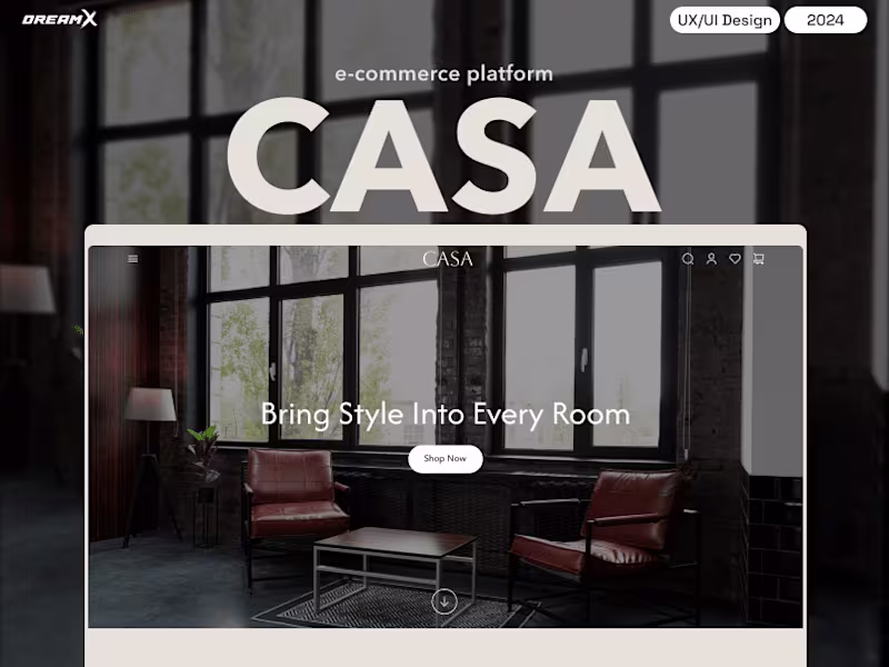
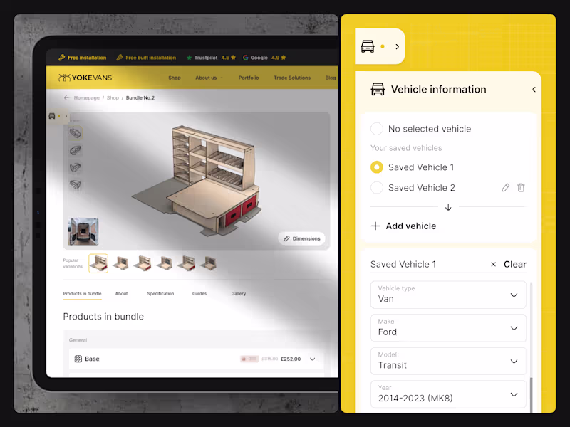
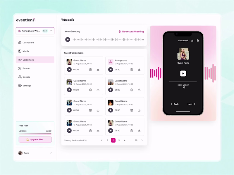
E-Commerce(2)
Award Winning AI | Web | Mobile App UX & UI Design
- $25k+
- Earned
- 6x
- Hired
- 5.0
- Rating
- 32
- Followers
Award Winning AI | Web | Mobile App UX & UI Design
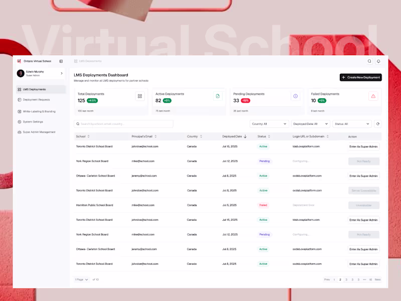
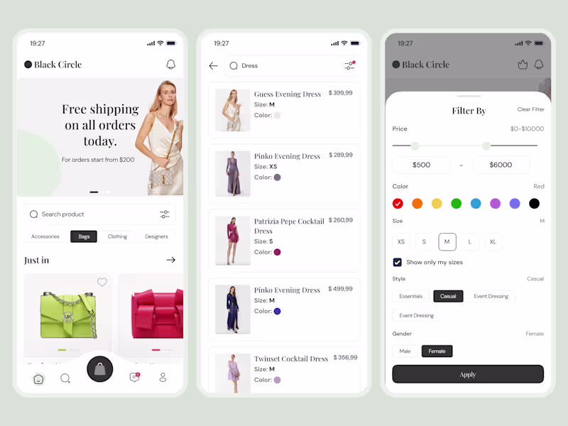
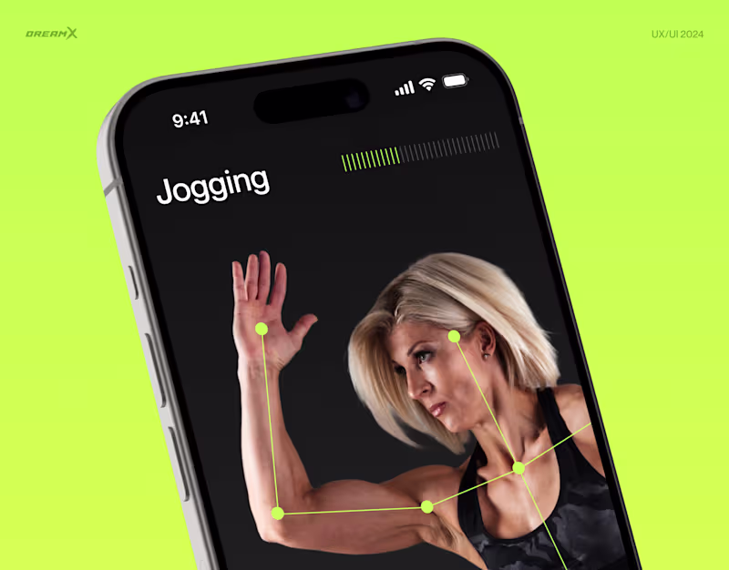
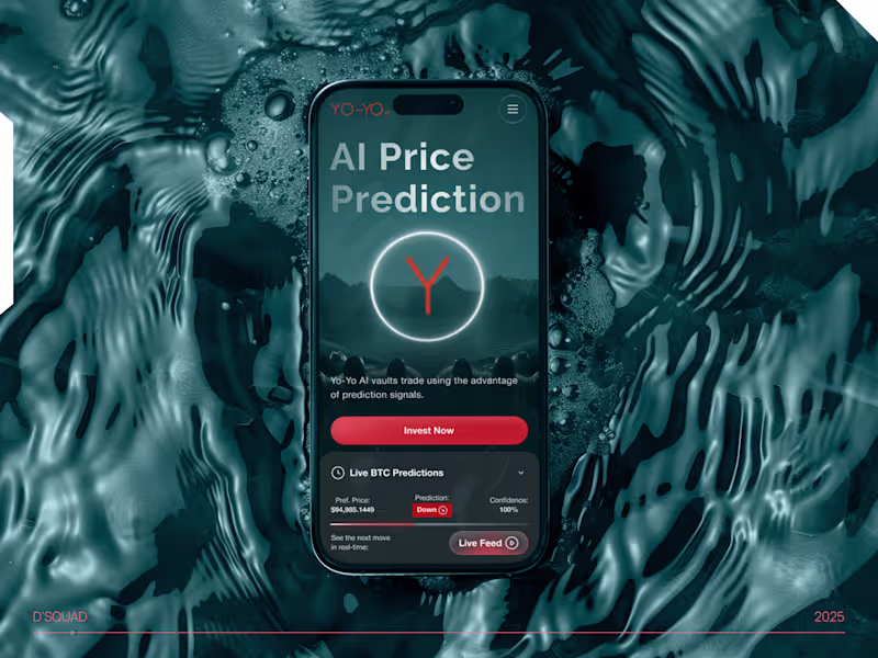
E-Commerce(1)
Web Design | Mobile App Design | SaaS | CRM | Figma Expert
- $1k+
- Earned
- 3x
- Hired
- 5.0
- Rating
- 16
- Followers
Web Design | Mobile App Design | SaaS | CRM | Figma Expert
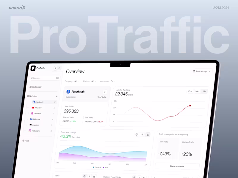
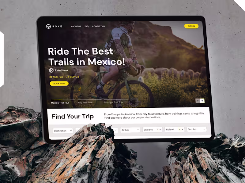
E-Commerce(1)
UI/UX designer and Art-Director with 10 years of experience
- 1x
- Hired
- 5.0
- Rating
- 49
- Followers
UI/UX designer and Art-Director with 10 years of experience
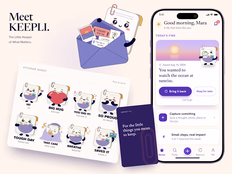
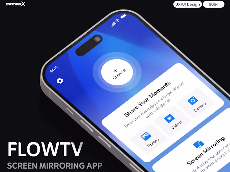
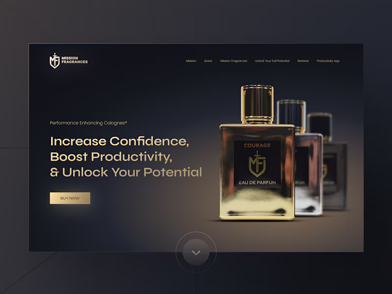
E-Commerce(1)
Creative UX/UI Designer for Health, Travel, Finance
- 1x
- Hired
- 5.0
- Rating
- 17
- Followers
Creative UX/UI Designer for Health, Travel, Finance
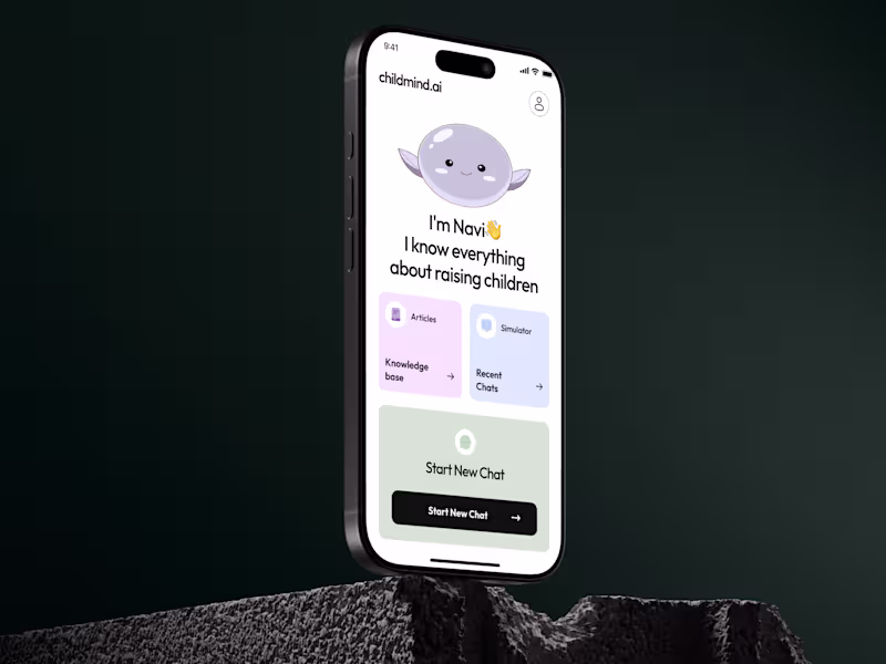
E-Commerce(1)
Product-focused UI/UX Designer for SaaS & Web

E-Commerce(1)
UX/UI Designer | Figma Expert | Pixel Perfectionist |
UX/UI Designer | Figma Expert | Pixel Perfectionist |


E-Commerce(2)
Senior UI/UX designer turning strategy into launch-ready UX
- 5.0
- Rating
- 6
- Followers
Senior UI/UX designer turning strategy into launch-ready UX
E-Commerce(1)