The network for creativity
Join 1.25M professional creatives like you
Connect with clients, get discovered, and run your business 100% commission-free
Creatives on Contra have earned over $150M and we are just getting started
Back to feedPost

Wanted to share one of my projects
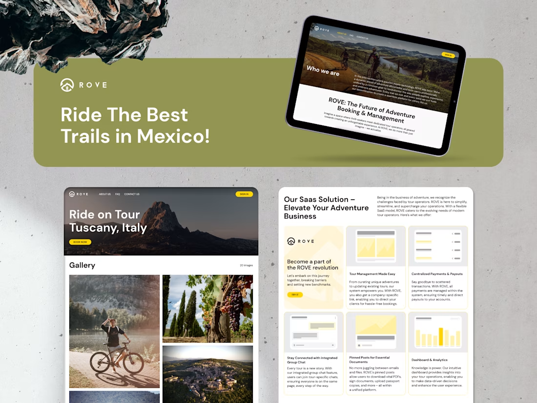
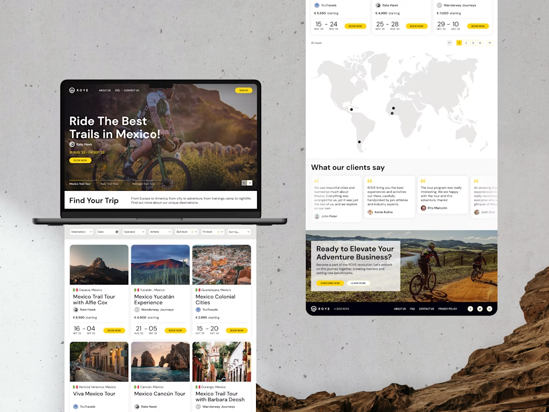
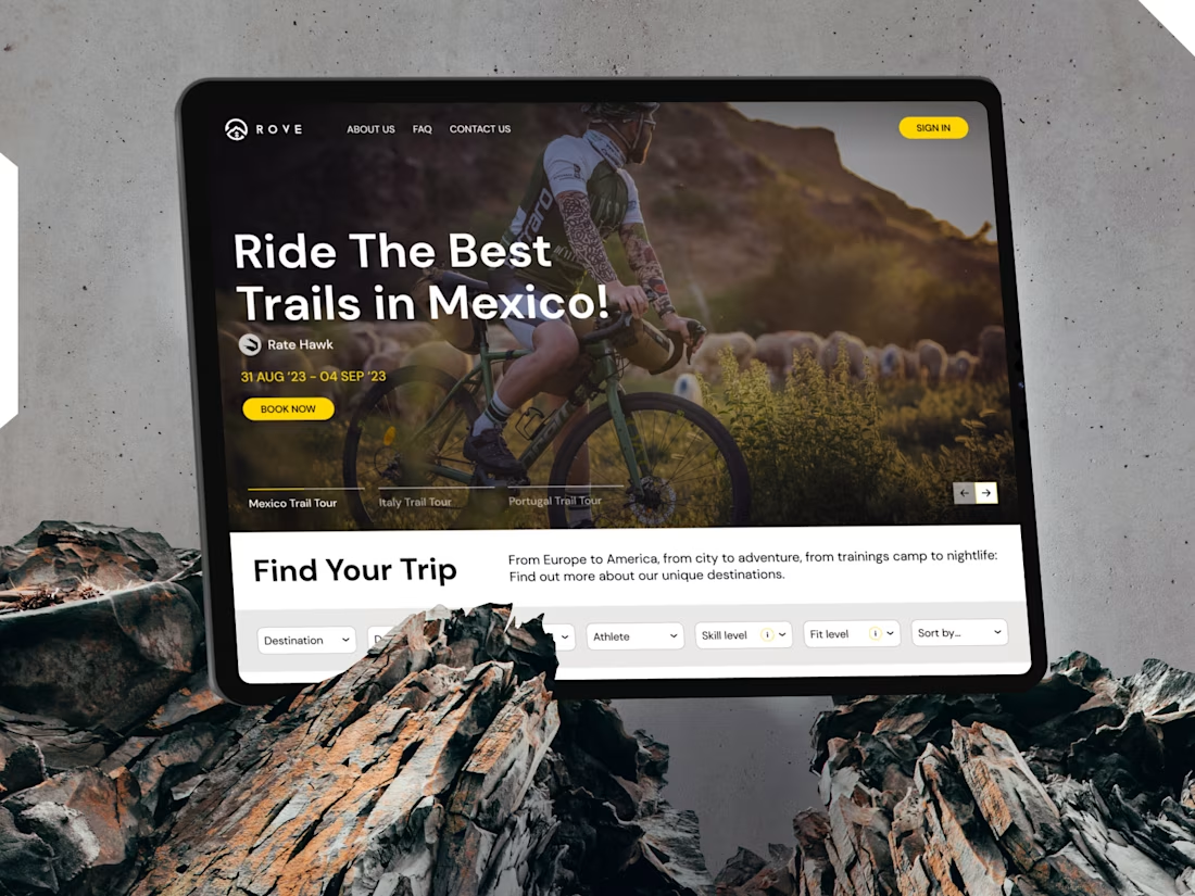
I led the end-to-end design of ROVE, a SaaS platform connecting cyclists with professional tour operators across Mexico, Italy, and Portugal.
The challenge was balancing two very different users — riders who want discovery and inspiration, and operators who need a serious back-office tool. The visual direction leans into the rawness of the sport: dark hero sections, high-impact photography, and a single yellow accent that punches through every screen.
On the UX side, the key decisions were around a skill-based tour filter system, a dual-sided booking flow, and keeping the operator dashboard functional without feeling corporate.

The network for creativity
Join 1.25M professional creatives like you
Connect with clients, get discovered, and run your business 100% commission-free
Creatives on Contra have earned over $150M and we are just getting started

Challenges
View all


Related posts


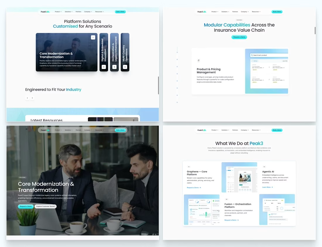
Our Peak3 website build covered 17 page templates and six CMS collections. At that scale, the questions about publishing deserve as much attention as the finished pages.
A blog post, a whitepaper and a careers entry need different information. Making them editable is only part of the design problem. The person adding the next entry also needs to understand what is missing and what happens when they publish it.
Here’s a hypothetical review I’d run before a CMS handoff: create a whitepaper entry, add the title and cover, then leave out the download file.
Does the editor flag the missing file? Can someone preview what the visitor will see? If the entry can still be published, does it create a download button that leads nowhere?
I’d use that test to decide which fields must be required and which incomplete states need an explanation.

Beautifully executed work


Same animation, one detail changed.
Motion blur or clean.
Which one feels better? 👇
16 voted
53%
14 voted
47%
30 votes
Closed

Blure is more focused and better ❤️❤️

Pipely is an AI-powered sales platform designed to turn conversations into actionable outcomes. The experience brings together video calls, AI-generated insights, CRM updates, sales analytics, and follow-up drafts in one workspace.
View project on Dribble:
https://dribbble.com/shots/27795621-Dashboard-Sales-Call-Intelligence