Luxury Private Jet Membership Landing Page UX/UI Design
Yuliia Ishchenko
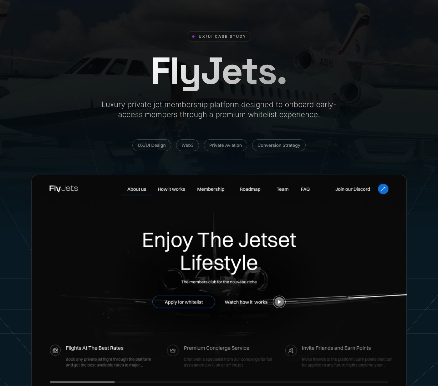
Luxury Private Jet Membership Platform
A premium private aviation landing page designed to onboard early-access members through a high-end whitelist experience.
FlyJets is a luxury private jet membership platform created for high-net-worth users who want access to exclusive travel experiences, premium concierge service, and private aviation benefits. The goal of the project was to design a cinematic, trust-building, and conversion-focused website that communicates exclusivity while guiding users toward joining the whitelist.
Year: 2025
Industry: Private Aviation, Luxury Travel, Web3, Membership Platform
Project Type: UX/UI Design, Landing Page, Web Design
Scope: Research, UX Strategy, UI Direction, Conversion Optimization, Design System
Contribution: UX/UI Design, Visual Direction, Landing Page Design, Conversion Strategy
Project Overview
FlyJets is a luxury private jet membership platform designed to position private aviation as an exclusive digital club experience.
The project focused on creating a premium website that combines luxury storytelling, Web3-inspired onboarding mechanics, and clear conversion points. The experience was built around one main goal: encouraging users to apply for the whitelist while feeling that they are entering a selective, high-value community.
The final design uses dark cinematic visuals, aircraft imagery, blue accent details, elegant typography, and structured content blocks to create a sense of exclusivity, credibility, and modern digital luxury.
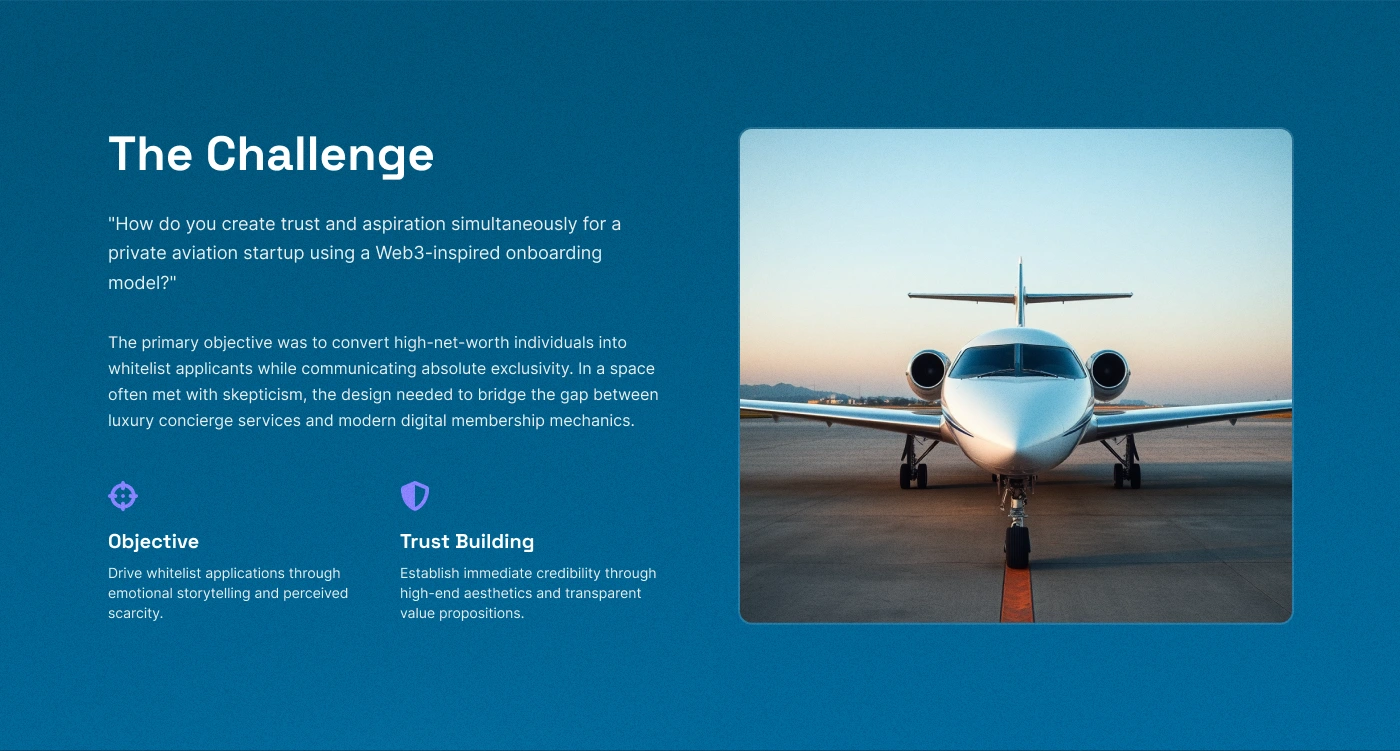
The Challenge
The main challenge was to create trust and aspiration at the same time.
Private aviation is a high-ticket, trust-sensitive niche. Users need to feel that the platform is premium, reliable, and exclusive before taking action. At the same time, the product uses a Web3-inspired whitelist model, which can feel unfamiliar or skeptical for some users if not explained clearly.
The design needed to bridge two worlds:
Luxury concierge experience — emotional, exclusive, aspirational.
Digital membership mechanics — whitelist access, community, points, roadmap, and online onboarding.
The key question was:
How do you make a private aviation startup feel premium, trustworthy, and conversion-ready while using a modern whitelist model?
Goals
Create a premium visual identity for a luxury private aviation platform.
Build trust through high-end aesthetics and clear value propositions.
Guide users toward the main action: applying for the whitelist.
Explain the membership experience in a simple and structured way.
Balance exclusivity with clarity, so users understand what they are applying for.
Design a landing page that feels cinematic, modern, and conversion-focused.
Create reusable UI elements for future scaling of the platform.
UX Strategy
The landing page structure was designed around a clear conversion journey.
The user first enters an immersive hero section that communicates the Jetset lifestyle and presents the main CTA: Apply for whitelist. Then the page gradually explains the value of the club, how it works, membership benefits, roadmap, community, and trust-building details.
The UX strategy focused on:
Clear CTA hierarchy
Simple section structure
Emotional storytelling
Trust-building content
Premium visual rhythm
Reduced friction before application
Web3-inspired but easy-to-understand flow
The goal was not only to make the platform look luxurious, but also to make the next step feel natural and desirable.
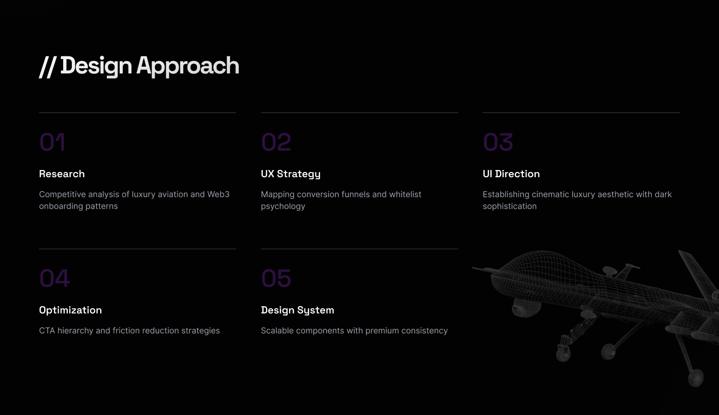
Design Approach
01. Research
The process started with competitive analysis of luxury aviation, premium membership platforms, and Web3 onboarding patterns.
The goal was to understand how high-end digital products create exclusivity, trust, and desire without overwhelming users.
02. UX Strategy
The structure was mapped around whitelist conversion psychology. Every section was designed to either increase desire, reduce uncertainty, or explain value.
03. UI Direction
The visual direction was built around cinematic luxury: dark backgrounds, soft gradients, aircraft imagery, subtle glow effects, and refined typography.
04. Optimization
The CTA hierarchy was simplified to keep the main action visible and focused. Supporting CTAs such as watching how it works and joining the community were placed as secondary actions.
05. Design System
A scalable design system was created with premium consistency across buttons, cards, labels, navigation, content sections, and interactive states.
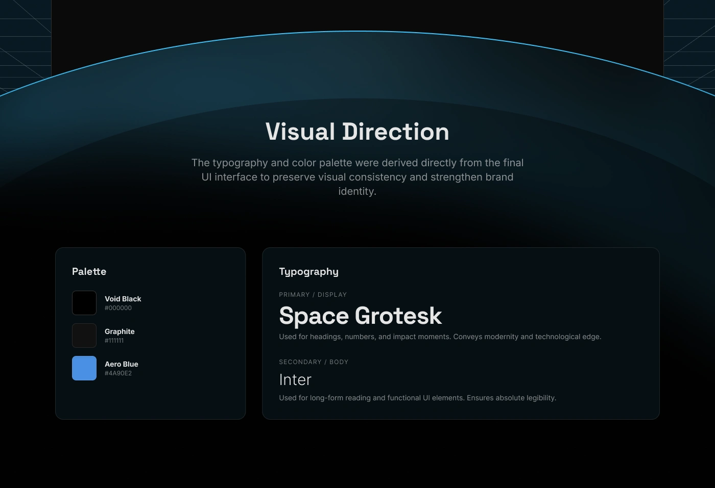
Visual Direction
The visual style was derived directly from the final interface to maintain consistency and strengthen brand identity.
The design uses a dark luxury aesthetic with blue highlights, creating a feeling of exclusivity, technology, and premium travel.
Color Palette
Void Black — #000000 | Used as the main background color to create depth, elegance, and cinematic contrast.
Graphite — #111111 | Used for cards, surfaces, and secondary dark layers.
Aero Blue — #4A90E2 | Used as the main accent color for CTAs, active states, highlights, and interactive elements.
Typography
Space Grotesk | Used for headings, numbers, and high-impact moments. It gives the interface a modern, premium, and slightly futuristic feel.
Inter | Used for body text, navigation, and functional UI elements to keep the experience readable and clean.
Interface Showcase
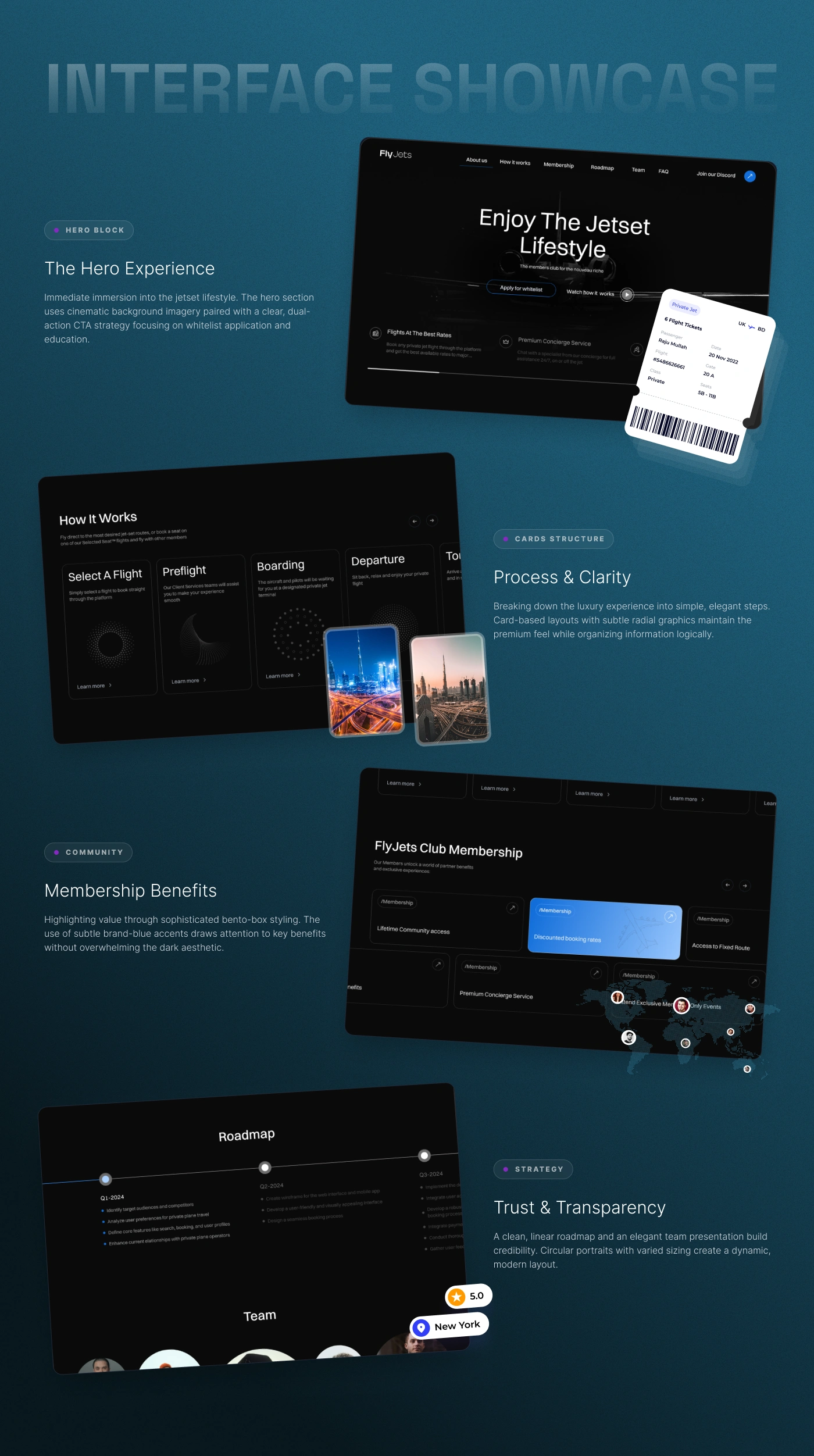
Hero Experience
The hero section was designed to create immediate immersion into the Jetset lifestyle.
It combines cinematic aircraft imagery, a strong headline, and a dual-action CTA structure:
Apply for whitelist
Watch how it works
The goal was to make the first screen feel aspirational while still clearly guiding users toward conversion.
The section also introduces core benefits such as:
Flights at the best rates
Premium concierge service
Invite friends and earn points
This helps users understand the value before scrolling deeper.
Process & Clarity
The “How it works” section breaks the luxury travel experience into simple, elegant steps.
Instead of overwhelming users with long explanations, the flow is organized into clear cards that explain the journey from selecting a flight to preflight, boarding, departure, and arrival.
This structure makes the premium experience feel organized, predictable, and easy to understand.
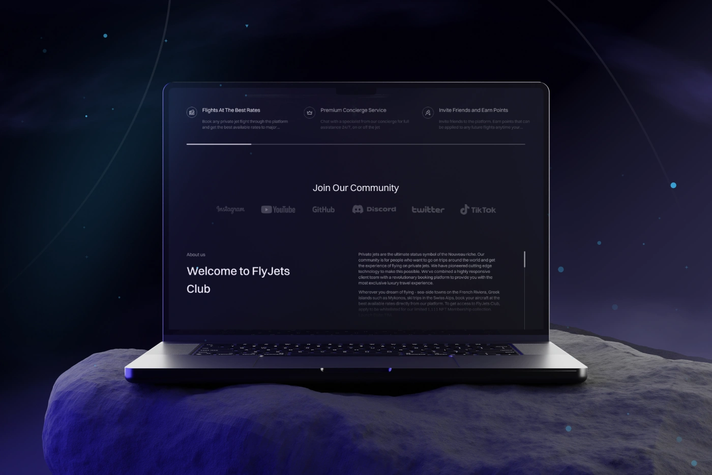
Membership Benefits
The membership section highlights the value of joining FlyJets Club through refined card-based layouts.
Benefits include:
Lifetime community access
Discounted booking rates
Access to fixed routes
Premium concierge service
Curated exclusive members-only events
The goal was to make the membership feel both exclusive and practical, showing users what they gain by joining early.
Community & Social Proof
The platform also includes a community-focused layer, encouraging users to join the FlyJets ecosystem through social channels and community spaces.
This supports the Web3-inspired positioning and helps the product feel like more than a booking service — it becomes a members club.
Community links include platforms such as Discord, Twitter, YouTube, Instagram, GitHub, and TikTok.
Roadmap & Transparency
The roadmap section was designed to build credibility and reduce uncertainty.
For early-stage or whitelist-based platforms, transparency is important. Users need to understand what is planned, what the product vision is, and how the platform will evolve.
The roadmap gives the product a more structured and trustworthy feel while keeping the visual language minimal and premium.
Trust-Building Strategy
Since the project sits in a luxury and high-ticket niche, trust was one of the most important design principles.
The interface builds trust through:
Premium visual quality
Clear value propositions
Transparent roadmap
Structured membership details
Consistent CTA hierarchy
Elegant typography
Professional imagery
Minimal but confident copy
A modern digital club atmosphere
The design avoids looking too corporate or too “crypto-heavy.” Instead, it positions the platform as a sophisticated private aviation membership experience with modern digital mechanics.
Design System
A visual system was created to keep the website scalable and consistent.
The system supports future platform growth while preserving a premium and recognizable visual identity.
Results
The final design delivers a cinematic and conversion-focused landing page for a luxury private aviation platform.
Key Results
A premium digital presence for a private aviation membership platform.
A clear whitelist conversion flow focused on early-access applications.
A luxury visual direction using dark themes, aircraft imagery, and blue accent details.
A structured landing page experience that explains the product, benefits, community, and roadmap.
Improved trust and clarity through transparent value propositions and refined content hierarchy.
A Web3-inspired experience that still feels accessible and easy to understand.
A scalable UI system for future product and website expansion.
A strong hero section built to create instant emotional impact and guide users to apply.
Project Scope
This case study covers the UX/UI design of the FlyJets landing page, including the hero experience, visual direction, membership blocks, community section, roadmap, trust-building content, CTA strategy, and design system.
The project was designed for a premium audience and focused on balancing luxury, clarity, exclusivity, and conversion.
Conclusion
FlyJets transforms private aviation into a modern digital membership experience.
The final design combines cinematic visuals, premium UI, Web3-inspired onboarding, and clear conversion strategy to create a landing page that feels exclusive, trustworthy, and easy to understand.
The result is a luxury aviation website that does more than present a service — it invites users into a high-value private club experience.
✍️ Contact me and we will set up 1-hour free design consultation for your project!
Like this project
Posted May 26, 2026
UX/UI design for FlyJets, a luxury private aviation membership platform with a premium landing page, whitelist flow, and conversion-focused design.
Likes
1
Views
16
Timeline
Sep 10, 2025 - Oct 31, 2025