UX/UI Design for Orthodontic SaaS, Web Platform Design
Yuliia Ishchenko
UX/UI Design for Orthodontic SaaS Platform
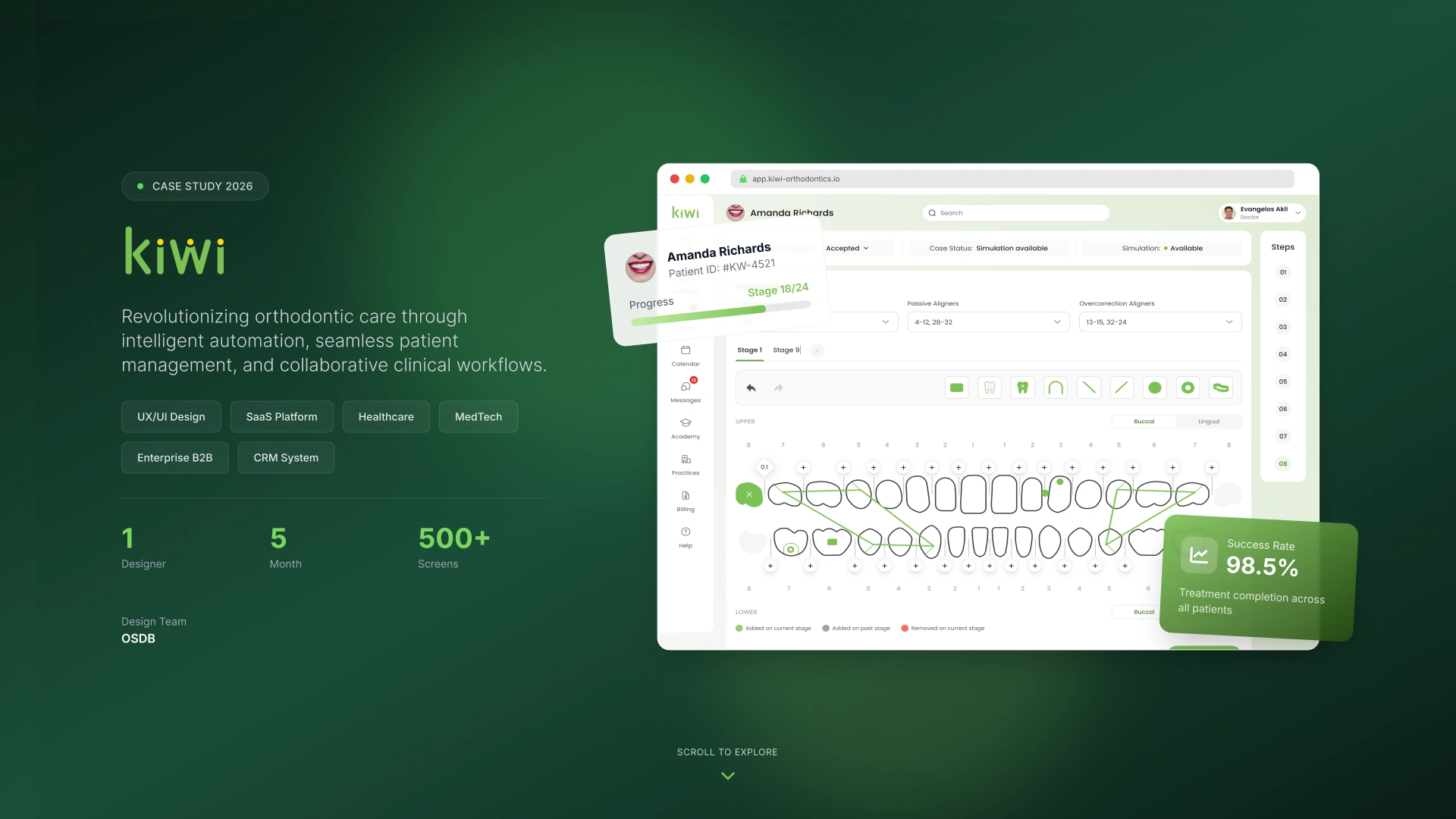
Revolutionizing orthodontic care through intelligent automation, seamless patient management, and collaborative clinical workflows.
Kiwi is a healthcare SaaS platform designed for orthodontic practices that need to manage patients, treatment planning, clinical records, billing, communication, and daily operational workflows in one connected system.
The product helps doctors, clinical teams, and practice managers reduce manual work, improve case visibility, and keep the full treatment process structured from the first patient intake to treatment completion.
Year: 2026
Industry: Healthcare, MedTech, SaaS, Orthodontics
Project Type: UX/UI Design, SaaS Platform Design
Timeline: 5 months
Team: 1 Designer
Scope: 500+ screens
Contribution: Product UX, UI Design, Visual Identity, Design System, Component Library, Dashboard Design, Patient Flow, Clinical Workflow Design
Project Overview
Kiwi was created as a complex B2B healthcare platform for orthodontic clinics and multi-practice teams. The main challenge was to transform a high-density clinical workflow into a clean, structured, and intuitive SaaS experience.
Orthodontic teams work with large amounts of patient data: records, treatment options, case stages, prescriptions, orthomarks, billing, calendars, messages, tasks, and approvals. Without a well-structured interface, this information can quickly become overwhelming and difficult to manage.
The goal was to design a platform that keeps all critical clinical and operational information in one place while making daily work faster, clearer, and easier for doctors and staff.
Problems
Complex clinical workflows were difficult to manage manually
Orthodontic teams needed to work with multiple types of data: patient records, case status, treatment options, simulations, billing, and communication. Without a unified structure, the workflow could become fragmented and time-consuming.
Patient creation required too much attention and could lead to missing data
The patient intake process included many clinical fields, records, photos, chief concerns, financial details, case assignments, and treatment-related information. If the process was not guided properly, important data could be missed before treatment planning began.
Doctors needed faster access to case status and treatment progress
Clinical teams needed to quickly understand where each patient was in the treatment process, whether the simulation was available, what stage the case was in, and what actions were required next.
The platform required a scalable structure for many modules
The product included patients, billing, calendar, messages, tasks, practices, user management, dashboards, case assignment, treatment planning, and more. The interface needed a scalable architecture and reusable component system to support growth.
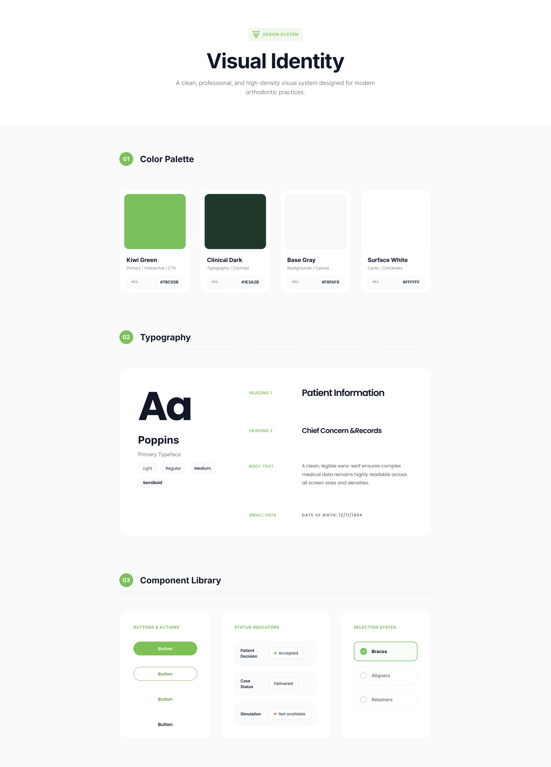
High-density medical data needed to stay readable and visually calm
Because the product is used in a clinical environment, the design needed to avoid visual overload. The interface had to remain clean, professional, and easy to scan, even when displaying complex patient and treatment data.
Goals
Create a clean and scalable SaaS interface for orthodontic practices.
Structure the patient creation process into a guided step-by-step flow.
Reduce cognitive load for doctors and clinical staff.
Improve visibility of case status, treatment progress, and required actions.
Design a full dashboard interface for practice performance tracking.
Build a consistent visual identity and component library.
Make the platform easy to expand across patients, billing, calendar, messages, tasks, and practice management modules.
Keep the visual style professional, modern, and suitable for daily clinical use.
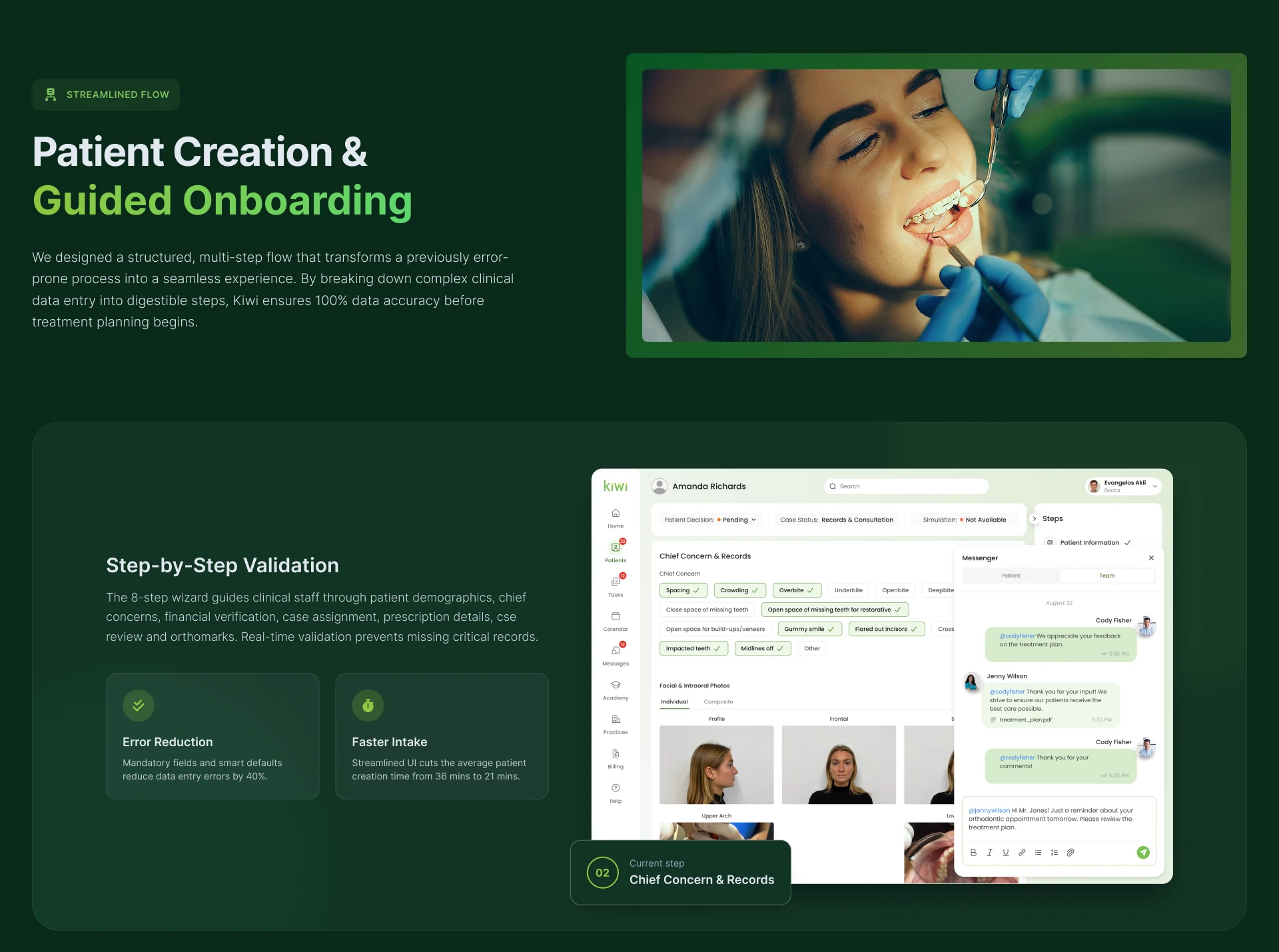
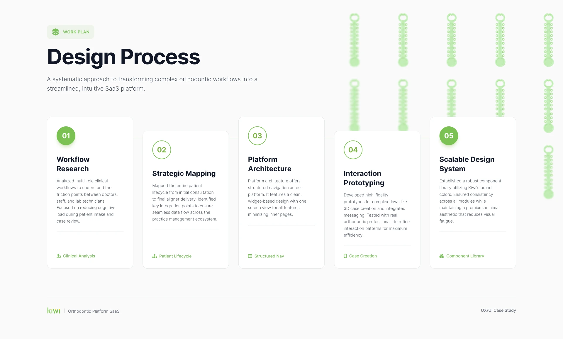
Patient Creation & Guided Onboarding
One of the most important flows was patient creation. The previous process could easily become overwhelming because it required multiple types of clinical and administrative data. To solve this, the flow was transformed into a structured multi-step experience.
The patient creation process guides clinical staff through the required information step by step, including patient details, chief concerns, records, photos, treatment preferences, case assignment, and orthomarks.
The interface uses validation, progress tracking, contextual panels, and clear status indicators to make sure important data is completed before treatment planning begins.
Key Improvements
Step-by-step validation: The 8-step wizard helps users complete clinical information in the right order and prevents missing critical records.
Error reduction: Mandatory fields and smart defaults help reduce data entry errors by up to 40%.
Faster intake: A more structured interface can reduce average patient creation time from 36 minutes to 21 minutes.
Contextual communication: Messaging is integrated into the patient workflow, allowing team members to discuss case details directly inside the platform.
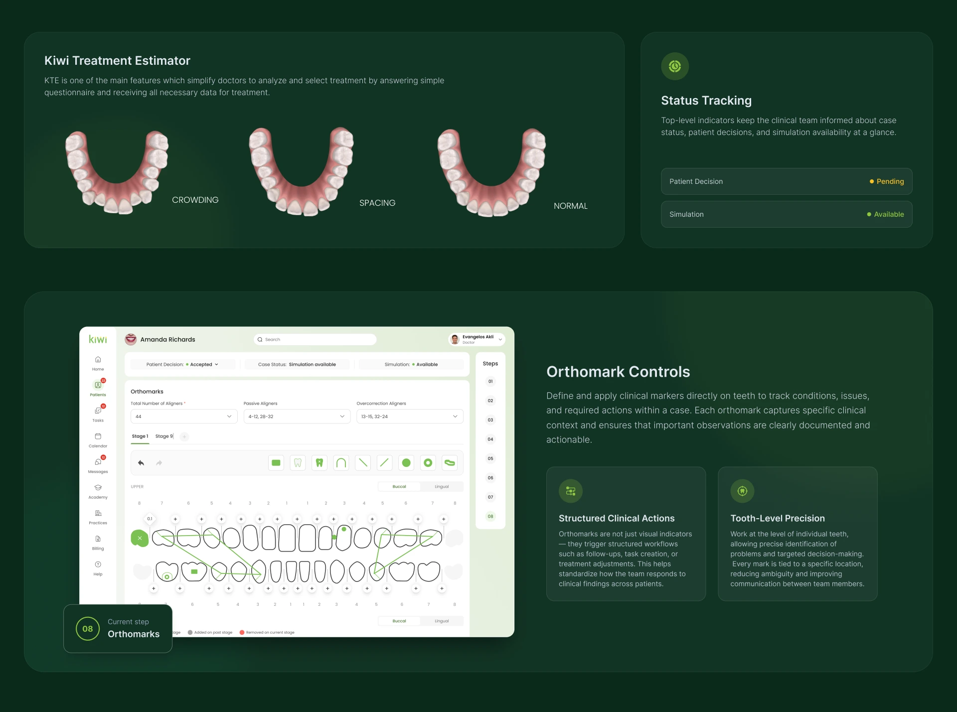
Treatment Estimator
The Kiwi Treatment Estimator was designed to help doctors analyze and select treatment options more efficiently.
Doctors can answer a simple questionnaire and receive the necessary treatment-related data in a structured format. The estimator supports conditions such as crowding, spacing, and normal cases, making treatment planning easier to understand and compare.
This feature simplifies the decision-making process and helps doctors work with treatment options in a more visual and guided way.
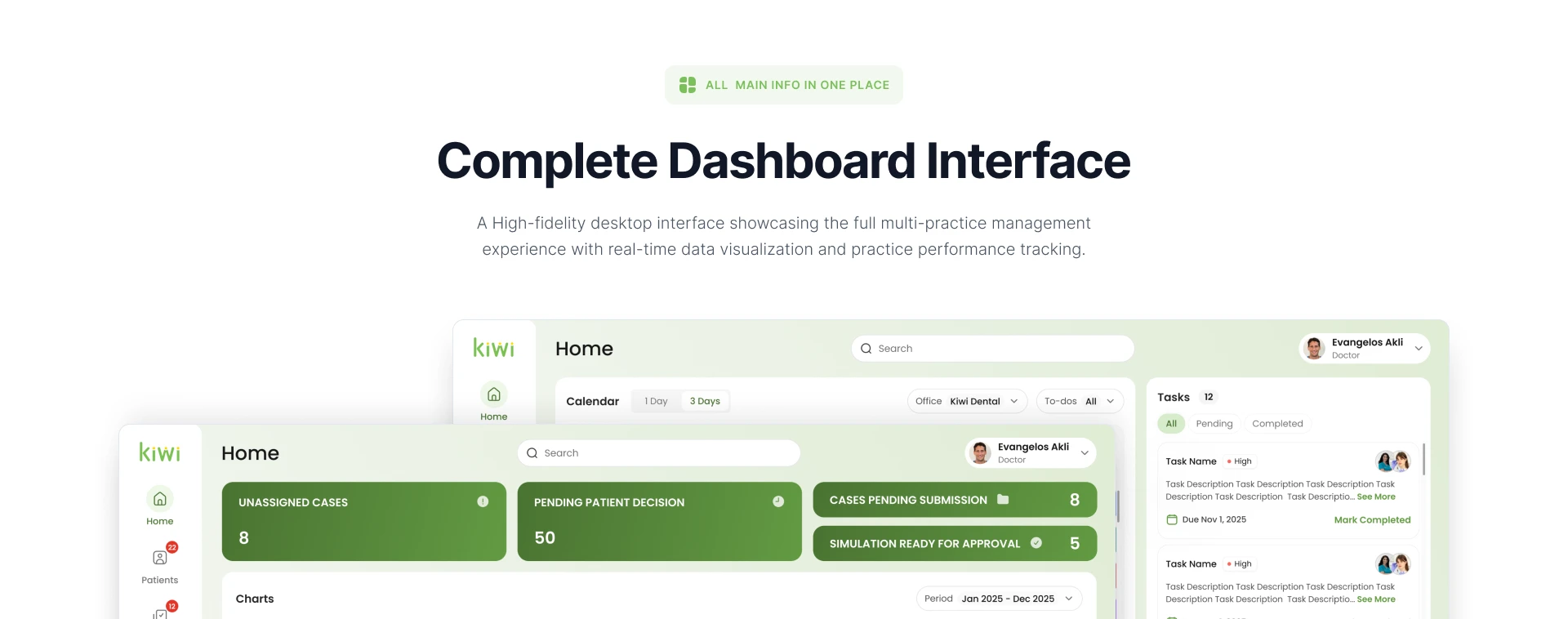
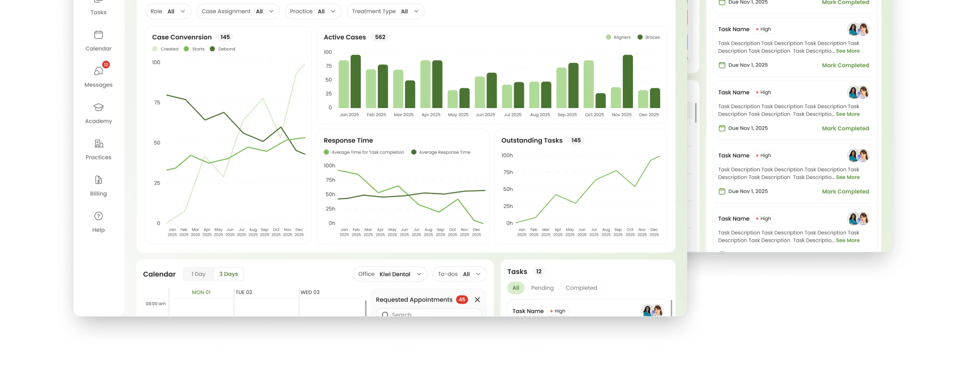
Complete Dashboard Interface
A full dashboard interface was designed to give users a high-level view of practice performance and daily workload.
The dashboard includes:
Unassigned cases
Pending patient decisions
Cases pending submission
Simulations ready for approval
Case conversion charts
Active cases
Response time analytics
Outstanding tasks
Calendar preview
Task list
Filters by role, case assignment, practice, and treatment type
The goal was to create a central workspace where doctors and managers can quickly understand what requires attention and make faster operational decisions.
The dashboard combines real-time data visualization with practical task management, helping the team stay aligned during the day.
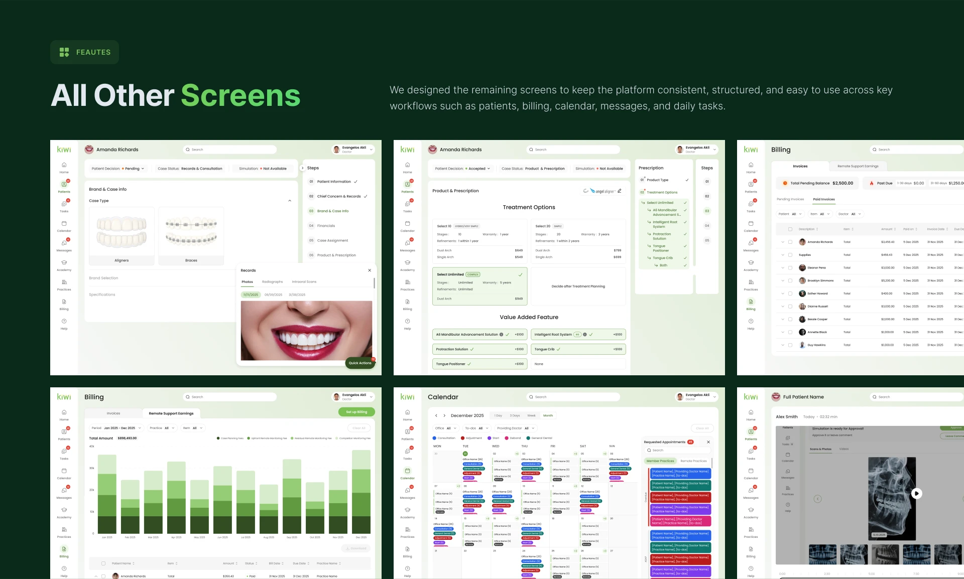
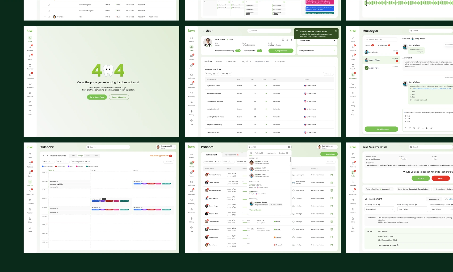
Calendar, Billing, Messages, and Other Screens
Beyond the core patient and treatment flows, the platform also included a large number of supporting modules.
Billing
Billing screens were designed to help users manage invoices, remote support earnings, paid and pending invoices, payment status, and financial records.
The interface uses tables, filters, charts, and status labels to make financial data easier to review.
Calendar
Calendar views were designed for daily, three-day, weekly, and monthly planning. The interface supports appointments, requested appointments, office filtering, doctor filtering, and task-related events.
Messages
The messaging module allows users to communicate with patients and team members directly inside the platform. It supports case-related conversations, automated messages, internal notes, and quick communication.
Tasks
The task module helps doctors and staff manage case assignment, approvals, priorities, and patient-related actions. Important tasks are connected to case context so users can act without switching between many screens.
User & Practice Management
Additional screens were created for managing users, practices, cases, preferences, integrations, legal documents, activity logs, and active/completed case overview.
Error States
A custom 404 page was designed to keep the experience consistent even in edge cases.
Redesign Results
The final design created a complete, scalable SaaS interface for orthodontic practices.
The product now provides a structured experience across patient management, treatment planning, clinical workflows, billing, calendar, messages, tasks, and analytics.
Key Results
500+ screens designed across core and supporting modules.
Scalable design system created for long-term product growth.
Faster patient intake through guided onboarding and structured validation.
Reduced data entry errors by making mandatory fields, clinical records, and progress states clear.
Improved case visibility through status tracking, dashboard widgets, and progress indicators.
Better clinical collaboration through integrated messages, tasks, and patient-related communication.
More efficient treatment planning through treatment estimator and orthomark controls.
Cleaner daily workspace for doctors, staff, and practice managers.
The platform became more intuitive, visually consistent, and easier to scale. Instead of spreading clinical and operational work across disconnected tools, Kiwi brings the full orthodontic workflow into one structured SaaS environment.
Project Scope
This case study highlights only part of the full design work. The complete project included more than 500 screens across patient management, treatment planning, dashboard analytics, calendar, billing, messages, tasks, user management, practice management, and system states.
The design was created as a scalable foundation that can support future functionality, additional clinical workflows, and multi-practice expansion.
Conclusion
Kiwi is a complex healthcare SaaS product transformed into a clean, structured, and scalable platform for orthodontic teams.
The main focus of the design was not only to make the interface visually appealing, but to make daily clinical work easier: faster patient creation, clearer case management, better treatment visibility, and smoother collaboration between doctors, staff, and practices.
The result is a professional MedTech platform that combines high-density medical data with a calm, intuitive, and modern user experience.
Like this project
Posted May 23, 2026
UX/UI design for Kiwi, a healthcare SaaS platform helping orthodontic clinics manage patients, treatment workflows, dashboards, billing, and team collaboration.
Likes
0
Views
24
Timeline
Nov 1, 2025 - May 1, 2026