Freelancers in Singapore
Sign Up
Post a job
Sign Up
Log In
Filters
2
Projects
People
Benjamin C
max
Singapore
CMO | Top 1% Content that Performs
$100k+
Earned
28x
Hired
5.0
Rating
381
Followers
Top
expert
Follow
Message
CMO | Top 1% Content that Performs
0
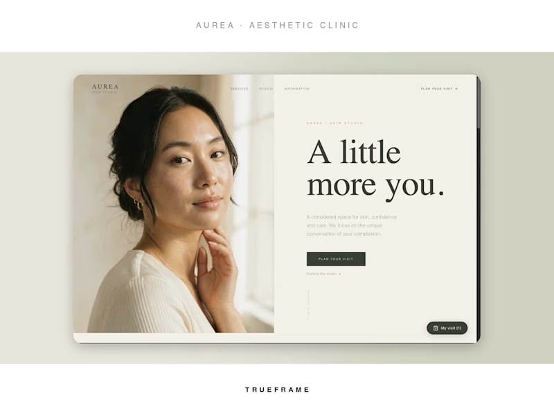
AUREA: An Editorial Skin Studio Website + Visit Planner
0
17
4
a16z Machine Age Fund Podcast Trailer
4
30
8
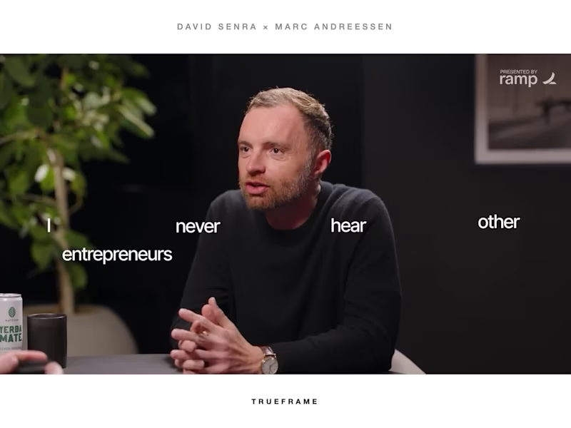
Podcast Trailer for Marc Andreessen Interview
8
83
1
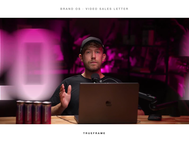
Brand OS: Motion-Designed Video Sales Letter
1
44
Beauty
(1)
Follow
Message
Anto Aryanto
pro
Singapore
Webflow Expert: Memorable Sites That Convert
$5k+
Earned
2x
Hired
8
Followers
Certified Partner
Follow
Message
Webflow Expert: Memorable Sites That Convert
0
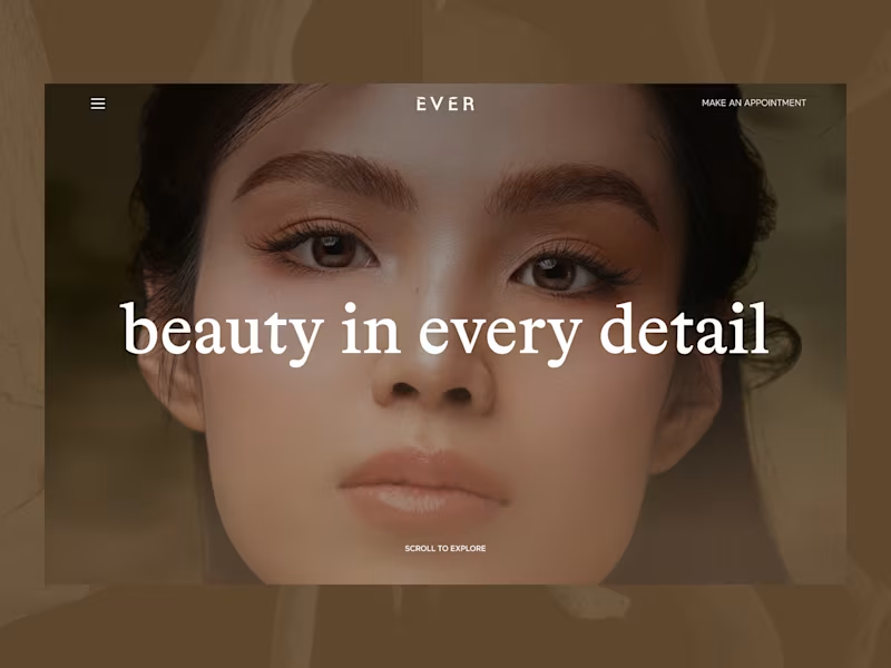
Luxury Spa & Beauty Studio Website Design
0
9
0
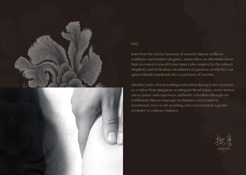
Luxury Wellness Brand Designer | ANMO
0
6
1
Dorset House Brand Identity & Editorial Repositioning Concept
1
8
0
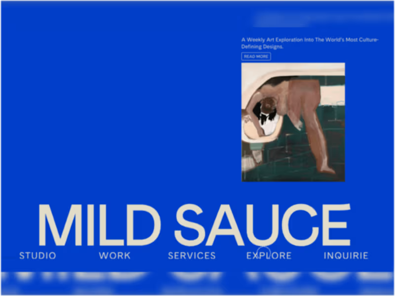
Mild Sauce Studio + Shop | Interior Design Chicago & Los Angeles
0
7
Beauty
(1)
Follow
Message
Hasini Tharupaba
Singapore
Building strategic brands and websites for businesses
1x
Hired
5.0
Rating
9
Followers
Follow
Message
Building strategic brands and websites for businesses
1
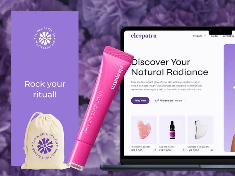
Cleopatra Ceylon is a beauty and self-care brand built for a new generation - one that sees femininity as a form of strength and self-care as something worth showing up for. The project came with a clear vision and the creative freedom to build an identity that could carry it. The brief was to design a brand and website that felt bold and intentional - something that spoke directly to a younger audience without blending into the sea of earthy, neutral-toned beauty brands dominating the space right now. Building the Visual Identity Colour Purple leads the palette - confident, distinctive, and a deliberate departure from the muted tones that define so much of the beauty industry today. It reflects where this brand stands: expressive, unapologetic, and speaking to an audience that wants to be seen. The off-white keeps everything balanced without dulling the impact. Identity A custom floral emblem sits at the heart of the brand. Designed to feel both soft and structured, it carries a sense of renewal and self-devotion without over-explaining it - the kind of mark that means something without needing a caption. Website The website was built with the same mindset as the identity - clean, considered, and easy to move through. The shopping experience is stripped back to only what’s necessary, so every visit feels effortless and every decision feels natural. As an emerging brand in its early growth stage, both the identity and the website are built to scale as Cleopatra Ceylon grows. The results spoke for themselves. After the website launched, sales doubled - a clear sign that minimal, easy user experience directly supports the conversions.
1
69
0
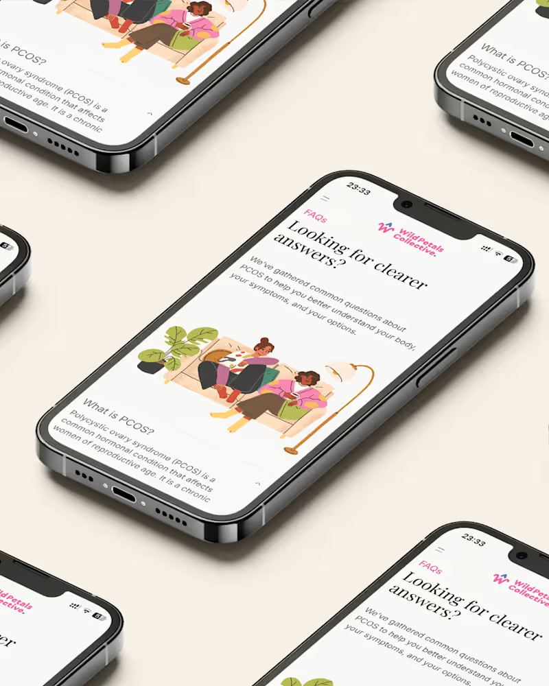
Overview Wild Petals Collective is a community-based brand focused on PCOS awareness and women’s health. The landing page was designed as the brand’s first digital touchpoint - building presence and community before the full website launch. Goals Introduce the brand and its mission to the target audience Drive registrations to grow the early community Establish a tone of care, credibility, and inclusivity around PCOS and endometriosis The challenge Starting a design without a brand guideline is both a creative opportunity and a responsibility. There were no defined colour palettes, no type scales, no tone-of-voice documentation to pull from. The only anchor was the logo. For a brand dealing with something as personal as hormonal health, getting the visual language wrong carries real weight. Too clinical and it feels cold. Too soft and it loses credibility. The design needed to earn trust while feeling warm and human. Design direction The overall aesthetic was soft, feminine, and professional. Not a typical health brand look - no sterile whites and clinical blues - but also not a lifestyle blog. The goal was something in between: a space that felt like it was designed for women, not at them. Beyond the landing page As a complementary deliverable, I also designed a blog page. This wasn’t part of the original brief, but it was a natural addition. A blog gives the brand a channel to publish health content, share community stories, and build topical authority over time - all of which feeds directly into SEO. For a brand in its early stages, organic search visibility is one of the most valuable long-term investments, and having the blog page ready to go meant the brand could start building that foundation from day one. Outcome The project resulted in a cohesive design system built from scratch - colour palette, typography, spacing, and component style - that the brand can carry forward into its full website. The landing page gives Wild Petals Collective a credible, warm, and intentional first impression, and the blog page sets up the infrastructure for content growth. It’s a project that reminded me how much design work happens before a single frame is built: understanding what a brand stands for, who it’s speaking to, and what it needs to make someone feel safe enough to say this is my community.
0
72
0
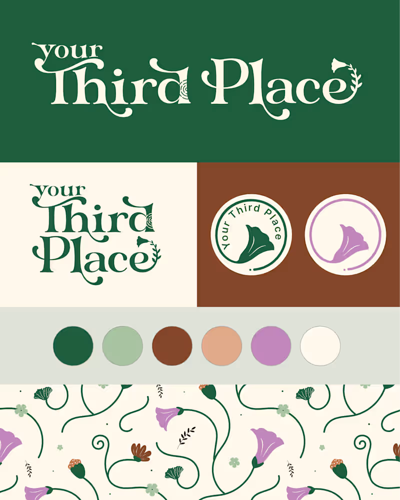
Your Third Place is a creative community inspired by the concept introduced by Sociologist Ray Oldenburg - a space beyond home and work where people gather, connect, and truly belong. Reimagined for modern creatives, it offers workshops and gatherings rooted in meaningful human interaction and nature conservation. The logo is designed with layered meaning. At its core is the Nelu flower, an endangered Sri Lankan bloom known for its rare, cyclical blossoming. Its slow and infrequent bloom symbolizes patience, protection, and the idea that growth unfolds in its own season - making it both an ecological statement and a metaphor for human potential. The letter “d” integrates a thumbprint-inspired mark, subtly embedded with tree-ring patterns to represent the brand’s three pillars: connection, conservation, and creativity. The thumbprint reinforces individuality within community - a reminder that while every person is unique, we are deeply interconnected. A grounded forest green color anchors the identity in nature and sustainability, complemented by a warm earthy brown that evokes soil, roots, and belonging. A soft lavender accent introduces femininity and creative expression. Slightly structured yet gently curved letterforms balance professionalism with warmth, ensuring the brand feels credible yet welcoming. Together, the identity positions Your Third Place at the intersection of creative collaboration, ecological awareness, and human belonging - a space where growth is not rushed, and people are free to bloom in their own time.
0
78
0
Tesla owners UK website UI developer
0
36
Beauty
(1)
Follow
Message
Hugo Jackson
pro
Singapore
Creative Director, 3D Generalist & AI Filmmaker.

62
Followers
Follow
Message
Creative Director, 3D Generalist & AI Filmmaker.
0
Biotherm Homme - Ahead of the Game
0
17
0
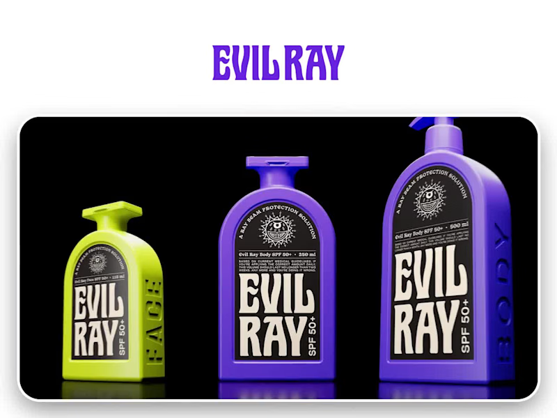
Evil Ray: Visualizing the Enemy of the Sun
0
12
0
The Explorer: Defining "Blue Chip" AI Documentary
0
27
4
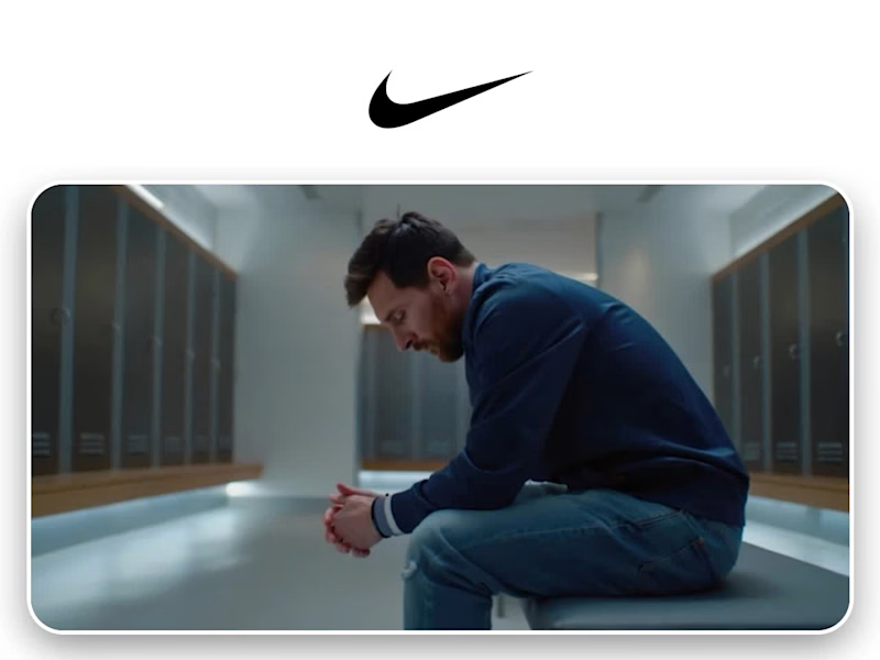
Messi – The GOAT is Home | Concept Ad (Nike 2025) - YouTube
4
63
Beauty
(2)
Follow
Message
Willie Noah Tan
pro
Singapore
A studio for soulful, human-made design.
8
Followers
Follow
Message
A studio for soulful, human-made design.

2
Visual Identity for A Modern Water Care Brand
2
14
0
Helping local Singapore-based tech like Easy-Peasy.AI (http://Easy-Peasy.AI) tell their story is exactly why we love what we do. We spent some time under the hood of their platform to script, record, and produce this 2min platform showcase. The goal: Make a massive AI powerhouse feel, well... Easy Peasy to understand! Have a look👇
0
111
3
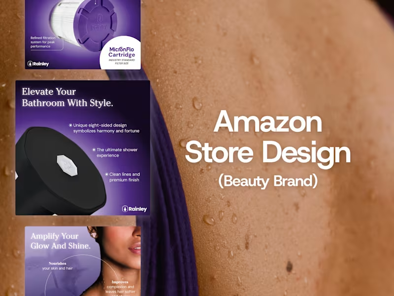
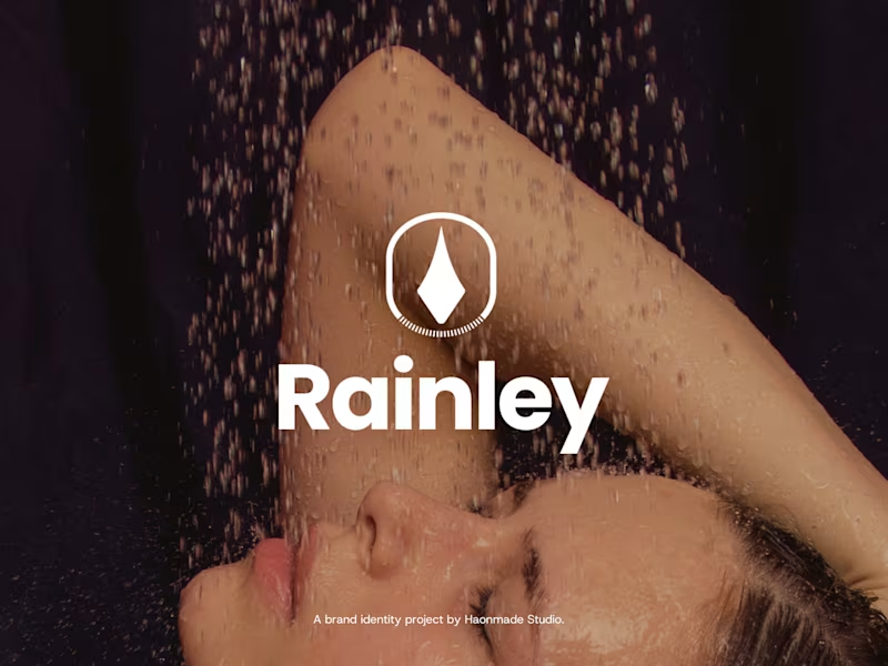
Rainley entered a crowded Amazon market where most water care brands looked clinical and technical. The challenge was to make the brand stand out by blending beauty, wellness, and functionality while keeping its credibility as a serious water care product. Service Provided: 1. Visual Identity 2. Amazon Store Design 3. Product Listing Design Portfolio Link: https://haonmade.com/work/rainley-to-amazon
3
205
1
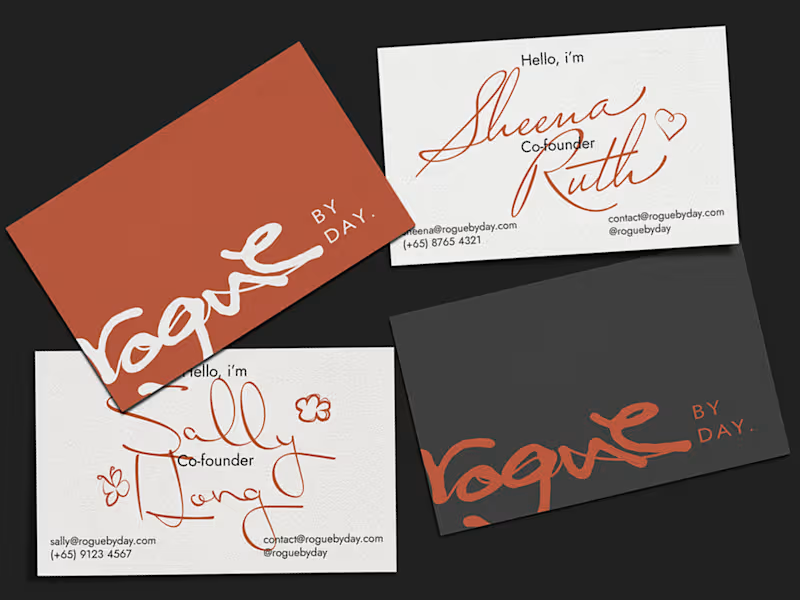
Rogue by Day is a lifestyle brand based in Singapore. The brand was born with the founder's love for fashion, a love letter to those start trends, not follow them. In collaboration with Haonmade, the creator of the brand approached us to build the foundation of the brand starting with a new brand identity. Service Provided: 1. Logo Design 2. Brand Design 3. Social Media Content Portfolio Link: https://haonmade.com/work/rogue-by-day
1
192
Beauty
(1)
Follow
Message
Yoki A J
pro
Singapore
Visual & Motion Designer bringing stories to life

New to Contra
Follow
Message
Visual & Motion Designer bringing stories to life
0
Complete Brand Identity & Website Launch
0
79
0
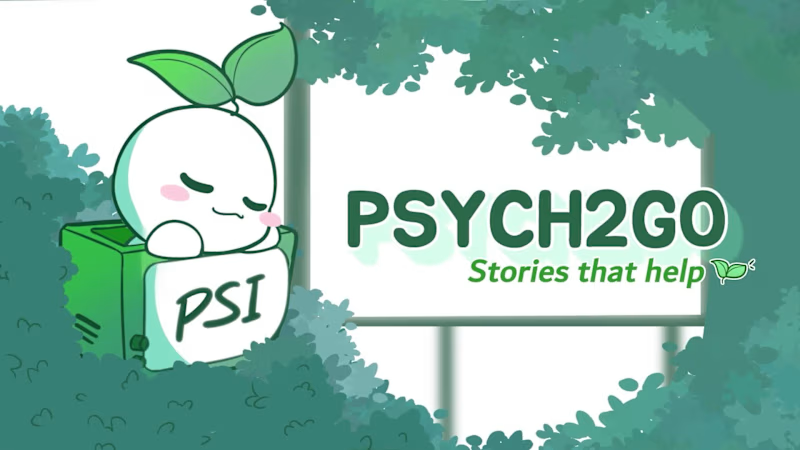
Unbreakable Mindset-Psychology Explainer Animation Video
0
16
0
Youtube Psychology Animation Explainer Video - Anime Inspired Style
0
111
0
Psychology Animation Explainer Video - Chibi Style
0
137
Beauty
(1)
Follow
Message
Kaye Lam
pro
Singapore
Digital designer helping brands in their glow up era.
Follow
Message
Digital designer helping brands in their glow up era.
0
The Ogee Clinic Visual Identity Design
0
9
0
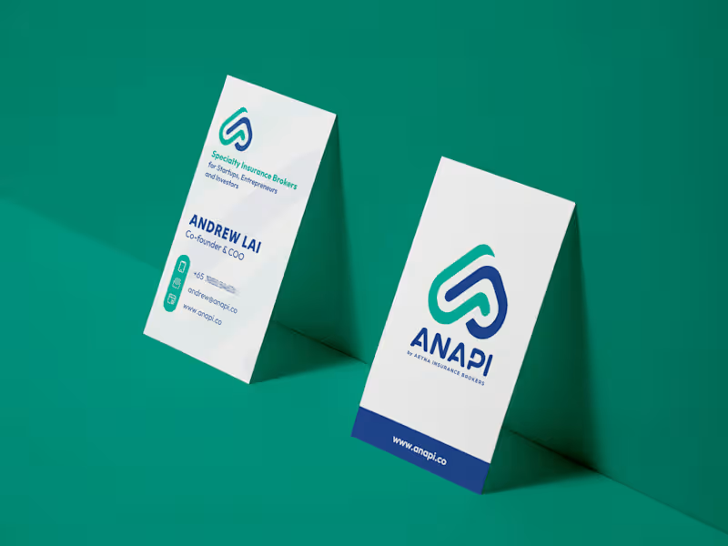
Anapi Brand Refresh and Web Design
0
8
0
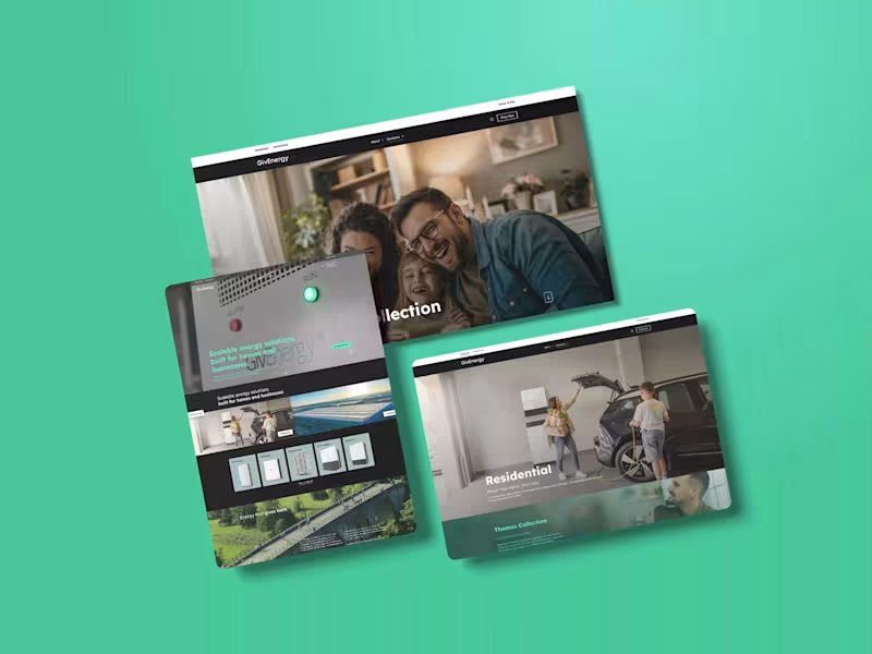
GivEnergy WordPress Multi-Site Development
0
3
0
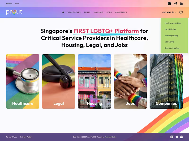
Prout's Directory Platform
0
6
Beauty
(1)
Follow
Message
Joey Lim
Singapore
Brand Designer + Marketer Building Creative Brands
Follow
Message
Brand Designer + Marketer Building Creative Brands
0
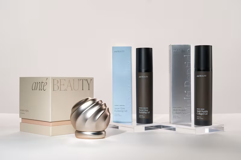
Anté Beauty - Full-suite Creative Partner
0
14
0
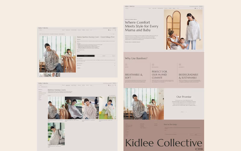
Kidlee Collective - Website Design
0
21
0
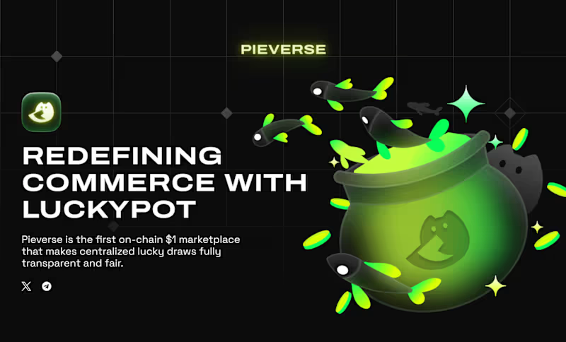
Pieverse - Website Design, Illustration
0
7
0
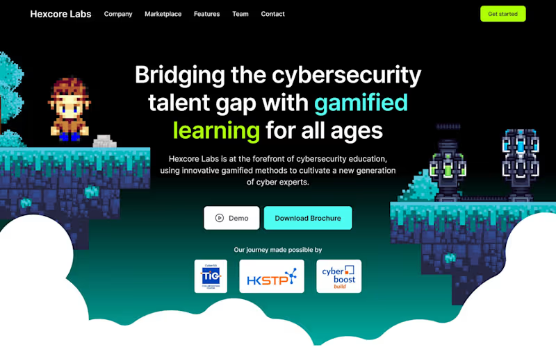
Hexcore Labs - Website Design, Social Media
0
9
Beauty
(1)
Follow
Message
Explore people