Visual Identity for A Modern Water Care Brand
Willie Noah Tan
Scope:
Creative Direction, Graphic Design, Shopify Webstore Graphics, Amazon Storefront Graphics, & Social Media Educational Content.
Team:
Willie - Creative Lead (Haonmade Studio)
Danielle - Design Lead (Haonmade Studio)
Water filter, but make it a beauty & wellness essential
As Rainley prepared for launch, founder David Tang brought us in to help steer his water filter dream into a real brand. Rainley was built upon the principle that a healthy life starts with clean water. Like the phrase “You can’t have a rainbow without rain”, Rainley aims to provide people the tools they need to achieve a healthier lifestyle.
Water is an essential, but David realised that the reality is not all water is the same, and not everyone has the same exact lifestyle. In a fast-paced world, people want to be pampered but just don’t have the time to perfect their routine. With this realisation, we collaborated closely and shifted the narrative. They weren’t just another shower filter, they were a gateway to treating yourself better just by doing something you already do everyday. Rainley is the first step to feeling fresh and beautiful.
A glimpse into the visual language and copy tone guiding this project.
Creative direction
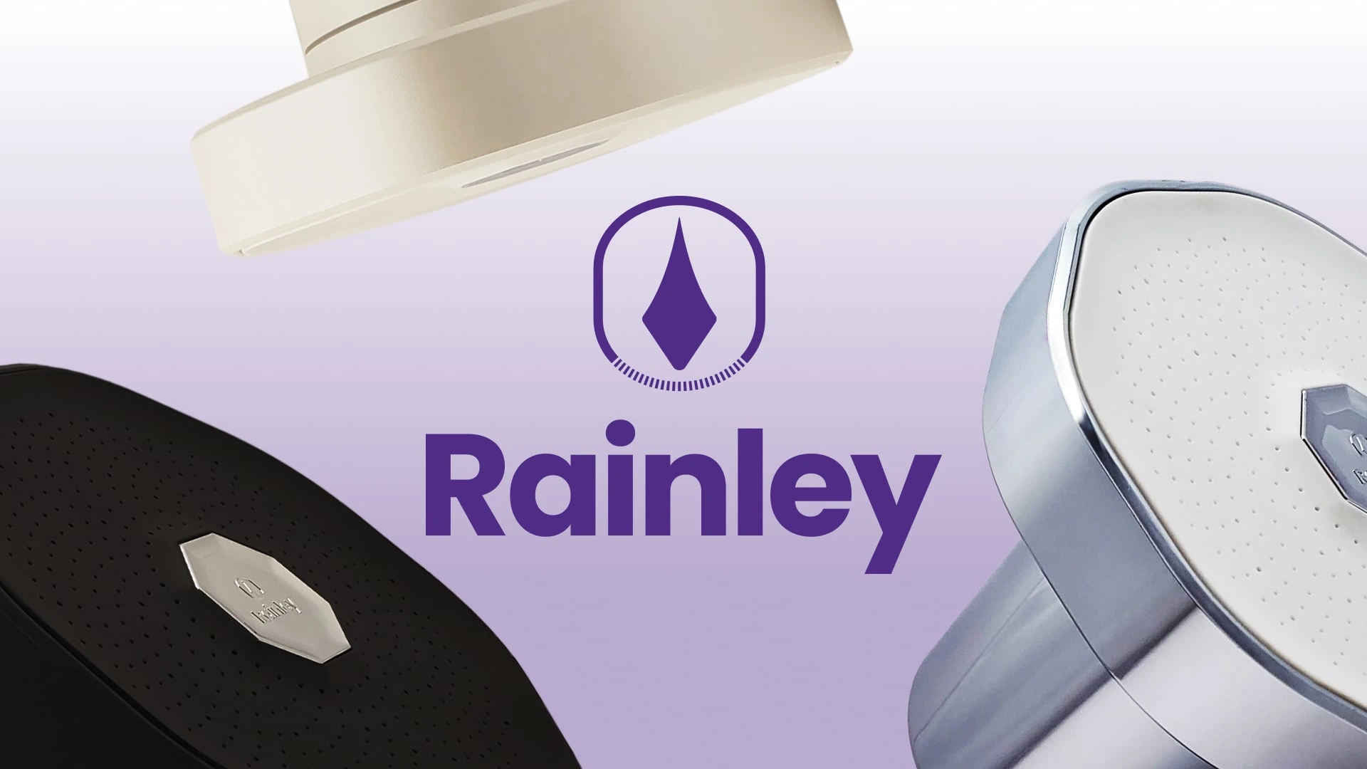
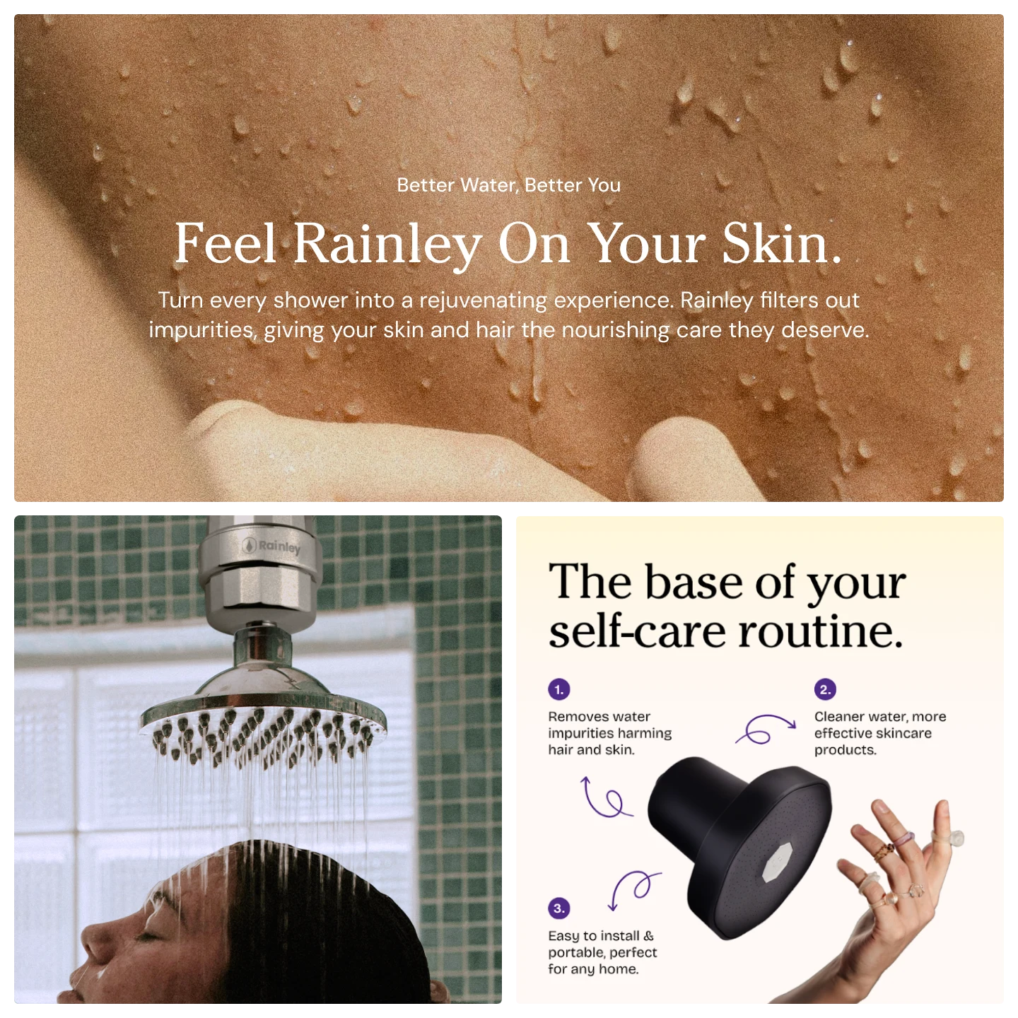
The visual direction we refined for Rainley focuses on an elevated wellness ritual, veering away from sterile and clinical visuals you mostly see in bathroom wares. Drawing inspiration from its namesake, we pulled colours and texture from nature’s sky. For typography, we used a classy serif font that’s not overly ornamental, a balance between authority and femininity.
The moodboard and visual direction guiding Rainley’s perception.
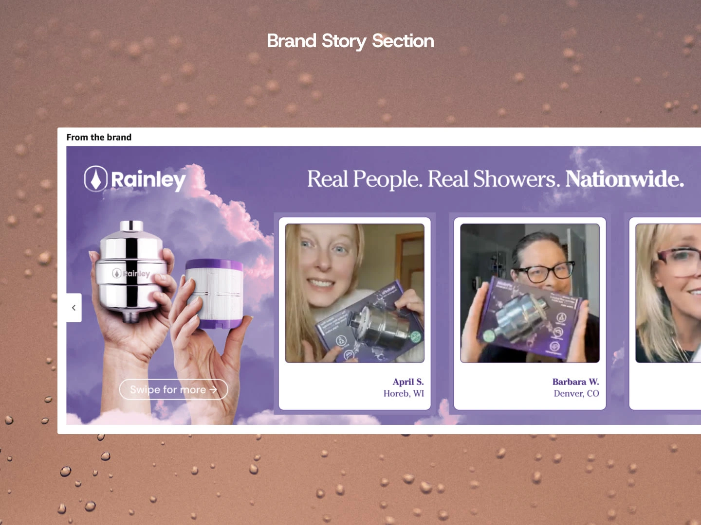
Inspiring water care and intentional self care on social media
The language on social channels focused on its core audience: people who want to feel good. We simplified complex tech into a story people actually want to read, shareable shower advice and beauty tips with clean and skin-centred visuals. The curated content allowed people to find the potential in their own skin with Rainley.
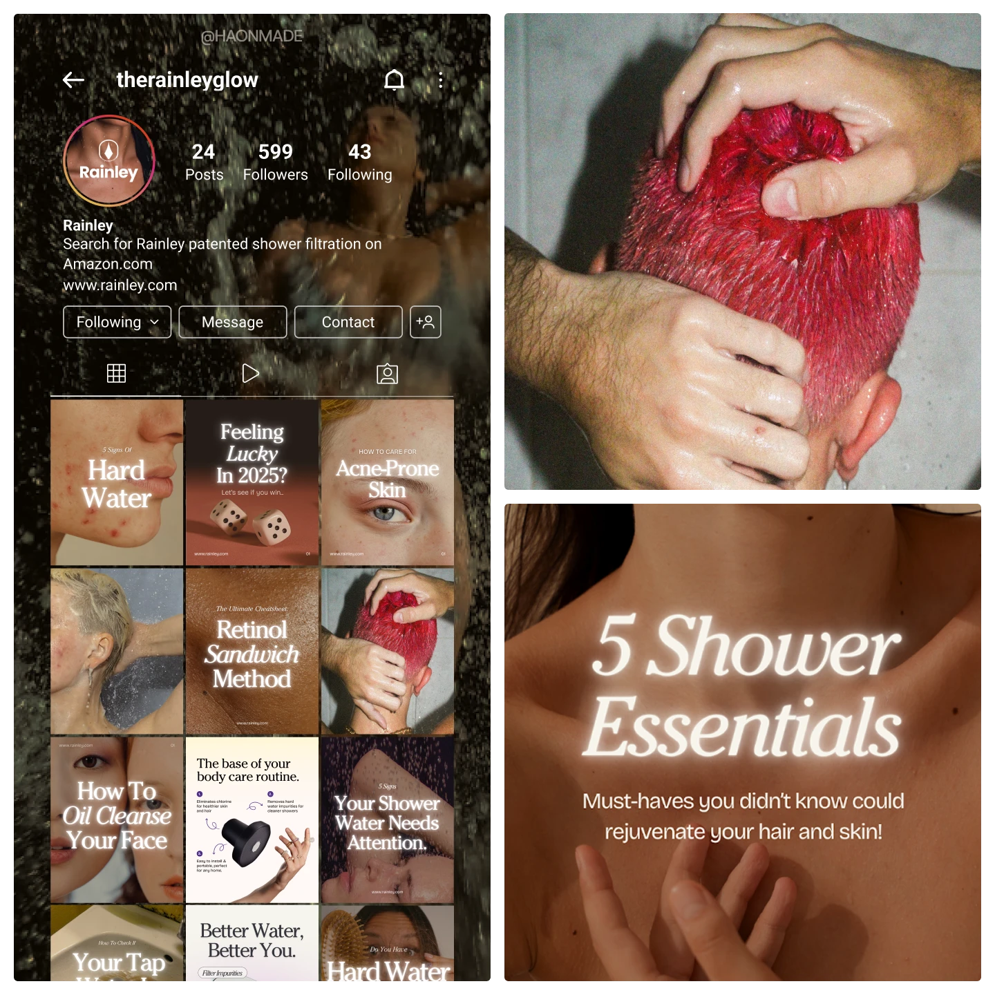
We crafted content that captures attention, stays true to the visual direction, and elevates Rainley as a considered water care brand.
Shopify Store
For the website, a challenge became apparent. With only two products and no real reviews yet, how can we make the experience feel whole and reliable?
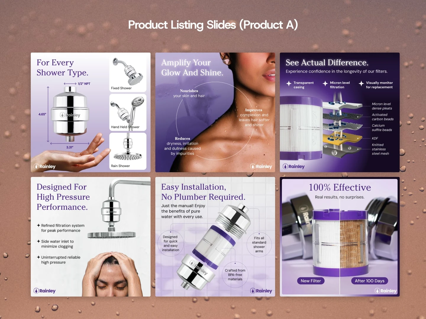
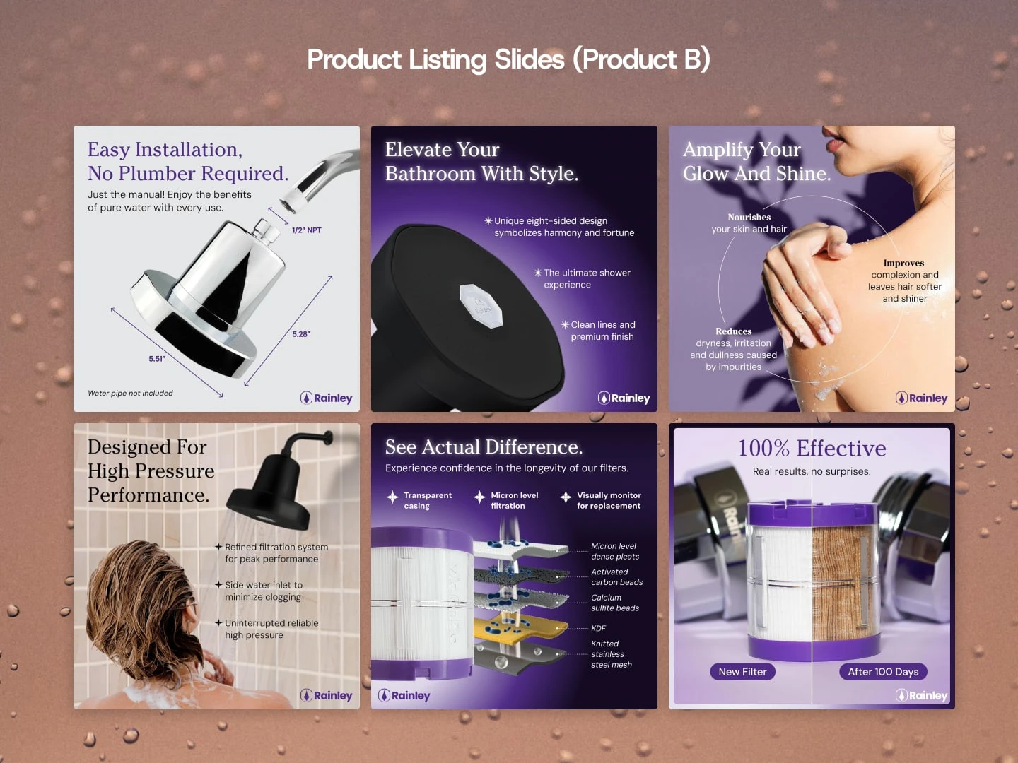
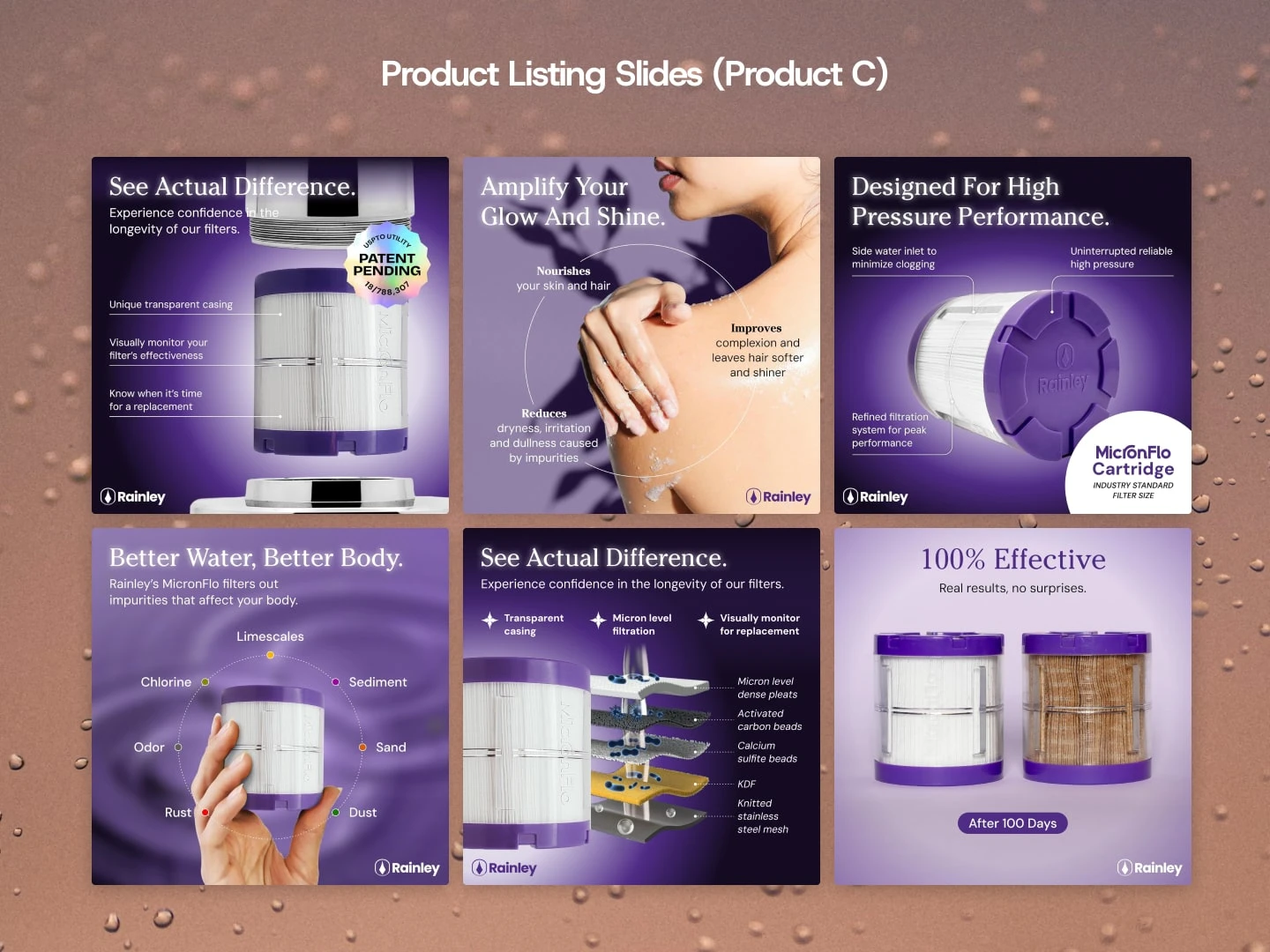
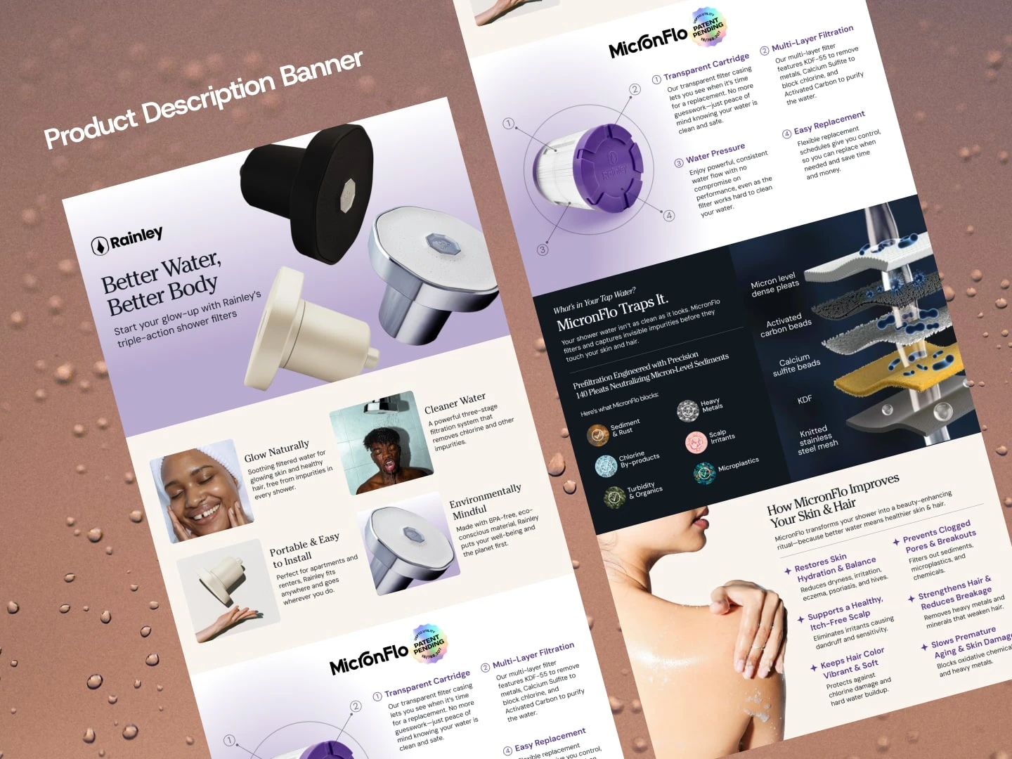
We educated users on the importance of clean water and broke down Rainley’s MicronFlo technology in a way that is easily digestible. Taking a minimalist approach, we created visuals that feel high-end while utilising pastel tones to provide a sense of cleanliness and calm and bring focus to their products while preserving their original brand purple for impact.
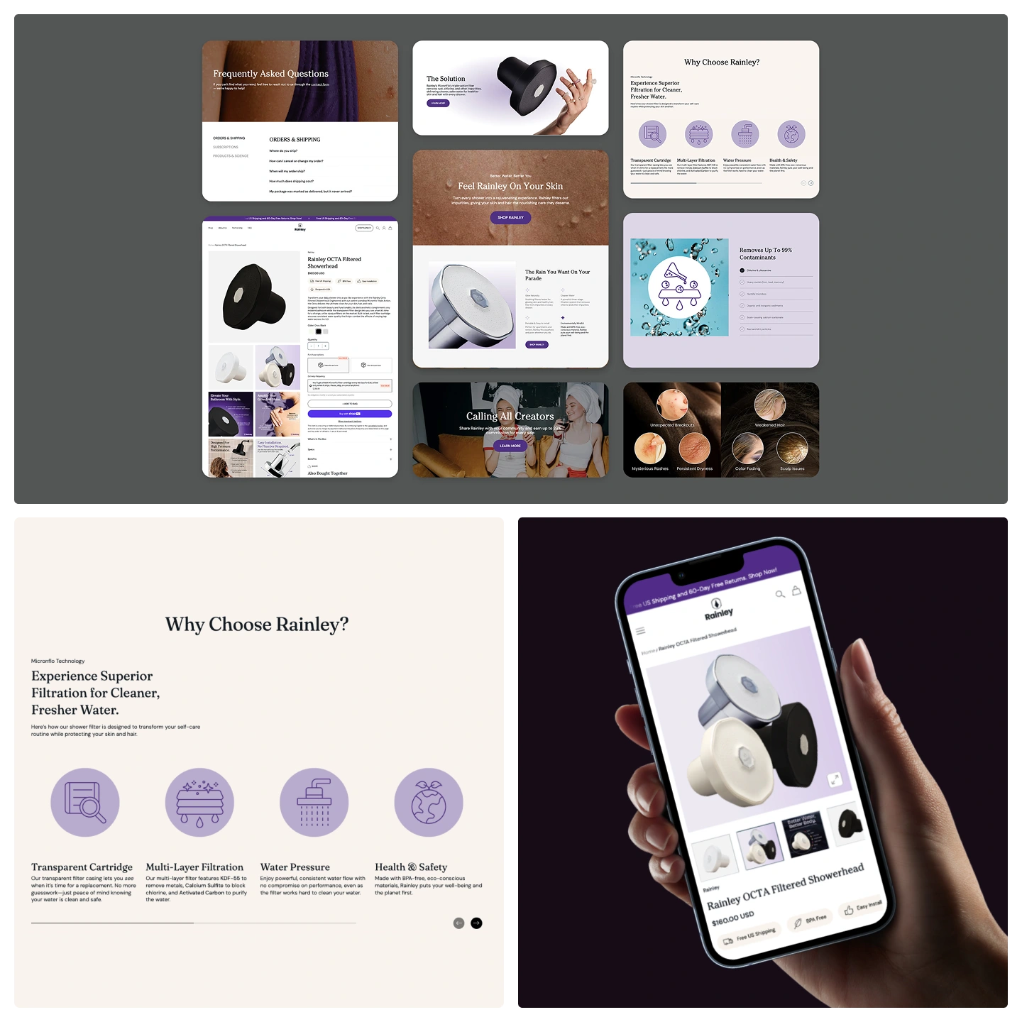
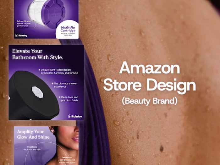
Amazon store & other digital platforms
From their website, to newsletter, Amazon store and social media, the result is a comprehensive brand ecosystem that doesn’t just compete in the market, but sets a new visual benchmark for what water care can be: a celebration of beauty. Proud of their newly made brand, Rainley was ready to go live.
“Haonmade’s dedication to the craft and attention to detail shine through in every aspect. The way they captured Rainley's mission to bring innovation and care to everyday routines is nothing short of inspiring. Rainley is lucky to have such a creative powerhouse on board!”
David
Founder, Rainley LLC
Project created by: Haonmade Studio
Thanks for exploring our work ♥
Like this project
Posted Jan 21, 2026
We partnered with Rainley to shape the creative direction, refine the visual identity, and build the Shopify store, Amazon storefront, and social content.