The Ogee Clinic Visual Identity Design
Kaye Lam
The Ogee Clinic Visual Identity Design
Overview
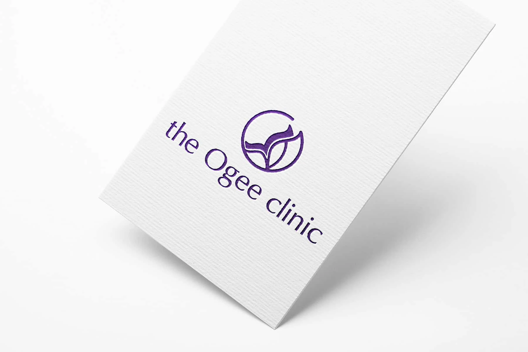
The Ogee Clinic is a medical aesthetic clinic based in Singapore.
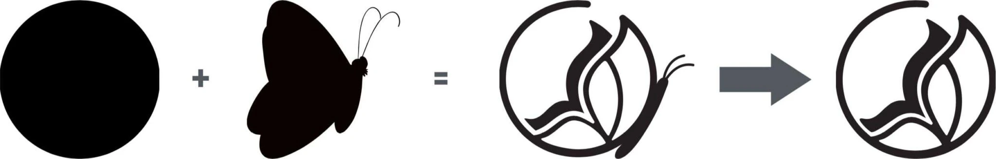
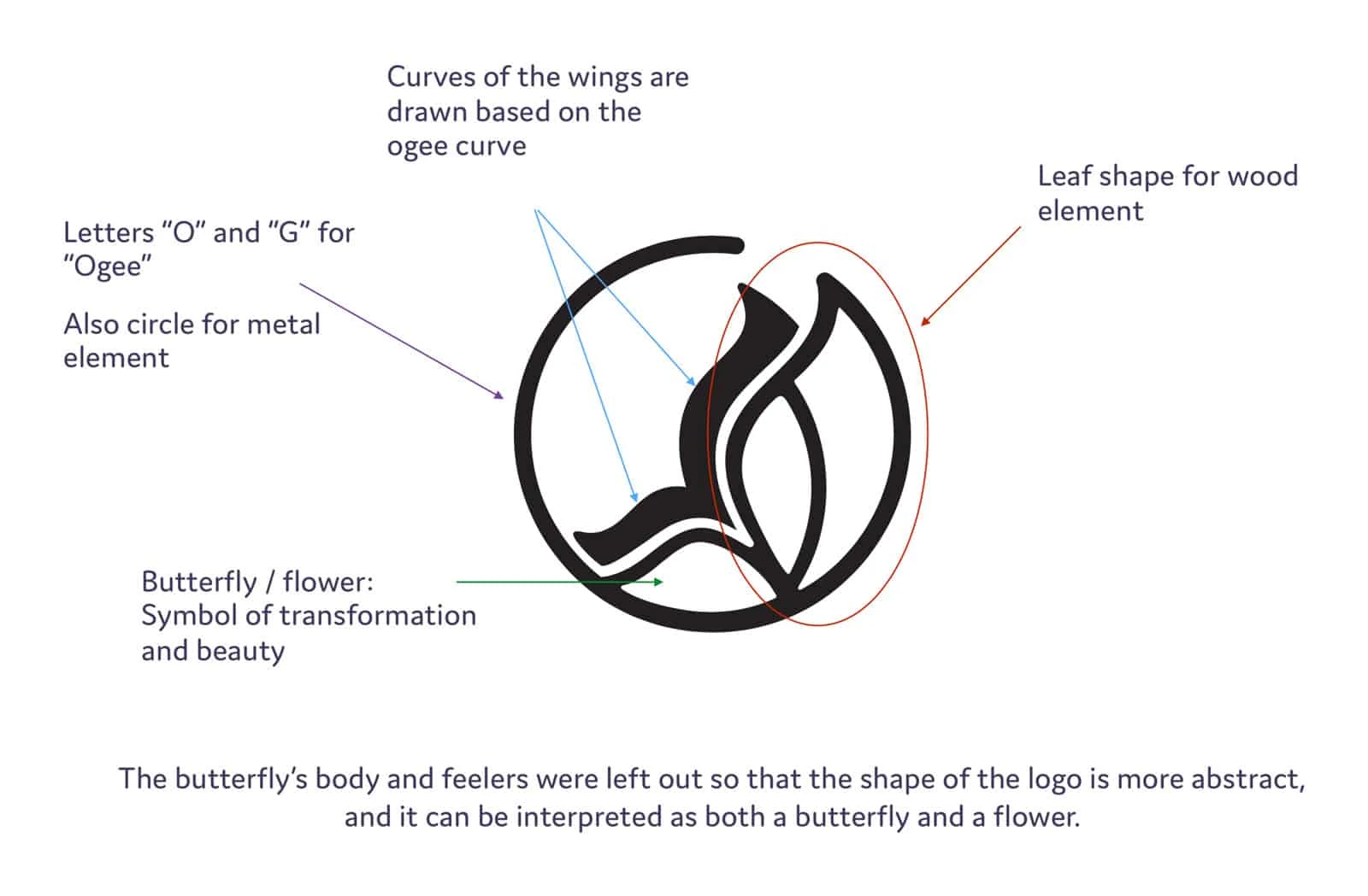
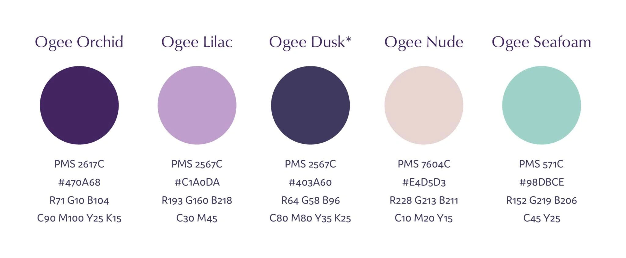
The client had several requirements for the logo – to include 1) specific shapes, 2) specific colours and 3) the elements of the logo have to be represented in equal strength for overall balance.
Process and Result
The logo can be seen as either a butterfly or a flower. Both are symbols of beauty, and the butterfly also has the added meaning of transformation. The final solution fulfilled all of the client’s requirements and was also a good representation of the business.
Like this project
Posted Oct 16, 2025
Designed a balanced logo for The Ogee Clinic, symbolizing beauty and transformation.
Likes
0
Views
6