AUREA: An Editorial Skin Studio Website + Visit Planner

Benjamin C


A first visit starts before the appointment
A clinic website has two jobs: communicate the character of the practice and help someone take a useful next step. A beautiful hero can establish the mood, but visitors still need to understand the services and decide what they want to ask about.
I created AUREA as an independent aesthetic studio concept to explore that journey. The brief was to design a calm, distinctive website with a consultation planning tool that a visitor could actually use. The studio is fictional. The business use case is practical: helping a prospective visitor organize their interests before making contact.
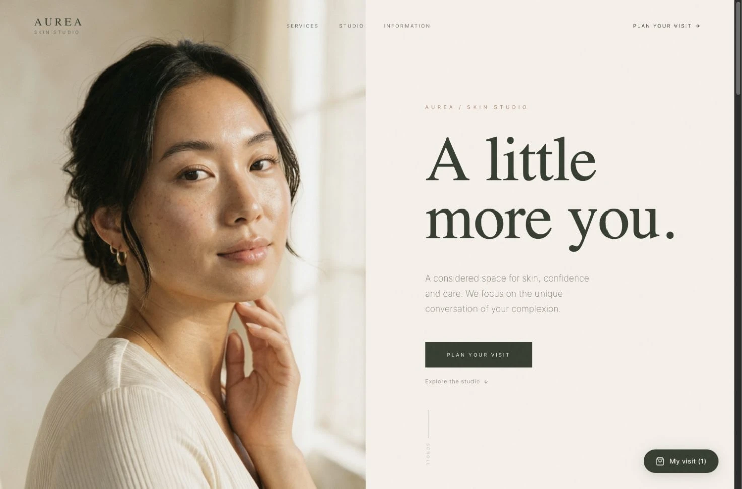
The finished editorial hero pairs original generated portraiture with a warm ivory and olive visual direction.
Defining the direction
I started with the atmosphere and the visitor flow together. Warm ivory, deep olive and muted clay give the interface a restrained palette. Large serif typography brings an editorial character, while smaller sans-serif labels keep practical actions easy to scan.
The initial brief connects that visual language to three actions: explore, ask and plan. That sequence shaped the page order and the planner. Each section has a purpose, from the first portrait through to the service collection and visit summary. The process screenshots document the brief and the build as it developed in Anything.
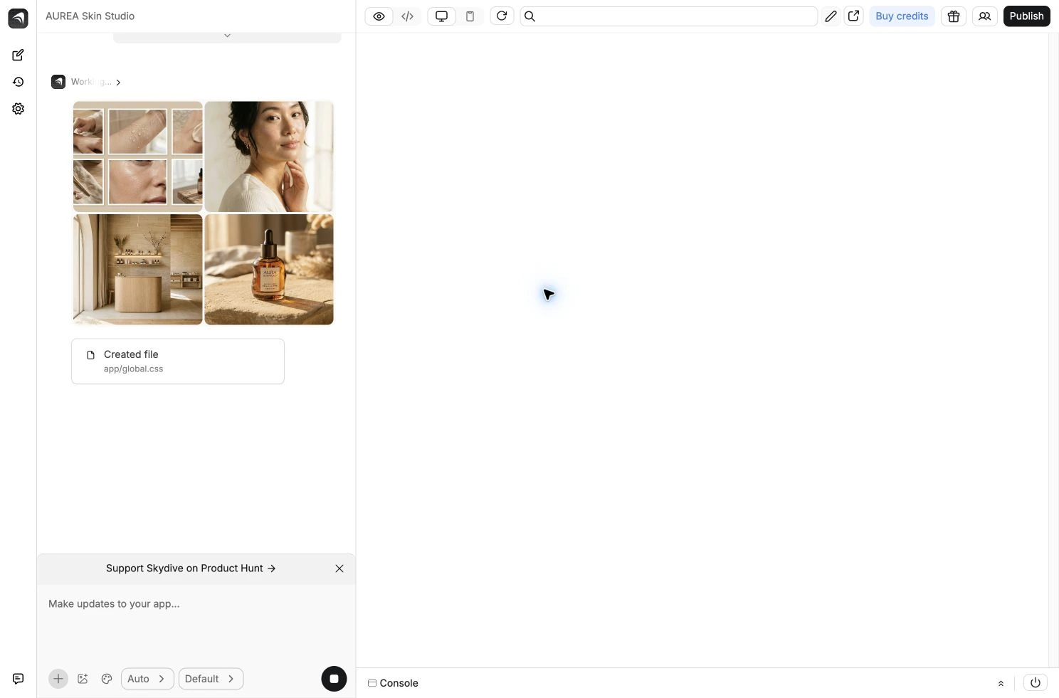
Early asset exploration inside Anything: skin portraiture, tactile product imagery and a sunlit studio direction before the page was assembled.
Giving the site its own identity
The hero pairs a close-up portrait with the line “A little more you.” Photography carries the atmosphere, while generous spacing gives the headline room. Skin, stone and studio imagery extend the direction through the page without relying on a repeated collection of generic cards.
I used Anything to generate the original visual assets and build the interface, then reviewed the actual browser output. The first render exposed a gap between the generated design and its styling. That review became part of the iteration process rather than treating the builder's completion message as final approval.
Making the service menu useful
The service explorer gives visitors a smaller set of choices at a time. Categories separate facial, skin and consultation services. A visitor can filter the collection and add the services they want to discuss to a personal shortlist.
This is a planning interaction, not a treatment recommendation. The interface avoids collecting medical history or deciding what a visitor should receive. Its job is to help someone express their interests clearly. Selected services remain visible in “My visit,” so browsing and planning stay connected.
From interest to a visit summary
The planner carries those selections into a simple review flow. The experience lets a visitor review the shortlist, choose a preferred weekday and time of day, and create a readable summary. A clear demo message distinguishes that summary from a confirmed appointment.
The concept keeps the interaction lightweight. Shortlist persistence happens in the browser, with no account requirement or collection of contact details. A live clinic implementation could connect an approved scheduling service and the practice's own intake process after its operational requirements were defined.
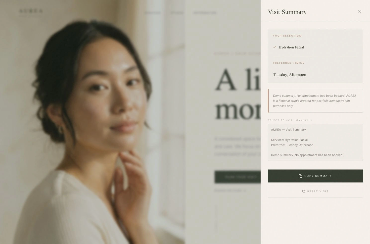
The working planner brings the selected service and timing preferences into a readable summary. This demo does not book an appointment.
Checking the experience
I checked the build in its external preview at desktop and mobile sizes. The checks covered category filters, saved selections after a reload, duplicate prevention, required timing preferences and the completed summary. Reset returned the planner to its empty state. Screenshots show both the visual direction and the practical interface behind it.
Motion supports the transition between sections and states. The portfolio cover uses actual screen movement from the finished experience, letting a prospective client see how the site behaves as well as how it looks.
Where this fits
AUREA demonstrates a direction for aesthetic studios, independent skincare practices and consultation-led service businesses that need a stronger first impression and a clearer enquiry journey. The deliverable is a working concept built in Anything, with an editorial website and a connected planning experience.
It is presented as a demonstration of design and implementation. No client revenue, booking uplift or clinical outcome is claimed.
Like this project
Posted Sep 8, 2026
An aesthetic studio concept built in Anything, combining an editorial website, service explorer and working visit planner.