Biotherm Homme - Ahead of the Game
Hugo Jackson
BIOTHERM HOMME - AHEAD OF THE GAME
When The Elements Meet The Athlete.
THE CHALLENGE
Visualizing "Sport" Without the Sweat.
Biotherm wanted to position their Force Supreme line for the active, competitive man. The challenge was to evoke the energy of sport without resorting to the usual clichés of sweaty athletes or locker rooms.
We needed a visual language that felt premium, architectural, and victorious. The goal was to bridge the gap between high-performance skincare and high-performance sport, creating a concept that could live as comfortably in a luxury Duty-Free display as it does on a social media feed.
THE CONCEPT
Deconstructing the Arena.
We stripped "Sport" down to its cleanest, most symbolic elements:
The Track: The geometric precision of white court lines on blue turf.
The Finish Line: The dynamism of breaking the tape.
The Podium: The elevation of the winner.
The concept was to treat the bottle not just as a product, but as the athlete itself, standing on the podium, crossing the line, and staying "Ahead of the Game."
THE VISUALS
From The Court to The Counter.
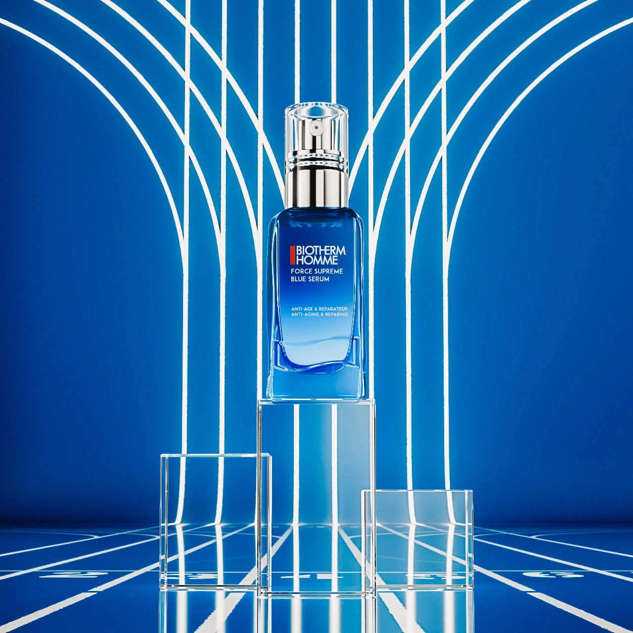
The Hero Podium (Key Visual): This is the centerpiece of the campaign. I elevated the bottle on a solid block of optical glass, treating the product itself as the trophy. The background features stylized neon light curves, evoking the speed of a wind tunnel or the lanes of a futuristic track. It creates a sense of forward momentum while keeping the product strictly in focus.
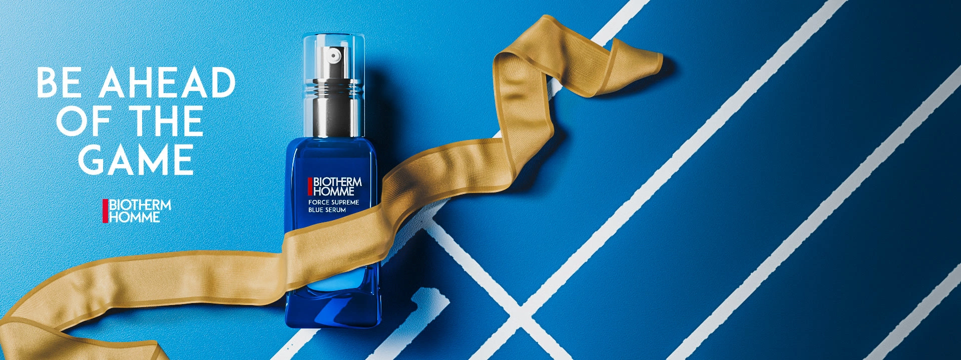
The Finish Line (Campaign Art): I placed the bottle on a textured blue court surface, bisected by sharp white boundary lines. The hero element is the Gold Ribbon, simulated (using cloth dynamics) to freeze-frame the exact moment of victory. It adds a soft, organic contrast to the rigid geometry of the bottle and the track.
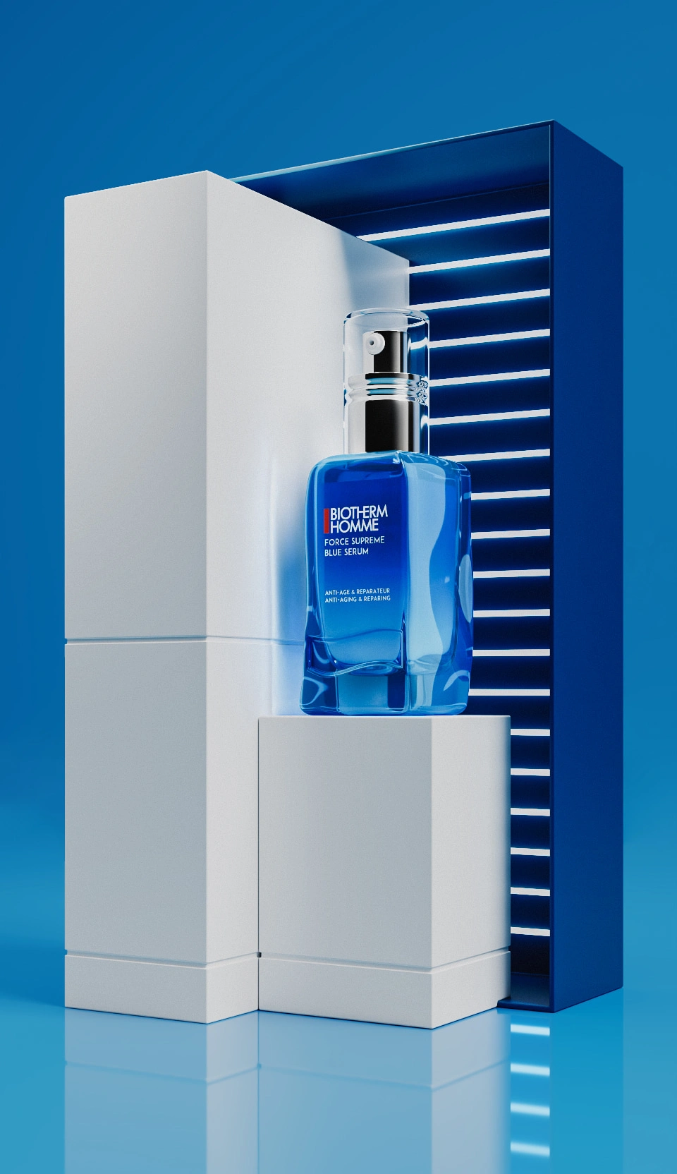
The Retail Experience (Airport Podium): I translated the brand's identity into a physical space concept for Global Travel Retail (Airports). Using slat lighting and architectural blocking, I designed a modern, "Tech-Luxe" podium. The lighting mimics the speed lines of a track while highlighting the premium glass material of the bottle, designed to stop travelers in their tracks.
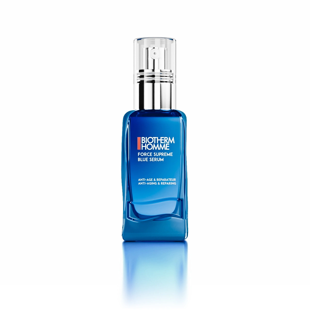
The E-Commerce Twin (Pure Product): For the webstore, storytelling takes a backseat to clarity. We stripped away the environment to create the "Digital Twin", a pure, white-background render. The focus here was entirely on the glass shader, perfecting the refraction and the liquid volume to ensure the customer knows exactly what they are buying.
TECHNICAL CRAFT
Materiality & Light.
The success of this pitch relied on Extreme Photorealism. There is no photography here; every pixel is CGI.
Glass Refraction: I spent extensive time calibrating the Index of Refraction (IOR) of the blue glass to ensure it caught the light exactly like the physical prototype.
Textural Contrast: The composition relies on the interplay of textures, the rough grain of the "track" floor against the smooth perfection of the bottle, and the woven satin detail of the gold ribbon.
Lighting: I utilized "strip lighting" techniques, reminiscent of stadium floodlights and neon tubes, to create long, clean specular highlights that define the bottle's curves.
THE RESULT
A Modular Visual System.
This project demonstrated how a single 3D asset can anchor an entire 360-degree campaign.
By building a high-fidelity master model, I was able to drop the product into three distinct contexts: Narrative (The Ribbon), Spatial (The Podium), and Commercial (The White Background). It is a scalable, future-proof approach to product photography that offers Biotherm total control over their brand image.
Ready to launch your product? Book a Call with me!
Like this project
Posted Jan 4, 2026
High-performance skincare meets sport architecture. A 3D campaign utilizing the podium and track to position the product as the ultimate trophy.
Likes
0
Views
11
Clients
Biotherm